3 Elements of Responsive Branding (and Why You Need Them)
Have you ever waved to someone and they didn’t wave back? Awkward, right? But are you sure they could see you and recognize you? Was the sun in their eyes? Were you too far away? Were you wearing a face mask?
There is a similar situation with your branding on your website. On a smaller mobile device, is your logo legible, or are the words shrunk down and too small? Are the colors high-contrast enough to be seen on a sunny day? Is there consistency between your social media avatar and your website, between your print materials and your digital advertising? Can customers recognize your brand wherever it might be displayed?
For your brand to be the most successful, it takes a little extra effort to think through all of these possible scenarios. But it’s worth it, or your customers will give you the cold shoulder, whether they intended to or not.
This extra bit of strategy and planning around your brand is called “Responsive Branding.” Just like responsive design, where your website’s content adapts to the device a customer is using, responsive branding adapts to the device, the medium, and the platform while also considering situations like low light, high light, animated, or static.
Oomph works with organizations across industries to build or refresh responsive brands that serve and delight their users across the full spectrum of digital experiences. Here’s what we’ve learned about responsive branding and our tips for creating one that works.
What Is Responsive Branding?
Let’s first start with what you’ve probably already heard — responsive web design. Coined by Ethan Marcotte in 2010, the “responsive” part came to mean that a web design responded to the size of the screen, from a phone to a tablet to a widescreen desktop monitor.
Then came responsive logos. These take the elements of the main logo and adapt them for different sizes and use cases. A logo might have too much detail to be legible as a small social media icon, for example.
Responsive Branding blends these ideas and looks at the design system holistically. A successful responsive brand may include:
- A logo version for different sizes and applications. Variations might include one with the tagline, one without, one with a mark and typeface, one just the name, one just the mark, the possibilities go on!
- Secondary logo options which may include abbreviations, monograms, or different combinations of the main elements
- When applicable, an internationalized version of the wordmark and tagline
- A color palette that can provide variation while addressing accessibility and situations of low light or high glare
- A fluid typography system that provides contrast between sizes within different size media (including print!)
- A fluid spacing system
- Motion when appropriate, like video intros and outros
Why Responsive Branding Matters
Your business makes a huge investment in building a brand that stands apart from the competition while communicating your personality and value. You are building trust with customers through every interaction. When your brand works well in one situation but not another, it erodes trust.
A strong brand will be clear, understandable, and memorable for all users in all situations. Whether you have physical locations or digital ones, the brand works with the same consistent strength and message every time.
When you invest in a responsive brand, you:
- Make your brand more visible. More users can connect with you when you have a brand that’s both recognizable and responsive. Given that 60% of consumers are more likely to buy from a brand they recognize, the opportunity cost of not getting this right is huge.
- Improve accessibility. Digital accessibility means people of all abilities can use your website and experience your brand. Up to 1 in 4 American adults live with a disability, so a lack of accessibility means fewer customers to reach. For visual brand elements, that means considerations for color blindness, low vision, and cognitive impairments like dyslexia.
- Create a more consistent brand. Responsive branding equips your team with the tools to express your brand effectively across mediums. That means less time involved in building new assets and a more consistent experience that meets your users’ high expectations.
3 Elements of a Responsive Brand
A responsive brand is more than a shape-shifting logo. The most responsive brands make strategic use of these three elements:
1. Logo
Your logo is the first piece of your brand that customers will recognize. Using a single-state logo can compromise that impression — a logo that looks great at a large scale is often unintelligible as a small icon.
Responsive logo designs help ensure your logomark is clear and impactful no matter where you apply it. Beyond the size considerations we mentioned, it should include different formats like horizontal, vertical, and square to support many different digital, social, and print platforms.
Some other techniques we use to create scalable logos include:
- Dropping words or lettering
- Dropping the icon or image
- Creating an abbreviation version
- Stacking the icon/image and text/lettering
- Combining separate elements into a single icon
- Simplifying details and shapes within logo marks
- Varying thickness and white space to make small logos more legible
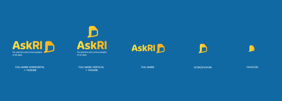
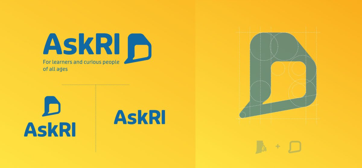
Oomph Tip: It’s okay to take several design rounds to get it right. Iterating helps uncover where you’ll use the logo, what it must convey, and which colors and iconography can best support that purpose. We went through several design iterations with our client AskRI before settling on a bold, simple font and clear chat bubble icon that plays off the state of Rhode Island’s distinctive shape.
Color Palette
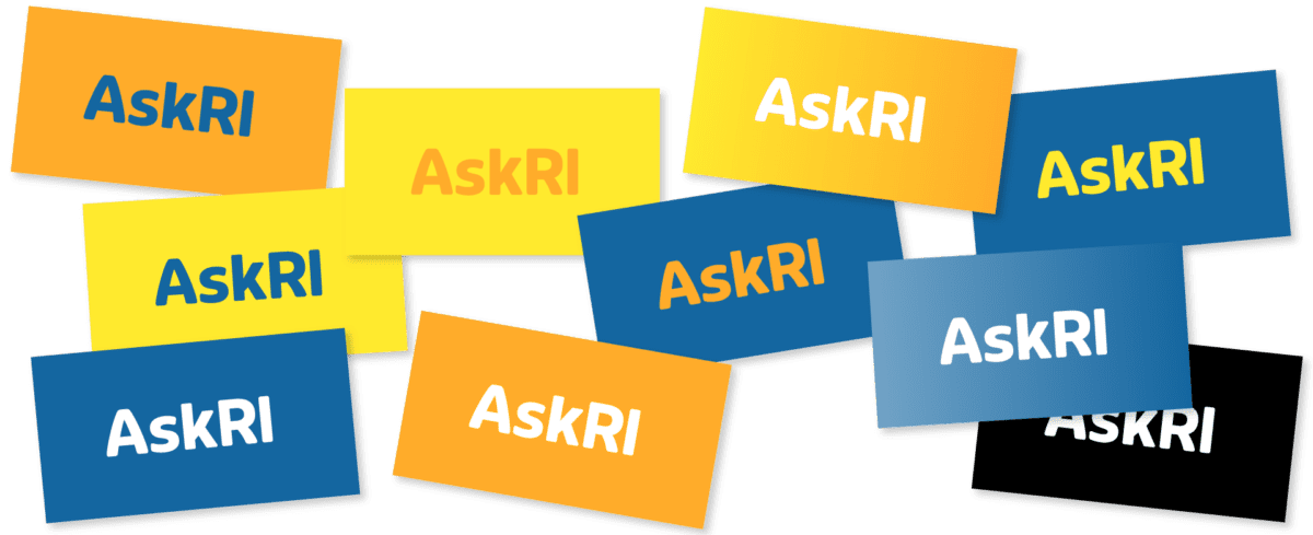
A responsive color palette is less about picking complementary shades on a color wheel and more about creating an experience that works in all situations. People with visual impairments and people on low-lit smartphones, for example, rely on high-contrast color combinations to engage with your brand.
Start by following the Web Content Accessibility Guidelines (WCAG), which include specific recommendations for color contrast ratios. Colors that meet that standard include light text with dark backgrounds, or vice versa.
Depending on where your brand appears, you may need to adjust your color palette for different settings. For example, your full-color logo might look stunning against a solid white background but becomes illegible against bright or dark colors. A single color logo is useful for some digital use cases like Windows web icons and iOS Pinned Tabs. In non-digital spaces, single color logos are great when color printing isn’t an option, such as with engraving or embroidery. Build out alternate color variations where necessary to make sure your palette works with you – not against you – across your materials.
Oomph Tip: If your brand palette is already set in stone, try playing with the brightness or saturation of the values to meet recommendations. Often your brand colors have a little wiggle room when combinations are already close to passing conformance ratios.
Typography and Layouts
Responsiveness is also important to consider when structuring web pages or marketing collateral. The most legible layouts will incorporate adaptable typography with clear contrast and simple scaling.
When selecting a font, be sure to think about:
- Minimum legible sizes. When is small too small? It depends, of course, but don’t forget older customers, those with low vision, or those in situations that make reading more difficult. Use at least a 16px size for digital products and 12pt size for print. These might change depending on the font, but these sizes are a great place to start.
- Inclusive typefaces. Many designers overlook how understandable certain letterforms appear to be. A way to quickly review is to look at the number 1, lowercase l (L), and uppercase I (i) of any typeface. Then also look at the capital O, the zero, and the lowercase o — 1lI O0o. Can you tell the difference when these characters are out of context? If you can’t, then your customers might have trouble as well. Use your judgment, but also use this trick to expose possible problems with your communication. These five keys to accessible web typography are a great place to start.
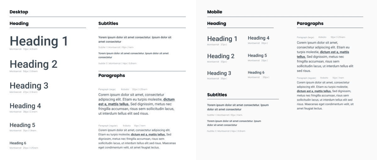
- Scaling ratios. Similar to a musical scale of harmonious notes, a typographic scale is a collection of font sizes that work well together. Using a typographic scale helps to make your text visually appealing and readable for different users across different devices. Some examples include exponential scales, where you multiply the previous font size by a ratio to get the next font size, and Fibonacci sequences, where you add a number from the Fibonacci set to the base font value to get a new size in the scale.
Oomph Tip: Don’t go it alone. Tools like Typescale and Material UI’s The Type System can simplify typography selection by recommending font sets that meet usability and scalability requirements. And the U.S. Design System has some suggestions as to which typefaces are the most accessible.
How To Get Started With Responsive Branding
To create a responsive brand that resonates, you first have to identify what elements you need and why you need them. That second part is your secret sauce: finding a balance between a design your users can recognize and one that inspires them.
A design audit can zero in on the needs of your brand and your audience, so you can create a responsive design system that meets both. Not sure where to start? Let’s talk.