AskRI
Reinventing the Future of Digital Learning and Seamless Information Access
view live site
capability
Branding
Design Systems
Mobile & Responsive
User Research
category
Design & UI
Research & Strategy
User Experience
industry
Environmental & Non-profits
Imagine having a digital librarian on call 24/7 with a bounty of free tools and resources — as long as you can easily find what you’re looking for. PPL & OLIS needed a more engaging and user-friendly digital platform to serve the Rhode Island community. We responded with energetic new branding and a more intuitive persona-based architecture.
THE BRIEF
AskRI is a digital platform providing Rhode Island residents with free access to some of the top educational and research tools, along with links to many state resources. A collaboration among the state government and various libraries and agencies, AskRI is essentially a 24/7 help desk for Rhode Islanders.
The platform’s structure has three main approaches:
Databases
Online portals provide free access to premium third-party tools and services, including research platforms and libraries, online learning and tutoring platforms, and consumer resources for health, jobs, and more.
Audiences
AskRI curates information and resources for specific audiences, including K-12 students and teachers, parents, non-native-English speakers, and adults seeking continuing education.
FAQs
Supporting local librarians with ready-made links, the FAQ section answers crowd-sourced questions about a variety of government services (how to get a green card, where to get a fishing permit, etc…).
Fundamentally, it’s an incredible resource! But, as AskRI grew over time, it became increasingly difficult for users to find the information they needed — and harder for site managers to organize, update, and expand the content.
Aiming to make the platform more user-friendly all around, its owners opted for a comprehensive redesign with a few primary goals:
- Refresh the branding to re-energize the service internally and externally
- Provide more flexible and efficient content management tools
- Increase usage of the platform’s resources across all target audiences
THE APPROACH
Through a quick Discovery phase, we uncovered a diverse user base with a broad range of needs. Our next challenge was to create an energetic brand identity and a more intuitive way to organize the platform.
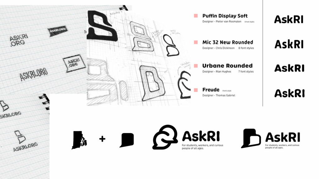
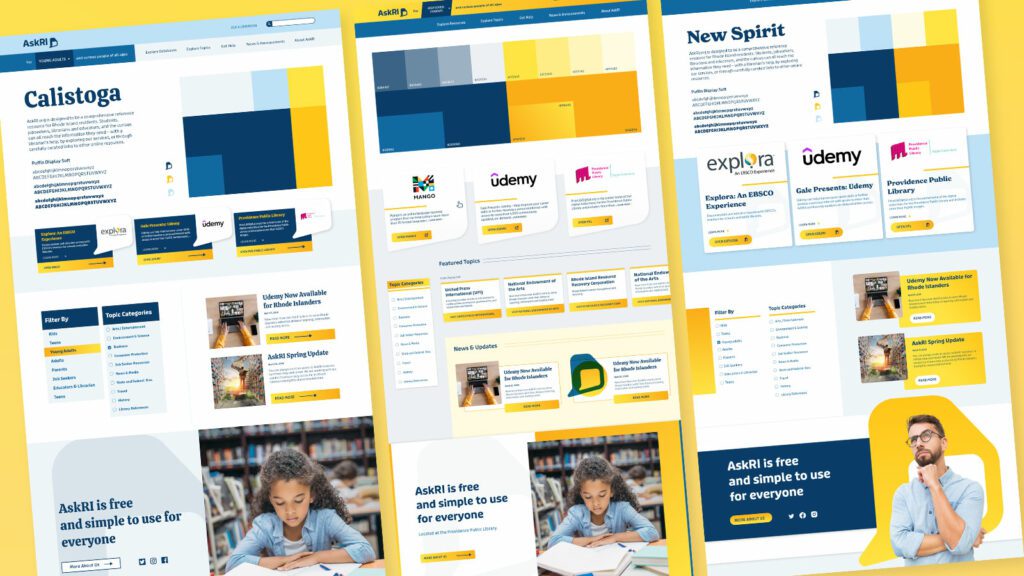
Visual Branding
Rhode Island is a small but unique place, and its residents are proud of their state. We wanted the new branding to leverage a more modern, yet uniquely Rhode Island, identity. It could also evoke a sense of engagement, reinforcing the platform’s two-way interaction.
Over several design rounds, we explored logos that would represent two-way conversations while suggesting Rhode Island’s distinct shape. We also introduced a new, brighter color palette.
Digital Platform
Redesigning the platform came down to an exercise in information architecture: What was the best way to organize the content so users could quickly find the tools and resources that were most relevant to them?
We knew only a small segment of the target audience would know exactly what they were looking for and be able to search for it directly. Most users would be on a mission of discovery, needing a way to browse the content. Then there was the FAQ section, where users might expect to find answers about the platform itself — but in its current form, the FAQs were confusingly broad and hard to find.
Our solution addressed all three areas:
- Knowing that frequent users would want to get to familiar databases quickly, we incorporated tried-and-true search and filter tools
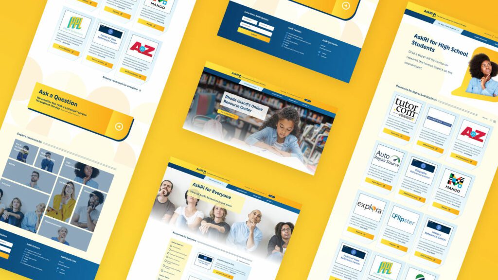
- For those needing more guidance, we created a persona-based architecture with curated lists of content that addressed each persona’s unique needs
- By making the platform simpler and more intuitive, we removed the need for an FAQ section. We replaced it instead with a more interactive feature
THE RESULTS
These relatively simple changes brought powerful results, creating a more engaging and intuitive platform. The fresh branding celebrates inquisitiveness and interaction, while the redesigned content is much easier for users to navigate and for authors to organize and expand.
The AskRI team loved the new brand identity, which evokes curiosity with visual elements that represent thinking and asking questions. Two thought bubbles form the shape of Rhode Island for the logo, while images of inquisitive people are featured throughout the site. In addition, the new colors bring fresh energy to the brand while preserving a sense of trust and authority.
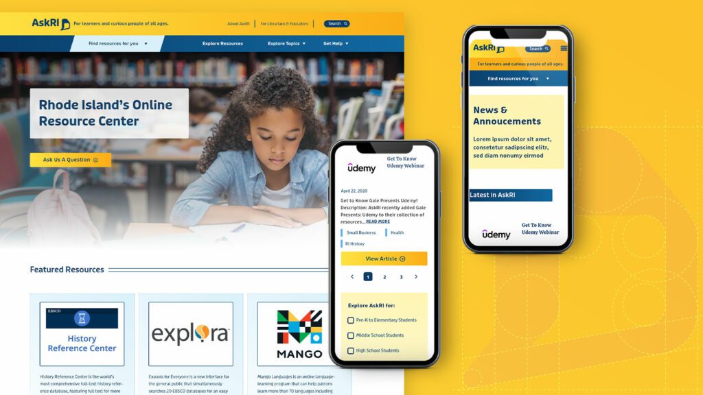
The redesign not only improved the content’s organization and accessibility, it also fosters a greater sense of interaction with platform users. Visual personas provide an intuitive starting point for exploration, backed up with curated resource lists. A new dropdown menu titled “Find Resources for You” speaks directly to target audiences, while a new “Explore Topics” section offers lists of state resources grouped by user needs (small business, health, families, etc.).
Finally, as the most interactive part of the platform, the redesigned FAQs section is now the “Ask a Librarian” page, where users can submit questions on any topic. The most common platform-related questions get published to the site as a list of answers that users can browse. Input from users will not only inform the kinds of content that goes on the site, but may also spur access to new tools and databases.