
SERVICES:
Brand Refresh or New Design
A website redesign initiative is the perfect opportunity to reimagine logos or wordmarks, and Oomph is a perfect partner.
Brand Identity Modernization & Alignment with New Digital Initiatives
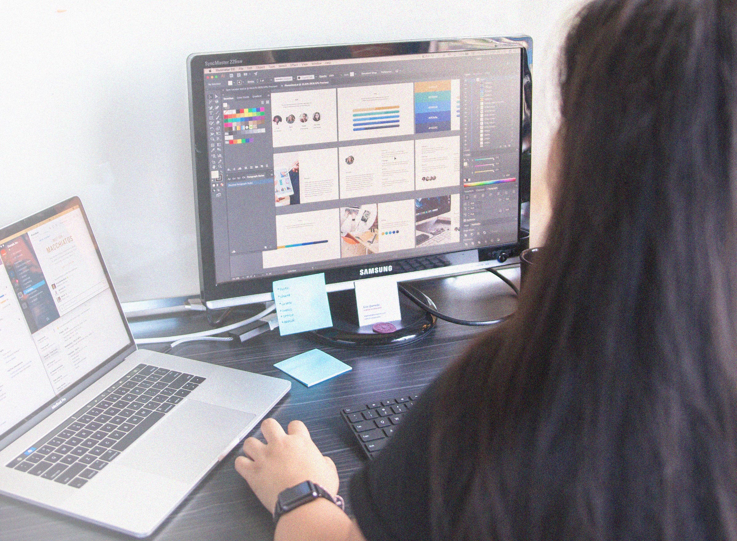
Oomph collaborates throughout a design project and learns much about a client’s audience and position within their community. In order to do an outstanding architecture and design job, we must start from a place of deep understanding — we need to know as much as you do about your brand, and maybe more.
That is why client partners take this opportunity to leverage our design insight and skills to modernize existing brand assets or create a new identity system. Oomph has helped companies update their brand design systems by modernizing the elements around an existing brand or delivering a new logo mark with documentation to support the brand post-project launch.
Brand Refresh Examples
Slight changes to existing brands as part of a larger redesign evolve the identity without losing positive associations.
The main digital property sets the tone. It is the front door to the brand and your customer experience. The logo and brand colors are a part of that — how they are used is just as important as what they look like. Our work on the digital platform often reinvigorates the brand because it is the most recent and most visible application of it.
We do this for everyone we work with. Oomph leverages our expertise to modernize brand assets like logos, colors, iconography, and photography treatments. We not-only work with the existing brand guidelines but we must extend them.
Keene State College
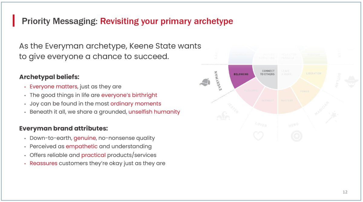
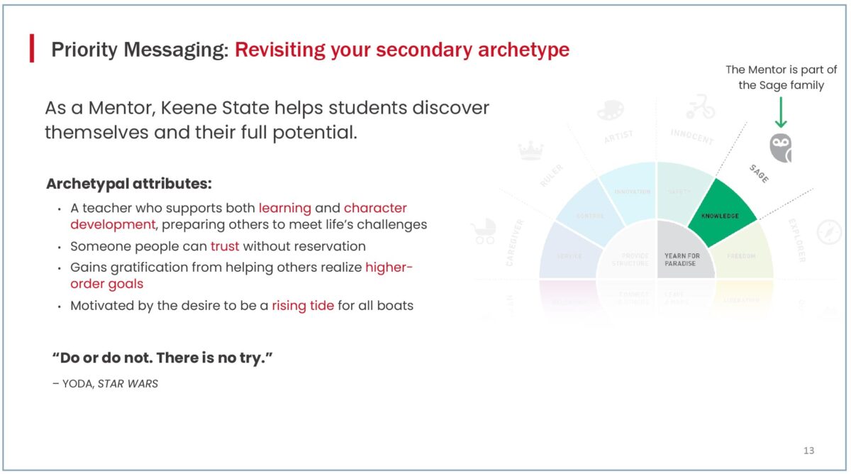
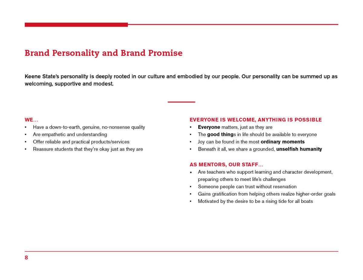
Keene recognized their brand voice needed unity and direction. They were at the point where it was no longer clear what the personality of the brand was, and how their audience perceived their messages.
We embarked on a Brand Messaging Framework exercise where we interviewed students and faculty to gather input on Keene’s strengths and weaknesses. With a group of stakeholders, we held information sessions and an interactive brand archetype workshop. With the help of a content strategist, we charted the course for Keene’s updated Voice and Tone and integrated the takeaways into a foundation for brand messaging.


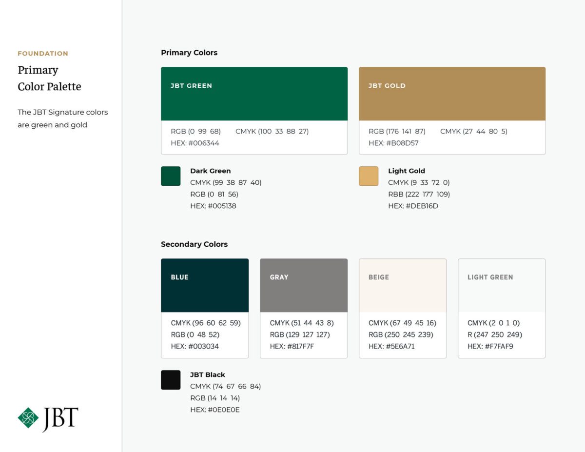
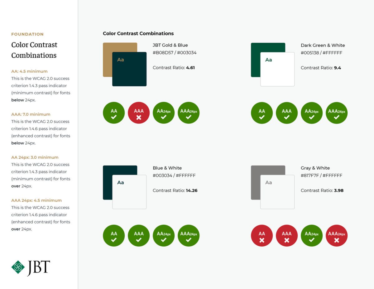
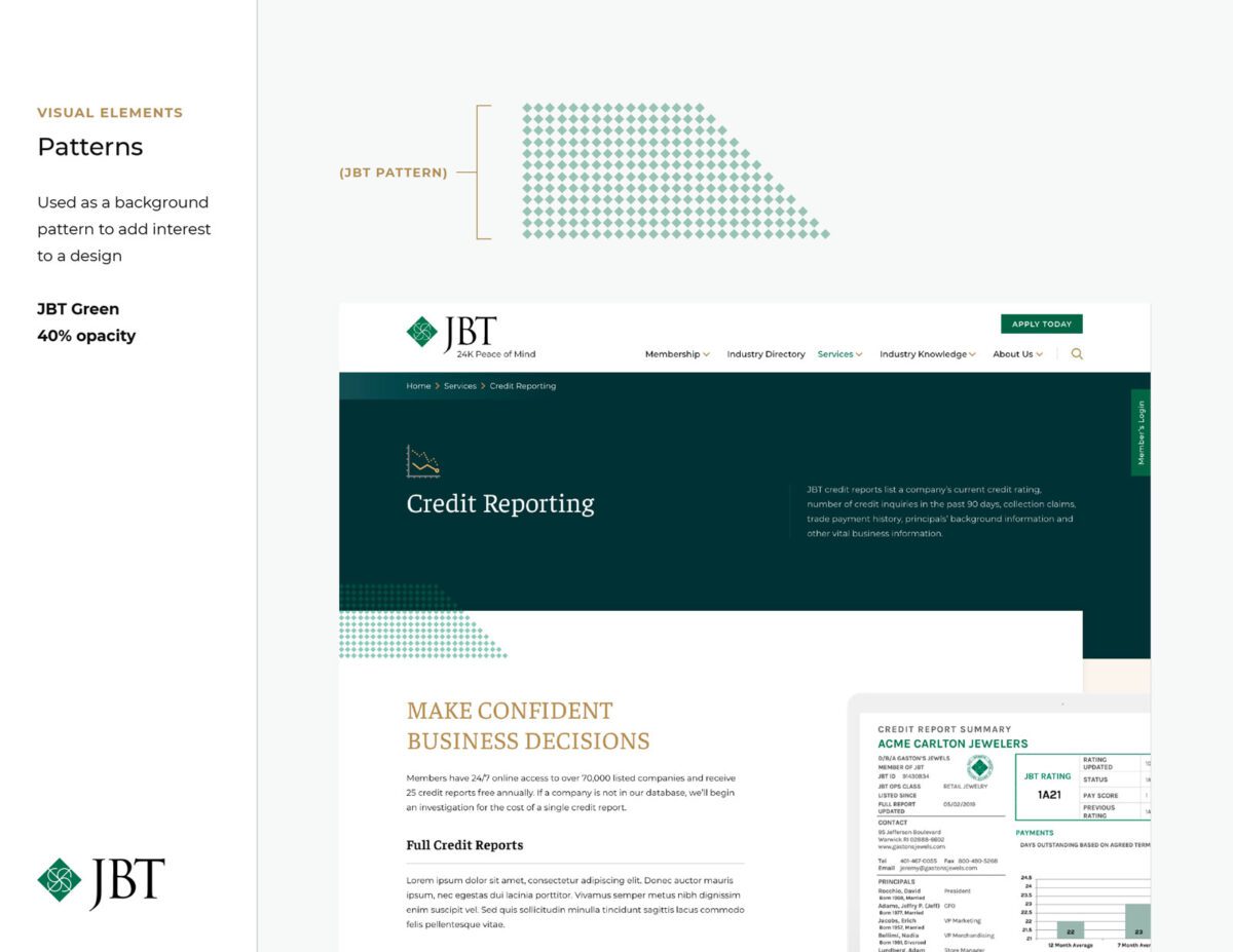
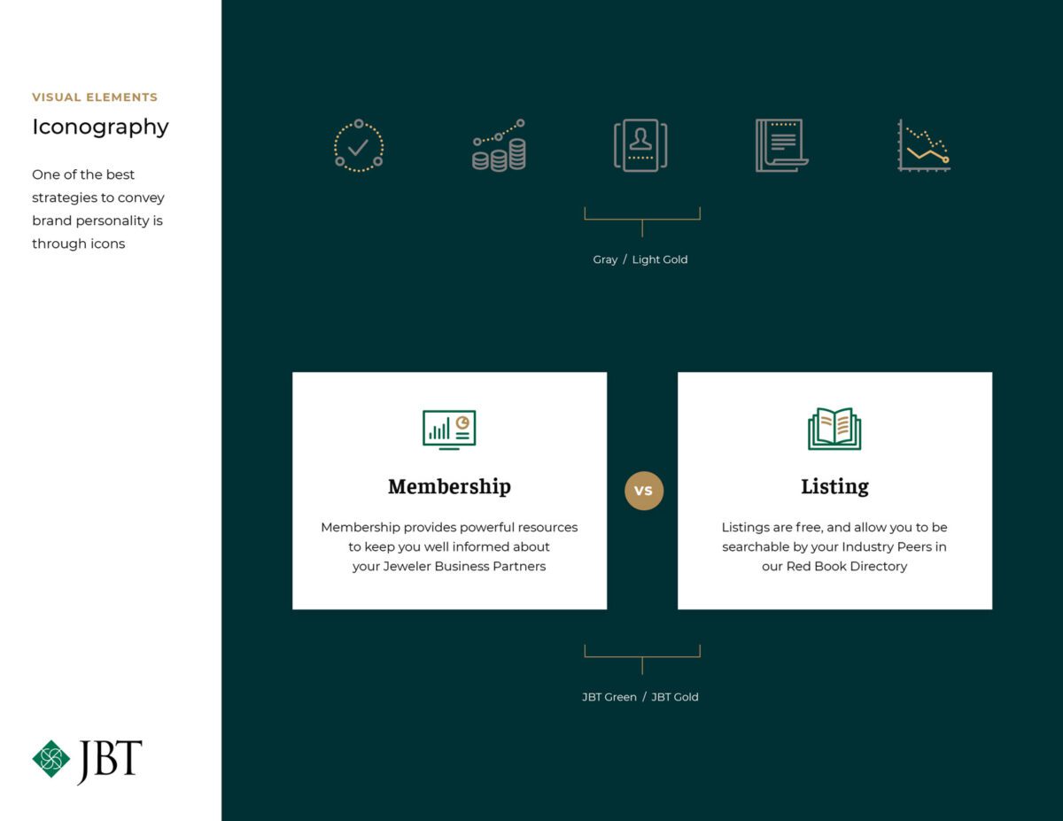
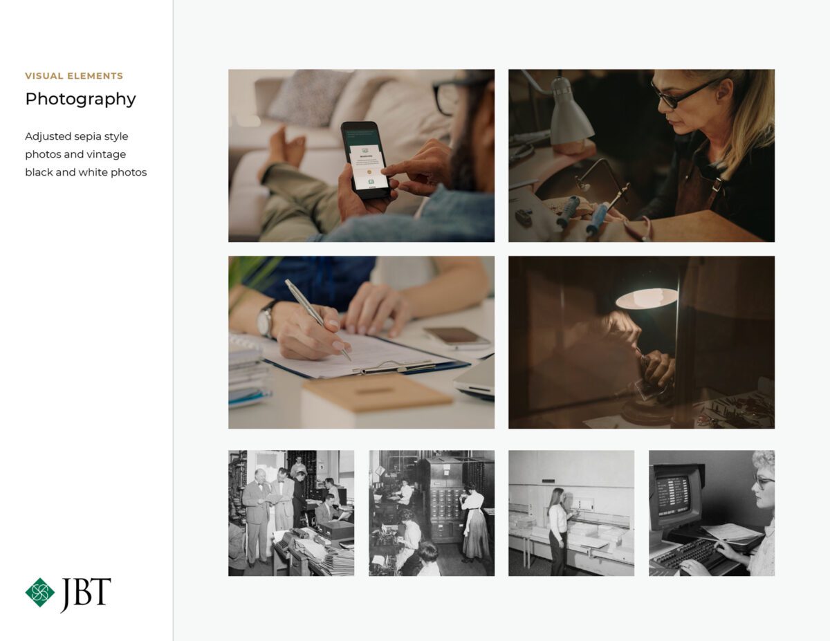
JBT: Jewelers Board of Trade
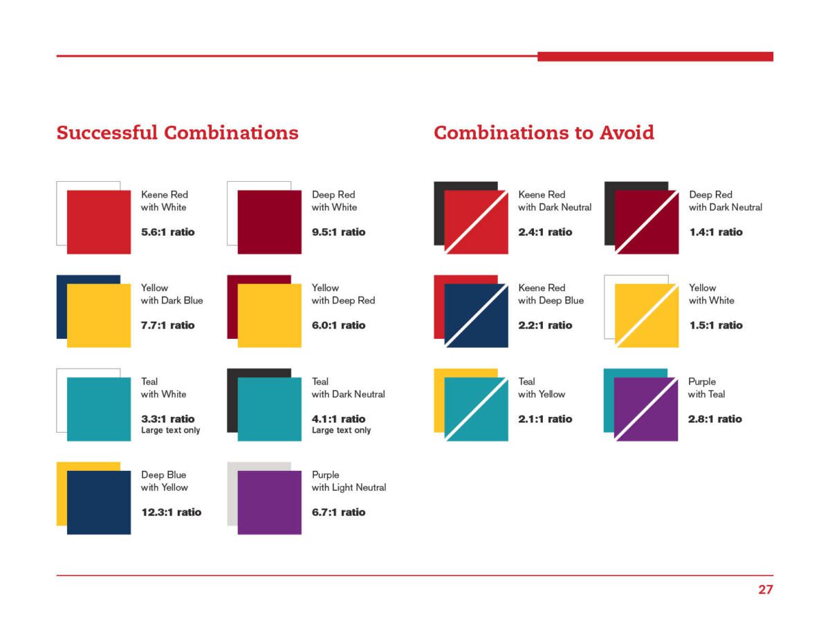
JBT embarked on a digital redesign in 2019. While the logo mark and three-letter abbreviation typography did not change, how the mark was used was modernized along with new color distribution and increased color pairing consistency to support digital accessibility. A comprehensive brand guideline book was included to assist internal teams in updating digital advertisements and printed handouts.
A logo refresh for Washfunders
Sometimes organizations need a refresh, not a redesign. The Washfunders logo was serviceable, but the detail was small and confusing — was it a flower? was it water? Supporting organizations that work to provide 663 million people in need with safe water access, Washfunders needed to clarify its mission and focus with a new website redesign. Part of that design addressed clarity in the logo as well.
New Brand Identity Examples
When a new brand system is needed, Oomph’s expertise delivers well-crafted logos and identity documentation.
When Oomph has been a long-time organizational partner, we have been invited to invent new brands that stand upon years of shared understanding. These examples are successful not only as visual exercises but as a translation of our client’s core purpose.
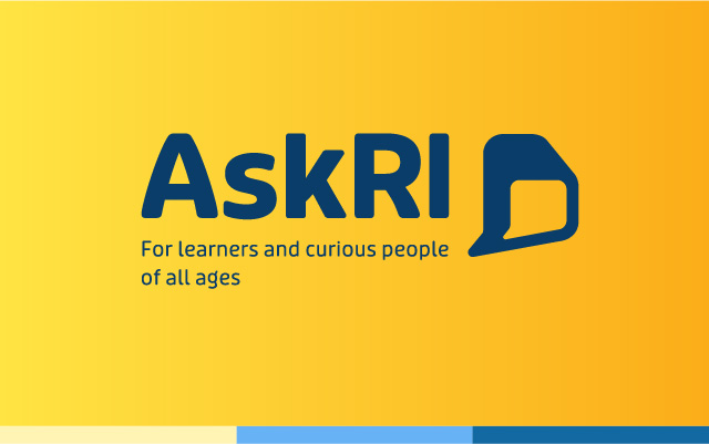
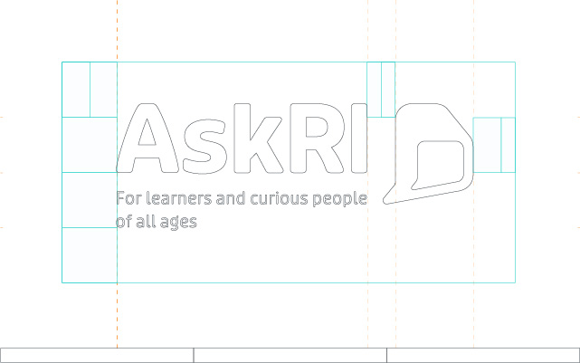
AskRI is a popular virtual resource platform and help desk for members of the Providence Public Library. They underwent a redesign and rebrand in 2021.
The rebrand needed to make the typography system more friendly. Previous iterations were either too young and cute, or too academic and stodgy. The new color palette is bright and strong, while the typeface is soft and approachable. The wordmark hints at the shape of the State of RI while also invoking the conversations that happen when a patron seeks help from a resource librarian.
The brand system has been applied to the website, bookmarks and other giveaway materials, and out-of-home advertisements on buses and bus shelters. The system has brandmark variations in horizontal, vertical, mark only, and with or without tagline formats.
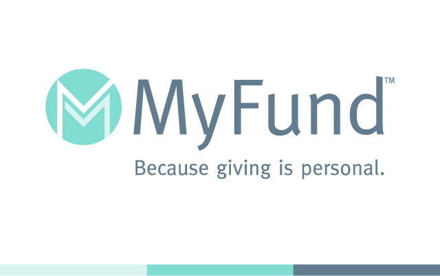
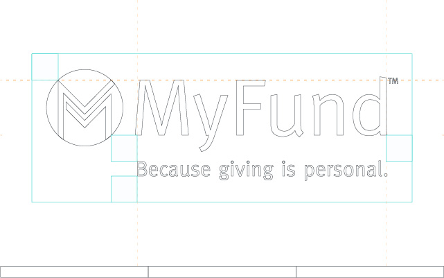
MyFund was a new online giving platform from the United Way of Rhode Island. They came to Oomph with this new project after our redesign. Oomph was involved in the naming process, URL naming conventions, tagline development, as well as the visual logo development and brand guide.
MyFund needed to feel similar to the United Way brand, but also stand apart. A tertiary “seafoam” color that was used on the United Way of Rhode Island website became the primary color for MyFund. The chosen “M” mark was developed to function like any social media mark — as a unique but succinct brand mark that reproduces well in small applications. Since it is a software platform that encourages philanthropy, the “M” mark can also be seen as an abstraction of two people linking arms.
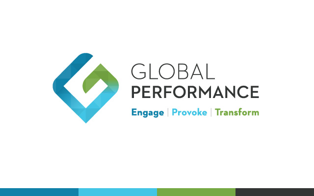
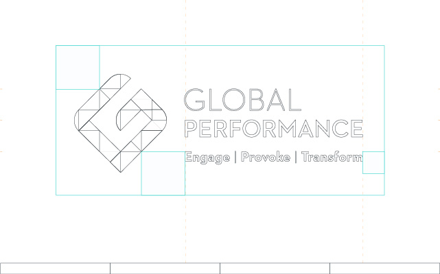
The Global Performance Group is a corporate sales training program. Their philosophy was rooted in transformation — transforming habits through content, technology and coaching.
The mark aims to introduce the multi-faceted nature of their approach, tailoring the trainings to the company’s business line and audience. Its rotated, up-turned nature also hints at growth abd dynamism, while the color gradation moves around the spiral showing a journey and change from the one end to the other.
Ready to refresh your own brand?
We’d love to talk about your needs and how Oomph can help. Complete the form below and a team member will reach out. Required fields are marked with an asterisk(*).
"*" indicates required fields