Our Website Discovery Playbook for Higher Education Institutions
It’s no secret: Higher education institutions are complex.
Between multiple campuses, multiple audiences, and a high volume of content, higher ed marketing and communications teams have a ton to juggle.
And that’s before you throw a new website into the mix.
Not long ago, the team at Oomph partnered with the University of Colorado (CU) and Keene State College (KSC) to redesign sites for each institution. While their asks – and end products – were unique, the processes had a lot in common. So much so that we’re peeling back the curtain on our discovery process to give other higher ed institutions the tools to deliver websites that meet business goals and audience needs.
In this article, we’re turning our lessons learned into a discovery playbook that can help higher education institutions set the stage for a successful site redesign.
The Projects
University of Colorado Giving Platform
The University of Colorado has an active and engaged alumni network that loves supporting all things CU. The university came to Oomph because it needed a donor funds platform that could keep up. The goals of the discovery process were to:
- Document existing conditions, strengths and weaknesses, and stakeholder perceptions.
- Compare the strengths and weaknesses of the current site to similar ones from other colleges and universities.
- Refocus and align on core audiences that visit the site.
- Recommend ways to improve and enhance existing content and storytelling.
- Evaluate and make recommendations for a modern technology stack
While CU had a gut feeling about what it would take to meet internal expectations and keep prospective donors happy, gut feelings aren’t enough to build a website. CU knew that a professional perspective and data-backed analysis would lay a firm foundation for the site redesign.
Keene State College Main Website
KSC, a public liberal arts college in New Hampshire, wanted a refreshed main website that would resonate with prospective students, current students, and alumni alike. For KSC, key goals during discovery were to:
- Better understand the needs and more deeply define their primary audience: prospective students.
- Identify navigation patterns that would make it easier for students and their parents to find the content they need.
- Define design styles that create a more welcoming website experience and support storytelling during the future redesign.
The team came to Oomph with ideas but wanted research validation and guidance to nurture those ideas into a strategic design plan.
The Approach
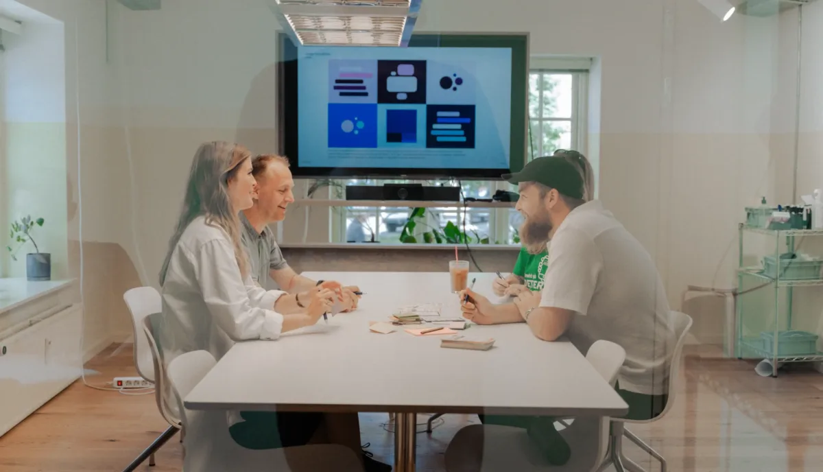
For both projects, Oomph utilized our in-depth discovery process to validate assumptions, clarify priorities, and gain buy-in across the organizations.
KSC and CU both had a good sense of the work they needed to be done. But having a feel for the floorplan doesn’t mean you’re ready to build your dream house. Whether it’s a home or a website, both projects need an architect: an experienced professional who can consider all the requirements and create a strategic framework that’s able to support them. That work should happen before deciding what paint to put on the walls.
In our initial review, Oomph found that both sites had similar challenges: They struggled to focus on one key audience and to easily guide users through the site to the desired content. Our question was: How do we solve those struggles in a new website?
To answer it, we led KSC and CU through discovery processes that included:
- An intake questionnaire and live sessions with key stakeholders to understand the goals and challenges holding the current sites back.
- Defining strengths and areas for improvement with methods like a UX audit, a content and analytics audit, and a cohort analysis.
- Creating user journey maps that rolled audience, website, and competitive insights into a unified vision for the new user experience.
- Delivering a final set of data-backed recommendations that translated needs and wants into actionable next steps, equipping both teams to secure organizational approval and move the projects forward.
The Insights
Discovery isn’t a one-size-fits-all. However, our experiences with KSC and CU highlighted some common challenges that many higher-ed institutions face. Our insights from these projects offer a starting point for other institutions kicking off their own website redesigns.
- Start with your audience’s needs.
Who is your primary audience? Figure out who they are, then really drill down on their needs, preferences, and desired actions. This can be uniquely challenging for higher education institutions because they serve such a wide range of people.
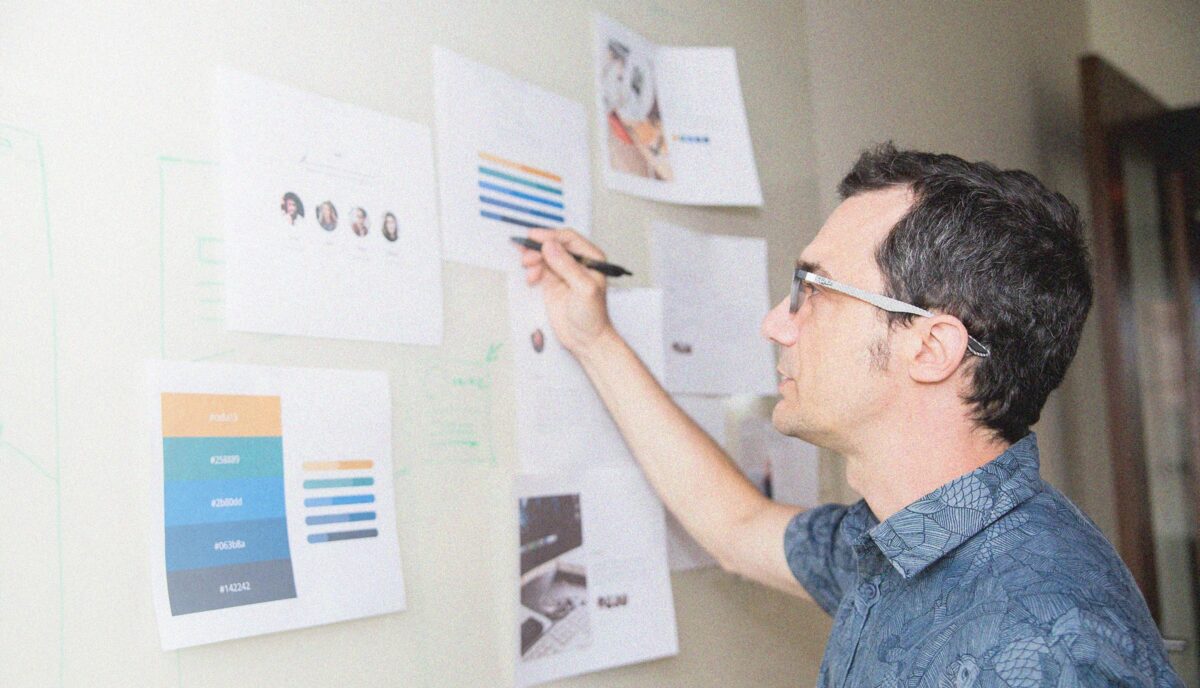
Data is how you overcome that hurdle. As part of discovery, we:
- Completed a UX audit with tools like the BASIC heuristics framework to see which parts of the user flow are working and which need an overhaul.
- Rounded out those findings with a content audit to understand how users engaged with the site content.
- Completed a cohort analysis to see how the sites stacked up against their higher-ed peers.
When you do that work, you get a birds-eye view into what your audience really needs – and what it’ll take for your website to be up to the challenge.
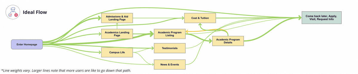
Take KSC. The existing site attempted to serve multiple audiences, creating a user journey that looked like this:
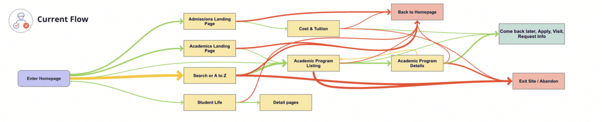
We identified a primary audience of prospective students, specifically local high school students and their parents/guardians. When you speak directly to those students, you get a simpler, cleaner user journey that looks like this:
- Define organized and clear navigation to support user journeys.
Your navigation is like a map. When all the right roads are in place, it should help your users get where they want to go.
That makes your navigation the starting point for your redesign. Your goal is to define where content will live, the actions users can take upon arrival, and, equally important, the content they won’t see at first. This then informs what goes where – the header nav, the footer nav, or the utility nav – because each has unique and complementary purposes.
With both KSC and CU, discovery was our opportunity to start building a navigation that would serve the primary audience we had already uncovered. For CU, the current navigation:
- Made it difficult for donors to find what they need. Search, Write-In Fund, and “Page Not Found” were among the top 20 most visited pages, indicating that users weren’t easily finding their way.
- Didn’t engage donors, which showed up in the low number of returning visits.
- Needed to help donors more quickly find what they need without having to search the entire site.
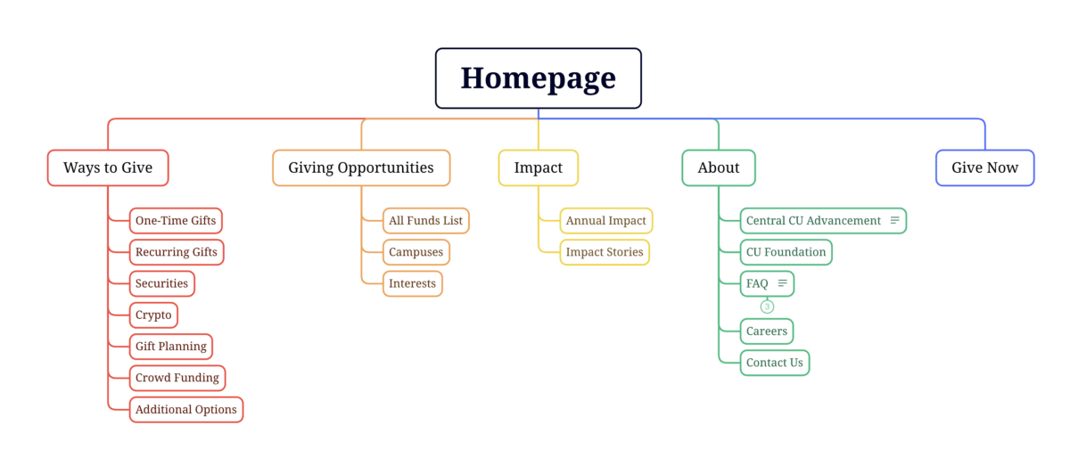
Current CU navigation:

During discovery, we created an updated navigation that would appeal to its primary audience of prospective donors, while still meeting the needs of secondary audiences (returning donors and giving professionals).
Proposed CU navigation:
- Find an optimal blend of branding, design, and content – especially for the home page and other high-visibility areas.
The design and content you choose for your site should resonate with your target audience and enhance the navigation you already defined. In that way, your home page is like your storefront. What will you put on the sign or display in the windows so people will actually walk inside?
That’s the secret sauce behind this part of discovery: deciding what your primary audience really needs to know and how best to showcase it.
To help KSC speak to prospective students, we recommended:
- Using movement, color, and text styles to add visual impact to important content and create a welcoming, curated experience.
- Prioritizing diversity in visuals, so wide a range of students could picture themselves as part of the student body.
- Using stats and testimonials to build trust and foster a feeling of belonging.
CU wanted to connect with prospective donors, so we suggested a design that:
- Incorporated more storytelling and impact stories to show the positive ripple effect of every dollar donated.
- Included strategic calls to action to pull users deeper into the site.
- Added social sharing to enable donors to highlight their generosity and feel a deeper sense of connection.
- Probe additional areas where needed (and skip where it’s not).
Our hot take: There is such a thing as too much data. If you’re wading through pools of information that isn’t relevant to your end user, it can muddy the waters and make it harder to identify what’s worth acting on.
With that in mind, this step will change from project to project. Ask yourself, what else does my audience need to feel like they got what they came for?
For KSC, that involved additional strategy work – like the information architecture – that helped the institution gear up for later design phases. CU, on the other hand, needed significant technical discovery to address the level of custom code required, limited page building capabilities and clunky e-commerce integration. We recommended an updated tech stack, including a new donation platform and payment gateway, that would improve security, simplify maintenance, and enhance the user experience.
- Plan for a system that allows for easy updates later.
As they say, the only constant is change. This rings especially true for higher ed institution websites, where content is plentiful and multiple stakeholders need to make site updates.
To make sure CU and KSC’s sites continued to work for them long after our projects had ended, our discovery included suggestions around:
- Choosing the right content management system (CMS). We ensured each site had CMS capabilities that would allow non-tech-savvy team members to maintain and update the content.
- Establish design systems and templates for ease and consistency. For CU, that involved creating repeatable page layouts for their fund pages for simpler authoring and visual polish.
Start Your Redesign on the Right Foot
A thorough, well-researched, and well-organized discovery is key for designing a website that meets all of your – and your audience’s – needs.
Need a fresh perspective on your higher ed site redesign? Let’s talk about it.