Unlocking The Power of Digital Data With Looker Studio
Finding yourself bogged down with digital analytics? Spending hours just collecting and organizing information from your websites and apps? Looker Studio could be the answer to all your problems (well, maybe not all of them, but at least where data analytics are concerned).
This business intelligence tool from Google is designed to solve one of the biggest headaches out there for marketers: turning mountains of website data into actionable insights. Anyone who’s ever gone down the proverbial rabbit hole scouring Google Analytics for the right metrics or manually inputting numbers from a spreadsheet into their business intelligence platform knows that organizing this data is no small task. With Looker Studio, you can consolidate and simplify complicated data, freeing up more time for actual analysis.
With so many customizable features and templates, it does take time to set up a Looker Studio report that works for you. Since Google’s recent switch from Universal Analytics to Google Analytics 4, you might also find that certain Looker Studio reports aren’t working the way they used to.
Not to worry: Our Oomph engineers help clients configure and analyze data with Looker Studio every day, and we’ve learned a few tips along the way. Here’s what to know to make Looker Studio work for your business.
The benefits of using Looker Studio for data visualization and analysis
Formerly known as Google Data Studio, Looker Studio pulls, organizes, and visualizes data in one unified reporting experience. For marketers who rely heavily on data to make informed decisions, Looker Studio can save precious time and energy, which you can then invest in analyzing and interpreting data.
Key benefits of using Looker Studio include:
- Connecting data from multiple sources: The platform can unify data from a mind-boggling 800+ sources and 600+ data connectors, which means you can upload and integrate multiple data sets into one comprehensive report. This not only saves time, but also provides more accurate insights into business performance for organizations with complex digital environments.
- User-friendly insights: Looker Studio’s visual dashboards are easy to interpret, customize, and share – even with executives who might not be as digitally fluent as you. You can choose from a variety of drag-and-drop data visualization options, such as charts, graphs, and tables, or use Looker Studio’s pre-designed visualizations.
- Powerful customization: Want to be informed the minute your form conversion rate changes? With Looker Studio, you can set up alerts to notify you of significant changes in your data, enabling you to adjust your marketing strategy and optimize ROI in real time. You can also generate reports to track your progress and share them with your clients or team members.
How Oomph uses Looker Studio
As a digital-first company in the business of helping other digital-first companies, we’re big fans of Looker Studio. We think the platform is a great way to share trends on your websites and apps in an easy-to-digest way, making monthly or quarterly reporting much more efficient.
Whether you’re looking for basic insights or need sophisticated analysis, Looker Studio’s visualization capabilities can support smarter, more informed digital decision-making. Here’s a peek at some of the metrics we monitor for our own business, including:
- Number of users
- New users versus returning users
- Average time spent on site and on page
- Top pages viewed
- Traffic sources
- Traffic by device
- Event tracking and conversion rates
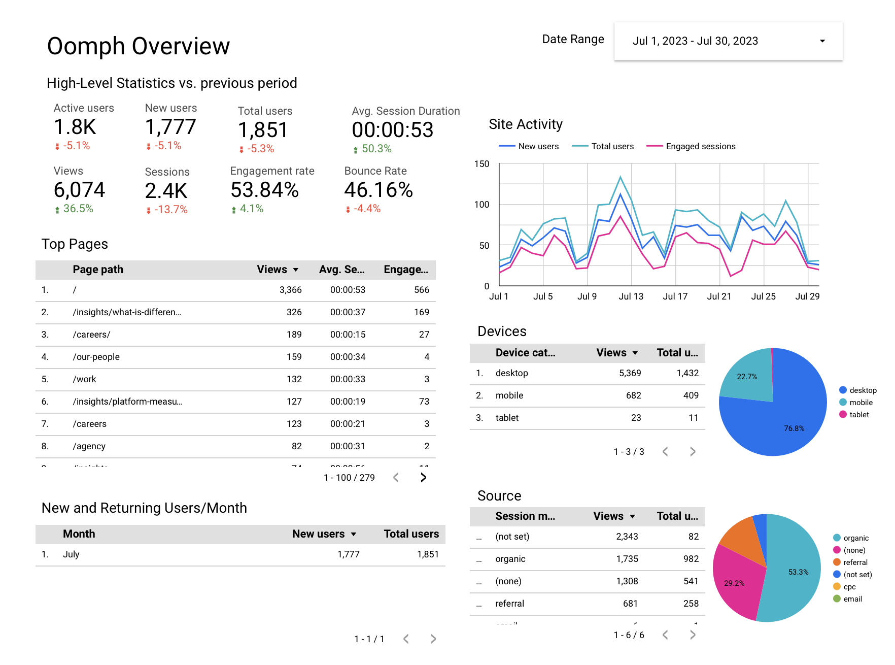
We also use the platform to drill deeper, comparing trends over time, identifying seasonal fluctuations and assessing the performance of specific campaigns. We leverage features like dashboards and filters in Looker Studio to give our clients an interactive view of their data.
How Looker Studio Works With GA4
Google Analytics, now known as GA4, is one of the primary tools we connect to Looker Studio. GA4 is the latest version of Google’s popular analytics platform and offers new features and functionality compared with its predecessor, Universal Analytics (UA), including new data visualization capabilities.
As many companies migrate over to GA4, they may be wondering if reporting will be similar between GA4 and Looker Studio – and if you need both.
While GA4 reports may challenge Looker Studio’s capabilities, Looker Studio provides a variety of features that go beyond what GA4 can do on its own. While GA4 dashboards and reports just include GA4 data, Looker Studio can import data from other sources as well. This means you can use Looker Studio to track trends in your site’s performance, regardless of the data source.
Looker Studio also has a unique feature called “LookML,” which allows users to create custom data models and transformations. This means you can tailor your data to your specific needs, rather than being limited by GA4’s built-in reporting. Finally, Looker Studio’s robust sharing and collaboration features allow teams to share data and insights easily and efficiently.
If your company set up Looker Studio before switching to GA4, you may notice a few metrics are now out of sync. Here are a few adjustments to get everything working correctly:
- Average time on page: This was previously a standard feature in UA that’s no longer available in GA4. To configure, you’ll need to track the “user engagement” metric divided by “number of sessions.”
- Bounce rate: Tracking bounce rate with GA4 now takes an additional step as well. To configure, subtract the “engagement rate” metric from 1 to arrive at your bounce rate.
- Events: Simply update your Looker Studio connection settings to use the new GA4 event schema and ensure that you’re using the correct event names and parameters in your LookML code.
How To Set Up a Looker Studio Report
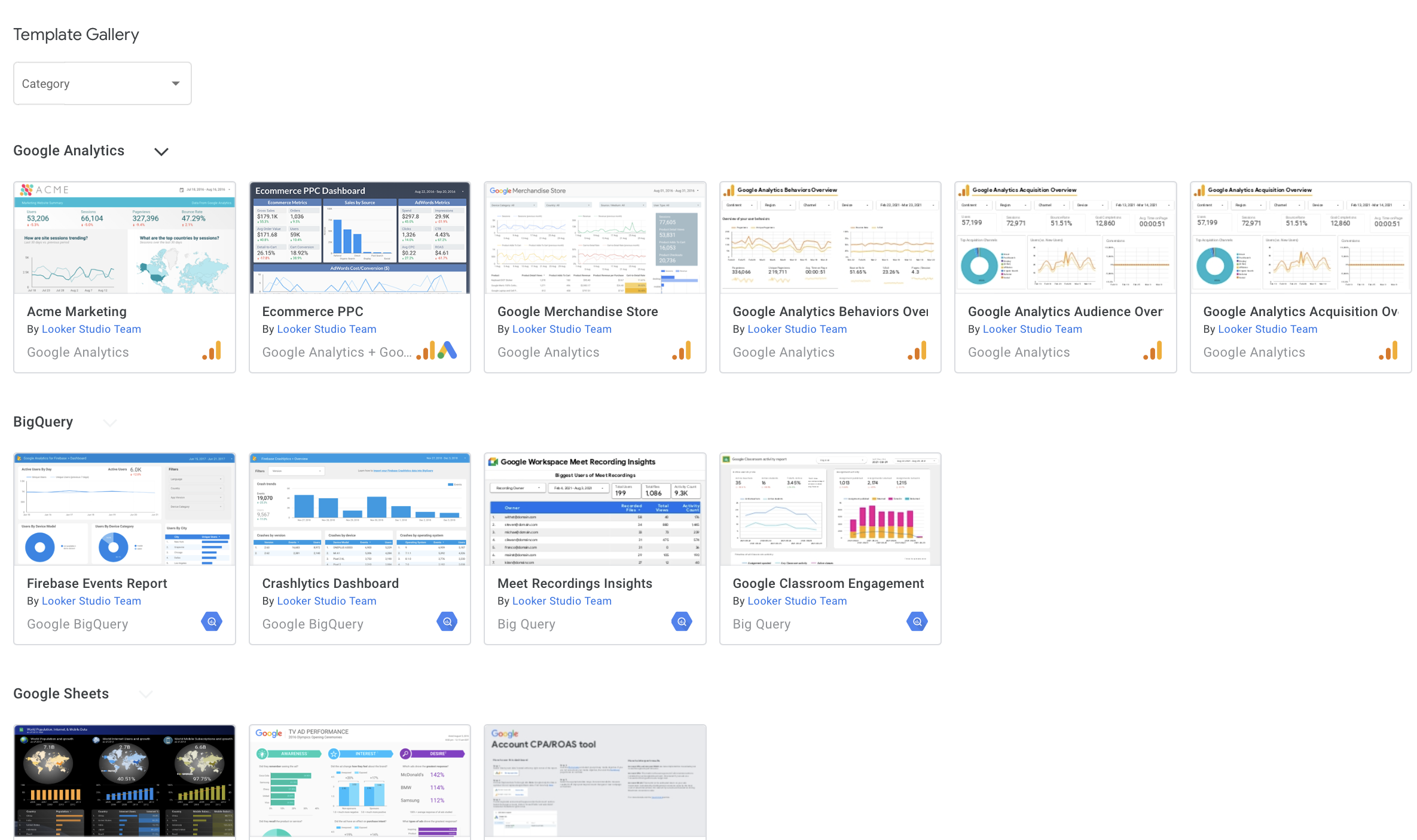
- Choose a template for your dashboard or create one from scratch. If you’re not sure, you can browse through templates to get an idea of what Looker can do.
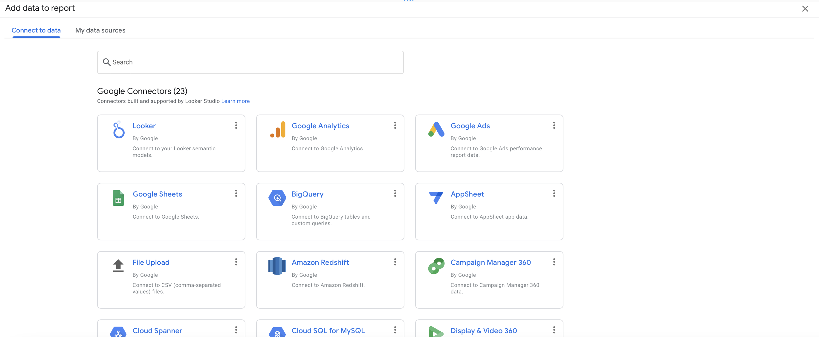
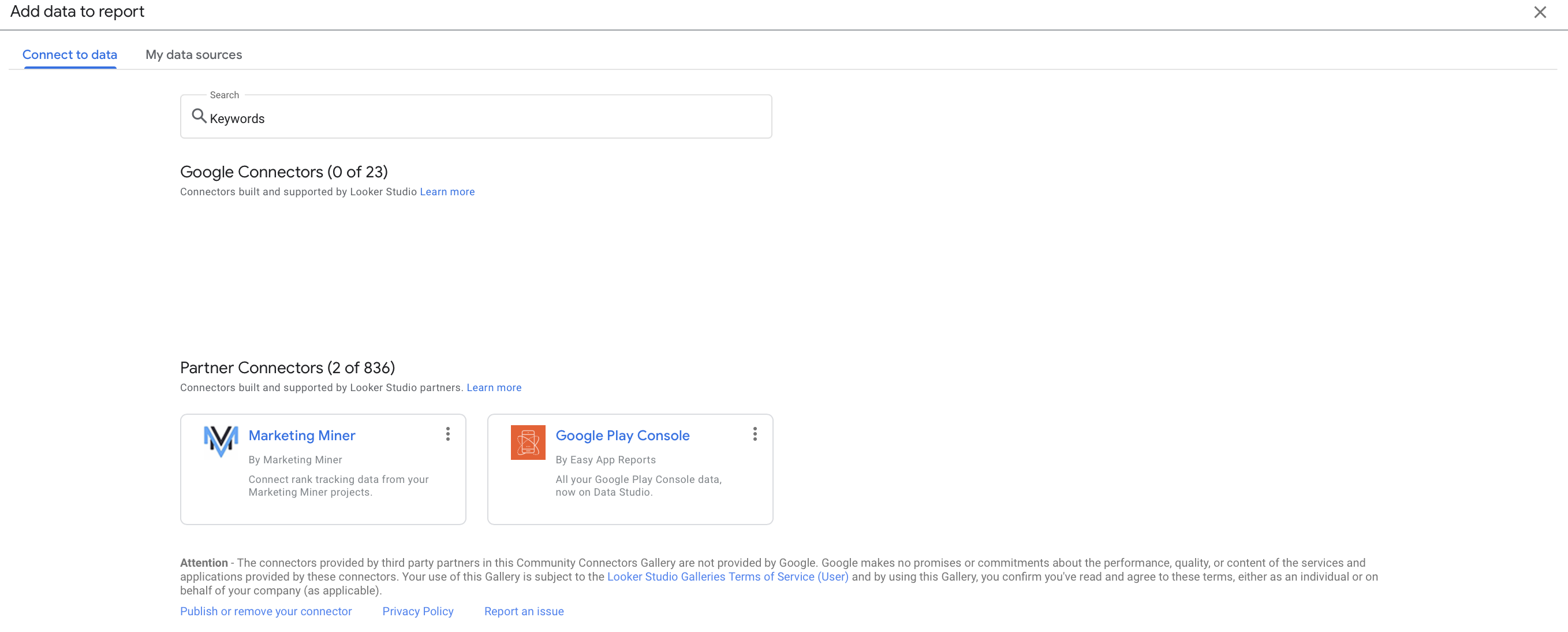
- Connect your data source. Looker supports a long list of sources, including Google, MySQL, AWS Redshift, and more. Don’t worry if your data isn’t in Google – Looker will likely be able to connect to it regardless.
- Choose your metrics. These are the specific data points you want to track and analyze in your report. You can customize your metrics to fit your specific needs.
- Build your dashboard. You can add charts, tables, and other visualizations to help you understand your data. Looker makes it easy to drag and drop these elements into place.
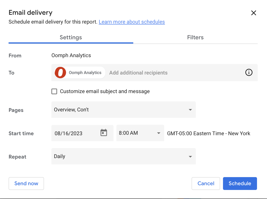
- Share it with others. You can either create a share link so that others can access the dashboard directly or you can set up automatic updates to be sent on a regular basis. This makes it easy for others to stay up-to-date on changes and progress.
A Powerful Path To Data Insights
The digital landscape is growing more fragmented and complex by the day, but tools like Looker Studio make it infinitely easier to find your path forward. Taking the time to configure and customize the platform can deliver major ROI by helping you understand user needs, pinpoint website strengths and challenges, and craft the right digital strategy.
Crunched for time or not sure where to start? Oomph can help take the hassle out of data analysis by setting up and monitoring your Looker Studio dashboards. Get in touch to chat about your needs.