Supporting Personal Safety: Best Practices with a Quick Exit Button
Warning: This article mentions domestic abuse.
You may call your site audience your “users,” but ultimately, they’re just people. Imperfect people with imperfect lives — sometimes to an extreme degree.
During the COVID-19 pandemic, there was a massive rise in domestic violence. This type of violence can take many forms, including technical abuse, where technology is used to control, harass, or intimidate someone. It can look different in various situations, from an abuser constantly sending phone or text messages to controlling the sites or devices their partner can access. Even sharing a store rewards phone number can have unintended consequences. The range of opportunities for abuse is endless.
In the book Design for Safety,” author Eva PenzeyMoog cites an NPR survey that found “85 percent of shelters they surveyed were helping survivors whose abusers were monitoring their activity and location through technology.” This is an alarming statistic. Domestic violence prevention isn’t something that is taught in schools — how would people know how to protect themselves before it’s too late?
As professionals creating digital products, it’s our responsibility to create “for good.” How can we be advocates for safety in design? According to Design for Safety, as an advocate, you must “support vulnerable users to reclaim power and control.” A website could have an easy-to-use interface but still provide pathways for users to experience abuse from domestic perpetrators. Ultimately, this leaves victims vulnerable while giving them a false sense that they have more control than they genuinely do.
During the website creation process, you should aim to design for safety. A key step is to identify “ways your product can be abused, then ways to prevent that abuse.” For example, to help address any abuse or harassment captured while on a call, Google Meet has the function to “report abuse.” You can attach a video clip when you report, and they will investigate and then take action on their end. By proactively planning around safety, your organization can deepen trust with users while doing your part to prevent domestic violence.
Case Study
This past year, Oomph worked with a nonprofit website, which helps the general public understand their legal issues, to perform a user experience discovery and redesign. The site provides individuals with low incomes and limited English with local laws written in plain English. Users visit the site for legal information on various topics, including evictions, government benefits, domestic violence restraining orders and family law. A subsection of the audience uses the website to look for resources dealing with domestic violence.
When designing for this audience, we needed a way to support users who may need to exit a page quickly if they are interrupted by a potential abuser while scrolling through sensitive information, such as divorce or domestic violence resources. The site had previously utilized an “Escape” button on pages that dealt with those sorts of topics. When approaching the redesign, we wanted to ensure this button would always appear but wouldn’t interfere with other audiences, such as someone looking for information about traffic tickets. It had to walk a fine line between in-your-face and too subtle to be helpful to ensure users could see and interact with it.
When dealing with “trauma-informed” design, designers must “prioritize comfort over technological trends” (Design for Safety). Our challenge was amplified by a lack of standards for a quick exit button’s function, especially for a site with multiple audiences. Since these buttons are a relatively new best practice and little research on them exists, we were careful in our strategic approach. A quick exit button is not ingrained in a user’s mental model, making its intended action new to most people. Those who feel they might need it have to recognize its function as soon as possible.
Approach to the Quick Exit Button
While designing the quick exit button, we considered its placement, colors, and typographic style to ensure that:
- The button was easy to understand and used by people who needed it,
- The language was not retraumatizing,
- The button wasn’t so big and distracting that it took away from the overall experience of the site for those who didn’t need it, and
- The button’s position was easily accessible on a range of device sizes and types.
Our first wireframe called the button “Quick Exit.” When we tested the prototype, all five participants did not understand what the exit button meant. This emphasized how important the language on the button is. For those who have dealt with domestic violence, even the word “escape” could be harmful to hear. Additionally, since audiences view the website in different languages, we wanted to ensure that the button’s translation would not adversely affect the layout.
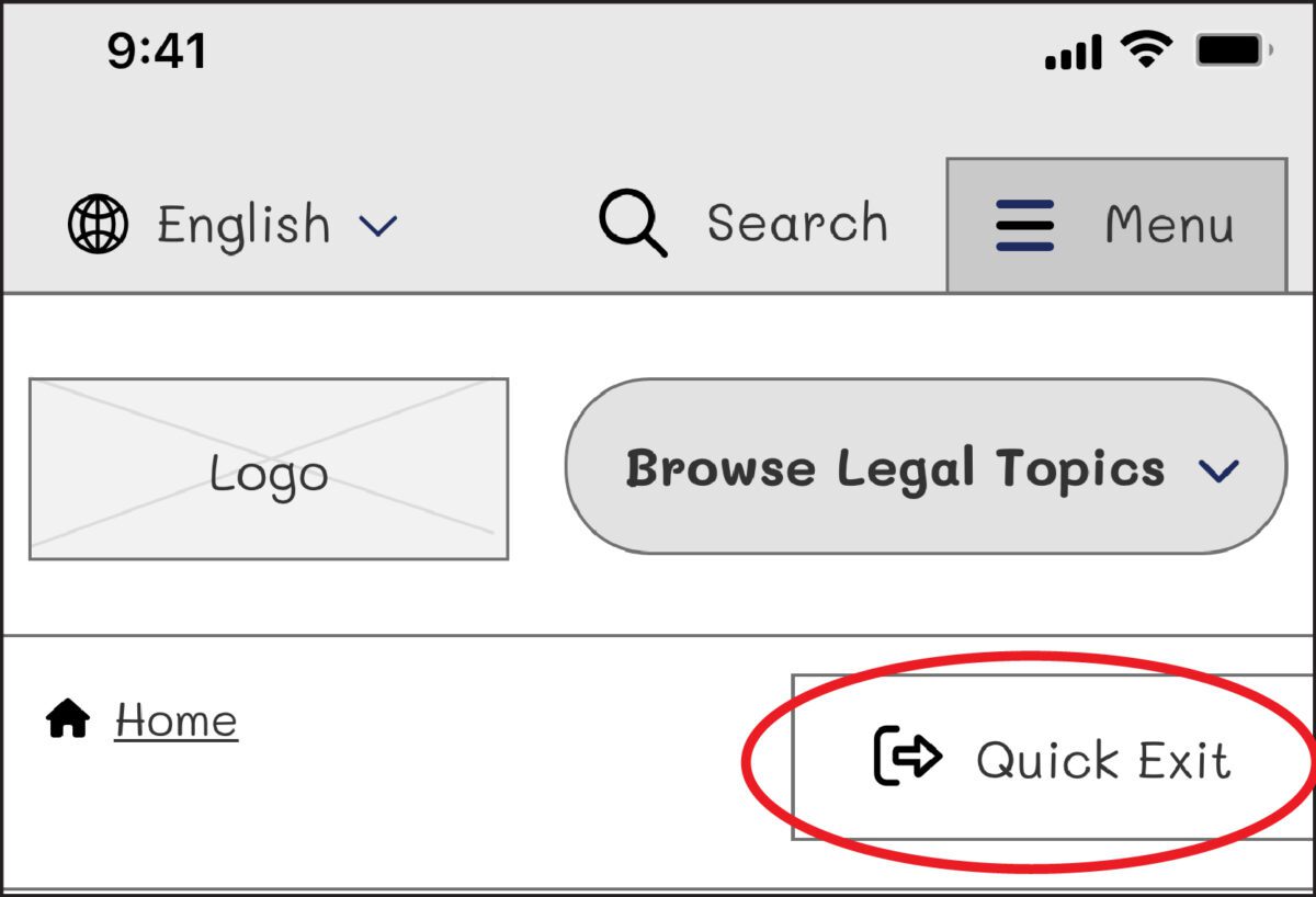
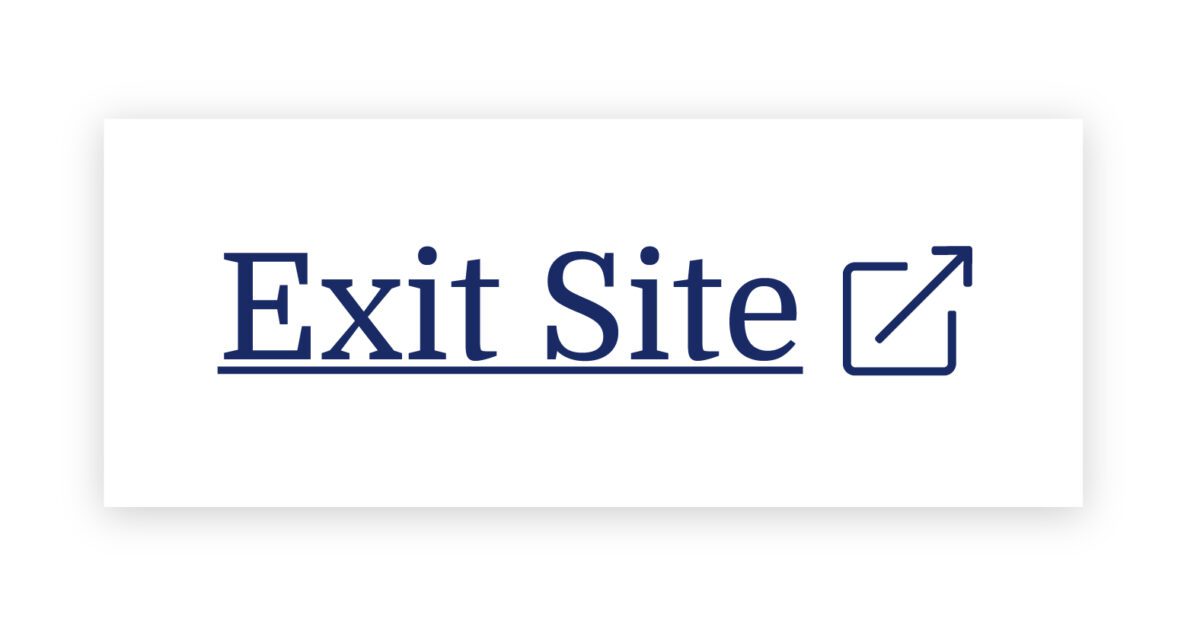
On our next iteration, we tried using the term “Exit” with the icon globally known for “external link.” But this still wasn’t clear enough for our users: Where would the exit bring you? To a page called “Exit”?
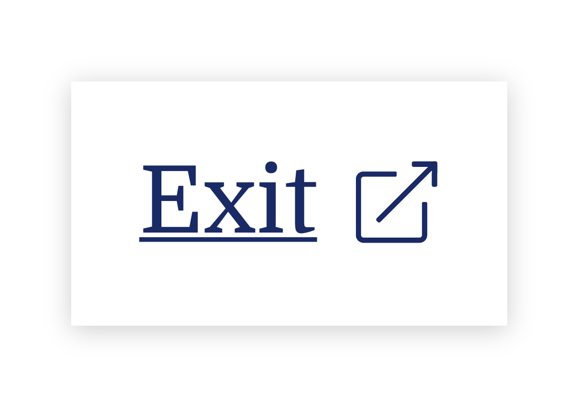
We needed to explain exactly what the button did, so we opted to use the universal external link icon with “Exit Site” as a label to best communicate what the button would do. Although it does not describe where you will end up, it clearly explains that you will leave the website.
To further help users understand what the button was for, we then created a pop-up at the start of the user’s journey that educates people on the button’s purpose:
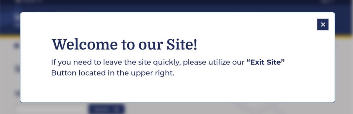
Overall, there was a delicate balance we had to achieve in managing all audiences that typically view the site. We wanted to ensure that we were educating all users but not preventing users from getting help for other topics, such as information about the right to an education or disability. The pop-up, however, had additional considerations we needed to weigh as well: What if their abuser sees it upon landing? What if the user who needs it ignores it?
An alternate approach focused more on domestic violence victims is the California Victims Resource Center’s (CVRC) website, 1800victims.org. When landing on the site, visitors are first educated with a pop-up, which includes reading the website’s Terms of Use and agreeing to the terms before they can enter.
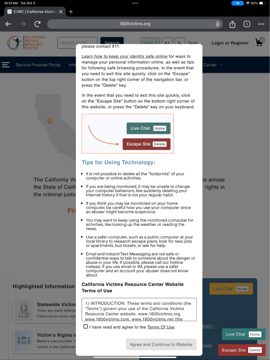
Additionally, when the user clicks the escape button (or uses the keyboard short-cut “Delete”), they are brought to a new tab that displays ABC News. The 1800victims site is changed to Netflix — with all traces of the CVRC gone. According to Columbia Health, this follows best practice because “a blank history can raise suspicion from your abuser.” This would be the safest approach for users.
To give back to the open-source community, the Oomph team turned our approach for this client into the “Quick Exit” Drupal Module. If you would like to add this kind of functionality to your own Drupal website, the module is a great place to start.
Designing for Safety
We must consider how users dealing with domestic violence may feel when they are visiting a site with sensitive content. By including information to educate users upon landing, we can help more people understand how to use a quick exit button if they find themselves in a situation where they need to swiftly leave a website. As an advocate for user safety and domestic violence prevention, you can proactively create a safety net for others by starting to review your work through the lens of how it may be abused prior to releasing it into the world.
This article is just one look at how organizations can design for safety using a quick exit button. By talking about these issues and advocating to protect users in your own design process, we can all take a step toward helping prevent domestic violence. Even if one person is helped or informed by Oomph’s quick exit button design on the website, it will be a success in our eyes.
Need help incorporating safety-focused design into your website or mobile apps? Let’s chat about your needs.
If you or someone you may know is struggling with domestic abuse, please visit or call the National Domestic Violence Hotline at 800-799-7233. For further reading on creating digital products with a safety mindset, we recommend Eva PenzeyMoog’s book Design for Safety available from A Book Apart.