Redefine the term “The Fold” to be something meaningful again
Responsive website design addresses many different viewports, from phones to tablets to large-screen televisions. The old notion of “The Fold”, is therefore meaningless. “The Fold” is dead, or at least, it should be.
And yet, “The Fold” as a measurement might still be useful. There is still a fold, but there is not one fold.
Instead of listening to people scream but this button needs to be above the fold!
, we need to remember that we are in a position to educate our clients. Start by asking Which fold?
What is “The Fold” in Web Design?
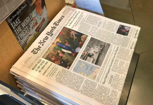
“The Fold” is a vestige of the newspaper industry. Quite literally, it references the content that was present on the top of the front page before it was folded in half. What was the important content that was needed to sell a paper from the top of a stack? The name, the date, and the most eye-grabbing headline(s) of the day.
In web design, the concept was the same — what is visible in the browser before a user has to scroll down? When websites were inflexible and typically built on a 960px grid, it was easy to define where the fold was (about 580 – 680px of viewable height for the average browsers and screens). In our multi-device, multi-screen and multi-viewport world, the measurement deserves to die while the concept, perhaps, can be revived.
“The Fold” is dead
“The Fold” was never a very concrete concept and I was never able to get a client to define what it meant for them. Was it the size of the CEO’s screen (the person who funds the project)? The most common user screen resolution? With or without browser chrome?[1] I always understood the concept, but when it came to putting it into practice, it was a squishy measurement that changed from one client and project to another.
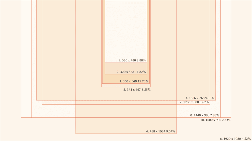
The idea that there is a quantifiable definition of “The Fold” should be dead by now, and the data proves this out. In the graphic above, the top 10 viewport sizes for a popular site (~8 million visits per month for six months) are presented all on top of each other. These are just the top 10, but they range from 320x480px wide to 1920x1080px. This range is the core problem with the notion of “The Fold”. One definition cannot cover this range of available pixels.
As a bonus, Google Analytics reports more than 22,000 viewport sizes and 8000+ devices for the same six month period.
Long live “The Fold”
While a definable “Fold” should die, “The Fold” as a concept remains strong in our multi-device world. Clients still love to talk about it. Maybe it feels like a bit of insider jargon that they are excited to throw out at a design meeting. Maybe they really do believe that if a user doesn’t see something in the split second before they scroll, they are lost. Either way, I think as a concept “The Fold” will remain persistent, which is why it is important to redefine it and make it a useful term again.
Scrolling is the only option
Even as we talk about the limitations of “The Fold”, clients need to accept that scrolling is unavoidable and need to stop being afraid that users will refuse to do it. Not only do users scroll, but a large number of users scroll before the page is fully loaded. Interestingly, engagement peaks right at or below the typical “Fold” — users have already grown accustomed to the idea that the good stuff is at the bottom of the page, not the top.
Users scroll a page as if it were a map of unknown territory. They scroll to get a lay of the land — what is this website about, what kind of content does it have, how is it organized? Only after they understand the map do they decide where they want to travel. Unless they come in through search or social share, they need time to review a site before they decide whether it is worth exploring. Granted, this might happen within a few seconds.
Scrolling is part of the interactive experience. Fast or slow, a little bit at a time or in quick chunks, scrolling is a necessary part of exploration.
Bottom line: Tell clients to stop being scared of scrolling.
“The Fold” is a Goal, not a Rule
In order for “The Fold” to be useful, it needs to be more flexible. It needs to be a goal, not a rule. And it needs to take into account the user, the device, and the use case relevant to that user and that device.
A mobile user coming to your website might be looking for something different than a desktop user. They are typically more action-oriented – they have a small screen, limited time, and limited attention. Give them what they want high up on the page or right in the navigation. Maybe some of the elements that desktop users find useful need to get out of the way for this experience.
Likewise, desktop users typically have more time. They are doing research, reading in depth, and more willing to go on a tangent with interactive elements like image galleries. Their screen real estate is larger as well, but that doesn’t mean that we should cram it with actionable elements.
These are only two generic scenarios, but we can see that it is important to have discussions about who your users are, what their user journeys are, and make sure to consider the differences between devices. The same user might need different things on a different device, and therefore, the number of actionable items in their viewport should reflect their goals as well as the amount of screen real estate we have to work with.
Good content is better than engagement tricks
When you open your mind about where “The Fold” is for which device, and you embrace the scroll, you can be more effective at beating out bad ideas like content carousels (or sliders, whatever the parlance might be that you use). Content carousels underperform every time and are one of the ultimate “design by committee” ideas. Don’t have enough real estate above “The Fold” to fit content X? Put it in a carousel!
But guess what, if you didn’t already know — engagement for slide 2, 3, 4, etc… is practically non-existent. The user has scrolled away or already found a piece of content to click on. Carousels make people on the committee happy — they make it feel like their important piece of content will be seen — but in reality the numbers show that the first slide is typically the ONLY slide that a user will see.
Instead of engagement tricks, focus on reducing the message to its essential components. Keep calls to action (“Read More”s included) to a minimum. Not everything can be important, and if everything were the same, nothing would stand out.
Redefine and Clarify the new “Fold”
The next time you are in a design meeting, or answering an RFP, and “The Fold” comes up, make sure to stop the conversation and define what “The Fold” means with today’s fractured viewport reality. Set content goals per device if you need to, and make sure they are realistic goals that take legibility of content into account. Most of all, make sure clients understand that scrolling is not the enemy. Users that discover are more engaged and more likely to stay on your site than those that are force fed top screen headlines to click over and over again.
If we can’t kill “The Fold”, let’s at least try to own what it means again and treat it as a goal, not a law.
- The “chrome” refers to the design of the browser itself… the address bar, tabs, and anything else that is part of the browser window but not part of the web page. ↥ Return