The “Read More” Teaser — A Persistent UX Pattern and How to Manage it with Drupal
A “Read More” Teaser is still a common UX pattern; it contains a title, often a summary, sometimes a date or author info, and, of course, a Read More link. The link text itself may differ — “read more”, “learn more”, “go to article”, and so on — but the function is the same: tell the user that what they see is only a preview, and link them to the full content.

In 2022, I’d argue that “Read More” links on Teaser components are more of a design feature than a functional requirement; they add a visual call to action to a list of Teasers or Cards, but they aren’t necessary for navigation or clarity.
Although I see fewer sites using this pattern recently, it’s still prevalent enough on the web and in UX designs to justify discussing it.
If you build sites with Drupal, you have a few simple options to implement a Read More Teaser. Both methods have some drawbacks, and both result in adjacent and non-descriptive links.
I’ll explore both options in detail and discuss how to resolve accessibility concerns with a little help from TWIG. (Spoiler: TWIG gives us the best markup without any additional modules)
Using Core
Without adding contributed modules or code, Drupal Core gives you a long, rich text field type for storing lengthy content and a summary of that content. It’s a single field that acts like two. In the UI, this field type is called Text (formatted, long, with summary), and it does exactly what the name describes.
Drupal installs two Content Types that use this field type for the Body – Article and Basic Page – but it can be added to any Content Type that needs both a full and a summarized display.
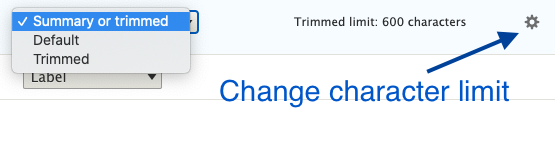
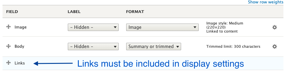
In the Manage Display settings of the Teaser or other summarized view mode, the Summary or Trimmed format is available. The default character limit is 600, but this can be configured higher or lower.
Finally, in the Manage Display settings, the Links field must be added to render the Read More link.
That’s all you need to create a Read More Teaser in just a few minutes with Drupal Core, but this method has some shortcomings.
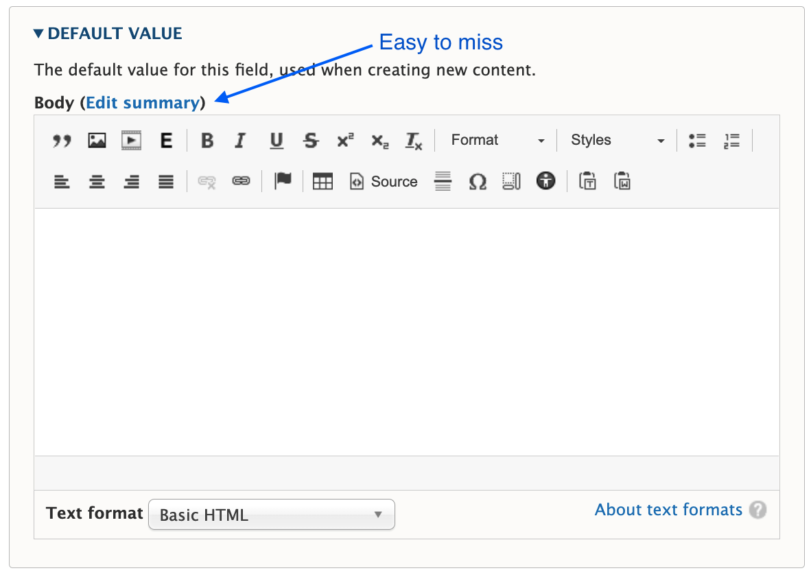
The summary field is easy to miss
Unless you require the summary, it’s often overlooked during content creation. A user has to click the Edit summary link to add a summary, and it’s easy to miss or forget.
You have to choose one or the other format
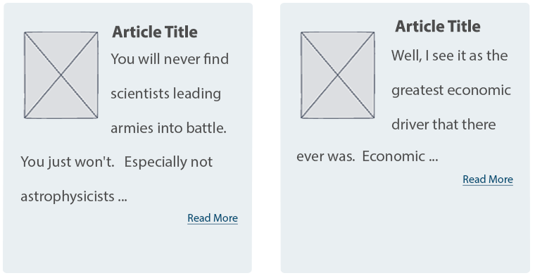
Notice the word “or” in the Summary or Trimmed format. Out of the gate, you can display what’s in the summary field, in its entirety, or you can display a trimmed version of the Body field. But you can’t display a trimmed version of the summary.
Expect the unexpected when a summary isn’t present
If a summary is not populated, Drupal attempts to trim the Body field to the last full sentence, while staying under the character limit. The problem is the unpredictable nature of content in a rich text field. These may be edge cases, but I’ve seen content editors insert images, headings, dates, and links as the first few elements in the Body field. When the content starts with something other than paragraph text, the Teaser display will, too.
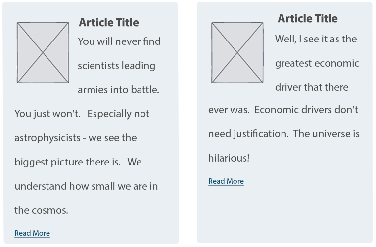
Expect varying length Teasers when a summary is present
Depending on your layout or visual preference, this may not be a concern. But unless you’re judicious about using a standard or similar length for every summary, you’ll have varying length Teasers, which looks awkward when they are displayed side by side.
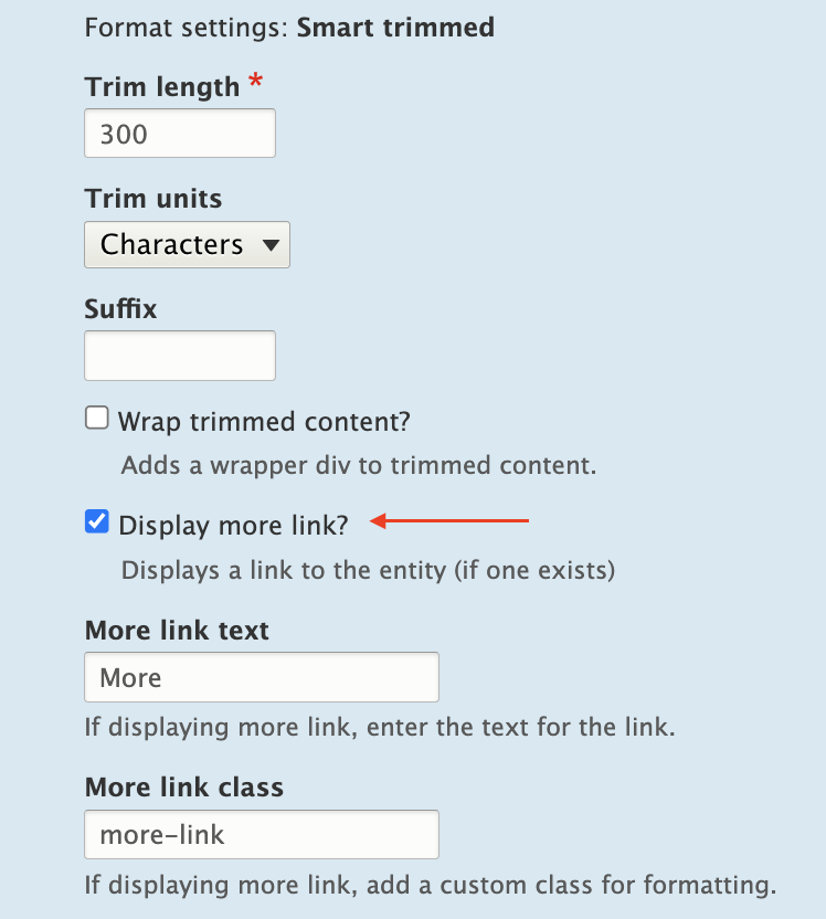
Using the Smart Trim Module
The contributed Smart Trim module expands on Core’s functionality with additional settings to “smartly” trim the field it’s applied to. The Smart Trim module’s description states:
With smart trim, you have control over:
- The trim length
- Whether the trim length is measured in characters or words
- Appending an optional suffix at the trim point
- Displaying an optional “More” link immediately after the trimmed text
- Stripping out HTML tags from the field
I won’t cover all of the features of Smart Trim, because it’s well documented already. Smart Trim solves one of the problems noted earlier: it lets you trim the summary. That said, Smart Trim has some of the same drawbacks as Core’s trim feature, along with some limitations of its own.
Sentences aren’t respected
Unlike Core’s trim feature, Smart Trim’s limits don’t look for full sentences. A character or word limitation stops when it hits the defined limit, even if that limit occurs mid-sentence.
Strip HTML might be helpful, or it might not
If your goal is rendering plain text without any HTML (something you might otherwise have to code in a template), Smart Trim’s Strip HTML setting is exactly what you need.
It’s also helpful for dealing with some of those edge cases where content starts with an element other than paragraph text. For example, if the first element in the Body field is an image, followed by paragraph text, the Strip HTML setting works nicely. It strips the image entirely and displays the text that follows in a trimmed format.
But be aware that Strip HTML also strips paragraph tags. If the first element in the Body field is a heading, followed by paragraph text, all tags are stripped, and everything runs together as one large block of text.
“Immediately after” doesn’t mean immediately after
If you want the Read More link to display immediately after the trimmed text, as the module description suggests, you’ll need to assign a class in the Smart Trim settings with a display other than block.
What about adjacent link and accessibility issues?
If you create a Read More Teaser using either the Core or Smart Trim methods described here, there are a couple of problems.
Either method results in markup something like this:
HTML

<article>
  <h2>
    <a href="/article/how-bake-cake">How to Bake a Cake</a>
  </h2>
  <div class="node__content">
    <div class="node__summary">
      <p>Practical tips on cake baking that you can't find anywhere else</p>
    </div>
    <div class="node__links">
      <ul class="links inline">
        <li class="node__readmore">
          <a href="/article/how-bake-cake" title="How to Bake a Cake">Read more</a>
       </li>
      </ul>
    </div>
  </div>
</article>
The <a> inside the <h2> contains descriptive text, which is necessary according to Google’s Link text recommendations and Mozilla’s Accessibility guidelines for link text.
But the Read More link has text that is not descriptive. Furthermore, it navigates to the same resource as the first <a>, making it an adjacent or redundant link. Without any other intervention, this markup causes repetition for keyboard and assistive technology users.
How do you make it better?
The WCAG has a recommendation for handling adjacent image and text links. You can use this same logic and wrap the entire Teaser content with a single link. But for this, you need TWIG.
Here’s an example of how to structure a TWIG template to create the link-wrapped Teaser.
node–article–teaser.html.twig:
Twig

<article{{ attributes.addClass(classes) }}>
 <div{{ content_attributes.addClass('node__content') }}>
   <a href={{ url }}>
     <div class="wrapper">
       <h2{{ title_attributes.addClass('node__title') }}>
         {{ label }}
       </h2>
       {{ content.body }}
     </div>
   </a>
 </div>
</article>
But while this solves the adjacent link issue, it creates another problem. When you combine this template with the Manage Display settings that insert Read More links, Drupal creates many, many duplicate links.
Instead of wrapping the Teaser content in a single anchor tag, anchors are inserted around every individual element (and sometimes around nothing). The markup is worse than before:
HTML

<div class="node__content">
  <a href="/article/how-bake-cake"> </a>
  <div class="wrapper">
    <a href="/article/how-bake-cake">
      <h2 class="node__title">How to Bake a Cake</h2>
    </a>
    <div class="field field--name--body field--type-text-with-summary">
      <a href="/article/how-bake-cake">
        <div class="field__label visually-hidden">Body</div>
      </a>
      <div class="field__item">
        <a href="/article/how-bake-cake"></a>
        <div class="trimmed">
          <a href="/article/how-bake-cake">
            <p>Practical tips on cake baking that you can’t find anywhere else</p>
          </a>
          <div class="more-link-x">
            <a href="/article/how-bake-cake"></a>
            <a href="/article/how-bake-cake" class="more-link-x" hreflang="en">More</a>
          </div>
        </div>
      </div>
    </div>
  </div>
</div>
But if you remove Smart Trim’s Read more link or Core’s Links field, the Read More text is also gone.
HTML

<div class="node__content">
  <a href="/article/how-bake-cake">
    <div class="wrapper">
      <h2 class="node__title">How to Bake a Cake</h2>
      <div class="field field--name--body field--type-text-with-summary">
        <div class="field__label visually-hidden">Body</div>
        <div class="field__item">
          <p>Practical tips on cake baking that you can’t find anywhere else</p>
        </div>
      </div>
    </div>
  </a>
</div>
Because we’ve already enlisted the help of TWIG to fix the adjacent link issue, it’s easy enough to also use TWIG to re-insert the words “read more.” This creates the appearance of a Read More link and wraps all of the Teaser contents in a single anchor tag.
Twig

<article{{ attributes.addClass(classes) }}>
 <div{{ content_attributes.addClass('node__content') }}>
   <a href={{ url }}>
     <div class="wrapper">
     <h2{{ title_attributes.addClass('node__title') }}>
       {{ label }}
     </h2>
     {{ content.body }}
     <span class="node__readmore">{{ 'Read More'|trans }}</span>
     </div>
   </a>
 </div>
</article>
Resulting HTML:
HTML

<div class="node__content">
  <a href="/article/how-bake-cake">
    <div class="wrapper">
      <h2 class="node__title">How to Bake a Cake</h2>
      <div class="field field--name--body field--type-text-with-summary">
        <div class="field__label visually-hidden">Body</div>
        <div class="field__item">
          <p>Practical tips on cake baking that you can’t find anywhere else</p>
        </div>
      </div>
      <span class="node__readmore">Read more</span>
    </div>
  </a>
</div>
Do it all with TWIG
Of course, you can eliminate Core’s trimming feature, and the Smart Trim module, and do everything you need with TWIG.
Using the same TWIG template, the Body field’s value can be truncated at a particular character length, split into words and appended with “read more” text.
Something like the following should do the trick in most cases.
node–article–teaser.html.twig:
Twig

<article{{ attributes.addClass(classes) }}>
 <div{{ content_attributes.addClass('node__content') }}>
   <a href={{ url }}>
     <div class="wrapper">
       <h2{{ title_attributes.addClass('node__title') }}>
         {{ label }}
       </h2>
       {{ node.body.0.value|striptags|slice(0, 175)|split(' ')|slice(0, -1)|join(' ') ~ '...' }}
       <span class="node__readmore">{{ 'Read More'|trans }}</span>
     </div>
   </a>
  </div>
</article>
Final Thoughts
Today’s internet doesn’t need a prompt on each Teaser or Card to indicate that there is, in fact, more to read. The Read More Teaser feels like a relic from bygone days when, perhaps, it wasn’t obvious that a Teaser was only a summary.
But until we, the creators of websites, collectively decide to abandon the Read More Teaser pattern, developers will have to keep building them. And we should make them as accessible as we can in the process.
Although Drupal provides simple methods to implement this pattern, it’s the templating system that really shines here and solves the accessibility problems.
Are you a developer looking for a new opportunity? Join our team.