The “Content Performance Quotient” is the next best Website Evaluation Metric
Engagement is a hot metric and measure of a website’s success. It’s like capturing a visitor’s attention and holding it hostage. Why has it become so important? One reason might be how easy it is to measure and declare success — high time-on-site, high page views per session, and low bounce rates mean high engagement. A high number of shares, comments, and backlinks don’t hurt either.
Engagement has become the only measure of success that people are willing to talk about. In client pitch meetings, engagement as a project goal comes up again and again. But now we think the word — and metric — has lost its meaning. Why? Because human psychology is relatively easy to manipulate. Have you heard the term clickbait? This term and terms like it have become part of the social consciousness as people have realized how they are being manipulated. It’s an icky feeling, and one which visitors try to avoid.
We need more ways to gauge whether or not our sites are delivering value to visitors. We need to decide what kind of sites we are designing, what are the goals, and what is the best experience for a visitor; only then can we figure out how to measure it.
The opposite of engagement might be speed — one of low time on site, low number of pages per visit, and a high bounce rate. We should measure how quickly a site can help a visitor accomplish a goal. Get a user to their goal, and then let them go about the rest of their day. This quick, helpful experience can contribute to a lot of brand positivity — in some case, a lot more so than “engagement” ever could. We have started to call this the Content Performance Quotient, or CPQ.
Think of CPQ as the “Speed to Usefulness”
Jeffrey Zeldman coined the term in a blog post titled “Beyond Engagement: The Content Performance Quotient”:
“The content performance quotient is an index of how quickly you get the right answer to the individual customer, allowing her to act on it or depart and get on with her day. It is a measurement of your value to the customer. […] From the organization’s point of view, CPQ can be the time it takes for a specific customer to find, receive, and absorb your most important content.”
At its heart, it a pretty simple idea. It requires a few things, however, to prepare for thinking in this way. A site must be evaluated and the goals must be defined as ones that need to perform vs. engage because the two modes are almost complete opposites.
To achieve high CPQ, a site should:
- Be transactional in nature — sharply defined tasks that we would like a user to accomplish
- Be as simple as possible, with clear and concise language
- Provide smart defaults to save users time, but not add to frustration (better to make no assumption than a bad assumption)
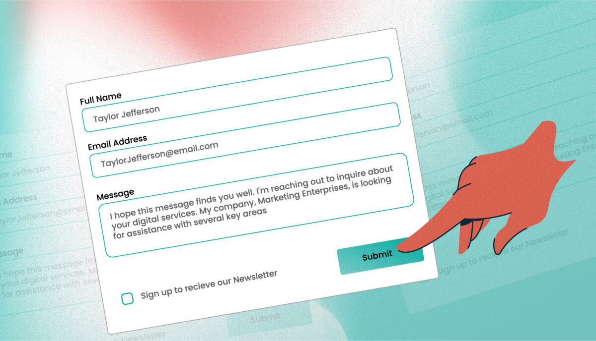
- Provide failure and success criteria when online form actions are involved
A site with high CPQ will see low time-on-site, fewer page views, and a higher bounce rate. On the other side, engagement is still a valuable metric for some types of sites.
A high CPQ site is not:
- Editorial in nature — news sites exist to disseminate timely content, therefore engagement is still a solid metric
- Social in nature — Social media websites are designed to be engaging (in the worst way, sometimes) and aim to suck away those 20 minutes you have standing in line at the grocery store. Engagement is still the right metric to use for success
There is always a Gray Area
In between a site that is very transactional, like a bank, and a site that is very engaging, like Instagram, are sites that need to have a little bit of both. We think that is perfectly fine, as long as we can identify it ahead of time. Properly understanding when a task needs to have high CPQ and when another task needs to have a low CPQ will be critical, both for the design of that task as well as the measurement of its success.
Example: A SaaS Product Site
Whether or not we know them by this name, we are all familiar with a Software as a Service (SaaS) site. A popular example would be something like Microsoft Outlook.
When a service costs money, the job of the website is to prove to the visitor that this thing is worth the price. It needs to outline all the major features, offer customer testimonials, show that there is real human support when needed, and be clear and upfront about pricing.
The site needs to engage the user for the time needed to make a decision and then get them through the signup process quickly. The site needs to inform the user (potential customer) of product features and keep them on the site, if possible, while they weigh the value of the product. Then the site needs to get out of the way and allow a smooth and quick transaction to a paid plan. It needs to have low CPQ at the front and high CPQ at the back.
For a scenario like this, it makes more sense to use more than one metric to measure success.
Google Analytics and other tools can be set up to have more than one set of data to look at while reviewing success. One View might track the transactional pages and therefore be concerned with low time on site and high goal completion. Another View under the same Property can track the features and pricing pages to measure high time on site, high number of pages per visit, and low bounce.
Its OK to do both![1].
Achieve High CPQ by Removing, Reducing, and Clarifying
The mobile web ushered a sea change in the web industry. Suddenly we had to fit all the same stuff that we were cramming onto a large desktop monitor into a much smaller handheld screen. It created some splinter groups — one that fought for mobile-specific sites, another that advocated for responsive design, and still others on the fringes shouting about what to do to handle it all.
Thankfully, in our minds, responsive design won. But it did have a problematic side effect. Moving multiple columns into a single column allowed designers to get all of the same information in front of people regardless of the size of the screen, which led to many clients shaking our hands and saying “job well done.” What we never did was revisit the content and ask the harder questions: “Is this really needed? Can we say it more simply?”
To achieve a high CPQ, we will need to ask these more difficult questions of our clients:
- Can we reduce the number of calls to action to one or two important, impactful ones?
- Can we reduce the amount of language on a page? Can we say these things more simply and still accomplish the goals?
- Can we change some business needs to achieve greater simplicity? Can we reduce that form from ten fields to four?
In short, we need to ask “why” more often. If the answer does not help achieve one of the business goals, then the item in question should be removed.
Again, in his talk, Mr. Zeldman makes this great observation: We do it for shopping carts. We can do it for content.
We relentlessly chop and chop away to simplify the shopping cart experience for our users because simplification leads to a very measurable bottom line — fewer abandoned carts. We can clearly see the business goals even though some changes to business practices to gain efficiencies can be painful. We can make the same sacrifices for clearer and more concise content.
Let’s Start Measuring CPQ
At the center of this idea is a simple observation that visitor engagement need not be the only measure of success in our industry. Seldom are we building the next Instagram or Twitter. Instead, we are probably building a SaaS service site that needs to do both, and the design team and the client team need to be aware of what we are doing, who it serves, and how we are going to measure success — perhaps in two different and opposite modes.
In the scenarios in which we are building a truly transactional tool or service — a banking site, shopping site, or healthcare insurance provider — both the design and client teams need to admit when engagement isNOT the objective. We would serve the customers (users) best if we made tools to help them complete their tasks and move on with their lives… have them spend less time on your site, give them a satisfying customer experience, and allow them to get back to scrolling on Instagram.
Related Links and Research:
- Follow the concept on Twitter: twitter.com/DesignCPQ
- Mr. Zeldman uses a screenshot of the BCBS.com homepage (slide 9) to illustrate a site that starting him thinking about this concept of high CPQ: noti.st/zeldman/vn6YlR#sYBxNLQ
- Another Jeffrey Zeldman idea — a design that is faster for people trying to get things done, and slower for people trying to comprehend. Sheesh, it’s like that guy knows a thing or two. Return ⤴