UI Design for the Short Attention Span
In the age of responsive websites, web designers love the interface unit called “The Card”. You’ve seen them, and chances are good that your website uses them, too.
While they are great for organizing information, they are not always so great for the mobile experience.
On a larger desktop screen they might organize items in a nice grid, but on a small screen, they can make the user feel like they are stuck in a stream of sameness with no end in sight. With short attention spans to battle and lots of competing sources of information, we need to hang onto every user as long as we can.
If your site has “cards” that consist of:
- An article summary with headline, date and image
- A product, with purchase button, description and link for more details
- A user bio, with headshot and contact details
- Any design pattern that repeats in long lists or grids
…than it is worth evaluating if your site design contributes to a high bounce rate, low time on site or a decrease in mobile traffic.
A Quick History and Definition of The Card
What’s this thing called the Card, anyway? An example might be a typical story from a news site, consisting of headline, maybe a date, an image, and a summary with a “Read More” link. We’ve all seen lots of these, as the Card quickly became a de facto unit of interfaces as responsive design started to take over. In short, a card is a compact summary of information in a stream of similar items.
Designers prefer to work with Cards as a user can easily discern that all of these similar things are the same type of content. That can be useful if you are looking for recent news, for example. Now you can scan a section of the homepage to see all the recent news, and it is ok that they follow the same format, because it is easy to see where this section of similar content begins and ends. If you are not looking for recent news, your eyes can skip over the entire section.
A Card is a useful device for repetitive content. But they are not without their pitfalls. The problem comes when designers shrink this grid or list of Cards down for mobile devices.
The easy design decision is to make that grid of Cards stack in a single column, one on top of the other, taking up the full width of the screen. The result is a list of items that look the same and seem to go on forever. A mobile screen isn’t big enough to show all of them and allow quick scanning, and the user has no idea how many of them are in the list. And guess what? Users see this and think that nothing else on the page is special, and they leave.
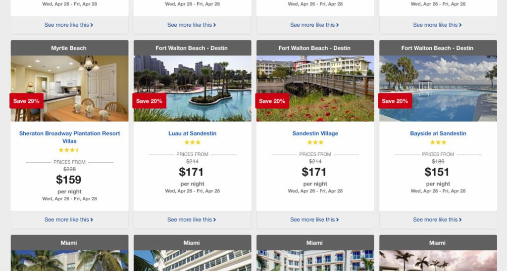
Travelocity made a mistake of letting their desktop card design change very little when it comes to mobile. A potential customer on their site is price-centric, and this design does not let them see more than one price at a time. That puts a significant amount of cognitive load in short term memory. Did I see this same travel deal for a lower price further up on the screen? Did that lower price have a high star rating as well? Were the available dates the same? A mobile user might abandon the site more quickly, frustrated that they can not comparison shop as they can on the desktop site.
Impatience is Human
We’re all impatient, and it’s getting worse. The last measure put our 8-second attention span under that of a goldfish. Web design has given users quick and easily understandable patterns to make disseminating content easier, but I believe that the standardized use of a Card has made some designers lazy as well—design a Card once, repeat it and forget about it. Mobile users? Let them scroll and scroll and scroll…
Now, I believe in scrolling. Scrolling is a necessity and people will do it. But, I do not believe in site designs that fail to engage an audience and causes people to leave a site because they were bored by seeing the same design pattern over and over again, to the point where they thought that it may never end.
Design Better Mobile Cards
How do you:
- Increase engagement on mobile devices, and get viewers to stay longer?
- Increase clicks on your content and exploration while on site?
- Get more users to consume your content and share it?
A simple solution is to think a little harder about what a mobile user wants to scan and engage with. What do they absolutely need? If your Card has a date, headline, image and blurb for desktop, is the date and blurb really needed for mobile? Does the image really need to be full screen? Will other things like color provide the visual variety that a user needs to remain interested?
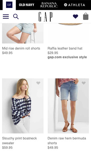
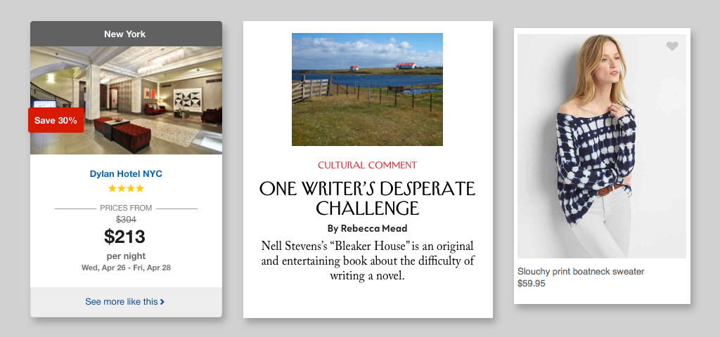
Like a lot of other sites, both the New Yorker and The Gap use Cards in their design — one is a news content site and the other is ecommerce. Still, they both realize that the mobile user needs to be able to scan quickly to find what interests them. The New Yorker decided that the images were not as important as their headlines, which makes perfect sense for them. The Gap leaned more heavily on images — clothes shopping is very visual, of course — but made sure to fit more of them on the screen.
There could be other, more interactive solutions as well:
- Hide additional card content (like the summary) off screen and make it accessible via a swipe. The user can still get a little more detail before deciding to dive into the full content.
- Use a layered approach, where the cards can stack on top of each other for quick scanning, but then a single tap can reveal the entire card and a second tap can take the user to the full content.
- Ditch the image all together. Sure, people click interesting images, but for a mobile device, if you have a user on your site, they are there for content. Drop the image and let them focus on the headlines instead (just make sure you have really good content, too)
In conclusion
Cards are an organizing principle that are not going away soon. When thinking about making iterative improvements to your website’s performance, security, and SEO, don’t forget to review the mobile design of your Cards. Could they contributing to visitors leaving too soon? Would you be willing to scroll through a list of the same Card design over and over again[1]? Make the mobile experience better for your users, because, after all, a happy user is a return user.
Related Links and Research:
- Nielsen Norman Group: Mobile Navigation: Image Grids or Text Lists?
- Nielsen Norman Group: Mobile Content: If in Doubt, Leave It Out
- Oliver Brooks for MetaLab: Mobile First, Desktop Worst, a rant about how mobile paradigms on desktop are a UI problem. Tangential, but related.
Footnotes
- Facebook and other social media networks are given credit for really starting the Card design pattern. Facebook’s activity stream uses them exclusively, and people stay on that site for a long time. But think about it… your site is probably not Facebook, which has a certain built-in voyeurism that taps into our human need to know what other people are doing. And if you really think about it, they have introduced design elements to vary cards. How about the new gradient messages? Return ⤴