
The Business Context
CarGurus operates one of the largest online automotive marketplaces in the U.S. Its revenue model depends on dealer subscriptions. Dealers pay for access to shopper data, market intelligence, product tools, and business support. When that relationship is mediated by digital, the quality of the digital experience is not a design question. It is a retention question.
By 2019, the infrastructure supporting that relationship had become a strategic liability.
The Problem: Digital Debt at Scale
CarGurus’ dealer-facing web presence had grown organically into a collection of disconnected properties: multiple WordPress sites, a gated resource center, a product microsite, and a dealer dashboard. Each operated independently, with different workflows, separate analytics, and no shared content standards.
The consequences were structural, not merely cosmetic.
For internal teams: The B2B marketing team could not publish or update content without engineering support. Campaign velocity, product launches, and content strategy were bottlenecked by a dependency that had nothing to do with marketing capability. Without centralized reporting, leadership had no way to understand what was working or where dealers were dropping off.
For dealers: Research and interviews surfaced a consistent pattern. There was no obvious place to log in, product information and help content scattered across destinations, and shopper data siloed away from the resources that gave it context. The experience communicated the opposite of CarGurus’ intent. Dealers found fragmentation where they expected authority. Pre-consolidation data made the cost of that fragmentation concrete. The Dealer Resource Center carried a bounce rate of 61.57%, the Insights pages topped 80%, and the bulk of visitors spent fewer than 10 seconds on the site. Nearly 15% of dealers reported struggling to find information, with the disjointed experience cited as the primary reason.
For compliance: Accessibility gaps across the WordPress properties introduced regulatory risk and excluded users relying on assistive technology, a segment of the dealer population that was simply invisible.
The problem was not any single site. It was the absence of a system.
The Diagnosis
Most agencies, presented with this problem, would have proposed a website redesign. Oomph diagnosed something different. CarGurus did not have a website problem, they had an operating model problem that manifested through websites.
The fragmentation was a symptom of three root causes:
- No content governance model. Without shared standards, each property developed its own editorial process, its own taxonomy, its own way of doing things. Content proliferated without coherence.
- No editorial independence. The marketing team’s dependency on engineering for routine publishing created a structural bottleneck that compounded over time. Every campaign, every update, every product launch queued behind engineering capacity.
- No shared measurement. Without centralized analytics, CarGurus could not connect dealer behavior across properties, could not identify friction points in the engagement journey, and could not make evidence-based decisions about where to invest.
Fixing any one of these without the others would have reproduced the same problem on a new platform.
The Solution: A Dealer Engagement System
Oomph began with structured discovery across sales, support, UX, and marketing using stakeholder interviews, a full content audit, heatmap analysis, and a card sort exercise to understand how dealers actually navigate and categorize content. The critical finding was that dealers organized information around their workflows and tasks, not around CarGurus’ internal team structures. The existing architecture reflected the org chart. The new one needed to reflect the dealer. Dealer research also surfaced where content investment would matter most. 38.78% of dealers were very interested in digital marketing best practices, and 36.12% in automotive marketing best practices, two content categories that had been scattered or buried across the fragmented properties.
From that research, Oomph designed and built three interconnected capabilities.
A Unified Content Platform
Three separate sites, the Dealer Resource Center, the Dealer Account Request page, and the product microsite at products.cargurus.com, were consolidated into a single governed destination. The Contentful-based content portal consolidated Articles, Events, Products, Authors, and reusable Design Components into a single governed destination, with localization for the Canadian market. The content model was documented and governed, giving the marketing team full editorial control without engineering dependency.
Centralized Measurement
One destination meant one analytics framework. For the first time, CarGurus could track dealer engagement across the entire content ecosystem, not property by property, but as a coherent journey. Internal teams could direct every channel to the same URL, building familiarity and reinforcing the hub over time.
Systematic Accessibility Remediation
Accessibility work ran in two phases, starting with the existing WordPress properties (addressing contrast failures, empty labels, and keyboard navigation gaps), then post-launch across three Contentful-based sites targeting WCAG 2.1 compliance. Remediations included fixing keyboard navigation and adding tab focus rings across dropdown menus, correcting color contrast ratios to meet the WCAG 4.5:1 standard in headers, forms, and FAQ blocks, adding alt text to logos and informational icons, and converting static chart images into accessible HTML formats. This was not a one-time fix but a repeatable compliance process designed to scale with the platform.
What Changed
Operational velocity: The marketing team gained the ability to publish, update, and govern content independently, removing the bottleneck that had constrained their ability to execute for years.
Dealer experience: Three sites became one. Dealers gained a single, consistent destination for products, services, research, and account access. The experience shifted from fragmented and frustrating to coherent and navigable. Where pre-consolidation data showed bounce rates above 61% and the majority of visitors spending fewer than 10 seconds on site, the unified hub gave CarGurus the structural foundation to actually retain and re-engage that audience.
Strategic visibility: Centralized analytics replaced fragmented multi-site tracking, creating a shared foundation for understanding dealer behavior and making evidence-based decisions about content investment, product positioning, and engagement optimization.
Market reach: Accessibility remediation across five properties extended the platform to dealers using assistive technology, a population that had been excluded by the previous architecture.
The Strategic Takeaway
Complex B2B organizations accumulate digital debt one property at a time. By the time the cost becomes visible, it has already slowed marketing, obscured what matters, and turned internal fragmentation into a customer-facing problem.
CarGurus’ situation is common. What made the engagement different was the diagnosis. The dealer experience needed to be treated as an integrated system rather than a collection of sites to be redesigned. The distinction matters. A site redesign solves today’s problem. A system creates the infrastructure to solve tomorrow’s.
Oomph delivered the architecture, governance model, and editorial capability for CarGurus to keep improving dealer engagement over time, not as a one-time project, but as an ongoing organizational capability.
Ready to turn your digital fragmentation into a system? Let’s talk about what’s possible for your organization.
Overview
nCino, Inc. is a leader in intelligent banking solutions and a pioneer in the financial technology space. As their business continues to grow and their digital strategy evolves, they needed to ensure their content management capabilities could keep pace with their expanding marketing needs.
Our collaboration with nCino focuses on optimizing their use of the Contentful platform to enhance their internal marketing and website capabilities. By leveraging Contentful, we’re helping nCino streamline and improve their content management processes, allowing their teams to focus more on innovation and growth within their core business.
The approach
We’re working alongside nCino to optimize their Contentful platform implementation. The goal is ensuring their digital presence continues to align with their evolving strategy and marketing needs while supporting their ongoing success as pioneers in the financial technology space.
By enhancing their content management processes, we’re empowering nCino’s internal teams to work more efficiently and strategically.
Why this project matters
This work represents an important step in ensuring nCino’s digital presence continues to align with their evolving strategy and marketing needs. The optimization supports their ongoing success as pioneers in the financial technology space by removing operational friction and enabling their teams to focus on what matters most — innovation and growth.
Overview
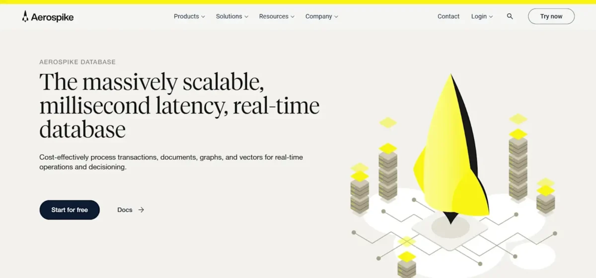
Aerospike specializes in high-performance NoSQL databases known for their speed, scalability, and reliability in handling large volumes of data in real-time applications. Their database technology is designed to meet the demands of modern data-intensive applications.
The company’s platform offers features such as strong consistency, high availability, and automatic failover to ensure continuous operations even in the event of hardware failures or network issues. Aerospike also provides tools and integrations to support analytics, monitoring, and management of the database environment, empowering developers and operations teams to optimize performance and scalability.
Think of a NoSQL database as a big, organized digital filing cabinet for storing different kinds of information. Traditional databases are like organized spreadsheets where everything is neatly arranged in rows and columns. However, NoSQL databases are designed to handle different types of data—like text, numbers, pictures, and more—and can store huge amounts of it very quickly. They’re a super-fast and flexible digital storage system.
The challenge
Aerospike needed a new platform to provide consistent, clean rebranding, increases in speed and efficiency, an enhanced user and client experience, and streamlined communication with clients.
Despite their renown in the NoSQL database market, their website lacked the clarity needed to capture conversion rates fitting for a brand in the spotlight of their digital industry.
The approach
Headless CMS functions similarly to NoSQL databases, allowing content managers to view and manage content of all forms easily and from one place. Under the guidance of our team, Aerospike decided that a migration to a headless CMS with Contentful was the right option.
This decision, along with brand redesign and consistent messaging, were all instrumental parts of Aerospike’s digital revolution. We were able to work side by side with Aerospike to give them a refresh that tells a story.
The Results
The result is a totally remastered headless CMS website, providing Aerospike the foundation needed for continued success and reputability. The new platform delivers the consistent, clean rebranding they needed along with the speed, efficiency, and enhanced user experience that positions them for growth.
We were able to work side by side with Aerospike to give them a refresh that tells a story and matches the innovative spirit of their cutting-edge database technology.
Throughout the process, I was impressed by the ways Aerospike would experiment with its database. That fits how [Oomph] approaches our projects: open-minded and ready to break the mold.
— Jesse Day, Technical Director
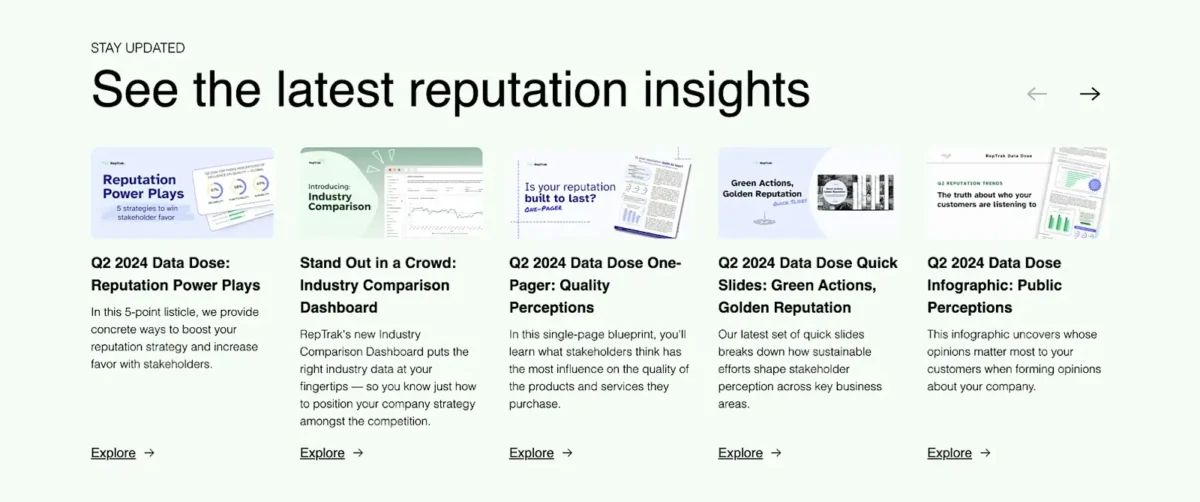
Overview
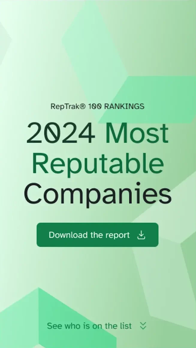
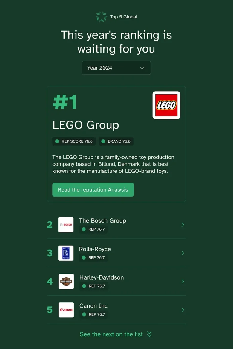
For over twenty years, RepTrak has been the go-to provider for reputation data and insights, helping organizations understand and improve their corporate reputation. With their flagship Global RepTrak 100 report, RepTrak offers an annual definitive ranking of corporate reputation for the world’s leading companies, providing valuable benchmarks that influence strategic decisions and stakeholder relationships.
The RepTrak Platform draws on the world’s largest reputation database with over 20 years of data. Their reputation scores serve as a leading indicator, allowing teams to interpret constantly updating streams of reputation, brand, ESG, and media data.
RepTrak’s Home and Global RepTrak 100 Landing Page are their most important lead generators, making it imperative to get these digital experiences right.
Key results
Increase in report downloads
YoY conversion boost
The Challenge
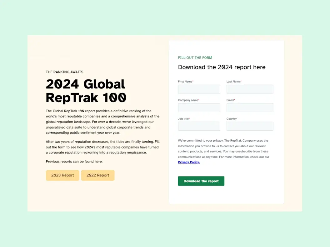
The Global RepTrak 100 report is more than just data — it’s a definitive ranking system recognized industry-wide that reinforces RepTrak’s leadership in the reputation industry. Their homepage demands similar attention as the first or second touchpoint for leads.
The challenge was to design landing pages that not only met the aesthetic and functional needs of their users but also reinforced RepTrak’s brand as a trusted and authoritative source. With the report being their top lead generator for the year, the landing page needed to be engaging, fast-loading, and seamlessly integrated into their Contentful site.
Beyond aesthetics for outside visitors, their internal team required Contentful modeling conducive to empowering Content Managers, guidance on technical integrations, and a new design system.
The Approach
Redefining Technical Support
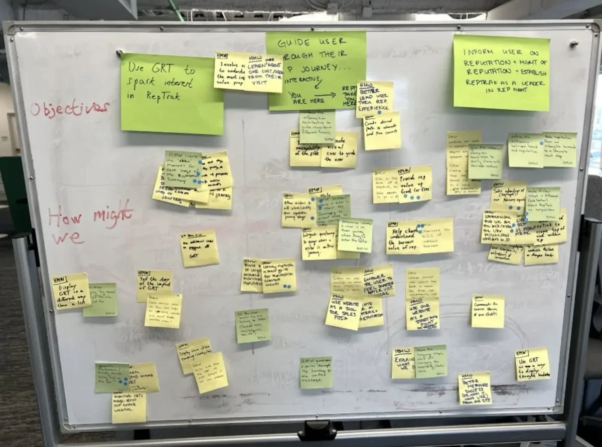
With any project, proper guidance is an often overlooked prerequisite. It’s fairly common to “know what you want” and have no idea how to get there. It’s even more common to “know what you want” and for that journey to achieve the “want” be ill-advised. Without the outside perspective of a technical solutions partner, internal biases and inefficiencies multiply.
We approached this project interdisciplinary and agile. Assuming the role of impartial confidant, we were able to give the RepTrak team objective recommendations, allowing us to focus on speed with a collaborative touch.
Collaborative and Strategic Design
The Home and Global RepTrak 100 landing page received a complete overhaul, designed to elevate user experience, increase engagement, and drive conversions. Not to mention, make content editing and management easier for all parties internally.
The redesigned landing page is a testament to our collaborative efforts with RepTrak, merging aesthetics with functionality. By focusing on user experience and leveraging Contentful’s robust capabilities, we created a page that not only highlights the significance of the Global RepTrak 100 report but also aligns with RepTrak’s brand values and business goals.
The design features intuitive navigation, clear calls to action, and visually appealing elements that draw attention to key insights from the report. We also incorporated responsive design principles to ensure the page performs well across devices, catering to a global audience.
The Results
The redesign delivered measurable impact on RepTrak’s most important lead generation channels. Report downloads increased by 6% and conversions saw an impressive 40% year-over-year boost.
The new landing page is not just a one-time update — it’s a strategic investment in RepTrak’s digital presence. By ensuring a seamless and engaging experience, we’ve laid the groundwork for future enhancements that will extend to other areas of their Contentful site.
[Oomph] truly understood how important this report was to the company and helped us build something that can be translated across our website — so every piece we release can be just as powerful.
— Bianca Martucci-FiNk, Director of Global Content Marketing, The RepTrak Company
Overview
8am is the professional business platform purpose-built to help lawyers, accountants, and other experts deliver world-class outcomes for their clients and their firms. The company manages five distinct brands: MyCase (legal practice management), LawPay (legal payments and financial management), CasePeer (personal injury practice management), DocketWise (immigration practice management), and CPACharge (accounting payments and billing). Trusted by over 260,000 professionals and approved by 175+ bar and professional associations, 8am has spent 20+ years helping professionals make time for what matters.
As 8am prepared for a major rebrand to unify operations across all brands, they faced a complex technical challenge: multiple legacy CMS platforms including WordPress, HubSpot, and custom page builders created inconsistent publishing workflows, heavy plugin dependencies, and thousands of scattered media assets across their portfolio.
Stats/Key Outcomes
- 5 brands → 1 architecture: MyCase, LawPay, CasePeer, Docketwise, and CPACharge now managed in one scalable platform.
- Faster publishing cycles: Marketing teams can launch campaigns in hours, not days.
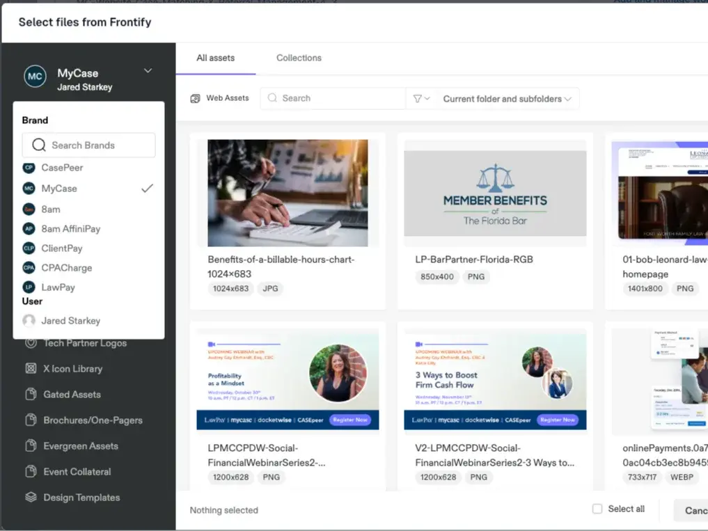
- Consistent branding & governance: Centralized templates + Frontify DAM integration keep every asset on-brand.
- GEO & SEO + growth built-in: Redirects preserved, structured content for AI/SEO visibility, and scalable content modeling.
- Future-ready: Supports personalization, localization, and new product rollouts.
The Challenge
8am faced operational challenges across multiple legacy CMS platforms including WordPress, HubSpot, and custom page builders. Inconsistent publishing workflows, heavy plugin dependencies, and thousands of scattered media assets created bottlenecks that slowed their marketing efforts.
The upcoming rebrand to 8am required unifying operations across all Affinipay brands, but their existing infrastructure couldn’t support this level of coordination and consistency.
The Solution
We partnered with Contentful to deliver a unified content architecture, beginning with a full migration of MyCase.com from WordPress to Contentful.
Key elements of the MyCase solution included a full migration of MyCase.com encompassing 166+ pages, 400+ blog posts, and 4,700+ media files. We built a structured content model for blogs, guides, webinars, press releases, videos, and landing pages. Design system standardization streamlined and standardized design components across the site. We ensured SEO continuity and GEO visibility by preserving 143+ SEO-critical redirects and improving metadata governance. For MarOps enablement, we integrated Marketo forms directly into Contentful’s structured model. Tech enablement connected Frontify DAM to manage brand assets consistently across all brands.
With the help of an Atomic Design System, this solution became the blueprint for ongoing migrations and updates across the broader 8am portfolio.
Shared DAM: One asset library powers all 8am brands — no duplication, no outdated files.
The Results
8am now operates on a centralized, API-first content platform that empowers its marketing and digital teams to scale campaigns faster, maintain consistent brand messaging, and collaborate more efficiently.
Structured workflows and reusable components reduced time-to-publish significantly. Brand, marketing, and digital teams now collaborate inside one system with shared visibility. Centralized asset management through DAM integration ensures consistency across all brands. The scalable foundation positions 8am for personalization, AI readiness, and continued growth.
It’s truly a night and day difference working with this new flow … It’s fantastic.
— Alexander Maxwell, Senior Designer, 8am
Overview
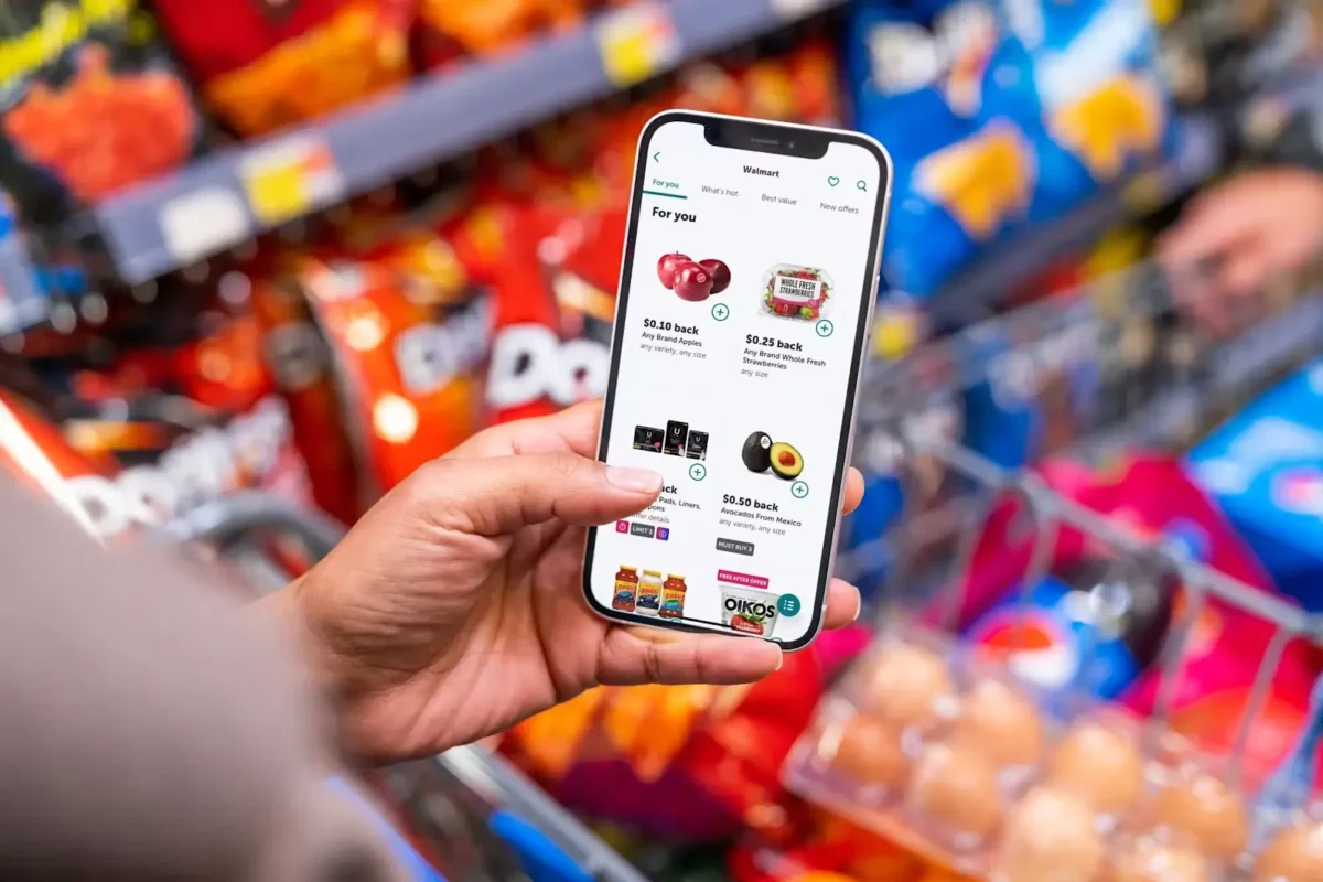
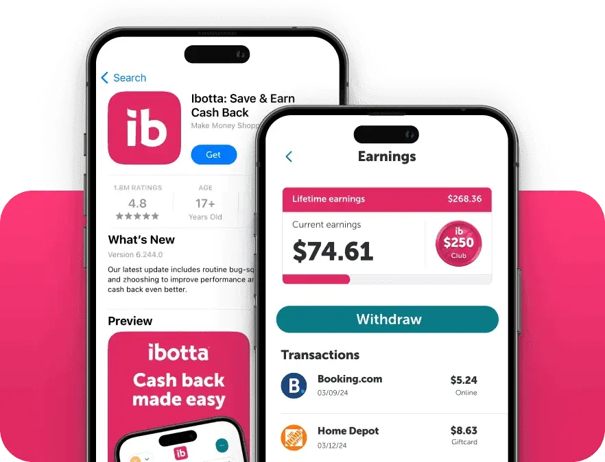
Ibotta is a leading performance marketing platform that helps brands reach over 200 million consumers through results-driven digital promotions. Backed by Walmart, Ibotta’s Performance Network (IPN) empowers marketers to influence purchasing decisions, shopping locations, and shopping frequency.
Millions of consumers use Ibotta to get cash back every time they shop, earning an average of $261 each year.
We partnered with Ibotta through a collaboration focused on Contentful. This partnership brought together Ibotta’s innovative consumer engagement model and our digital strategy expertise. Our shared goal: build smarter, results-driven experiences that move people and move product.
The approach
Our collaboration with Ibotta centered on providing hands-on development support and Contentful guidance.
We worked alongside their team to ensure smooth implementation, troubleshoot platform challenges, and support scalable workflows. The goal was helping them get more out of their tools and move faster with confidence.
The Results
Together, we crafted digital experiences that increase brand visibility and drive real-world sales.
By combining Ibotta’s performance-driven platform with our technical expertise, we delivered added value — not just to the Ibotta team, but to the brands they serve. This translated into measurable impact where it matters most.
Why this project matters
We’re proud to support partners like Ibotta who are reshaping the future of performance marketing.
This collaboration reflects what we do best: delivering flexible, expert support that helps teams move faster, scale smarter, and stay focused on what drives results. We look forward to continuing to build alongside innovative brands making an impact.
With Ibotta, you can get cash back every time you shop, on the app or in-store. Join the millions of Savers who earn $261 each year on average.
The Results
8am now operates on a centralized, API-first content platform that empowers its marketing and digital teams to scale campaigns faster, maintain consistent brand messaging, and collaborate more efficiently.
The transformation delivered measurable improvements across key operational areas. Reduced time-to-publish through structured workflows and reusable components speeds content delivery. Cross-functional alignment improved as brand, marketing, and digital teams now collaborate inside one system. Centralized asset management through DAM integration supports consistency across all brands. The scalable foundation positions 8am for personalization, AI readiness, and continued growth.
Wow! We are so thankful and impressed with your ability to flex fast and support this project.
— Keith Nickoles, Ibotta
Key Outcomes
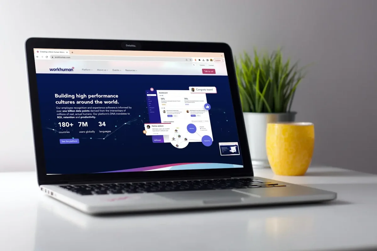
The new content system fundamentally changed how Workhuman operates digitally and enabled tracking of critical performance indicators:
Content reuse efficiency: Content is created once and deployed across channels. The system tracks reuse patterns and identifies optimization opportunities, enabling measurement of how efficiently content scales.
Time-to-publish: Streamlined workflows and automated propagation reduce publishing cycles. Updates deploy across channels instantly, creating measurable improvements in speed-to-market.
Brand consistency: The system enforces design standards, voice, and structure automatically. Consistency becomes measurable rather than subjective, with deviations flagged before publication.
Cross-channel engagement visibility: Consolidated, structured content creates the foundation for unified analytics. Workhuman can now measure what performs, where, and why—then optimize accordingly.
Operational efficiency: Eliminated duplicate content management across previously siloed systems, reduced redundant workflows, and created measurable improvements across editorial operations.
Beyond the metrics, the system established foundational capabilities:
Single source of truth: Editorial and development teams work from unified content infrastructure, eliminating version control issues and conflicting updates.
Foundation for continuous improvement: Clear analytics, structured content models, and flexible architecture enable ongoing optimization based on performance data.
Strategic agility: Content decoupled from presentation means new channels and formats don’t require content rewrites, dramatically reducing time-to-market for new initiatives.
The Challenge
Workhuman’s content infrastructure had become operationally unsustainable and strategically misaligned:
Fragmented publishing workflows: Content lived across WordPress (1,500 news and blog posts, 3,500 files) and Uberflip (3,500 posts and resources)—8,500+ pieces total with no single source of truth, forcing redundant work across editorial teams.
No performance visibility: Siloed systems meant siloed analytics. Understanding what content drove engagement, what could be optimized, or what deserved investment required manual aggregation and guesswork.
Inconsistent brand experiences: Different platforms meant different capabilities. Design standards varied. Brand consistency depended on individual editors remembering guidelines rather than systems enforcing them.
Technical debt accumulation: Years of workarounds, custom code, and platform limitations created brittleness that slowed innovation and prevented strategic content initiatives.
These systemic barriers prevented Workhuman from achieving core digital objectives: measuring content performance, optimizing based on data, and deploying content strategically across channels.
The Approach
Oomph designed and implemented a unified content system built on Contentful’s headless architecture—treating content as structured data that could be published anywhere while enabling comprehensive measurement:
Content structure and governance: Developed structured content models that replaced freeform HTML with controlled fields and vocabularies. This created consistency guardrails that empowered editors while enabling measurement of reuse patterns and brand compliance.
Strategic migration at scale: Consolidated 8,500+ pieces across WordPress and Uberflip systems. Worked with Workhuman to evaluate, prioritize, and migrate only valuable content—eliminating outdated resources, consolidating duplicates, and archiving low-performing pieces to improve quality while creating a cleaner baseline for measurement.
Capability preservation with systemic improvement: Rather than removing features editors relied on, reimagined how needs could be met through structured models. Editors maintained flexibility while the system enforced brand standards automatically and tracked compliance.
Operational system delivery: Delivered complete functioning infrastructure including content models, migration tooling, editorial workflows, governance documentation, and team training. Workhuman could operate, publish, and measure from day one.
The Result
Workhuman launched a headless content system that unified previously fragmented operations. Their editorial and development teams now work from a single source of truth, publishing consistent brand experiences across digital channels while tracking the performance indicators that drive continuous improvement.
The system doesn’t just manage content—it enables the operational clarity and measurement infrastructure Workhuman needs to optimize performance over time.
Why This Matters
Content systems are performance systems. When content operations are fragmented, organizations can’t measure what matters or optimize with confidence. They’re managing logistics instead of improving outcomes.
By treating content infrastructure as an integrated system, Oomph helped Workhuman build the foundation for continuous improvement—creating operational capacity to measure, learn, and systematically optimize how content drives business value.
This transformation enables what matters most: moving from content management to content performance optimization.
We are all super pumped with the progress. You and the team are doing an amazing job and we are very excited to unveil this!
— Jon Bizeur, Senior Director of Web & Digital Experience, Workhuman
THE BRIEF
Never Stopping, Always Evolving
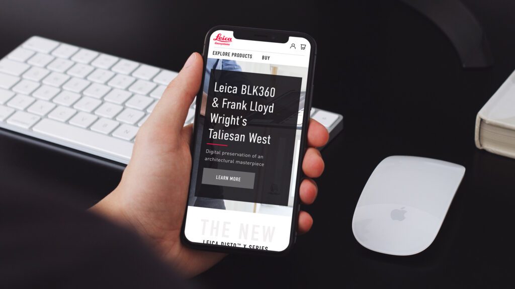
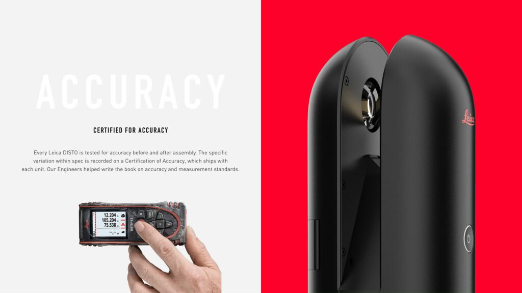
Leica Geosystems was founded on cutting-edge technology and continues to push the envelope with their revolutionary products. Leica Geosystems was founded by Heinrich Wild and made its first rangefinder in 1921. Fast forward to the 21st century, and Leica Geosystems is the leading manufacturer of precision laser technology used for measurements in architecture, construction, historic preservation, and DIY home remodeling projects.
Oomph and Leica collaborated on an initial project in 2014 and have completed multiple projects since. We transitioned the site into a brand new codebase with Drupal 8. With this conversion, Oomph smoothed out the Leica team’s pain points related to a multisite architecture. We created a tightly integrated single site that can still serve multiple countries, languages, and currencies.
THE CHALLENGE
Feeling the Pain-points with Multisite
Leica’s e-commerce store is active in multiple countries and languages. Managing content in a Drupal multisite environment meant managing multiple sites. Product, content, and price changes were difficult. It was Oomph’s challenge to make content and product management easier for the Leica team as well as support the ability to create new country sites on demand. Leica’s new e-commerce site needed to support:
MULTIPLE COUNTRIES AND A GLOBAL OPTION
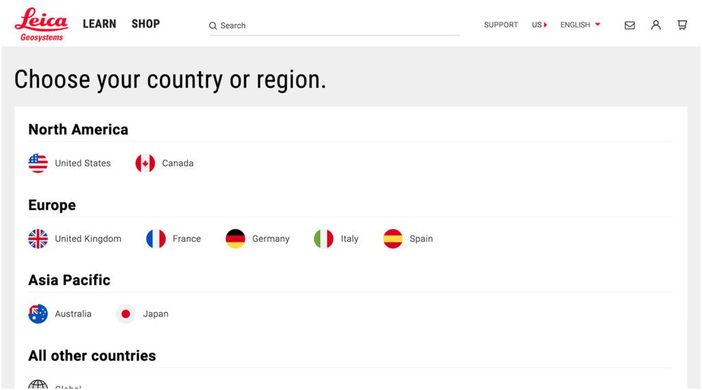
SIX LANGUAGES
MANY 3RD-PARTY INTEGRATIONS
The pain points of the previous Multisite architecture were that each country was a silo:
- No Single Sign On (SSO): Multiple admin log-ins to remember
- Repetitive updates: Running Drupal’s update script on every site and testing was a lengthy process
- Multiple stores: Multiple product lists, product features, and prices
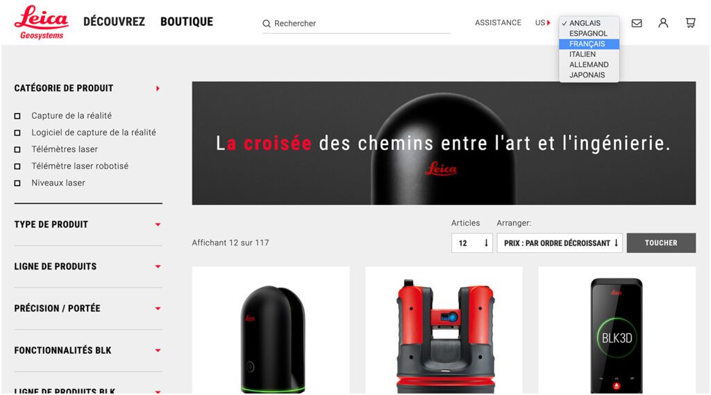
- Multiple sites to translate: each site was sent individually to be translated into one language
THE APPROACH
Creating a Singularity with Drupal 8, Domain Access, & Drupal Commerce
A move to Drupal 8 in combination with some smart choices in module support and customization simplified many aspects of the Leica team’s workflow, including:
- Configuration management: Drupal 8’s introduction of configuration management in core means that point-and-click admin configuration can get exported from one environment and imported into another, syncing multiple environments and saving configuration in our code repository
- One Database to Rule Them All: Admins have a single site to log into and do their work, and developers have one site to update, patch, and configure
- One Commerce Install, Multiple stores: There is one Drupal Commerce 2.x install with multiple stores with one set of products. Each product has the ability to be assigned to multiple stores, and price lists per country control product pricing
- One Page in Multiple Countries and Multiple Languages: The new single site model gives a piece of content one place to live, while authors can control which countries the content is available and the same content is translated into all the languages available once.
- Future proof: With a smooth upgrade path into Drupal 9 in 2020, the Drupal 8 site gives Leica more longevity in the Drupal ecosystem
LEARN VS. SHOP
Supporting Visitor Intention with Two Different Modes
While the technical challenges were being worked out, the user experience and design had to reflect a cutting-edge company. With the launch of their revolutionary product, the BLK 360, in 2018, Leica positioned itself as the Apple of the geospatial measurement community — sleek, cool, cutting-edge and easy to use. While many companies want to look as good as Apple, few of them actually have the content and product to back it up.
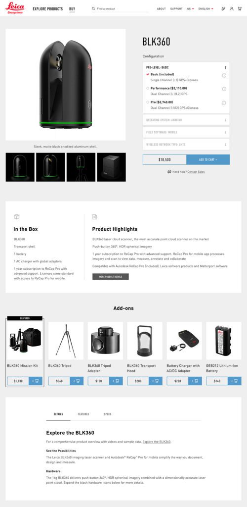
The navigation for the site went through many rounds of feedback and testing before deciding on something radically simple — Learn or Shop. A customer on the website is either in an exploratory state of mind — browsing, comparing, reviewing pricing and specifications — or they are ready to buy. We made it very clear which part of the website was for which.
This allowed us to talk directly to the customer in two very different ways. On the Learn side, the pages educate and convince. They give the customer information about the product, reviews, articles, sample data files, and the like. The content is big, sleek, and leverages video and other embedded content, like VR, to educate.
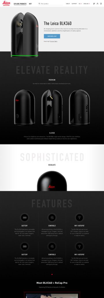
On the Shop side the pages are unapologetically transactional. Give the visitor the right information to support a purchase, clearly deliver specs and options like software and warranties, without any marketing. We could assume the customer was here to purchase, not to be convinced, so the page content could concentrate on order completion. The entire checkout process was simplified as much as possible to reduce friction. Buying habits and patterns of their user base over the past few site iterations were studied to inform our choices about where to simplify and where to offer options.
THE RESULTS
More Nimble Together
The willingness of the Drupal community to support the needs of this project cannot be overlooked, either. Oomph has been able to leverage our team’s commitment to open source contributions to get other developers to add features to the modules they support. Without the give and take of the community and our commitment to give back, many modifications and customizations for this project would have been much more difficult. The team at Centarro, maintainers of the Commerce module, were fantastic to work with and we thank them.
We look forward to continuing to support Leica Geosystems and their product line worldwide. With a smooth upgrade path to Drupal 9 in 2020, the site is ready for the next big upgrade.
Generative Engine Optimization (GEO) is making organizations scramble — our clients have been asking “Are we ready for the new ways LLMs crawl, index, and return content to users? Does our site support evolving GEO best practices? What can we do to boost results and citations?”
Large language models (LLMs) and the services that power AI summaries don’t “think” like humans but they do perform similar actions. They seek content, split it into memorable chunks, and rank the chunks for trust and accuracy. If pages use semantic HTML, include facts and cite sources, and include structured metadata, AI crawlers and retrieval systems will find, store, and reproduce content accurately. That improves your chance of being cited correctly in AI overviews.
While GEO has disrupted the way people use search engines, the fundamentals of SEO and digital accessibility continue to be strong indicators of content performance in LLM search results. Making content understandable, usable, and memorable for humans also has benefits for LLMs and GEO.
How LLM systems (and AI-driven overviews) get their facts
Understanding how LLMs crawl, process, and retrieve web content helps us understand why semantic structure and accessibility best practices have a positive effect. When an AI system generates an answer that cites the web, several distinct back-end steps usually happen:
- Crawling — Bots visit URLs and download page content. Some crawlers execute javascript like a browser (Googlebot) while others prefer raw HTML and limit their rendering.
- Chunking — Large documents are split into small, logical “chunks” of paragraphs, sections, or other units. These chunks are the pieces that are later retrieved for an answer. How a page’s content is structured with headings, paragraphs, and lists determines the likely chunk boundaries for storage.
- Vectorization — Each chunk is then converted into a numeric vector that captures its semantic meaning. These embeddings live in a vector database and enable systems to find chunks quickly. The quality of the vector depends on the clarity of the chunk’s text.
- Indexing — Systems will store additional metadata (URL, title, headings, metadata) to filter and rank results. Structured data like schema metadata is especially valuable.
- Retrieval — A user asks a question or performs a search and the system retrieves the most semantically similar chunks via a vector search. It re-ranks those chunks using metadata and other signals and then composes its answer while citing sources (sometimes).
The Case for Human-Accessible Content
There are many more reasons why digital accessibility is simply the right thing to do. It turns out that in addition to boosting SEO, accessibility best practices help LLMs crawl, chunk, store, and retrieve content more accurately.
During retrieval, small errors like missing text, ambiguous links, or poor heading order can fail to expose the best chunks. Let’s dive into how this can happen and what common accessibility pitfalls contribute to the confusion.
For Content Teams — Authors, Writers, Editors
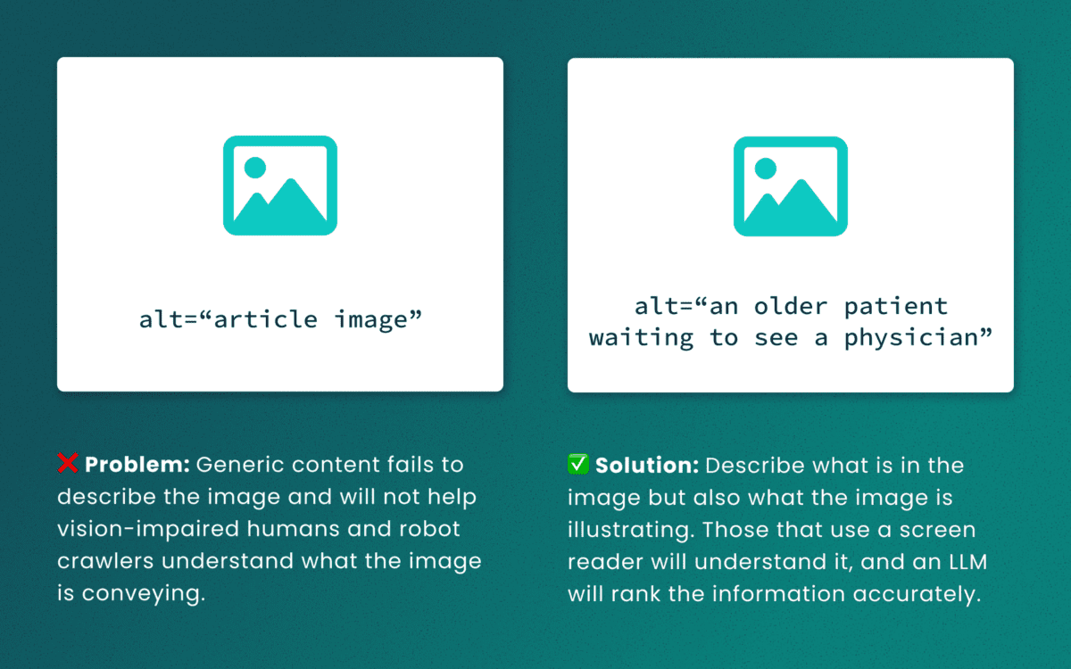
Lack of descriptive “alt” text
While some LLMs can employ machine-vision techniques to “see” images as a human would, descriptive alt text verifies what they are seeing and the context in which the image is relevant. The same best practices for describing images for people will help LLMs accurately understand the content.
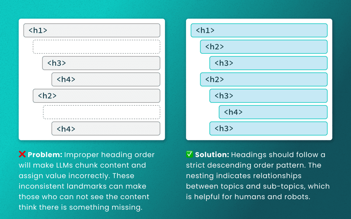
Out-of-order heading structures
Similar to semantic HTML, headings provide a clear outline of a page. Machines (and screen readers!) use heading structure to understand hierarchy and context. When a heading level skips from an <h2> to an <h4>, an LLM may fail to determine the proper relationship between content chunks. During retrieval, the model’s understanding is dictated by the flawed structure, not the content’s intrinsic importance. (Source: research thesis PDF, “Investigating Large Language Models ability to evaluate heading-related accessibility barriers”)
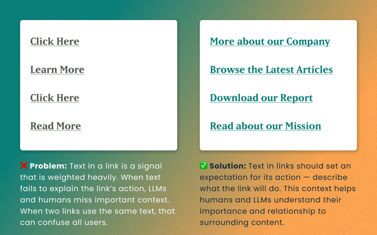
Descriptive and unique links
All of the accessibility barriers surrounding poor link practices affect how LLMs evaluate their importance. Link text is a short textual signal that is vectorized to make proper retrieval possible. Vague link text like “Click here” or “Learn More” does not provide valuable signals. In fact, the same “Learn More” text multiple times on a page can dilute the signals for the URLs they point to.
Using the same link text for more than one destination URLs creates a knowledge conflict. Like people, an LLM is subject to “anchoring bias,” which means it is likely to overweight the first link it processes and underweight or ignore the second, since they both have the same text signal.
Example of the duplicate link problem: <a href=“[URL-A]”>Duplicate Link Text</a>, and then later in the same article, <a href=“[URL-B]”>Duplicate Link Text</a>. Conversely, when the same URL is used more than once on a page, the same link text should be repeated exactly.
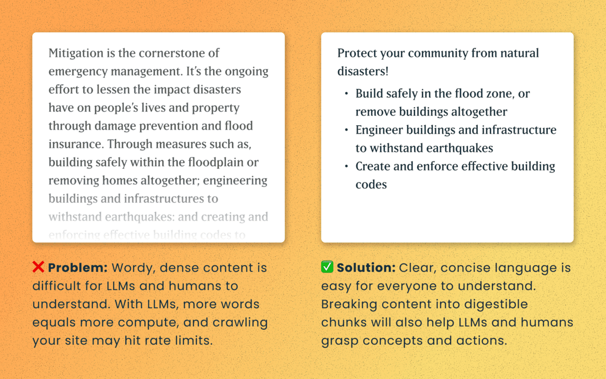
Logical order and readable content
Simple, direct sentences (one fact per sentence) produce cleaner embeddings for LLM retrieval. Human accessibility best practices of plain language and clear structure are the same practices that improve chunking and indexing for LLMs
For Technical Teams — IT, Developers, Engineers
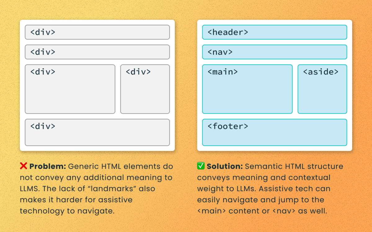
Poorly structured semantic HTML
Semantic elements (<article>, <nav>, <main>, <h1>, etc.) add context and suggest relative ranking weight. They make content boundaries explicit, which helps retrieval systems isolate your content from less important elements like ad slots or lists of related articles.
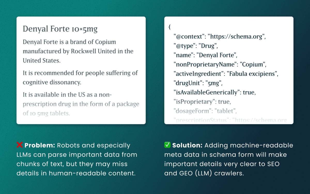
Lack of schema
This is technical and under the hood of your human-readable content. Machines love additional context and structured schema data is how facts are declared in code — product names, prices, event dates, authors, etc. Search engines have used schema for rich results and LLMs are no different. Right now, server-rendered schema data will guarantee the widest visibility, as not all crawlers execute client-side Javascript completely.
How to make accessibility even more actionable
The work of digital accessibility is often pushed to the bottom of the priority list. But once again, there are additional ways to frame this work as high value. While this work is beneficial for SEO, our recent research uncovers that it continues to be impactful in the new and evolving world of GEO.
If you need to frame an argument to those that control the investments of time and money, some talking points are:
- Accurate brand representation — Poor accessibility hides facts from LLMs. When customers ask an AI assistant for “best X for Y,” your content may not be shown — or worse, misrepresented. Fixing accessibility reduces brand risk and increases content authority.
- Engagement boost — Improvements that increase accurate citations and AI visibility can increase referral traffic, feature mentions, and lead quality. In a landscape where AI Answers are reducing click-through rates, keeping the traffic you have on your site for longer and building brand trust becomes vital.
- Increased exposure — Digital inclusion makes your content widely accessible to machines and the machines that assist humans. Think about a search engine as another human-assistive device, just like a keyboard or screen reader.
- Multi-pronged benefits — Accessibility improvement improves traditional SEO, can benefit mobile performance, and reduces the risks associated with accessibility compliance policies.
Staying steady in the storm
Let’s be clear — this summer was a “generative AI search freak out.” Content teams have scrambled to get smart about LLM-powered search quickly while search providers rolled out new tools and updates weekly. It’s been a tough ride in a rough sea of constant change.
To counter all that, know that the fundamentals are still strong. If your team has been using accessibility as a measure for content effectiveness and SEO discoverability, don’t stop now. If you haven’t yet started, this is one more reason to apply these principles tomorrow.
If you continue to have questions within this rapidly evolving landscape, talk to us about your questions around SEO, GEO, content strategy, and accessibility conformance. Ask about our training and documentation available for content teams.
Additional Reading
- AHREFs.com: Is SEO Dead? Real Data vs. Internet Hysteria
- SearchEngineJournal.com: How LLMs Interpret Content: How To Structure Information For AI Search
- InclusionHub.com: SEO and Web Accessibility: What You Need to Know (from 2020, but still relevant)
As a digital services firm partnering with destination marketing organizations (DMOs) across the U.S., we’re helping teams navigate what’s already proving to be a volatile 2025—especially on the inbound side. Analysis from the World Travel & Tourism Council (WTTC) projects a stark reality: the U.S. economy will miss out on $12.5 billion in international visitor spending this year, with inbound spend expected to dip to just under $169B, down from $181B in 2024. Even more concerning, the U.S. is the only country among 184 economies in WTTC’s study forecast to see an inbound-spend decline this year.
While external market forces remain largely beyond control, we’ve identified three strategic areas where DMOs can focus their digital platforms to weather this storm and continue demonstrating measurable demand to their partners.
1. Transform Content Into Action-Driving Experiences
Why this strategic shift matters now
With inbound spend shrinking by $12.5B and key feeder markets weakening, undecided travelers need clarity and confidence to choose your destination. Content that reduces uncertainty and highlights immediate value converts better than generic inspiration.
Strategic implementation approach
Activate “Go Now” signals. Combine always-on inspiration with time-sensitive reasons to visit—shoulder-season value, midweek deals, cooling weather breaks—strategically mapped to the soft periods your analytics reveal.
Elevate discovery through intelligent architecture. Curate SEO-optimized content hubs organized by Themes (outdoors, arts, culinary) and Moments (fall colors, winter lights). Implement structured data (FAQ, Event, Attraction) with strategic internal linking architecture so travelers find relevant options fast.
Deploy micro-itineraries for immediate conversion. Design 24–48-hour “micro-itins” featuring embedded maps, transit and parking guidance, and seamless handoffs to bookable partners. Partnering with platforms like MindTrip reduces content team effort while accelerating output—a strategy that’s proven particularly effective for our DMO clients facing resource constraints.
Authority-driven event content optimization. Event pages generate the highest intent traffic. Enhance them with rich media, last-minute planning resources, and strategic “if sold-out, try this” alternatives.
Transparent value communication. Feature free experiences prominently, implement intuitive budget filters, and deploy “Best Time to Visit” calendars comparing crowds and pricing by week and month. Transparency builds trust, and trust drives conversion.
2. Build Your Competitive Moat Through Data-Driven Audience Cultivation
Your first-party data represents your most defensible competitive advantage. As platform targeting becomes increasingly constrained and inbound spending softens, DMOs that build and activate their own audience will capture attention far more efficiently than those relying solely on paid channels.
Strategic audience development
Implement high-intent capture everywhere. Deploy contextual email and SMS prompts across high-intent templates—events, itineraries, trip planners, partner directories. Offer valuable micro-perks like exclusive maps and early event alerts.
Master progressive profiling. Collect visitor preferences—season, interests, party type, origin market—over multiple touchpoints rather than overwhelming users with lengthy initial forms.
Create actionable audience segments. Develop cohorts around 2025’s market realities: last-minute planners, shoulder-season seekers, road-trippers, value hunters, family weekenders, and meetings planners.
Future-proof attribution systems. Combine GA4 with server-side tagging and standardized UTM schemas for every partner handoff. Track outbound clicks, partner session quality, itinerary saves and usage, offer redemptions, and newsletter-driven sessions. This comprehensive approach ensures you maintain visibility into conversion paths as third-party cookies disappear.
Deploy trend-driven editorial strategy. Develop weekly dashboards blending organic query trends, on-site search terms, partner click-through rates, and feeder-market signals. When interest dips in one market, pivot homepage modules and paid social toward value and itinerary content targeting more resilient markets.
3. Transform Partner Relationships Through Measurable Value Delivery
In a softening inbound environment where domestic spending carries approximately 90% of the economic load, your partners need two critical elements: qualified attention and proof of conversion. Your website should function as the region’s premier meta-directory and conversion engine.
Experience optimization strategies
Enable one-click handoffs with context preservation. Pass user filters—dates, neighborhoods, price ranges—directly into partner sites and booking engines while preserving state if travelers return.
Deploy persistent trip planning tools. Allow users to save places and generate shareable itineraries with intelligent handoffs: “Book these two hotels,” “Reserve rentals,” “Get festival passes.”
Create compelling partner storefronts. Develop rich partner profiles featuring availability widgets, authentic reviews, social proof, and clear calls-to-action.
Implement strategic co-op modules. Design paid placements that provide value rather than feeling like advertisements: “Local Favorites” carousels, sponsor highlights, seasonal deal tiles—rotated by audience cohort and season. This generates additional revenue while maintaining user experience quality.
Establish closed-loop reporting systems. Standardize UTM tracking, monitor outbound events, and where permitted, implement partner pixels and offer codes to report assisted conversions by category and campaign. Partners need proof of ROI, and data-driven reporting builds stronger, more profitable relationships.
How Oomph Can Accelerate Your Success
If you’re experiencing softer international interest, shorter booking windows, or declining partner satisfaction, you’re facing the same challenges as DMOs nationwide. The organizations pulling ahead aren’t waiting for market recovery—they’re strengthening their digital platforms through strategic content optimization, systematic audience cultivation, and demonstrable partner value creation.
Our proven methodology transforms these challenges into competitive advantages.
We’ll conduct a comprehensive audit of your digital platform against these three strategic pillars, quantify immediate optimization opportunities, and provide your partners with what they need most: qualified, measurable demand. The market headwinds are real, but the right strategic approach can help you maintain resilience and emerge stronger when conditions improve. Let’s navigate these challenges together.
The Brief
Visit California is a Destination Marketing Organization (DMO) with over 25 years of experience in promoting California as a premier travel destination. The organization, funded through a unique partnership between the state and the travel industry, operates with a substantial budget of over $185 million (2023). As the leader of California’s brand messaging, Visit California previously anchored its campaigns under the “Dream Big” brand positioning. However, following a significant shift in traveler motivations post-pandemic, Visit California recognized a growing desire for experiences that foster joy, connection, and adventure.
This insight led to the evolution of the brand into “The Ultimate Playground,” a strategic repositioning that highlights the state’s unparalleled diversity of geography, activities, and cultural experiences.
The “Let’s Play” campaign leveraged a robust mix of television, out-of-home, digital, and social media activations to showcase California’s diverse offerings — from wine tasting and rock climbing to luxury hotel stays, food truck adventures, and outdoor music festivals. By highlighting the playful spirit inherent in every experience, the campaign aimed to deepen the audience’s emotional connection to the state, reinforcing California’s identity as The Ultimate Playground and setting the stage for sustained brand engagement.
The APPROACH
The initial roll-out of a rebrand update is critical, and transitioning from “Dream Big” to “The Ultimate Playground” required careful internal alignment and thorough message testing. Oomph, alongside Visit California’s partner agencies, began collaborating on this effort about nine months before the campaign launch. During these early planning meetings, our team contributed key ideas and strategic approaches to help shape the campaign.
Our focus remained on the web user and their position in the customer journey. Previous campaigns had not fully optimized the user flow, so we saw this as an opportunity to reimagine the experience. With paid media driving traffic to the website, it was essential to provide visitors with clear actions once they arrived. The advertising had done its job by capturing attention and sparking interest. Now, our challenge was to build on that momentum, guiding users from interest to meaningful engagement and action.
An interactive Quiz
The Ultimate Playground campaign needed to accomplish a few things:
- Educate the consumer about the new brand positioning and why California should be considered the Ultimate Playground
- Inform the consumer about play and how it is more about kids and theme parks. Adults can and should play as well, and serious activities can be conducted in playful ways
- Activate the consumer with inspiration by giving them a unique experience and curating inspirational, playful activities throughout the state
Our teams settled on a quiz as a way to engage visitors and serve them personalized content. Based on initial research, we decided an image-based quiz would be the fastest and most fun way to answer questions and receive a set of recommendations. Choosing preferences from a set of images is a quick way to make progress tangible. We limited the questions to nine, and most visitors took two minutes to complete the quiz.
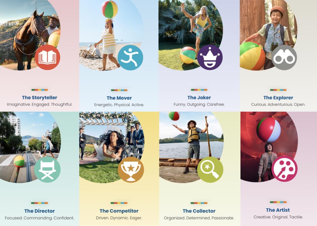
Play Styles
The eight Play Styles were based on personas researched and created by the National Institute for Play, headquartered in California. Content creators at Visit California crafted a series of TV spots with glimpses into different styles of play. Our Play Quiz would highlight which Play Style matched the participant’s preferences, and our results pages served relevant, curated content, a similar Celebrity personality, and even a secondary play style.
Email collection allowed visitors to send their play style results to themselves and allowed opt-in to more personalized content. Our team worked quickly over three months to solidify the approach, choose the quiz method and weighting criteria of the questions, and design the eight play style pages, two landing pages, a homepage takeover, and supporting pages for the new campaign.
The Results
Play Quiz: Avg. session duration
Play Styles: Avg. session duration
Compared to Site: Avg. session duration
Our approach to the campaign was to support the bottom of the funnel and give visitors coming from digital ads something useful. Given the wealth of content the Visit California website contains, these broad Play Style personas made visitors see themselves in California. It brought curated content to them and provided what we thought of as a personal homepage with relevant recommendations.
“Let’s Play” was the first part of a years-long brand campaign. We are already working on the campaign for 2025 which we hope will be even more engaging than the first!
THE BRIEF
When Seraphic Group’s founder, Zach Bush, MD, saw patterns in people’s health linked directly to problems with the food supply, he became an advocate for regenerative farming. As a potential solution to deteriorating public health, global warming, and even poverty, regenerative farming offers benefits for local and global communities. But, getting farmers to switch to it from conventional techniques is a challenge.
Regenerative farming is good for the environment and the economy in the long run—but, short term, it’s more work and more expensive than chemical-heavy, conventional farming. Add in that the appropriate techniques depend on variables like geography, soil type, and climate, and it’s a difficult thing for people to figure out on their own.
Their platform idea, Atlus∗U, needed to not only educate farmers about regenerative agriculture, but also motivate them to try it, and stick with it, for the long haul.
THE APPROACH
Understanding the Educational Purpose
As we noted in an article on different types of online learning platforms, a platform’s educational purpose determines the tools and features that will best achieve its objectives. Atlus∗U spans two purpose categories, Student Stakes Learning and Broad Stakes Learning, which means that effective education is crucial for both the learners and their larger communities.
To that end, our design vision focused heavily on content comprehension, along with keeping users motivated and engaged. Our framework included educational content and tools, accountability systems, and community features. A key component was personal stories: sharing the experiences of farmers who had successfully converted their businesses to regenerative farming and could help and encourage others to do the same.
Above all, Seraphic wanted Atlus∗U to grow and evolve over time as a kind of living guide to regenerative farming. While most online learning platforms stop when the coursework ends (think of a CPR course, where you get a certificate and you’re done), for this platform, the end of the coursework was just the beginning of the journey.
THE RESULTS
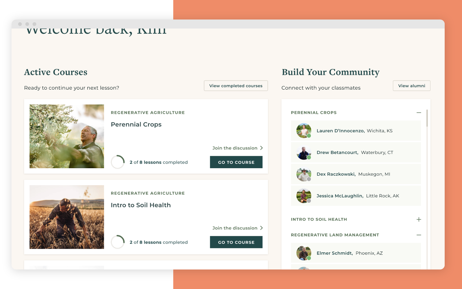
In our design, the whole community drives the learning experience, not just the teachers and coursework. It’s easy for students to connect with others who are taking the same courses, while members-only forums provide a place for productive networking, questions, stories, and support. Some forums are attached to specific lessons, so that the dialogue isn’t just between teachers and students; all members, including alumni, can participate and share their learnings on a given topic.
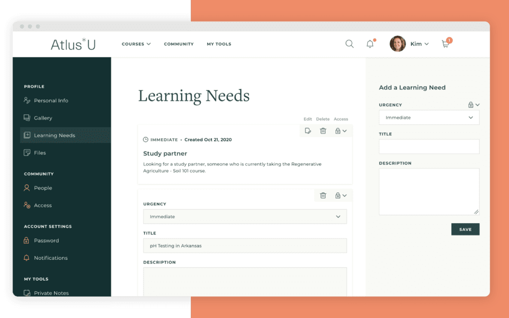
Another component, the accountability partner system, was crucial for achieving Seraphic’s goal of driving lasting change. Research shows that publicly sharing a goal gives people a 65% chance of success, while reporting to a specific accountability partner boosts that chance to 95%.
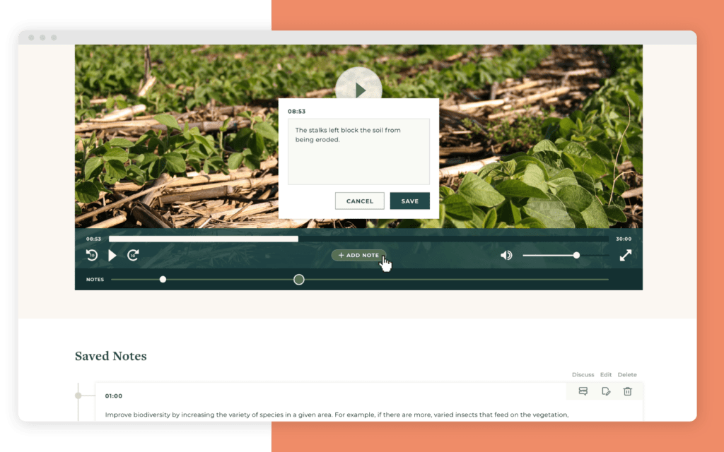
Finally, our learning tools were designed to enhance both content comprehension and retention. Course videos were a key feature, designed not just for the course, but for reference over time. Students have the ability to bookmark videos and attach notes to specific sections, letting them revisit important info whenever they need it.
THE IMPACT
While online learning has been around for a long time, recent advancements in design and functionality make it possible for learning platforms to have a transformative impact on individuals and across society.
In the case of Atlus∗U, it’s not just the coursework that drives users’ learning; an entire community is mobilized to help you succeed. With a focus on collaborative, lifelong learning, our design brings together farmers from around the world to improve their business, grow healthier food, and protect our world.
Need help building an effective online learning platform? Let’s talk about your goals and how to achieve them.