
Portable Document Format, or PDF, files have been around since 1992, offering a software-agnostic solution for presenting and sharing digital documents. For organizations that existed before the ’90s, PDFs became an easy way to move from physical to digital; they could take the same documents they used to print and now share them digitally as PDFs.
A few years after PDFs were officially launched, CSS came onto the scene as the preferred computer language for styling web pages. Over the following three decades, PDF capabilities grew alongside CSS and other digital technologies, giving creators new ways to lay out and publish their content.
Fast forward to today. Developers worldwide (Oomph among them) have been making websites for a while. We have online forms, interactive databases, and of course, plain old text on a webpage. And yet, PDFs persist.
What’s So Bad About PDFs?
Mobile Phones
Think of the last time you tried looking at a PDF on your phone. First off, there’s the issue of finding it. Depending on your operating system and browser, the file might open right in a new browser tab, or it might download and disappear into some folder you forgot about until this exact moment. (And of course, when you find the folder, you realize this is the fifth time you’ve downloaded this same file.)
Now that you’ve opened the file, you see the tiny text of an 8.5” x 11” page shrunk to a quarter of its intended size. So you pinch, zoom, and drag the page around your screen. You might rotate your phone to the dreaded horizontal orientation to fit a whole line of text at once. If this PDF is a fillable form, you may be simply out of luck on your mobile device unless you’re ready to go down a rabbit hole of separate apps and workarounds.
If, for just a minute, we want to ignore the massive amount of mobile usage — including the 15% of American adults who fully depend on phones for internet access — there’s plenty more cause for PDF concern.
Accessibility
Let’s talk about accessibility. There’s a good chance that your digital properties, including PDFs, are legally required to conform to accessibility standards. This is true for government entities — both federal and more recently, state, local, and district governments, thanks to a Title II update — as well as businesses and nonprofit organizations.
Beyond the legalities, the CDC reports that about 27% of American adults have a disability. While not all 70 million of these people use a screen reader, we know some people use assistive technology even if they don’t identify as having a disability. (When’s the last time you pressed a button to open a door just because your hands were full or to let a large group of people pass through?) Improvements for the sake of accessibility, more often than not, lead to a more effortless, more intuitive experience for everyone.
While it’s possible to make a PDF accessible, the process for doing so is extensive and involves several manual checks. This can be so time-consuming and specialized that businesses and professionals dedicate themselves entirely to remediating PDFs for accessibility.
Of course, making a website accessible isn’t as easy as plug-and-play, but accessibility should already be built into the system. Content editors who are not technical professionals can publish accessible content with relative ease on an accessible website platform (as long as we can all remember not to link “click here”) but are typically left to their own devices when it comes to documents.
Brand Reputation
Beyond these critical issues, there are a few more problems that are less vital to users but could have a negative business impact.
For one, documents like PDFs open up a whole world of styling possibilities. The flexibility might feel like a benefit at first, but give it a little time and I’m certain you’ll start seeing inconsistencies from one document to the next. Add in a few more people preparing these files, and those small differences will pile up, giving users an impression that maybe the business is not quite as put together as they thought. (Not to mention that every change in presentation is asking users to understand a new format, slowing them down or confusing them.) Consistency is key to building a trustworthy brand; every unnecessary variation erodes that trust.
There’s also the near certainty that the information provided in PDFs will need updating. When that happens, you’d better make sure to delete the old file in favor of the new one and update all your links. Since the file format made it easy (or necessary) for users to download the content to their devices, there’s a greater chance that they’ll hold onto old information, even though a newer version is now on the website.
Finally, storing important information in PDFs gives you less control over optimizing for search engines. Google has a tough time reading PDF content (though proper tagging and metadata will help), so these files often rank lower in search results than webpages with similar content. The more that content lives in PDFs and not webpages, the more your SEO will suffer, and the less likely people will be to find and consume your content.
What You Can Do Instead
Like I said, PDFs solved a real problem… 30 years ago. They still have their place today, but more often than not, there’s a better way.
Does It Need To Be a PDF?
When the PDF is just a basic document of text, we recommend turning that into a basic webpage of text. It’s easy to say, but making it happen might mean taking a fresh look at why that information is in a PDF in the first place.
Custom Layout
If you’re using PDFs to create a certain layout, consider how you can achieve something similar through CSS. You might be able to build something you like using the layout and style options already available in your CMS, but you probably won’t create a perfect 1:1 match.
Any design in a Word or Google document can also exist on a webpage. If there’s a certain design you use time and time again in your PDFs that you just can’t recreate with the web editing tools, you might need some new code. It becomes an exercise in prioritization to weigh the benefits of building a custom layout against the time and cost of doing so.
Also, remember that a design that works well for a printed page may not be the best design for a responsive webpage. Rather than recreating the exact layout digitally, ask yourself what you’re trying to achieve with the layout and whether there’s a better way to meet that same goal. While unique designs may be more difficult to create on a webpage than a PDF, I’d urge you to consider this a benefit in most cases. Limitations create consistency, which will most likely simplify the experience for both content editors and users.
Designing for Print
Speaking of print, that might be another reason for including PDFs. You may know that a portion of your audience will want to print out the page, maybe to annotate it or to have it on hand as they complete a related task.
In reality, you can serve this user without sacrificing everyone else’s online experience. Developers can use targeted CSS to customize how a webpage will print or export — including what content will display and its styling. Going this route affects how the page will print with the browser tool, and you could even provide a “Print” link if that’s a common need. Ultimately, targeted CSS means the printed content can look as similar or different from the webpage as needed.
Process
Another common cause for PDFs is that they’re simply baked into the content publishing process. Whether from fear of changing approved content or a lack of knowledge around what’s possible in the CMS, content teams may use PDF uploads as a fallback for publishing the information quickly and moving on.
A solution here may be to bring your site editor into the process sooner. As the web expert, they can speak to what will work well and what might need to change when moving the content to a webpage. The site editor may need to be heavily involved at first, but their load should lighten as the writers and other team members learn the website’s needs.
In some cases, it might also be worth building new CMS templates, such as content types. This can be especially helpful for reinforcing consistency when several people manage the website. If the content needs to follow a specific format, a highly structured edit form can act as an outline. You can share this template with the original content creators so that everyone is working toward a shared goal.
Repurposed Content
Most likely, your organization does more than manage a website. Maybe you have a brick-and-mortar office with brochures and paperwork, or you host webinars with branded slide decks. There are plenty of reasons you might create and share documents other than uploading them onto your website, but you still want the same information available online. And since it’s already put together, the easiest way to share it could be to upload the PDF.
Unfortunately, this is a situation where easy doesn’t cut it. The same tri-fold brochure that looks professional and appealing on a reception desk can be confusing and annoying on a computer or phone. A printed form works great for in-office visitors, but a web form can give users the benefits of autocomplete and progressive disclosure they’ve come to expect online.
The best experience for your users requires attention to their context. Ultimately, we need to be intentional and thoughtful about what users need in their current situation, which may require different presentations of the same content.
Embrace Digital
We’re not expecting to see the end of PDFs on websites anytime soon. For one, sometimes it’s simply out of your control. Maybe you’re providing an official government form that only exists as a fillable PDF. Even if the document is internally produced, change may be lengthy and involved, requiring buy-in from those who hold the purse strings.
While we wait for the world to change, we can advocate for a better user experience. If a PDF “needs” to stay, maybe you can duplicate the most important content onto the page linking to it. If you have any control over the document itself, you can test for accessibility and make sure it’s properly tagged. Get started with the tools and guidance we’ve collected in this accessibility resources document.
How easily your audience can access your information and services sets the tone for how they perceive your organization. The good news is that there’s so much you can do to make their experience positive, no matter how they choose to interact with your content. If you need help, let us know.
Have you ever waved to someone and they didn’t wave back? Awkward, right? But are you sure they could see you and recognize you? Was the sun in their eyes? Were you too far away? Were you wearing a face mask?
There is a similar situation with your branding on your website. On a smaller mobile device, is your logo legible, or are the words shrunk down and too small? Are the colors high-contrast enough to be seen on a sunny day? Is there consistency between your social media avatar and your website, between your print materials and your digital advertising? Can customers recognize your brand wherever it might be displayed?
For your brand to be the most successful, it takes a little extra effort to think through all of these possible scenarios. But it’s worth it, or your customers will give you the cold shoulder, whether they intended to or not.
This extra bit of strategy and planning around your brand is called “Responsive Branding.” Just like responsive design, where your website’s content adapts to the device a customer is using, responsive branding adapts to the device, the medium, and the platform while also considering situations like low light, high light, animated, or static.
Oomph works with organizations across industries to build or refresh responsive brands that serve and delight their users across the full spectrum of digital experiences. Here’s what we’ve learned about responsive branding and our tips for creating one that works.
What Is Responsive Branding?
Let’s first start with what you’ve probably already heard — responsive web design. Coined by Ethan Marcotte in 2010, the “responsive” part came to mean that a web design responded to the size of the screen, from a phone to a tablet to a widescreen desktop monitor.
Then came responsive logos. These take the elements of the main logo and adapt them for different sizes and use cases. A logo might have too much detail to be legible as a small social media icon, for example.
Responsive Branding blends these ideas and looks at the design system holistically. A successful responsive brand may include:
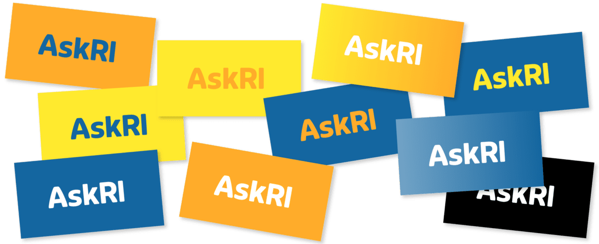
- A logo version for different sizes and applications. Variations might include one with the tagline, one without, one with a mark and typeface, one just the name, one just the mark, the possibilities go on!
- Secondary logo options which may include abbreviations, monograms, or different combinations of the main elements
- When applicable, an internationalized version of the wordmark and tagline
- A color palette that can provide variation while addressing accessibility and situations of low light or high glare
- A fluid typography system that provides contrast between sizes within different size media (including print!)
- A fluid spacing system
- Motion when appropriate, like video intros and outtros
Why Responsive Branding Matters
Your business makes a huge investment in building a brand that stands apart from the competition while communicating your personality and value. You are building trust with customers through every interaction. When your brand works well in one situation but not another, it erodes trust.
A strong brand will be clear, understandable, and memorable for all users in all situations. Whether you have physical locations or digital ones, the brand works with the same consistent strength and message every time.
When you invest in a responsive brand, you:
- Make your brand more visible. More users can connect with you when you have a brand that’s both recognizable and responsive. Given that 60% of consumers are more likely to buy from a brand they recognize, the opportunity cost of not getting this right is huge.
- Improve accessibility. Digital accessibility means people of all abilities can use your website and experience your brand. Up to 1 in 4 American adults live with a disability, so a lack of accessibility means fewer customers to reach. For visual brand elements, that means considerations for color blindness, low vision, and cognitive impairments like dyslexia.
- Create a more consistent brand. Responsive branding equips your team with the tools to express your brand effectively across mediums. That means less time involved in building new assets and a more consistent experience that meets your users’ high expectations.
3 Elements of a Responsive Brand
A responsive brand is more than a shape-shifting logo. The most responsive brands make strategic use of these three elements:
1. Logo
Your logo is the first piece of your brand that customers will recognize. Using a single-state logo can compromise that impression — a logo that looks great at a large scale is often unintelligible as a small icon.
Responsive logo designs help ensure your logomark is clear and impactful no matter where you apply it. Beyond the size considerations we mentioned, it should include different formats like horizontal, vertical, and square to support many different digital, social, and print platforms.
Some other techniques we use to create scalable logos include:
- Dropping words or lettering
- Dropping the icon or image
- Creating an abbreviation version
- Stacking the icon/image and text/lettering
- Combining separate elements into a single icon
- Simplifying details and shapes within logo marks
- Varying thickness and white space to make small logos more legible
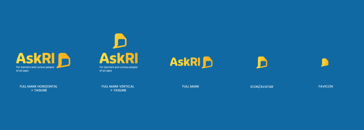
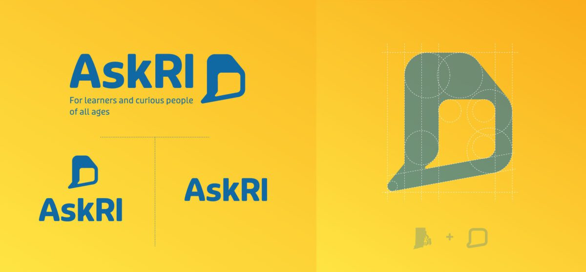
Oomph Tip: It’s okay to take several design rounds to get it right. Iterating helps uncover where you’ll use the logo, what it must convey, and which colors and iconography can best support that purpose. We went through several design iterations with our client AskRI before settling on a bold, simple font and clear chat bubble icon that plays off the state of Rhode Island’s distinctive shape.
Color Palette
A responsive color palette is less about picking complementary shades on a color wheel and more about creating an experience that works in all situations. People with visual impairments and people on low-lit smartphones, for example, rely on high-contrast color combinations to engage with your brand.
Start by following the Web Content Accessibility Guidelines (WCAG), which include specific recommendations for color contrast ratios. Colors that meet that standard include light text with dark backgrounds, or vice versa.
Depending on where your brand appears, you may need to adjust your color palette for different settings. For example, your full-color logo might look stunning against a solid white background but becomes illegible against bright or dark colors. A single color logo is useful for some digital use cases like Windows web icons and iOS Pinned Tabs. In non-digital spaces, single color logos are great when color printing isn’t an option, such as with engraving or embroidery. Build out alternate color variations where necessary to make sure your palette works with you – not against you – across your materials.
Oomph Tip: If your brand palette is already set in stone, try playing with the brightness or saturation of the values to meet recommendations. Often your brand colors have a little wiggle room when combinations are already close to passing corformance ratios. Check out our article about this issue for more pointers.
Typography and Layouts
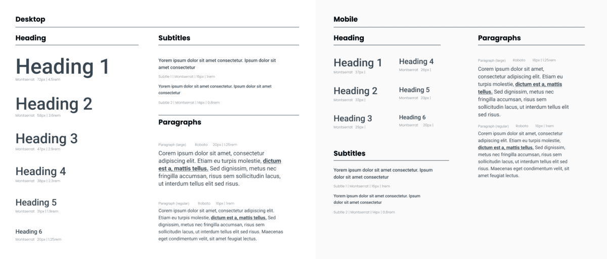
Responsiveness is also important to consider when structuring web pages or marketing collateral. The most legible layouts will incorporate adaptable typography with clear contrast and simple scaling.
When selecting a font, be sure to think about:
- Minimum legible sizes. When is small too small? It depends, of course, but don’t forget older customers, those with low vision, or those in situations that make reading more difficult. Use at least a 16px size for digital products and 12pt size for print. These might change depending on the font, but these sizes are a great place to start.
- Inclusive typefaces. Many designers overlook how understandable certain letterforms appear to be. A way to quickly review is to look at the number 1, lowercase l (L), and uppercase I (i) of any typeface. Then also look at the capital O, the zero, and the lowercase o — 1lI O0o. Can you tell the difference when these characters are out of context? If you can’t, then your customers might have trouble as well. Use your judgment, but also use this trick to expose possible problems with your communication. These five keys to accessible web typography are a great place to start.
- Scaling ratios. Similar to a musical scale of harmonious notes, a typographic scale is a collection of font sizes that work well together. Using a typographic scale helps to make your text visually appealing and readable for different users across different devices. Some examples include exponential scales, where you multiply the previous font size by a ratio to get the next font size, and Fibonacci sequences, where you add a number from the Fibonacci set to the base font value to get a new size in the scale.
Oomph Tip: Don’t go it alone. Tools like Typescale and Material UI’s The Type System can simplify typography selection by recommending font sets that meet usability and scalability requirements. And the U.S. Design System has some suggestions as to which typefaces are the most accessible.
How To Get Started With Responsive Branding
To create a responsive brand that resonates, you first have to identify what elements you need and why you need them. That second part is your secret sauce: finding a balance between a design your users can recognize and one that inspires them.
A design audit can zero in on the needs of your brand and your audience, so you can create a responsive design system that meets both. Not sure where to start? Let’s talk.
Warning: This article mentions domestic abuse.
You may call your site audience your “users,” but ultimately, they’re just people. Imperfect people with imperfect lives — sometimes to an extreme degree.
During the COVID-19 pandemic, there was a massive rise in domestic violence. This type of violence can take many forms, including technical abuse, where technology is used to control, harass, or intimidate someone. It can look different in various situations, from an abuser constantly sending phone or text messages to controlling the sites or devices their partner can access. Even sharing a store rewards phone number can have unintended consequences. The range of opportunities for abuse is endless.
In the book Design for Safety,” author Eva PenzeyMoog cites an NPR survey that found “85 percent of shelters they surveyed were helping survivors whose abusers were monitoring their activity and location through technology.” This is an alarming statistic. Domestic violence prevention isn’t something that is taught in schools — how would people know how to protect themselves before it’s too late?
As professionals creating digital products, it’s our responsibility to create “for good.” How can we be advocates for safety in design? According to Design for Safety, as an advocate, you must “support vulnerable users to reclaim power and control.” A website could have an easy-to-use interface but still provide pathways for users to experience abuse from domestic perpetrators. Ultimately, this leaves victims vulnerable while giving them a false sense that they have more control than they genuinely do.
During the website creation process, you should aim to design for safety. A key step is to identify “ways your product can be abused, then ways to prevent that abuse.” For example, to help address any abuse or harassment captured while on a call, Google Meet has the function to “report abuse.” You can attach a video clip when you report, and they will investigate and then take action on their end. By proactively planning around safety, your organization can deepen trust with users while doing your part to prevent domestic violence.
Case Study
This past year, Oomph worked with a nonprofit website, which helps the general public understand their legal issues, to perform a user experience discovery and redesign. The site provides individuals with low incomes and limited English with local laws written in plain English. Users visit the site for legal information on various topics, including evictions, government benefits, domestic violence restraining orders and family law. A subsection of the audience uses the website to look for resources dealing with domestic violence.
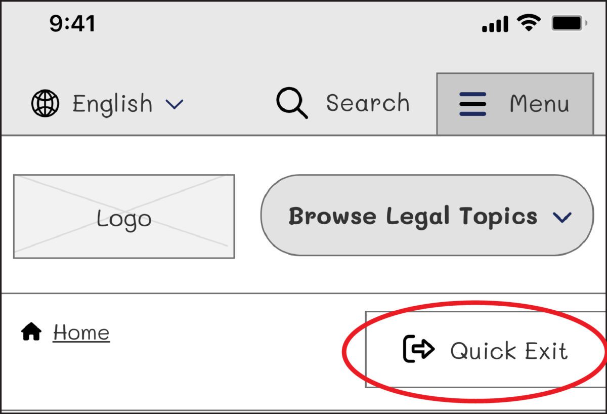
When designing for this audience, we needed a way to support users who may need to exit a page quickly if they are interrupted by a potential abuser while scrolling through sensitive information, such as divorce or domestic violence resources. The site had previously utilized an “Escape” button on pages that dealt with those sorts of topics. When approaching the redesign, we wanted to ensure this button would always appear but wouldn’t interfere with other audiences, such as someone looking for information about traffic tickets. It had to walk a fine line between in-your-face and too subtle to be helpful to ensure users could see and interact with it.
When dealing with “trauma-informed” design, designers must “prioritize comfort over technological trends” (Design for Safety). Our challenge was amplified by a lack of standards for a quick exit button’s function, especially for a site with multiple audiences. Since these buttons are a relatively new best practice and little research on them exists, we were careful in our strategic approach. A quick exit button is not ingrained in a user’s mental model, making its intended action new to most people. Those who feel they might need it have to recognize its function as soon as possible.
Approach to the Quick Exit Button
While designing the quick exit button, we considered its placement, colors, and typographic style to ensure that:
- The button was easy to understand and used by people who needed it,
- The language was not retraumatizing,
- The button wasn’t so big and distracting that it took away from the overall experience of the site for those who didn’t need it, and
- The button’s position was easily accessible on a range of device sizes and types.
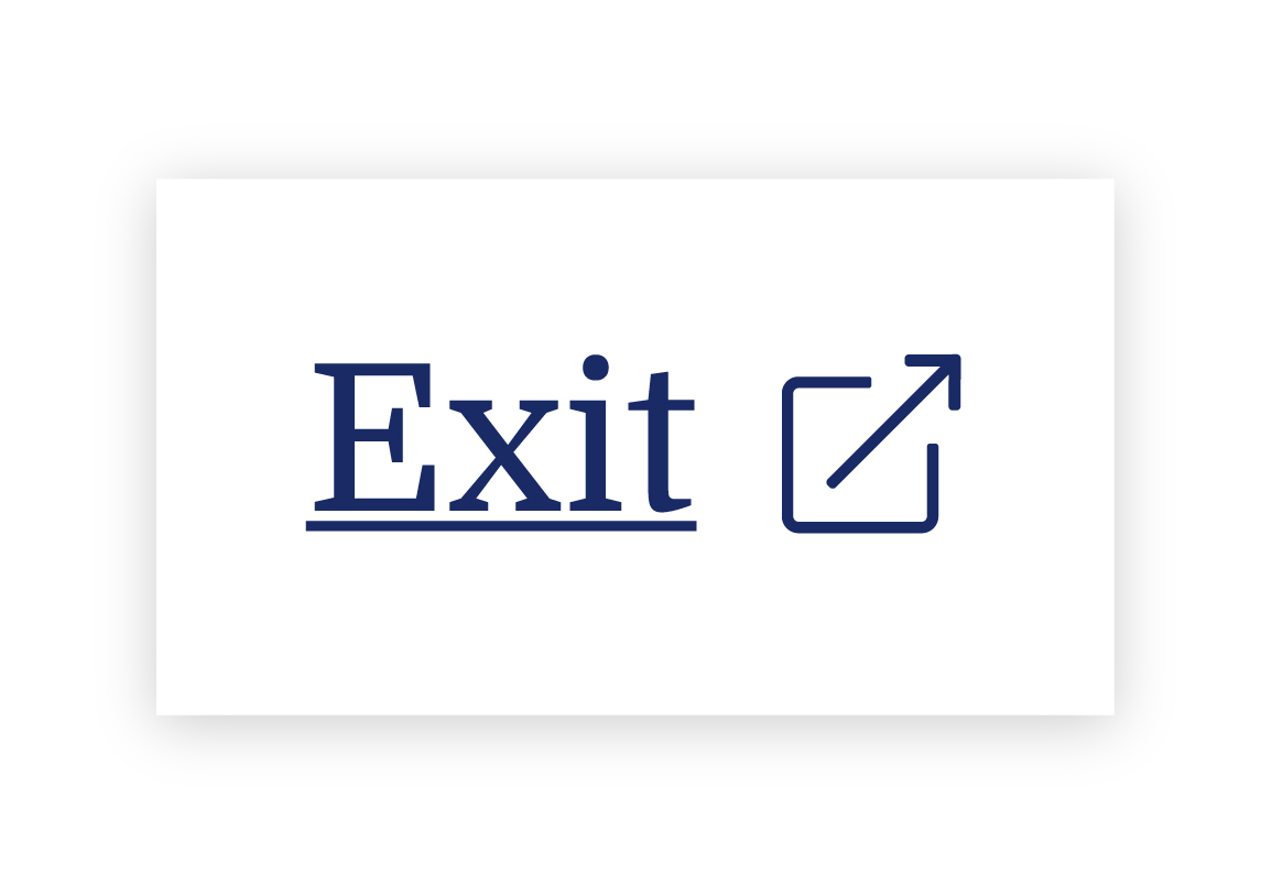
Our first wireframe called the button “Quick Exit.” When we tested the prototype, all five participants did not understand what the exit button meant. This emphasized how important the language on the button is. For those who have dealt with domestic violence, even the word “escape” could be harmful to hear. Additionally, since audiences view the website in different languages, we wanted to ensure that the button’s translation would not adversely affect the layout.
On our next iteration, we tried using the term “Exit” with the icon globally known for “external link.” But this still wasn’t clear enough for our users: Where would the exit bring you? To a page called “Exit”?
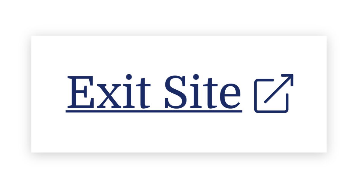
We needed to explain exactly what the button did, so we opted to use the universal external link icon with “Exit Site” as a label to best communicate what the button would do. Although it does not describe where you will end up, it clearly explains that you will leave the website.
To further help users understand what the button was for, we then created a pop-up at the start of the user’s journey that educates people on the button’s purpose:
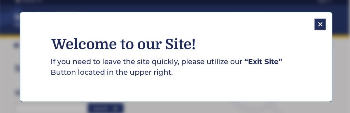
Overall, there was a delicate balance we had to achieve in managing all audiences that typically view the site. We wanted to ensure that we were educating all users but not preventing users from getting help for other topics, such as information about the right to an education or disability. The pop-up, however, had additional considerations we needed to weigh as well: What if their abuser sees it upon landing? What if the user who needs it ignores it?
An alternate approach focused more on domestic violence victims is the California Victims Resource Center’s (CVRC) website, 1800victims.org. When landing on the site, visitors are first educated with a pop-up, which includes reading the website’s Terms of Use and agreeing to the terms before they can enter.
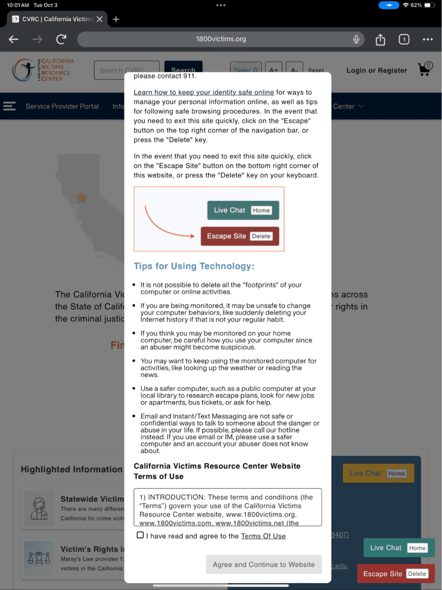
Additionally, when the user clicks the escape button (or uses the keyboard short-cut “Delete”), they are brought to a new tab that displays ABC News. The 1800victims site is changed to Netflix — with all traces of the CVRC gone. According to Columbia Health, this follows best practice because “a blank history can raise suspicion from your abuser.” This would be the safest approach for users.
To give back to the open-source community, the Oomph team turned our approach for this client into the “Quick Exit” Drupal Module. If you would like to add this kind of functionality to your own Drupal website, the module is a great place to start.
Designing for Safety
We must consider how users dealing with domestic violence may feel when they are visiting a site with sensitive content. By including information to educate users upon landing, we can help more people understand how to use a quick exit button if they find themselves in a situation where they need to swiftly leave a website. As an advocate for user safety and domestic violence prevention, you can proactively create a safety net for others by starting to review your work through the lens of how it may be abused prior to releasing it into the world.
This article is just one look at how organizations can design for safety using a quick exit button. By talking about these issues and advocating to protect users in your own design process, we can all take a step toward helping prevent domestic violence. Even if one person is helped or informed by Oomph’s quick exit button design on the website, it will be a success in our eyes.
Need help incorporating safety-focused design into your website or mobile apps? Let’s chat about your needs.
If you or someone you may know is struggling with domestic abuse, please visit or call the National Domestic Violence Hotline at 800-799-7233. For further reading on creating digital products with a safety mindset, we recommend Eva PenzeyMoog’s book Design for Safety available from A Book Apart.
Humans encounter thousands of words every day. As a website owner, that means your site content is vying for your user’s attention alongside emails from their colleagues, the novel on their nightstand, and even the permission slip scrunched at the bottom of their kid’s backpack.
How do you cut through the clutter to create site content that people actually want to read?
While you may already be choosing topics that are the most interesting and relevant for your audience, the structure of your writing may not be optimized for how people read. By understanding your audience’s reading behaviors following best practices for readability and accessibility, you can make sure your content works with people’s natural tendencies – not against them – to create a more engaging digital experience. An added bonus: Google shares many of those same tendencies, so content that’s designed well for humans is also more likely to perform well for organic SEO.
As a digital platform partner to many clients with content-rich sites, Oomph often works with brands to redesign their content for digital success. Here’s a look at the basic principles we apply to any site design – and how you can use them to your advantage.
How People Read Online
When we dive into a book, we typically settle in for a long haul, ready to soak up each chapter one by one. But when we open up a website, it’s more like scanning a newspaper or the entire bookshelf – we’re looking for something specific to catch our eye. We quickly scan, looking for anything that jumps out at us. If we see something interesting, then we’ll slow down and start reading in more detail.
Think of it like an animal following an information “scent,” identifying a mixture of clues that are likely to lead to the content you’re looking for. Most people will decide which pages to visit based on how likely the page will have the answer they’re looking for and how long it’s going to take to get the answer.
Users need to be hooked within a few moments of looking at a website or they’ll move on. They need to be able to identify and understand key factors like:
- The point of the information and why they should keep reading
- Whether they can trust the information and the source
- The type of content provided and any action expected from them, like signing up for an event
- How visually engaging and readable the content is
The takeaway for brands? Writing with your readers’ needs in mind is a way to show them you care and want to help them solve their problem. It’s also the key to achieving your site goals.
Your site content does more than just convey information – it’s about building trust, establishing rapport, and creating a connection that goes beyond the page. Whether you’re trying to sell a product or promote a cause, crafting content around your audience’s needs, desires, and preferences is the most effective way to compel them to take action. Here are four ways to set your website content up for success.
1. Put your data to work.
If you’re looking to refresh your current site, data can help you make informed choices about everything from your content strategy to your layout and design. Use digital reporting tools to answer questions like:
- Is our target audience visiting our site – and are other audiences visiting that we don’t know about yet?
- Which content do visitors download or engage with most frequently?
- What does a typical site visit look like? Are there places where users are getting stuck or bouncing off?
Google Analytics is a go-to tool for understanding the basics of who is visiting your site and how they’re engaging with your content. You can track metrics like session duration, traffic sources, and top-performing pages, all of which can help you better understand what your audience is looking for and what you want to tell them. (If you haven’t made the switch to Google Analytics’ latest platform, GA4, jump-start the process with our 12-step migration guide.)
Additional tools like Screaming Frog and Hotjar can give you even deeper insights, helping you track content structure and real-time user interactions.
2. Create a simple and consistent content structure.
When it comes to site content, consistency is like the foundation of a house (minus the power tools and hard hats).
A well-structured site not only helps users navigate and understand your content more easily, but also enhances the visual appeal and flow of the site. Think of it like a dance floor – you want your users to be able to move smoothly from one section to the next, without any awkward missteps.
That means focusing on shorter sentences, bullet points, and clear subheadings, all backed up by engaging visuals that serve as resting points for the eye. And while you’re at it, don’t forget to declutter your content — users don’t want to wade through a sea of unnecessary words just to find the nuggets of gold.
Ask yourself: Does this content flow smoothly, is it easy to scan, and does it make my key messages stand out? If the answer is yes, then you’re on your way to successful content.
3. Make sure visuals and content play nicely together.
When it comes to enhancing your content with visuals, the key is to strike a balance between style and substance. Your design should complement your content, not compete or distract from it.
Beyond their aesthetic appeal, well-designed visuals are important for creating a sense of credibility with users. Think back to the concept of information scent: If your design looks sloppy or inconsistent, users are less likely to trust the information you’re presenting. So make sure you’re using design elements wisely, creating ample white space, and avoiding anything that makes your content feel like a sales pitch.
4. Focus on accessibility.
When it comes to site content, accessibility can’t be ignored. Content should be engaging and informative and also conform to the , Website Content Accessibility Guidelines (WCAG). Tools like SortSite can help identify these issues and guide you toward accessibility success.
There are a number of things all sites need to consider:
- Using consistent text stylings, including text color, leading, kerning, and tracking.
- Design to support individuals with visual impairments, assistive technology like screen readers, and those that require navigation via the keyboard only
- Following heading orders and grouping content together to make it easier to scan. For example: Following a heading level 2 with a heading level 3 when the ideas are related, but starting with a new heading 2 if changing to a new section of thought.
- Using multiple methods to indicate action items and descriptive text for buttons and alternative text.
- PDFs can be useful, but are also big accessibility red flags, so it’s best to avoid using them when possible. If a PDF is a must, make sure it follows accessibility best practices.
Designing Engaging Content Doesn’t Need To Be a Full-Time Job
If you already have a library of content, auditing the content that already exists can be daunting. And sometimes, you need a little help from your friends. That’s where third-party experts (like us!) come in.
During our website discovery process, we use strategies like content and analytics audits, UX heuristics, and user journey mapping to help position client sites for success. We’ll help you identify areas for improvement, highlight opportunities for growth, and guide you toward achieving content greatness.
Ready for a fresh perspective on your content? We’d love to talk about it.
Have you ever tried to buy tickets to a concert and experienced the frustration and eventual rage of waiting for pages to load, unresponsive pages, unclear next steps, timers counting down, or buttons not working to submit — and you probably still walked away with zero tickets? Yeah, you probably had some choice words, and your keyboard and mouse might have suffered your ire in the process.
As a website owner, you strive to create a seamless user experience for your audience. Ideally, one that doesn’t involve them preparing to star in their own version of the printer scene in Office Space. Despite your best efforts, there will be times when users get frustrated due to slow page loads, broken links, navigation loops, or any other technical issues. This frustration can lead to what the industry calls “rage clicks” and “thrashed cursors.” When your users are driven to these actions, your website’s reputation, engagement, and return visits can be damaged. Let’s dig in to discuss what rage clicks and thrashed cursors are and how to deal with frustrated users.
First of all, what are Rage Clicks?
Rage clicks are when a user repeatedly clicks on a button or link when it fails to respond immediately — the interface offers no feedback that their first click did something. This bad user experience doesn’t motivate them to return for more. These clicks are likely often accompanied by loud and audible sighs, groans, or even yelling. “Come on, just GO!” might ring a bell if you’ve ever been in this situation. Rage clicks are one of the most frustrating things a user can experience when using a website or app.
Rage Clicks are defined technically by establishing that:
- At least three clicks take place
- These three clicks happen within a two-second time frame
- All clicks occur within a 100px radius

Similarly, what is a Thrashed Cursor?
A thrashed cursor is when a user moves the cursor back and forth over a page or element, indicating impatience or confusion. Various issues, including slow page load times, broken links, unresponsive buttons, and unclear navigation, can cause users to exhibit these digital behaviors. It can also indicate the user is about to leave the site if they cannot find that solution quickly.
Thrashed cursors are defined technically by establishing that:
- There is an area on the page where a user was moving their mouse erratically
- An established pattern of “thrashing” occurs around or on specific elements or pages
- Higher rate of user exits from the identified pages
Why do Rage Clicks and Thrashed Cursor happen?
Common reasons rage clicks and thrashed cursors happen are:
- Poor Design: Poor design is one of the most common reasons for rage clicks and thrashed cursors. If the website has a confusing layout or navigation structure, it can be frustrating for users to find what they’re looking for. Or, they may assume an element is clickable; when it’s not, it can be irksome. Underlined text is an excellent example, as users often associate underlines with links.
- Technical Issues: Technical issues such as slow loading times, broken links, or non-responsive buttons can cause rage clicks and thrashed cursors. Users expect the website to work correctly; when it doesn’t, they can become annoyed or frustrated. If they click a button, they expect the button to do something.
- Lack of Clarity: If the website’s content is unclear or poorly written, it can cause confusion and frustration for users. They may struggle to understand the information provided or find it challenging to complete the intended action. Content loops can be a good example of this. Content loops happen when users repeatedly go back and forth between pages or sections of a website, trying to find the information they need. Eventually, they’ll become frustrated, leading to this user leaving the website.

How do you resolve issues that lead to Rage Clicks and Thrashed Cursors?
Now that we know what rage clicks and thrashed cursors are and why they happen, how do you resolve it, you may be asking. Here are a few things an agency partner can help you with that can significantly reduce the risk of your users resorting to these behaviors.
Use Performance Measuring Tools
By employing performance measuring, you can analyze the data collected, gain valuable insights into how users interact with your platform, and identify areas for improvement. For example, if you notice a high number of rage clicks on a specific button or link, it may indicate that users are confused about its functionality or that it’s not working correctly. Similarly, if you see a high number of thrashed cursors on a particular page, it may suggest that users are struggling to navigate or find the information they need.
Tools that support Friction or Frustration measurement:
- Clarity (from Microsoft)
- ContentSquare
- Heap
- HotJar
- Mouseflow
- Quantum Metric
Conduct User Experience Exercises and Testing
Identifying the root causes of rage clicks and thrashed cursors can be done through a UX audit. An agency can examine your website design, functionality, and usability, identifying areas of improvement.
- User Journey Mapping: User journey mapping involves mapping the user’s journey through your website from a starting point to a goal, identifying pain points along the way, and determining where users may get stuck or frustrated.
- Usability Testing: Usability testing involves putting the website in front of real users and giving them tasks to complete. The tester then looks to identify issues, such as slow loading times, broken links, or confusing navigation.
- User Surveys: User surveys can be conducted in various ways, including online surveys, in-person interviews, and focus groups. These surveys can be designed to gather information about users’ perceptions of the website, interactions with the website, and satisfaction levels. Questions can be designed to identify areas of frustration, such as difficult-to-find information, slow page load times, or confusing navigation. It’s wise to keep surveys short, so work with your agency to select the questions to garner the best feedback.
- Heat Mapping: Heat mapping involves analyzing user behavior on your website, identifying where users are clicking, scrolling, and spending their time. This can identify areas of the website that are causing frustration and leading to rage clicks and thrashed cursors.
Focus on Website Speed Optimization
A digital agency can synthesize findings from UX research and performance-measuring tools and work to optimize your website for quicker page loads and buttons or links that respond immediately to user actions.
- Image Optimization: Optimizing images on your website will significantly improve page loading times. An agency can help you optimize server settings and compress images to reduce their size without sacrificing quality.
- Minification: Minification involves reducing the size of HTML, CSS, and JavaScript files by removing unnecessary characters such as white space, comments, and line breaks. This can significantly improve page loading times.
- Caching: Caching involves storing frequently accessed website data on a user’s device, reducing the need for data retrieval and improving website speed.
- Content Delivery Network (CDN): A CDN is a network of servers distributed worldwide that store website data, improving website speed by reducing the distance between the user and the server.
- Server Optimization: Server optimization involves optimizing server settings and configurations, such as increasing server resources, using a faster server, and reducing request response time. Website owners frequently skip this step and don’t select the right hosting plan, which can cost more money through lost users and lower conversions.
Resolve Technical Issues
A web agency can help resolve any technical issues that may be causing frustration for your users. These issues may include broken links or buttons, 404 errors, slow page load times, and server errors. Technical issue resolution can involve various activities, including code optimization, server maintenance, and bug fixes that work to ensure that everything is working correctly and address any issues that arise promptly. The resolution of technical issues will improve website performance, reducing the likelihood of user frustration and rage clicks.
Next Steps
User frustration can negatively impact user satisfaction and business outcomes. Partnering with a digital agency can be a valuable investment to mitigate these issues. Through the use of tools, UX audits, user surveys, website speed optimization, and technical issue resolution, a digital agency can identify and address the root causes of user frustration, improving the overall user experience — leading to an increase in user engagement, satisfaction, and loyalty, which means improved conversion rates, higher customer retention, and ultimately, increased revenue for your business.
If your customers are hulking out, maybe it’s time to call us!
With low-code and no-code development tools, anyone can be a developer. Right?

That depends. While working in low-code/no-code tools may feel like you’ve unlocked the power of the digital universe, there are still many projects that require traditional full-code solutions.
According to Zapier’s recent no-code report, over 50% of no-code users started in the past year, many of whom are self-taught. Industry analysts also expect that by 2025, over 70% of the applications organizations develop will rely on no-code/low-code tools. That’s not surprising, given that these tools lower the barrier to entry – and the cost – of developing new sites and apps.
With a slew of effective low-code/no-code solutions on the market today, the question isn’t whether you should use no-code/low-code tools to evolve your digital footprint. It’s how and when you should use them so that the tools work for your organization, not against it.
What Is Low-Code/No-Code?
There are three ways to build websites or apps: full-code, low-code, and no-code. Developers hold the keys to the proverbial full-code city, but low-code and no-code open the door to people without a coding background.
While it’s tempting to brush off low-code and no-code as “same same but different,” the differences do matter. Understanding what they are and how they work will help you choose the best route for whatever digital property you need to build.
Low-code development
Low-code development uses APIs, drag-and-drop tools, code and process templates, and more to help build websites, apps, and workflows. These tools typically require some coding skills, but nothing like what you’d need to create a full-code solution. That makes it much quicker and easier to create a product using low-code development than writing all of the code from scratch.
No-code development
No-code development uses visual builders and other simple tools that allow people without any coding skills to build digital experiences. Through drag-and-drop, visual flows, and templated plug-ins, you can build something beautiful without having to touch the code at all. They’re one step more accessible than low-code solutions, making them compelling options for organizations that need fast and cost-effective development.
Pros and Cons of Low-Code/No-Code Development
Low-code/no-code tools take a lot of the time, cost, and aggravation out of traditional development – but they’re not a cure-all for your coding challenges. Before you dive in, keep their strengths and limitations in mind.
Pros of low-code/no-code
- Speed to market: Your path to launch is much quicker with low-code/no-code tools. Stand up a simple brochure-style website or multi-step workflow in a matter of hours, rather than weeks or even months.
- Less expensive: Many businesses are on a budget that can’t flex for an experienced developer. Both low-code and no-code tools can deliver an effective product at a fraction of the price. Once you’ve built your site, you can also rely on your internal team to tweak the copy or update an image down the road instead of hiring outside help.
- Expansive options: The low-code/no-code tools on the market have expanded along with their user base. There are more options than ever before, with themes and plug-ins that look so sleek you’d think they were full code.
Cons of low-code/no-code
- Limited customization: You can create something appealing with no-code/low-code options. But will it totally look and feel like your brand? Probably not. Because these tools are designed to be easy to use, they don’t have the custom capabilities you’ll get through coding.
- Somewhat breakable: Low-code/no-code tools do use code, it’s just written and templated by someone else. That means that if you don’t use the features correctly, you can break the code – and you might still have to call in a developer to make important fixes.
- Time intensive: Drag-and-drop may sound simple, but getting it just right can actually be a time suck for people with minimal web dev skills. You may end up spending more time on your site or app than if you hired someone with development experience.
When Should You Use Low-Code/No-Code Tools?
For simple projects where hitting budgets and timelines is more important than highly customized design, low-code/no-code tools can be a great solve. They’re especially good for:
- Proof-of-concept builds: Looking to stand up a site or app for a new product? Rather than spending months on traditional development (and losing precious time in the market), low-code/no-code tools allow you to build the core functionality, test your idea with users, and gain buy-in or funding from key decision-makers. If you pick the right tool, your MVP could even serve as the foundation for a larger build later.
- Creating simple websites and apps: For basic builds like customer portals, knowledge centers, or bug ticketing systems, you don’t need to recreate the wheel. Low-code/no-code tools offer tons of templates that make it easy to launch straightforward digital experiences.
- Updating an existing digital experience: Thanks to the bevy of CMS tools out there, you can hire a developer for an initial build and have them set up CMS functionality for simple updates later. This hybrid approach gives you the freedom to adapt your site or app as your organization evolves, while still maintaining a custom look and feel.
- Reporting dashboards and workflow automations: Need a new setup for your business intelligence? Since dashboards and workflows are mainly built for internal users, achieving a custom look isn’t typically a priority – and options abound for automating virtually any task.
What Should You Look For in a Low-Code/No-Code Tool?
Before you choose a solution, consider whether anyone on your team has basic coding skills. If yes, low-code tools may be up your alley. If not, consider narrowing your focus to the many no-code tools around.
Whichever route you go, look for these features in both low-code and no-code tools:
- An extensive marketplace: Because low-code and no-code solutions aren’t very customizable, look for a tool with robust built-in features. You’ll want to be able to choose from a diverse set of additional features, tools, and pre-built APIs that integrate with any tech you need.
- Integration support: You may need custom code solutions here and there. Make sure the low-code or no-code tool you choose will allow you to add extra code.
- Visual builder tools: With these tools, you’ll be able to edit the user interface and not the back end, which is key if you want an approachable no-code/low-code tool. Look for drag-and-drop capabilities that can be used to create things like data workflow mapping or dashboard building. Without that, you may still need someone with development experience.
- Granular permission systems: Your website shouldn’t be an open door. Look for low-code/no-code tools that allow you to restrict access to certain apps and data sets by assigning different permissions to different users (administrators, edit access, view-only, etc.).
When Should You Bring in an Agency To Build a Full-Code Solution?
Sometimes, only a custom or full-code solution will do. The more unique you want your digital property to be, the more likely it is that you’ll need to call in an expert. We also suggest you look for support if:
- You have a complex digital environment: If you need a site with hundreds of pages or a multisite architecture, you’ll probably need a custom solution to get the results you’re looking for.
- You need a custom feature: Low-code/now-code tools aren’t bottomless wells of features and plug-ins. If you need a unique-to-you feature or integration that isn’t readily available, it’s time to call in someone who can build one.
- You need a custom user interface: Cookie-cutter templates won’t work for all brands and products. If you need a specific user interface, you may not be able to achieve that within even a low-code platform.
- You want the product to be proprietary: Low-code/no-code products must be hosted within a specific low-code/no-code platform. You’ll need a custom, full-code solution if you want to own the product and sell it as a proprietary tool.
Get Help Leveraging the Right Tools for the Right Projects
You wouldn’t build a house on shaky ground, would you? Then why build an experience on a platform that might not actually be able to support it?
Though no-code/low-code tools certainly democratize the web development market, they aren’t a silver bullet. If you know that whatever you’re building is simple enough that a no-code/low-code tool and your existing team can support it, we say go for it.
But if you’re even a little uncertain, consider getting an outside opinion on how to lay a strong foundation for your next development project.
Want help deciding whether no-code, low-code, or full-code is best for you? We’d love to talk with you about your needs.
Among enterprise-scale organizations, from healthcare to government to higher education, we’ve seen many content owners longing for a faster, easier way to manage content-rich websites. While consumer-level content platforms like Squarespace or Wix make it easy to assemble web pages in minutes, most enterprise-level platforms prioritize content governance, stability, and security over ease of use.
Which is a nice way of saying, sometimes building a new page is as much fun as getting a root canal.
That’s why we’re excited about Site Studio, a robust page-building tool from our partners at Acquia. Site Studio makes content editing on Drupal websites faster and more cost-effective, while making it easy for non-technical users to create beautiful, brand-compliant content.
In this article, we’ll explain what Site Studio is, why you might want it for your next Drupal project, and a few cautions to consider.
What is Site Studio?
Formerly known as Cohesion, Site Studio is a low-code visual site builder for Drupal that makes it easy to create rich, component-based pages without writing code in PHP, HTML, or CSS. Essentially, it’s a more feature-rich alternative to Drupal’s native design tool, Layout Builder.
How does Site Studio work? Site developers lay the groundwork by building a component library and reusable templates with brand-approved design elements, such as hero banners, article cards, photo grids, buttons, layouts, and more. They can either create custom components or customize existing components from a built-in UI kit.
Content editors, marketers, and other non-technical folks can then create content directly in the front end of the website, using a drag-and-drop visual page builder with a full WYSIWYG interface and real-time previews.
Who is Site Studio For?
In our experience, the businesses that benefit most from a powerful tool like Site Studio tend to be enterprise-level organizations with content-rich websites — especially those that own multiple sites, like colleges and universities.
Within those organizations, there are a number of roles that can leverage this tool:
Content owners
With Site Studio, marketers and content editors can browse to any web page they want to update, and edit both the content and settings directly on the page. Rewriting a header, swapping an image with a text box, or rearranging a layout can be done in just seconds.
Site builders
Using Drupal’s site configuration interfaces and Site Studio’s theming tools, site builders can easily create Drupal websites end-to-end, establishing everything from the information architecture to the content editing experience.
Brand managers
Managers can define site wide elements, like headers and footers or page templates, to ensure that an organization’s branding and design preferences are carried out. They can also create sub-brand versions of websites that have unique styles alongside consistent brand elements.
IT and web teams
By putting content creation and updates in the hands of content authors, Site Studio frees up developers to work on more critical projects. In addition, new developers don’t need to have expert-level Drupal theming experience, because Site Studio takes care of the heavy lifting.
What Can You Do With Site Studio?
Site Studio makes it easy to create and manage web content with impressive flexibility, giving content owners greater control over their websites without risking quality or functionality. Here’s how.
Go to market faster.
Site Studio’s low-code nature and library of reusable components (the building blocks of a website) speeds up both site development and content creation. Creators can quickly assemble content-rich pages, while developers can easily synchronize brand styles, components, and templates.
Site Studio provides a UI Kit with around 50 predefined components, like Text, Image, Slider, Accordion, etc… Developers can also build custom components. Change any component in the library, and all instances of that component will update automatically. You can also save layout compositions as reusable ”helpers” to streamline page creation.
Build beautiful pages easily.
While we love the power and versatility of Drupal, its page building function has never been as user-friendly as, say, WordPress. Site Studio’s Visual Page Builder brings the ease of consumer-level platforms to the enterprise website world.
This intuitive, drag-and-drop interface lets users add or rewrite text, update layouts, and change fonts, styles, colors, or images without any technical help. And, it’s easy to create new pages using components or page templates from the asset library.
Ensure brand consistency.
With Site Studio, you can define standards for visual styles and UI elements at the component level. This provides guardrails for both front-end developers and content creators, who draw on the component library to build new pages. In addition, Site Studio’s import and sync capabilities make it easy to enforce brand consistency across multiple sites.
Get the best out of Drupal.
Because Site Studio is designed exclusively for Drupal, it supports many of Drupal’s core features. With Site Studio’s component library, for instance, you can create templates for core content types in Drupal. Site Studio also supports a number of contributed content modules (created by Drupal’s open-source community), so developers can add additional features that are compatible with Site Studio’s interface.
What Are Some Limitations of Using Site Studio?
There’s no doubt Site Studio makes life easier for everyone from marketers to web teams. But there are a few things to consider, in terms of resource costs and potential risks.
Start from the ground up.
To ensure the best experience, Site Studio should be involved in almost all areas of your website. Unlike other contributed modules, it’s not a simple add-on — plan on it being the core of your Drupal site’s architecture.
This will let you make decisions based on how Site Studio prefers a feature to be implemented, rather than bending Drupal to fit your needs (as is often the case). Staying within Site Studio’s guardrails will make development easier and faster.
Be careful with custom components.
With its recent Custom Components feature, Site Studio does let developers create components using their preferred code instead of its low-code tools. So, you can create a level of custom functionality, but you must work within Site Studio’s architecture (and add development time and cost).
If you decide instead that for a given content type, you’re going to sidestep Site Studio and build something custom, you’ll lose access to all its components and templates — not to mention having to manage content in different systems, and pay for the custom development.
Rolling back changes is tough.
A standard Drupal site has two underlying building blocks: database and code. Drupal uses the code (written by developers) to carry out functions with the database.
When a developer changes, say, the HTML code for a blog title, the change happens in the code, not the database. If that change happened to break the page style, you could roll back the change by reverting to the previous code. In addition, most developers test changes first in a sandbox-type environment before deploying them to the live website.
By contrast, with Site Studio, most changes happen exclusively in the database and are deployed via configuration. This presents a few areas of caution:
- Users with the correct permissions can override configuration on a live site, which could impact site functionality.
- Database changes can have far-reaching impacts. If you have to roll back the database to fix a problem, you’ll lose any content changes that were made since the last backup.
That’s why Site Studio requires meticulous QA and careful user permissioning to prevent inadvertent changes that affect site functionality.
One Last Thing: You Still Need Developers
While it’s true that just about anyone in your organization can create pages with Site Studio’s intuitive interface, there are still aspects of building and maintaining a Drupal website that require a developer. Those steps include:
- Setup and implementation of Site Studio,
- Building reusable components and templates, and
- Back-end maintenance (like updates, compliance, and security).
However, once the components have been built, it’s easy for non-technical content owners to create beautiful pages. In the end, you’ll be able to launch websites and pages faster — with the creativity and consistent identity your brand deserves.
Interested in learning whether Site Studio is a good fit for your Drupal website? Contact us for more info.
Not a lot of people get excited about creating an annual report. Yay! Let’s dive into last year’s operational metrics! If you and your colleagues fall into that camp, this statement should help stoke a little enthusiasm:
A compelling annual report can make the difference in reaching your goals for the coming year — and maybe even exceeding them.
Your annual report (also known as an “impact report” at many nonprofits) can be pivotal in earning the trust and support of key stakeholders. Read on to learn how a strong story, good design, and the right format can transform your company data into an invaluable outreach tool.
Why the Quality of Your Annual Report Matters
A good annual report communicates more than just financial performance and forecasts. It provides stakeholders with a deeper understanding of what you do, why you do it, and how well you do it — and gives them a reason to trust, invest in, and/or work with your brand.
This is crucial for nonprofits that rely heavily on fundraising or volunteers, or for-profit companies that need to attract and retain investors and employees. In the health and wellness sector, it’s a key opportunity for organizations to show how they’ve followed through on their commitments to contribute to the health and wellness of communities.
With an engaging design and thoughtful content, an annual report can be a powerful tool for fundraising, marketing, and recruiting. Done well, it’s also a good way to strengthen your brand reputation.
By contrast, a poorly done annual report can downplay your strengths and successes. It can also diminish your brand image, particularly if your website and other channels are more thoughtfully designed. In that case, the annual report may feel like an afterthought to readers who rely on its information.
How Your Annual Report Can Engage Key Audiences
While current and potential donors or investors tend to be the primary audiences for annual reports, there are a number of other stakeholders to take into account. Employees, customers, alumni, partners, and community leaders are all part of the ecosystem that benefits from, and drives value for, your organization.
Creating a multi-faceted report with content that speaks to different audiences can help you earn the trust and support of a range of key stakeholders. Here’s how.
Strengthen your investor or donor base
With an easy-to-digest record of accomplishments and impact, your annual report can help convince current and potential donors, sponsors, or investors that your organization is a solid investment. It’s also a great way to recognize those who helped you achieve your goals over the year or to reconnect with disengaged supporters.
Motivate your employees or volunteers
An engaging report can congratulate your team on their wins and highlight the innovation, commitment, and cooperation that underpin your success. By showing people how their work affects everything from stock value to community impact, you’ll reinforce why the work they do every day makes a difference and how they fit into the bigger picture.
Capture more customers or clients
Whether they’re buying your products or receiving the benefits of your services, most people want to do business with brands that genuinely care about them. Your annual report can include stories and visuals that showcase your mission and core values, as well as highlighting initiatives that put customers or clients first.
Enhance vendor or partner relationships
External partners want to know what they can expect from you and what’s expected of them — and just about everyone wants to feel appreciated. Your annual report can leverage data to show your financial strength and longevity while highlighting the level of quality and commitment you expect from vendors and partners. It can also spotlight those who went above and beyond, reinforcing those relationships.
6 Best Practices for an Engaging Annual Report
It’s not easy to distill an entire year’s worth of data into a single report that’s digestible, engaging, and convincing. The best annual reports tend to combine clear and purposeful storytelling with a little creativity.
Choose a unifying theme
One of the best ways to craft a cohesive narrative for your annual report is to choose an overarching theme and create relevant content around it. Centralizing your accomplishments around a main message will keep the report focused and better support your core objectives.
Some organizations anchor their reports by opening with their mission statements. Others use marketing-driven catchphrases like “Poised for the 21st Century.” We love the 2021 annual report from AIDS Foundation Chicago — it’s built around the theme “A Better Normal,” opens with a leaders’ letter, and includes a list of strategic priorities linked to different report sections.
Use visual elements to express impact
It’s easy for a message to get lost if it’s not presented in the right way. Design matters! Use things like photos, infographics, and other visual elements to bring your goals and successes to life. This will also help keep readers engaged with your content. In a nutshell: aim for more visuals and fewer words.
The Blue Cross Blue Shield of Rhode Island 2021 Annual Report does a great job of using impactful imagery and colorful visuals to illustrate their mission and key accomplishments.
Make it interactive
At the end of the day, you want people to read what you’ve put together. One of the best ways to keep readers engaged is to create an immersive experience with interactive features. Let your audience click through slides, watch videos, or expand graphics for more information.
TOMS’s 2022 Impact Report combines videos and dynamic visuals with lots of clickable content to cover a ton of info without making readers wade through long blocks of text.
Create a web page, not a PDF
While PDFs are easy to share online or in print, they can be clunky to interact with, they’re hard to read on mobile, and they’re notoriously inaccessible.
Here are some important advantages to building a web page instead:
- Web pages can be optimized for different digital devices
- You can use SEO techniques to help increase exposure
- They can easily meet diverse accessibility needs
Plus, since they’re native to web browsers, web pages make it easier for readers to navigate to additional resources or take action. And, well, PDFs just aren’t as much fun to scroll through as the 2020 Mailchimp Annual Report.
Employ data visualization
Numbers alone are easy to skim right over. Visual representations of data, however, get readers to think about the content in a more constructive way, like identifying trends or significant changes. Visualizations also help transform complex data into easy-to-understand information that’s more enjoyable to read.
Start Network’s 2019 Annual Report shows how to use color, graphics, and animation to bring life to your data.
Connect the data to real people
This is especially important for nonprofits and for-profit social enterprises, where it’s crucial to convey the impact of your work. You can humanize facts and data — and make an emotional connection with readers — by including stories and images showing how your product or service impacted the lives of real people.
For a wonderful example of how to incorporate real stories, check out Fairtrade Foundation’s 2019 Annual Report.
Why It’s All Worth It
Think about all the marketing and outreach methods your team uses to attract support for your organization. Of all those methods, the annual report provides a unique chance to showcase the full breadth of your value and impact. To unabashedly brag about yourselves, if you will.
For health and wellness organizations in particular, an annual report is a great opportunity to share community impact over the past year and highlight important investments or initiatives that impact the health and lives of the individuals they serve.
Is it a significant investment? It can be. But if you invest in making your annual report as engaging and compelling as possible, it can pay for itself by helping to fulfill your fundraising or recruitment goals — and spotlighting the crucial role your organization plays in the world at large.
Need help crafting your next annual report? Reach out to us today.