
Drupal has long been known for its flexibility, robustness, and scalability. But for many marketers and content creators, that flexibility can come with a steep learning curve — especially when it comes to building layouts and managing design without the help of a developer. That’s about to change in a big way.
Enter Experience Builder, a new initiative in Drupal that promises to radically streamline and simplify how we build and design pages. While still in its early stages, Experience Builder is ready for testing and experimentation — and it’s something marketers should absolutely have on their radar.
What is Experience Builder?
Experience Builder is the evolution of Drupal’s current method of flexible page building called Layout Builder. It takes what we know from layout builder and expands it into a unified, user-friendly tool that allows non-developers to build and theme websites directly in the browser. It’s a huge leap toward making Drupal more accessible for site builders, marketers, and content creators alike.
Unlike other page builders, Experience Builder doesn’t just provide drag-and-drop layout tools. It leverages Drupal’s core strengths — structured data, fine-grained access controls, and reusable components — to ensure consistency across channels and scalability across enterprise-level websites. This makes it uniquely powerful for large organizations managing multiple digital properties.
Dries Buytaert, Drupal’s founder, described it as a response to the fragmented landscape of site-building options in Drupal today. The vision is to consolidate functionality from tools like Paragraphs and Layout Builder into a single, cohesive solution. One that’s intuitive, efficient, and packed with modern capabilities.
Here is a fantastic video demo from DrupalCon Atlanta that was shown by Dries during the keynote address:
Why Now?
The timing couldn’t be better. While Layout Builder was a step in the right direction when it launched in 2018, its limitations became clear as more site builders demanded easier workflows, styling tools, and richer content composition features.
At recent Drupal conventions, the community has rallied around the idea of enhancing user experience across the board. As part of the broader Starshot initiative (now named Drupal CMS), Experience Builder is a key component in bringing Drupal’s usability in line with the expectations of modern content teams.
Why I’m Excited About It
As an engineer who has worked closely with Drupal for years, what excites me most is how Experience Builder can bridge the many gaps in Drupal’s current page-building ecosystem. Today, there are so many ways to structure content — Blocks, Paragraphs, Layout Builder, Panels — that choosing the right one can be overwhelming.
Experience Builder is shaping up to be that “one-stop-shop” we’ve needed. It reduces decision fatigue and gives teams a faster way to get projects off the ground without needing to architect every page structure from scratch.
Even better, it supports creating single-page overrides, component-level editing, and even React-based components right in the editor. That’s something I’ve personally looked forward to for a long time. The ability to build and save reusable components that can be dropped into any page makes this a tool that truly enhances productivity — not just for developers, but for marketers and content creators, too.
My First Look
I had the chance to see Experience Builder in action at DrupalCon Atlanta this year. The live demos were impressive and really opened my eyes to what this tool could do, both for newcomers to Drupal and seasoned site builders. Along with Drupal CMS, and recipes, Experience Builder is easily one of the hottest topics in the Drupal ecosystem right now.
The energy in the room during the sessions was palpable—people are genuinely excited about this. It’s not just another experimental module; it’s a shift in how we think about building on Drupal.
A Game-Changer for Marketers
One of the biggest barriers for marketing teams has always been reliance on developers to make even small layout edits. That’s starting to change.
With Experience Builder, non-developers will be able to build out dynamic, visually engaging pages — without needing to dive into code. That’s a massive win, especially for small teams in government, education, or nonprofit sectors, where resources are limited and time is of the essence.
Being able to make changes quickly, reuse content intelligently, and maintain a consistent brand without touching a template file is something many organizations have wanted for years. Experience Builder delivers on that promise.
Want to Try It Yourself?
If you’re curious to see what the buzz is about, the best way to get started is simple: head to Drupal.org and download the latest version of Drupal CMS. It now comes with an optimized installer that makes getting started faster than ever. Once you’re up and running, you can add the Experience Builder module and start exploring.
Looking Ahead
It’s important to note that this is just the alpha version of the Experience Builder initiative. The team behind it is committed to rapid iteration and community feedback, which means what we’re seeing today is just the beginning.
If this is the foundation, I can only imagine how powerful the tool will become in the next year or two. The Drupal community is known for its collaborative spirit and constant innovation — and Experience Builder is shaping up to be one of the most important steps forward in years.
So if you’re a marketer, content strategist, or anyone who’s ever been frustrated by the limits of page building in Drupal — now’s the time to dive in. Experience Builder is here, and it’s ready to change the game. Contact us for a demo or more information about Experience Builder in Drupal.
The Brief
Less can be Much More
The previous Foundation Medicine (FMI) team built their marketing platform on a decoupled content management architecture. Oomph has used decoupled and micro-service architecture for projects such as Leica Geosystems and Wingspans.
But decoupled is not right for every organization, and a decoupled approach can be architected in many different ways. FMI had found their implementation created more headaches than high-fives:
- The flat hierarchy of Contentful created 158 content types, most of which were not useful for creating content.* Therefore, authors had to sift through long lists to find the actual content they needed to edit or create.
- Not everything in their front-end templates was accessible through the CMS. (That would have created even more content types!) So the team was beholden to an engineer to make text edits within some areas.
- Previewing new pages before publishing was not added to their implementation. Authors struggled to predict how content in the admin would display as the published page, and spent much time toggling back and forth.
In short, publishing new content or making content edits was too slow. Responding quickly to changing market conditions or new announcements in the cancer treatment space was not possible, eroding reliance and trust in what should be a cutting-edge brand.
* It should be noted that Contentful uses a “Content Type” for almost everything, from content to taxonomy to design components.
The Approach
Moving away from Decoupled
Based on their current pain points, Oomph verified that switching to a traditional “monolithic” architecture would solve their problems and provide additional benefits:
- Reduce cognitive overload and maintenance overhead by drastically reducing content types
- Empower authors to update all content anywhere
- Accelerate content publishing with an accurate visual preview
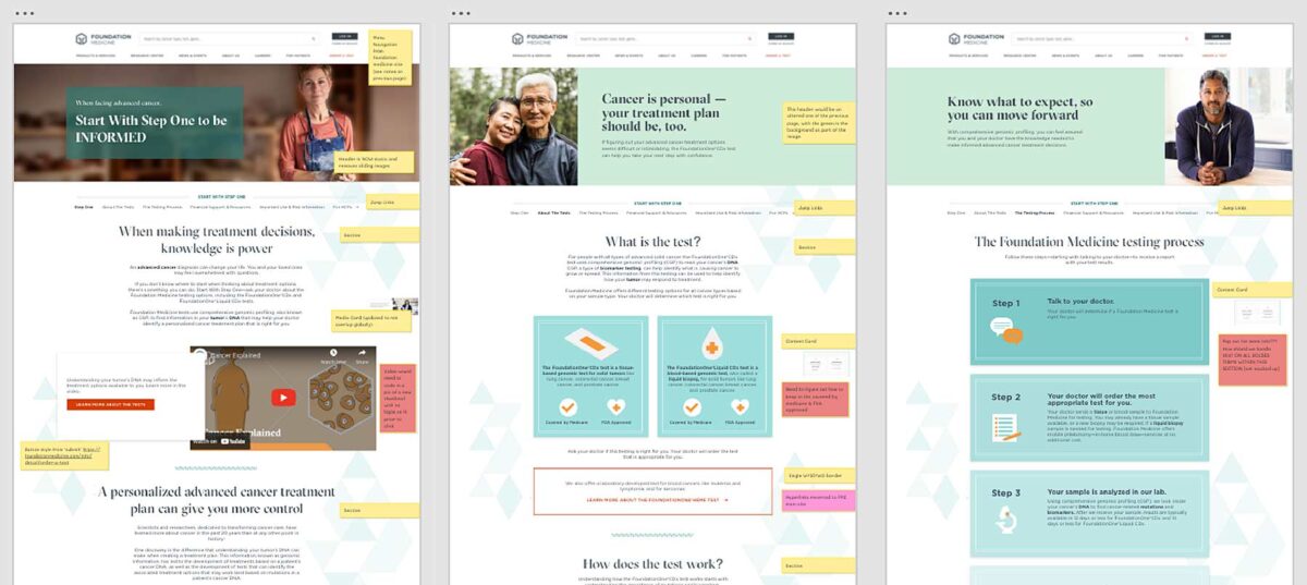
Oomph completed an extensive audit and reduced content types from 158 down to 30. We created a tight, flexible system in Drupal of just 14 content types — news item, event page, product page, etc. — and 16 design components — text blocks, accordions, etc.
How did we achieve such a reduction? Our consolidation approach moved from fewer specific options (one thing for a small number of very specific pieces of content) to flexibility within general ones (one thing to support many pieces of content with specific options).
Retaining Key Functionality
Foundation Medicine exists to help people with cancer and those who treat them. To accomplish this, the website features intricate tools for providers to navigate essential cancer resources and patients to find a specialist. None of these tools were compromised by switching to Drupal. In fact, with efficiency gains and more timely content governance, these resources became more valuable.
The Results
Connecting Providers with Genomic Data and Patients with Personalized Care
The upgrade to Foundation Medicine’s digital platform has been invisible by design. The brand and the visuals were performing well for their business and were comfortable for their audience. The outward appearance didn’t need an update, but the internal workflows that support continued trust certainly did.
The Foundation Medicine team now has the autonomy to make content updates quickly, the architecture and design components to confidently curate each page build, and the infrastructure to create clear and consistent content — a win for the team and for the many people who turn to Foundation Medicine in their time of need.
Page Views
Scroll Depth
User Engagement
The Brief
Oomph has worked with Lifespan since 2010 and created the second version of their intranet on Drupal 7. A critical tool like an intranet needs regular maintenance. Even with regular updates, there comes a time when the whole platform needs a re-architecture to be flexible, secure, and performant.
In 2021, it was time to plan the next phase of the intranet on Drupal 9. Lifespan used the redesign as an opportunity to realign the employee journeys with the evolution of their work. And COVID-19 had provided an opportunity to reevaluate whether a security-first, HIPAA-compliant intranet could be available to those working from home.
Departments
Job & Clinical Tools
Staff Contacts
Critical Top-Tasks
The Oomph team ran a Discovery and research phase to gather requirements and understand employee expectations. We ran workshops with client stakeholders, identified important work tasks and created 5 employee personas, conducted one-on-one interviews with key persona types, and gathered feedback from employees with an online and email survey.
Through this research, we started to see two different types of tasks emerge: those that required speed to a destination and those that required exploration and unstructured browsing.
Tasks requiring speed to completion:
- Access health and safety policies
- Access a staff directory and immediately contact high-value individuals
- Access job tools, which are often 3rd-party digital services, for everything from timesheets to diagnostics to general education
- Access online forms to request items and services
- Access HR and employment benefits
Tasks requiring unstructured browsing:
- Access Department sites, particularly my department for relevant news & events
- Be exposed to company culture through up-to-date news and events, videos, seminars, and important business announcements or press coverage
- Access the internal job board to find advancement opportunities
- If I am a new employee, or a new manager, access onboarding material and quick links for new individuals
- Visit and browse the Bulletin Board
It became clear through our process that Lifespan employees needed to move quickly and slowly, often in the same session, depending on the important tasks they needed to complete. The intranet needed to support both types of journeys to remain a successful platform for getting work done and absorbing company culture.
The Approach
A Focused Priority on Search
Expectations about fast and accurate search are high because of you know who. When designing search for an employee intranet, the baseline requirements are even higher. We knew that we had to get the design and implementation of search right.
We took a learn-once, use-everywhere approach when it came to search interfaces. Search would be a core part of finding many types of content — tools, forms, people, departments, locations, and more. Each had to have a similar structure and set of filtering options to be the most useful.
The list of tools, locations, or people needed smart defaults. Before someone conducts their own search, each screen displays popular searches and the common content people need to access. In some cases, an employee does not even need to search in order to find what they need.
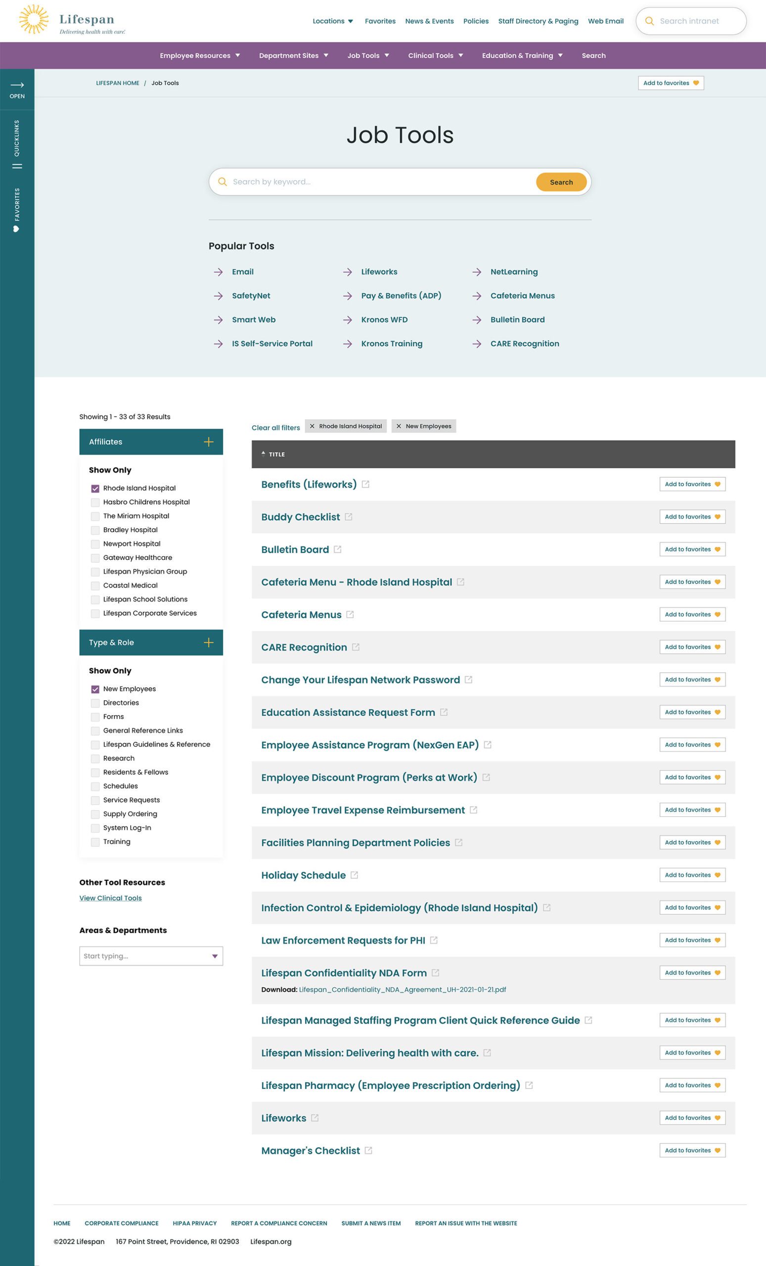


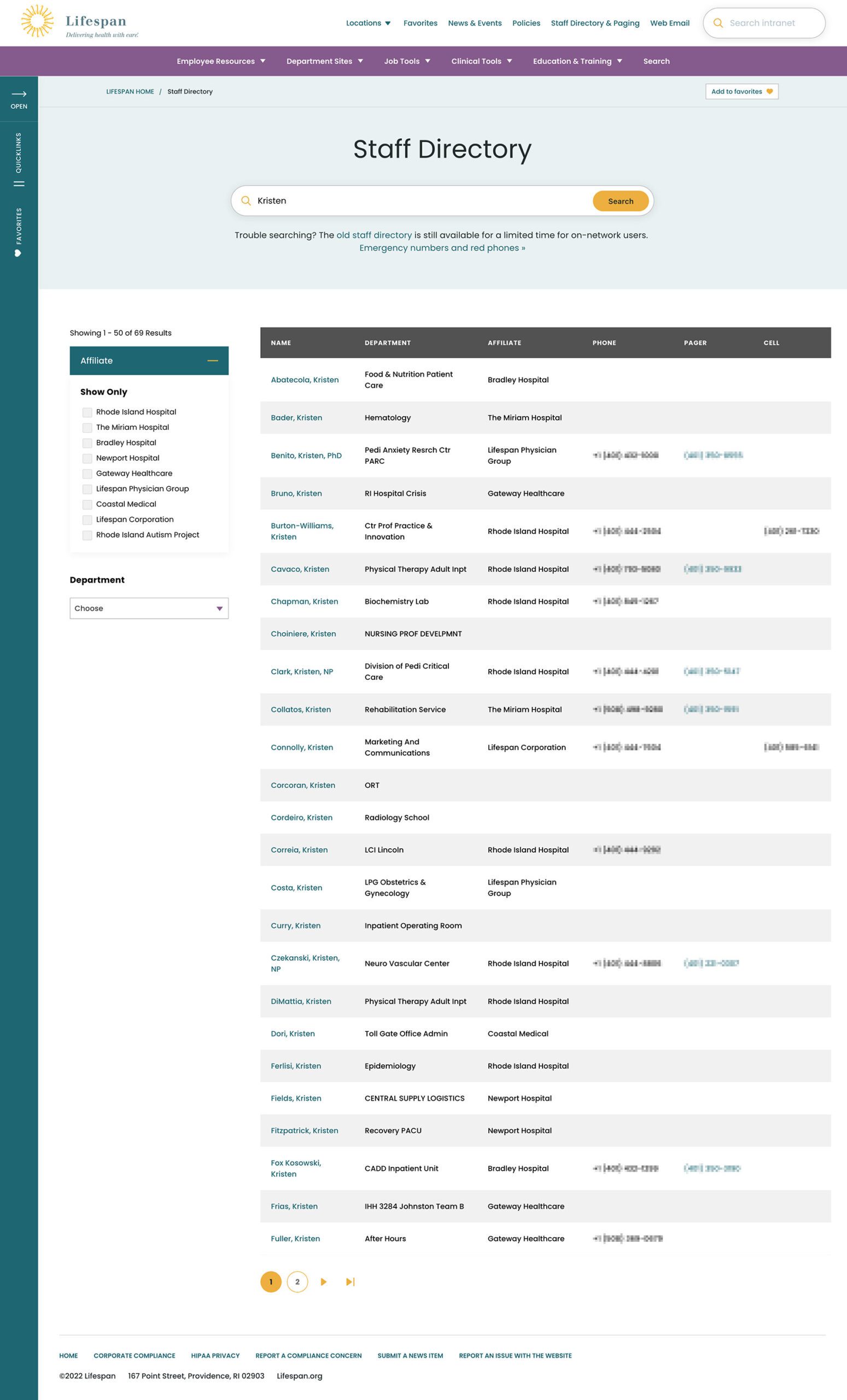
Two search pages, similar interfaces: The Job Tools search and Staff Directory follow similar patterns, adhering to our “learn once, use everywhere” rule
Personalization that follows Employees from Device to Device
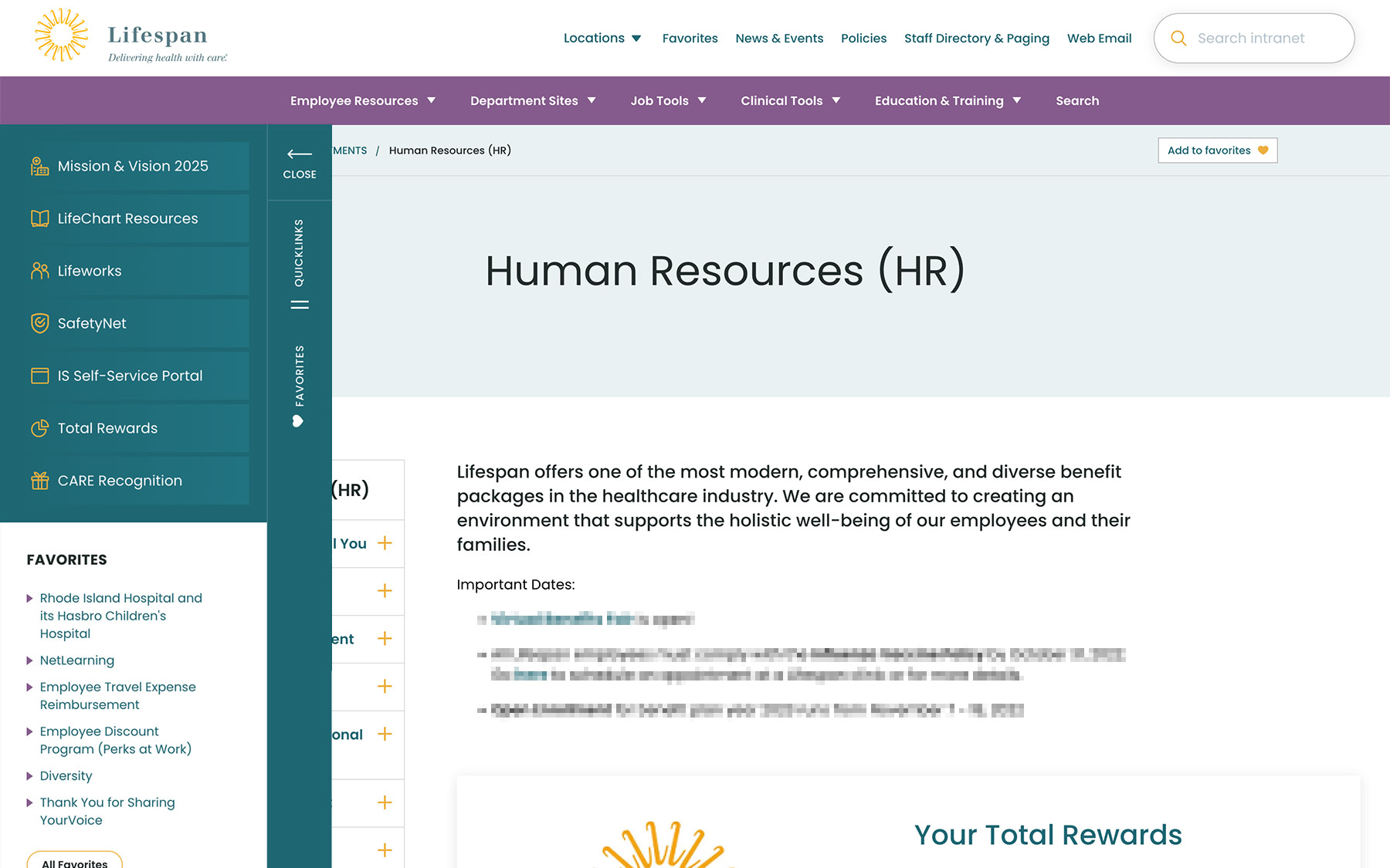
Personalization had to be a part of our solution as well. Employees are able to use S.S.O. to access the intranet from their personal devices or workstation computers in the hospitals. Workstations are often shared between multiple clinical staff, therefore, our system needed to support stopping one task on on device and picking it back up on another.
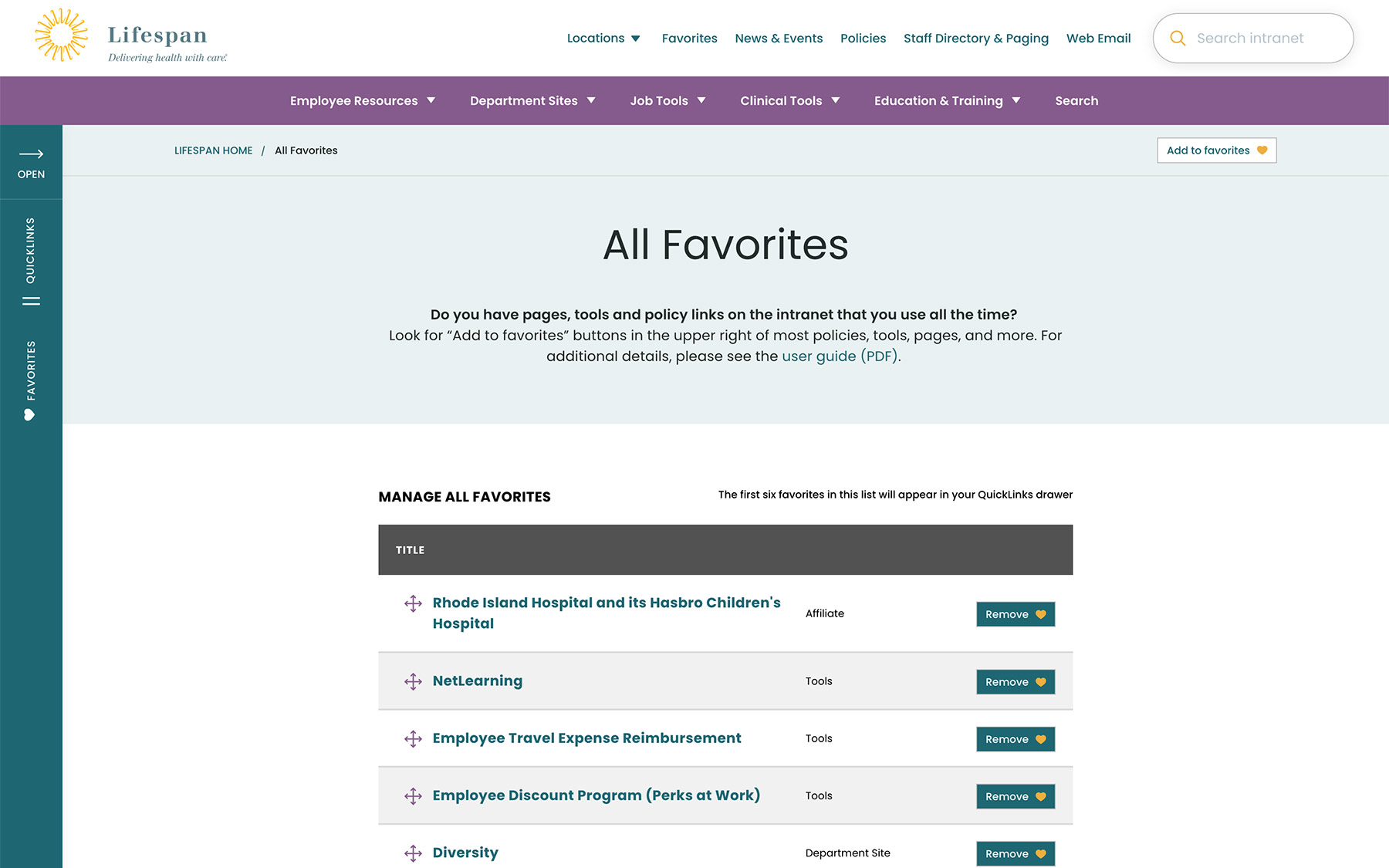
A Favorites feature allows employees to create their own transportable bookmarks. Almost everything on the site can be bookmarked, reducing the need to search for commonly used content and tools. Six custom favorites are available from the left drawer at all times, while the entire list of favorites is one more click away.
Supporting Speed and Engagement
Speed is at the heart of critical tasks and high-quality patient care. A nurse, at a shared workstation, needs to log in quickly, find the tool they need, and administer care. Time is critical. They don’t want extra clicks, a search that doesn’t work intuitively, or slow page load times. Staff don’t want it, and management doesn’t want it, either.
Engagement is slower and the intention is different. Speed is for tasks. Engagement is for exploring. This is how company culture is communicated and absorbed. This is when people catch up with department and company news, find events to attend, view a photo gallery from an event they missed, or browse a bulletin board to swap items with other employees. You can’t have an intranet that is ALL business just like you can’t have an intranet that is NO business.
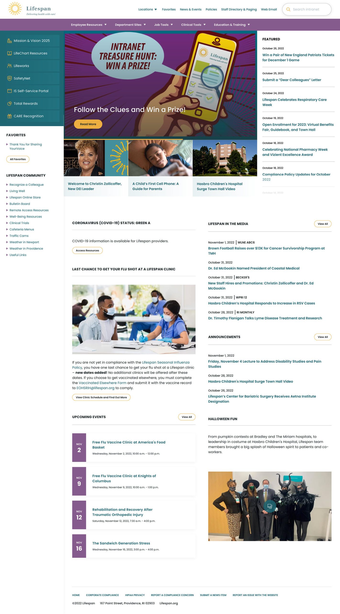
A Dashboard Built for Speed or Browsing
On the starting page, an employee might be in need for something immediate or might have time to explore. We do not know their intention, therefore, this page needs to support both.
The left drawer is open to employees on the dashboard. It is open to show them what it contains and to remove a click when accessing the important common destinations within. The first seven links are common items for any employee, curated by the Lifespan team. They are a mixture of tactical items — like time sheets — and company culture items — like the CARE recognition program.
Below that are the employee Favorites. The first six favorites are shown while all are available with an extra click.
The top navigation supports speed to common destinations, some of which are search interfaces and others which are built for browsing.
The rest of the page showcases engagement and company culture. Featured news stories with images are balanced with quick news and event lists. Flexible content sections allow authors to add and remove content blocks as new items are required.
Other content pages that were focused on engagement are the deeper News and Events pages, customized Location pages (for each major hospital location), and a community Bulletin Board.
The Results
Smooth Onboarding and Acceptance
No matter how confident our teams were, we didn’t really know if the redesign was a success until employees moved from the older tools they were familiar with. The Lifespan team did a fantastic job creating walk through videos ahead of the launch. Old tools and directories stayed available for a period of overlap, but our teams saw quick adoption into the new tools in favor of the familiar.
Since the intranet is now available off of the closed Lifespan network, we have seen mobile traffic increase dramatically. The responsive design is an improved experience over the previous intranet and the numbers prove it. In fact, we have found that more employees engage in company culture content on their personal devices, while using the company workstations for their tasks.
Oomph is very proud to have worked with one of the largest private employers in the state, and we are very proud to have our work used by over 17,000 people every day. Oomph continues to support the Lifespan team and the intranet project, iteratively improving the features and evolving the toolset to be effective for all.
The Brief
New Drupal, New Design
Migrating a massive site like healthdata.org is challenging enough, but implementing a new site design simultaneously made the process even more complex. IHME wanted a partner with the digital expertise to translate its internal design team’s page designs into a flexible, functional set of components — and then bring it all to life in the latest Drupal environment. Key goals included:
- Successfully moving the site from Drupal 7 to the latest release of Drupal
- Auditing and updating IHME’s extensive set of features to meet its authoring needs while staying within budget
- Translating the designs and style guide produced by the IHME team into accessible digital pages
- Enhancing site security by overhauling security endpoints, including an integration with SSO provider OneLogin
The Approach
The new healthdata.org site required a delicate balance of form and function. Oomph consulted closely with IHME on the front-end page designs, then produced a full component-based design system in Drupal that would allow the site’s content to shine now and in the future — all while achieving conformance with WCAG 2.1 standards.
Equipping IHME To Lead the Public Health Conversation
Collaborating on a Comprehensive Content Model
IHME needed the site to support a wide variety of content and give its team complete control over landing page layouts, but the organization had limited resources to achieve its ambitious goals. Oomph and IHME went through several rounds of content modeling and architecture diagramming to right-size the number and type of components. We converted their full-page designs into annotated flex content diagrams so IHME could see how the proposed flex-content architecture would function down to the field level. We also worked with the IHME team to build a comprehensive list of existing features — including out-of-the-box, plugins, and custom — and determine which ones to drop, replace, or upgrade. We then rewrote any custom features that made the grade for the Drupal migration.
Building Custom Teaser Modules
The IHME team’s design relied heavily on node teaser views to highlight articles, events, and other content resources. Depending on the teaser’s placement, each teaser needed to display different data — some displayed author names, for example, while others displayed only a journal title. Oomph built a module encompassing all of the different teaser rules IHME needed depending on the component the teaser was being displayed in. The teaser module we built even became the inspiration for the Shared Fields Display Settings module Oomph is developing for Drupal.
Creating a Fresh, Functional Design System
With IHME’s new content model in place, we used Layout Paragraphs in Drupal to build a full design system and component library for healthdata.org. Layout Paragraphs acts like a visual page builder, enabling the IHME team to construct feature rich pages using a drag and drop editor. We gave IHME added flexibility through customizable templates that make use of its extensive component library, as well as a customized slider layout that provides the team with even more display options.
You all are a fantastic team — professional yet personal; dedicated but not stressed; efficient, well-planned, and organized. Thank you so much and we look forward to more projects together in the future!
CHRIS ODELL Senior Product Manager: Digital Experience, University of Washington
The Results
Working to Make Citizens and Communities Healthier
IHME has long been a leader in population health, and its migration to the latest version of Drupal ensures it can lead for a long time. By working with Oomph to balance technical and design considerations at every step, IHME was able to transform its vision into a powerful and purposeful site — while giving its team the tools to showcase its ever-growing body of insights. The new healthdata.org has already received a Digital Health Award, cementing its reputation as an essential digital resource for the public health community.
Not a lot of people get excited about creating an annual report. Yay! Let’s dive into last year’s operational metrics! If you and your colleagues fall into that camp, this statement should help stoke a little enthusiasm:
A compelling annual report can make the difference in reaching your goals for the coming year — and maybe even exceeding them.
Your annual report (also known as an “impact report” at many nonprofits) can be pivotal in earning the trust and support of key stakeholders. Read on to learn how a strong story, good design, and the right format can transform your company data into an invaluable outreach tool.
Why the Quality of Your Annual Report Matters
A good annual report communicates more than just financial performance and forecasts. It provides stakeholders with a deeper understanding of what you do, why you do it, and how well you do it — and gives them a reason to trust, invest in, and/or work with your brand.
This is crucial for nonprofits that rely heavily on fundraising or volunteers, or for-profit companies that need to attract and retain investors and employees. In the health and wellness sector, it’s a key opportunity for organizations to show how they’ve followed through on their commitments to contribute to the health and wellness of communities.
With an engaging design and thoughtful content, an annual report can be a powerful tool for fundraising, marketing, and recruiting. Done well, it’s also a good way to strengthen your brand reputation.
By contrast, a poorly done annual report can downplay your strengths and successes. It can also diminish your brand image, particularly if your website and other channels are more thoughtfully designed. In that case, the annual report may feel like an afterthought to readers who rely on its information.
How Your Annual Report Can Engage Key Audiences
While current and potential donors or investors tend to be the primary audiences for annual reports, there are a number of other stakeholders to take into account. Employees, customers, alumni, partners, and community leaders are all part of the ecosystem that benefits from, and drives value for, your organization.
Creating a multi-faceted report with content that speaks to different audiences can help you earn the trust and support of a range of key stakeholders. Here’s how.
Strengthen your investor or donor base
With an easy-to-digest record of accomplishments and impact, your annual report can help convince current and potential donors, sponsors, or investors that your organization is a solid investment. It’s also a great way to recognize those who helped you achieve your goals over the year or to reconnect with disengaged supporters.
Motivate your employees or volunteers
An engaging report can congratulate your team on their wins and highlight the innovation, commitment, and cooperation that underpin your success. By showing people how their work affects everything from stock value to community impact, you’ll reinforce why the work they do every day makes a difference and how they fit into the bigger picture.
Capture more customers or clients
Whether they’re buying your products or receiving the benefits of your services, most people want to do business with brands that genuinely care about them. Your annual report can include stories and visuals that showcase your mission and core values, as well as highlighting initiatives that put customers or clients first.
Enhance vendor or partner relationships
External partners want to know what they can expect from you and what’s expected of them — and just about everyone wants to feel appreciated. Your annual report can leverage data to show your financial strength and longevity while highlighting the level of quality and commitment you expect from vendors and partners. It can also spotlight those who went above and beyond, reinforcing those relationships.
6 Best Practices for an Engaging Annual Report
It’s not easy to distill an entire year’s worth of data into a single report that’s digestible, engaging, and convincing. The best annual reports tend to combine clear and purposeful storytelling with a little creativity.
Choose a unifying theme
One of the best ways to craft a cohesive narrative for your annual report is to choose an overarching theme and create relevant content around it. Centralizing your accomplishments around a main message will keep the report focused and better support your core objectives.
Some organizations anchor their reports by opening with their mission statements. Others use marketing-driven catchphrases like “Poised for the 21st Century.” We love the 2021 annual report from AIDS Foundation Chicago — it’s built around the theme “A Better Normal,” opens with a leaders’ letter, and includes a list of strategic priorities linked to different report sections.
Use visual elements to express impact
It’s easy for a message to get lost if it’s not presented in the right way. Design matters! Use things like photos, infographics, and other visual elements to bring your goals and successes to life. This will also help keep readers engaged with your content. In a nutshell: aim for more visuals and fewer words.
The Blue Cross Blue Shield of Rhode Island 2021 Annual Report does a great job of using impactful imagery and colorful visuals to illustrate their mission and key accomplishments.
Make it interactive
At the end of the day, you want people to read what you’ve put together. One of the best ways to keep readers engaged is to create an immersive experience with interactive features. Let your audience click through slides, watch videos, or expand graphics for more information.
TOMS’s 2022 Impact Report combines videos and dynamic visuals with lots of clickable content to cover a ton of info without making readers wade through long blocks of text.
Create a web page, not a PDF
While PDFs are easy to share online or in print, they can be clunky to interact with, they’re hard to read on mobile, and they’re notoriously inaccessible.
Here are some important advantages to building a web page instead:
- Web pages can be optimized for different digital devices
- You can use SEO techniques to help increase exposure
- They can easily meet diverse accessibility needs
Plus, since they’re native to web browsers, web pages make it easier for readers to navigate to additional resources or take action. And, well, PDFs just aren’t as much fun to scroll through as the 2020 Mailchimp Annual Report.
Employ data visualization
Numbers alone are easy to skim right over. Visual representations of data, however, get readers to think about the content in a more constructive way, like identifying trends or significant changes. Visualizations also help transform complex data into easy-to-understand information that’s more enjoyable to read.
Start Network’s 2019 Annual Report shows how to use color, graphics, and animation to bring life to your data.
Connect the data to real people
This is especially important for nonprofits and for-profit social enterprises, where it’s crucial to convey the impact of your work. You can humanize facts and data — and make an emotional connection with readers — by including stories and images showing how your product or service impacted the lives of real people.
For a wonderful example of how to incorporate real stories, check out Fairtrade Foundation’s 2019 Annual Report.
Why It’s All Worth It
Think about all the marketing and outreach methods your team uses to attract support for your organization. Of all those methods, the annual report provides a unique chance to showcase the full breadth of your value and impact. To unabashedly brag about yourselves, if you will.
For health and wellness organizations in particular, an annual report is a great opportunity to share community impact over the past year and highlight important investments or initiatives that impact the health and lives of the individuals they serve.
Is it a significant investment? It can be. But if you invest in making your annual report as engaging and compelling as possible, it can pay for itself by helping to fulfill your fundraising or recruitment goals — and spotlighting the crucial role your organization plays in the world at large.
Need help crafting your next annual report? Reach out to us today.
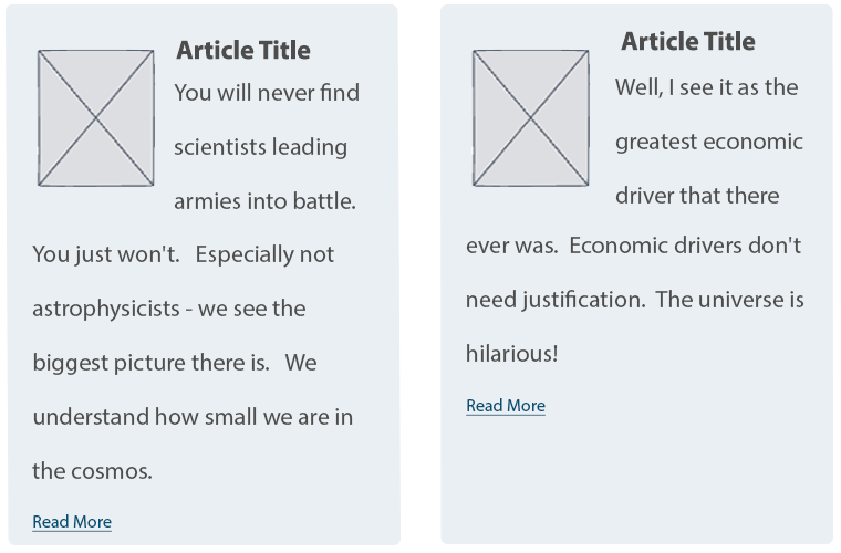
A “Read More” Teaser is still a common UX pattern; it contains a title, often a summary, sometimes a date or author info, and, of course, a Read More link. The link text itself may differ — “read more”, “learn more”, “go to article”, and so on — but the function is the same: tell the user that what they see is only a preview, and link them to the full content.
In 2022, I’d argue that “Read More” links on Teaser components are more of a design feature than a functional requirement; they add a visual call to action to a list of Teasers or Cards, but they aren’t necessary for navigation or clarity.
Although I see fewer sites using this pattern recently, it’s still prevalent enough on the web and in UX designs to justify discussing it.
If you build sites with Drupal, you have a few simple options to implement a Read More Teaser. Both methods have some drawbacks, and both result in adjacent and non-descriptive links.
I’ll explore both options in detail and discuss how to resolve accessibility concerns with a little help from TWIG. (Spoiler: TWIG gives us the best markup without any additional modules)
Using Core
Without adding contributed modules or code, Drupal Core gives you a long, rich text field type for storing lengthy content and a summary of that content. It’s a single field that acts like two. In the UI, this field type is called Text (formatted, long, with summary), and it does exactly what the name describes.
Drupal installs two Content Types that use this field type for the Body – Article and Basic Page – but it can be added to any Content Type that needs both a full and a summarized display.
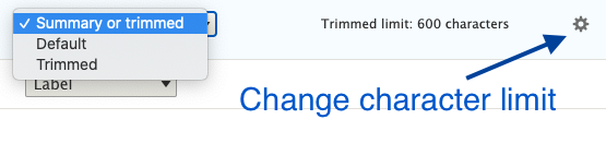
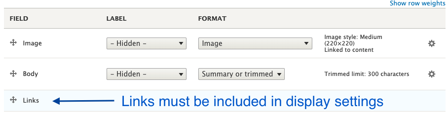
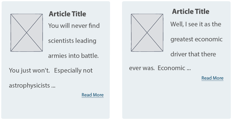
In the Manage Display settings of the Teaser or other summarized view mode, the Summary or Trimmed format is available. The default character limit is 600, but this can be configured higher or lower.
Finally, in the Manage Display settings, the Links field must be added to render the Read More link.
That’s all you need to create a Read More Teaser in just a few minutes with Drupal Core, but this method has some shortcomings.
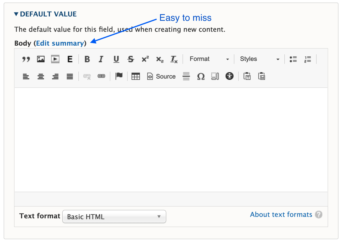
The summary field is easy to miss
Unless you require the summary, it’s often overlooked during content creation. A user has to click the Edit summary link to add a summary, and it’s easy to miss or forget.
You have to choose one or the other format
Notice the word “or” in the Summary or Trimmed format. Out of the gate, you can display what’s in the summary field, in its entirety, or you can display a trimmed version of the Body field. But you can’t display a trimmed version of the summary.
Expect the unexpected when a summary isn’t present
If a summary is not populated, Drupal attempts to trim the Body field to the last full sentence, while staying under the character limit. The problem is the unpredictable nature of content in a rich text field. These may be edge cases, but I’ve seen content editors insert images, headings, dates, and links as the first few elements in the Body field. When the content starts with something other than paragraph text, the Teaser display will, too.
Expect varying length Teasers when a summary is present
Depending on your layout or visual preference, this may not be a concern. But unless you’re judicious about using a standard or similar length for every summary, you’ll have varying length Teasers, which looks awkward when they are displayed side by side.
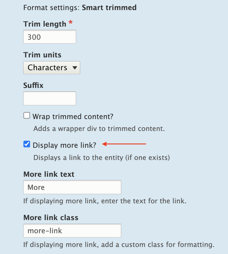
Using the Smart Trim Module
The contributed Smart Trim module expands on Core’s functionality with additional settings to “smartly” trim the field it’s applied to. The Smart Trim module’s description states:
With smart trim, you have control over:
- The trim length
- Whether the trim length is measured in characters or words
- Appending an optional suffix at the trim point
- Displaying an optional “More” link immediately after the trimmed text
- Stripping out HTML tags from the field
I won’t cover all of the features of Smart Trim, because it’s well documented already. Smart Trim solves one of the problems noted earlier: it lets you trim the summary. That said, Smart Trim has some of the same drawbacks as Core’s trim feature, along with some limitations of its own.
Sentences aren’t respected
Unlike Core’s trim feature, Smart Trim’s limits don’t look for full sentences. A character or word limitation stops when it hits the defined limit, even if that limit occurs mid-sentence.
Strip HTML might be helpful, or it might not
If your goal is rendering plain text without any HTML (something you might otherwise have to code in a template), Smart Trim’s Strip HTML setting is exactly what you need.
It’s also helpful for dealing with some of those edge cases where content starts with an element other than paragraph text. For example, if the first element in the Body field is an image, followed by paragraph text, the Strip HTML setting works nicely. It strips the image entirely and displays the text that follows in a trimmed format.
But be aware that Strip HTML also strips paragraph tags. If the first element in the Body field is a heading, followed by paragraph text, all tags are stripped, and everything runs together as one large block of text.
“Immediately after” doesn’t mean immediately after
If you want the Read More link to display immediately after the trimmed text, as the module description suggests, you’ll need to assign a class in the Smart Trim settings with a display other than block.
What about adjacent link and accessibility issues?
If you create a Read More Teaser using either the Core or Smart Trim methods described here, there are a couple of problems.
Either method results in markup something like this:
HTML

<article>
  <h2>
    <a href="/article/how-bake-cake">How to Bake a Cake</a>
  </h2>
  <div class="node__content">
    <div class="node__summary">
      <p>Practical tips on cake baking that you can't find anywhere else</p>
    </div>
    <div class="node__links">
      <ul class="links inline">
        <li class="node__readmore">
          <a href="/article/how-bake-cake" title="How to Bake a Cake">Read more</a>
       </li>
      </ul>
    </div>
  </div>
</article>
The <a> inside the <h2> contains descriptive text, which is necessary according to Google’s Link text recommendations and Mozilla’s Accessibility guidelines for link text.
But the Read More link has text that is not descriptive. Furthermore, it navigates to the same resource as the first <a>, making it an adjacent or redundant link. Without any other intervention, this markup causes repetition for keyboard and assistive technology users.
How do you make it better?
The WCAG has a recommendation for handling adjacent image and text links. You can use this same logic and wrap the entire Teaser content with a single link. But for this, you need TWIG.
Here’s an example of how to structure a TWIG template to create the link-wrapped Teaser.
node–article–teaser.html.twig:
Twig

<article{{ attributes.addClass(classes) }}>
 <div{{ content_attributes.addClass('node__content') }}>
   <a href={{ url }}>
     <div class="wrapper">
       <h2{{ title_attributes.addClass('node__title') }}>
         {{ label }}
       </h2>
       {{ content.body }}
     </div>
   </a>
 </div>
</article>
But while this solves the adjacent link issue, it creates another problem. When you combine this template with the Manage Display settings that insert Read More links, Drupal creates many, many duplicate links.
Instead of wrapping the Teaser content in a single anchor tag, anchors are inserted around every individual element (and sometimes around nothing). The markup is worse than before:
HTML

<div class="node__content">
  <a href="/article/how-bake-cake"> </a>
  <div class="wrapper">
    <a href="/article/how-bake-cake">
      <h2 class="node__title">How to Bake a Cake</h2>
    </a>
    <div class="field field--name--body field--type-text-with-summary">
      <a href="/article/how-bake-cake">
        <div class="field__label visually-hidden">Body</div>
      </a>
      <div class="field__item">
        <a href="/article/how-bake-cake"></a>
        <div class="trimmed">
          <a href="/article/how-bake-cake">
            <p>Practical tips on cake baking that you can’t find anywhere else</p>
          </a>
          <div class="more-link-x">
            <a href="/article/how-bake-cake"></a>
            <a href="/article/how-bake-cake" class="more-link-x" hreflang="en">More</a>
          </div>
        </div>
      </div>
    </div>
  </div>
</div>
But if you remove Smart Trim’s Read more link or Core’s Links field, the Read More text is also gone.
HTML

<div class="node__content">
  <a href="/article/how-bake-cake">
    <div class="wrapper">
      <h2 class="node__title">How to Bake a Cake</h2>
      <div class="field field--name--body field--type-text-with-summary">
        <div class="field__label visually-hidden">Body</div>
        <div class="field__item">
          <p>Practical tips on cake baking that you can’t find anywhere else</p>
        </div>
      </div>
    </div>
  </a>
</div>
Because we’ve already enlisted the help of TWIG to fix the adjacent link issue, it’s easy enough to also use TWIG to re-insert the words “read more.” This creates the appearance of a Read More link and wraps all of the Teaser contents in a single anchor tag.
Twig

<article{{ attributes.addClass(classes) }}>
 <div{{ content_attributes.addClass('node__content') }}>
   <a href={{ url }}>
     <div class="wrapper">
     <h2{{ title_attributes.addClass('node__title') }}>
       {{ label }}
     </h2>
     {{ content.body }}
     <span class="node__readmore">{{ 'Read More'|trans }}</span>
     </div>
   </a>
 </div>
</article>
Resulting HTML:
HTML

<div class="node__content">
  <a href="/article/how-bake-cake">
    <div class="wrapper">
      <h2 class="node__title">How to Bake a Cake</h2>
      <div class="field field--name--body field--type-text-with-summary">
        <div class="field__label visually-hidden">Body</div>
        <div class="field__item">
          <p>Practical tips on cake baking that you can’t find anywhere else</p>
        </div>
      </div>
      <span class="node__readmore">Read more</span>
    </div>
  </a>
</div>
Do it all with TWIG
Of course, you can eliminate Core’s trimming feature, and the Smart Trim module, and do everything you need with TWIG.
Using the same TWIG template, the Body field’s value can be truncated at a particular character length, split into words and appended with “read more” text.
Something like the following should do the trick in most cases.
node–article–teaser.html.twig:
Twig

<article{{ attributes.addClass(classes) }}>
 <div{{ content_attributes.addClass('node__content') }}>
   <a href={{ url }}>
     <div class="wrapper">
       <h2{{ title_attributes.addClass('node__title') }}>
         {{ label }}
       </h2>
       {{ node.body.0.value|striptags|slice(0, 175)|split(' ')|slice(0, -1)|join(' ') ~ '...' }}
       <span class="node__readmore">{{ 'Read More'|trans }}</span>
     </div>
   </a>
  </div>
</article>
Final Thoughts
Today’s internet doesn’t need a prompt on each Teaser or Card to indicate that there is, in fact, more to read. The Read More Teaser feels like a relic from bygone days when, perhaps, it wasn’t obvious that a Teaser was only a summary.
But until we, the creators of websites, collectively decide to abandon the Read More Teaser pattern, developers will have to keep building them. And we should make them as accessible as we can in the process.
Although Drupal provides simple methods to implement this pattern, it’s the templating system that really shines here and solves the accessibility problems.
Are you a developer looking for a new opportunity? Join our team.
Each spring, students at the Rhode Island School of Design (RISD) exhibit their undergraduate and master’s thesis projects at the RISD Museum. Due to Covid-19, they were unable to prepare and stage physical exhibits in the spring of 2020.
Not to be deterred, the school and museum agreed to host the student work online as fully digital exhibits. The Museum previously partnered with Oomph to build out the award-winning “Raid the Icebox” online publication using Drupal and Layout Builder, so it felt familiar and natural to build out similar features for university student projects.
The necessary work involved extending the existing online gallery features to hundreds of additional artists, so we needed to build a system that could scale. Along the way, while we were at it, we were tasked with adding additional features to the platform. Why not have lofty goals?
The Timeline
We kicked off the first stage of the project on April 20, 2020, aiming for a two-staged release. Most of the new code would need to be deployed by the last week of May, with the additional features released two weeks later. The basic infrastructure would have to be established along with the custom permissions for artists, editors, and museum administrators. A second stage would add refinement to font selection and color palette.
What the Artists Needed
- A platform for routine editor tasks such as editing content, uploading media, altering the layout, and resources to perform many tasks outside the usual scope of content editors.
- The ability to add primary, secondary, and system webfonts to custom content types as well as their associated layout builder templates.
- A custom color palette whose colors were chosen by an admin user. This kind of style addition had to be available through Layout Builder for new publication nodes.
- A few trusted student authors also needed the ability to add JavaScript directly1 into page content. This was an intimidating requirement from a security standpoint, but the end results were highly engaging.

What the Staff Needed
- A robust set of permissions to enable multiple departments to have ownership and administrative controls over their particular domains, including:
- Bulk upload of new users in anticipation of needing to add hundreds of students.
- Node clone functionality (the ability to duplicate pages) to speed up time creating new pieces of content.
- Custom permissions for trusted editors for all content in a particular section.
- Enabling those editors to grant artists permission to view, edit, and access Layout Builder for a particular node.
A Deeper Dive
Overall Approach
We leveraged Drupal to build out our new features “the Drupal way.” The Node Clone and Bulk User Import modules could be installed and enabled with our Composer workflow and used right out of the box to offer additional powerful functionality. Now a user with the Editor role could craft a meticulously designed template and then clone it for other school departments. A user with the Web Administrator role would not have to add users one-by-one through the user interface but could import large numbers of new users — while specifying the user role — with CSV files.
We added the new custom fields, content types, user roles, and text formats manually through Drupal’s UI. We could later use preprocess functions in the theme and Twig templates to render content as needed.
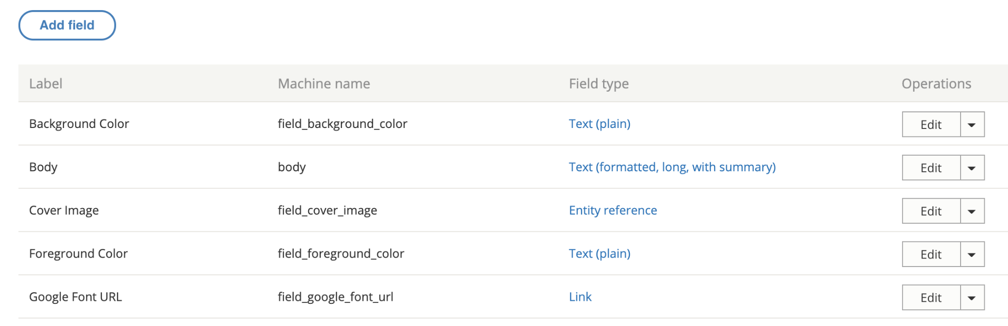
There were a lot of fields needed, covering different aspects of the typography. Here are a few:RISD
Since it was a Drupal 8 project, we made extensive use of config sync to export and import config files. The front-end and back-end developers could work independently until it was time to merge branches for testing. Then we were able to seamlessly push changes to higher environments as part of our deploy process.
Note: As a rule, we recommend setting config to read-only, especially on projects that have many web admin users.
Custom Webfont Example
With those new fields in place, a user sees text input fields on the node edit view of each publication to enter in custom font URLs or names.
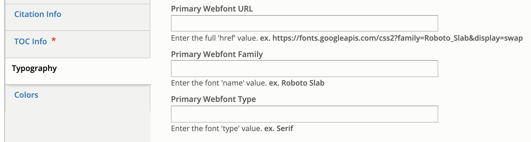
In terms of rendering to the page when someone is viewing the node, this requires both a preprocess hook in the [custom_theme].theme file and changes to the Twig template.
Note: Please be aware that allowing hundreds of users to input free text is not an ideal situation, and that security measures should be taken when processing free text.
Here is what the preprocess hook looks like for the mytheme.theme file:
use Drupal\node\Entity\Node;
use Drupal\taxonomy\TermStorage;

/**
 * Implements hook_preprocess_HOOK().
 */
function mytheme_preprocess_html(array &$variables) {
  $routeMatch = Drupal::routeMatch();
  $node = $routeMatch->getParameter('node');

  if ($node instanceof Node && $node->getType() === 'publication’) {

    if (isset($node->field_primary_webfont_url) && !$node->field_primary_webfont_url->isEmpty()) {
      $variables['primary_webfont_url'] = $node->field_primary_webfont_url->value;
      $variables['primary_webfont_family'] = $node->field_primary_webfont_family->value;
      $variables['primary_webfont_type'] = $node->field_primary_webfont_type->value;
    }
PHP
Then in the Twig template, which is at this path: myproject/docroot/themes/custom/mytheme/templates/layout/html.html.twig
<!DOCTYPE html>
<html{{ html_attributes }}>
  <head>
    <title>{{ head_title }}</title>

    {% if primary_webfont_url|length %}
      <link rel="stylesheet prefetch" media="screen" href="{{ primary_webfont_url }}">
      <style type="text/css">
        :root {
          --ff__serif: '{{ primary_webfont_family }}', {{ primary_webfont_type }};
        }
      </style>
    {% endif %}

    {% if secondary_webfont_url|length %}
      <link rel="stylesheet prefetch" media="screen" href="{{ secondary_webfont_url }}">
      <style type="text/css">
        :root {
          --ff__sans: '{{ secondary_webfont_family }}', {{ secondary_webfont_type }};
        }
      </style>
    {% endif %}

    {% if background_color_override|length and foreground_color_override|length %}
      <style type="text/css">
        :root {
          --c__primary--bg: {{ background_color_override }};
          --c__primary--fg: {{ foreground_color_override }};
        }
      </style>
    {% endif %}

  </head>
  <body{{ attributes }}>
    {{ page_top }}
    {{ page }}
    {{ page_bottom }}
  </body>
</html>
HTML
Finally, here is what someone viewing a page would see:
Most of the creative work for each piece of content happened behind the scenes in Layout Builder. Each block or section could be configured individually, which gave the artists a lot of ability to customize their online territories to the fullest extent possible.
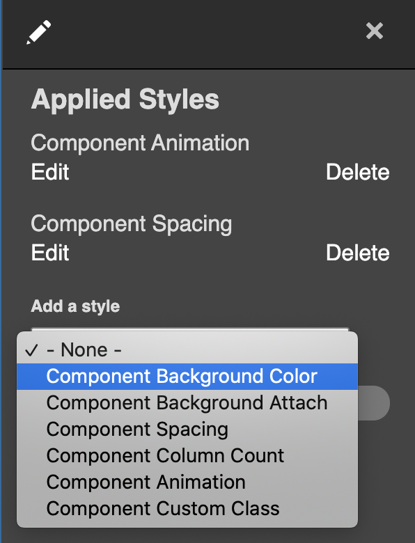
In addition to being able to choose a foreground or background color on the node level, an artist or editor can choose to change the color of just one block in Layout Builder simply by clicking on the “Style Settings” link.
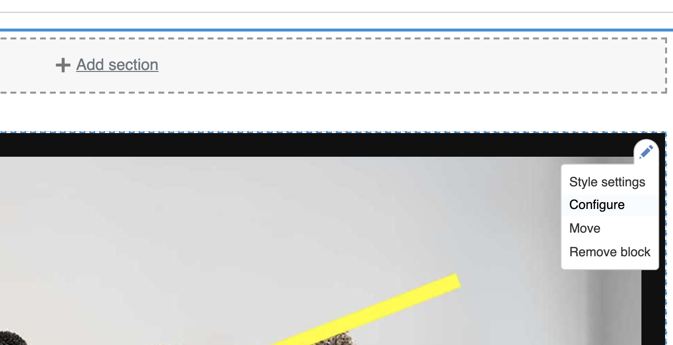
Another inline-editing window will pop up with additional options. In the “Add a style” dropdown menu, the artist or editor can select “Component Background Color,” click “Add Styles,” and choose from one of the colors in the palette to be applied to the block.
Along with the preprocessing described in the previous section, we extended Layout Builder’s features with a custom module to alter layouts. The plugin class lives at: docroot/modules/custom/my_module/Plugin/Layout/LayoutBase.php
<?php

namespace Drupal\my_module\Plugin\Layout;

use Drupal\Core\Form\FormStateInterface;
use Drupal\Core\Layout\LayoutDefault;
use Drupal\Core\Plugin\PluginFormInterface;

/**
 * Provides a layout base for custom layouts.
 */
abstract class LayoutBase extends LayoutDefault implements PluginFormInterface {

  public const NO_BACKGROUND_COLOR = 0;

  public function build(array $regions): array {
    $build = parent::build($regions);
    $backgroundColor = $this->configuration['background_color'];
    if ($backgroundColor) {
      $build['#attributes']['class'][] = 'rpp__bg-color--' . $backgroundColor;
    }
    return $build;
  }

  public function defaultConfiguration(): array {
    return [
      'background_color' => NO_BACKGROUND_COLOR,
      'id' => NULL,
      'background_color_override' => NULL,
    ];
  }

  public function buildConfigurationForm(array $form, FormStateInterface $form_state): array {
    $form['background'] = [
      '#type' => 'details',
      '#title' => $this->t('Background'),
      '#open' => TRUE,
      '#weight' => 20,
    ];
    $form['background']['background_color'] = [
      '#type' => 'radios',
      '#default_value' => $this->configuration['background_color'],
    ];
    $form['background']['overrides'] = [
      '#type' => 'fieldset',
      '#title' => $this->t('Overrides'),
    ];
    $form['background']['overrides']['background_color_override'] = [
      '#type' => 'textfield',
      '#title' => $this->t('Background Color'),
      '#default_value' => $this->configuration['background_color_override'],
      '#attributes' => [
        'placeholder' => '#000000',
      ],
    ];
    return $form;
  }

  public function submitConfigurationForm(array &$form, FormStateInterface $form_state) {
    $values = $form_state->getValues();
    $this->configuration['background_color'] = $values['background']['background_color'];
    $this->configuration['id'] = $values['extra']['attributes']['id'];
    $this->configuration['background_color_override'] = $values['background']['overrides']['background_color_override'];
  }

}
PHP
The Background Color form gets inserted into the Layout Builder form, and the user’s color selections get submitted and saved to configuration in the submitConfigurationForm() method.
The custom layout needs to be registered, so it should be added in a file called: my_module.layouts.yml and looks like:
layout_base:
  label: 'New Layout'
  category: 'Custom Layouts'
  template: templates/layout-base
  default_region: main
  regions:
    main:
      label: Main content
PHP
Now this custom layout with color overrides and whatever else you want to add will be available for users with the appropriate permissions to edit content in Layout Builder.
Conclusion
Jeremy Radtke, Assistant Director of Digital Initiatives at the RISD Museum, said in a recent presentation to the Museum Publishing Digital Interest Group that RISD sees the museum as a site of creative collaboration. In terms of the end-of-year digital showcase, this is demonstrated in the emphasis on student artists having a high degree of creative control over their projects. They were able to radically alter the existing layout templates offered to them, changing fonts, colors, and other elements of the theme. They were able to configure blocks to add static images, animated gifs, and other media files such as short films to stretch the limits of the digital space.
There were a total of 700 undergraduates and grads featured in the online exhibit, which featured 16 departments. The art school is attached to the RISD Museum, and Radtke said the museum’s style is very much along the lines of an art school, in that it employs critique — asking questions and solving problems is strongly emphasized. This project was about content delivery, but also how to generate content. Oomph was proud to be part of that collective journey of exploration and experimentation.
Related Resources
- Oomph case study about Ziggurat and “RAID the Icebox”
- Museum Publishing Digital Interest Group presentation on RISD Museum online exhibits
This post will assume you have already completed the base setup of enabling Layout Builder and added the ability to manage layouts to one of your content types. If you are not to this point check out Drupal.orgs documentation on layout builder or this article by Tyler Fahey which goes over setup and some popular contrib module enhancements.
As we mentioned in part 1 of this series, you should expect a little DIY with Layout Builder. So far the best way we have found to theme Layout Builder is by creating a custom module to provide our own custom layouts and settings. By defining custom layouts in a custom module we get the ability to control each layout’s markup as well as the ability to add/remove classes based on the settings we define.
Writing the custom layout module
Setup the module
Start by creating your custom module and providing the required .info.yml file.
demo_layout.info.yml:
name: Demo Layout
description: Custom layout builder functionality for our theme.
type: module
core: 8.x
package: Demo

dependencies:
  - drupal:layout_builder
YAML
Remove default core layouts
Layout Builder comes with some standard layouts by default. There’s nothing wrong with these, but generally for our clients, we want them only using our layouts. This hook removes those core layouts, leaving only the layouts that we will later define:
demo_layout.module
/**
 * Implements hook_plugin_filter_TYPE__CONSUMER_alter().
 */
function demo_layout_plugin_filter_layout__layout_builder_alter(array &$definitions): void {
  // Remove all non-demo layouts from Layout Builder.
  foreach ($definitions as $id => $definition) {
    if (!preg_match('/^demo_layout__/', $id)) {
      unset($definitions[$id]);
    }
  }
}
PHP
Register custom layouts and their regions
The next step is to register the custom layouts and their respective regions. This process is well documented in the following drupal.org documentation: https://www.drupal.org/docs/8/api/layout-api/how-to-register-layouts
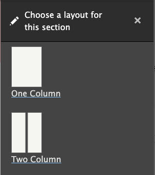
For this particular demo module we are going to define a one column and a two column layout. These columns will be able to be sized later with the settings we provide.
demo_layout.layouts.yml
demo_layout__one_column:
  label: 'One Column'
  path: layouts/one-column
  template: layout--one-column
  class: Drupal\demo_layout\Plugin\Layout\OneColumnLayout
  category: 'Columns: 1'
  default_region: first
  icon_map:
    - [first]
  regions:
    first:
      label: First

demo_layout__two_column:
  label: 'Two Column'
  path: layouts/two-column
  template: layout--two-column
  class: Drupal\demo_layout\Plugin\Layout\TwoColumnLayout
  category: 'Columns: 2'
  default_region: first
  icon_map:
    - [first, second]
  regions:
    first:
      label: First
    second:
      label: Second
YAML
Pay close attention to the path, template, and class declarations. This determines where the twig templates and their respective layout class get placed.
Creating the base layout class
Now that we have registered our layouts, it’s time to write a base class that all of the custom layouts will inherit from. For this demo we will be providing the following settings:
- Column width
- Column padding (top and bottom)
- Background color
- Custom classes
However, there is a lot of PHP to make this happen. Thankfully for the most part it follows a general pattern. To make it easier to digest, we will break down each section for the Column Width setting only and then provide the entire module at the end which has all of the settings.
src/Plugin/Layout/LayoutBase.php
<?php
  declare(strict_types = 1);

  namespace Drupal\demo_layout\Plugin\Layout;

  use Drupal\demo_layout\DemoLayout;
  use Drupal\Core\Form\FormStateInterface;
  use Drupal\Core\Layout\LayoutDefault;

  /**
   * Provides a layout base for custom layouts.
   */
  abstract class LayoutBase extends LayoutDefault {

  }
PHP
Above is the layout class declaration. There isn’t a whole lot to cover here other than to mention use Drupal\demo_layout\DemoLayout;. This class isn’t necessary but it does provide a nice one-stop place to set all of your constant values. An example is shown below:
src/DemoLayout.php
<?php

declare(strict_types = 1);

namespace Drupal\demo_layout;

/**
 * Provides constants for the Demo Layout module.
 */
final class DemoLayout {

  public const ROW_WIDTH_100 = '100';

  public const ROW_WIDTH_75 = '75';

  public const ROW_WIDTH_50 = '50';

  public const ROW_WIDTH_25 = '25';

  public const ROW_WIDTH_25_75 = '25-75';

  public const ROW_WIDTH_50_50 = '50-50';

  public const ROW_WIDTH_75_25 = '75-25';

}
PHP
The bulk of the base class logic is setting up a custom settings form using the Form API. This form will allow us to formulate a string of classes that get placed on the section or to modify the markup depending on the form values. We are not going to dive into a whole lot of detail as all of this is general Form API work that is well documented in other resources.
Setup the form:
/**
   * {@inheritdoc}
   */
  public function buildConfigurationForm(array $form, FormStateInterface $form_state): array {

    $columnWidths = $this->getColumnWidths();

    if (!empty($columnWidths)) {
      $form['layout'] = [
        '#type' => 'details',
        '#title' => $this->t('Layout'),
        '#open' => TRUE,
        '#weight' => 30,
      ];

      $form['layout']['column_width'] = [
        '#type' => 'radios',
        '#title' => $this->t('Column Width'),
        '#options' => $columnWidths,
        '#default_value' => $this->configuration['column_width'],
        '#required' => TRUE,
      ];
    }

    $form['#attached']['library'][] = 'demo_layout/layout_builder';

    return $form;
  }

 /**
   * {@inheritdoc}
   */
  public function validateConfigurationForm(array &$form, FormStateInterface $form_state) {
  }

  /**
   * {@inheritdoc}
   */
  public function submitConfigurationForm(array &$form, FormStateInterface $form_state) {
    $this->configuration['column_width'] = $values['layout']['column_width'];
  }

 /**
   * Get the column widths.
   *
   * @return array
   *   The column widths.
   */
  abstract protected function getColumnWidths(): array;
PHP
Finally, we add the build function and pass the column width class:
/**
   * {@inheritdoc}
   */
  public function build(array $regions): array {
    $build = parent::build($regions);

    $columnWidth = $this->configuration['column_width'];
    if ($columnWidth) {
      $build['#attributes']['class'][] = 'demo-layout__row-width--' . $columnWidth;
    }

    return $build;
  }
PHP
Write the column classes
Now that the base class is written, we can write column-specific classes that extend it. These classes are very minimal since most of the logic is contained in the base class. All that is necessary is to provide the width options for each individual class.
src/Plugin/Layout/OneColumnLayout.php
<?php

declare(strict_types = 1);

namespace Drupal\demo_layout\Plugin\Layout;

use Drupal\demo_layout\DemoLayout;

/**
 * Provides a plugin class for one column layouts.
 */
final class OneColumnLayout extends LayoutBase {

  /**
   * {@inheritdoc}
   */
  protected function getColumnWidths(): array {
    return [
      DemoLayout::ROW_WIDTH_25 => $this->t('25%'),
      DemoLayout::ROW_WIDTH_50 => $this->t('50%'),
      DemoLayout::ROW_WIDTH_75 => $this->t('75%'),
      DemoLayout::ROW_WIDTH_100 => $this->t('100%'),
    ];
  }

  /**
   * {@inheritdoc}
   */
  protected function getDefaultColumnWidth(): string {
    return DemoLayout::ROW_WIDTH_100;
  }
}
PHP
src/Plugin/Layout/TwoColumnLayout.php
<?php

declare(strict_types = 1);

namespace Drupal\demo_layout\Plugin\Layout;

use Drupal\demo_layout\DemoLayout;

/**
 * Provides a plugin class for two column layouts.
 */
final class TwoColumnLayout extends LayoutBase {

  /**
   * {@inheritdoc}
   */
  protected function getColumnWidths(): array {
    return [
      DemoLayout::ROW_WIDTH_25_75 => $this->t('25% / 75%'),
      DemoLayout::ROW_WIDTH_50_50 => $this->t('50% / 50%'),
      DemoLayout::ROW_WIDTH_75_25 => $this->t('75% / 25%'),
    ];
  }

  /**
   * {@inheritdoc}
   */
  protected function getDefaultColumnWidth(): string {
    return DemoLayout::ROW_WIDTH_50_50;
  }
}
PHP
We can now check out the admin interface and see our custom form in action.
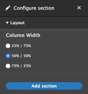
One column options:
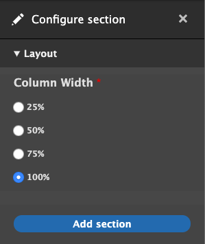
Two column options:
Add twig templates
The last step is to provide the twig templates that were declared earlier in the demo_layout.layouts.yml file. The variables to be aware of are:
- Content: contains the block content for this layout separated by region
- Attributes: contains the custom classes that were passed in the base class build function.
- Settings:contains the submitted form values from the settings form.
src/layouts/one-column/layout–one-column.html.twig
{#
/**
 * @file
 * Default theme implementation to display a one-column layout.
 *
 * Available variables:
 * - content: The content for this layout.
 * - attributes: HTML attributes for the layout <div>.
 * - settings: The custom form settings for the layout.
 *
 * @ingroup themeable
 */
#}

{%
  set row_classes = [
    'row',
    'demo-layout__row',
    'demo-layout__row--one-column'
  ]
%}

{% if content %}
  <div{{ attributes.addClass( row_classes|join(' ') ) }}>
    <div {{ region_attributes.first.addClass('column', 'column--first') }}>
      {{ content.first }}
    </div>
  </div>
{% endif %}
Twig
src/layouts/two-column/layout–two-column.html.twig
{#
/**
 * @file
 * Default theme implementation to display a two-column layout.
 *
 * Available variables:
 * - content: The content for this layout.
 * - attributes: HTML attributes for the layout <div>.
 * - settings: The custom form settings for the layout.
 *
 * @ingroup themeable
 */
#}

{# Get the column widths #}
{% set column_widths = settings.column_width|split('-') %}

{%
  set row_classes = [
    'row',
    'demo-layout__row',
    'demo-layout__row--two-column'
  ]
%}

{% if content %}
  <div{{ attributes.addClass( row_classes|join(' ') ) }}>

    {% if content.first %}
      <div {{ region_attributes.first.addClass('column', 'column--' ~ column_widths.0, 'column--first') }}>
        {{ content.first }}
      </div>
    {% endif %}

    {% if content.second %}
      <div {{ region_attributes.second.addClass('column', 'column--' ~ column_widths.1, 'column--second') }}>
        {{ content.second }}
      </div>
    {% endif %}

    </div>
  </div>
{% endif %}
Twig
Notice settings.column_width was passed with a string: 75-25. We need to split it and place each value on our column which results in the following output.
<div class="demo-layout__row-width--75-25 row demo-layout__row demo-layout__row--two-column ">
  <div class="column column--75 column--first"></div>
  <div class="column column--25 column--second"></div>
</div>
HTML
Since these are custom classes, and we haven’t written any CSS, these columns do not have any styling. Depending on your preference, you can implement your own custom column styles or wire up a grid framework such as Bootstrap in order to get the columns to properly size themselves.
Wrapping it up
You should be at a point where you have an idea of how to create custom settings in order to theme layout builder sections. You can take this method and extend it however you need to for your particular project. There’s no definitive best way to do anything in the world of web development, and Layout Builder is no exception to that rule. It’s a great addition to Drupal’s core functionality, but for larger sites, it likely won’t be and shouldn’t be the only way you handle layout. Much like Drupal itself though, as more and more people use it, Layout Builder will only become stronger, more robust, more fully-featured, and better documented. If it doesn’t seem like a good fit for you right now, it may become a better fit as it grows. If it does seem like a good fit, be ready to get your hands dirty!
The full demo layouts module with all of the custom settings is available here: https://github.com/oomphinc/layout-builder-demo/tree/master/moduleexamples/demolayout
With the release of Drupal 8.7 in May of 2019 came the rollout of the much-anticipated Layout Builder core module. According to Drupal.org, Layout Builder allows content editors and site builders to easily and quickly create visual layouts for displaying content by providing the ability to drag and drop site-wide blocks and content fields into regions within a given layout. Drupalists were excited about it, and so were we.
For a long time, we developed and came to heavily rely on our own extension of the Paragraphs module to give content managers the power to build and modify flexible layouts. When we heard that there would now be an equivalent option built right into core, we thought, “could this be the end of Paragraphs?” Well, the only way to find out is to dig in and start using it in some real-world scenarios.
Layout Builder is still new enough that many how-to guides only focus on installing it and enabling it on a content type or two and overviews of options that are available right out of the box. That’s probably fine if your use-case is something akin to Umami, Drupal.org’s example recipe site. But if you want to use it in a significant way on a larger site, it probably won’t be long before you want to customize it to fit your situation. Once you get to that point, documentation becomes scant. If you’ve already got some experience rolling your own extension of a module or at least writing preprocesses, you’re more likely to get better mileage out of your experience with Layout Builder.
First, let’s take a look at some of the pros and cons of using Layout Builder. If there are any deal-breakers for you, it’s better to identify them sooner than later.
Layout Builder Pros:
1. All core code
Yes, the fact that Layout Builder is a core initiative that will continue to get attention and updates is fantastic no matter how stable similar module initiatives might be. As it’s core, you get great integration for language translation.
2. Block-based, but supports fields as well
Blocks are a familiar core Drupal content paradigm. They can be used as one-off content containers or as repeatable containers for content that appears in multiple places but should be edited from a single location. Fields can also be placed as content into a layout, which makes building custom templates that can continue to leverage fields very flexible.
3. Better WYSIWYG authoring experience
End-users will be much happier with the (not quite) WYSIWYG editing experience. While it is not directly one-to-one, it is much better than what we have seen with Paragraphs, which is a very “Drupal” admin experience. In many ways, previously, Preview was needed to know what kind of design your content was creating.
4. Supports complex design systems with many visual options
Clients can get quite a bit of design control and can see the effects of their decisions very quickly. It makes building special landing pages very powerful.
5. Plays nice with Clone module
While custom pages described in Pro #4 are possible, they are time-consuming to create. The Clone module is a great way to make copies of complex layouts to modify instead of starting from scratch each time.
6. “Locked” Layouts are the default experience
While complex custom pages are possible, they are not the default. Layout Builder might have been intended to replace custom template development, because by default when it is applied to a content type, the option to override the template on a node-by-node basis is not turned on. A site builder needs to decide to turn this feature on. When you do, proceed with caution.
Layout Builder Cons
1. Lack of Documentation
Since LB is so relatively new, there is not an abundance of documentation in the wild. People are using it, but it is sort of still the Wild Wild West. There are no established best practices on how to use it yet. Use it with Paragraphs? Maybe. Use it for the entire page, including header and footer? You can. Nest it in menus? We’ve done it. Should we have done it? Time will tell.
2. More time is required to do it well
Because of Con #1, it’s going to take more time. More time to configure options, more time to break designs down into repeatable components, and more time to test all the variations and options that design systems present.
3. Admin interface can conflict with front-end styles
While Pro #3 is a great reason to use LB, it should be known that some extra time will be needed to style the admin mode of your content. There is some bleeding together of admin and non-admin front-end styles that could cause your theme build to take longer.
An example: We created a site where Layout Builder custom options could control the animation of blocks. Great for the front-end, but very annoying for the backend author when blocks would animate while they were trying to edit.
4. Admin editing experience still in its infancy
Again, while Pro #3 is significant, the current admin editing experience is not the best. We know it is being worked on, and there are modules that help, but it is something that could tip the scales depending on the project and the admin audience.
5. Doesn’t play nice with other template methods
Which is to say that you can’t easily have a page that is partially LB and partially a templated View or something else. You can create a View that can be placed into a Block that is placed via Layout Builder, but you can’t demarcate LB to one section of a page and have a View or the body field in the other.
6. Content blocks do not export with configuration
As blocks go, the configuration of a block is exportable, but the content isn’t. Same with the blocks that Layout Builder uses, which can make keeping staging/production environments in sync frustrating. Just like with Paragraphs or custom blocks, you’ll have to find a reliable way of dealing with this.
7. Overriding a default layout has consequences
We have seen this ourselves first-hand. The design team and client want a content type to be completely flexible with Layout Builder, so the ability for an author to override the default template is turned on. That means the node is now decoupled from the default template. Any changes to the default will not propagate to those nodes that have been decoupled and modified. For some projects, it’s not a big deal, but for others, it might become a nightmare.
8. The possibility of multiple design options has a dark side
Too many options can be a bad thing. It can be more complex for authors than necessary. It can add a lot more time to theming and testing the theme when options create exponential possibilities. And it can be very hard to maintain.
With great power comes great responsibility. Layout Builder certainly gives the Drupal community great power. Are we ready for the caveats that come with that?
Ready to tackle customizing Layout Builder? Watch for Part Two, where we’ll dive into defining our own layouts and more.
Over the past week Kathy Beck and I have had the pleasure of touring a talk that we have prepared around Drupal 8’s Layout Builder. We aren’t the only ones talking about it, of course, but it is a set of tools in Drupal core that have lately found new interest in the community. More and more developers are discovering and using the tool, which makes it an exciting bit of technology to talk about.
We recently had great success with Layout Builder on a new project. What was a really nice was that our design system paradigm from previous projects was easily portable into this new Layout Builder tool. So our UX thinking was solid, and this was a solid tool that could continue to support that way of working.
Moving into Layout Builder also gave us some additional advantages:
- Layout Builder is a core part of Drupal. Other similar tools are contributed modules, which means they could fail to keep up with security or compatibility issues or die on the vine all together
- Layout Builder plays more nicely with Drupal’s core Translation methods
- Layout Builder has better performance that some similar solutions in the contributed module world
- And Layout Builder has built-in template control
What Template Control in Layout Builder looks like
For most projects, the key advantage to Layout Builder is that it puts the creation and “design” of a content type’s main template in the admin experience. Drupal already puts many controls in the Admin experience, allowing site builders to create content types, configure the fields that they use, and even configure some of the ways in which that data will be displayed to users. With that, it makes sense that Layout Builder provides way in which site builders can create visual templates.
This reduces the need for front-end templates in Twig. Again, since a site builder is the one to configure a new content type directly in the admin, they can now also create that default template in the admin as well. Just like theming in Twig, though, if a site builder makes a change to the main template, any piece of content created with that template will also update. Its a powerful way to edit and control templates per content type.
What’s really cool is that we as the site builders can decide which content type template’s an author has access to override the layout of. The scenario is this: An article content type is locked down, and the author can only access the fields to update title, image, and body content. But a “Marketing page” content type has that restriction removed, so an author has access to “Layout”, and therefore they can make as many changes to that page as they want. They can add new content components, they can delete others, change color, column design, and anything else that we create to modify designs.
Watch the Videos
With that explanation, our talks go into more detail about how this all works and what problems we wanted to try to solve. The first video that we have ready to view was geared towards a design audience. Another one to come along soon was geared towards a more technical, Drupal-knowledgable audience. Pick the one that is right for you!
Oh, and as a “cool to know”, the presentation deck itself was built in Layout Builder!
Presentation in front of a Developer Audience for DrupalCamp Atlanta:
Presentation in front of a Design Audience for DesignWeek RI:
Oomph has been using Paragraphs to deliver “flexible content” areas and content layouts for our clients. With the release of Drupal 8.7 and the addition of Layout Builder, Oomph has begun to incorporate the new Layout Builder functionality into our websites. Learn the advantages of Layout Builder over Paragraphs and how you can successfully implement Layout Builder on your next project.
Some topics covered are:
- How to setup Layout Builder for static and flexible content templates.
- How to setup components (blocks) to be added to your Layout.
- How to add custom user-selected configuration to your components (blocks) as classes.
- Useful contribute modules to use with Layout Builder.
- Future Roadmap of Layout Builder
Watch Senior Drupal Architect John Picozzi and <Senior UX Engineer Kathy Beck from their Design4Drupal 2019 talk on all things Layout Builder.
Watch the Design4Drupal talk on Drupal Layout Builder
Traditional pages should be a thing of the past. The modern web experience is composed of small pieces of content arranged into a cohesive story. For an author, a single content area is fine for a blog post—a single story that expounds upon one thought. But for a modern website with many landing pages—places where the user needs to decide what they want to do next—a single content column will no longer suffice. We need modular content and a better way to manage its creation.
At An Event Apart this April, Ethan Marcotte was talking about the future of design and User Experience in a multi-device world. Specifically, he said that we should:
[…] design networks of content that are composed of patterns. These patterns, which are small responsive patterns themselves, can be stitched together to create composite experiences like pages.
In other words, the idea of “pages” needs to be blown apart into smaller patterns. Break free from the single content area and create compelling experiences for a modern audience!
We at Oomph agree, and the roadmap that we drew last summer while designing and developing the new BCBS.com (launched in November, 2016) was already blowing the old idea of pages apart with a modular content system.
How did we get here?
Why have we been bound by a single content area? This all goes back to the prevalence of blogs and content management systems (CMSs), which, for ease of use, created just one main content area. For an author of a blog post, one content area is enough as they are writing a single story. But for business sites that need to market a product or service, it is usually not enough.
For Blue Cross and Blue Shield Association, when we were discovering ways in which we could redesign their site, we recognized that they needed to break out from the constraints of the single content area provided by CMSs. The new BCBS.com was going to be built on Drupal 8, so we needed to think about solutions within that ecosystem.
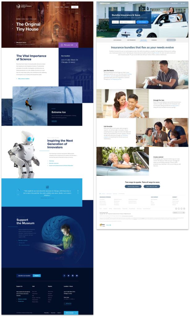
Why we Chose the Drupal Paragraphs Module
Modern CMSs have started to handle multiple chunks of content, and within the Drupal community there are a few ways to address it. The downfall—in our minds—with a few of these solutions is that they put all of the power into the hands of the authors. If you have a team of savvy people that understand interface design, responsive design, and are not afraid to get their hands dirty with some HTML, that can work. In our experience, though, it is too much power and authors are more liable to break something—either break the rendering of the page or break too far outside the brand guidelines. These solutions are difficult to use and typically get abandoned by the author.
Instead of unlimited options, what we as the design and development team wanted was the ability to define our own set of options that we could then expose to the authors. We’d build each set of options into a small responsive pattern, which allows the author to concentrate on their content and how they want to tell a story.
The Paragraphs Module can do exactly that. It adds a new field type that works like Entity References, and with it, we can define all sorts of Paragraph Types and configurable options to give to authors. For the end viewer, the experience has visual variety, but it never veers off brand or looks broken. For the author, they have many options but do not need to think about what happens to their content for mobile or tablet. Those decisions have been baked into each Paragraph Type.
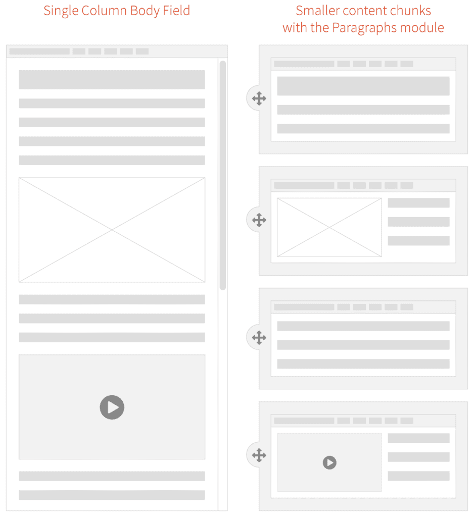
What we Built for BCBSA
We based our modular design patterns on a simple “card” consisting of an optional icon, an optional background (could be color, image, or gradient), and a WYSIWYG content field. These elements had many, many options associated with them:
- 300+ icons to choose from
- 6 buttons styles in 3 different sizes
- 20 background colors
- 3 background gradients
- 11 Header styles
- 5 sizes for body copy with fluid responsive sizing
- 6 body copy colors
- Width pairings for multi-card rows
From here, we defined 10 different Paragraph “Rows” of cards and other types of content. Each of these bundles have responsive design built in — they are small responsive patterns that can be stitched together to create pages:
- Single, Two and Three Card “Heros” — text over a background color or image
- Two, Three, and Four Card Rows
- Image Card Row
- Video Card Row
- Image Gallery Row
- iFrame Row
- Wayfinding Row—a way to insert and control jump links (anchors) on a page
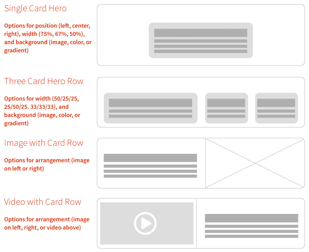
With these options and rows together, the BCBSA team can create fantastic long-form content pages as well as complex landing pages that can still use Drupal’s Body Content area, Featured Images, and even Blocks and Views.
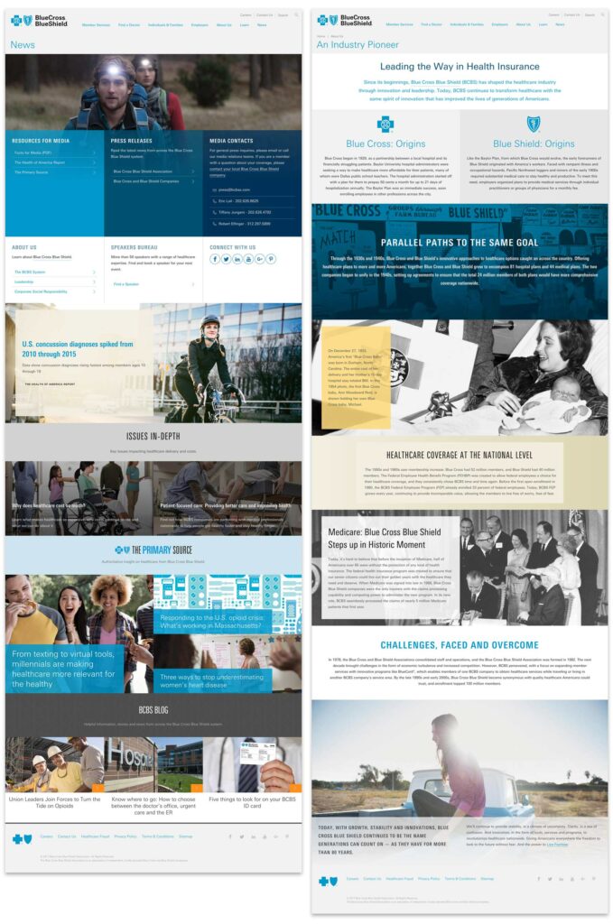
Oomph & BCBSA ❤ Paragraphs
With Drupal and Paragraphs, both the Oomph and BCBSA teams are very excited about the extensive possibilities of a curated system of modular components, options, and rows. Authors have a large but controlled set of options which makes every page feel unique but on brand, and the viewers get a fully responsive experience without any additional work.
We’ve become believers in this kind of system and have already started adapting it to other clients who need to solve a similar problem. We could design a custom system of Paragraphs and options for you, too.
Resources:
- A joint presentation at Drupalcon North America, 2017 by John Eckroth, Director of Digital Experience and Strategy at Blue Cross Blue Shield Association and J. Hogue, Director of Design & UX at Oomph, Inc. (with video)
- Video of the presentation on YouTube (voiceover on top of the slide deck)
- Drupal’s Paragraphs Module page
- Psychological statistics about reading and visual comprehension, in a marketing context
- Jason Santa Maria musing on the growing prevalence of long-form content back in 2014