Redesign & Relaunch: Oomph’s Color Accessibility Tool for Designers gets a Redesign
It’s been a long time since the Hack Day that launched ColorCube 1.0 — almost exactly 5 years, in fact. We are excited to have redesigned the tool to make it easier to use and to also give ourselves the opportunity to explore some new technology in the process.
Say Hello to AccessibleColor.design
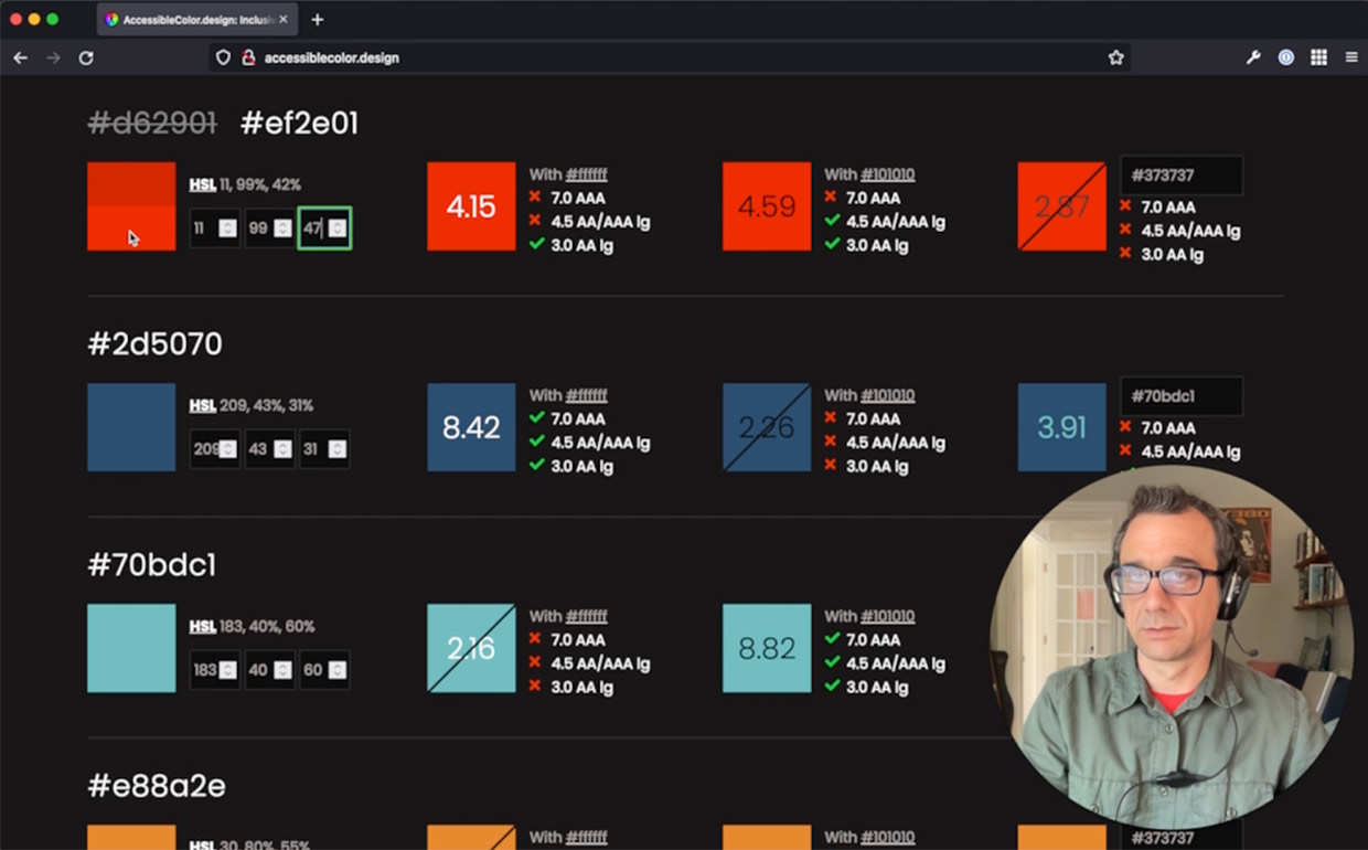
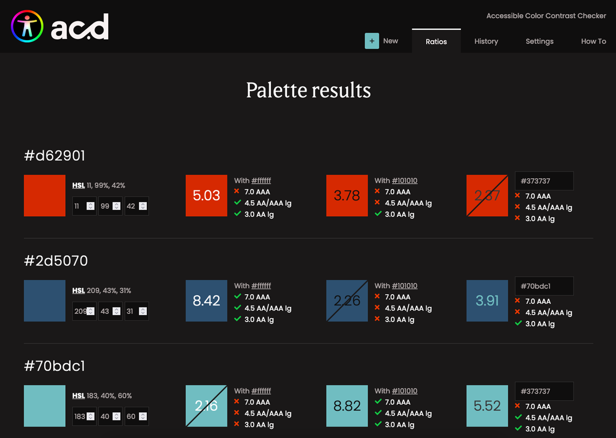
Formerly called ColorCube, AccessibleColor.design (ACd) is a tool built by developers for designers. It’s a tool that anyone can use, but the way it allows visitors to adjust colors to reach a passing threshold without the need for Photoshop or similar tools makes it perfect for designers.
The intention of the tool was always to display and manipulate color in a list. When we devised the interface, we noticed that so many of the other tools deal with one color pair at a time (this color text on top of that colored background). We wanted our tool to display a dense set of information — from a list of colors, show them with white, black, and one more color from the same lists. Then, allow the visitor to adjust the colors to a passing grade, as well as compare one color to another specific color without reloading the interface.
Highlights of the Redesign
The previous version of the tool was put up very quickly, and did not use a responsive design. Making a tool that displays dense information work for mobile was not our first priority, but now the interface has been simplified and so a move to responsive design was easier. While mobile traffic might continue to be low for a tool such as this, it is more likely that one might want to shrink the viewport to fit it on a large monitor alongside a website or design that someone is currently evaluating.
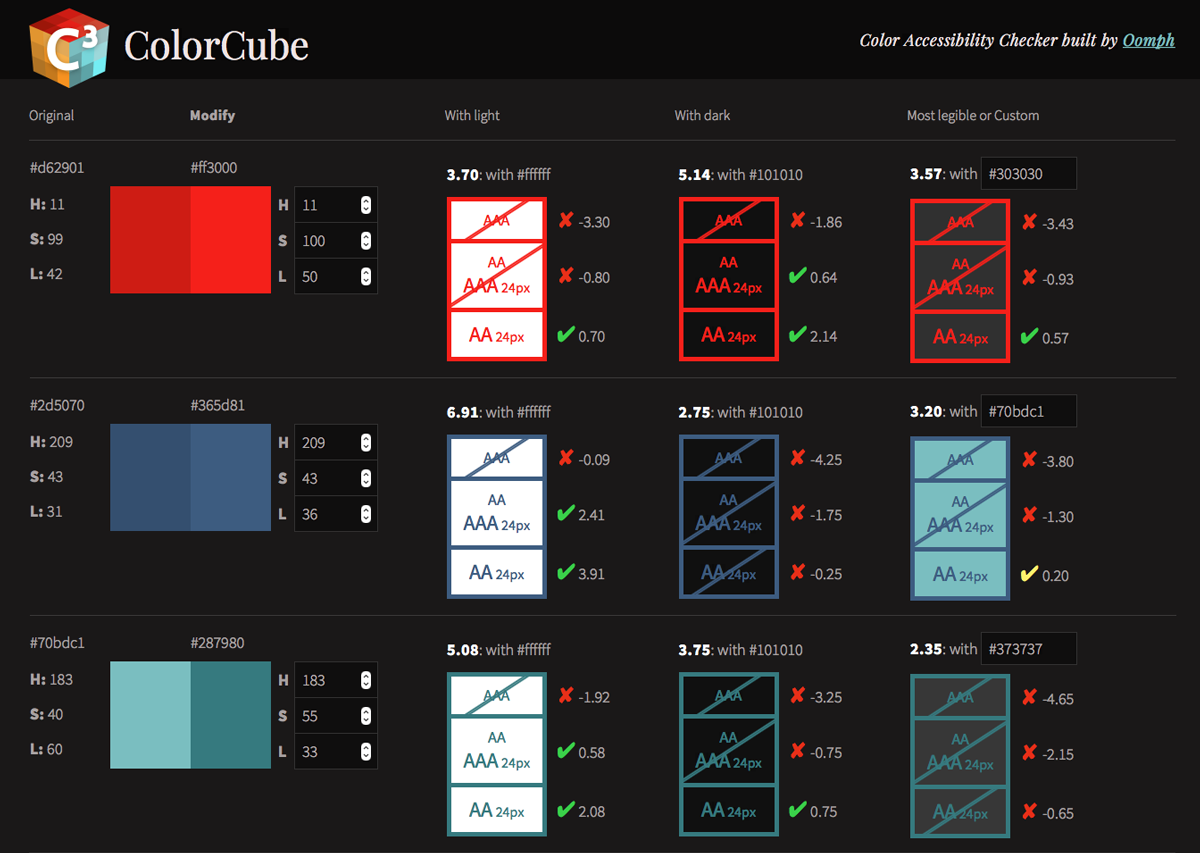
The design also greatly simplifies the output in the interface, making it easier to understand at a glance whether a particular color pair is passing or not. The previous tool highlighted values that were “edge”, meaning that they passed, but just barely. We found that this was confusing and did not add value to someone’s experience — so we removed it. The result is a more streamlined and clutter-free interface.
Functional Improvements
In addition to fixing a few bugs in the color calculations, we added new controls. Visitors can now specify a custom value for the default “light” and “dark” colors. Maybe your design does not use a white background or maybe nothing even gets to true black. Those colors can now be adjusted to meet your design.
The interface now takes advantage of operating system color mode preferences — ”Light” or “Dark” modes. These change the perceptions of the colors as well, so a visitor can override their OS setting in the interface and flip between light or dark modes as many times as they like.
Finally, a History tab has been added and the browser’s LocalStorage is used to save a history of color palettes that are provided to the tool. Going back to a previous color palette is easy, and any palettes from the list can be permanently removed as well.
Functional Enhancements
Internal projects are our chance to experiment with some new ideas and technology. We used this opportunity to add a few fun features.
One of these was the addition of a “Colors from image” feature. Upload an image, and the tool will pull out dominant colors and provide it as a new color palette to evaluate. Besides being fun and a source of color inspiration, this can be useful when a brand logo file has multiple colors that need to be evaluated.
Another enhancement was to add features that support Progressive Web Apps (PWAs). With a service worker in place and a little bit of extra code, the tool can now be recognized as a PWA, which allows it to be “installed” on a smartphone. It will work offline, syncing later as needed, and can be added to a home screen like any other native App without having to go through the App store. This was a fun enhancement that also taught our team a bit about how to make it all happen.
Future Improvements
Our GitHub issues list contains ideas we have sourced from the people who use the tool the most. Contribute your ideas if you use AccessibleColor.design for your next project. We hope to roll out more incremental improvements as we continue to use this project as a way to learn and contribute something valuable to the accessibility community.