Beyond Mobile UX: User-Centered Design Trends for 2017
UX will continue to advance rapidly in 2017. The question is, in what ways? I’ve spent some time thinking about the UX trends I noticed happening with our client work over the past year, and I began to draw some conclusions about how those trends will evolve (or not) in 2017. From moving beyond mobile design to adapting to an onslaught of new technology, here is what I found.
Mobile design patterns are the norm, and that’s good
I might be talking about what seems like ancient history to most designe
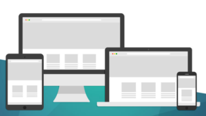
rs, but it used to be normal to create one thing for mobile devices and one thing for desktop. Thankfully, this is not true anymore, but not because it’s too difficult to programmatically determine the differences between mobile, tablet, and desktop.
Design patterns that people have seen for mobile have become the norm for design in general, and in my opinion, that’s great for a few reasons. Users started to appreciate things like larger text, bigger buttons, and links to tap, as well as more concise writing. Why limit these nice ideas to a mobile experience?
We’ve seen more than one client move from a dense desktop-design aesthetic to a more open, structured, and cleanly modern design that encourages scanning, browsing, and exploration. If anything, adapting our large and unwieldy websites for mobile has forced us out of bad design habits that seem to have stymied the progress of an open and inclusive web for all[1].
Hamburgers are the norm, and that’s meh
With the prevalence of mobile design patterns bleeding into tablet and desktop comes a few negative patterns as well — one is the navigation “hamburger.”

I feel the hamburger is a necessary evil that is practically required for mobile, but should be avoided for desktop use. The main problem I have is that it hides much of a site’s context. Too often, just a logo for the company name sits at the top of the screen, and navigation elements give the user clues as to what they can do with this site. Hiding it behind a navigation hamburger icon removes those cues and context, and can even hurt metrics.
What we might see in 2017 is a coalescing around a few ideas, making them standard for users, and therefore reducing the cognitive load for a new person to a site when getting an important first impression. I have seen hamburger icons on the upper left and the upper right, as well as a few odd places like in the center under the logo. I’d like to see the design world embrace the upper left for menu (reserving the upper right for Search and Login/My Account functions) so a user always knows where to look for a navigation menu.
Non-mouse devices are the norm, and that’s complicated
The current device landscape is already pretty diverse. On one side of the spectrum you have touchscreen mobile phones, and on the other you have desktop devices with mice. In between, you have touchscreen tablets and laptops with trackpads, but also laptops with touch-enabled screens. Somewhere else in the middle is an iPad Pro with a touchscreen and a stylus. Then you have the newcomers which might quickly become the norm—gesture remotes, body scanning, and this crazy puck thing. What about the extension of the device via a connected smartwatch? Even more, with the prevalence of VR, we might see more and more cases where the user is the pointer-device.
What does this mean for a developer who likes to know just how a user is interacting with their site? The short answer is that you can never know. Not only are these different inputs really difficult to detect, but the user could switch between input types at any point.
The solution? Design for as many interactions as possible, and don’t forget those who do not use a fancy device at all. Remember it is possible to have no pointer device at all and use the keyboard. (Yes, even in 2017 people will continue to use keyboards!)
Hover states are old school, and that’s sad
I love a nice hover state, a smooth and subtle animation that lets a user know that a certain element is interactive. Sadly, the prevalence of a multi-pointer world (see the previous paragraphs) means that hover states are not seen by all of your users[2].
Designers must now embrace the idea that a user needs to scan a page and determine which elements are interactive and which are not without the benefit of hovering over them with a mouse or touchpad. Elements must look interactive at all times, which forces us to think about establishing conventions within our design systems, whether it be a consistent color, border, underline, or “button” style.
This seems like a limitation, but, again, I think this is the mobile design world pushing back on our desktop-centric assumptions and forcing us to rethink bad habits. Show a user that something is interactive before they interact with it, and everyone wins.
What I’d like to see more of in 2017

Designers and developers do a lot of work to automagically determine a user’s preference. We detect their device, their screen size, their screen pixel density, the ambient light and even the distance of a face from the screen. Instead of banging our heads against the wall, why don’t we just ask them?
Why ask? Because even if our assumptions were perfect, the user knows things that we will never know. Take high-resolution images, for example. We can detect that a user has a Retina screen and deliver them denser images. But we don’t know — and can’t reliably detect — that they are on a slow 3G connection and would prefer to get smaller images for the sake of speed.
Another example that I love to bring up is the iPad Mini. Despite its smaller form factor, the 7″ iPad Mini and the 9″ iPad are indistinguishable. Therefore, our best practice baseline font size of 16px on the iPad renders as 13px, or 19% smaller. How many users know how to make the default font size larger in iOS? My guess is not many. Wouldn’t a control for increasing or decreasing the font size be useful?
We have powerful ways to store this device- or user-specific data these days, either through old-school Javascript cookies or with new school browser storage.
2017 should be the year that we all work on personalizing the web instead of designing for every possible user-scenario.
In conclusion
The prevalence of mobile design has changed the public’s perception of “good” design, and therefore we see the mobile aesthetic as the only aesthetic — it is not even proper to call it a “mobile design pattern” anymore. Not all of these design ideas are great — there are problematic patterns in the wild — but it seems as though the design community is slowly coming to a consensus about what works and what confuses users. I have high hopes that in 2017 more of these varying patterns will coalesce as the emerging best practices users come to expect.
But we can’t stop there. We need to keep pushing and innovating to make the web an accessible and beautiful place for all. The ever-changing device landscape will keep us on our toes. What will the virtual reality web start to look like in 2017, and how will website design adapt?
In the short term, I think there is an opportunity here to personalize the web experience for users and let them decide how to handle the enhancements that designers and developers can make available. If the user is truly the center of the design experience, then we should allow them to really make that experience their own.
Footnotes
- We are a web-focused agency, so I have neglected to mention how native apps have affected a user’s expectation of what the non-app web should be. But I think similar ideas hold true—that a user expects more animations and interactions in the design of non-app websites. This is an exciting development that makes web design more fun, and with CSS3 properties, easier to achieve. Return ⤴
- There was a short-lived and much lauded Sony experiment called “Floating Touch” which introduced the idea of hover for a touchscreen phone back in 2012. Since then, Apple introduced a similar idea with the Apple watch and iPhone 6S, the Force touch, adding a “hard press” to the interface that is different than a normal tap. More and more, I see designers avoiding hover states all together and doing the bare minimum to surface interactivity solely based on a hover state. Even some of Google’s sites have buttons with no hover effect, and other hovers are pretty subtle. Return ⤴