Evaluate Your Company Brand Color Palette for Accessibility
Vision impairments are widespread and will affect different populations more than others. According to the CDC, 6% of Americans have self-reported vision impairment. Add to that 8.5% of the population with a form of color blindness. Add to that 3% who are legally blind. Depending on the state and the age range we are talking about, anywhere between 14-20% of the population is affected by a partial or full vision impairment.
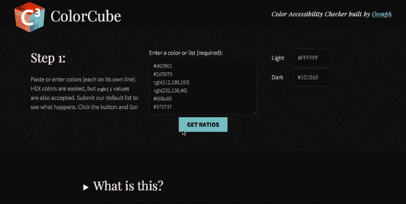
Unless you yourself have vision trouble, it is a silent, personal disability. Making sure your brand colors meet minimum guidelines for accessibility is an important step towards making a website more inclusive. Luckily, there are many tools and guidelines that can help. Oomph has created a color tool as well, and we’d like to describe how easy it can be to evaluate your own color palette.
Why are Color Contrast Ratios Important?
A contrast ratio is a mathematical difference between a foreground color (text, typically) and a background color. If there is not a high-enough contrast, anyone will have a hard time reading the content. Low contrast is 0.0 and the highest contrast (black over white) is 21.0.
A minimum contrast ratio is necessary for all readers of all abilities, but very necessary if they are color blind, near-sighted, far-sighted, or have degenerative vision conditions.
We have all encountered text that is too light on a white background or too dark on a dark background. Older or tired eyes that have been staring at a screen all day have an even harder time than younger and “fresher” eyes.
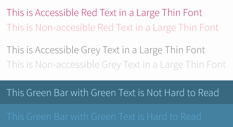
Here are some examples:
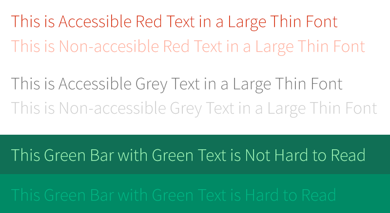
The first row in each of the three groups passes the recommended color contrast ratios. The second in each does not. Even a well-sighted person might find them hard to read. Below is the same image with a filter applied to show what it looks like to someone with the most common form of color blindness, Deuteranopia (also referred to as green color blindness):
The same problems are present — there is not enough contrast between the foreground and the background. But also note a tangential issue — there is little to no visual difference between red text and green text. If a page on your site has instructions that refer to the color of text — click on the green button,
for example — some of your visitors may not be able to tell what the instructions are referring to.
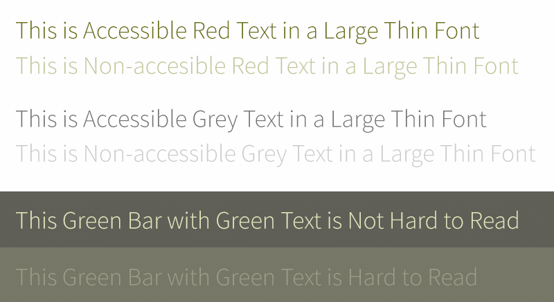
The colors I have selected for the example look basically the same for another rarer type of color blindness, Protanopia (red color blindness). The rarest form of color blindness, Tritanopia (blue-yellow color blindness), looks a bit different:
Notice that the red looks basically normal, but now the green looks blue. Yellow for this condition looks pale purple as well. This form is very rare, with 1 in 10,000 persons affected and can affect men or women equally. The other two conditions affect mostly men and only a small percentage of women.
Color blindness is relatively easy to experience thanks to various software simulators. Adobe products have a color blindness preview mode and accessible color contrast plug-ins as well. Other degenerative vision conditions are a bit harder to visualize, but these tools can help:
Impairment simulators and testing tools:
- Who can Use, a tool which breaks down who might have trouble with certain color combinations
- Simulator for glaucoma, cataracts, diabetic retinopathy, and macular degeneration at Versant Health
- A Chrome store plugin to simulate conditions on top of existing web pages
- A set of downloadable software for Windows and Mac to simulate common vision problems
The Guidelines: Minimum Color Contrast Ratios
Because of these differences in the ways in which people can see, the Web Content Accessibility Guidelines (WCAG) have a set of recommendations. There are two levels of conformance and two targets within each level. They break down like this:
Level AA recommended minimum contrast ratios:
For all text or images of text, a ratio of 4.5:1 is required, except for the following:
- Large Text: Text 24px and larger or bold text 19px and larger, a ratio of 3.0:1 is required
- Incidental: Text or images of text that are part of an inactive user interface component — that are pure decoration — have no contrast requirement
- Logotypes: Text that is part of a logo or brand name have no contrast requirement
Level AAA (enhanced) recommended minimum contrast ratios:
For all text or images of text, a ratio of 7.0:1 is required, except for the following:
- Large Text: Text 24px and larger or bold text 19px and larger, a ratio of 4.5:1 is required
- Incidental: Text or images of text that are part of an inactive user interface component — that are pure decoration — have no contrast requirement
- Logotypes: Text that is part of a logo or brand name have no contrast requirement
The rules in plainer English are as follows:
- All text color over a background color should have a contrast ratio of 4.5. If the text is larger than 23px, or bold and larger than 18px, it can have a contrast ratio of 3.0
- For sites where accessibility is very important — think banking, healthcare, and government websites — the higher levels of 7.0 and 4.5 should be used. respectively
Our ColorCube tool’s feedback includes success or failure criteria for all three contrast levels. No matter the target your project needs to hit, it will show how each color fares with each level of conformance.
The HSL Color Space
When a color combination does not meet a contrast threshold, what can you do? At Oomph, we like to adjust colors using the HSL color format. HSL stands for Hue, Saturation, and Lightness. By using only the Saturation and Lightness factors and keeping the Hue the same, we only darken or lighten the color without changing what kind of color it is.
Hue
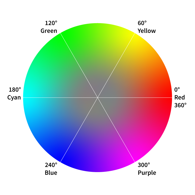
The HSL color space is represented by a color wheel. Hue is numerically a value on a circle, from 0° to 360°. The beginning and end of the color wheel are the same — Zero degrees and 360° are both red. Every 60 degrees is a new primary color — 60° is yellow, 120° is green, 180° is cyan, 240° is blue, and 300° is purple. Hue is what makes red a red or yellow a yellow. Change the Hue and you change where on the rainbow the color falls — you change the fundamental nature of the color.
Saturation
Saturation can be thought of as the purity of a color. In the wheel, it reflects the distance from the center to the outside perimeter. Closer to the center, and the more of the other colors are mixed in. Closer to the outside of the wheel, and the more “pure” the color is. Values of 0% saturation and 50% lightness would result in a gray — all the colors are mixed together in equal amounts. Values of 100% saturation and 50% of lightness would result in the brightness version of that color — one without any of the other colors in the wheel.
Lightness
Lightness refers to how much black or white is being used in the color. Along with saturation, lightness can greatly change the perception of the hue. Values of 100% saturation and 0% lightness would result in black, while 100% saturation and 100% lightness would result in white. 100% saturation and 50% lightness values are the purest form of the color where no black or white is introduced.
A great 2 minute video of how HSL color and the color wheel works can be seen at the Khan Academy.
Adjusting an Example Brand Color to Pass Contrast Ratios
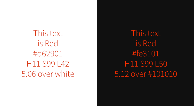
Say a company uses red as a brand color — as we do. That color passes Level AA when used over white but not when used with almost black. What should we do to make that color pass Level AA criteria?
First, we load up the colors in ColorCube (the demonstration color palette already contains the red we are discussing). We can see that it does not pass over black #101010. It fails by 0.72 with a color contrast of 3.78. We need it to pass 4.5. The HSL values for this red are H11 S99 L42. We don’t want to change the kind of red this is, so we do not touch the hue controls. We are already at almost 100% saturation, so making the color more pure will not help. Instead, we increase the lightness value from 42 to 50.
Second, we click the up arrow in the L field (or use our arrow up key) to see the test results update in real time. The results move from failing to “edge” to passing once we hit 50% lightness and a passing contrast ratio of 5.12. The new hex value has also been updated, and we can cut and paste that into our CSS code.
Most people will not notice that the red color has changed slightly over a dark background. In the image below we show the original color over white and the new color over black. Because the backgrounds are so different, it is hard to perceive a change in the base color.
This is why we prefer to use the HSL color space. Unlike RGB, it is more intuitive. It is easier to change only saturation or lightness to get a failing color to pass. And most people won’t even notice that there was a color change.
Create Accessible Color Palettes with ColorCube
ColorCube delivers maximum functionality in minimum space. Detailed color contrast test results for each color against three of the WCAG contrast minimums. HSL adjustment tools quickly change and retest colors without affecting the original intention of the color — unless you want to. A third color takes custom color combinations to test something specific. Plus, white or black values can be customized before testing.
We hope you find our tool useful, and most of all, we hope it helps teams build more accessible digital products. Be inclusive — test, adjust, and implement accessible color palettes with ColorCube.
Reach out to J. Hogue on Twitter or email or drop an issue into GitHub. Contributions are welcome!