Managing CSS Colors Systems with a Single Source of Truth
Our team recently worked through the first phase of a large government platform run by a component design system. The goals were to create a set of visual themes that could support accessibility, native light- and dark-mode switching, and a set of content components that were flexible enough to support more than 70 government agencies. There is quite a bit of complexity to the system, but what we’d like to focus on right now is how we are managing the color system.
The sites are still evolving, but the current count is five color themes, each with a light- and dark-mode, using a total of 46 colors. We decided to use PatternLab to manage our design patterns, which means that each component is comprised of its own Sass, JS, and Twig files packaged together in a portable way. It also means that we could leverage custom Gulp processes to make some pretty cool stuff happen.
First, our goals of using PatternLab and creating a single source of truth:
- Define a color once and in one place and make its definition available to Sass and Twig
- Define color themes once and in one place and make those definitions available to Sass, Twig, and PHP
- Define colors in HSL(), which is more human-readable, making it easy to understand the relationships between colors, while allowing conversion to whatever color space we might need
For the government employee using this system, our goals were to:
- Allow authors the choice of background colors from defined theme options without controlling foreground colors — this takes the ability to create inaccessible color combinations out of their hands
- Allow authors to design content for their own preferred color scheme (light or dark) and be confident that it will look great for those who use the other mode
And for the end-user viewing any of these sites, we wanted to support:
- A minimum color contrast ratio of 4.5 for accessibility in menus and design components but a higher contrast for main content
- A dark mode that responds to a viewer’s system preference but can also be overridden with local site controls
Here’s how we were able to achieve those goals.
One (H)JSON file to rule them all
We decided that our single source of truth needed to be in a flexible and simple format. JSON fit our needs the best with its ability to support nested relationships and arrays. The only thing it didn’t allow was comments, which can add legibility and documentation. We found that HJSON was a great compromise, and used Gulp to convert our master HJSON file to JSON as part of the build process1.
The HJSON file is one large array. Colors are defined one level deep alongside themes, which are also one level deep. The first level of the structure looks like this:
{
  "colors": { … }
  "themes": [ … }
}
JSON
Color Definitions
Simple so far. Inside the colors array, individual definitions are structured as a single-depth array:
{
  "colors":
    # Medium blue
    "ocean--dark": {
      "name": "Ocean State dark",
      "hue": "medium blue",
      "hsl": "hsl(208, 12%, 32%)",
      "needs": "light-text"
    },
    "ocean": {
      "name": "Ocean State",
      "hue": "medium blue",
      "hsl": "hsl(208, 54%, 73%)",
      "needs": "dark-text"
    },
    "ocean--light": {
      "name": "Ocean State light",
      "hue": "light blue",
      "hsl": "hsl(208, 58%, 92%)",
      "needs": "dark-text"
    },
    "ocean--trans25": {
      "name": "Ocean State 25% transparent",
      "hue": "medium blue",
      "hsl": "hsla(208, 54%, 73%, 0.25)",
      "needs": "dark-text"
    }
  }
}
JSON
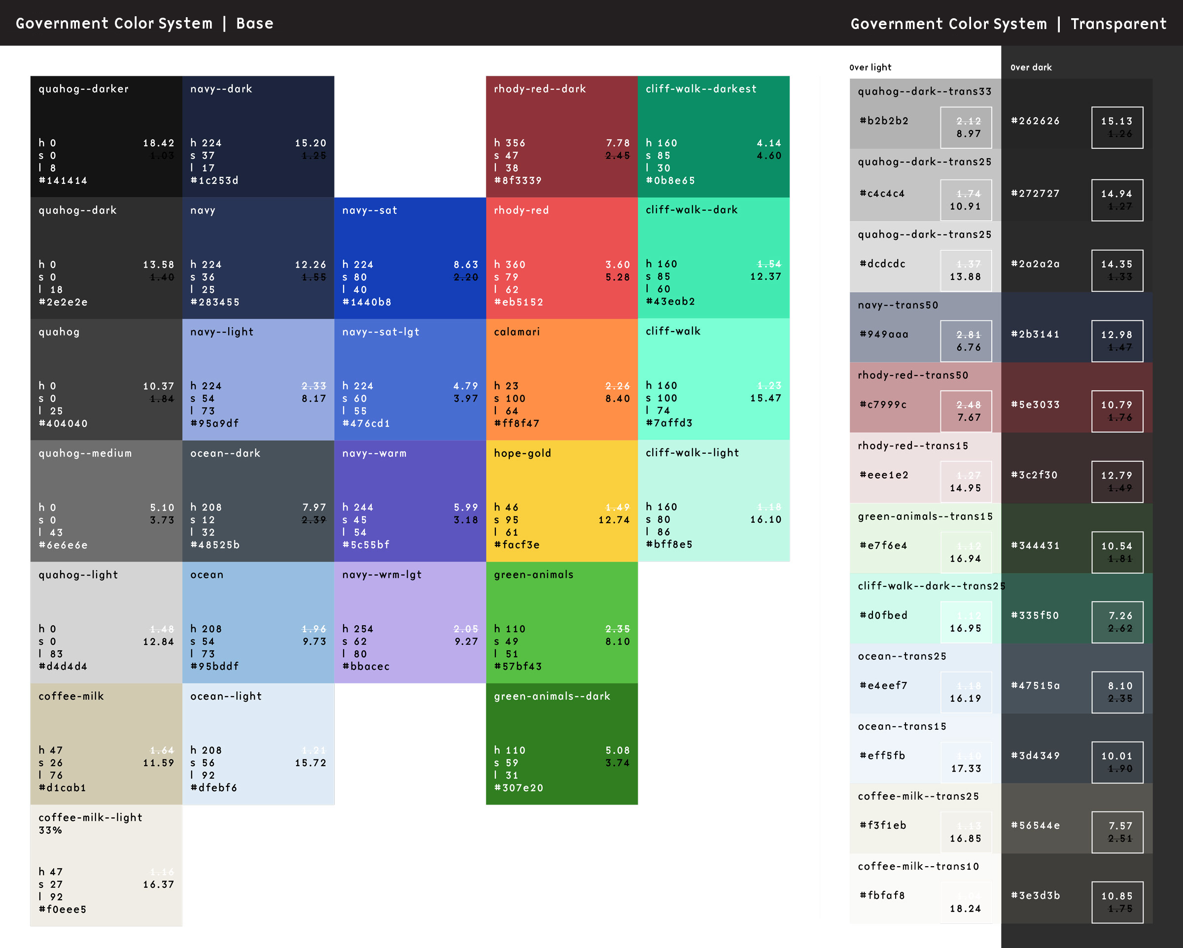
There are 46 colors total, but they all follow this pattern2. The first key is the name of the color, written in a slug form that will work in Sass and Twig. We like BEM, so the naming of our colors follow a similar idea. We tried to keep naming things easy, so once a color name is established, its variations are “–darker”, “–dark”, “–light”, with some colors using variations like “–bright” or “–trans25”.
Within each color definitions are the following bits of data:
- name: A human-readable name that can be used in a select list
- hue: How the color might be described
- hsl: The actual color definition in either the HSL() or the HSLA() color space
- needs: What color text would this color need? Light or dark are the values we expect here
Outside of Pattern Lab, the colors in our system are represented by this preview from our documentation:
Turning HJSON Colors into Sass
Now the fun begins.
With our custom Gulp process, these HJSON definitions get turned into minified JSON. This happens as part of the initial build time. Once that JSON is created, when our Sass is saved and a new compilation happens, the contents of that JSON file are available to the Sass build process as a large Sass array. That allows a Sass file to define all of these colors as custom properties:
In a file called _colors.scss, we use an @each loop to write them all into our stylesheet as CSS custom properties on the HTML element3:
html {
  /* Default color CSS vars */
  @each $key, $value in $colors {
    --c__#{$key}: #{map-get($value, hsl)};
  }
}
Sass (Scss)
The output looks as you might expect. The Gulp process converts the colors from the HSL color space into the more typical Hexidecimal and RGBA color spaces:
html {
  --c__ocean--dark: #48525b;
  --c__ocean: #95bddf;
  --c__ocean--light: #dfebf6;
  --c__ocean--trans25: rgba(149, 189, 223, 0.25);
}
CSS
Turning HJSON Colors into Twig
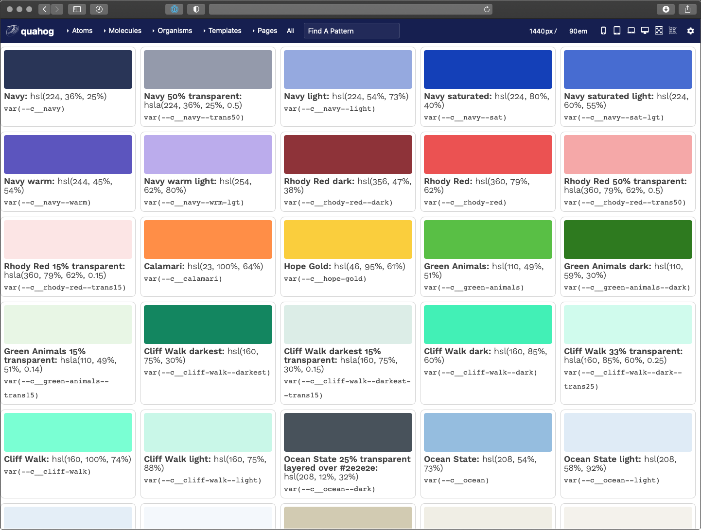
That’s pretty cool, but it gets cooler. In a design system tool like Pattern Lab, we want to display swatches of these colors to end users of the design system. This is where the same ideas as converting JSON to Sass can be applied inside Twig files. The JSON file is read into and available as an array as well, which allows a colors.twig file to do this:
<ul class="sg-colors">
  {% for key, color in colors %}
    <li>
      <span class="sg-swatch" style="background: {{ color.hsl }};"></span>
      <span class="sg-label"><b>{{ color.name }}:</b> {{ color.hsl }}</span>
      <span class="sg-code"><code>var(--c__{{ key }})</code></span>
    </li>
  {% endfor %}
</ul>
Twig
A for loop in Twig iterates on the array and outputs a color swatch, a human-readable label, and the name of the CSS custom property. Pretty neat! Now we can update our colors in the HJSON file and those changes trickle down to the Sass definition and the Twig preview as well as our CSS stylesheet.
But that’s not all…
Theme Definitions
The second array in our HJSON file controls our themes — again, five different color themes each with a light- and dark-mode. To manage these effectively, we had to make some architectural decisions. Here is where we landed:
- Break the theme down into components, like “header”, “nav-main”, and “default” among others
- Name these theme colors with a functional component name — i.e., in the main navigation, a color name might be
var(--fc__nav-main__fg)which representsfunctional color, navigation main, foreground - Define functional colors in themes as a reference to the colors array
This structure allows a front-end developer to only concern themselves with the functional color name — i.e., --fc__nav-main__link. They don’t need to know what color that maps to as long as it has been defined in the theme. The theme designer is the one that focuses on making colors available and controlling the accessibility of those color combinations.
Define the Themes
Much like our color definitions, the top depth of the array defines our color theme
"palettes": {
  "scarborough": {
      "humanName": "Scarborough Beach",
      "values": { … }
  }
}
JSON
We only need a slug, which is the array key, and a humanName. The slug will be used to output a list of colors per theme. The human-readable name is used in a dynamically-generated list of available themes through the authoring admin screens (more to come on that later).
Define the Components
Inside the values array, each component definition is included. The list is long, but a sample of it looks like this (with our inline comments allowed by HJSON):
"header": [
  { "fnName": "fg", "colorName": "white" },
  { "fnName": "bg", "colorName": "navy" },
  { "fnName": "link", "colorName": "white" },
  { "fnName": "link--hover", "colorName": "ocean" },
  { "fnName": "social__link", "colorName": "ocean" },
  # Hover should be the same as the default accent color
  { "fnName": "social__link--hover", "colorName": "hope-gold" }
]
JSON
These compile to a list of color definitions per component. The final color variables look like this:
html {
  /* Default functional colors used by the header component */
  --fc__header__fg: white;
  --fc__header__bg: #293557;
  --fc__header__link: white;
  --fc__header__link--hover: #95bddf;
  --fc__header__social__link: #95bddf;
  --fc__header__social__link--hover: #face3d;
}
CSS
Output the theme components
Our themes are controlled by overriding the functional color definitions with specificity. A loop in our colors.scss file renders all the colors and all the themes as CSS variables. The first theme definition serves as our default, while additional definitions with a class present on the <body> override those definitions.
It makes more sense in CSS. Here is a full example of only the header component:
html {
  /* Default functional colors used by the header component */
  --fc__header__fg: white;
  --fc__header__bg: #293557;
  --fc__header__link: white;
  --fc__header__link--hover: #95bddf;
  --fc__header__social__link: #95bddf;
  --fc__header__social__link--hover: #face3d;
}
/* Default colors for dark mode (overrides only) */
html.dark {
  --fc__header__bg: #1b243b;
}
@media (prefers-color-scheme: dark) {
  html:not(.light) {
    --fc__header__bg: #1b243b;
  }
}
/* Component colors when a theme class is present (overrides only) */
html .qh__t__federal-hill {
    --fc__header__bg: #8e3339;
    --fc__header__link--hover: #face3d;
    --fc__header__social__link: white;
}
/* Component colors when a theme class is present AND it is dark mode (overrides only) */
html.dark .qh__t__federal-hill {
    --fc__header__bg: rgba(235, 82, 82, 0.15);
    --fc__header__social__link: #eb5252;
}
@media (prefers-color-scheme: dark) {
  html:not(.light) .qh__t__federal-hill {
      --fc__header__bg: rgba(235, 82, 82, 0.15);
      --fc__header__social__link: #eb5252;
  }
}
CSS
The power of CSS specificity helps us here. The top of the file is our fallback for any functional color in our default theme — they all need to be present here. Any additional definitions only need to change those colors. Anything in html.dark overrides the colors in html4. Anything in html .qh__t__federal-hill overrides colors in html with specific theme colors. And anything in html.dark .qh__t__federal-hill overrides colors in html .qh__t__federal-hill when dark mode is present.
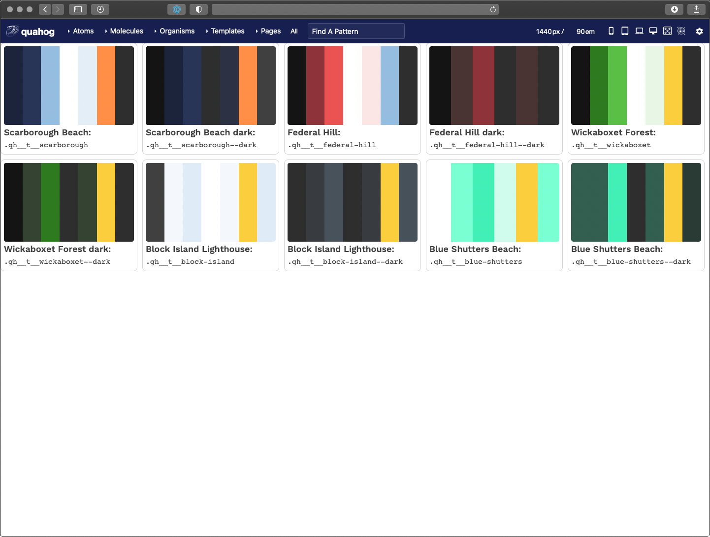
Outputting Visual Theme Previews
Similar to the Twig for loop for color swatches, we created a loop in Pattern Lab that renders a visual swatch to represent a theme. I won’t go into all the code here, but the trick we used was to create stripes of color using an inline CSS linear-gradient(). The result looks like this:
Taking it a Step Further for Accessibility
We decided that the theme designer would be responsible for providing accessible color contrast ratios (CCR) when defining --bg and --fg colors. It is up to them to choose which combinations to use, but with 46 colors, that’s 2,116 possible combinations! How can a theme designer know which combinations pass which CCRs?
Through the power of programming, we created another Twig file that leverages a nested for loop to create a large table. Across the top are our 46 colors and down the side are our 46 colors again. In the middle where a color row intersects a color column, we render enough data on the table cell to allow a Javascript loop to calculate the CCR for that combination of colors.
The result is a data table that shows every color combination and how that combination passes or does not conform to WCAG CCR thresholds. The power of for loops!
Here is what that looks like:
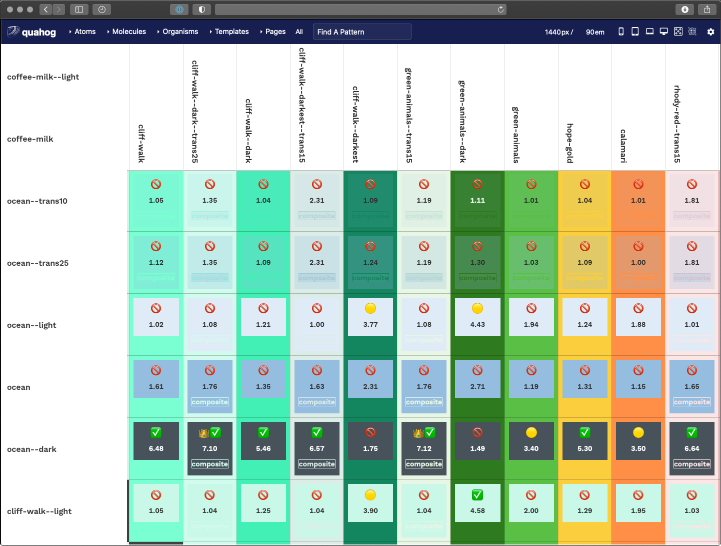
A fun little thing here is that we used emojis as our visual output. Anything under 3.0 is not allowed, anything 3.0 to 4.5 is passable under certain conditions, while anything over 4.5 is great and anything over 7.0 is royalty.
function setMessage(ccr) {
  var message = '';
  if (ccr >= 7.0) {
    messge = '👑';
  }
  if (ccr >= 4.5) {
    message = message + '✅';
  }
  if (ccr < 4.5 && ccr >= 3.0) {
    message = '🟡';
  }
  if (ccr < 3.0) {
    message = '🚫';
  }
  return message;
}
JavaScript
Another trick here was how to calculate CCR when one or more of the colors are transparent. In short, we had to do some JS that was aware of the background color — therefore, view this table in light mode AND dark mode to get the fullest amount of data around transparent color combinations.
Displaying a Theme Selection
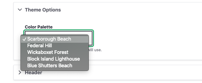
The final step of making our HJSON file control colors and themes from end to end is getting the list of themes into the admin of the site. With this, a site author can choose a color theme for their site, and further, when we add a new theme, that setting is available as soon as there is a new design system deployment.
A bit of PHP in the Drupal theme-settings.php file cycles through our JSON to render the select list of theme names. The end result of that looks like this:
Wrapping it all Up
In an extreme example of the DRY principle (Don’t Repeat Yourself), we’ve set up a system where one file rules all of our color definitions. A JSON array can render the following data through a Gulp process:
- Custom CSS properties for color definitions in Sass
- A Twig file with a visual preview of all colors
- Custom CSS properties for functional component colors within defined color themes for light and dark modes
- A Twig file with a visual preview of all themes
- A Twig file with a data table calculating color contrast ratios for all colors in the system, and
- A dynamic drop-down menu in the admin of the sites that allows a site author to choose a color theme
A HJSON to JSON/Sass/Twig/PHP workflow is certainly a great foundation. While this file manages only colors and themes, the same workflow could manage font-families, font-sizes, spacing values, and more. For now, we are taking it one step at a time but this certainly gives us some ideas to expand upon in the future.
- Yes, we could have added a comment field to our JSON structure, but we wanted more than that. Commenting individual lines with a hash character (“#”) was very helpful when we got to defining entire color themes
- Is this article actually about the new hotness, “design tokens”? Yes, in some ways, it is. Rather than being prescriptive about what and how to use design tokens, though, we concentrate on how we use them for this project. If you want to call them design tokens, that’s fine with us — but it’s not the main point.
- Why html and not
:root? Solely because the Javascript polyfill we use to support CSS variables with Internet Explorer 11 requires definitions on the HTML orbodyelement, and does not work if we use:root - Too bad about the media query for
prefers-color-schemeneeding to be declared in its own group. The repetition hurts a little bit but luckily the lists of colors are small.