Evolve your Best Practices: More Accessible HTML Forms
Accessibility on the web is important. You know it. We know it. Everyone knows it. Let’s learn more about how to make it happen.
We’ve been thinking about accessibility (A11Y) for a long time and are always looking for ways to improve our best practices. While every project presents its own set of unique challenges, there are some common practices that have become part of what we do for any project. We’d like to share those practices and a little bit about what effect they have on a11y.
The Difficulty of Online Forms
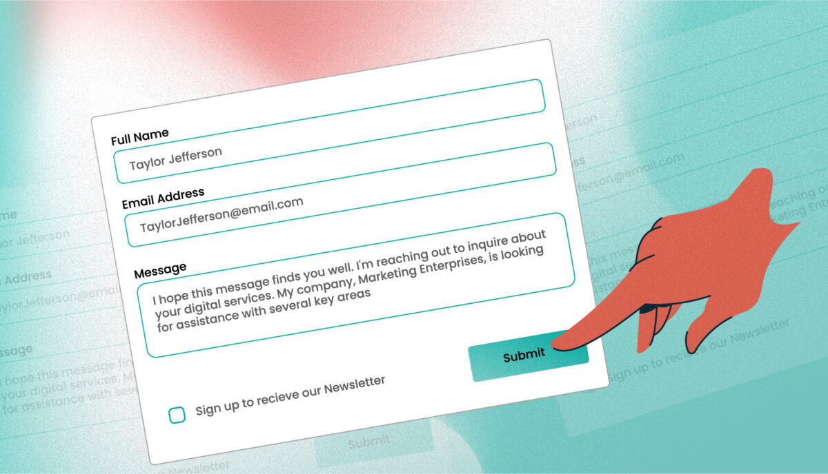
One of the thorniest issues that a web developer wrestles with is online forms. There are user interface design challenges and development challenges in the browser and server environments — forms can become too long and too complex very quickly. There are many states of a form element to design and program — static, hovered, in focus, with valid content, with invalid content, read-only, disabled. On top of all that, there should be special considerations for users who rely on screen readers or keyboards to navigate.
The good news is when you use all the HTML components as they are intended, you get a form that is about 90% accessible. That’s why those elements exist. Screen readers inherently know how to handle form elements, understand the relationship between form labels and form inputs, the actions associated with select lists, and the action associated with submitting the form. Most developers get this right, but some, of course, try to skimp on adhering to the HTML specs. That should be avoided — we are all better than that.
Quick Wins
Where it gets more complicated is when a designer or developer tries to reinvent the way forms inherently work, or leaves elements off of a form that are essential for non-mouse and non-visual users. That’s when we start to get into trouble. Here are some simple things that you can get right in your next form implementation.
For Every Input there is a Label
This seems to be common sense, but you might be surprised how many designers think that it’s cooler to use the placeholder attribute as the label, which is bad UX. Even if a designer wants to do that (and again, please don’t do that), a developer needs to supply one in the markup for screen readers or the experience will be broken for those users.
The best markup for a simple form, with one input and one button, goes like this:
<form id="search-form" role="search">
  <label class="a11y-text" for="search-field">Enter a phrase or keyword to search the site</label>
  <input id="search-field" class="search-form__input" name="search" type="search" placeholder="Search for..." />
  <button type="submit"><span class="a11y-text">Submit your </span>Search</button>
</form>
See this markup in action: codepen.io/kbeck303/pen/yPXpeN
Things to note:
- A role of Search: The search landmark role identifies a section of the page used to search the page, site, or a collection of sites. ARIA Roles help explain HTML elements to screen readers and add context. If a form is not used for search, then the role of “form” should be applied (see the MDN WAI-ARIA roles reference page for more)
- Don’t forget the “for” attribute: HTML 101 says it’s not enough to have a label visually close to an input. The
forattribute should contain the ID and Name of the input element that it is labelling. Not only is this great for screen readers, but it is also great for mouse users since a click on the label will focus or select the referenced input field - Don’t hide a label, but when you must, let it be readable: In this example, an open text input field next to a button labelled “Search” is enough to inform users that this is a search form. It does not need a label but it should still have one for screen readers. In this example, our label describes what a user can search for. We hide it with CSS that retains the element on the page for a screen reader. If we used
display: noneorvisibility: hiddenthe element would not be available to a screen reader - Use a placeholder to describe the data expected: In most cases it makes sense to rely on a
placeholderattribute to describe the content that the input expects. Our example search form may not need it, but a better example might be a phone field for which the label is “Phone Number” and the placeholder text is “123-456-7890” - When a button reads funny, add more context for screen readers: The
a11y-textclass is a great way to add more context to an action when needed. In this case, when a screen reader says “Search” it seems like a command as well as an action. By adding the words “Submit your,” it makes it more clear that this button submits the content of the search form. Again, that class would hide the content visually but still keep it available for screen readers (Bootstrap uses a similar class namedsr-only, for “screen reader only”)
Every Checkbox/Radio group is wrapped in a Fieldset
A fieldset is an element that may not be widely understood. The HTML 4.1 spec explains a fieldset as an element [that] allows authors to group thematically related controls and labels.
Importantly, a fieldset requires a legend, and neither element should be used without the other.
Groups of radio buttons and checkboxes should always be wrapped in a fieldset with a legend. When you see it in code, it makes sense as to why:
<fieldset>
  <legend>Do you like coffee?</legend>
  <div class="radio">
    <input type="radio" name="coffee" id="no" value="no"/>
    <label for="no">Nope</label>
    <input type="radio" name="coffee" id="yes" value="yes"/>
    <label for="yes">Yes</label>
    <input type="radio" name="coffee" id="love" value="love" checked />
    <label for="love">No, I LOVE it!</label>
  </div>
</fieldset>
See this markup in action: codepen.io/kbeck303/pen/OOgzve?editors=1000#0
The legend in this example serves as the description for the entire group, while the label/input pairs explain the different answers. The fieldset groups all of these items together into one element that a user can interact with. If you want people to answer the question Do you like coffee?
this is the preferred way to mark that up.
For screen readers, this grouping makes a much bigger differences if you think about an ecommerce checkout experience. Consider the fact that Billing information and Shipping information typically use the same labels and inputs inside them — Address, Address 2, City, State, etc… To a screen reader, the thing that makes them distinct is their fieldset and legend. If one legend is “Shipping information” and the other is “Billing information,” this makes the relationship more clear. A screen reader navigates the tree of hierarchy like this:
form
-    fieldgroup
--     legend: Shipping information
---      label: Address -> Input
---      label: Address 2 -> Input
---      etc…
-    fieldgroup
--     legend: Billing information
---      label: Address -> Input
---      label: Address 2 -> Input
---      etc…
A non-sighted user can now understand the hierarchy and how fields with the same labels now relate to a larger grouping of content. For more, the Paciello Group provides a great in-depth breakdown of fieldsets and legends.
Required Fields look Required
This is another idea that seems so simple and so basic, but many form implementations fail to do it. Both visual and non-visual users need to understand which form elements are required. It’s not enough to add an asterisk to a form label — you need to describe what the asterisk means.
Designers are likely to cite the prevalence of asterisks on forms to mean that a field is required as a reason not to explain them — if you do something often enough, it’s easy to think that everyone has seen it, and everyone has a collective understanding of what it means. But, as we all know, it’s lazy and dangerous to assume (among other things).
Consider these accessibility points:
- Asterisks are usually pretty small, and someone with reduced vision may not see them
- Asterisks are usually red, which indicates they are important, but someone with red/green color blindness loses that association and will only know they are important if they have experienced the asterisk on a form previously
- The asterisk character is not read out loud by many screen readers. Even if they were read out loud, the user would hear “asterisk” and not know why it was being read aloud
The best thing to do is verbosely explain them. There are a few techniques to achieve this, and in our example, we use a combination of text intended to be read by screen readers with visual notation intended to be ignored:
<form>
  <p>The fields with an asterisk <span aria-hidden="true">(*)</span> are required.</p>
  <label for="name" class="required-field">
    Full Name
    <span class="a11y-text"> (required)</span>
    <span aria-hidden="true">*</span>
  </label>
  <input type="text" id="name" name="name" aria-describedby="name-help-text" required>
  <p id="name-error-message" class="error valid a11y-text" aria-live="assertive" role="alert">A value for the Full Name field is required</p>
  <p id="name-help-text" class="help-text">Add your first and last name to this field</p>
  <input type="submit" value="Submit">
</form>
Things to note:
- Explain the asterisk: Plain language is preferred. Make it simple, make it understandable. If all fields of a form are required, additional text at the beginning of the form should announce that all are required in addition to the individual prompts
- Use aria-describedby: The first input in this example uses an
aria-describedbyattribute to link the input to the ID of the help text below it. A screen reader will announce this when the input comes into focus. When the user tabs to the form element, the announcement will be Full Name, required, edit text [pause] Add your first and last name to this field. Once the input has been validated, the error message will need to be dynamically added to the string of messages by using Javascript to add another ID to the aria-describedby attribute:<input id="name" type="text" name="name" aria-describedby="name-help-text name-error-message" require>. Since thename-error-messageelement has an aria-live value of “assertive”, it will be announced right away - Visual distinctions are helpful but they can’t be the only indicator: For visual users, when a field is invalid, it should look invalid as well, either with a persistent red glow or a red border or something else distinct from the rest of the valid fields. That’s great for non-color blind users, so don’t make it the only indication. The error text should become visible as well, with a clear visual association between it and the invalid field
These are three relatively quick wins that a designer/developer should keep in their arsenal of best practices. But we have more…
Advanced: ARIA Live Regions are your Friend
If you start to dive deeper into what ARIA roles can do, you might have come across the aria-live attribute. This is a way to queue messages for screenreader users that are announced in one of two ways: polite will announce messages when the user pauses, or when another announcement finishes; assertive means that the announcement will be made immediately, interrupting whatever a user might be doing.
One might think that a live region is only needed when AJAX is injecting new content into the page, but that is not a good rule of thumb. A field with a password strength test is a nice, small example of announcing an item while it is in progress. Another example is a field that has a character length counter attached to it. In that example, one would want the total number of characters to be announced politely, after the user has taken a pause in their writing.
Forms with inline (client-side) validation should also announce errors after a user has finished typing his/her input. This is another example of using an ARIA live region. If you are interested in using ARIA live regions, MDN has a great page of resources to start with.
In general:
- IDs link elements together: Use an ID on the region container and link it to any input fields with an
aria-describedbyattribute. This will queue messages into the region that are either announced politely or assertively - Polite and Status: The live region will have an aria-live=”polite” attribute added to it as well as a role=”status”. Both of these used together cover the most ground with major market screen readers and allow messages to be announced once the user has paused. More information about combining Region roles with aria-live can be found at MDN.
More to think about
These ideas and new best practices are just the tip of the iceberg, of course. There are lots of things to think about when you add accessibility to the mix and you truly start to understand how the visual and aural experiences differ. Some other ideas that you should probably think about when it comes to accessible forms, or websites in general, could be:
- When/How do error messages get triggered? Do they happen inline on each field as the user types, or are all the errors grouped together and shown visually/announced aurally when the user submits the form? This is typically referred to as client-side vs. server-side validation. Both approaches need to consider the screen reader experience with some form of live region
- What about conditional fields? A great use case for an ARIA live region is when a new field comes into view based on the input of another field. Previously hidden fields will need to be announced for screen readers once they come into view for everyone else
- Have you designed an accessible focus state? For users that navigate with their keyboard, a focus state that is not the same as the hover state of an element might be needed. The browser’s default light blue outline is usually not enough to meet color contrast requirements of 4.5:1 (same as WCAG 2.1 Level AA for small text). The focus state should be consistent from element to element, changing only to meet color contrast requirements based on the background or surrounding colors of the element in focus
The Goals of Evolving your Best Practices
Just as any other craftsperson would, you need to take time in between projects to sharpen the tools in your belt. Although learning more about accessibility and how screen readers work might seem like a galaxy of complexity, the results are truly worth the effort. The web started as an accessible place, and even though it has grown in complexity, many people who help draft new specs for HTML and CSS work diligently to keep it that way, resulting in a language that seems simple on the surface but which is incredibly robust and accessible once you know what tools to use.
Think about accessibility more often. Use attributes that are new to you to solve problems. Use Google, Stack Exchange, CodePen, and others to share and discover new ideas and approaches. We’ll do the same, and we’ll share more tips as our own best practices continue to evolve.