Drupal has long been known for its flexibility, robustness, and scalability. But for many marketers and content creators, that flexibility can come with a steep learning curve — especially when it comes to building layouts and managing design without the help of a developer. That’s about to change in a big way.
Enter Experience Builder, a new initiative in Drupal that promises to radically streamline and simplify how we build and design pages. While still in its early stages, Experience Builder is ready for testing and experimentation — and it’s something marketers should absolutely have on their radar.
What is Experience Builder?
Experience Builder is the evolution of Drupal’s current method of flexible page building called Layout Builder. It takes what we know from layout builder and expands it into a unified, user-friendly tool that allows non-developers to build and theme websites directly in the browser. It’s a huge leap toward making Drupal more accessible for site builders, marketers, and content creators alike.
Unlike other page builders, Experience Builder doesn’t just provide drag-and-drop layout tools. It leverages Drupal’s core strengths — structured data, fine-grained access controls, and reusable components — to ensure consistency across channels and scalability across enterprise-level websites. This makes it uniquely powerful for large organizations managing multiple digital properties.
Dries Buytaert, Drupal’s founder, described it as a response to the fragmented landscape of site-building options in Drupal today. The vision is to consolidate functionality from tools like Paragraphs and Layout Builder into a single, cohesive solution. One that’s intuitive, efficient, and packed with modern capabilities.
Here is a fantastic video demo from DrupalCon Atlanta that was shown by Dries during the keynote address:
Why Now?
The timing couldn’t be better. While Layout Builder was a step in the right direction when it launched in 2018, its limitations became clear as more site builders demanded easier workflows, styling tools, and richer content composition features.
At recent Drupal conventions, the community has rallied around the idea of enhancing user experience across the board. As part of the broader Starshot initiative (now named Drupal CMS), Experience Builder is a key component in bringing Drupal’s usability in line with the expectations of modern content teams.
Why I’m Excited About It
As an engineer who has worked closely with Drupal for years, what excites me most is how Experience Builder can bridge the many gaps in Drupal’s current page-building ecosystem. Today, there are so many ways to structure content — Blocks, Paragraphs, Layout Builder, Panels — that choosing the right one can be overwhelming.
Experience Builder is shaping up to be that “one-stop-shop” we’ve needed. It reduces decision fatigue and gives teams a faster way to get projects off the ground without needing to architect every page structure from scratch.
Even better, it supports creating single-page overrides, component-level editing, and even React-based components right in the editor. That’s something I’ve personally looked forward to for a long time. The ability to build and save reusable components that can be dropped into any page makes this a tool that truly enhances productivity — not just for developers, but for marketers and content creators, too.
My First Look
I had the chance to see Experience Builder in action at DrupalCon Atlanta this year. The live demos were impressive and really opened my eyes to what this tool could do, both for newcomers to Drupal and seasoned site builders. Along with Drupal CMS, and recipes, Experience Builder is easily one of the hottest topics in the Drupal ecosystem right now.
The energy in the room during the sessions was palpable—people are genuinely excited about this. It’s not just another experimental module; it’s a shift in how we think about building on Drupal.
A Game-Changer for Marketers
One of the biggest barriers for marketing teams has always been reliance on developers to make even small layout edits. That’s starting to change.
With Experience Builder, non-developers will be able to build out dynamic, visually engaging pages — without needing to dive into code. That’s a massive win, especially for small teams in government, education, or nonprofit sectors, where resources are limited and time is of the essence.
Being able to make changes quickly, reuse content intelligently, and maintain a consistent brand without touching a template file is something many organizations have wanted for years. Experience Builder delivers on that promise.
Want to Try It Yourself?
If you’re curious to see what the buzz is about, the best way to get started is simple: head to Drupal.org and download the latest version of Drupal CMS. It now comes with an optimized installer that makes getting started faster than ever. Once you’re up and running, you can add the Experience Builder module and start exploring.
Looking Ahead
It’s important to note that this is just the alpha version of the Experience Builder initiative. The team behind it is committed to rapid iteration and community feedback, which means what we’re seeing today is just the beginning.
If this is the foundation, I can only imagine how powerful the tool will become in the next year or two. The Drupal community is known for its collaborative spirit and constant innovation — and Experience Builder is shaping up to be one of the most important steps forward in years.
So if you’re a marketer, content strategist, or anyone who’s ever been frustrated by the limits of page building in Drupal — now’s the time to dive in. Experience Builder is here, and it’s ready to change the game. Contact us for a demo or more information about Experience Builder in Drupal.
Today I learned about a military term that has come into the culture: VUCA, which stands for volatility, uncertainty, complexity, and ambiguity. That certainly describes our current times.
All of this VUCA makes me concentrate on what is stable and slow to change. Its easy to get distracted by that which changes quickly and shines in the light. Its harder to be grateful for what changes slowly. Its harder to see what those things might even be.
In the face of AI and the way it will transform all industries (if not now, very soon), its important to remember what AI can not yet do well. Maybe it will learn how to create a facsimile of these traits in the future as it becomes more “human” (trained on human data with all its flaws might mean it has embedded within it those traits we find undeniably human). However, these skills seem like the ones that can help us navigate the VUCA that is life today.
Be Curious
AI can ask follow-up questions for clarification, but it does not (yet) ask questions for its own curiosity. It asks when it has been directed to do something. It does not sit idle and wonder what the world is like beyond the walls of the chat window.
Humans and high-order animals have curiosity. We seek information and naturally have questions about our world — why is the sky blue? why does the wind blow? why do waves crash onto the shore?
In our operations, Oomph prides itself on Discovery. This is our chance to ask the big questions — why does your business work the way it does? why are those your goals? who is your audience you have vs. the audience you want?
In life and work, curiosity is one of our best traits. This means trying new tools, changing our processes and habits for improved outcomes, and exploring something new just to see what it can do. Even with all the VUCA in the world, approaching uncertainty with curiosity keeps us open and engaged with what we can learn next.
Use Judgement
Another important human trait is judgement, and this continues to be invaluable as humans are needed to evaluate AI outputs.
AI is very good at creating dozens, if not hundreds of outputs. In fact, probabilistic (not deterministic) output is the strength and sometimes weakness of AI — you almost never get the same answer twice.
Our human expertise is needed to curate these outputs. We need to discard what is average and unremarkable to find the outputs that are surprising and valuable. We need to use our judgement and experience to find the ideas that are applicable to the client, the project, and the moment. Given the same 100 outputs, the right ones might be a different selection depending on the problem we want to solve and the industry in which it will be applied.
Exude Empathy
In the world of design and creating software for humans, empathy is what drives the decisions we need to make. In the flow of vibe coding, our judgments will drive technical and architectural decisions while empathy drives interface design and product feature decisions. Humans are still the ones who need to find the problems that are worth solving.
The language on the page, the helpfulness of the tooltip, and the order in which the form elements appear are some examples of how empathy drives interactions. Empathy helps team members identify confusion and redundancy.
Further, until we are designing for AI Agents and robots as our product’s primary users, we are designing for humans. This means we need to continue to ask humans for feedback, monitor human behavior on our sites and in our apps, and understand why they make the decisions they make. All of this continues to make empathy an important human trait to cultivate.
Make Connections
Mike Bechtel, Chief Futurist at Deloitte Consulting, gave a talk at SXSW this year about how the future favors polymaths instead of specialists. His argument boils down to this: AI is a specialist at almost anything but what humans have shown over time is that the greatest inventions and insights come from disparate teams putting their expertise together or individuals making new connections between disciplines.
Novel ideas are mash-ups of existing ideas more than brand-new ideas that have never been thought of. And these mash-ups come from curious humans who have broad experience, not deep specialization. They are the ones who can identify and bring the specialists together if need be, but most of all, they can make the connections and see the bigger picture to create new approaches.
Support Culture
No matter how smart AI gets, it doesn’t “read the room.” It doesn’t build relationships between others, react to group dynamics, or pick up on body language. In an ambiguous human way, it does not sense when something “feels off.”
In group settings, humans command culture. AI won’t directly help you build trust with a client. It won’t read the faces in the room or over Zoom and pause for questions. It won’t sense that people are not engaging and reacting, and therefore you need to change a tactic while speaking. AI is interested in the facts and not the feelings.
Broad team culture and the culture that exists between individuals is built and nurtured by the humans within them. AI might help you craft a good sales pitch, internal memo, or provide ice breaker ideas, but in the end, humans deliver it. Mentoring, supporting culture, collaborating, and building trust continue to be human endeavors.
Break Patterns
AI is very good at replicating patterns and what has already been created. AI is very good at using its vast amount of data to emphasize best practices with patterns that are the most prevalent and potentially the most successful. But it won’t necessarily find ways to break existing patterns to create new and disruptive ones.
Asking great questions (being curious), applying our experience and judgement, and doing it all with empathy for the humans we support leads to creative, pattern-breaking solutions that AI has not seen before. Best practices don’t stay the best forever. Changes in technology and our interface with it create new best practices.
The easiest answer (the common denominator that AI may reach for) is not always the best solution. There is a time and a place to repeat common patterns for efficiency, but then there are times when we need to create new patterns. Humans will continue to be the ones who can make that judgement.
Be Human
AI will continue to evolve. It may get better at some of the attributes I mention — or at best, it may get better at looking like it has empathy, supports culture, and mashes existing patterns together to create new ones. But for humans, these traits come more naturally. They don’t have to be trained or prompted to use these traits.
Of all these traits, curiosity may be the most important and impactful one. AI has become our answer-engine, making it less necessary to know it all. But we need to continue to be curious, to wonder about “what if?” AI shouldn’t tell us what to ask, but it should support us in asking deeper questions and finding disparate ideas that could create a new approach.
We no longer need to learn everything. All the answers to what is already known can be provided. It is up to humans to continue with curiosity into what we do not yet know.
Digital accessibility can be difficult to stay ahead of. The laws have been evolving and now the European Union (EU) has entered the arena with their own version of the Americans with Disabilities Act (ADA).
If your business sells products, services, and/or software to European consumers, this law will apply to you.
The good news:
- The EU enacted this legislation to make it easier for businesses to comply across its various member states.
- Just like the ADA, many EU member states have specified the Web Content Accessibility Guidelines (WCAG) as their basis for measuring conformance.
The bad news:
- Each member country can define its regulations and its penalties. One infraction within the EU could accumulate fines from multiple countries.
Keep reading for a breakdown of how the Act works and what your business needs to prepare.
What is the European Accessibility Act?
In 2019, the EU formally adopted the European Accessibility Act (EAA). The primary goal is to create a common set of accessibility guidelines for EU member states and unify the diverging accessibility requirements in member countries. The EU member states had two years to translate the act into their national laws and four years to apply them. The deadline of June 28, 2025 is now looming.
The EAA covers a wide array of products and services, but for those that own and maintain digital platforms, the most applicable items are:
- Computers and operating systems
- Banking services and bill payments
- E-books
- Online video games
- Websites and mobile services, including e-commerce, bidding (auction) services, accommodations booking, online courses and training, and media streaming services
Who Needs to Comply?
The EAA requires that all products and services sold within the EU be accessible to people with disabilities. The EAA applies directly to public sector bodies, ensuring that government services are accessible. But it goes further as well. In short, private organizations that regularly conduct business with or provide services to public-facing government sites should also comply.
Examples of American-based businesses that would need to comply:
- Ecommerce platforms with customers who may reside in Europe. Ecommerce is typically worldwide, so this category is particularly important
- Companies that provide healthcare support via Telehealth services if offered to travelers from Europe. Drug manufacturers who offer products available to a European audience and are required to post treatment guidelines and side effects
- Hospitality platforms that attract European tourists. This includes hotels, cruise lines, tour guides and groups, and destinations such as theme parks and other amenities
- Universities and colleges who attract foreign students from Europe and elsewhere
- Banking and financial institutions who have European customers
There are limited exemptions. Micro-enterprises are exempt, and they are defined as small service providers with fewer than 10 employees and/or less than €2 million in annual turnover or annual balance sheet total.
What is required?
Information about the service
Service providers are required to explain how a service meets digital accessibility requirements. We recommend providing an accessibility statement that outlines the organization’s ongoing commitment to accessibility. It should include:
- A broad overview of the service in plain (non-technical) language
- Detailed guidelines and explanations on using the service
- An explanation of how the service aligns with the digital accessibility standards listed in Annex I of the European Accessibility Act
Compatibility and assistive technologies
Service providers must ensure compatibility with various assistive technologies that individuals with disabilities might use. This includes screen readers, alternative input devices, keyboard-only navigation, and other tools. This is no different than ADA compliance in the United States.
Accessibility of digital platforms
Websites, online applications, and mobile device-based services must be accessible. These platforms should be designed and developed in a way that makes them perceivable, operable, understandable, and robust (POUR) for users with disabilities. Again, this is no different than ADA compliance in the United States.
Accessible support services
Communication channels for support services related to the provided services must also be accessible. This includes help desks, customer support, training materials, self-serve complaint and problem reporting, user journey flows, and other resources. Individuals with disabilities should be able to seek accessible assistance and information.
What are the metrics for compliance?
The EAA is a directive, not a standard, which means it does not promote a specific accessibility standard. Each member country can define its regulations for standards and conformance and define their penalties for non-compliance. Each country in which your service is determined to be non-compliant can apply a fine, which means that one infraction could accumulate fines from multiple countries.
Just like the Americans with Disabilities Act, most EU member states are implementing Web Content Accessibility Guidelines 2.1 AA as their standard, which is great news for organizations that already invest in accessibility conformance.
If a member country chooses to use the stricter EN 301 549, which still uses WCAG as its baseline, there are additional standards for PDF documents, the use of biometrics, and technology like kiosks and payment terminals. These standards go beyond the current guidelines for business in the United States.
Accessibility overlays (3rd Party Widgets)
It should be noted that the EAA specifically recommends against accessibility overlay products and services — a third-party service that promises to make a website accessible without any additional work. Oomph has said for a long time that plug-ins will not fix your accessibility problem, and the EAA agrees, stating:
“Claims that a website can be made fully compliant without manual intervention are not realistic, since no automated tool can cover all the WCAG 2.1 level A and AA criteria. It is even less realistic to expect to detect automatically the additional EN 301549 criteria.”
The goals for your business
North American organizations that implemented processes to address accessibility conformance are well-positioned to comply with the EAA by June 28, 2025. In most cases, those organizations will have to do very little to comply.
If your organization has waited to take accessibility seriously, the EAA is yet another reason to pursue conformance. The deadline is real, the fines could be significant, and the clock is ticking.
Need a consultation?
Oomph advises clients on accessibility conformance and best practices from health and wellness to higher education and government. If you have questions about how your business should prepare to comply, please reach out to our team of experts.
Additional Reading
Deque is a fantastic resource for well-researched and plain English articles about accessibility: European Accessibility Act (EAA): Top 20 Key Questions Answered. We suggest starting with that article and then exploring related articles for more.
THE CHALLENGE
The Challenge
For caregivers, clinicians, and individuals impacted by dementia, finding reliable, up-to-date resources is often difficult. Many existing platforms were outdated, hard to navigate, and cluttered with static information that failed to reflect the latest research and best practices.
To address this, a team at the University of California, San Francisco (UCSF) secured grant funding to create a new, centralized digital resource for dementia care. This website would serve as a go-to hub for caregivers, healthcare professionals, and those living with dementia, making essential guidance, local support services, and educational tools more accessible and easier to use.
UCSF partnered with Oomph to develop a modern, scalable platform designed to improve content discovery, simplify search, and support long-term content growth.
OUR APPROACH
To ensure the new dementia care site was intuitive, structured, and easy to maintain, Oomph worked closely with UCSF to:
1. Build a Flexible and Organized Content System
With hundreds of resources ranging from clinical guides to local service listings, content needed to be structured for easy access. We:
- Developed a content model that allows UCSF to continuously expand and update information.
- Designed audience-specific pathways so caregivers, clinicians, and individuals with dementia can quickly find relevant content.
- Built an admin system that simplifies content management for UCSF’s team.
2. Optimize Search and Resource Navigation
Given the depth of content, finding the right resources quickly was a priority. We:
- Built a location-based filtering system to help users find local dementia support services.
- Designed an intuitive search experience that prioritizes the most relevant resources.
- Created structured content relationships so users can easily explore related topics.
3. Introduce Video and Multimedia Features
To make the site more engaging, UCSF wanted to integrate video content as a core educational tool. We:
- Developed a featured video content block that highlights key dementia care topics.
- Ensured seamless integration of video alongside traditional text-based resources.
- Designed a flexible content structure that allows UCSF to scale its multimedia offerings over time.
THE RESULTS
A Smarter, More Accessible Dementia Care Resource
The new dementia care platform is a comprehensive digital tool designed to improve how caregivers and clinicians access critical information.
- One centralized hub for dementia care resources, all timely and up-to-date.
- Fast, intuitive navigation that allows users to find resources based on role and location.
- Optimized multimedia experience that integrates video education alongside traditional content.
- A scalable platform that UCSF can continue to expand as research and best practices evolve.
By focusing on content organization, searchability, and usability, Oomph delivered a digital hub that will support dementia care communities for years to come.
Helping Healthcare Organizations Build Digital Resources That Matter
For healthcare providers, research institutions, and public health organizations, a well-designed digital platform can be the difference between confusion and clarity, isolation and support. Let’s connect to see how we can help.
THE CHALLENGE
The Challenge
Keene State College (KSC), a liberal arts institution within the University System of New Hampshire, needed a modern, user-friendly website that aligned with its mission while effectively serving multiple audiences.
Over time, the existing site had grown into an overwhelming digital ecosystem, filled with complex navigation, disjointed content, and inconsistent branding. To better serve students and stakeholders, KSC needed to:
- Prioritize prospective students while maintaining relevance for parents, faculty, and alumni.
- Simplify content structure to help users quickly find what they need.
- Modernize the design and user experience while staying true to the college’s brand.
- Improve accessibility and performance to ensure a seamless experience across all devices.
KSC partnered with Oomph to create a scalable, audience-first digital experience that supports recruitment, engagement, and long-term adaptability.
OUR APPROACH
We focused on eliminating friction and enhancing engagement through a user-first strategy, modern information architecture, and a flexible, scalable design system.
Understanding the Audience & Challenges
Our discovery process included stakeholder workshops, user journey mapping, and content analysis to identify key roadblocks. We uncovered:
- Difficult navigation made it hard for prospective students to find admissions and academic program details.
- Multiple audiences competing for visibility resulted in a cluttered, confusing user experience.
- Inconsistent branding and outdated UI weakened the college’s online presence and first impressions.
By clearly defining what success looked like and identifying areas of improvement, we laid the foundation for a streamlined, student-centric digital experience.
Defining the Strategy & Roadmap
With a deep understanding of user needs, we developed a strategy focused on engagement, clarity, and accessibility.
- Navigation designed for prospective students while keeping secondary audiences accessible.
- A scalable mega menu that simplified content discovery without overwhelming users.
- A brand refresh of the digital identity that modernized KSC’s online presence while maintaining its authenticity.
- WCAG 2.1 Level AA accessibility compliance to ensure an inclusive experience for all users.
This strategy ensured that KSC’s website would be functional, engaging, and built to support student recruitment.
Executing the Vision
To bring the strategy to life, we developed a modern design system with a flexible, component-driven architecture that simplifies content management and improves the user experience.
- Audience-first navigation & mega menu – Prospective students can quickly find key admissions and academic information, while faculty, parents, and alumni have dedicated sections tailored to their needs.
- Scalable component library – A structured yet flexible design system enables KSC teams to easily update and manage content while maintaining a cohesive visual identity.
- Optimized for mobile & accessibility – A fully responsive, WCAG-compliant design ensures a seamless experience across all devices.
By creating a well-structured, intuitive content ecosystem, KSC now has a digital experience that is easy to manage and designed for long-term adaptability.
This team brings creativity and structure to projects. Decisions are based on data and reports, but they include a connection to heart and real world users. They bring in subject matter experts at the appropriate time but never lose site of the big picture.”
DIRECTOR OF MARKETING, Keene State College
THE RESULTS
A Student-Centric Digital Experience
The new Keene State College website now provides:
- A clear, structured experience for prospective students – Admissions, academics, and student life content is now easier to find and explore.
- A modernized digital identity – A refreshed brand and UI create a welcoming, engaging first impression.
- Seamless navigation for multiple audiences – While prospective students remain the priority, faculty, alumni, and parents still have dedicated access points.
- An accessible, scalable, and future-proof platform – Designed to support long-term growth, engagement, and institutional goals.
A Digital Experience That Grows With Its Community
Keene State’s new site is more than just a redesign—it’s a long-term investment in student engagement, accessibility, and institutional identity. By focusing on audience needs, structured content, and a scalable design system, KSC now has a future-ready digital presence that enhances recruitment, supports students, and strengthens the college community.
Is Your Higher Ed Website Ready for the Next Generation of Students?
If your institution is struggling with outdated content, complex navigation, or disconnected user experiences, a strategic digital approach can create clarity and engagement.
Let’s talk about how Oomph can help your institution stand out in an increasingly competitive higher ed landscape.
The tech industry has never been accused of moving slowly. The exponential explosion of AI tools in 2024, though, sets a new standard for fast-moving. The past few months of 2024 rewrote what happened in the past few years. If you have not been actively paying attention to AI, now is the time to start.
I have been intently watching the AI space for over a year. I started from a place of great skepticism, not willing to internalize the hype until I could see real results. I can now say with confidence that when applied to the correct problem with the right expectations, AI can make significant advancements possible no matter the industry.
In 2024, not only did the large language models get more powerful and extensible, but the tools are being created to solve real business problems. Because of this, skepticism about AI has shifted to cautious optimism. Spurred by the Fortune 500’s investments and early impacts, companies of every shape and size are starting to harness the power of AI for efficiency and productivity gains.
Let’s review what happened in Quarter Four of 2024 as a microcosm of the year in AI.
New Foundational Models in the AI Space
A foundational large language model (LLM) is one which other AI tools can be built from. The major foundational LLMs have been Chat GPT, Claude, Llama, and Gemini, operated by OpenAI & Microsoft, Anthropic, Meta, and Google respectively.
In 2024, additional key players entered the space to create their own foundational models.
Amazon
Amazon has been pumping investments into Anthropic as their operations are huge consumers of AI to drive efficiency. With their own internal foundational LLM, they could remove the need to share their operational data with an external party. Further, like they did with their AWS business, they can monetize their own AI services with their own models. Amazon Nova was launched in early December.
xAI
In May of 2024, X secured funding to start to create and train its own foundational models. Founder Elon Musk was a co-founder of OpenAI. The company announced they would build the world’s largest supercomputer in June and it was operational by December.
Nvidia
In October, AI chip-maker Nvidia announced it own LLM named Nemotron to compete directly with OpenAI and Google — organizations that rely on its chips to train and power their own LLMs.
Rumors of more to come
Apple Intelligence launched slowly in 2024 and uses OpenAI’s models. Industry insiders think it is natural to expect Apple to create its own LLM and position it as a privacy-first, on-device service.
Foundational Model Advancements
While some companies are starting to create their own models, the major players have released advanced tools that can use a range of inputs to create a multitude of outputs:
Multimodal Processing
AI models can now process and understand multiple types of data together, such as images, text, and audio. This allows for more complex interactions with AI tools.
Google’s NotebookLM was a big hit this year for its ability to use a range of data as sources, from Google Docs to PDFs to web links for text, audio, and video. The tool essentially allows the creation of small, custom RAG databases to query and chat with.
Advanced Reasoning
OpenAI’s 01 reasoning model (pronounced “Oh One”) uses step-by-step “Chain of Thought” to solve complex problems, including math, coding, and scientific tasks. This has led to AI tools that can draw conclusions, make inferences, and form judgments based on information, logic, and experience. The queries take longer but are more accurate and provide more depth.
Google’s Deep Research is a similar product that was released to Gemini users in December.
Enhanced Voice Interaction
More and more AI tools can engage in natural and context-aware voice interactions — think Siri, but way more useful. This includes handling complex queries, understanding different tones and styles, and even mimicking personalities such as Santa Claus.
Vision Capabilities
AI can now “see” and interpret the world through cameras and visual data. This includes the ability to analyze images, identify objects, and understand visual information in real-time. Examples include Meta’s DINOv2, OpenAI’s GPT-4o, and Google’s PaliGemma.
AI can also interact with screen displays on devices, allowing for a new level of awareness of sensory input. OpenAI’s desktop app for Mac and Windows is contextually aware of what apps are available and in focus. Microsoft’s Co-pilot Vision integrates with the Edge browser to analyze web pages as users browse. Google’s Project Mariner prototype allows Gemini to understand screen context and interact with applications.
While still early and fraught with security and privacy implications, the technology will lead to more advancements for “Agentic AI” which will continue to grow in 2025.
Agentic Capabilities
AI models are moving towards the ability to take actions on behalf of users. No longer confined to chat interfaces alone, these new “Agents” will perform tasks autonomously once trained and set in motion.
Note: Enterprise leader SalesForce launched AgentForce in September 2024. Despite the name, these are not autonomous Agents in the same sense. Custom agents must be trained by humans, given instructions, parameters, prompts, and success criteria. Right now, these agents are more like interns that need management and feedback.
Specialization
2024 also saw an increase in models designed for specific domains and tasks. With reinforcement fine-tuning, companies are creating tools for legal, healthcare, finance, stocks, and sports.
Examples include Sierra, who offers a specifically trained customer service platform, and LinkedIn agents as hiring assistants.
What this all means for 2025
It’s clear that AI models and tools will continue to advance, and businesses that embrace AI will be in a better position to thrive. To be successful, businesses need an experimental mindset of continuous learning and adaptation:
- Focus on AI Literacy — Ensure your team understands AI and its capabilities. Start with use cases that add value immediately.
- Prioritize Data Quality — AI models need high-quality, relevant data to be effective. Start cleaning and preparing your internal data before implementing AI at scale.
- Combine AI and Human Expertise — Use AI to augment human capabilities, not replace them. Think of AI as a junior employee who will require input, alignment, and reinforcement.
- Experiment and Iterate — Be willing to try new approaches and adapt based on results. Include measurement in your plans — collect data before and after to benchmark progress.
- Embrace Ethical AI — Implement policies to ensure AI is used responsibly and ethically. Investigate ways the company can offset carbon and support cleaner energy, as AI tools require more electricity than non-AI tools. Understand hallucinations and the new, more complex “scheming” in reasoning models problem.
- Prepare for Change — Understand that technology is constantly evolving, and business models will need to adapt.
While the models will continue to get better into 2025, don’t wait to explore AI. Even if the existing models never improve, they are powerful enough to drive significant gains in business. Now is the time to implement AI in your business. Choose a model that makes sense and is low-friction — if you are an organization that uses Microsoft products, start with a trial of AI add-ons for office tools, for example. Start accumulating experience with the tools at hand, and then expand to include multiple models to evaluate more complex AI options that may have greater business impact. It almost doesn’t matter which you choose, as long as you get started.
Oomph has started to experiment with AI ourselves and Drupal has exciting announcements about integrating AI tools into the authoring experience. If you would like more information, please reach out for a chat.
THE BRIEF
The Virtual Lab School (VLS) supports military educators with training and enrichment around educational practices from birth through age 12. Their curriculum was developed by a partnership between Ohio State University and the U.S. Department of Defense to assist direct-care providers, curriculum specialists, management personnel, and home-based care providers. Because of the distributed nature of educators around the world, courses and certifications are offered virtually through the VLS website.
Comprehensive Platform Assessment
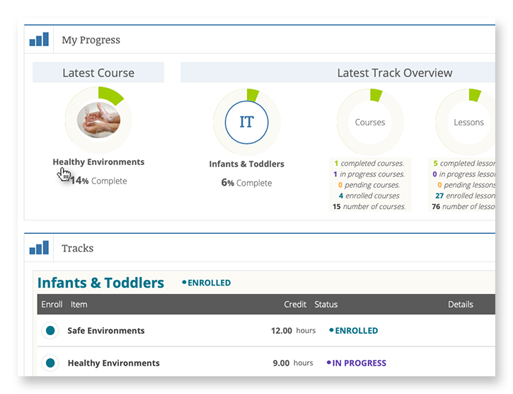
The existing online learning platform had a deep level of complexity under the surface. For a student educator taking a certification course, the site tracks progress through the curriculum. For training leaders, they need to see how their students are progressing, assign additional coursework, or assist a student educator through a particular certification.
Learning platforms in general are complex, and this one is no different. Add to this an intertwined set of military-style administration privileges and it produces a complex tree of layers and permutations.
The focus of the platform assessment phase was to catalog features of the largely undocumented legacy system, uncover complexity that could be simplified, and most importantly identify opportunities for efficiencies.
THE RESULTS
Personalized Online Learning Experience
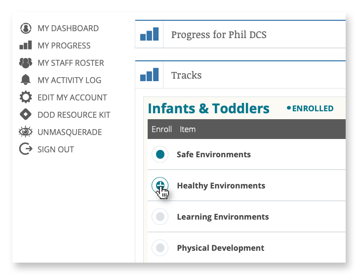
Enrollment and Administration Portal
Administrators and instructors leverage an enrollment portal to manage the onboarding of new students and view progress on coursework and certifications.
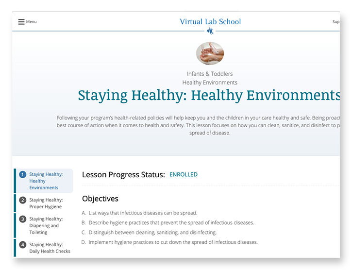
Course Material Delivery
Students experience the course material through a combination of reading, video, and offline coursework downloads for completion and submission.
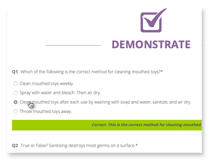
Learning Assessments & Grading
Students are tested with online assessments, where grading and suggestions are delivered in real time, and submission of offline assignments for review by instructors.
Progress Pathways
A personalized student dashboard is the window into progress, allowing students to see which courses have been started, how much is left to complete, and the status of their certifications.
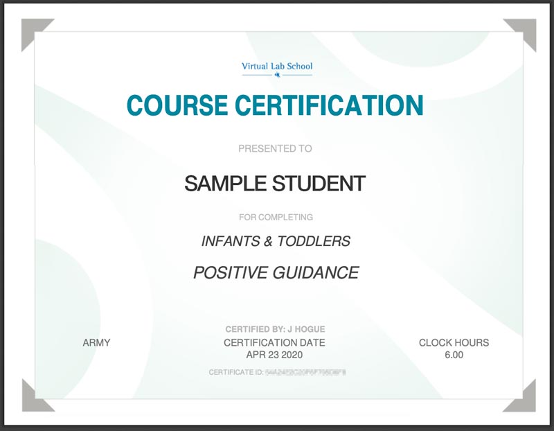
Certification
Completed coursework and assessments lead students to a point of certification resulting in a printable Certificate of Completion.
FINAL THOUGHTS
Faster and More Secure than Ever Before
When building for speed and scalability, fully leveraging Drupal’s advanced caching system is a major way to support those goals. The system design leverages query- and render-caching to support a high level of performance while also supporting personalization to an individual level. This is accomplished with computed fields and auto-placeholdering utilizing lazy builder.
The result is an application that is quicker to load, more secure, and able to support hundreds more concurrent users.
Why Drupal?
When building for speed and scalability, fully leveraging Drupal’s advanced caching system is a major way to support those goals. The system design leverages query- and render-caching to support a high level of performance while also supporting personalization to an individual level. This is accomplished with computed fields and auto-placeholdering utilizing lazy builder.
The result is an application that is quicker to load, more secure, and able to support hundreds more concurrent users.
The U.S. is one of the most linguistically diverse countries in the world. While English may be our official language, the number of people who speak a language other than English at home has actually tripled over the past three decades.
Statistically speaking, the people you serve are probably among them.
You might even know they are. Maybe you’ve noticed an uptick in inquiries from non-English speaking people or tracked demographic changes in your analytics. Either way, chances are good that organizations of all kinds will see more, not less, need for translation — especially those in highly regulated and far-reaching industries, like higher education and healthcare.
So, what do you do when translation becomes a top priority for your organization? Here, we explain how to get started.
3 Solutions for Translating Your Website
Many organizations have an a-ha moment when it comes to translations. For our client Lifespan, that moment came during its rebrand to Brown Health University and a growing audience of non-English speaking people. For another client, Visit California, that moment came when developing their marketing strategies for key global audiences.
Or maybe you’re more like Leica Geosystems, a longtime Oomph client that prioritized translation from the start but needed the right technology to support it.
Whenever the time comes, you have three main options:
Manual translation and publishing
When most people think of translating, manual translation comes to mind. In this scenario, someone on your team or someone you hire translates content by hand and uploads the translation as a separate page to the content management system (CMS).
Translating manually will offer you higher quality and more direct control over the content. You’ll also be able to optimize translations for SEO; manual translation is one of the best ways to ensure the right pages are indexed and findable in every language you offer them. Manual translation also has fewer ongoing technical fees and long-term maintenance attached, especially if you use a CMS like Drupal which supports translations by default.
“Drupal comes multi-lingual out of the box, so it’s very easy for editors to publish translations of their site and metadata,” Oomph Senior UX Engineer Kyle Davis says. “Other platforms aren’t going to be as good at that.”
While manual translation may sound like a winning formula, it can also come at a high cost, pushing it out of reach for smaller organizations or those who can’t allocate a large portion of their budget to translate their website and other materials.
Integration with a real-time API
Ever seen a website with clickable international flags near the top of the page? That’s a translation API. These machine translation tools can translate content in the blink of an eye, helping users of many different languages access your site in their chosen language.
“This is different than manual translation, because you aren’t optimizing your content in any way,” Oomph Senior UX Engineer John Cionci says. “You’re simply putting a widget on your page.”
Despite their plug-and-play reputation, machine translation APIs can actually be fairly curated. Customization and localization options allow you to override certain phrases to make your translations appropriate for a native speaker. This functionality would serve you well if, like Visit California, you have a team to ensure the translation is just right.
Though APIs are efficient, they also do not take SEO or user experience into account. You’re getting a direct real-time translation of your content, nothing more and nothing less. This might be enough if all you need is a default version of a page in a language other than English; by translating that page, you’re already making it more accessible.
However, this won’t always cut it if your goal is to create more immersive, branded experiences — experiences your non-English-speaking audience deserves. Some translation API solutions also aren’t as easy to install and configure as they used to be. While the overall cost may be less than manual translation, you’ll also have an upfront development investment and ongoing maintenance to consider.
Use Case: Visit California
Manual translation doesn’t have to be all or nothing. Visit California has international marketing teams in key markets skilled in their target audiences’ primary languages, enabling them to blend manual and machine translation.
We worked with Visit California to implement machine translation (think Google Translate) to do the heavy lifting. After a translation is complete, their team comes in to verify that all translated content is accurate and represents their brand. Leveraging the glossary overrides feature of Google Cloud Translate V3, they can tailor the translations to their communication objectives for each region. In addition, their Drupal CMS still allows them to publish manual translations when needed. This hybrid approach has proven to be very effective.
Third-party translation services
The adage “You get what you pay for” rings true for translation services. While third-party translation services cost more than APIs, they also come with higher quality — an investment that can be well worth it for organizations with large non-English-speaking audiences.
Most translation services will provide you with custom code, cutting down on implementation time. While you’ll have little to no technical debt, you will have to keep on top of recurring subscription fees.
What does that get you? If you use a proxy-based solution like MotionPoint, you can expect to have content pulled from your live site, then freshly translated and populated on a unique domain.
“Because you can serve up content in different languages with unique domains, you get multilingual results indexed on Google and can be discovered,” Oomph Senior Digital Project Manager Julie Elman says.
Solutions like Ray Enterprise Translation, on the other hand, combine an API with human translation, making it easier to manage, override, moderate, and store translations all within your CMS.
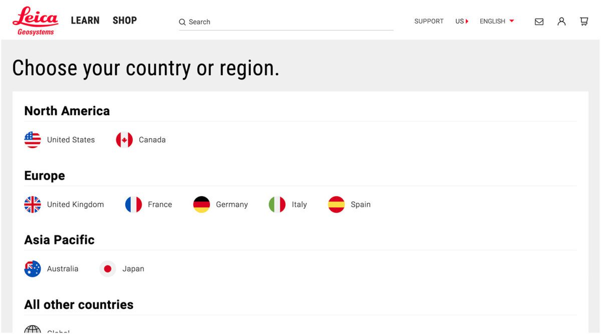
Use Case: Leica Geosystems
Leica’s Drupal e-commerce store is active in multiple countries and languages, making it difficult to manage ever-changing products, content, and prices. Oomph helped Leica migrate to a single-site model during their migration from Drupal 7 to 8 back in 2019.
“Oomph has been integral in providing a translation solution that can accommodate content generation in all languages available on our website,” says Jeannie Records Boyle, Leica’s e-Commerce Translation Manager.
This meant all content had one place to live and could be translated into all supported languages using the Ray Enterprise Translation integration (formerly Lingotek). Authors could then choose which countries the content should be available in, making it easier to author engaging and accurate content that resonates around the world.
“Whether we spin up a new blog or product page in English or Japanese, for example, we can then translate it to the many other languages we offer, including German, Spanish, Norwegian Bokmål, Dutch, Brazil Portuguese, Italian, and French,” Records Boyle says.
Taking a Strategic Approach to Translation
Translation can be as simple as the click of a button. However, effective translation that supports your business goals is more complex. It requires that you understand who your target audiences are, the languages they speak, and how to structure that content in relation to the English content you already have.
The other truth about translation is that there is no one-size-fits-all option. The “right” solution depends on your budget, in-house skills, CMS, and myriad other factors — all of which can be tricky to weigh.
Here at Oomph, we’ve helped many clients make their way through website translation projects big and small. We’re all about facilitating translations that work for your organization, your content admins, and your audience — because we believe in making the Web as accessible as possible for all.
Want to see a few recent examples or dive deeper into your own website translation project? Let’s talk.
The Brief
New Drupal, New Design
Migrating a massive site like healthdata.org is challenging enough, but implementing a new site design simultaneously made the process even more complex. IHME wanted a partner with the digital expertise to translate its internal design team’s page designs into a flexible, functional set of components — and then bring it all to life in the latest Drupal environment. Key goals included:
- Successfully moving the site from Drupal 7 to the latest release of Drupal
- Auditing and updating IHME’s extensive set of features to meet its authoring needs while staying within budget
- Translating the designs and style guide produced by the IHME team into accessible digital pages
- Enhancing site security by overhauling security endpoints, including an integration with SSO provider OneLogin
The Approach
The new healthdata.org site required a delicate balance of form and function. Oomph consulted closely with IHME on the front-end page designs, then produced a full component-based design system in Drupal that would allow the site’s content to shine now and in the future — all while achieving conformance with WCAG 2.1 standards.
Equipping IHME To Lead the Public Health Conversation
Collaborating on a Comprehensive Content Model
IHME needed the site to support a wide variety of content and give its team complete control over landing page layouts, but the organization had limited resources to achieve its ambitious goals. Oomph and IHME went through several rounds of content modeling and architecture diagramming to right-size the number and type of components. We converted their full-page designs into annotated flex content diagrams so IHME could see how the proposed flex-content architecture would function down to the field level. We also worked with the IHME team to build a comprehensive list of existing features — including out-of-the-box, plugins, and custom — and determine which ones to drop, replace, or upgrade. We then rewrote any custom features that made the grade for the Drupal migration.
Building Custom Teaser Modules
The IHME team’s design relied heavily on node teaser views to highlight articles, events, and other content resources. Depending on the teaser’s placement, each teaser needed to display different data — some displayed author names, for example, while others displayed only a journal title. Oomph built a module encompassing all of the different teaser rules IHME needed depending on the component the teaser was being displayed in. The teaser module we built even became the inspiration for the Shared Fields Display Settings module Oomph is developing for Drupal.
Creating a Fresh, Functional Design System
With IHME’s new content model in place, we used Layout Paragraphs in Drupal to build a full design system and component library for healthdata.org. Layout Paragraphs acts like a visual page builder, enabling the IHME team to construct feature rich pages using a drag and drop editor. We gave IHME added flexibility through customizable templates that make use of its extensive component library, as well as a customized slider layout that provides the team with even more display options.
You all are a fantastic team — professional yet personal; dedicated but not stressed; efficient, well-planned, and organized. Thank you so much and we look forward to more projects together in the future!
CHRIS ODELL Senior Product Manager: Digital Experience, University of Washington
The Results
Working to Make Citizens and Communities Healthier
IHME has long been a leader in population health, and its migration to the latest version of Drupal ensures it can lead for a long time. By working with Oomph to balance technical and design considerations at every step, IHME was able to transform its vision into a powerful and purposeful site — while giving its team the tools to showcase its ever-growing body of insights. The new healthdata.org has already received a Digital Health Award, cementing its reputation as an essential digital resource for the public health community.
THE BRIEF
The RISD Museum publishes a document for every exhibition in the museum. Most of them are scholarly essays about the historical context around a body of work. Some of them are interviews with the artist or a peek into the process behind the art. Until very recently, they have not had a web component.
The time, energy, and investment in creating a print publication was becoming unsustainable. The limitations of the printed page in a media-driven culture are a large drawback as well. For the last printed exhibition publication, the Museum created a one-off web experience — but that was not scalable.
The Museum was ready for a modern publishing platform that could be a visually-driven experience, not one that would require coding knowledge. They needed an authoring tool that emphasized time-based media — audio and video — to immediately set it apart from printed publications of their past. They needed a visual framework that could scale and produce a publication with 4 objects or one with 400.
THE APPROACH
A Flexible Design System
Ziggurat was born of two parents — Oomph provided the design system architecture and the programmatic visual options while RISD provided creative inspiration. Each team influenced the other to make a very flexible system that would allow any story to work within its boundaries. Multimedia was part of the core experience — sound and video are integral to expressing some of these stories.
The process of talking, architecting, designing, then building, then using the tool, then tweaking the tool pushed and pulled both teams into interesting places. As architects, we started to get very excited by what we saw their team doing with the tool. The original design ideas that provided the inspiration got so much better once they became animated and interactive.
Design/content options include:
- Multiple responsive column patterns inside row containers
- Additionally, text fields have the ability to display as multiple columns
- “Hero” rows where an image is the primary design driver, and text/headline is secondary. Video heroes are possible
- Up to 10-colors to be used as row backgrounds or text colors
- Choose typefaces from Google Fonts for injection publication-wide or override on a page-by-page basis
- Rich text options for heading, pull-quotes, and text colors
- Video, audio, image, and gallery support inside any size container
- Video and audio player controls in a light or dark theme
- Autoplaying videos (where browsers allow) while muted
- Images optionally have the ability to Zoom in place (hover or touch the image to see the image scale by 200%) or open more
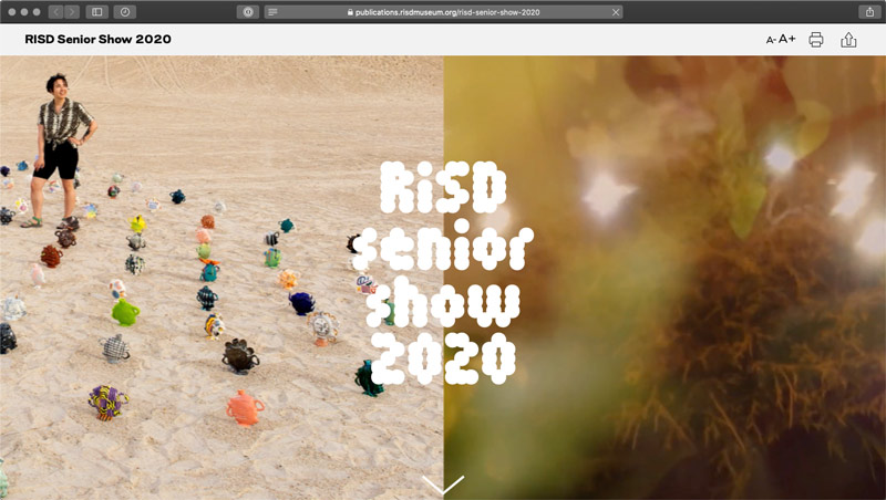
There are 8 chapters total in RAID the Icebox Now and four supporting pages. For those that know library systems and scholarly publications, notice the Citations and credits for each chapter. A few liberally use the footnote system. Each page in this publication is rich with content, both written and visual.
RAPID RESPONSE
An Unexpected Solution to a New Problem
The story does not end with the first successful online museum publication. In March of 2020, COVID-19 gripped the nation and colleges cut their semesters short or moved classes online. Students who would normally have an in-person end-of-year exhibition in the museum no longer had the opportunity.
Spurred on by the Museum, the university invested in upgrades to the Publication platform that could support 300+ new authors in the system (students) and specialized permissions to limit access only to their own content. A few new features were fast-tracked and an innovative ability for some authors to add custom javascript to Department landing pages opened the platform up for experimentation. The result was two online exhibitions that went into effect 6 weeks after the concepts were approved — one for 270+ graduate students and one for 450+ undergraduates.

Oomph has been quiet about our excitement for artificial intelligence (A.I.). While the tech world has exploded with new A.I. products, offerings, and add-ons to existing product suites, we have been formulating an approach to recommend A.I.-related services to our clients.
One of the biggest reasons why we have been quiet is the complexity and the fast-pace of change in the landscape. Giant companies have been trying A.I. with some loud public failures. The investment and venture capitalist community is hyped on A.I. but has recently become cautious as productivity and profit have not been boosted. It is a familiar boom-then-bust of attention that we have seen before — most recently with AR/VR after the Apple Vision Pro five months ago and previously with the Metaverse, Blockchain/NFTs, and Bitcoin.
There are many reasons to be optimistic about applications for A.I. in business. And there continue to be many reasons to be cautious as well. Just like any digital tool, A.I. has pros and cons and Oomph has carefully evaluated each. We are sharing our internal thoughts in the hopes that your business can use the same criteria when considering a potential investment in A.I.
Using A.I.: Not If, but How
Most digital tools now have some kind of A.I. or machine-learning built into them. A.I. has become ubiquitous and embedded in many systems we use every day. Given investor hype for companies that are leveraging A.I., more and more tools are likely to incorporate A.I.
This is not a new phenomenon. Grammarly has been around since 2015 and by many measures, it is an A.I. tool — it is trained on human written language to provide contextual corrections and suggestions for improvements.
Recently, though, embedded A.I. has exploded across markets. Many of the tools Oomph team members use every day have A.I. embedded in them, across sales, design, engineering, and project management — from Google Suite and Zoom to Github and Figma.
The market has already decided that business customers want access to time-saving A.I. tools. Some welcome these options, and others will use them reluctantly.
Either way, the question has very quickly moved from should our business use A.I. to how can our business use A.I. tools responsibly?
The Risks that A.I. Pose
Every technological breakthrough comes with risks. Some pundits (both for and against A.I. advancements) have likened its emergence to the Industrial Revolution of the early 20th century. And a high-level of positive significance is possible, while the cultural, societal, and environmental repercussions could also follow a similar trajectory.
A.I. has its downsides. When evaluating A.I. tools as a solution to our client’s problems, we keep this list of drawbacks and negative effects handy, so that we may review it and think about how to mitigate their negative effects:
- A.I. is built upon biased and flawed data
- Bias & flawed data leads to the perpetuation of stereotypes
- Flawed data leads to Hallucinations & harms Brands
- Poor A.I. answers erode Consumer Trust
- A.I.’s appetite for electricity is unsustainable
We have also found that our company values are a lens through which we can evaluate new technology and any proposed solutions. Oomph has three cultural values that form the center of our approach and our mission, and we add our stated 1% For the Planet commitment to that list as well:
- Smart
- Driven
- Personal
- Environmentally Committed
For each of A.I.’s drawbacks, we use the lens of our cultural values to guide our approach to evaluating and mitigating those potential ill effects.
A.I. is built upon biased and flawed data
At its core, A.I. is built upon terabytes of data and billions, if not trillions, of individual pieces of content. Training data for Large Language Models (LLMs) like Chat GPT, Llama, and Claude encompass mostly public content as well as special subscriptions through relationships with data providers like the New York Times and Reddit. Image generation tools like Midjourney and Adobe Firefly require billions of images to train them and have skirted similar copyright issues while gobbling up as much free public data as they can find.
Because LLMs require such a massive amount of data, it is impossible to curate those data sets to only what we may deem as “true” facts or the “perfect” images. Even if we were able to curate these training sets, who makes the determination of what to include or exclude?
The training data would need to be free of bias and free of sarcasm (a very human trait) for it to be reliable and useful. We’ve seen this play out with sometimes hilarious results. Google “A.I. Overviews” have told people to put glue on pizza to prevent the cheese from sliding off or to eat one rock a day for vitamins & minerals. Researchers and journalists traced these suggestions back to the training data from Reddit and The Onion.
Information architects have a saying: “All Data is Dirty.” It means no one creates “perfect” data, where every entry is reviewed, cross-checked for accuracy, and evaluated by a shared set of objective standards. Human bias and accidents always enter the data. Even the simple act of deciding what data to include (and therefore, which data is excluded) is bias. All data is dirty.
Bias & flawed data leads to the perpetuation of stereotypes
Many of the drawbacks of A.I. are interrelated — All data is dirty is related to D.E.I. Gender and racial biases surface in the answers A.I. provides. A.I. will perpetuate the harms that these biases produce as they become easier and easier to use and more and more prevalent. These harms are ones which society is only recently grappling with in a deep and meaningful way, and A.I. could roll back much of our progress.
We’ve seen this start to happen. Early reports from image creation tools discuss a European white male bias inherent in these tools — ask it to generate an image of someone in a specific occupation, and receive many white males in the results, unless that occupation is stereotypically “women’s work.” When AI is used to perform HR tasks, the software often advances those it perceives as males more quickly, and penalizes applications that contain female names and pronouns.
The bias is in the data and very, very difficult to remove. The entirety of digital written language over-indexes privileged white Europeans who can afford the tools to become authors. This comparably small pool of participants is also dominantly male, and the content they have created emphasizes white male perspectives. To curate bias out of the training data and create an equally representative pool is nearly impossible, especially when you consider the exponentially larger and larger sets of data new LLM models require for training.
Further, D.E.I. overflows into environmental impact. Last fall, the Fifth National Climate Assessment outlined the country’s climate status. Not only is the U.S. warming faster than the rest of the world, but they directly linked reductions in greenhouse gas emissions with reducing racial disparities. Climate impacts are felt most heavily in communities of color and low incomes, therefore, climate justice and racial justice are directly related.
Flawed data leads to “Hallucinations” & harms Brands
“Brand Safety” and How A.I. can harm Brands
Brand safety is the practice of protecting a company’s brand and reputation by monitoring online content related to the brand. This includes content the brand is directly responsible for creating about itself as well as the content created by authorized agents (most typically customer service reps, but now AI systems as well).
The data that comes out of A.I. agents will reflect on the brand employing the agent. A real life example is Air Canada. The A.I. chatbot gave a customer an answer that contradicted the information in the URL it provided. The customer chose to believe the A.I. answer, while the company tried to say that it could not be responsible if the customer didn’t follow the URL to the more authoritative information. In court, the customer won and Air Canada lost, resulting in bad publicity for the company.
Brand safety can also be compromised when a 3rd party feeds A.I. tools proprietary client data. Some terms and condition statements for A.I. tools are murky while others are direct. Midjourney’s terms state,
“By using the Services, You grant to Midjourney […] a perpetual, worldwide, non-exclusive, sublicensable no-charge, royalty-free, irrevocable copyright license to reproduce, prepare derivative works of, publicly display, publicly perform, sublicense, and distribute text and image prompts You input into the Services”
Midjourney’s Terms of Service Statement
That makes it pretty clear that by using Midjourney, you implicitly agree that your data will become part of their system.
The implication that our client’s data might become available to everyone is a huge professional risk that Oomph avoids. Even using ChatGPT to provide content summaries on NDA data can open hidden risks.
What are “Hallucinations” and why do they happen?
It’s important to remember how current A.I. chatbots work. Like a smartphone’s predictive text tool, LLMs form statements by stitching together words, characters, and numbers based on the probability of each unit succeeding the previously generated units. The predictions can be very complex, adhering to grammatical structure and situational context as well as the initial prompt. Given this, they do not truly understand language or context.
At best, A.I. chatbots are a mirror that reflects how humans sound without a deep understanding of what any of the words mean.
A.I. systems are trying its best to provide an accurate and truthful answer without a complete understanding of the words it is using. A “hallucination” can occur for a variety of reasons and it is not always possible to trace their origins or reverse-engineer them out of a system.
As many recent news stories state, hallucinations are a huge problem with A.I. Companies like IBM and McDonald’s can’t get hallucinations under control and have pulled A.I. from their stores because of the headaches they cause. If they can’t make their investments in A.I. pay off, it makes us wonder about the usefulness of A.I. for consumer applications in general. And all of these gaffes hurt consumer’s perception of the brands and the services they provide.
Poor A.I. answers erode Consumer Trust
The aforementioned problems with A.I. are well-known in the tech industry. In the consumer sphere, A.I. has only just started to break into the public consciousness. Consumers are outcome-driven. If A.I. is a tool that can reliably save them time and reduce work, they don’t care how it works, but they do care about its accuracy.
Consumers are also misinformed or have a very surface level understanding of how A.I. works. In one study, only 30% of people correctly identified six different applications of A.I. People don’t have a complete picture of how pervasive A.I.-powered services already are.
The news media loves a good fail story, and A.I. has been providing plenty of those. With most of the media coverage of A.I. being either fear-mongering (“A.I. will take your job!”) or about hilarious hallucinations (“A.I. suggests you eat rocks!”), consumers will be conditioned to mistrust products and tools labeled “A.I.”
And for those who have had a first-hand experience with an A.I. tool, a poor A.I. experience makes all A.I. seem poor.
A.I.’s appetite for electricity is unsustainable
The environmental impact of our digital lives is invisible. Cloud services that store our lifetime of photographs sound like featherly, lightweight repositories that are actually giant, electricity-guzzling warehouses full of heat-producing servers. Cooling these data factories and providing the electricity to run them are a major infrastructure issue cities around the country face. And then A.I. came along.
While difficult to quantify, there are some scientists and journalists studying this issue, and they have found some alarming statistics:
- Training GPT-3 required more than 1,200 MWh which led to 500 metric tons of greenhouse gas emissions — equivalent to the amount of energy used for 1 million homes in one hour and the emissions of driving 1 million miles. GPT-4 has even greater needs.
- Research suggests a single generative A.I. query consumes energy at four or five times the magnitude of a typical search engine request.
- Northern Virginia needs the equivalent of several large nuclear power plants to serve all the new data centers planned and under construction.
- In order to support less consumer demand on fossil fuels (think electric cars, more electric heat and cooking), power plant executives are lobbying to keep coal-powered plants around for longer to meet increased demands. Already, soaring power consumption is delaying coal plant closures in Kansas, Nebraska, Wisconsin, and South Carolina.
- Google emissions grew 48% in the past five years in large part because of its wide deployment of A.I.
While the consumption needs are troubling, quickly creating more infrastructure to support these needs is not possible. New energy grids take multiple years and millions if not billions of dollars of investment. Parts of the country are already straining under the weight of our current energy needs and will continue to do so — peak summer demand is projected to grow by 38,000 megawatts nationwide in the next five years.
While a data center can be built in about a year, it can take five years or longer to connect renewable energy projects to the grid. While most new power projects built in 2024 are clean energy (solar, wind, hydro), they are not being built fast enough. And utilities note that data centers need power 24 hours a day, something most clean sources can’t provide. It should be heartbreaking that carbon-producing fuels like coal and gas are being kept online to support our data needs.
Oomph’s commitment to 1% for the Planet means that we want to design specific uses for A.I. instead of very broad ones. The environmental impact of A.I.’s energy demands is a major factor we consider when deciding how and when to use A.I.
Using our Values to Guide the Evaluation of A.I.
As we previously stated, our company values provide a lens through which we can evaluate A.I. and look to mitigate its negative effects. Many of the solutions cross over and mitigate more than one effect and represent a shared commitment to extracting the best results from any tool in our set
Smart
- Limit direct consumer access to the outputs of any A.I. tools, and put a well-trained human in the middle as curator. Despite the pitfalls of human bias, it’s better to be aware of them rather than allow A.I. to run unchecked
- Employ 3rd-party solutions with a proven track-record of hallucination reduction
Driven
- When possible, introduce a second proprietary dataset that can counterbalance training data or provide additional context for generated answers that are specific to the client’s use case and audience
- Restrict A.I. answers when qualifying, quantifying, or categorizing other humans, directly or indirectly
Personal
- Always provide training to authors using A.I. tools and be clear with help text and microcopy instructions about the limitations and biases of such datasets
1% for the Planet
- Limit the amount of A.I. an interface pushes at people without first allowing them to opt in — A.I. should not be the default
- Leverage “green” data centers if possible, or encourage the client using A.I. to purchase carbon offset credits
In Summary
While this article feels like we are strongly anti-A.I., we still have optimism and excitement about how A.I. systems can be used to augment and support human effort. Tools created with A.I. can make tasks and interactions more efficient, can help non-creatives jumpstart their creativity, and can eventually become agents that assist with complex tasks that are draining and unfulfilling for humans to perform.
For consumers or our clients to trust A.I., however, we need to provide ethical evaluation criteria. We can not use A.I. as a solve-all tool when it has clearly displayed limitations. We aim to continue to learn from others, experiment ourselves, and evaluate appropriate uses for A.I. with a clear set of criteria that align with our company culture.
To have a conversation about how your company might want to leverage A.I. responsibly, please contact us anytime.
Additional Reading List
- “The Politics of Classification” (YouTube). Dan Klyn, guest lecture at UM School of Information Architecture. 09 April 2024. A review of IA problems vs. AI problems, how classification is problematic, and how mathematical smoothness is unattainable.
- “Models All the Way Down.” Christo Buschek and Jer Thorp, Knowing Machines. A fascinating visual deep dive into training sets and the problematic ways in which these sets were curated by AI or humans, both with their own pitfalls.
- “AI spam is already starting to ruin the internet.” Katie Notopoulos, Business Insider, 29 January 2024. When garbage results flood Google, it’s bad for users — and Google.
- Racial Discrimination in Face Recognition Technology, Harvard, 24 October 2020. The title of this article explains itself well.
- Women are more likely to be replaced by AI, according to LinkedIn, Fast Company, 04 April 2024. Many workers are worried that their jobs will be replaced by artificial intelligence, and a growing body of research suggests that women have the most cause for concern.
- Brand Safety and AI, Writer.com. An overview of what brand safety means and how it is usually governed.
- AI and designers: the ethical and legal implications, UX Design, 25 February 2024. Not only can using training data potentially introduce legal troubles, but submitting your data to be processed by A.I. does as well.
- Can Generative AI’s Hallucination Problem be Overcome? Louis Poirier, C3.ai. 31 August 2023. A company claims to have a solution for A.I. hallucinations but doesn’t completely describe how in their marketing.
- Why AI-generated hands are the stuff of nightmares, explained by a scientist, Science Focus, 04 February 2023. Whether it’s hands with seven fingers or extra long palms, AI just can’t seem to get it right.
- Sycophancy in Generative-AI Chatbots, NNg. 12 January 2024. Human summary: Beyond hallucinations, LLMs have other problems that can erode trust: “Large language models like ChatGPT can lie to elicit approval from users. This phenomenon, called sycophancy, can be detected in state-of-the-art models.”
- Consumer attitudes towards AI and ML’s brand usage U.S. 2023. Valentina Dencheva, Statistica. 09 February 2023
- What the data says about Americans’ views of artificial intelligence. Pew Research Center. 21 November 2023
- Exploring the Spectrum of “Needfulness” in AI Products. Emily Campbull, The Shape of AI. 28 March 2024
- AI’s Impact On The Future Of Consumer Behavior And Expectations. Jean-Baptiste Hironde, Forbes. 31 August 2023.
- Is generative AI bad for the environment? A computer scientist explains the carbon footprint of ChatGPT and its cousins. The Conversation. 23 May 2023
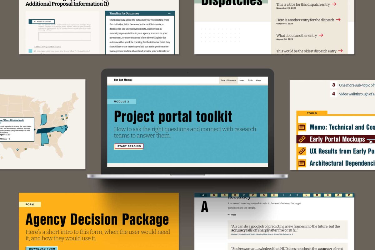
THE BRIEF
The goal of the site was to create a well-organized hub for a trove of resources that had been previously provided in one-off conversations. He also knew that those resources would only continue to grow, making it important to build a living site that appealed to public officials and future funders alike.
Together, we architected a vision for The Lab Manual website, identifying the essentials for launch and features to phase in later. Key goals included:
- Creating an interactive experience with tools that readers could use directly in their work
- Infusing the site with visual creativity and storytelling elements to make complex research topics more digestible
- Launching a minimum viable product (MVP) site within the desired timeline and budget, while planning for future growth
THE APPROACH
Oomph knew we had to look beyond traditional government and research sites to achieve The Lab Manual’s unique digital goals. We conducted in-depth stakeholder discovery sessions and scoured websites across industries, from data-rich websites like FiveThirtyEight to e-reader apps like Kindle, to gather inspiration for the features The Lab Manual needed: engaging long-form content, strong visual storytelling, and interactive data. Then, we engineered a website for The Lab Manual that felt like a dynamic guided journey.
Telling a Story Through Design & Development
A Narrative-Driven Homepage
To captivate users from their first click, we created a storytelling-focused homepage that concisely explained The Lab Manual’s mission and resources. Animated elements also helped make the page feel more immersive than a traditional linear scroll. We mocked up the animations directly in Figma so the client could see, rather than imagine, the user experience — saving time and effort during the development process.
Custom Educational Features
Oomph designed the website to be thought-provoking, but The Lab Manual wanted to leave readers with answers — not more questions. Our designers and developers collaborated to build features that helped readers understand content without interrupting the story. Key features included a linked glossary to expand on key terms used throughout the site; a pop-up search for other terms and topics, rather than relegating additional information to the footnotes; and a map created with Mapbox to help visitors find nearby policy labs.
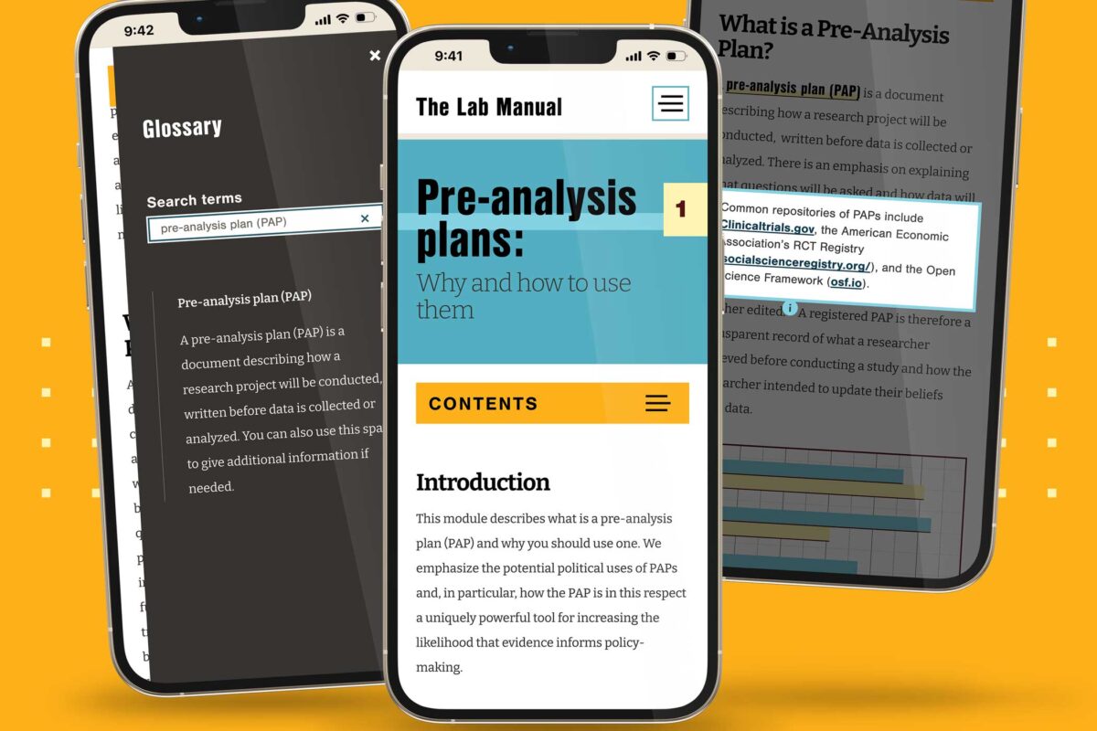
Simplified Content Management
Despite the complexity of its content, The Lab Manual needed to be simple to manage. Our developers built a CMS-less solution the client could edit using Markdown, making it easier and more cost-effective to update content as The Lab Manual grows.
THE RESULTS
Bridging Science and Policy, Now & For the Future
With a solid MVP in place, we are already seeking new features and content opportunities to serve The Lab Manual’s growing user base. The website has quickly caught the eye of the industry, winning a GDUSA Digital Design Award. For The Lab Manual, though, the real win is bringing what was once a lofty vision into reality — a resource that provides government officials with the tools to create effective, evidence-based policies.