
In 2026, website accessibility has shifted from a “best practice” to a strictly codified legal requirement. New federal and state regulations have eliminated previous ambiguities, making WCAG 2.1 Level AA the mandatory technical standard for digital content.
1. The 2026 Enforcement Cliff
The U.S. Department of Justice (DOJ) finalized a rule under Title II of the ADA that sets a firm compliance deadline for many entities:
- April 24, 2026: Deadline for public entities (and many private partners) serving populations of 50,000 or more to achieve full WCAG 2.1 Level AA conformance.
- April 26, 2027: Deadline for smaller entities.
- Private Sector Impact: While the DOJ rule focuses on public entities, it solidifies WCAG 2.1 AA as the de-facto legal standard for private businesses in Title III lawsuits, which saw a 102% increase in recent years.
2. Why WCAG 2.1 Level AA?
Unlike older versions, WCAG 2.1 includes 17 additional criteria specifically designed for mobile accessibility and users with cognitive disabilities. Compliance is measured by the “POUR” Principles:
- Perceivable: Users must be able to see or hear content (e.g., Alt-Text for images, captions for video).
- Operable: The site must work without a mouse (e.g., Keyboard-only navigation, no keyboard traps).
- Understandable: Content must be predictable with clear error messaging on forms.
- Robust: Code must be “clean” enough to work with all current and future assistive technologies, like screen readers.
3. Critical 2026 Compliance Risks
- No “Grandfathering” for New Content: Any digital asset (PDFs, videos, or web pages) posted after April 2026 must be compliant from day one.
- Vendor Liability: Business owners are legally responsible for their website’s accessibility, even if they use third-party platforms or templates.
- Inadequacy of “Overlay” Widgets: The DOJ has clarified that automated widgets or “overlays” alone cannot guarantee ADA compliance; true accessibility requires fixing the underlying code.
- California-Specific Penalties: Under California’s Unruh Act, businesses can face statutory damages of $4,000+ per violation in addition to federal ADA settlements.
4. Future-Proofing: Looking Toward WCAG 3.0
While WCAG 2.1/2.2 is the current law, WCAG 3.0 is in development (expected no earlier than 2028). It will move from a pass/fail model to a Bronze, Silver, and Gold scoring system. Achieving WCAG 2.1 Level AA now effectively places an organization at the “Bronze” level, providing a solid foundation for future shifts.
Is your website ready for the April 2026 deadline? Achieving WCAG 2.1 Level AA compliance requires more than a quick fix — it means addressing the underlying code, auditing every digital asset, and building accessibility into your process from the ground up. Whether you’re starting an audit, planning remediation, or building something new, get in touch with our team to start the conversation.
By Rachel Heidenry & Rachel Hart
Museum websites are beautifully complex. As the digital counterpart to a physical space, they serve many essential functions. They must reflect the museum’s mission and values, while guiding users clearly to key areas of information. Museums with collections often need dedicated sections for research and archives; zoos may focus on telling the stories of their animals; and contemporary art institutions sometimes even use their sites as platforms for artists to showcase new work. At the same time, nearly all museum websites must serve practical needs like selling tickets or memberships, promoting events or fundraisers, and providing essential visitor information, like hours and directions.
Managing that much critical and varied information is a challenge for any website, which is why strong information architecture (IA) is essential. A successful navigation should be intuitive and accessible, with clear labels and well-organized categories.
Mobile-responsiveness is also crucial, especially for visitors who need quick access to find information, like admission prices or the current exhibitions, or who want to purchase tickets on the go.
For cultural organizations, a strong menu and navigation system is arguably the most important indicator of a successful website.
A Survey of Website Navigation Trends for Art Museums
While not all cultural organizations prioritize aesthetics, art museums inherently do. As institutions dedicated to the presentation of art, they think critically about how visual design shapes their brand identity. In some cases, aesthetics can overshadow usability, resulting in beautiful or cutting-edge websites that are ultimately difficult for both internal staff members and external visitors to navigate.
As part of a recent engagement with the Isabella Stewart Gardner Museum in Boston, we conducted a cohort analysis of other leading museum websites. The study focused on key elements of art museum digital platforms including menu design, navigation, content organization, and user flows. One striking insight was that many art museum websites avoid dropdown menus, instead favoring a simple list of four or five top-level categories. These are often labeled with opaque or “insider” terms, raising questions like: What does “Programs” signify? Does “Art” lead to the permanent collection or temporary exhibitions? Does the general population know the difference? And where in the world is the museum’s blog?
Let’s take a look at the building blocks of a site’s navigation and what we learned from reviewing a cohort of cultural institution websites.
Utility Navigation
The utility navigation should help visitors quickly access essential information. As the name suggests, the utility navigation traditionally contains tools and actions (like login, search, and language select) that help visitors use the website. You’ll typically see it as a secondary list of items above the main menu, often in a smaller font.
When deciding what to include in it, consider your primary visitors’ goals: What do they need to know or do on your website? Museums often use the utility navigation to drive high-value actions like purchasing tickets or memberships. Our analysis also showed that museums with online shops frequently included links to the store or member login portals when relevant. In general, it’s best practice to limit the utility navigation to 2-4 key items, not including search.
- Open/Closed Status — More museum websites are starting to include an open/closed status directly in the utility navigation, as demonstrated by The Huntington’s website. This enhancement directly improves user experience and is particularly valuable on mobile where this status sits at the very top of the page. (Some museums, like MoMA, include this status elsewhere on the homepage which is a second best option).
- Tickets, Tickets, Tickets — For most museums, ticket sales or memberships drive revenue. Our findings show that successful museum websites don’t shy away from putting that fact front and center, with optimal placement in the utility navigation as simply “Tickets” and “Join.” Even better is if the “Tickets” link/button stands out through a distinctive design or unique brand color, like this pop of yellow on the MFA Boston’s website that makes the button unmissable.
The Dropdown or Mega Menu
Museums have a lot of content. And the larger the institution, the more content its website undoubtedly has to provide visitors. Our analysis showed that institutions that embrace the dropdown menu are overall easier to navigate and more often mobile-friendly. The bottom line: you don’t want visitors to your website to have to go down rabbit holes to find essential information.
- Dropdown Usability — Just having dropdowns on your menu isn’t enough. You still need to make sure the design is usable and accessible. Make sure you can move your mouse around without losing your place, and that you can navigate through menu items only using a keyboard. Mega menus provide the space for further grouping of sub-items or helpful descriptive text, but don’t fill them with too much or you risk overwhelming users. A well-designed menu dropdown can even take the place of a top-level landing page for the section, a pattern we saw on several museum websites.
- Menu Subpages — If you do have dropdown menus, be strategic about what pages you feature in the subnavigation. Resist including every single website subpage—many museums unfortunately attempt to accommodate too many categories. With competing departments and stakeholders, limiting selections sometimes proves challenging, but aim for 3-6 subpages. To supplement, you can create deeper content tiers within sections themselves and rely on structured in-page linking to help users discover additional site content.
Categories & Language
A navigation menu requires words (obviously). These are among the first words anyone sees when they land on your website. Thus they set the tone and expectation for what kind of museum you are, while also telling the story of what someone can do both on-site and online. Making sure the words that comprise the navigation are distinctive, accessible, and concise is key.
- Titles & Character Counts — Sometimes the hardest part of finalizing a navigation is agreeing on the words that comprise it. You might have figured out the general categories, but should you call the permanent collection “Collection” or “Art” or something else entirely? User testing provides essential validation and can help museum stakeholders move beyond insider terminology towards language that resonates with broader audiences. Whatever category headings you land on, consider length carefully. You rarely want to have more than 2 words and definitely strive to stay under 20 characters.
- “What’s On” — Many museum sites are adopting the “What’s On” category to capture Events and Exhibitions together. This colloquium is already widely used for British museums and reflects a more casual and (arguably) approachable language. If you’re considering this category title, think about your particular audience and if that phrase will resonate with visitors. Keeping it classic with “Exhibitions” or “Events” is perfectly fine too and is still widely in use.
Hamburger Menu
To keep the main navigation simple and clean, some museums, like The Barnes Foundation, opt to put additional links behind a hamburger menu, even at desktop widths. In this way, less significant information does not busy up the navigation, but visitors can still intuitively click through to find other key subpages. If you do this, be sure to still repeat the top level menu items, as this pop-out navigation will become your mobile view.
- Collapsed Menus — Whether hamburger menus, accordions, or other collapsible components, make sure that the most important information is always visible. Though most users these days recognize and understand the hamburger menu icon, hiding menu items behind a click or tap means they might be overlooked. Whether on desktop or mobile, determine what highly important items (like today’s hours or a link to purchase tickets) should always be visible on the page.
- Side Menus — Many websites use side menus to help users navigate to deeply nested content, but these constrain available width and cut into key page content. For museums who pay close attention to how the website looks and how images are being displayed, this may be reason enough to avoid this solution. If ensuring that artwork images are never cropped or obstructed is part of your acceptance criteria, this is not the route for your site. If you choose to forego the side menu, take care to help visitors move through the deeper content on your site with another solution, like a horizontal subnavigation bar or structured on-page links.
Conclusion: Building a Successful Navigation for Museums
If you are a cultural institution that is starting to rethink your website navigation, the first step is to put yourself in the shoes of your visitor. It’s critical to put aside internal org charts and take a user-centered design approach. Come up with a few key user journeys for various audiences. How would a first-time visitor purchase a ticket? How would a repeat visitor find more information about a particular work of art they loved? And then navigate your site as your user would. What are the pain points? What works well? What makes absolutely no sense at all?
Once you’ve done that, be sure to take a step back from your website to see what types of content you have and the common ways they might intersect. This is important for establishing the key categories of your site, as well as its subcategories. You’ll often be surprised at the connections you can make and the overlaps in content that can be streamlined together.
From there, you have the building blocks to start conceptualizing your new navigation, one that is usable, clear, and beautifully intuitive. Learn more about building a successful navigation in a Case Study of our 2025 Re-Architecture project for the Isabella Stewart Gardner Museum.
Generative Engine Optimization (GEO) is making organizations scramble — our clients have been asking “Are we ready for the new ways LLMs crawl, index, and return content to users? Does our site support evolving GEO best practices? What can we do to boost results and citations?”
Large language models (LLMs) and the services that power AI summaries don’t “think” like humans but they do perform similar actions. They seek content, split it into memorable chunks, and rank the chunks for trust and accuracy. If pages use semantic HTML, include facts and cite sources, and include structured metadata, AI crawlers and retrieval systems will find, store, and reproduce content accurately. That improves your chance of being cited correctly in AI overviews.
While GEO has disrupted the way people use search engines, the fundamentals of SEO and digital accessibility continue to be strong indicators of content performance in LLM search results. Making content understandable, usable, and memorable for humans also has benefits for LLMs and GEO.
How LLM systems (and AI-driven overviews) get their facts
Understanding how LLMs crawl, process, and retrieve web content helps us understand why semantic structure and accessibility best practices have a positive effect. When an AI system generates an answer that cites the web, several distinct back-end steps usually happen:
- Crawling — Bots visit URLs and download page content. Some crawlers execute javascript like a browser (Googlebot) while others prefer raw HTML and limit their rendering.
- Chunking — Large documents are split into small, logical “chunks” of paragraphs, sections, or other units. These chunks are the pieces that are later retrieved for an answer. How a page’s content is structured with headings, paragraphs, and lists determines the likely chunk boundaries for storage.
- Vectorization — Each chunk is then converted into a numeric vector that captures its semantic meaning. These embeddings live in a vector database and enable systems to find chunks quickly. The quality of the vector depends on the clarity of the chunk’s text.
- Indexing — Systems will store additional metadata (URL, title, headings, metadata) to filter and rank results. Structured data like schema metadata is especially valuable.
- Retrieval — A user asks a question or performs a search and the system retrieves the most semantically similar chunks via a vector search. It re-ranks those chunks using metadata and other signals and then composes its answer while citing sources (sometimes).
The Case for Human-Accessible Content
There are many more reasons why digital accessibility is simply the right thing to do. It turns out that in addition to boosting SEO, accessibility best practices help LLMs crawl, chunk, store, and retrieve content more accurately.
During retrieval, small errors like missing text, ambiguous links, or poor heading order can fail to expose the best chunks. Let’s dive into how this can happen and what common accessibility pitfalls contribute to the confusion.
For Content Teams — Authors, Writers, Editors
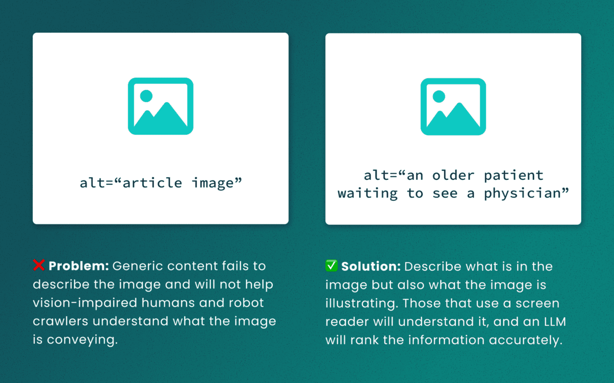
Lack of descriptive “alt” text
While some LLMs can employ machine-vision techniques to “see” images as a human would, descriptive alt text verifies what they are seeing and the context in which the image is relevant. The same best practices for describing images for people will help LLMs accurately understand the content.
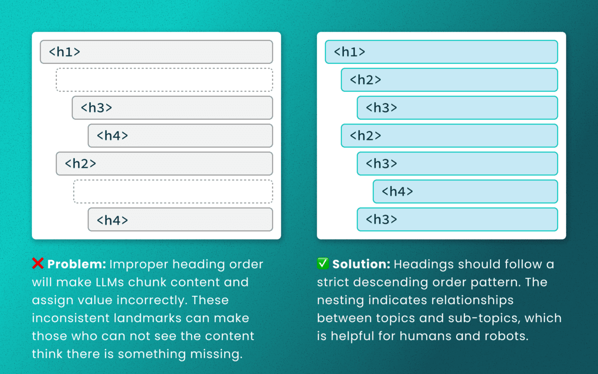
Out-of-order heading structures
Similar to semantic HTML, headings provide a clear outline of a page. Machines (and screen readers!) use heading structure to understand hierarchy and context. When a heading level skips from an <h2> to an <h4>, an LLM may fail to determine the proper relationship between content chunks. During retrieval, the model’s understanding is dictated by the flawed structure, not the content’s intrinsic importance. (Source: research thesis PDF, “Investigating Large Language Models ability to evaluate heading-related accessibility barriers”)
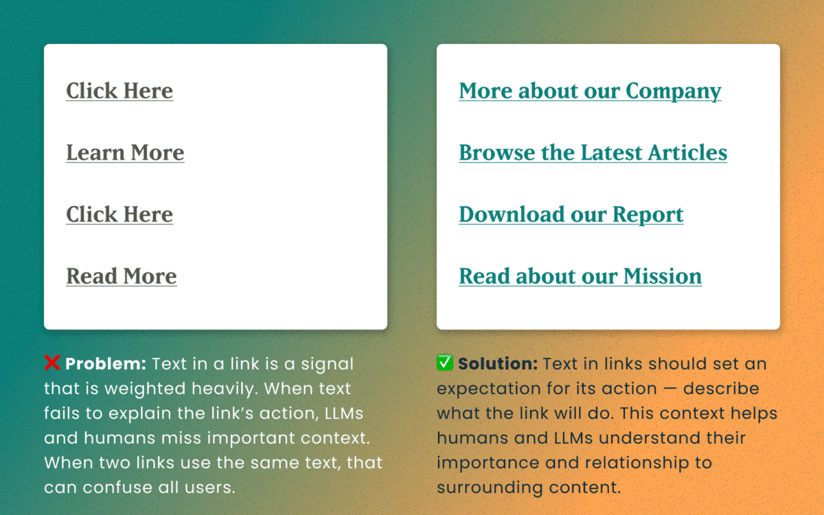
Descriptive and unique links
All of the accessibility barriers surrounding poor link practices affect how LLMs evaluate their importance. Link text is a short textual signal that is vectorized to make proper retrieval possible. Vague link text like “Click here” or “Learn More” does not provide valuable signals. In fact, the same “Learn More” text multiple times on a page can dilute the signals for the URLs they point to.
Using the same link text for more than one destination URLs creates a knowledge conflict. Like people, an LLM is subject to “anchoring bias,” which means it is likely to overweight the first link it processes and underweight or ignore the second, since they both have the same text signal.
Example of the duplicate link problem: <a href=“[URL-A]”>Duplicate Link Text</a>, and then later in the same article, <a href=“[URL-B]”>Duplicate Link Text</a>. Conversely, when the same URL is used more than once on a page, the same link text should be repeated exactly.
Logical order and readable content
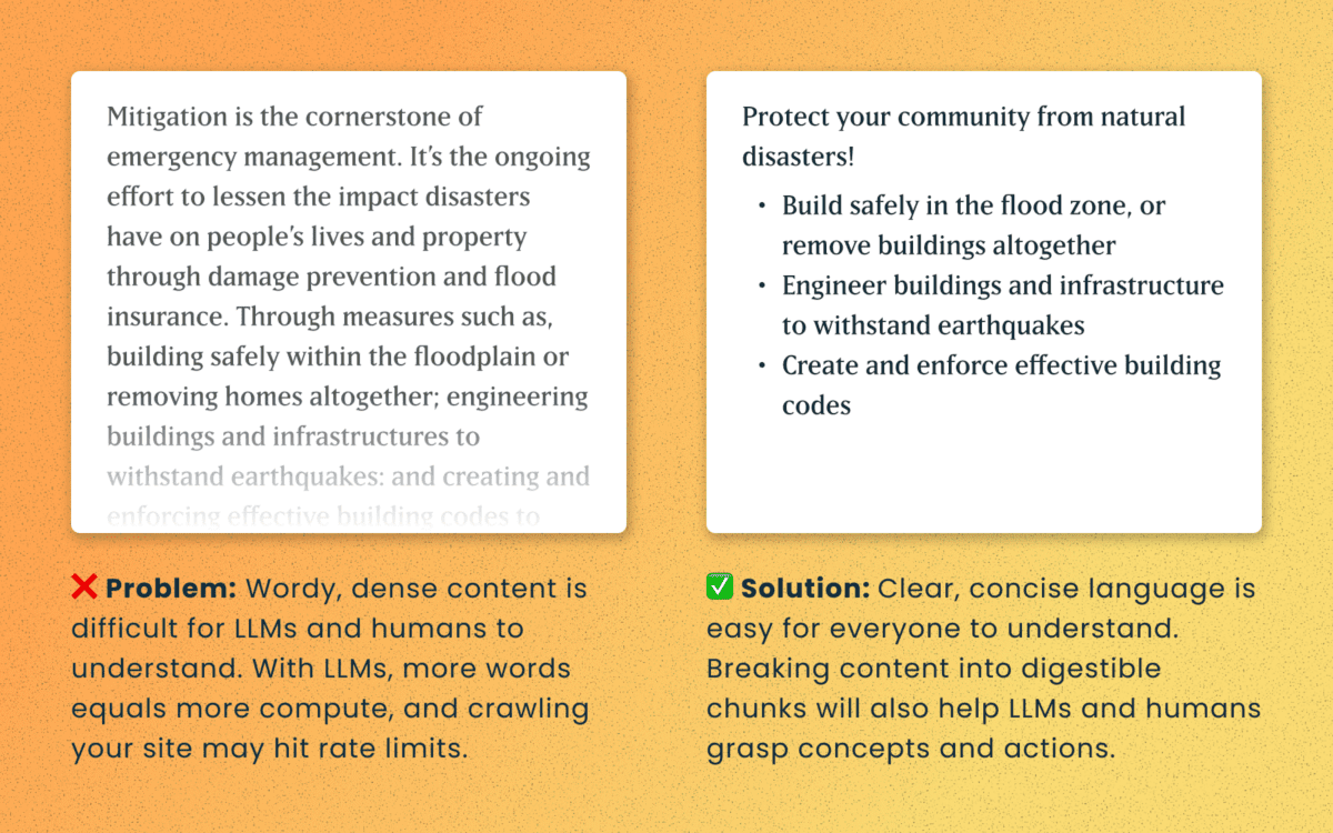
Simple, direct sentences (one fact per sentence) produce cleaner embeddings for LLM retrieval. Human accessibility best practices of plain language and clear structure are the same practices that improve chunking and indexing for LLMs
For Technical Teams — IT, Developers, Engineers
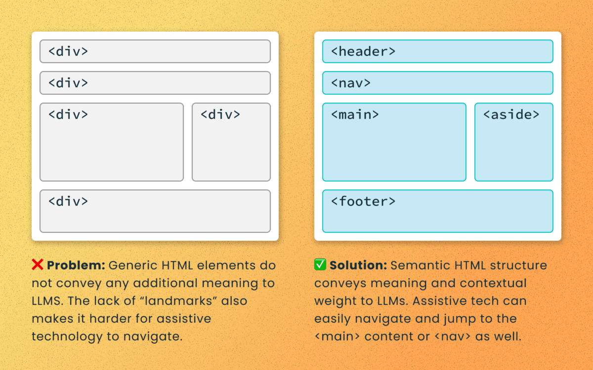
Poorly structured semantic HTML
Semantic elements (<article>, <nav>, <main>, <h1>, etc.) add context and suggest relative ranking weight. They make content boundaries explicit, which helps retrieval systems isolate your content from less important elements like ad slots or lists of related articles.
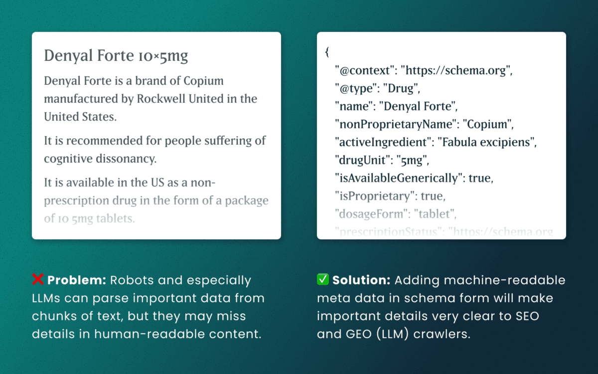
Lack of schema
This is technical and under the hood of your human-readable content. Machines love additional context and structured schema data is how facts are declared in code — product names, prices, event dates, authors, etc. Search engines have used schema for rich results and LLMs are no different. Right now, server-rendered schema data will guarantee the widest visibility, as not all crawlers execute client-side Javascript completely.
How to make accessibility even more actionable
The work of digital accessibility is often pushed to the bottom of the priority list. But once again, there are additional ways to frame this work as high value. While this work is beneficial for SEO, our recent research uncovers that it continues to be impactful in the new and evolving world of GEO.
If you need to frame an argument to those that control the investments of time and money, some talking points are:
- Accurate brand representation — Poor accessibility hides facts from LLMs. When customers ask an AI assistant for “best X for Y,” your content may not be shown — or worse, misrepresented. Fixing accessibility reduces brand risk and increases content authority.
- Engagement boost — Improvements that increase accurate citations and AI visibility can increase referral traffic, feature mentions, and lead quality. In a landscape where AI Answers are reducing click-through rates, keeping the traffic you have on your site for longer and building brand trust becomes vital.
- Increased exposure — Digital inclusion makes your content widely accessible to machines and the machines that assist humans. Think about a search engine as another human-assistive device, just like a keyboard or screen reader.
- Multi-pronged benefits — Accessibility improvement improves traditional SEO, can benefit mobile performance, and reduces the risks associated with accessibility compliance policies.
Staying steady in the storm
Let’s be clear — this summer was a “generative AI search freak out.” Content teams have scrambled to get smart about LLM-powered search quickly while search providers rolled out new tools and updates weekly. It’s been a tough ride in a rough sea of constant change.
To counter all that, know that the fundamentals are still strong. If your team has been using accessibility as a measure for content effectiveness and SEO discoverability, don’t stop now. If you haven’t yet started, this is one more reason to apply these principles tomorrow.
If you continue to have questions within this rapidly evolving landscape, talk to us about your questions around SEO, GEO, content strategy, and accessibility conformance. Ask about our training and documentation available for content teams.
Additional Reading
- AHREFs.com: Is SEO Dead? Real Data vs. Internet Hysteria
- SearchEngineJournal.com: How LLMs Interpret Content: How To Structure Information For AI Search
- InclusionHub.com: SEO and Web Accessibility: What You Need to Know (from 2020, but still relevant)
One question we frequently hear from clients, especially those managing web content, is “How can we implement accessibility best practices without breaking the bank or overwhelming our editorial team?”
It’s a valid concern. As a content editor, you’re navigating the daily challenge of maintaining quality while meeting deadlines and managing competing priorities.
When your team decides to prioritize website accessibility, the initial scope can feel daunting. You might wonder “Does this really make a difference?” or “Is remediation worth the effort?” The answer is always a resounding yes.
Whether you’re working on a small site or managing thousands of pages, accessible content improves user experience, ensures legal compliance, boosts SEO performance, and reinforces your brand as inclusive and responsible. As a content editor, you have the power to make steady, meaningful progress with the content you touch every day.
Why Accessibility Creates Business Impact
Accessible content delivers measurable outcomes across multiple business objectives:
Expanded Market Reach: When your content is inaccessible to users with disabilities, you’re limiting your potential audience. Consider that disabilities can be temporary, like a broken arm, and 70% of seniors are now online—a demographic that often benefits from accessible design principles.
Risk Mitigation: Inaccessible websites can lead to legal complaints under the ADA and other regulations, creating both financial and reputational risks.
Enhanced User Experience: Clear structure, descriptive alt text, and keyboard-friendly navigation improve usability for all users while boosting SEO performance.
Brand Differentiation: Demonstrating commitment to accessibility positions your organization as inclusive and socially responsible.
Implementing Accessibility in Your Editorial Workflow
The challenge isn’t whether to implement accessibility—it’s how to do it efficiently without overwhelming your team or budget.
The Fix-It-Forward Approach
Rather than attempting to overhaul your entire site overnight, we recommend a “fix-it-forward” strategy. This approach ensures all new and updated content meets accessibility standards while gradually improving legacy content. The result? Steady progress without resource strain.
Leverage Open Source Tools
Many CMS platforms offer free accessibility tools that integrate directly into your editorial workflow:
Drupal: Editoria11y Accessibility Checker, Accessibility Scanner, CKEditor Accessibility Auditor
WordPress: WP Accessibility, Editoria11y Accessibility Checker, WP ADA Compliance Check Basic
These tools scan your content and flag common WCAG 2.2 AA issues before publication, transforming accessibility checks into routine quality assurance.
Prioritize High-Impact Changes
Focus your efforts on fixes that significantly improve usability for screen reader and keyboard users:
- Missing image alt text
- Poor heading structure
- Duplicate or unclear link text
- Links that open new windows without warning
- Insufficient color contrast (may require developer collaboration)
Less critical issues can be addressed during routine content updates, spreading the workload over time.
Manage Legacy Content Strategically
Don’t let your content backlog create paralysis. Prioritize high-traffic pages and those supporting key user journeys. Since refreshing legacy content annually is already an SEO best practice, use these updates as opportunities to implement accessibility improvements.
Build Team Capabilities
Make accessibility part of your content culture through targeted education and resources. Provide internal training, quick reference guides, and trusted resources to keep editors confident and informed.
Recommended Learning Resources:
Track Progress and Celebrate Wins
Measure success by tracking pages published with zero critical accessibility issues. Share achievements in editorial meetings to reinforce your team’s impact and maintain momentum.
Scaling Your Accessibility Program
While regular content checks provide immediate value, sustainable accessibility success requires periodic comprehensive assessments and usability testing. If your team lacks bandwidth for advanced testing, consider adding this to your 1-2 year digital roadmap. Consistent attention over time proves more sustainable and cost-effective than attempting massive one-time remediation.
Start with Free Tools: Google Lighthouse provides immediate insights into accessibility issues and actionable remediation guidance.
Advanced Assessment Options: For teams ready to expand their program, tools like SortSite, SiteImprove, and JAWS screen reader testing offer comprehensive assessments. These advanced tools can uncover complex issues beyond content-level checks, though they may require developer collaboration for implementation.
Quarterly Program Goals:
- Regular Google Lighthouse assessments for incremental improvements
- Full-site scans or top-page audits with developer support
- Remediation prioritization based on traffic and business value
- Ongoing WCAG 2.2 AA compliance tracking
Consider engaging someone who navigates the web differently than your team does. This perspective will expand your understanding of accessibility’s real-world impact and inform more effective solutions.
Accessibility as Continuous Improvement
Accessibility isn’t a one-time project—it’s an ongoing commitment to inclusive digital experiences.
By integrating accessibility best practices into your publishing workflow, you’ll build a stronger, more inclusive website that protects your brand, empowers your users, and demonstrates digital leadership.
The fix-it-forward approach transforms what seems like an overwhelming challenge into manageable, sustainable progress.
Ready to Accelerate Your Accessibility Journey?
Explore additional insights from our team:
- More than Mouse Clicks: A Non-Disabled User’s Guide to Accessible Web Navigation
- How Does the European Accessibility Act Affect Your Business?
Ready to take action? Contact Oomph to see how we can support your accessibility journey. We start with targeted accessibility audits that identify your highest-impact opportunities, then collaborate with your team to develop a strategic roadmap that aligns with your internal goals while respecting your resources and team size.
Digital accessibility can be difficult to stay ahead of. The laws have been evolving and now the European Union (EU) has entered the arena with their own version of the Americans with Disabilities Act (ADA).
If your business sells products, services, and/or software to European consumers, this law will apply to you.
The good news:
- The EU enacted this legislation to make it easier for businesses to comply across its various member states.
- Just like the ADA, many EU member states have specified the Web Content Accessibility Guidelines (WCAG) as their basis for measuring conformance.
The bad news:
- Each member country can define its regulations and its penalties. One infraction within the EU could accumulate fines from multiple countries.
Keep reading for a breakdown of how the Act works and what your business needs to prepare.
What is the European Accessibility Act?
In 2019, the EU formally adopted the European Accessibility Act (EAA). The primary goal is to create a common set of accessibility guidelines for EU member states and unify the diverging accessibility requirements in member countries. The EU member states had two years to translate the act into their national laws and four years to apply them. The deadline of June 28, 2025 is now looming.
The EAA covers a wide array of products and services, but for those that own and maintain digital platforms, the most applicable items are:
- Computers and operating systems
- Banking services and bill payments
- E-books
- Online video games
- Websites and mobile services, including e-commerce, bidding (auction) services, accommodations booking, online courses and training, and media streaming services
Who Needs to Comply?
The EAA requires that all products and services sold within the EU be accessible to people with disabilities. The EAA applies directly to public sector bodies, ensuring that government services are accessible. But it goes further as well. In short, private organizations that regularly conduct business with or provide services to public-facing government sites should also comply.
Examples of American-based businesses that would need to comply:
- Ecommerce platforms with customers who may reside in Europe. Ecommerce is typically worldwide, so this category is particularly important
- Companies that provide healthcare support via Telehealth services if offered to travelers from Europe. Drug manufacturers who offer products available to a European audience and are required to post treatment guidelines and side effects
- Hospitality platforms that attract European tourists. This includes hotels, cruise lines, tour guides and groups, and destinations such as theme parks and other amenities
- Universities and colleges who attract foreign students from Europe and elsewhere
- Banking and financial institutions who have European customers
There are limited exemptions. Micro-enterprises are exempt, and they are defined as small service providers with fewer than 10 employees and/or less than €2 million in annual turnover or annual balance sheet total.
What is required?
Information about the service
Service providers are required to explain how a service meets digital accessibility requirements. We recommend providing an accessibility statement that outlines the organization’s ongoing commitment to accessibility. It should include:
- A broad overview of the service in plain (non-technical) language
- Detailed guidelines and explanations on using the service
- An explanation of how the service aligns with the digital accessibility standards listed in Annex I of the European Accessibility Act
Compatibility and assistive technologies
Service providers must ensure compatibility with various assistive technologies that individuals with disabilities might use. This includes screen readers, alternative input devices, keyboard-only navigation, and other tools. This is no different than ADA compliance in the United States.
Accessibility of digital platforms
Websites, online applications, and mobile device-based services must be accessible. These platforms should be designed and developed in a way that makes them perceivable, operable, understandable, and robust (POUR) for users with disabilities. Again, this is no different than ADA compliance in the United States.
Accessible support services
Communication channels for support services related to the provided services must also be accessible. This includes help desks, customer support, training materials, self-serve complaint and problem reporting, user journey flows, and other resources. Individuals with disabilities should be able to seek accessible assistance and information.
What are the metrics for compliance?
The EAA is a directive, not a standard, which means it does not promote a specific accessibility standard. Each member country can define its regulations for standards and conformance and define their penalties for non-compliance. Each country in which your service is determined to be non-compliant can apply a fine, which means that one infraction could accumulate fines from multiple countries.
Just like the Americans with Disabilities Act, most EU member states are implementing Web Content Accessibility Guidelines 2.1 AA as their standard, which is great news for organizations that already invest in accessibility conformance.
If a member country chooses to use the stricter EN 301 549, which still uses WCAG as its baseline, there are additional standards for PDF documents, the use of biometrics, and technology like kiosks and payment terminals. These standards go beyond the current guidelines for business in the United States.
Accessibility overlays (3rd Party Widgets)
It should be noted that the EAA specifically recommends against accessibility overlay products and services — a third-party service that promises to make a website accessible without any additional work. Oomph has said for a long time that plug-ins will not fix your accessibility problem, and the EAA agrees, stating:
“Claims that a website can be made fully compliant without manual intervention are not realistic, since no automated tool can cover all the WCAG 2.1 level A and AA criteria. It is even less realistic to expect to detect automatically the additional EN 301549 criteria.”
The goals for your business
North American organizations that implemented processes to address accessibility conformance are well-positioned to comply with the EAA by June 28, 2025. In most cases, those organizations will have to do very little to comply.
If your organization has waited to take accessibility seriously, the EAA is yet another reason to pursue conformance. The deadline is real, the fines could be significant, and the clock is ticking.
Need a consultation?
Oomph advises clients on accessibility conformance and best practices from health and wellness to higher education and government. If you have questions about how your business should prepare to comply, please reach out to our team of experts.
Additional Reading
Deque is a fantastic resource for well-researched and plain English articles about accessibility: European Accessibility Act (EAA): Top 20 Key Questions Answered. We suggest starting with that article and then exploring related articles for more.
Portable Document Format, or PDF, files have been around since 1992, offering a software-agnostic solution for presenting and sharing digital documents. For organizations that existed before the ’90s, PDFs became an easy way to move from physical to digital; they could take the same documents they used to print and now share them digitally as PDFs.
A few years after PDFs were officially launched, CSS came onto the scene as the preferred computer language for styling web pages. Over the following three decades, PDF capabilities grew alongside CSS and other digital technologies, giving creators new ways to lay out and publish their content.
Fast forward to today. Developers worldwide (Oomph among them) have been making websites for a while. We have online forms, interactive databases, and of course, plain old text on a webpage. And yet, PDFs persist.
What’s So Bad About PDFs?
Mobile Phones
Think of the last time you tried looking at a PDF on your phone. First off, there’s the issue of finding it. Depending on your operating system and browser, the file might open right in a new browser tab, or it might download and disappear into some folder you forgot about until this exact moment. (And of course, when you find the folder, you realize this is the fifth time you’ve downloaded this same file.)
Now that you’ve opened the file, you see the tiny text of an 8.5” x 11” page shrunk to a quarter of its intended size. So you pinch, zoom, and drag the page around your screen. You might rotate your phone to the dreaded horizontal orientation to fit a whole line of text at once. If this PDF is a fillable form, you may be simply out of luck on your mobile device unless you’re ready to go down a rabbit hole of separate apps and workarounds.
If, for just a minute, we want to ignore the massive amount of mobile usage — including the 15% of American adults who fully depend on phones for internet access — there’s plenty more cause for PDF concern.
Accessibility
Let’s talk about accessibility. There’s a good chance that your digital properties, including PDFs, are legally required to conform to accessibility standards. This is true for government entities — both federal and more recently, state, local, and district governments, thanks to a Title II update — as well as businesses and nonprofit organizations.
Beyond the legalities, the CDC reports that about 27% of American adults have a disability. While not all 70 million of these people use a screen reader, we know some people use assistive technology even if they don’t identify as having a disability. (When’s the last time you pressed a button to open a door just because your hands were full or to let a large group of people pass through?) Improvements for the sake of accessibility, more often than not, lead to a more effortless, more intuitive experience for everyone.
While it’s possible to make a PDF accessible, the process for doing so is extensive and involves several manual checks. This can be so time-consuming and specialized that businesses and professionals dedicate themselves entirely to remediating PDFs for accessibility.
Of course, making a website accessible isn’t as easy as plug-and-play, but accessibility should already be built into the system. Content editors who are not technical professionals can publish accessible content with relative ease on an accessible website platform (as long as we can all remember not to link “click here”) but are typically left to their own devices when it comes to documents.
Brand Reputation
Beyond these critical issues, there are a few more problems that are less vital to users but could have a negative business impact.
For one, documents like PDFs open up a whole world of styling possibilities. The flexibility might feel like a benefit at first, but give it a little time and I’m certain you’ll start seeing inconsistencies from one document to the next. Add in a few more people preparing these files, and those small differences will pile up, giving users an impression that maybe the business is not quite as put together as they thought. (Not to mention that every change in presentation is asking users to understand a new format, slowing them down or confusing them.) Consistency is key to building a trustworthy brand; every unnecessary variation erodes that trust.
There’s also the near certainty that the information provided in PDFs will need updating. When that happens, you’d better make sure to delete the old file in favor of the new one and update all your links. Since the file format made it easy (or necessary) for users to download the content to their devices, there’s a greater chance that they’ll hold onto old information, even though a newer version is now on the website.
Finally, storing important information in PDFs gives you less control over optimizing for search engines. Google has a tough time reading PDF content (though proper tagging and metadata will help), so these files often rank lower in search results than webpages with similar content. The more that content lives in PDFs and not webpages, the more your SEO will suffer, and the less likely people will be to find and consume your content.
What You Can Do Instead
Like I said, PDFs solved a real problem… 30 years ago. They still have their place today, but more often than not, there’s a better way.
Does It Need To Be a PDF?
When the PDF is just a basic document of text, we recommend turning that into a basic webpage of text. It’s easy to say, but making it happen might mean taking a fresh look at why that information is in a PDF in the first place.
Custom Layout
If you’re using PDFs to create a certain layout, consider how you can achieve something similar through CSS. You might be able to build something you like using the layout and style options already available in your CMS, but you probably won’t create a perfect 1:1 match.
Any design in a Word or Google document can also exist on a webpage. If there’s a certain design you use time and time again in your PDFs that you just can’t recreate with the web editing tools, you might need some new code. It becomes an exercise in prioritization to weigh the benefits of building a custom layout against the time and cost of doing so.
Also, remember that a design that works well for a printed page may not be the best design for a responsive webpage. Rather than recreating the exact layout digitally, ask yourself what you’re trying to achieve with the layout and whether there’s a better way to meet that same goal. While unique designs may be more difficult to create on a webpage than a PDF, I’d urge you to consider this a benefit in most cases. Limitations create consistency, which will most likely simplify the experience for both content editors and users.
Designing for Print
Speaking of print, that might be another reason for including PDFs. You may know that a portion of your audience will want to print out the page, maybe to annotate it or to have it on hand as they complete a related task.
In reality, you can serve this user without sacrificing everyone else’s online experience. Developers can use targeted CSS to customize how a webpage will print or export — including what content will display and its styling. Going this route affects how the page will print with the browser tool, and you could even provide a “Print” link if that’s a common need. Ultimately, targeted CSS means the printed content can look as similar or different from the webpage as needed.
Process
Another common cause for PDFs is that they’re simply baked into the content publishing process. Whether from fear of changing approved content or a lack of knowledge around what’s possible in the CMS, content teams may use PDF uploads as a fallback for publishing the information quickly and moving on.
A solution here may be to bring your site editor into the process sooner. As the web expert, they can speak to what will work well and what might need to change when moving the content to a webpage. The site editor may need to be heavily involved at first, but their load should lighten as the writers and other team members learn the website’s needs.
In some cases, it might also be worth building new CMS templates, such as content types. This can be especially helpful for reinforcing consistency when several people manage the website. If the content needs to follow a specific format, a highly structured edit form can act as an outline. You can share this template with the original content creators so that everyone is working toward a shared goal.
Repurposed Content
Most likely, your organization does more than manage a website. Maybe you have a brick-and-mortar office with brochures and paperwork, or you host webinars with branded slide decks. There are plenty of reasons you might create and share documents other than uploading them onto your website, but you still want the same information available online. And since it’s already put together, the easiest way to share it could be to upload the PDF.
Unfortunately, this is a situation where easy doesn’t cut it. The same tri-fold brochure that looks professional and appealing on a reception desk can be confusing and annoying on a computer or phone. A printed form works great for in-office visitors, but a web form can give users the benefits of autocomplete and progressive disclosure they’ve come to expect online.
The best experience for your users requires attention to their context. Ultimately, we need to be intentional and thoughtful about what users need in their current situation, which may require different presentations of the same content.
Embrace Digital
We’re not expecting to see the end of PDFs on websites anytime soon. For one, sometimes it’s simply out of your control. Maybe you’re providing an official government form that only exists as a fillable PDF. Even if the document is internally produced, change may be lengthy and involved, requiring buy-in from those who hold the purse strings.
While we wait for the world to change, we can advocate for a better user experience. If a PDF “needs” to stay, maybe you can duplicate the most important content onto the page linking to it. If you have any control over the document itself, you can test for accessibility and make sure it’s properly tagged. Get started with the tools and guidance we’ve collected in this accessibility resources document.
How easily your audience can access your information and services sets the tone for how they perceive your organization. The good news is that there’s so much you can do to make their experience positive, no matter how they choose to interact with your content. If you need help, let us know.
Change is the only constant in life, and the same goes for accessibility. Our understanding of how to create truly accessible websites is always evolving, and so are the standards for measuring if we’ve succeeded.
The most recent update to the Website Content Accessibility Guidelines (WCAG) — released on October 5, 2023 — is the latest attempt to help brands make their digital experiences more accessible for all users.
Don’t panic, WCAG 2.2 isn’t an overhaul. But it does shift the previous standards, delivering more specific and, in some cases, more realistic guidelines that make compliance easier (good news, website managers!). While WCAG 2.2 isn’t cause for alarm, it is something to get out in front of. Here’s what to know about WCAG, the ins and outs of the latest updates, and what it all means for your website.
What Is WCAG, Anyway?
The Web Content Accessibility Guidelines set the standard for accessible website design. WCAG first issued design guidance in 1999, but the 2008 WCAG 2.0 laid the groundwork for accessibility today. Those standards created a framework for designing websites that are perceivable, operable, understandable, and robust for people of varying abilities.
2018’s WCAG 2.1 wasn’t a radical departure from its predecessor, but it did add criteria related to mobile devices and users with vision and cognitive impairments. By 2023, accessibility had become widely understood and embraced as essential for inclusive design. That shift helped usher in WCAG 2.2, an update based on multiple years of research and review.
WCAG 2.2 adds nine new success criteria split across three different levels, A, AA, and AAA:
- Level A: This is the WCAG minimum, and it now includes two additional success criteria.
- Level AA: Websites that achieve AA status go beyond the basics. We advise our clients to achieve Level AA as much as possible, depending on their audience.
- Level AAA: Websites that implement all WCAG guidelines to the highest degree can achieve AAA status. We recommend our clients do so when it suits their website and their users’ needs. For example, a healthcare organization serving older patients may need the highest level of color contrast on its site, while a university serving young students may not.
The WCAG 2.2 update didn’t just add criteria; it made some criteria obsolete, others weaker, and still others more essential than ever. Specifically, WCAG 2.2 promoted 2.4.7 Focus Visible from Level AA to Level A, which means all websites will need visual indicators that show which page feature is in focus. It also changed the recommended size of touch targets, making it easier for designers everywhere to comply.
What WCAG Standard Am I Required to Meet?
The standard you’re required to meet depends on your industry:
- State and Local Governments: Organizations in the public sector have the most explicit accessibility requirements. The Department of Justice (DOJ) recently announced a proposed rule that requires state and local governments to meet WCAG 2.1 Level AA standards for their websites and mobile apps.
- Private Sector: Accessibility in the private sector is less regulated, but complying with WCAG guidelines is in your best interest. One reason is that noncompliance could open your company up to a lawsuit. A recent report estimated that 4,220 ADA website lawsuits would be filed by the end of 2023 — almost double the number filed in 2018.
Though there is no official standard in courts, the DOJ has referenced WCAG 2.1 Level AA in past filings. We expect the courts to slowly start referencing 2.2 as cases catch up, but it might take another year for version 2.2 to become the standard.
While wanting to stay out of court is understandable, legal requirements are only one reason to adopt WCAG. Millions of users around the world use screen readers and other assistive devices. Those users have buying power and they want to engage with your organization, whether that’s registering to vote, signing up for a class, or making an appointment with their healthcare provider. When your website is accessible, you’re able to connect with the broadest audience possible — likely earning more loyal users in the process.
WCAG 2.2 Checklist
While achieving inclusive website design is an exciting prospect, the nuts and bolts of getting there can feel anything but. Here, we help you visualize what the new guidelines mean in practice. You might be surprised by how accessible your website already is.
Guideline 2.4: Navigable
The standards under guideline 2.4 address anything that will make it easier for users to move through your website.
2.4.11 Focus Not Obscured (Minimum) (AA)
- What It Means: The indicator that signals which page element is in focus is unobscured. “Sticky” elements on the page that don’t move as the user scrolls are the most common culprits that obscure key features.
- How To Succeed: People who can’t use a mouse need to see where the keyboard has focus. You’ll have succeeded if the item that has keyboard focus is at least partially visible as a user moves from one interactive element to another.
2.4.12 Focus Not Obscured (Enhanced) (AAA)
- What It Means: This also addresses the visibility of the keyboard focus, but it offers a path for organizations that want to go the extra mile.
- How To Succeed: You can satisfy 2.4.11 with partial visibility, but 2.4.12 requires complete visibility of the keyboard focus.
2.4.13 Focus Appearance (AAA)
- What It Means: This is an additional measurement criterion for how a website visually indicates what the keyboard focuses on. WCAG recommends a 3:1 contrast ratio for the colors for the focus state vs. the non-focus state and an outline or border around the entire element that is at least 2 CSS pixels thick. Background colors are acceptable as long as they still satisfy the contrast ratio.
- How To Succeed: WCAG 2.1 was ambiguous about what it meant for a focus indicator to be visible. This update clarifies what’s required with clear benchmarks for contrast and thickness/visibility.
Guideline 2.5: Input Modalities
An “input” is an action a user takes to elicit a response from your website — think clicking a button or dragging and dropping a feature. These standards govern the design of those inputs.
2.5.7 Dragging Movements (AA)
- What It Means: When an interface provides drag-and-drop functionality, there should be a simple pointer alternative that does not require drag-and-drop. This is more relevant for apps and web tools that will need to provide an alternative interface.
- How To Succeed: This standard serves users who can’t use a mouse or touch screen to drag items. You meet the standard by allowing a user to choose not to use the supplied drag-and-drop functionality unless dragging is considered “essential.”
2.5.8 Target Size (Minimum) (AA)
- What It Means: A minimum size and minimum space for an interactive element allows a user to choose one action without accidentally triggering a nearby action.
- How To Succeed: Some people with physical impairments may not be able to click buttons that are close together. For example, they might hit the “Cancel” button instead of “Submit,” forcing them to start the process over again. You can succeed with this guideline by ensuring the size of the target for pointer inputs is at least 24 by 24 CSS pixels, with some exceptions.
Guideline 3.2: Predictable
This guideline covers repeating features that may appear across your web pages, such as email sign-up forms or support widgets.
3.2.6 Consistent Help (A)
- What It Means: When a site or app has a help feature, it appears in the same location consistently.
- How To Succeed: People who need help can find it more easily if it’s in the same place. If a web page contains help mechanisms that repeat across pages, they should occur in the same order relative to other content on the page — unless the user initiates the change. Those help items can include human contact details, human contact mechanisms, self-help options, or a fully automated contact mechanism (i.e., a chat feature).
Guideline 3.3: Input Assistance
Many websites include elements that help users take certain actions. This could include directing a user to re-enter information or to make sure two fields match. Guideline 3.3 addresses this type of assistance, increasing WCAG’s support of those with cognitive disabilities. This puts the onus on developers to provide simple and secure methods for all users.
3.3.7 Redundant Entry (A)
- What It Means: Ask for information only once in the same session.
- How To Succeed: Some people with cognitive disabilities have difficulty remembering what they entered. If you’re asking the user to re-enter information they previously added, the field must either be auto-populated or the previous answer must be available for the user to select. The exception is if the user is re-entering information essential or required for security or the previous information is no longer valid.
3.3.8 Accessible Authentication (Minimum) (AA)
- What It Means: Don’t make people solve, recall, or transcribe something to log in.
- How To Succeed: Some people with cognitive disabilities can’t solve puzzles, memorize a username and password, or retype one-time passcodes. This guideline considers remembering a password or solving a puzzle (like a CAPTCHA) a cognitive function test. Websites that comply won’t require that step unless the step also provides an alternate authentication method, an assistive mechanism, a test with simple object recognition, or a test to identify non-text content the user provided to the website.
3.3.9 Accessible Authentication (Enhanced) (AAA)
- What It Means: This builds upon 3.3.8, offering developers a greater opportunity to include users with cognitive disabilities.
- How To Succeed: The success criteria for 3.3.9 are narrower than for 3.3.8. Websites meet the enhanced standard when a cognitive function test isn’t part of authentication unless the website also offers an alternative authentication method or a mechanism to assist the user with the test.
Walking the Walk of WCAG
A commitment to accessibility is two-fold. It requires understanding what the most recent guidelines are (the talk) and putting those guidelines into practice (the walk).
While it might seem like Level AAA accessibility is the way to go, the reality is that accessible websites are nuanced. Some level of accessibility is non-negotiable, but the ideal level for your site very much depends on your industry, your users, and how mature your website is — all factors we can better assess with an accessibility audit.
If you’re building a new website, embedding WCAG principles is smart. But if you’re WCAG 2.1 compliant and a refresh is a year or two off, WCAG 2.2 may be able to wait. Curious about where your website stands? Let’s talk about it.
The world of digital accessibility can be daunting. There are many regulations and ways in which a website can be accessible or inaccessible. Many of us don’t understand what a good or bad experience looks like, and we think we can’t possibly understand people who rely solely on assistive technology to use the web.
It doesn’t have to be daunting, though. And with anything, the key is to start small. To those who create websites or own/manage one, the first step to understanding accessibility is empathy. If more people used assistive technology, more people would understand the difference between a terrible experience and a great one. Don’t be scared of learning about accessibility tools, because you might already be more familiar with them than you realize.
Have you ever broken your dominant hand and been forced to use a keyboard instead of a mouse or trackpad? Have you tried to complete a payment form really quickly to snag concert tickets, and figured out that using the keyboard can be much faster?
Have you been in loud surroundings and tried to watch a video? How great are captions? Have you realized that captions are assistive technology? There are alternate modes of consuming content and using a digital product that are beneficial to a much wider audience than the audience it was created for.
With some instruction, we hope more people feel comfortable using a keyboard to navigate a website. We also hope that more of you are brave enough to try a screen reader as well, or at least watch our video to experience what that experience can be like.
Video Tutorial
Our video is 37 minutes and we provide a break-down of the different minute-marks below if you’d like to jump to a certain area. (All cookies must be accepted for the video to play. You may also view on YouTube directly.)
Table of Contents
- 00:00 — Using a Keyboard
- 02:00 — The tab key
- 02:20 — A “Skip to Content” link and why that is so useful
- 03:40 — “Focus ring” style
- 04:20 — An example of an inaccessible drop-down menu
- 05:40 — An example of an inaccessible link (no focus ring)
- 07:40 — Common article card patterns and how they work with a keyboard
- 10:45 — The Screen Reader Experience
- 11:10 — Invoking VoiceOver with Command F5
- 12:35 — Tabbing through interactive elements
- 12:54 — Skip to Content link
- 13:07 — Company logo
- 13:55 — Projects link
- 14:31 — Topics
- 15:55 — About Us link, inaccessible to keyboard users
- 16:16 — Reading of non-interactive elements with Control Option arrows
- 16:50 — Reading content, Headings, links
- 18:50 — Visually hidden heading but screen reader accessible
- 19:55 — Alt text image examples
- 20:06 — Kittens, no alt tag present
- 21:06 — Doggos, empty alt tag
- 23:00 — Squirrels, descriptive alt text
- 23:48 — Article content examples
- 23:53 — Article 1 example, too many links
- 25:37 — Article 2 example, too much content
- 26:32 — Article 3 example, hidden content
- 27:44 — Article 4 example, alternate pattern
- 30:02 — Voiceover’s Rotor Feature, control option U
- 30:15 — Headings menu
- 30:55 — Empty heading element
- 31:50 — Other Rotor menus
- 32:18 — Non-visited Links menu
- 33:01 — All Links menu
- 33:40 — “Click here” and “Read more” link text
- 35:09 — Landmarks menu
- 35:25 — Form Controls menu
- 36:06 VoiceOver off and wrap up
For those who want to learn a little more, below we collect a few keyboard command cheatsheets for navigating a webpage or using VoiceOver on a Mac. Links to additional resources for setting up and getting started with VoiceOver are also included.
More Resources
Keyboard User Cheatsheet
- Tab key — Navigate from link to link
- For sighted users who can still use a mouse: Getting started on a page might mean clicking into the top left corner to get the keyboard focus to be within the browser window and not on the desktop or in the browser (URL bar)
- In a Checkbox list in a form, the tab key will move from one element to another
- Return key (Enter) — “Presses” a link to open the destination or perform the one page action (for buttons)
- Spacebar
- When over an interactive element in a navigation, spacebar opens the element. Arrow keys may move up and down through the open list, or the tab key can be used. Spacebar again should toggle the element closed.
- In a Checkbox list in a form, the spacebar chooses the element currently in focus
- Escape key — Close most items that have been opened, like pop-up modal windows
- Arrows Up/Down — Generally, scrolls the page
- In a Radio Button group in a form, Tab will select the group of options while arrow keys will traverse the list
- With a Select list in a form, Tab makes the list active. Arrow keys traverses the list. Enter key selects the option in focus.
- Any letter key — With a Select list in a form, Tab makes the list active. When active and open, a letter key will jump to that letter in the list. Useful for long lists, like States or Countries.
VoiceOver Cheatsheet
These key commands reflect the default set-up for Mac OSX — I have not made any modifications. Of course, power users will modify these commands to fit their needs.
The default VoiceOver key command combination is ^Control ⌥Option. This combination is used to ensure key combinations do not conflict with other quick key commands through the OS and Apps.
Many key commands for navigating a webpage are the same as a Keyboard user. Return, Spacebar, and Arrow keys all work the same.
- ⌘Command F5 — Open and start Voiceover
- ^Control ⌥Option Arrow Right — Read next string of text
- ^Control ⌥Option Arrow Left — Read previous string of text
- ^Control ⌥Option Space — “Presses” a link or button
- For some elements, VoiceOver will announce that there are “Actions available.” Access the Actions menu with ^Control ⌥Option Space, and navigate the menu with the up and down arrow keys; press VO-Space to select a custom action.
- ^Control ⌥Option M — Access the Apple Menu (File, Edit, View, etc.). Escape Key returns to the web page content.
- ^Control ⌥Option H twice quickly — Commands Help menu
- While inside, arrow keys move up and down in lists. Left and Right arrows move from one list to another. Return key chooses an element from a list
- ^Control ⌥Option K — Keyboard Help. Similar to Command Help, but here, keys can be pressed without having any effect on the system (like a practice session). Escape key exits the Keyboard Help session
- ^Control ⌥Option U — Open the Rotor
- While inside, arrow keys move up and down in Rotor lists. Left and Right arrows move from one list to another. Return key chooses an element from a list, closes the Rotor, and moves focus to the selected element. Escape key exits the Rotor
- Traversing the page by Element Type:
- ^Control ⌥Option H — Find next heading
- ^Control ⌥Option L — Find next link (different from the Tab key as it will look for Links only, not buttons that perform on-page actions)
- ^Control ⌥Option J — Find next form control
- ^Control ⌥Option T — Find next table
- ^Control ⌥Option X — Find next list
- ^Control ⌥Option F — Find next frame
Additional Resources to Start Using VoiceOver
- Welcome to VoiceOver, Apple website
- Deep dive into using VoiceOver and customizing the system to work the way you prefer
Conclusion
With some practice, we hope you might find that using a keyboard to navigate can be your superpower. When filling out forms, for example, I use the keyboard almost exclusively to quickly move from one field to another and to find my state in a long drop-down list. Unless, of course, I run into another poorly coded form that is not accessible. Lucky for me, I can go back to using a mouse. But some do not have that option, and for them, our empathy should turn into empowerment and we shall demand better from our design and development practices.
For questions or to discuss how to make your next project more accessible, please contact us anytime.
More in Our Accessibility Series
Notable articles from the Accessibility category:
- Supporting Personal Safety: Best Practices with a Quick Exit Button
- Equity by Design with a new Inclusive Language Tool
- Redesign & Relaunch: Oomph’s Color Accessibility Tool for Designers gets a Redesign
- There is no Magic Wand: Plugins won’t fix accessibility
- Evolve your Best Practices: More Accessible HTML Forms
- Accessibility: Images, “Alt” tags, and the “Out Loud” Experience
- Accessibility is not only for Disabilities
Warning: This article mentions domestic abuse.
You may call your site audience your “users,” but ultimately, they’re just people. Imperfect people with imperfect lives — sometimes to an extreme degree.
During the COVID-19 pandemic, there was a massive rise in domestic violence. This type of violence can take many forms, including technical abuse, where technology is used to control, harass, or intimidate someone. It can look different in various situations, from an abuser constantly sending phone or text messages to controlling the sites or devices their partner can access. Even sharing a store rewards phone number can have unintended consequences. The range of opportunities for abuse is endless.
In the book Design for Safety,” author Eva PenzeyMoog cites an NPR survey that found “85 percent of shelters they surveyed were helping survivors whose abusers were monitoring their activity and location through technology.” This is an alarming statistic. Domestic violence prevention isn’t something that is taught in schools — how would people know how to protect themselves before it’s too late?
As professionals creating digital products, it’s our responsibility to create “for good.” How can we be advocates for safety in design? According to Design for Safety, as an advocate, you must “support vulnerable users to reclaim power and control.” A website could have an easy-to-use interface but still provide pathways for users to experience abuse from domestic perpetrators. Ultimately, this leaves victims vulnerable while giving them a false sense that they have more control than they genuinely do.
During the website creation process, you should aim to design for safety. A key step is to identify “ways your product can be abused, then ways to prevent that abuse.” For example, to help address any abuse or harassment captured while on a call, Google Meet has the function to “report abuse.” You can attach a video clip when you report, and they will investigate and then take action on their end. By proactively planning around safety, your organization can deepen trust with users while doing your part to prevent domestic violence.
Case Study
This past year, Oomph worked with a nonprofit website, which helps the general public understand their legal issues, to perform a user experience discovery and redesign. The site provides individuals with low incomes and limited English with local laws written in plain English. Users visit the site for legal information on various topics, including evictions, government benefits, domestic violence restraining orders and family law. A subsection of the audience uses the website to look for resources dealing with domestic violence.
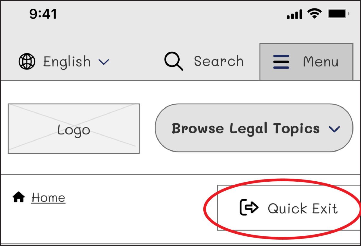
When designing for this audience, we needed a way to support users who may need to exit a page quickly if they are interrupted by a potential abuser while scrolling through sensitive information, such as divorce or domestic violence resources. The site had previously utilized an “Escape” button on pages that dealt with those sorts of topics. When approaching the redesign, we wanted to ensure this button would always appear but wouldn’t interfere with other audiences, such as someone looking for information about traffic tickets. It had to walk a fine line between in-your-face and too subtle to be helpful to ensure users could see and interact with it.
When dealing with “trauma-informed” design, designers must “prioritize comfort over technological trends” (Design for Safety). Our challenge was amplified by a lack of standards for a quick exit button’s function, especially for a site with multiple audiences. Since these buttons are a relatively new best practice and little research on them exists, we were careful in our strategic approach. A quick exit button is not ingrained in a user’s mental model, making its intended action new to most people. Those who feel they might need it have to recognize its function as soon as possible.
Approach to the Quick Exit Button
While designing the quick exit button, we considered its placement, colors, and typographic style to ensure that:
- The button was easy to understand and used by people who needed it,
- The language was not retraumatizing,
- The button wasn’t so big and distracting that it took away from the overall experience of the site for those who didn’t need it, and
- The button’s position was easily accessible on a range of device sizes and types.
Our first wireframe called the button “Quick Exit.” When we tested the prototype, all five participants did not understand what the exit button meant. This emphasized how important the language on the button is. For those who have dealt with domestic violence, even the word “escape” could be harmful to hear. Additionally, since audiences view the website in different languages, we wanted to ensure that the button’s translation would not adversely affect the layout.
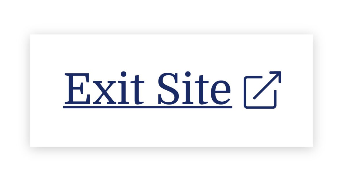
On our next iteration, we tried using the term “Exit” with the icon globally known for “external link.” But this still wasn’t clear enough for our users: Where would the exit bring you? To a page called “Exit”?
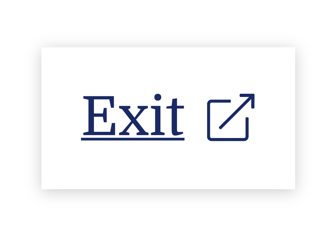
We needed to explain exactly what the button did, so we opted to use the universal external link icon with “Exit Site” as a label to best communicate what the button would do. Although it does not describe where you will end up, it clearly explains that you will leave the website.
To further help users understand what the button was for, we then created a pop-up at the start of the user’s journey that educates people on the button’s purpose:
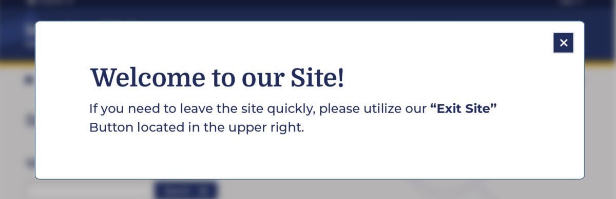
Overall, there was a delicate balance we had to achieve in managing all audiences that typically view the site. We wanted to ensure that we were educating all users but not preventing users from getting help for other topics, such as information about the right to an education or disability. The pop-up, however, had additional considerations we needed to weigh as well: What if their abuser sees it upon landing? What if the user who needs it ignores it?
An alternate approach focused more on domestic violence victims is the California Victims Resource Center’s (CVRC) website, 1800victims.org. When landing on the site, visitors are first educated with a pop-up, which includes reading the website’s Terms of Use and agreeing to the terms before they can enter.
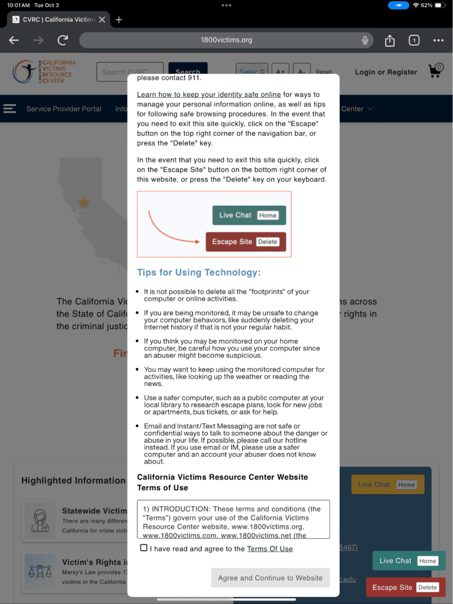
Additionally, when the user clicks the escape button (or uses the keyboard short-cut “Delete”), they are brought to a new tab that displays ABC News. The 1800victims site is changed to Netflix — with all traces of the CVRC gone. According to Columbia Health, this follows best practice because “a blank history can raise suspicion from your abuser.” This would be the safest approach for users.
To give back to the open-source community, the Oomph team turned our approach for this client into the “Quick Exit” Drupal Module. If you would like to add this kind of functionality to your own Drupal website, the module is a great place to start.
Designing for Safety
We must consider how users dealing with domestic violence may feel when they are visiting a site with sensitive content. By including information to educate users upon landing, we can help more people understand how to use a quick exit button if they find themselves in a situation where they need to swiftly leave a website. As an advocate for user safety and domestic violence prevention, you can proactively create a safety net for others by starting to review your work through the lens of how it may be abused prior to releasing it into the world.
This article is just one look at how organizations can design for safety using a quick exit button. By talking about these issues and advocating to protect users in your own design process, we can all take a step toward helping prevent domestic violence. Even if one person is helped or informed by Oomph’s quick exit button design on the website, it will be a success in our eyes.
Need help incorporating safety-focused design into your website or mobile apps? Let’s chat about your needs.
If you or someone you may know is struggling with domestic abuse, please visit or call the National Domestic Violence Hotline at 800-799-7233. For further reading on creating digital products with a safety mindset, we recommend Eva PenzeyMoog’s book Design for Safety available from A Book Apart.
Humans encounter thousands of words every day. As a website owner, that means your site content is vying for your user’s attention alongside emails from their colleagues, the novel on their nightstand, and even the permission slip scrunched at the bottom of their kid’s backpack.
How do you cut through the clutter to create site content that people actually want to read?
While you may already be choosing topics that are the most interesting and relevant for your audience, the structure of your writing may not be optimized for how people read. By understanding your audience’s reading behaviors following best practices for readability and accessibility, you can make sure your content works with people’s natural tendencies – not against them – to create a more engaging digital experience. An added bonus: Google shares many of those same tendencies, so content that’s designed well for humans is also more likely to perform well for organic SEO.
As a digital platform partner to many clients with content-rich sites, Oomph often works with brands to redesign their content for digital success. Here’s a look at the basic principles we apply to any site design – and how you can use them to your advantage.
How People Read Online
When we dive into a book, we typically settle in for a long haul, ready to soak up each chapter one by one. But when we open up a website, it’s more like scanning a newspaper or the entire bookshelf – we’re looking for something specific to catch our eye. We quickly scan, looking for anything that jumps out at us. If we see something interesting, then we’ll slow down and start reading in more detail.
Think of it like an animal following an information “scent,” identifying a mixture of clues that are likely to lead to the content you’re looking for. Most people will decide which pages to visit based on how likely the page will have the answer they’re looking for and how long it’s going to take to get the answer.
Users need to be hooked within a few moments of looking at a website or they’ll move on. They need to be able to identify and understand key factors like:
- The point of the information and why they should keep reading
- Whether they can trust the information and the source
- The type of content provided and any action expected from them, like signing up for an event
- How visually engaging and readable the content is
The takeaway for brands? Writing with your readers’ needs in mind is a way to show them you care and want to help them solve their problem. It’s also the key to achieving your site goals.
Your site content does more than just convey information – it’s about building trust, establishing rapport, and creating a connection that goes beyond the page. Whether you’re trying to sell a product or promote a cause, crafting content around your audience’s needs, desires, and preferences is the most effective way to compel them to take action. Here are four ways to set your website content up for success.
1. Put your data to work.
If you’re looking to refresh your current site, data can help you make informed choices about everything from your content strategy to your layout and design. Use digital reporting tools to answer questions like:
- Is our target audience visiting our site – and are other audiences visiting that we don’t know about yet?
- Which content do visitors download or engage with most frequently?
- What does a typical site visit look like? Are there places where users are getting stuck or bouncing off?
Google Analytics is a go-to tool for understanding the basics of who is visiting your site and how they’re engaging with your content. You can track metrics like session duration, traffic sources, and top-performing pages, all of which can help you better understand what your audience is looking for and what you want to tell them. (If you haven’t made the switch to Google Analytics’ latest platform, GA4, jump-start the process with our 12-step migration guide.)
Additional tools like Screaming Frog and Hotjar can give you even deeper insights, helping you track content structure and real-time user interactions.
2. Create a simple and consistent content structure.
When it comes to site content, consistency is like the foundation of a house (minus the power tools and hard hats).
A well-structured site not only helps users navigate and understand your content more easily, but also enhances the visual appeal and flow of the site. Think of it like a dance floor – you want your users to be able to move smoothly from one section to the next, without any awkward missteps.
That means focusing on shorter sentences, bullet points, and clear subheadings, all backed up by engaging visuals that serve as resting points for the eye. And while you’re at it, don’t forget to declutter your content — users don’t want to wade through a sea of unnecessary words just to find the nuggets of gold.
Ask yourself: Does this content flow smoothly, is it easy to scan, and does it make my key messages stand out? If the answer is yes, then you’re on your way to successful content.
3. Make sure visuals and content play nicely together.
When it comes to enhancing your content with visuals, the key is to strike a balance between style and substance. Your design should complement your content, not compete or distract from it.
Beyond their aesthetic appeal, well-designed visuals are important for creating a sense of credibility with users. Think back to the concept of information scent: If your design looks sloppy or inconsistent, users are less likely to trust the information you’re presenting. So make sure you’re using design elements wisely, creating ample white space, and avoiding anything that makes your content feel like a sales pitch.
4. Focus on accessibility.
When it comes to site content, accessibility can’t be ignored. Content should be engaging and informative and also conform to the , Website Content Accessibility Guidelines (WCAG). Tools like SortSite can help identify these issues and guide you toward accessibility success.
There are a number of things all sites need to consider:
- Using consistent text stylings, including text color, leading, kerning, and tracking.
- Design to support individuals with visual impairments, assistive technology like screen readers, and those that require navigation via the keyboard only
- Following heading orders and grouping content together to make it easier to scan. For example: Following a heading level 2 with a heading level 3 when the ideas are related, but starting with a new heading 2 if changing to a new section of thought.
- Using multiple methods to indicate action items and descriptive text for buttons and alternative text.
- PDFs can be useful, but are also big accessibility red flags, so it’s best to avoid using them when possible. If a PDF is a must, make sure it follows accessibility best practices.
Designing Engaging Content Doesn’t Need To Be a Full-Time Job
If you already have a library of content, auditing the content that already exists can be daunting. And sometimes, you need a little help from your friends. That’s where third-party experts (like us!) come in.
During our website discovery process, we use strategies like content and analytics audits, UX heuristics, and user journey mapping to help position client sites for success. We’ll help you identify areas for improvement, highlight opportunities for growth, and guide you toward achieving content greatness.
Ready for a fresh perspective on your content? We’d love to talk about it.
“Inclusive design” may sound like vague, trendy, technical jargon. But inclusive design isn’t a trend — it’s the world catching up on the kind of digital experiences that should have been part of the web from the beginning.
Inclusive design is a crucial part of nearly every digital platform, be it website, app, or intranet.
Inclusive design as a concept and practice is broad and deep — this article barely scratches the surface, but will help you understand the mindset required. We’ll cover what it is, why it matters for your business, and some ways to assess whether your digital platform could be more inclusive.
- What does “inclusive design” mean?
- What are the benefits of inclusive design?
- How are inclusive design and accessibility different?
- How can you make your platform more inclusive?
What does “inclusive design” mean?
The Inclusive Design Research Center defines inclusive design as “design that considers the full range of human diversity with respect to ability, language, culture, gender, age and other forms of human difference.” Adding to that, Nielsen Norman calls it creating products that “understand and enable people of all backgrounds and abilities,” including economic situation, geography, race, and more.
Essentially, you’re aspiring to create interfaces that reflect how people from all walks of life interact with the world.
Inclusive design allows people to use a digital platform with ease, whatever their needs or point of view. Looking at characteristics like race, abilities, or geography helps us identify key areas where friction can occur between humans and the web.
In the end, it’s about designing for everyone.
What are the benefits of inclusive design?
Inclusive design isn’t just about recognizing and accommodating diversity; it also creates business advantages for organizations that are willing to invest in an inclusive approach. Here are a few key areas where inclusive design can give your digital platform an edge:
Grow your customer base. By understanding the best way to connect with a wider target audience, your team can create digital experiences that attract the most possible users.
Increase user engagement. Engagement goes up when platforms are welcoming and easy to use. Inclusive web design removes barriers and creates motivation for people to engage with your brand.
Spark innovation. Inclusive solutions have a history of spawning innovation that goes beyond the initial intended audience (think closed-captioning-turned-subtitles on Netflix). Sometimes, when you aim to solve a specific usability issue, you end up creating an entirely new market solution.
Motivate your team. The way a digital platform is designed affects all audiences, even employees. Designing with inclusivity in mind can also have a positive influence on your own team. Engaging employees in your efforts to build an inclusive digital platform can help create a sense of shared purpose — one many people are likely to rally around.
How are inclusive design and accessibility different?
You may have heard these terms used in similar contexts. While they overlap in meaning, they’re not the same thing.
By definition, accessibility focuses on accommodating people with varying physical and mental abilities. Accessible websites are measured by their conformance with Web Content Accessibility Guidelines, which pertain to things like auditory, cognitive, physical, and visual disabilities. Accessibility tests typically cover code-level issues that can be fixed in the source code of a site.
Inclusive design is about accommodating the entire spectrum of human diversity. It involves a variety of viewpoints, including those of people with disabilities. Inclusive solutions can involve anything from back-end coding to the way headlines are worded.
In a nutshell: An accessible site is one of the outcomes of an inclusive design, whereas inclusive design is the overall approach to creating accessibility.
Consider these examples:
- You’re filling out a form, and because you have a visual impairment, you’re using the keyboard to move through it. When you get to the end, you discover the form can’t be submitted because you left a few areas blank — even though you filled out every question asked. Turns out the keyboard had skipped past a few required fields. What a pain!
- While filling out a form, you’re asked to select your ethnicity from a list. As you read the options, you discover that yours is not listed, or that you identify with more than one. You feel like the “other,” compared to everyone else, leaving you frustrated about the task and… maybe even about the company too.
While both issues are addressed by inclusive design, the first issue relates to ability and can be fixed within the code, while the second relates to diversity and will take additional measures to address.
How Can You Make Your Platform More Inclusive?
The ethnicity example raises some interesting questions, such as:
- How do you know which ethnicities to add?
- How many do you need to account for?
- Should you just change the way the question is worded?
- Do you need to ask the question at all?
Mainly, this raises a bigger question: how do you maintain an inclusive site when there are so many important and broad variables (ability, language, culture, gender, age, etc.) — especially when that list of variables continues to grow and change?
The best way to get started is to arm yourself with knowledge and create a plan.
1. Identify the problems to solve.
Start by identifying opportunities for improvement in your current user experience (UX) by collecting quantitative and qualitative research with tools like UX audits, user interviews, user recordings, and heatmaps. Keep an eye out for areas where users seem confused, backpedal, or struggle to complete tasks. The more information you gather, the better!
2. Determine the best solutions.
Your user research will likely uncover many possible paths to change. This may include adding more categories to a list, creating an “Other” field users can type any answer into, or adding options to gather additional information.
Note: It’s common for areas that need improvement to hit on sensitive topics, things you may not fully figure out through data and research. Remember that the goal is understanding. Don’t be afraid to reach out to others for their thoughts and opinions.
3. Measure the results.
Some measures of success are easy to determine from user data in Google Analytics or changes in heatmaps and user recordings. Further data can come from users via surveys asking how your audience feels about the changes. The key is to stay continuously informed and aware of what your users are experiencing.
Note: One helpful tool for checking whether your design is, in fact, inclusive is Cards for Humanity. It offers a fun way to make sure you’re not missing anyone or anything in the spectrum of inclusivity.
Remember that the process of creating an inclusive design doesn’t end with implementation. Inclusive design is a work in progress. As a field, inclusive design is always evolving and requires continuous research to develop best practices.
We can’t predict what kind of mismatched interactions users will face in the years to come. But, with an open mind and a desire to learn and grow, we can continually adapt to meet them.
We’ve only scratched the surface of inclusive design! If you have any questions about inclusive design, we’d love to chat. Contact us anytime.
Second chances are expensive. Why? Because it takes five positive experiences to counterbalance the effects of a negative one. If someone’s first experience with your platform is disappointing, you have a long way to go to win back their confidence — if they even complete your sign-up form.
More than 67% of site visitors will completely abandon a sign-up process if they encounter any complications. If you’re lucky, maybe 20% of them will follow up with your company in some way. Whether you’re trying to get people to sign up for your mobile app, e-commerce platform, or company intranet, you must make the process as seamless as possible.
Here are six tips to reduce sign-up friction for your platform.
1. Use a Single Sign On Service
This is crucial for larger platforms that are part of a vast ecosystem with multiple logins, like a complex hospital platform providing access to multiple systems. On the other hand, for a basic paywall, you may want to manage user info yourself. The key is to think strategically about what your systems may look like down the road and how unwieldy your sign-up process may become.
Here are a few things to consider:
Pros
- Single Sign On (SSO) reduces password fatigue and simplifies password management for users
- It allows businesses to quickly provide or revoke employees’ system access
- It lowers the security risk for customers, vendors, and partners
- It improves identity protection with the ability to add multi-factor verification
- The number of available off-the-shelf SSO products makes it more cost effective to implement
Cons
- When SSO is down, access to all platform systems becomes more difficult
- It may introduce a security flaw, as a stolen password from a single user can provide access to multiple systems — which makes multi-factor verification more important
- SSO using social network sign in may not work in corporate systems where social media platforms are blocked by IT
In the end, the advantages of SSO significantly outweigh the downsides. But you’ll likely need expert guidance when planning and implementing SSO to ensure you reap the benefits while minimizing the risks.
2. Keep It Short
More than a quarter of users who abandon online forms do so because they’re too long. To maximize the number of sign-ups, minimize the steps involved.
How do you decide which fields to keep? Try asking, “If I didn’t have this piece of information, would I still be able to provide a good customer experience?” If it’s something you don’t really need to know, then don’t ask.
Here are two more ways to shorten form length:
- Use only required fields. Save anything optional for after sign-up, with prompts to help users “complete” their profile. Hide any repeated fields, like email or password verification. Display one email field, then, once it’s being entered, display the second one below it. Better yet, don’t force people to type things twice.
- Still having a hard time cutting fields? Consider this: Expedia dropped one form field and gained $12 million per year. If a piece of data is labelled as optional, it shouldn’t be in your sign-up form.
3. Use a Single Column Layout
In general, your form should adhere to this core UX principle:
Make the user experience smoother, faster, and better; not messier, slower, and worse.
The simpler the flow of your form, the faster and easier it feels to fill out. Here are a few tips:
- Put all your fields in a logical order.
- Make it easy to read and enter information in a smooth flow from top to bottom.
- Put labels above the input fields, not to the left (as many forms do).
- Avoid placing fields side by side, except for items where it tends to be the norm, such as city, state, and zip code.
4. Play Nice with Autofill
Nothing makes our sanguine CEO spout expletives faster than a platform that doesn’t allow browser-suggested passwords. While many of those suggested passwords are long strings of characters saved securely to the browser, the letter/number/special character combination may not meet your platform’s arbitrary standards.
In addition, some accessibility checkers will flag fields where autofill is turned off, indicating a possible issue for people with disabilities.
Here are a few more ways to make the experience smoother:
- In phone input fields, automatically fill in dashes. In date fields, fill in slashes
- Transition from one field or step to the next automatically
- Don’t use select lists for date values like months or years
And, don’t forget to test the autofill function on both a desktop and phone — the experience can be very different between the two.
5. Allow Guest Checkout for eCommerce
To put it bluntly, don’t get in the way of someone spending money on your site. Instead, make it easy to open an account just by creating a password. Or, create a new user account automatically with the info you have, then send users an email with instructions on how to finalize the sign-up process.
What we’ve seen work well: after a successful shopping experience, follow up with an email to the customer that sells the benefits of having an account and asks if they would like to activate theirs.
6. Don’t Use a CAPTCHA
That’s right, we said it. It’s time to get rid of CAPTCHA on your sign-up form. Here are three good reasons why:
- There are too many ways to counter CAPTCHA, especially as AI evolves
- CAPTCHA puzzles are getting harder and harder for humans to solve
- Use of CAPTCHA has been shown to increase form abandonment
Instead, confirm any new account the tried-and-true way: with an email to the registered address. And consider if there are ways to clean up your security features on the back end, instead of presenting barriers to customers upon sign-up.
Don’t put the onus on the people who are trying to give you money. Put it on your systems instead.
You Only Get a First Impression Once
As the gateway to onboarding users, the sign-up process is the most crucial piece of your user experience to get right. Whether your goal is to acquire and retain customers, or to engage and inform employees, your success depends on getting your target audience past the initial sign-up hurdle. If their first task is difficult, it doesn’t bode well for the rest of the experience.
Don’t let your sales and marketing be better than your user onboarding. Once someone has decided your platform offers what they need, you’re more than halfway to converting them into a user. Just make sure your sign-up process lives up to your marketing promises.