
THE BRIEF
Never Stopping, Always Evolving
Leica Geosystems was founded on cutting-edge technology and continues to push the envelope with their revolutionary products. Leica Geosystems was founded by Heinrich Wild and made its first rangefinder in 1921. Fast forward to the 21st century, and Leica Geosystems is the leading manufacturer of precision laser technology used for measurements in architecture, construction, historic preservation, and DIY home remodeling projects.
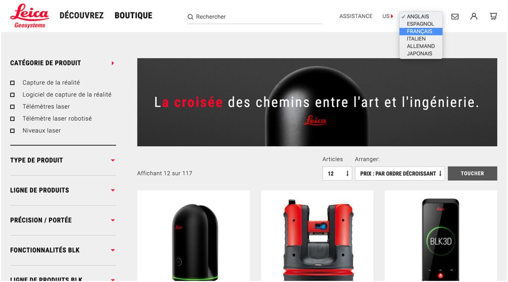
Oomph and Leica collaborated on an initial project in 2014 and have completed multiple projects since. We transitioned the site into a brand new codebase with Drupal 8. With this conversion, Oomph smoothed out the Leica team’s pain points related to a multisite architecture. We created a tightly integrated single site that can still serve multiple countries, languages, and currencies.
THE CHALLENGE
Feeling the Pain-points with Multisite
Leica’s e-commerce store is active in multiple countries and languages. Managing content in a Drupal multisite environment meant managing multiple sites. Product, content, and price changes were difficult. It was Oomph’s challenge to make content and product management easier for the Leica team as well as support the ability to create new country sites on demand. Leica’s new e-commerce site needed to support:
MULTIPLE COUNTRIES AND A GLOBAL OPTION
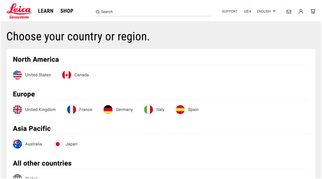
SIX LANGUAGES
MANY 3RD-PARTY INTEGRATIONS
The pain points of the previous Multisite architecture were that each country was a silo:
- No Single Sign On (SSO): Multiple admin log-ins to remember
- Repetitive updates: Running Drupal’s update script on every site and testing was a lengthy process
- Multiple stores: Multiple product lists, product features, and prices
- Multiple sites to translate: each site was sent individually to be translated into one language
THE APPROACH
Creating a Singularity with Drupal 8, Domain Access, & Drupal Commerce
A move to Drupal 8 in combination with some smart choices in module support and customization simplified many aspects of the Leica team’s workflow, including:
- Configuration management: Drupal 8’s introduction of configuration management in core means that point-and-click admin configuration can get exported from one environment and imported into another, syncing multiple environments and saving configuration in our code repository
- One Database to Rule Them All: Admins have a single site to log into and do their work, and developers have one site to update, patch, and configure
- One Commerce Install, Multiple stores: There is one Drupal Commerce 2.x install with multiple stores with one set of products. Each product has the ability to be assigned to multiple stores, and price lists per country control product pricing
- One Page in Multiple Countries and Multiple Languages: The new single site model gives a piece of content one place to live, while authors can control which countries the content is available and the same content is translated into all the languages available once.
- Future proof: With a smooth upgrade path into Drupal 9 in 2020, the Drupal 8 site gives Leica more longevity in the Drupal ecosystem
LEARN VS. SHOP
Supporting Visitor Intention with Two Different Modes
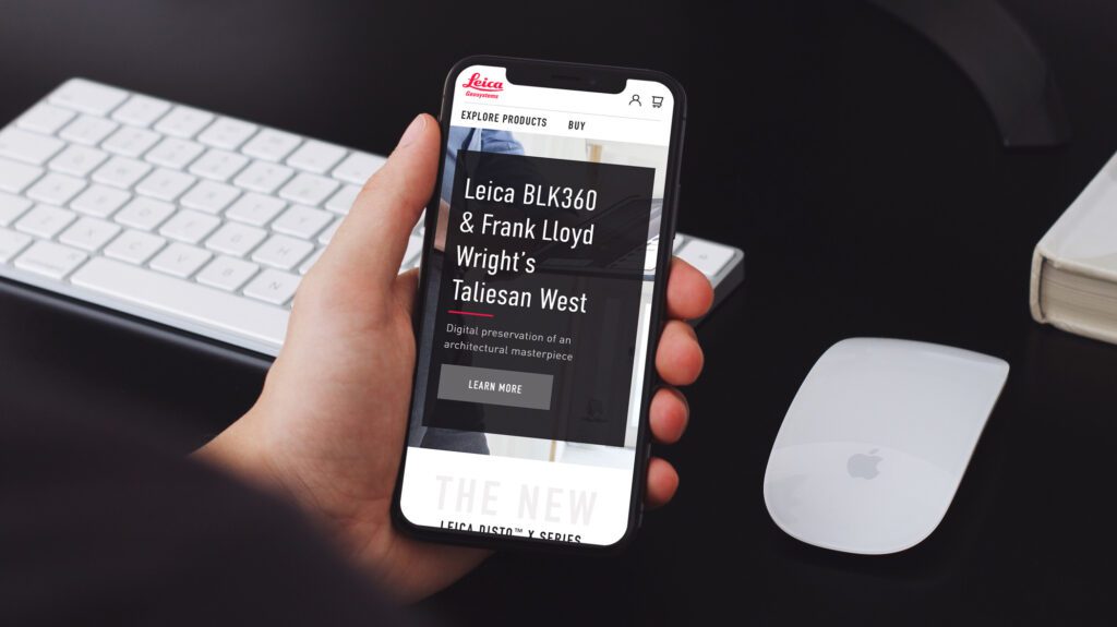
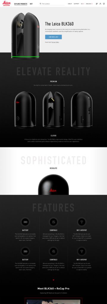
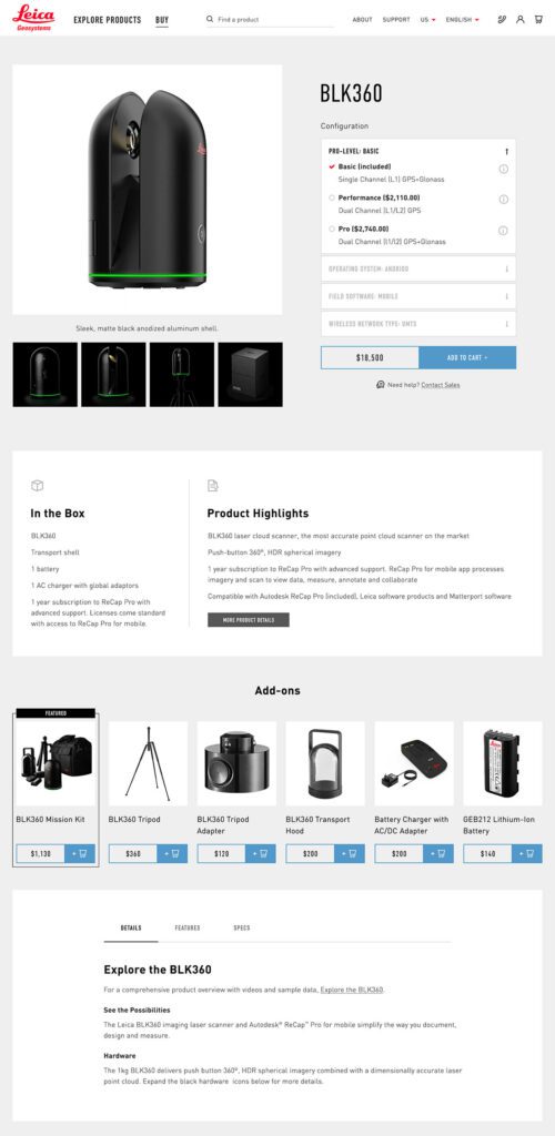
While the technical challenges were being worked out, the user experience and design had to reflect a cutting-edge company. With the launch of their revolutionary product, the BLK 360, in 2018, Leica positioned itself as the Apple of the geospatial measurement community — sleek, cool, cutting-edge and easy to use. While many companies want to look as good as Apple, few of them actually have the content and product to back it up.
The navigation for the site went through many rounds of feedback and testing before deciding on something radically simple — Learn or Shop. A customer on the website is either in an exploratory state of mind — browsing, comparing, reviewing pricing and specifications — or they are ready to buy. We made it very clear which part of the website was for which.
This allowed us to talk directly to the customer in two very different ways. On the Learn side, the pages educate and convince. They give the customer information about the product, reviews, articles, sample data files, and the like. The content is big, sleek, and leverages video and other embedded content, like VR, to educate.
On the Shop side the pages are unapologetically transactional. Give the visitor the right information to support a purchase, clearly deliver specs and options like software and warranties, without any marketing. We could assume the customer was here to purchase, not to be convinced, so the page content could concentrate on order completion. The entire checkout process was simplified as much as possible to reduce friction. Buying habits and patterns of their user base over the past few site iterations were studied to inform our choices about where to simplify and where to offer options.
THE RESULTS
More Nimble Together
The willingness of the Drupal community to support the needs of this project cannot be overlooked, either. Oomph has been able to leverage our team’s commitment to open source contributions to get other developers to add features to the modules they support. Without the give and take of the community and our commitment to give back, many modifications and customizations for this project would have been much more difficult. The team at Centarro, maintainers of the Commerce module, were fantastic to work with and we thank them.
We look forward to continuing to support Leica Geosystems and their product line worldwide. With a smooth upgrade path to Drupal 9 in 2020, the site is ready for the next big upgrade.
Generative Engine Optimization (GEO) is making organizations scramble — our clients have been asking “Are we ready for the new ways LLMs crawl, index, and return content to users? Does our site support evolving GEO best practices? What can we do to boost results and citations?”
Large language models (LLMs) and the services that power AI summaries don’t “think” like humans but they do perform similar actions. They seek content, split it into memorable chunks, and rank the chunks for trust and accuracy. If pages use semantic HTML, include facts and cite sources, and include structured metadata, AI crawlers and retrieval systems will find, store, and reproduce content accurately. That improves your chance of being cited correctly in AI overviews.
While GEO has disrupted the way people use search engines, the fundamentals of SEO and digital accessibility continue to be strong indicators of content performance in LLM search results. Making content understandable, usable, and memorable for humans also has benefits for LLMs and GEO.
How LLM systems (and AI-driven overviews) get their facts
Understanding how LLMs crawl, process, and retrieve web content helps us understand why semantic structure and accessibility best practices have a positive effect. When an AI system generates an answer that cites the web, several distinct back-end steps usually happen:
- Crawling — Bots visit URLs and download page content. Some crawlers execute javascript like a browser (Googlebot) while others prefer raw HTML and limit their rendering.
- Chunking — Large documents are split into small, logical “chunks” of paragraphs, sections, or other units. These chunks are the pieces that are later retrieved for an answer. How a page’s content is structured with headings, paragraphs, and lists determines the likely chunk boundaries for storage.
- Vectorization — Each chunk is then converted into a numeric vector that captures its semantic meaning. These embeddings live in a vector database and enable systems to find chunks quickly. The quality of the vector depends on the clarity of the chunk’s text.
- Indexing — Systems will store additional metadata (URL, title, headings, metadata) to filter and rank results. Structured data like schema metadata is especially valuable.
- Retrieval — A user asks a question or performs a search and the system retrieves the most semantically similar chunks via a vector search. It re-ranks those chunks using metadata and other signals and then composes its answer while citing sources (sometimes).
The Case for Human-Accessible Content
There are many more reasons why digital accessibility is simply the right thing to do. It turns out that in addition to boosting SEO, accessibility best practices help LLMs crawl, chunk, store, and retrieve content more accurately.
During retrieval, small errors like missing text, ambiguous links, or poor heading order can fail to expose the best chunks. Let’s dive into how this can happen and what common accessibility pitfalls contribute to the confusion.
For Content Teams — Authors, Writers, Editors
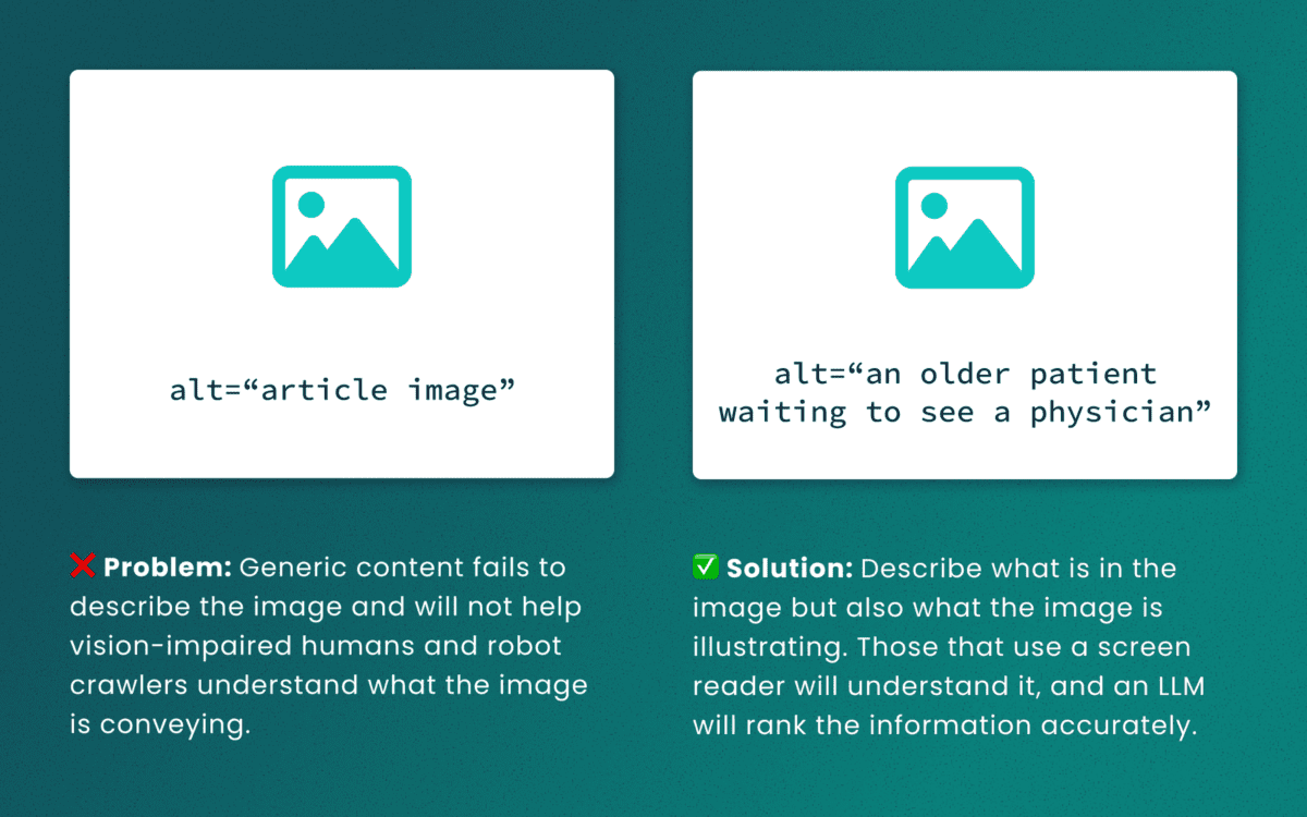
Lack of descriptive “alt” text
While some LLMs can employ machine-vision techniques to “see” images as a human would, descriptive alt text verifies what they are seeing and the context in which the image is relevant. The same best practices for describing images for people will help LLMs accurately understand the content.
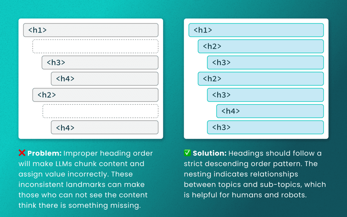
Out-of-order heading structures
Similar to semantic HTML, headings provide a clear outline of a page. Machines (and screen readers!) use heading structure to understand hierarchy and context. When a heading level skips from an <h2> to an <h4>, an LLM may fail to determine the proper relationship between content chunks. During retrieval, the model’s understanding is dictated by the flawed structure, not the content’s intrinsic importance. (Source: research thesis PDF, “Investigating Large Language Models ability to evaluate heading-related accessibility barriers”)
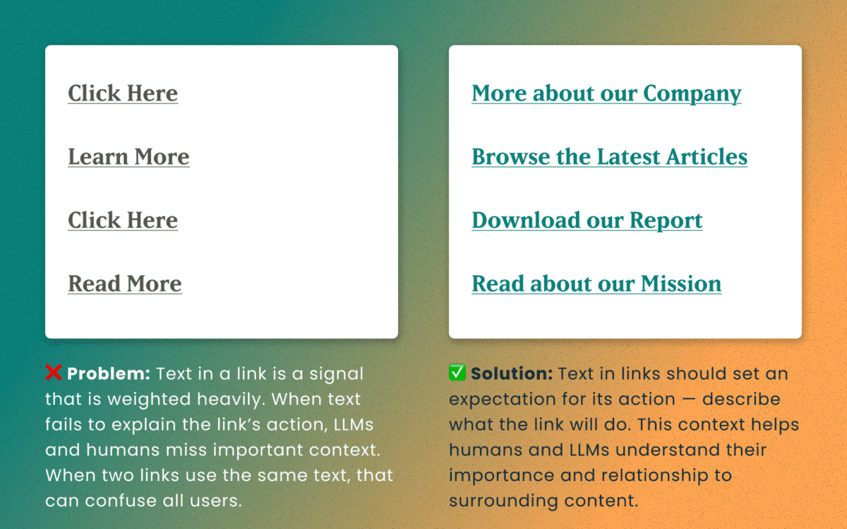
Descriptive and unique links
All of the accessibility barriers surrounding poor link practices affect how LLMs evaluate their importance. Link text is a short textual signal that is vectorized to make proper retrieval possible. Vague link text like “Click here” or “Learn More” does not provide valuable signals. In fact, the same “Learn More” text multiple times on a page can dilute the signals for the URLs they point to.
Using the same link text for more than one destination URLs creates a knowledge conflict. Like people, an LLM is subject to “anchoring bias,” which means it is likely to overweight the first link it processes and underweight or ignore the second, since they both have the same text signal.
Example of the duplicate link problem: <a href=“[URL-A]”>Duplicate Link Text</a>, and then later in the same article, <a href=“[URL-B]”>Duplicate Link Text</a>. Conversely, when the same URL is used more than once on a page, the same link text should be repeated exactly.
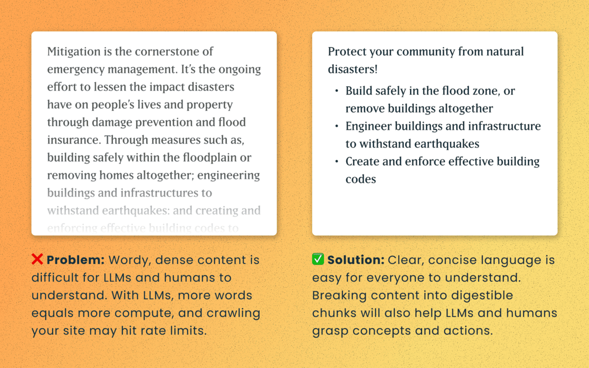
Logical order and readable content
Simple, direct sentences (one fact per sentence) produce cleaner embeddings for LLM retrieval. Human accessibility best practices of plain language and clear structure are the same practices that improve chunking and indexing for LLMs
For Technical Teams — IT, Developers, Engineers
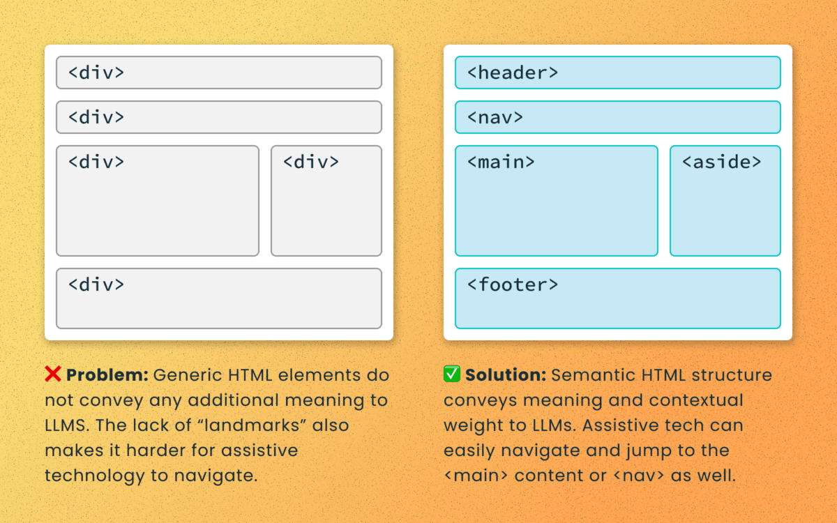
Poorly structured semantic HTML
Semantic elements (<article>, <nav>, <main>, <h1>, etc.) add context and suggest relative ranking weight. They make content boundaries explicit, which helps retrieval systems isolate your content from less important elements like ad slots or lists of related articles.
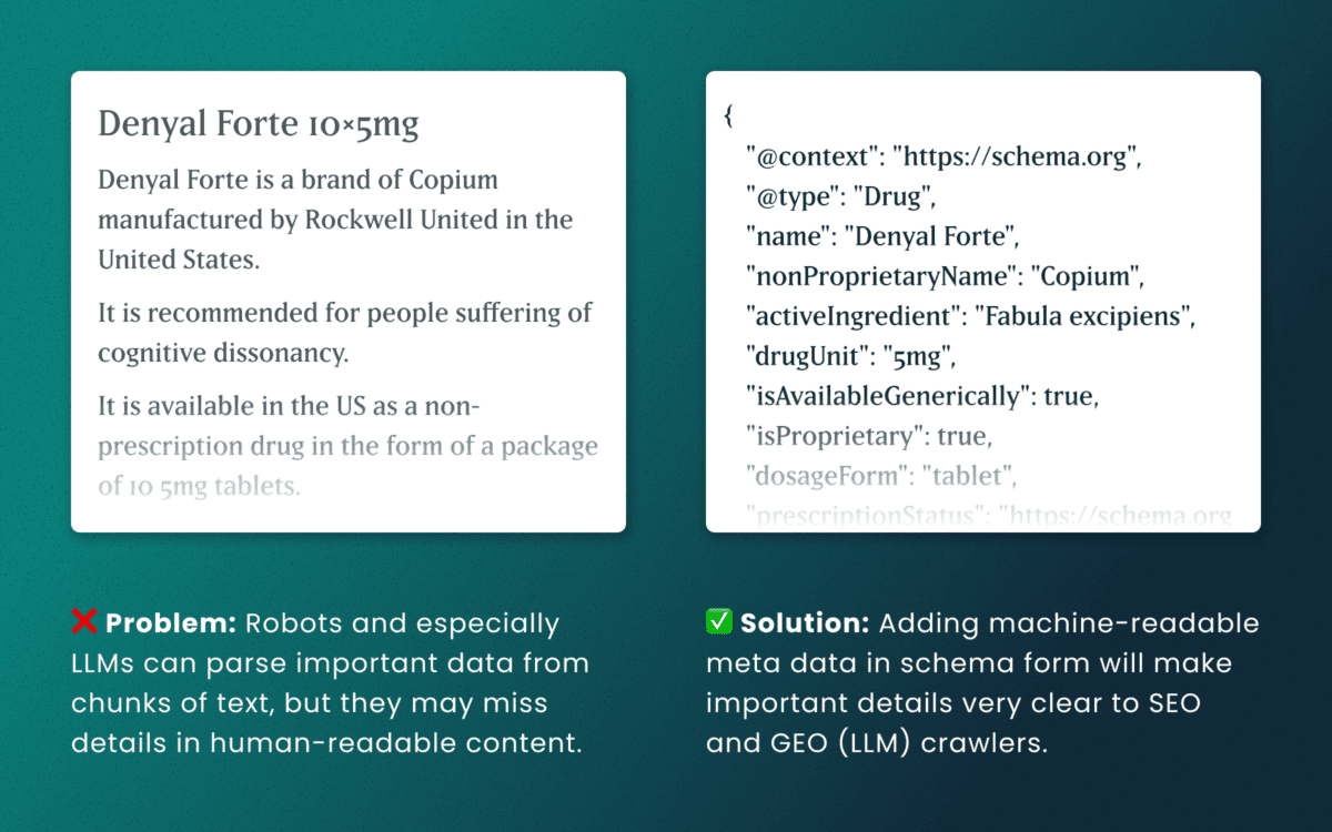
Lack of schema
This is technical and under the hood of your human-readable content. Machines love additional context and structured schema data is how facts are declared in code — product names, prices, event dates, authors, etc. Search engines have used schema for rich results and LLMs are no different. Right now, server-rendered schema data will guarantee the widest visibility, as not all crawlers execute client-side Javascript completely.
How to make accessibility even more actionable
The work of digital accessibility is often pushed to the bottom of the priority list. But once again, there are additional ways to frame this work as high value. While this work is beneficial for SEO, our recent research uncovers that it continues to be impactful in the new and evolving world of GEO.
If you need to frame an argument to those that control the investments of time and money, some talking points are:
- Accurate brand representation — Poor accessibility hides facts from LLMs. When customers ask an AI assistant for “best X for Y,” your content may not be shown — or worse, misrepresented. Fixing accessibility reduces brand risk and increases content authority.
- Engagement boost — Improvements that increase accurate citations and AI visibility can increase referral traffic, feature mentions, and lead quality. In a landscape where AI Answers are reducing click-through rates, keeping the traffic you have on your site for longer and building brand trust becomes vital.
- Increased exposure — Digital inclusion makes your content widely accessible to machines and the machines that assist humans. Think about a search engine as another human-assistive device, just like a keyboard or screen reader.
- Multi-pronged benefits — Accessibility improvement improves traditional SEO, can benefit mobile performance, and reduces the risks associated with accessibility compliance policies.
Staying steady in the storm
Let’s be clear — this summer was a “generative AI search freak out.” Content teams have scrambled to get smart about LLM-powered search quickly while search providers rolled out new tools and updates weekly. It’s been a tough ride in a rough sea of constant change.
To counter all that, know that the fundamentals are still strong. If your team has been using accessibility as a measure for content effectiveness and SEO discoverability, don’t stop now. If you haven’t yet started, this is one more reason to apply these principles tomorrow.
If you continue to have questions within this rapidly evolving landscape, talk to us about your questions around SEO, GEO, content strategy, and accessibility conformance. Ask about our training and documentation available for content teams.
Additional Reading
- AHREFs.com: Is SEO Dead? Real Data vs. Internet Hysteria
- SearchEngineJournal.com: How LLMs Interpret Content: How To Structure Information For AI Search
- InclusionHub.com: SEO and Web Accessibility: What You Need to Know (from 2020, but still relevant)
As a digital services firm partnering with destination marketing organizations (DMOs) across the U.S., we’re helping teams navigate what’s already proving to be a volatile 2025—especially on the inbound side. Analysis from the World Travel & Tourism Council (WTTC) projects a stark reality: the U.S. economy will miss out on $12.5 billion in international visitor spending this year, with inbound spend expected to dip to just under $169B, down from $181B in 2024. Even more concerning, the U.S. is the only country among 184 economies in WTTC’s study forecast to see an inbound-spend decline this year.
While external market forces remain largely beyond control, we’ve identified three strategic areas where DMOs can focus their digital platforms to weather this storm and continue demonstrating measurable demand to their partners.
1. Transform Content Into Action-Driving Experiences
Why this strategic shift matters now
With inbound spend shrinking by $12.5B and key feeder markets weakening, undecided travelers need clarity and confidence to choose your destination. Content that reduces uncertainty and highlights immediate value converts better than generic inspiration.
Strategic implementation approach
Activate “Go Now” signals. Combine always-on inspiration with time-sensitive reasons to visit—shoulder-season value, midweek deals, cooling weather breaks—strategically mapped to the soft periods your analytics reveal.
Elevate discovery through intelligent architecture. Curate SEO-optimized content hubs organized by Themes (outdoors, arts, culinary) and Moments (fall colors, winter lights). Implement structured data (FAQ, Event, Attraction) with strategic internal linking architecture so travelers find relevant options fast.
Deploy micro-itineraries for immediate conversion. Design 24–48-hour “micro-itins” featuring embedded maps, transit and parking guidance, and seamless handoffs to bookable partners. Partnering with platforms like MindTrip reduces content team effort while accelerating output—a strategy that’s proven particularly effective for our DMO clients facing resource constraints.
Authority-driven event content optimization. Event pages generate the highest intent traffic. Enhance them with rich media, last-minute planning resources, and strategic “if sold-out, try this” alternatives.
Transparent value communication. Feature free experiences prominently, implement intuitive budget filters, and deploy “Best Time to Visit” calendars comparing crowds and pricing by week and month. Transparency builds trust, and trust drives conversion.
2. Build Your Competitive Moat Through Data-Driven Audience Cultivation
Your first-party data represents your most defensible competitive advantage. As platform targeting becomes increasingly constrained and inbound spending softens, DMOs that build and activate their own audience will capture attention far more efficiently than those relying solely on paid channels.
Strategic audience development
Implement high-intent capture everywhere. Deploy contextual email and SMS prompts across high-intent templates—events, itineraries, trip planners, partner directories. Offer valuable micro-perks like exclusive maps and early event alerts.
Master progressive profiling. Collect visitor preferences—season, interests, party type, origin market—over multiple touchpoints rather than overwhelming users with lengthy initial forms.
Create actionable audience segments. Develop cohorts around 2025’s market realities: last-minute planners, shoulder-season seekers, road-trippers, value hunters, family weekenders, and meetings planners.
Future-proof attribution systems. Combine GA4 with server-side tagging and standardized UTM schemas for every partner handoff. Track outbound clicks, partner session quality, itinerary saves and usage, offer redemptions, and newsletter-driven sessions. This comprehensive approach ensures you maintain visibility into conversion paths as third-party cookies disappear.
Deploy trend-driven editorial strategy. Develop weekly dashboards blending organic query trends, on-site search terms, partner click-through rates, and feeder-market signals. When interest dips in one market, pivot homepage modules and paid social toward value and itinerary content targeting more resilient markets.
3. Transform Partner Relationships Through Measurable Value Delivery
In a softening inbound environment where domestic spending carries approximately 90% of the economic load, your partners need two critical elements: qualified attention and proof of conversion. Your website should function as the region’s premier meta-directory and conversion engine.
Experience optimization strategies
Enable one-click handoffs with context preservation. Pass user filters—dates, neighborhoods, price ranges—directly into partner sites and booking engines while preserving state if travelers return.
Deploy persistent trip planning tools. Allow users to save places and generate shareable itineraries with intelligent handoffs: “Book these two hotels,” “Reserve rentals,” “Get festival passes.”
Create compelling partner storefronts. Develop rich partner profiles featuring availability widgets, authentic reviews, social proof, and clear calls-to-action.
Implement strategic co-op modules. Design paid placements that provide value rather than feeling like advertisements: “Local Favorites” carousels, sponsor highlights, seasonal deal tiles—rotated by audience cohort and season. This generates additional revenue while maintaining user experience quality.
Establish closed-loop reporting systems. Standardize UTM tracking, monitor outbound events, and where permitted, implement partner pixels and offer codes to report assisted conversions by category and campaign. Partners need proof of ROI, and data-driven reporting builds stronger, more profitable relationships.
How Oomph Can Accelerate Your Success
If you’re experiencing softer international interest, shorter booking windows, or declining partner satisfaction, you’re facing the same challenges as DMOs nationwide. The organizations pulling ahead aren’t waiting for market recovery—they’re strengthening their digital platforms through strategic content optimization, systematic audience cultivation, and demonstrable partner value creation.
Our proven methodology transforms these challenges into competitive advantages.
We’ll conduct a comprehensive audit of your digital platform against these three strategic pillars, quantify immediate optimization opportunities, and provide your partners with what they need most: qualified, measurable demand. The market headwinds are real, but the right strategic approach can help you maintain resilience and emerge stronger when conditions improve. Let’s navigate these challenges together.
When you’re responsible for your organization’s digital presence, it’s natural to focus on what’s visible: the design, the content, the user experience. But beneath every modern website lies a complex ecosystem of technologies, integrations, and workflows that can either accelerate your team’s success or create hidden friction that slows everything down.
That’s where a technical audit becomes invaluable. It’s not just a diagnostic tool—it’s a strategic opportunity to understand the foundation of your platform and make informed decisions about your digital future.
It’s Like a Home Inspection for Your Website
Think about buying a house. You walk through focusing on the big picture—does the kitchen work for your family? Is there enough space? But a good home inspector looks deeper, checking the foundation, examining the electrical system, and spotting that small leak under the bathroom sink that could become a major problem later.
A technical audit takes the same comprehensive approach to your digital platform. We examine not just what’s working today, but what might impact your team’s ability to execute tomorrow. The goal isn’t to find problems for the sake of finding them—it’s to give you the complete picture you need to plan strategically.
Creating Shared Understanding Across Your Entire Team
One of the most powerful outcomes of a technical audit is alignment. Whether you’re managing internal developers, partnering with an agency, or preparing to issue an RFP, having a clear baseline allows everyone to ask better questions and make more accurate decisions.
A strategic technical audit delivers:
Proactive Problem-Solving: Surface technical issues before they become roadblocks to important campaigns or launches.
Performance Optimization: Identify specific improvements that will measurably enhance user experience and conversion rates.
Workflow Enhancement: Reveal friction points that slow down content updates, campaign launches, or day-to-day management tasks.
Vendor Enablement: Provide partners and potential vendors with the context they need to scope work accurately and ask intelligent questions.
Strategic Planning: Create a foundation for long-term digital strategy decisions, from infrastructure investments to editorial tooling.
The organizations we work with often tell us that a technical audit helped them transition from reactive maintenance to proactive digital platform management—a shift that pays dividends across every initiative.
What We Typically Discover
While every platform is unique, certain patterns emerge across industries and organization types. Technical audits frequently reveal:
Security and Maintenance Opportunities: Outdated software, plugins requiring updates, or access configurations that can be strengthened with minimal effort. This often includes ensuring accessibility compliance meets current standards.
Performance Enhancements: Specific optimizations in areas like image compression, caching strategies, or database queries that directly impact user experience. Modern audits also examine search visibility and performance optimization.
Scalability Considerations: Code or architectural decisions that work fine today but could limit growth or flexibility as your needs evolve. This includes evaluating search infrastructure and international expansion capabilities.
Process Improvements: Gaps in version control, deployment workflows, or change management that create unnecessary risk or slow down development cycles.
Editorial Workflow Optimization: Content management processes that feel cumbersome or inconsistent, often because they evolved organically rather than being designed strategically. For global organizations, this includes reviewing translation and localization systems.
Many of these findings aren’t urgent fixes—they’re strategic insights that become incredibly valuable when you’re planning a redesign, launching a major campaign, or evaluating new partnerships.
When a Technical Audit Delivers Maximum Value
You don’t need to wait for problems to emerge. Technical audits are particularly valuable when:
Taking Over Digital Responsibility: You’ve inherited a platform and need a comprehensive understanding of what you’re working with and where the opportunities lie.
Planning Major Initiatives: Before investing in a redesign, platform migration, or significant feature development, understanding your current foundation prevents costly surprises.
Preparing for Vendor Selection: Whether you’re issuing an RFP or evaluating agencies, giving potential partners accurate technical context leads to better proposals and more realistic timelines.
Developing Digital Strategy: When you’re ready to create a roadmap for digital growth, grounding decisions in technical reality rather than assumptions leads to better outcomes. This is especially important when considering AI integration or generative engine optimization strategies.
Our Approach to Technical Audits
We design our audits to build clarity and confidence, not overwhelm you with technical jargon. Rather than simply delivering a report, we walk through findings with your team, prioritize recommendations based on your specific goals, and translate technical insights into actionable business language you can share with stakeholders.
Our methodology goes beyond code analysis. We examine how your platform supports your current workflows, aligns with your organizational objectives, and positions you for future growth. This combination of technical depth and strategic perspective ensures you get insights that drive real business outcomes.
The audit process focuses on partnership, not judgment.
We’re not looking for flaws to criticize—we’re identifying opportunities to help you and your partners make smarter decisions. The result is visibility into the hidden layers of your digital platform and a foundation for more strategic planning, better technology investments, and sustainable long-term success.
Ready to understand what’s really happening under the hood of your digital platform? Let’s talk about how a technical audit could support your goals and strengthen your team’s ability to execute on your digital vision.
If your Drupal site relies on Acquia Search leveraging Solr, you’re likely facing a migration from Acquia Search to SearchStax. We’ve guided numerous organizations through this transition and want to share our proven approach to help you navigate this change successfully.
Before diving into the migration process, this transition presents an excellent opportunity to reassess your search strategy entirely. While Solr remains a powerful and robust solution, the search landscape has evolved significantly with innovative alternatives now available. For organizations considering broader platform transitions, this moment offers strategic value beyond search improvements. Modern React-based solutions can deliver dramatically faster user experiences. Our recent work with ONS demonstrates this potential—by replacing their Solr solution with Algolia Instant Search, we helped them achieve a 40% improvement in search response times while creating a more intuitive experience for their members.
Why the Move to SearchStax?
Acquia announced earlier this year that they’re sunsetting their Acquia Search offering in 2026, positioning SearchStax as the recommended migration path through their new partnership. This transition offers enhanced search capabilities and more direct control over your search environment through SearchStax’s comprehensive dashboard, providing visibility into Solr server performance, data analysis tools, search preview functionality, and advanced configuration options.
The architectural similarity ensures a seamless end-user experience—Solr remains the foundation, requiring no front-end changes for this migration path while delivering improved administrative control.
Our Proven Migration Framework
Through multiple successful migrations, we’ve developed a structured approach that minimizes risk and ensures smooth transitions. Here’s our step-by-step framework:
Phase 1: Foundation Setup
- Secure access to the SearchStax dashboard for complete environment management
- Install the SearchStax modules, including the critical “Solr to SearchStax Site Search Migration” module
- Configure and commit your basic settings to establish the foundation
Phase 2: Testing and Validation
- Deploy changes to DEV or STAGE environments for comprehensive testing
- Validate search functionality, performance, and user experience
- Identify and resolve any configuration issues before production deployment
Phase 3: Production Implementation
- Push validated changes to production environment
- Execute core migration steps including server migration (Drupal’s SearchStax authentication automatically generates endpoint and token configurations), index migration to transfer existing search indexes, and view switching to activate SearchStax indexes across your site
Phase 4: Configuration Management
- Implement configuration overrides and ignores to ensure environment-specific settings
- Secure sensitive data while maintaining dedicated SearchStax server settings per environment
- Export SearchStax indexes and updated views from production to feature branch
- Commit and deploy changes in your next release cycle
Phase 5: Transition Management
- Maintain Acquia search indexes temporarily for rollback capability
- Monitor performance and user experience during initial transition period
- Complete final cleanup by disabling Acquia search module and migration tools once stability is confirmed
Addressing Technical Challenges
Our experience across multiple migrations has revealed common technical hurdles that require proactive attention. Configuration issues with Boost by Date Processor settings, Highlighted Fields errors during index rebuilding, and Facet configuration mismatches between environments are frequent challenges. The key to success lies in early identification during lower environment testing and leveraging Acquia support resources to resolve issues before they impact production.
Each migration presents unique challenges based on your specific configuration and content structure. Our approach prioritizes thorough testing and validation to surface these issues early, ensuring smooth production deployment.
Strategic Search Optimization
Successful migration extends beyond technical implementation. Understanding your content architecture, user behavior patterns, and business objectives enables you to optimize search effectiveness during the transition. This migration provides an ideal opportunity to evaluate search performance metrics, refine content indexing strategies, and enhance user experience design.
By following this proven framework and preparing for potential challenges, your organization can successfully transition to SearchStax while improving both administrative capabilities and user search experience. The result is a more robust, manageable search solution that positions your site for future growth and enhanced user engagement.
Our comprehensive migration expertise extends beyond search implementations to complete platform transformations, ensuring your digital infrastructure supports your long-term strategic objectives.
Ready to begin your SearchStax migration? Don’t wait until the 2026 deadline creates a migration rush. Our fixed-price SearchStax migration service ($2,500) provides the structured, proven approach outlined in this guide—from foundation setup through transition management. Get started with your SearchStax migration today.
Drupal has long been known for its flexibility, robustness, and scalability. But for many marketers and content creators, that flexibility can come with a steep learning curve — especially when it comes to building layouts and managing design without the help of a developer. That’s about to change in a big way.
Enter Drupal Canvas (previously called Experience Builder), a new initiative in Drupal that promises to radically streamline and simplify how we build and design pages. While still in its early stages, Experience Builder is ready for testing and experimentation — and it’s something marketers should absolutely have on their radar.
What is Drupal Canvas?
Drupal Canvas is the evolution of Drupal’s current method of flexible page building called Layout Builder. It takes what we know from layout builder and expands it into a unified, user-friendly tool that allows non-developers to build and theme websites directly in the browser. It’s a huge leap toward making Drupal more accessible for site builders, marketers, and content creators alike.
Unlike other page builders, Canvas doesn’t just provide drag-and-drop layout tools. It leverages Drupal’s core strengths — structured data, fine-grained access controls, and reusable components — to ensure consistency across channels and scalability across enterprise-level websites. This makes it uniquely powerful for large organizations managing multiple digital properties.
Dries Buytaert, Drupal’s founder, described it as a response to the fragmented landscape of site-building options in Drupal today. The vision is to consolidate functionality from tools like Paragraphs and Layout Builder into a single, cohesive solution. One that’s intuitive, efficient, and packed with modern capabilities.
Here is a fantastic video demo from DrupalCon Atlanta that was shown by Dries during the keynote address:
Why Now?
The timing couldn’t be better. While Layout Builder was a step in the right direction when it launched in 2018, its limitations became clear as more site builders demanded easier workflows, styling tools, and richer content composition features.
At recent Drupal conventions, the community has rallied around the idea of enhancing user experience across the board. As part of the broader Drupal CMS, Canvas is a key component in bringing Drupal’s usability in line with the expectations of modern content teams.
Why I’m Excited About It
As an engineer who has worked closely with Drupal for years, what excites me most is how Canvas can bridge the many gaps in Drupal’s current page-building ecosystem. Today, there are so many ways to structure content — Blocks, Paragraphs, Layout Builder, Panels — that choosing the right one can be overwhelming.
Drupal Canvas is shaping up to be that “one-stop-shop” we’ve needed. It reduces decision fatigue and gives teams a faster way to get projects off the ground without needing to architect every page structure from scratch.
Even better, it supports creating single-page overrides, component-level editing, and even React-based components right in the editor. That’s something I’ve personally looked forward to for a long time. The ability to build and save reusable components that can be dropped into any page makes this a tool that truly enhances productivity — not just for developers, but for marketers and content creators, too.
My First Look
I had the chance to see Drupal Canvas in action at DrupalCon Atlanta this year. The live demos were impressive and really opened my eyes to what this tool could do, both for newcomers to Drupal and seasoned site builders. Along with Drupal CMS, and recipes, Canvas is easily one of the hottest topics in the Drupal ecosystem right now.
The energy in the room during the sessions was palpable — people are genuinely excited about this. It’s not just another experimental module; it’s a shift in how we think about building on Drupal.
A Game-Changer for Marketers
One of the biggest barriers for marketing teams has always been reliance on developers to make even small layout edits. That’s starting to change.
With Canvas, non-developers will be able to build out dynamic, visually engaging pages — without needing to dive into code. That’s a massive win, especially for small teams in government, education, or nonprofit sectors, where resources are limited and time is of the essence.
Being able to make changes quickly, reuse content intelligently, and maintain a consistent brand without touching a template file is something many organizations have wanted for years. Drupal Canvas delivers on that promise.
Want to Try It Yourself?
If you’re curious to see what the buzz is about, you have two great options to get started:
- Try it yourself: Head to Drupal.org and download the latest version of Drupal CMS. It now comes with an optimized installer that makes getting started faster than ever. Once you’re up and running, you can add the Drupal Canvas module and start exploring.
- See it in action: Not ready to dive in alone? Schedule an implementation consultation with our team for a live demo and personalized guidance on how Drupal CMS can work for your organization.
Looking Ahead
It’s important to note that this is just the alpha version of the Canvas initiative. The team behind it is committed to rapid iteration and community feedback, which means what we’re seeing today is just the beginning.
If this is the foundation, I can only imagine how powerful the tool will become in the next year or two. The Drupal community is known for its collaborative spirit and constant innovation — and Canvas is shaping up to be one of the most important steps forward in years.
So if you’re a marketer, content strategist, or anyone who’s ever been frustrated by the limits of page building in Drupal — now’s the time to dive in. Drupal Canvas is here, and it’s ready to change the game. Ready to explore Drupal Canvas for your organization? Contact us for a complimentary consultation.
Digital accessibility can be difficult to stay ahead of. The laws have been evolving and now the European Union (EU) has entered the arena with their own version of the Americans with Disabilities Act (ADA).
If your business sells products, services, and/or software to European consumers, this law will apply to you.
The good news:
- The EU enacted this legislation to make it easier for businesses to comply across its various member states.
- Just like the ADA, many EU member states have specified the Web Content Accessibility Guidelines (WCAG) as their basis for measuring conformance.
The bad news:
- Each member country can define its regulations and its penalties. One infraction within the EU could accumulate fines from multiple countries.
Keep reading for a breakdown of how the Act works and what your business needs to prepare.
What is the European Accessibility Act?
In 2019, the EU formally adopted the European Accessibility Act (EAA). The primary goal is to create a common set of accessibility guidelines for EU member states and unify the diverging accessibility requirements in member countries. The EU member states had two years to translate the act into their national laws and four years to apply them. The deadline of June 28, 2025 is now looming.
The EAA covers a wide array of products and services, but for those that own and maintain digital platforms, the most applicable items are:
- Computers and operating systems
- Banking services and bill payments
- E-books
- Online video games
- Websites and mobile services, including e-commerce, bidding (auction) services, accommodations booking, online courses and training, and media streaming services
Who Needs to Comply?
The EAA requires that all products and services sold within the EU be accessible to people with disabilities. The EAA applies directly to public sector bodies, ensuring that government services are accessible. But it goes further as well. In short, private organizations that regularly conduct business with or provide services to public-facing government sites should also comply.
Examples of American-based businesses that would need to comply:
- Ecommerce platforms with customers who may reside in Europe. Ecommerce is typically worldwide, so this category is particularly important
- Companies that provide healthcare support via Telehealth services if offered to travelers from Europe. Drug manufacturers who offer products available to a European audience and are required to post treatment guidelines and side effects
- Hospitality platforms that attract European tourists. This includes hotels, cruise lines, tour guides and groups, and destinations such as theme parks and other amenities
- Universities and colleges who attract foreign students from Europe and elsewhere
- Banking and financial institutions who have European customers
There are limited exemptions. Micro-enterprises are exempt, and they are defined as small service providers with fewer than 10 employees and/or less than €2 million in annual turnover or annual balance sheet total.
What is required?
Information about the service
Service providers are required to explain how a service meets digital accessibility requirements. We recommend providing an accessibility statement that outlines the organization’s ongoing commitment to accessibility. It should include:
- A broad overview of the service in plain (non-technical) language
- Detailed guidelines and explanations on using the service
- An explanation of how the service aligns with the digital accessibility standards listed in Annex I of the European Accessibility Act
Compatibility and assistive technologies
Service providers must ensure compatibility with various assistive technologies that individuals with disabilities might use. This includes screen readers, alternative input devices, keyboard-only navigation, and other tools. This is no different than ADA compliance in the United States.
Accessibility of digital platforms
Websites, online applications, and mobile device-based services must be accessible. These platforms should be designed and developed in a way that makes them perceivable, operable, understandable, and robust (POUR) for users with disabilities. Again, this is no different than ADA compliance in the United States.
Accessible support services
Communication channels for support services related to the provided services must also be accessible. This includes help desks, customer support, training materials, self-serve complaint and problem reporting, user journey flows, and other resources. Individuals with disabilities should be able to seek accessible assistance and information.
What are the metrics for compliance?
The EAA is a directive, not a standard, which means it does not promote a specific accessibility standard. Each member country can define its regulations for standards and conformance and define their penalties for non-compliance. Each country in which your service is determined to be non-compliant can apply a fine, which means that one infraction could accumulate fines from multiple countries.
Just like the Americans with Disabilities Act, most EU member states are implementing Web Content Accessibility Guidelines 2.1 AA as their standard, which is great news for organizations that already invest in accessibility conformance.
If a member country chooses to use the stricter EN 301 549, which still uses WCAG as its baseline, there are additional standards for PDF documents, the use of biometrics, and technology like kiosks and payment terminals. These standards go beyond the current guidelines for business in the United States.
Accessibility overlays (3rd Party Widgets)
It should be noted that the EAA specifically recommends against accessibility overlay products and services — a third-party service that promises to make a website accessible without any additional work. Oomph has said for a long time that plug-ins will not fix your accessibility problem, and the EAA agrees, stating:
“Claims that a website can be made fully compliant without manual intervention are not realistic, since no automated tool can cover all the WCAG 2.1 level A and AA criteria. It is even less realistic to expect to detect automatically the additional EN 301549 criteria.”
The goals for your business
North American organizations that implemented processes to address accessibility conformance are well-positioned to comply with the EAA by June 28, 2025. In most cases, those organizations will have to do very little to comply.
If your organization has waited to take accessibility seriously, the EAA is yet another reason to pursue conformance. The deadline is real, the fines could be significant, and the clock is ticking.
Need a consultation?
Oomph advises clients on accessibility conformance and best practices from health and wellness to higher education and government. If you have questions about how your business should prepare to comply, please reach out to our team of experts.
Additional Reading
Deque is a fantastic resource for well-researched and plain English articles about accessibility: European Accessibility Act (EAA): Top 20 Key Questions Answered. We suggest starting with that article and then exploring related articles for more.
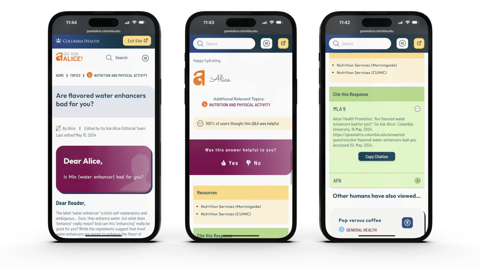
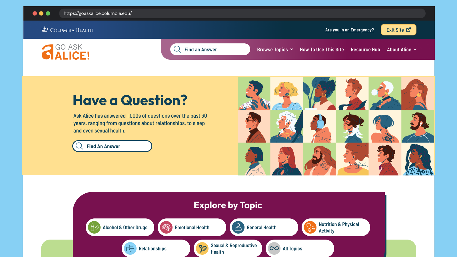
Go Ask Alice! (GAA!) is a judgment-free, anonymous question-and-answer site. It is part of Alice! Health Promotion, a department of Columbia Health. Their content has always been reliable, accurate, and thoroughly researched by professionals — humans, not Artificial intelligence (AI)! While organic search brings many different kinds of audiences across the globe to their answers, their primary audience is the college students of Columbia University. These digital natives need the content to speak their language and to look modern and relevant. Oomph leaned into the college-aged persona to create a user interface that was fun, unique, and approachable while acknowledging and respecting the gravity of the questions students ask.
The Brief
Empathize with both Visitors and Authors
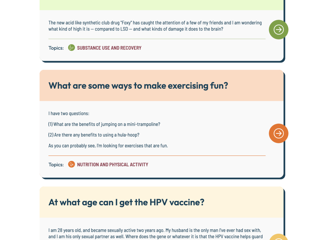
We began by working to understand and empathize with their audience — which was easy. How many of us have gotten lost searching for answers to questions we might not ask our own close friends? Questions like, “Can I get Hepatitis A from eating raw seafood?”, “Do I have OCD?” or even “Why did my father abandon me?” Analytics supported how these types of questions were prevalent. They also showed that while many visitors found GAA! through search, those visitors found their answer and quickly left. While in some ways, this was positive — someone had a question and found a satisfactory answer — visitors missed lots of other answers to questions they might have.
For the Go Ask Alice! author team, technical issues often arose that were rooted in an overly complex content architecture and workflows that required lengthy workarounds. A complicated review and approval process and ineffective spam filters made combing through user submissions time-consuming. The longer it takes the team to create new answers, the less students will want to send GAA! their questions.
Our shared goals were to:
- Modernize the design and attract more web-savvy students to read answers to questions they didn’t know they should ask.
- Reinforce trust by being open about the process and the real human professionals behind the answers.
- Improve search, filtering, and findability by leading with topics first and guiding visitors to the types of questions that interest them most.
- Mitigate and simplify complex authoring processes to empower the small editorial team to answer more questions, support responses with engaging media, and reduce staff frustration.
The Approach
Modernization & Trust-building
Most Gen-Z students and younger generations won’t trust a site that isn’t designed well for a mobile screen. Our design process emphasized the small screen experience, keeping filters, sharing, citations, and recirculation in logical places. The Columbia Health brand is also a powerful lever for establishing trust with a young audience, but we were careful not to let it overpower GAA!’s own authentic brand.
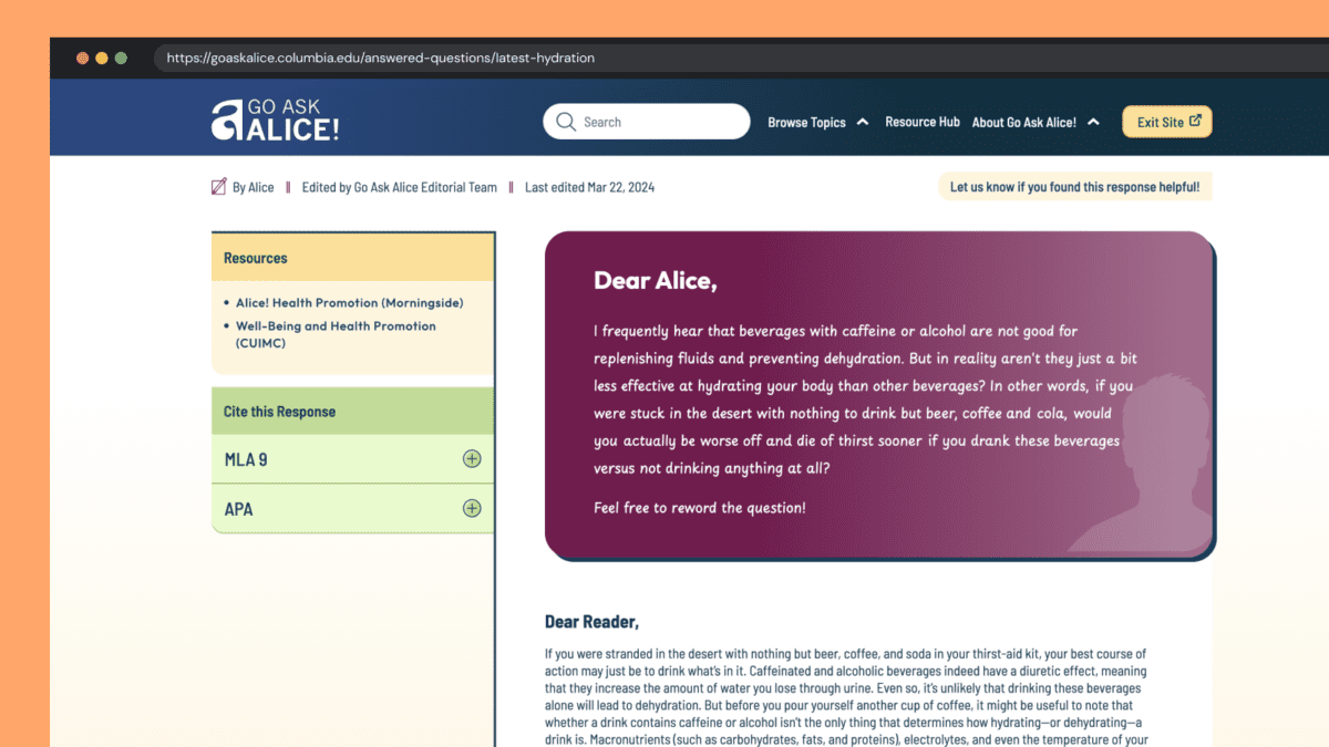
Human responses feel human
With the rise of AI and Google’s AI-generated search results, our design reinforced the humanity and empathy of GAA! by establishing a clear “Dear Alice” with a unique handwritten font and response from the author. When dealing with potentially sensitive and health-threatening answers, an authentic human voice is essential, and one that puts answers into context — is this thing I am asking about “normal”? What are the additional considerations I should know about? And so on. AI might give you one answer, but it won’t contain the context and nuance these anonymous human-generated questions require.
Unique Colors & Illustrations
Blue is strongly associated with Columbia Health and prevented the previous site from standing independently. Our design reduced focus on blue and shifted the site’s primary colors to maroon and yellow. Several other colors create wayfinding paths associated with answer topics. Scrolling the All Topics category page becomes a delightfully random color experience.
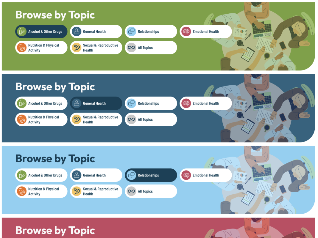
All color combinations adhere to WCAG 2.2 guidelines for Level AA, increasing the accessibility of this color-rich site for all visitors.
A new set of illustrations curates a sense of inclusivity better than stock photos could. A wide variety of humans were chosen to represent the diversity of student populations. Little details, like the randomized person in the site’s footer, add a sense of surprise and delight to the entire browsing experience.
Supporting Trust with New Features
Enhancement ideas started to surface during Discovery and continued throughout the process from both teams. Some of our favorites include:
- The editor’s name, the answer’s published date, and its revision date were moved from the bottom of an answer and brought to the top. This information helps establish credibility quickly before reading an entire answer
- A feedback feature was added to individual answers, giving the GAA! team real-time data about the responses but also giving new visitors a greater sense of social proof
- A “Cite this Response” feature makes cutting and pasting an MLA (Modern Language Association) General Format- or Chicago-style academic citation into research papers easy. Since answers are so well-researched, these citations propagate GAA! further into academic culture
Increased User Engagement & Accessibility
Accessibility & Safety with a Quick Exit Button
Go Ask Alice! has many sensitive questions: questions about sexual abuse, suicide, drug use, and topics generally that you may not want someone else to see on your phone. We introduced a Quick Exit feature on each page of the site. When visitors click the button, a new tab is quickly opened, and the site’s browsing history is removed from their device. While this is not a well-known action in the general population, many in unsafe situations know how they work and what “Exit Site” means.
Oomph has written an in-depth article about the quick exit button and has released a Quick Exit Drupal Module to help other teams implement this feature.
Encouraging Question Browsing over Asking New Questions
It may seem counterintuitive, but one of the major workflows we redesigned was asking a question in the first place. The GAA! team has compiled thousands of great answers over the years and frequently updates old answers with new content to keep them current with changes in medical approaches. The small but mighty team didn’t want to answer the same questions over and over again by referring new askers to pre-published answers.
Our solution emphasized search and intentionally made access to the Question form difficult. Visitors are encouraged to search for answers to previously posted questions first. Quite often, they will discover an answer to their questions (and maybe some helpful answers to questions they did not expect). Only if they have searched first will they encounter the “Can’t find your question” call to action, which leads them through the steps of asking a new question.
The Results
The new site feels like a new beginning for the GAA! team. While the site has only recently launched, we look forward to seeing how it impacts key metrics like time on site and return visits. In the meantime, we’re also excited to see how the newly revamped admin experience helps the GAA! content team serve their audience even better than before.
When faced with a sensitive question about mental, nutritional, emotional, or sexual health, college students can continue to Go Ask Alice!
The tech industry has never been accused of moving slowly. The exponential explosion of AI tools in 2024, though, sets a new standard for fast-moving. The past few months of 2024 rewrote what happened in the past few years. If you have not been actively paying attention to AI, now is the time to start.
I have been intently watching the AI space for over a year. I started from a place of great skepticism, not willing to internalize the hype until I could see real results. I can now say with confidence that when applied to the correct problem with the right expectations, AI can make significant advancements possible no matter the industry.
In 2024, not only did the large language models get more powerful and extensible, but the tools are being created to solve real business problems. Because of this, skepticism about AI has shifted to cautious optimism. Spurred by the Fortune 500’s investments and early impacts, companies of every shape and size are starting to harness the power of AI for efficiency and productivity gains.
Let’s review what happened in Quarter Four of 2024 as a microcosm of the year in AI.
New Foundational Models in the AI Space
A foundational large language model (LLM) is one which other AI tools can be built from. The major foundational LLMs have been Chat GPT, Claude, Llama, and Gemini, operated by OpenAI & Microsoft, Anthropic, Meta, and Google respectively.
In 2024, additional key players entered the space to create their own foundational models.
Amazon
Amazon has been pumping investments into Anthropic as their operations are huge consumers of AI to drive efficiency. With their own internal foundational LLM, they could remove the need to share their operational data with an external party. Further, like they did with their AWS business, they can monetize their own AI services with their own models. Amazon Nova was launched in early December.
xAI
In May of 2024, X secured funding to start to create and train its own foundational models. Founder Elon Musk was a co-founder of OpenAI. The company announced they would build the world’s largest supercomputer in June and it was operational by December.
Nvidia
In October, AI chip-maker Nvidia announced it own LLM named Nemotron to compete directly with OpenAI and Google — organizations that rely on its chips to train and power their own LLMs.
Rumors of more to come
Apple Intelligence launched slowly in 2024 and uses OpenAI’s models. Industry insiders think it is natural to expect Apple to create its own LLM and position it as a privacy-first, on-device service.
Foundational Model Advancements
While some companies are starting to create their own models, the major players have released advanced tools that can use a range of inputs to create a multitude of outputs:
Multimodal Processing
AI models can now process and understand multiple types of data together, such as images, text, and audio. This allows for more complex interactions with AI tools.
Google’s NotebookLM was a big hit this year for its ability to use a range of data as sources, from Google Docs to PDFs to web links for text, audio, and video. The tool essentially allows the creation of small, custom RAG databases to query and chat with.
Advanced Reasoning
OpenAI’s 01 reasoning model (pronounced “Oh One”) uses step-by-step “Chain of Thought” to solve complex problems, including math, coding, and scientific tasks. This has led to AI tools that can draw conclusions, make inferences, and form judgments based on information, logic, and experience. The queries take longer but are more accurate and provide more depth.
Google’s Deep Research is a similar product that was released to Gemini users in December.
Enhanced Voice Interaction
More and more AI tools can engage in natural and context-aware voice interactions — think Siri, but way more useful. This includes handling complex queries, understanding different tones and styles, and even mimicking personalities such as Santa Claus.
Vision Capabilities
AI can now “see” and interpret the world through cameras and visual data. This includes the ability to analyze images, identify objects, and understand visual information in real-time. Examples include Meta’s DINOv2, OpenAI’s GPT-4o, and Google’s PaliGemma.
AI can also interact with screen displays on devices, allowing for a new level of awareness of sensory input. OpenAI’s desktop app for Mac and Windows is contextually aware of what apps are available and in focus. Microsoft’s Co-pilot Vision integrates with the Edge browser to analyze web pages as users browse. Google’s Project Mariner prototype allows Gemini to understand screen context and interact with applications.
While still early and fraught with security and privacy implications, the technology will lead to more advancements for “Agentic AI” which will continue to grow in 2025.
Agentic Capabilities
AI models are moving towards the ability to take actions on behalf of users. No longer confined to chat interfaces alone, these new “Agents” will perform tasks autonomously once trained and set in motion.
Note: Enterprise leader SalesForce launched AgentForce in September 2024. Despite the name, these are not autonomous Agents in the same sense. Custom agents must be trained by humans, given instructions, parameters, prompts, and success criteria. Right now, these agents are more like interns that need management and feedback.
Specialization
2024 also saw an increase in models designed for specific domains and tasks. With reinforcement fine-tuning, companies are creating tools for legal, healthcare, finance, stocks, and sports.
Examples include Sierra, who offers a specifically trained customer service platform, and LinkedIn agents as hiring assistants.
What this all means for 2025
It’s clear that AI models and tools will continue to advance, and businesses that embrace AI will be in a better position to thrive. To be successful, businesses need an experimental mindset of continuous learning and adaptation:
- Focus on AI Literacy — Ensure your team understands AI and its capabilities. Start with use cases that add value immediately.
- Prioritize Data Quality — AI models need high-quality, relevant data to be effective. Start cleaning and preparing your internal data before implementing AI at scale.
- Combine AI and Human Expertise — Use AI to augment human capabilities, not replace them. Think of AI as a junior employee who will require input, alignment, and reinforcement.
- Experiment and Iterate — Be willing to try new approaches and adapt based on results. Include measurement in your plans — collect data before and after to benchmark progress.
- Embrace Ethical AI — Implement policies to ensure AI is used responsibly and ethically. Investigate ways the company can offset carbon and support cleaner energy, as AI tools require more electricity than non-AI tools. Understand hallucinations and the new, more complex “scheming” in reasoning models problem.
- Prepare for Change — Understand that technology is constantly evolving, and business models will need to adapt.
While the models will continue to get better into 2025, don’t wait to explore AI. Even if the existing models never improve, they are powerful enough to drive significant gains in business. Now is the time to implement AI in your business. Choose a model that makes sense and is low-friction — if you are an organization that uses Microsoft products, start with a trial of AI add-ons for office tools, for example. Start accumulating experience with the tools at hand, and then expand to include multiple models to evaluate more complex AI options that may have greater business impact. It almost doesn’t matter which you choose, as long as you get started.
Oomph has started to experiment with AI ourselves and Drupal has exciting announcements about integrating AI tools into the authoring experience. If you would like more information, please reach out for a chat.
From code to launch
Sites launched within a year
Performance improvement
THE BRIEF
A Fractured System
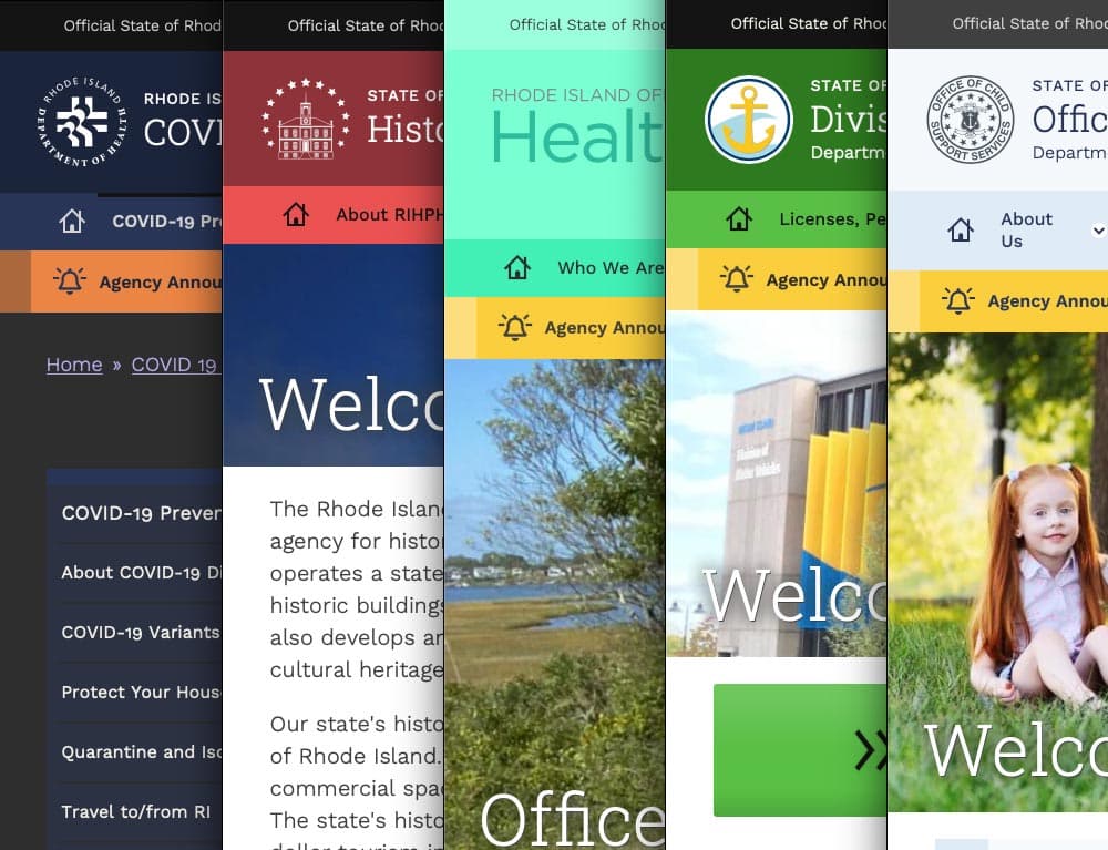
With a network of websites mired in old, outdated platforms, Rhode Island was already struggling to serve the communication needs of government agencies and their constituents. And then the pandemic hit.
COVID accelerated the demand for better, faster communication and greater efficiency amid the rapidly changing pandemic. It also spotlighted an opportunity to create a new centralized information hub. What the government needed was a single, cohesive design system that would allow departments to quickly publish and manage their own content, leverage a common and accessible design language, and use a central notification system to push shared content across multiple sites.
With timely, coordinated news and notifications plus a visually unified set of websites, a new design system could turn the state’s fragmented digital network into a trusted resource, especially in a time of crisis.
THE APPROACH
Custom Tools Leveraging Site Factory
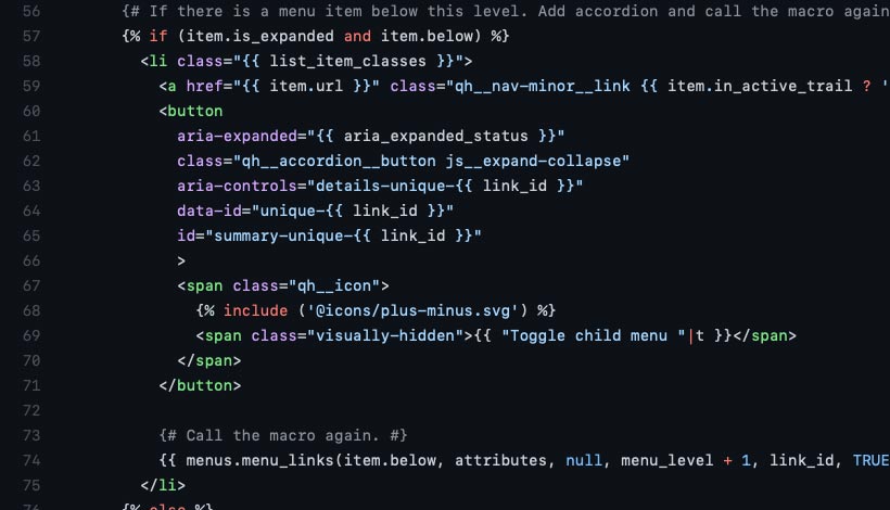
A key goal was being able to quickly provision sites to new or existing agencies. Using Drupal 9 (and updated to Drupal 10) and Acquia’s Site Factory, we gave the state the ability to stand up a new site in just minutes. Batch commands create the site and add it to necessary syndication services; authors can then log in and start creating their own content.
We also created a set of custom tools for the state agencies, to facilitate content migration and distribution. An asynchronous hub-and-spoke syndication system allows sites to share content in a hierarchical manner (from parent to child sites), while a migration helper scrapes existing sites to ensure content is properly migrated from a database source.
Introducing Quahog: A RI.gov Design System
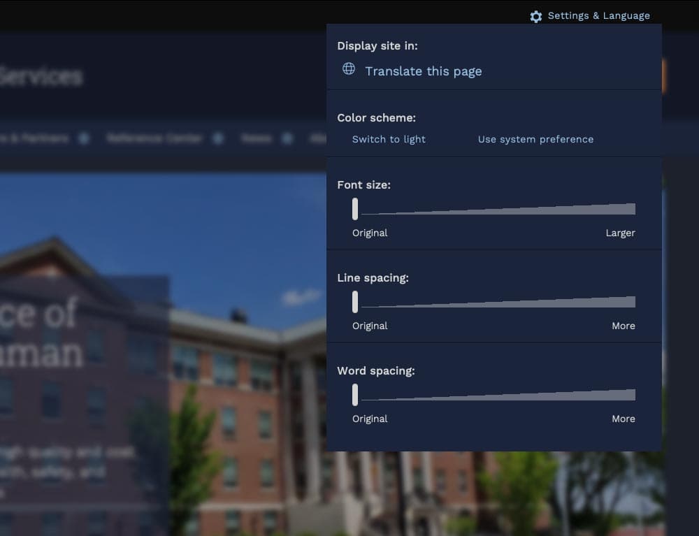
For organizations needing agility and efficiency, composable technology makes it easier to quickly adapt digital platforms as needs and conditions change. We focused on building a comprehensive, component-based visual design system using a strategy of common typography, predefined color themes and built-in user preferences to reinforce accessibility and inclusivity.
The Purpose of the Design System
The new, bespoke design system had to support four key factors: accessibility, user preferences, variation within a family of themes, and speedy performance.
Multiple color themes
Site authors choose from five color themes, each supporting light and dark mode viewing. Every theme was rigorously tested to conform with WCAG AA (and sometimes AAA), with each theme based on a palette of 27 colors (including grays) and 12 transparent colors.
User preferences
Site visitors can toggle between light or dark mode or use their own system preference, along with adjusting font sizes, line height, word spacing, and default language.
Mobile first
Knowing that many site visitors will be on mobile devices, each design component treats the mobile experience as a first-class counterpart to desktop.
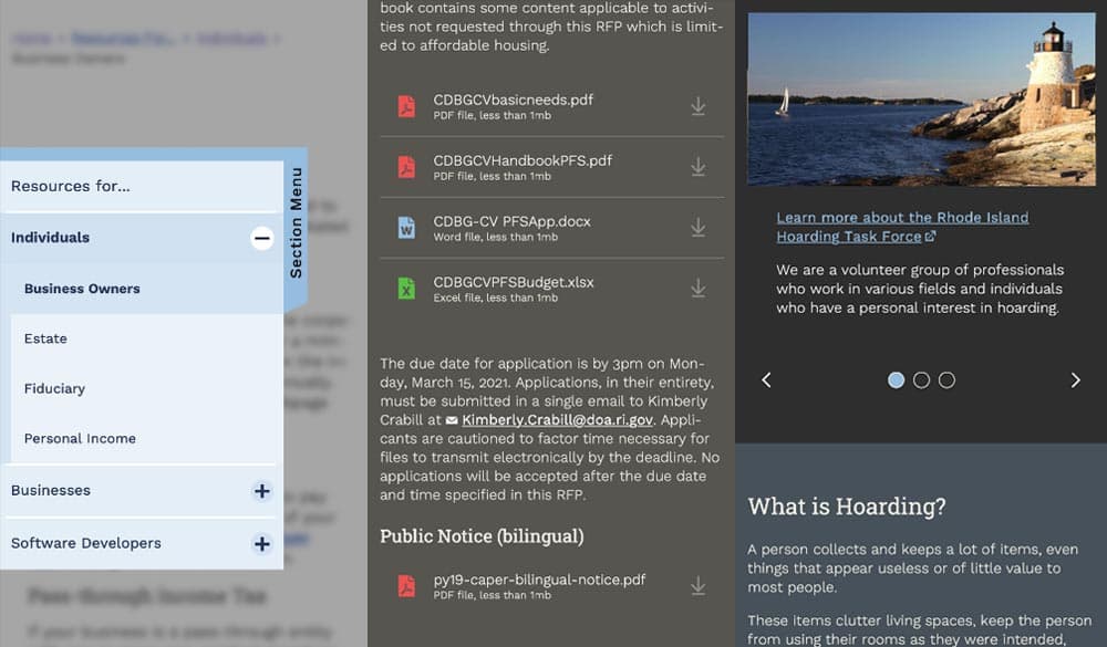
Examples: The section menu sticks to the left side of the view port for easy access within sections; Downloads are clearly labelled with file type and human-readable file sizes in case someone has an unreliable network connection; galleries appear on mobile with any text labels stacked underneath and support swipe gestures, while the desktop version layers text over images and supports keyboard navigation.
High Accessibility
Every design pattern is accessible for screen readers and mobile devices. Color contrast, keyboard navigation, semantic labeling, and alt text enforcement all contribute to a highly accessible site. Extra labels and help text have been added to add context to actions, while also following best practices for use of ARIA attributes.
Performance aware
Each page is given a performance budget, so design components are built as lightly as possible, using the least amount of code and relying on the smallest visual asset file sizes possible.
THE RESULTS
Efficient and Effective Paths to Communication
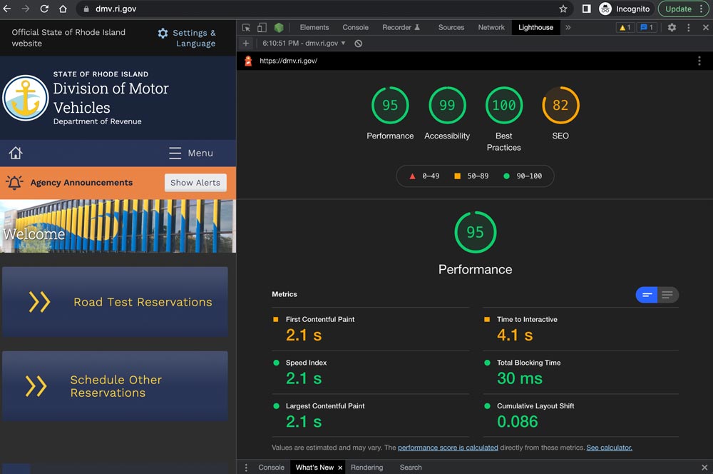
The first sites to launch on the new system, including covid.ri.gov, went live four and a half months after the first line of code was written. A total of 15 new sites were launched within just 8 months, all showing a 3-4x improvement in speed and performance compared with previous versions.
Every site now meets accessibility guidelines when authors adhere to training and best practices, with Lighthouse accessibility and best practice scores consistently above 95%. This means the content is available to a larger, more diverse audience. In addition, a WAF/CDN provider increases content delivery speeds and prevents downtime or slowdowns due to attacks or event-driven traffic spikes.
State agencies have been universally pleased with the new system, especially because it provides authors with an improved framework for content creation. By working with a finite set of tested design patterns, authors can visualize, preview, and deploy timely and consistent content more efficiently and effectively.
We were always impressed with the Oomph team’s breadth of technical knowledge and welcomed their UX expertise, however, what stood out the most to me was the great synergy that our team developed. All team members were committed to a common goal to create an exceptional, citizen-centered resource that would go above and beyond the technical and design expectations of both agencies and residents .
ROBERT MARTIN ETSS Web Services Manager, State of Rhode Island
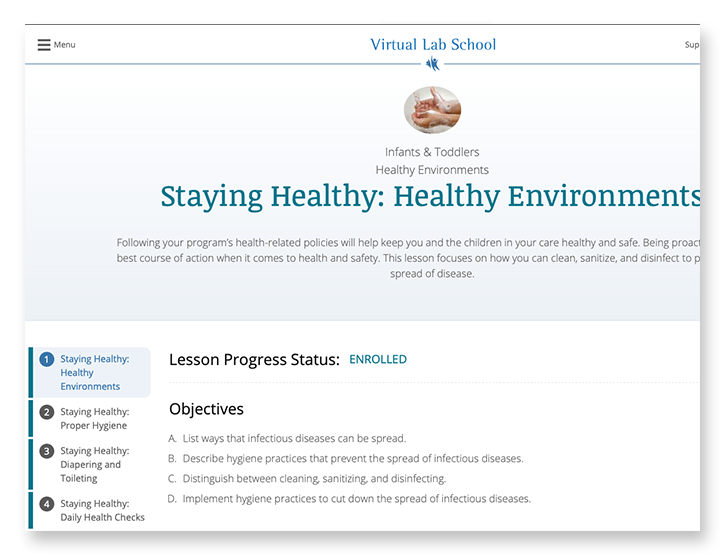
THE BRIEF
The Virtual Lab School (VLS) supports military educators with training and enrichment around educational practices from birth through age 12. Their curriculum was developed by a partnership between Ohio State University and the U.S. Department of Defense to assist direct-care providers, curriculum specialists, management personnel, and home-based care providers. Because of the distributed nature of educators around the world, courses and certifications are offered virtually through the VLS website.
Comprehensive Platform Assessment
The existing online learning platform had a deep level of complexity under the surface. For a student educator taking a certification course, the site tracks progress through the curriculum. For training leaders, they need to see how their students are progressing, assign additional coursework, or assist a student educator through a particular certification.
Learning platforms in general are complex, and this one is no different. Add to this an intertwined set of military-style administration privileges and it produces a complex tree of layers and permutations.
The focus of the platform assessment phase was to catalog features of the largely undocumented legacy system, uncover complexity that could be simplified, and most importantly identify opportunities for efficiencies.
THE RESULTS
Personalized Online Learning Experience
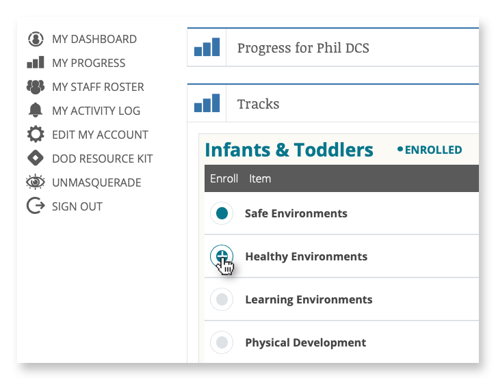
Enrollment and Administration Portal
Administrators and instructors leverage an enrollment portal to manage the onboarding of new students and view progress on coursework and certifications.
Course Material Delivery
Students experience the course material through a combination of reading, video, and offline coursework downloads for completion and submission.
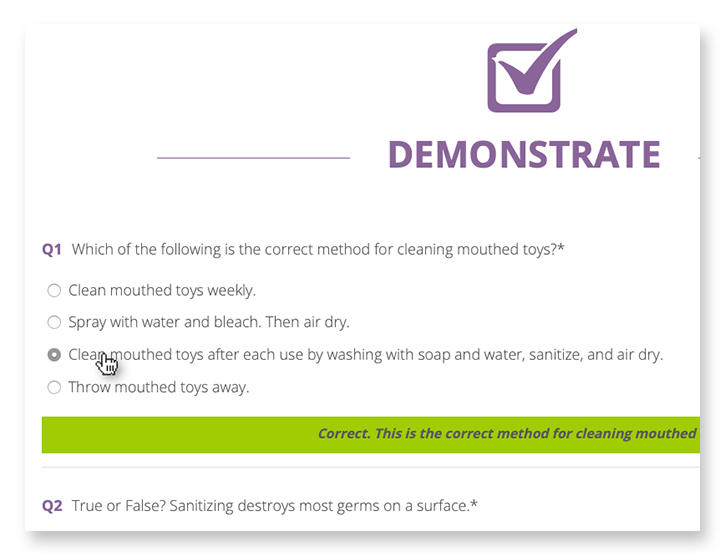
Learning Assessments & Grading
Students are tested with online assessments, where grading and suggestions are delivered in real time, and submission of offline assignments for review by instructors.
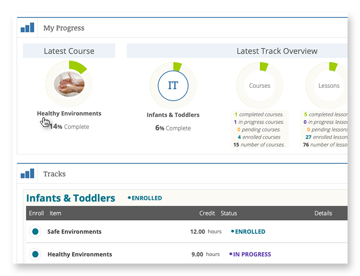
Progress Pathways
A personalized student dashboard is the window into progress, allowing students to see which courses have been started, how much is left to complete, and the status of their certifications.
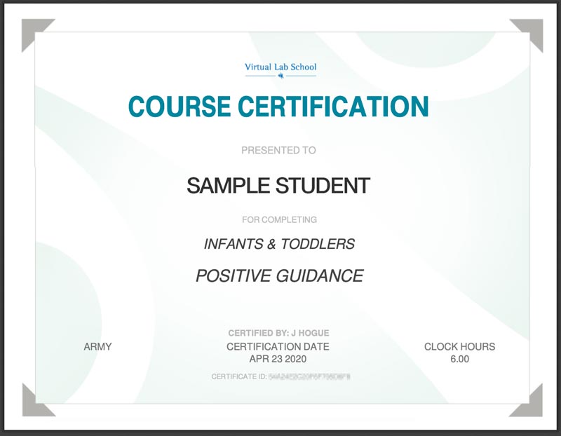
Certification
Completed coursework and assessments lead students to a point of certification resulting in a printable Certificate of Completion.
FINAL THOUGHTS
Faster and More Secure than Ever Before
When building for speed and scalability, fully leveraging Drupal’s advanced caching system is a major way to support those goals. The system design leverages query- and render-caching to support a high level of performance while also supporting personalization to an individual level. This is accomplished with computed fields and auto-placeholdering utilizing lazy builder.
The result is an application that is quicker to load, more secure, and able to support hundreds more concurrent users.
Why Drupal?
When building for speed and scalability, fully leveraging Drupal’s advanced caching system is a major way to support those goals. The system design leverages query- and render-caching to support a high level of performance while also supporting personalization to an individual level. This is accomplished with computed fields and auto-placeholdering utilizing lazy builder.
The result is an application that is quicker to load, more secure, and able to support hundreds more concurrent users.
The Challenge
For nearly a decade, Oomph has been the strategic digital partner behind two key member engagement platforms for one of the largest health insurers in the United States. These platforms have consistently driven steady year-over-year growth, strengthening relationships between members and their healthcare provider.
However, as digital engagement in healthcare surged, the existing on-premise data center was no longer the right fit. Members increasingly relied on the platform for personalized health resources, wellness programs, and provider access, creating new demands for scalability, security, and performance.
With rising traffic and evolving member expectations, the insurer needed a future-ready infrastructure that could seamlessly scale, ensure compliance, and provide a frictionless experience for all users. To achieve this, Oomph led a full cloud migration—on time and without disruption.
The Approach
The legacy data center model had effectively supported planned growth, but it wasn’t built for unpredictable spikes in engagement or the flexibility needed for future expansion. Maintaining high performance without excessive fixed costs required a scalable cloud solution. After evaluating multiple cloud providers, Oomph selected AWS, supported by Cloudticity, a HIPAA/HITRUST-managed services provider specializing in healthcare security and compliance. In collaboration with our client and Cloudticity, our platform team executed the migration in just three months, ensuring:
- Scalable, cost-efficient infrastructure: Auto-scaling eliminated the need for expensive, fixed-capacity hardware.
- Enhanced security & compliance: Cloudticity’s advanced threat monitoring strengthened HIPAA/HITRUST compliance.
- More flexibility for engineering teams: Granular access controls empowered developers to optimize and scale faster.
The migration was seamless—no downtime, no disruption, just an infrastructure built for the future.
The Results
Performance, Security, and Agility at Scale
The transition to AWS + Cloudticity unlocked measurable performance gains and ensured the platform was ready for future growth, demand shifts, and disaster recovery scenarios.
- Speed & Performance: Faster load times and seamless functionality, even under peak traffic conditions.
- Stronger Security: Advanced HIPAA-compliant threat monitoring reduces risk and safeguards member data.
- Scalability & Flexibility: Auto-scaling enables instant resource allocation without wasteful over-provisioning.
- Engineering Autonomy: Granular access controls give internal teams greater agility in optimizing the platform.
What started as an infrastructure upgrade became a long-term strategic advantage. With a cloud-based foundation in place, this mission-critical platform is faster, more resilient, and primed for continued innovation.
Built for the Future of Digital Healthcare
Healthcare organizations can no longer afford rigid, outdated digital infrastructure—patients and members expect seamless, always-on access to trusted health resources.