
Overview
Catch Carbon is powered by Rare, a global conservation organization with 40 years of experience driving behavior change across 60 countries. Their mission depends on mobilizing individuals and communities to take actions that benefit both people and the planet.
To expand the voluntary carbon credit market, Rare needed a digital platform that could explain carbon offsets clearly, build trust with everyday users, and convert awareness into action. Nothing quite like it existed. Oomph partnered with Rare across two phases: first to bring the concept to market quickly, then to build the infrastructure to sustain and scale it.
The Challenge
The voluntary carbon market had a visibility problem. Carbon offsets represent a powerful tool for individual climate action, but public awareness remained low. Most people didn’t understand what carbon offsets were, why they mattered, or how to purchase them confidently.
Rare needed more than a website. They needed a digital experience system that could:
- Educate and convert users unfamiliar with carbon markets
- Publish and iterate content quickly as they tested messaging and engagement strategies
- Scale efficiently without recurring platform constraints or cost bloat
- Maintain design and message consistency across all content and user journeys
And they needed it fast, with the flexibility to learn and adjust as real user behavior emerged.

The Approach
Phase 1: Design and Launch
Oomph led discovery, experience design, and development for Catch Carbon’s initial launch, bringing the platform to market in under three months.
We started with a cohort analysis of more than 20 platforms, from other emerging carbon marketplaces to crowdfunding sites like Kickstarter and Kiva, to understand the landscape and identify what was missing. The research confirmed there were no established best practices; Catch Carbon would need to set its own.
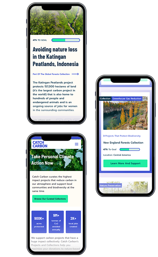
From there, we focused on connection and credibility. User journey mapping helped us anticipate visitor mindsets at every stage: curious on arrival, inspired while browsing, confident at checkout. Our approach included synthesizing project data to showcase aggregate impact, simplifying navigation, standardizing project descriptions, and introducing “Collections” that bundled multiple projects to help users maximize their contribution.
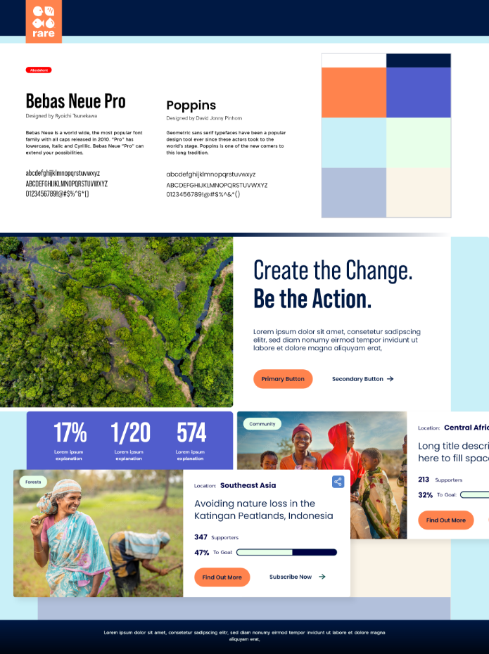
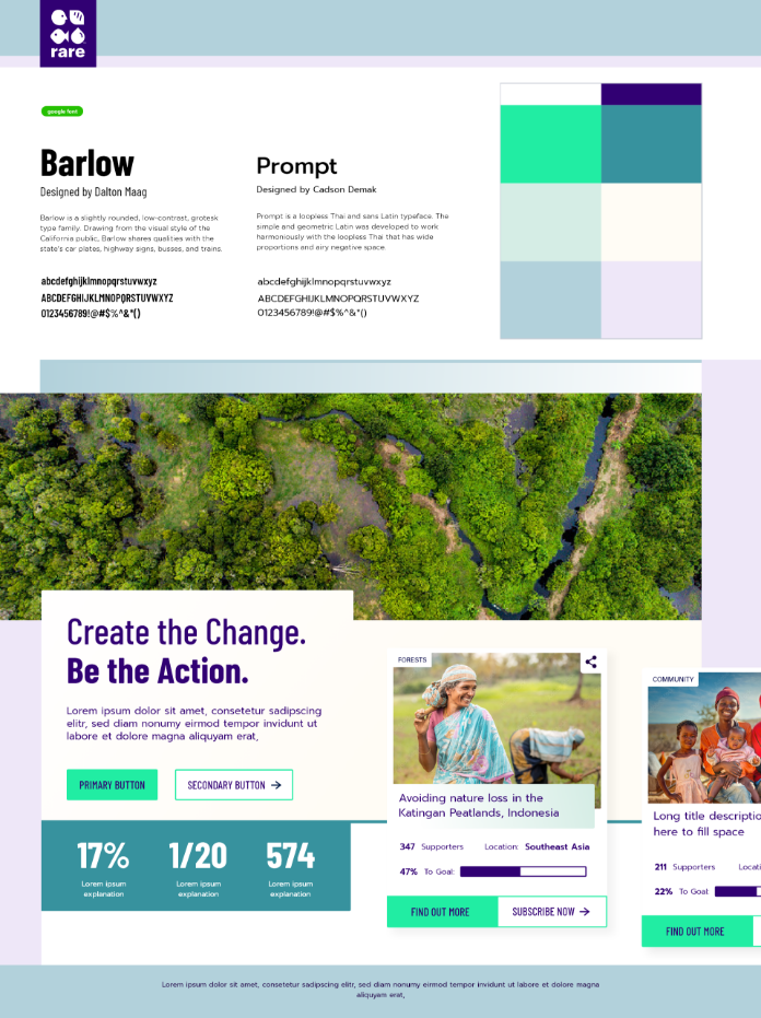
We led Rare through a design language workshop, used style tiles to align on aesthetics quickly, and refined full page designs in real time as we tested the internal API. Seven weeks after kickoff, Catch Carbon launched publicly.
Phase 2: Platform Rebuild
With the concept validated, Rare needed infrastructure to match their ambitions. Oomph designed and built a modern, flexible platform, leading both design and engineering.
We recommended Contentful as the content foundation and React for the front-end experience. This headless architecture separated content management from presentation, giving Rare’s team the ability to update messaging, launch campaign pages, and refine user flows without developer dependencies.
We built a modular design system that balanced clarity, trust, and accessibility across every component, from educational explainers to conversion flows. On the engineering side, we extended Rare’s existing API to support the new platform, working alongside their internal team to ensure seamless data flow and operational continuity.
Throughout, we treated the platform as a system to operate, not a project to complete.
What This Made Possible
Two things made this work: Oomph’s ability to balance speed with rigor, and our commitment to operating as a true partner with Rare. In Phase 1, we moved from vision to launch in weeks without sacrificing design quality. In Phase 2, we built on what had been learned rather than starting over, preserving continuity for users while dramatically improving the underlying infrastructure.
Oomph is personally invested in the kind of environmental work Rare does, which made this collaboration something more than a project.
The Result
Catch Carbon launched v1.0 to the public in seven weeks, marking a milestone for the voluntary carbon credit market and democratizing access for everyday consumers. The platform has since been rebuilt on a modern headless architecture that gives Rare the operational flexibility to test, iterate, and scale on their own terms, supported by a design system that maintains quality and consistency as the audience grows.

Why This Matters
Most organizations in the climate and nonprofit space face the same trade-off: build something fast and limited, or invest in systems that take too long and cost too much. Catch Carbon is proof that speed and sustainability aren’t mutually exclusive. They just require the right partner and the right approach.
By treating digital infrastructure as a system to operate rather than a project to deliver, Rare gained the foundation to test, learn, and scale. And by staying in the partnership across both phases, Oomph helped ensure that what was built in Phase 1 wasn’t discarded. It was built on.
It’s nice to have a partnership [with Oomph] where you guys are so honest, straightforward, hardworking, and thoughtful.
— Catch Carbon
Summary
Health systems grown through acquisition are investing heavily in unified digital front doors – the patient-facing layer of scheduling, intake, navigation, and engagement. But most of these initiatives stall because the front door is a design problem, while the real barrier is an architecture and governance problem: dozens of disconnected content management systems, conflicting editorial workflows, and duplicate content libraries that sit behind it. We call this the Front Door / Back Office Gap. With healthcare M&A accelerating – 231 health services deals in the first half of 2025 alone – and the digital front door market projected to reach $82 billion by 2031, closing this gap is the difference between a unified patient experience and an expensive redesign layered on top of operational chaos.
Through May 2025, more than 445 health service deals totaling $64 billion were announced. That pace is not slowing. In 2025, approximately 44% of announced M&A transactions involved a distressed party, and healthcare services M&A volume rose 14.4% in the first half of 2025, with total deal value surging 549.8% to $20.8 billion.
Every one of those transactions creates the same digital problem: two or more organizations, each with its own website (or websites), its own CMS, its own editorial team, its own brand standards, and its own content governance structure. Add in the EHR systems that power scheduling, provider directories, appointment booking, and patient portals, and the fragmentation runs deeper than the marketing layer. All of this is now expected to present a unified experience to patients.
The executive mandate is always some version of “build a digital front door.” The assumption is that the front door is the hard part. It is not. The digital front door market is projected to grow from $31.66 billion in 2026 to $82.25 billion by 2031, and platform vendors are delivering increasingly capable scheduling, intake, and engagement tools. The technology for the front door exists. What does not exist in most post-acquisition health systems is the content infrastructure to support it.
Why Do “Unified Digital Front Door” Initiatives Stall After the Design Phase?
Because they treat the patient-facing experience as a design challenge when it is actually a content operations challenge.
A digital front door needs content – provider directories, service line descriptions, location information, patient education materials, insurance and billing guidance, procedural instructions. In a health system that has grown through acquisition, that content exists across multiple platforms, maintained by multiple teams, governed by multiple (and often contradictory) editorial standards.
The Front Door / Back Office Gap refers to the structural disconnect between the unified patient experience a health system promises and the fragmented content operations that must produce it.
You cannot build a coherent front door on an incoherent back office.
Yet this is precisely what most digital front door initiatives attempt: a new presentation layer on top of unreformed content infrastructure.
Only 14% of healthcare M&A deals reach successful integration, with 83% of practitioners citing integration hurdles as the leading cause for failure. The digital properties are rarely the first integration priority – EHR consolidation, revenue cycle management, and clinical systems take precedence. By the time leadership turns attention to the website, the content fragmentation has compounded for months or years.
What Does Post-M&A Digital Fragmentation Actually Look Like?
It looks like a health system operating 8 to 15 separate websites on 3 to 5 different CMS platforms, each with its own content model, its own editorial workflow, and its own version of “how we describe cardiac services.”
Here is the pattern we see in practice. A regional health system acquires two community hospitals and a physician group. The parent system runs Drupal. One hospital runs WordPress. The other runs a legacy proprietary CMS. The physician group has a Squarespace site that a practice manager updates. Each site describes overlapping services in different language, with different levels of clinical detail, different calls to action, and different information architectures. Provider directories are maintained in at least two places and contradict each other on accepted insurances.
This is not a hypothetical. As KPMG noted in its 2025 healthcare M&A outlook, “postclose integration must prioritize digital enablement, especially in RCM, patient engagement, and data interoperability.” But digital enablement for patient engagement requires content consistency – and content consistency requires infrastructure that most post-acquisition systems simply do not have.
For patients, the fragmentation is not abstract. A patient searching for a cardiologist in the newly merged system finds one provider directory on the parent system’s website and a different, partially overlapping directory on the acquired hospital’s site. The scheduling pathways are different. The insurance information may conflict. Deloitte estimates healthcare organizations stand to lose $54.4 billion if they cannot deliver on consumer expectations, and the expectation is increasingly a coherent, consumer-grade digital experience across the entire care network.
Why Is Multi-Brand CMS Consolidation Different in Healthcare?
Because healthcare content carries compliance obligations that make “just merge the sites” genuinely dangerous, and because local brand equity often has clinical implications that other industries do not face.
Three factors make healthcare CMS consolidation distinct:
Regulatory content requirements. Service descriptions, patient education materials, consent language, and pricing transparency content all carry compliance obligations – HIPAA, ADA, CMS price transparency rules, and state-specific regulations. When you consolidate content from multiple sources into a unified platform, every piece of clinical and billing content must be reviewed for regulatory accuracy in its new context. A service description that was compliant on Hospital A’s website may not be compliant when published under the parent system’s brand with different insurance contracts.
Local brand trust. In many acquisition scenarios, the acquired facility’s brand carries decades of community trust that the acquiring system does not yet have in that market. Rushing to rebrand or subsume the local site under a parent domain can alienate patients who chose their provider based on the local name. The digital architecture needs to accommodate a multi-brand reality – shared infrastructure, shared governance, but distinct brand presentation where it matters clinically and commercially.
Editorial team distribution. Unlike a SaaS company where a central marketing team owns the website, health system content is produced by marketing, clinical departments, physician liaisons, compliance, and sometimes individual practices. When multiple teams across 6 to 10 departments collaborate on content, governance overhead increases by 27%. In a post-acquisition health system, those teams have never worked together and may not even know each other’s content exists.
What Does a Realistic Content Architecture Look Like for Multi-Brand Health Systems?
It looks like a shared content infrastructure with federated editorial control – not a single website, and not a collection of disconnected ones.
The architecture that works for post-acquisition health systems is what we describe as a multi-brand content platform: a single CMS instance (or a tightly integrated set of instances) with a unified content model, shared governance, and brand-specific presentation layers. Content is structured once – a provider profile, a service line description, a location record – and published to whichever brand surface needs it, styled appropriately for each. Our work with Bradley Hospital illustrates this in a healthcare context: Bradley’s site runs on Drupal using the Domain Access module suite, sharing infrastructure with the Brown University Health system while presenting as a fully independent domain with its own brand, content, and editorial control.
This is the approach we took when consolidating 8,500+ pieces of content across disconnected systems for Workhuman, building a unified Contentful-based content system with structured models, governance documentation, and team training. The same architectural principles apply to healthcare, with the addition of compliance review workflows and HIPAA-aware access controls. We have written separately about how to evaluate CMS platforms specifically for healthcare organizations – the selection criteria are meaningfully different from what a SaaS or media company would prioritize.
West Virginia University Health System, which grew to 21 hospitals through M&A, offers an instructive parallel. By standardizing its integration infrastructure, WVUHS cut interface development time by more than 50% and accelerated onboarding of new facilities. The same principle applies to content: standardize the model, federate the editorial control, and new acquisitions plug into the existing architecture rather than creating another silo.
What Should Health System Digital Leaders Do First?
Accept that the digital front door initiative is actually a content infrastructure initiative, and sequence the work accordingly.
1. Inventory what you actually have. Before any platform decision, catalogue every digital property across the system – websites, microsites, provider directories, patient portals, landing pages. For each, document the CMS, the editorial team, the update frequency, and the content overlap with other properties. In our research and strategy engagements, this audit consistently reveals 30 to 50% more digital properties than leadership realized existed.
2. Define shared content types before selecting a platform. Provider profiles, locations, service lines, conditions, insurance information – these are the content objects that must be consistent across every brand surface. Design the content model for these shared types first, with input from clinical, compliance, and marketing stakeholders across all entities. The platform decision follows from the model, not the other way around.
3. Plan for multi-brand governance from day one. Establish who owns the shared content model, who can publish under which brand, and how compliance review works when content appears across multiple sites. This governance structure is the single most important determinant of whether your digital front door initiative produces a unified patient experience or a redesigned facade over the same fragmentation.
The digital front door is a compelling vision. But for health systems shaped by acquisition, the path to that vision runs through the back office first – through the content models, editorial workflows, and governance structures that determine whether “unified” is a patient experience or just a press release.
Health systems that invest in content infrastructure before investing in the front-end design will build something durable. Those that do not will build something that looks unified and operates in fragments.
Oomph is a digital experience consultancy serving regulated industries and mission-driven organizations, including healthcare, higher education, government, and associations, where compliance, accessibility, and trust are non-negotiable.
Overview
Bradley Hospital is the nation’s first hospital dedicated exclusively to children’s mental health and behavioral health care, and a teaching hospital for Brown University. Families travel from across the country seeking specialized care. Providers turn to Bradley for clinical expertise, education, and research. The organization’s national reputation is well established.
Previously, Bradley’s website lived inside the broader Brown University Health system site, a shared platform built to serve an entire health system with a wide range of services and audiences. As Bradley’s clinical profile and reach expanded, the opportunity emerged to give the organization its own dedicated digital home: one structured specifically around the people who turn to Bradley, the content they need, and the urgency they often feel when they arrive.
That’s the work Oomph was brought in to do.
The Challenge
Elevating Bradley’s digital presence to match the weight of its clinical reputation meant addressing three interconnected opportunities.
First, consolidating Bradley’s content into a unified, findable home. Some Bradley content lived in its own section of the Brown University Health site, while some was spread throughout the broader system. Key educational resources were either static PDFs or hosted on external platforms with no connection to Bradley’s web presence. Users who found one piece of content had no clear path to related resources. Bringing everything together under a single, purpose-built destination would make that content far more discoverable to those in need.
Second, building a structure around Bradley’s specific audiences. Families searching for care for a child in crisis, providers evaluating referral options, and clinicians seeking professional development have distinct needs and varying levels of urgency. Building a dedicated site allowed us to create an Information Architecture that centered around those three groups: their priorities, their task flows, and the moments when they most need clear answers.
Third, establishing a dedicated search and AEO/GEO presence. A standalone domain with structured, indexable content is the foundation for organic search visibility. It’s also increasingly central to how AI-powered tools and engines surface authoritative health information. Bradley is among the most authoritative institutions in the country on pediatric mental health. A dedicated digital presence would enable that authority to translate directly into discoverability for both traditional search and AI-driven discovery.
The Approach
Oomph partnered with Bradley Hospital leadership, clinicians, and internal stakeholders to understand each audience’s needs before making any structural decisions. Those conversations shaped content priorities, navigation architecture, and the task flows that matter most: finding care, accessing crisis support, making a referral, and registering for a course.
A dedicated platform within a shared infrastructure
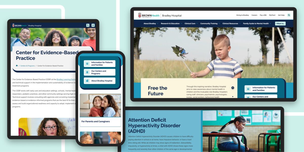
The site was built in Drupal using the Domain Access suite of modules. This architecture gave Bradley a fully independent domain and brand while keeping it connected to the Brown University Health ecosystem. Bradley-specific content serves exclusively on BradleyHospital.org. Shared resources adapt dynamically to the appropriate domain and theme. Canonical URL strategies prevent SEO conflicts across the two properties. Bradley’s team gained full control of their digital presence without duplicating the operational overhead of maintaining a separate platform.
Three new content types that replaced fragmentation
One of the most significant structural decisions was building purpose-built content types for Conditions, Courses, and Podcasts, formats designed specifically for how Bradley’s audiences search for and engage with information. A long-standing mental health education publication that had existed only as a PDF became structured, accessible web pages. Courses previously hosted on external platforms moved directly into the site, improving visibility, searchability, and registration flow. Podcasts became indexable content connected to related topics and programs. Taxonomy-driven connections across all three types help users navigate related content naturally, rather than hitting a dead end.
Navigation built for action
A custom “I Want To” quick-action menu surfaces the highest-priority tasks across all user types: finding care, accessing crisis support, exploring programs, and making a referral. Families in stressful moments can reach critical information within one or two clicks. Key conversion pathways, including crisis help, philanthropic giving, career exploration, and educational resources, were elevated in the global navigation to reduce friction wherever a user enters the site.
Design that earns trust without creating distance
Bradley’s visual identity needed to feel distinct from Brown University Health while remaining credible within that system. The design extends the Brown Health palette, then refines it: rounded shapes, thick borders, muted tones, and soft animations that create a sense of warmth and approachability without sacrificing authority. As one key stakeholder described it, the site “speaks ‘professional’ while also having a little lighter touch to it.” Accessibility and mobile responsiveness were integrated throughout, with WCAG best practices and screen reader compatibility front of mind throughout the design process rather than as afterthoughts.
What This Made Possible
Since launching in November 2025, BradleyHospital.org has attracted more than 95,000 new users, with nearly 89,000 sessions driven by organic search, the direct result of the dedicated domain and SEO-structured content. The site’s dedicated domain also helps ensure that Bradley content is correctly attributed and surfaced by AI-powered search tools and generative engines. Clear brand identity, structured content, and a standalone domain are exactly the signals those systems use to identify authoritative sources. For a site that previously had no independent search presence, that volume of organic discovery represents a fundamental shift in how families and providers find Bradley online.
Nearly half of all visitors arrive on mobile (48.1%), which validates both the design investment and a harder truth: families searching for pediatric mental health resources aren’t always doing so from a desk. They’re doing it from a parking lot, a waiting room, or a kitchen table at night. The mobile experience was built for that reality.
Key program and condition pages are generating engagement time that indicates genuine research, not quick bounces. Pages covering intensive OCD and anxiety programs, outpatient services, and levels of care are averaging 50 to 83 seconds of engagement time, a range consistent with focused, task-oriented research behavior. Users spend real time with the content that matters to them before taking action, rather than scanning and bouncing. The Courses page averages 65 seconds.
The returning user base of 13,000 is meaningful in context. Families researching care for a child often return to a site multiple times before taking action. That return behavior signals that the site is functioning as a trusted resource, not just a one-time destination.
Bradley’s team can now manage, update, and promote their content independently, without navigating the constraints of a shared health system platform. The structured content model makes it faster to add new conditions, publish new courses, and surface new resources without relying on outside support for routine updates.
The result
BradleyHospital.org is a purpose-built digital system that reflects the organization’s national authority in pediatric mental health while meeting the practical, urgent needs of the families and providers it serves. The independent domain, structured content architecture, and accessible design give Bradley both the visibility and the operational foundation to grow its digital presence on its own terms.
The site launched in November 2025 with a user testing initiative now underway to inform the next phase of optimization, an approach that reflects Bradley’s commitment to continuous improvement rather than a one-time launch. Design refinements and accessibility enhancements are being worked into the roadmap as the organization gathers real-world feedback from the community it serves.
Why This Matters
Healthcare organizations known for clinical excellence often find it difficult to showcase their unique strengths when operating within the digital ecosystem of a larger health system. The gap creates real costs: families can’t find care, providers can’t make informed referrals, and educational resources reach a fraction of the audience they should. Closing that gap requires more than a redesign. It requires a system that’s structured to perform, built to be maintained, and designed around the people who need it most.
Structured content distribution is the decoupling of content from presentation through a headless CMS and Content as a Service (CaaS) architecture. It is a sound strategy for organizations managing complex content distribution networks across multiple channels.
To be the most successful, this digital transformation requires organizations to change both their publishing workflows and their content ownership structures. Governance complexity affects 41% of CaaS adopters (PDF), workflow mismatches impact a third, and training requirements average 14 to 18 weeks.
We have implemented these systems for clients in healthcare, financial services, and higher education, and the pattern is consistent: the three failures that kill structured content initiatives are the preview gap, the ownership vacuum, and the training deficit. Here is what we have learned about each one — and what actually works.
The Promise
The pitch for structured content distribution is compelling: create content once, store it as modular data in a headless CMS, deliver it via API to any channel (web, mobile, kiosks, AI agents) without reformatting. The CaaS market is projected to reach $2.8 billion by 2035, and over 65% of enterprises have adopted headless CMS architectures.
What they do not tell you is that integration challenges affect 46% of adopters using legacy CMS platforms, and that 31% of enterprises encounter deployment delays exceeding six months. The technology works, but the governance requires just as much attention and is often overlooked. We have seen this avoidable pattern repeat across many structured content implementations.
Why Do Structured Content Migrations Stall?
In short, because organizations implement the technology without redesigning how their teams create, review, approve, and own content. That’s the governance problem.
A headless CMS decouples content from presentation. But most editorial teams have spent years, sometimes decades, working in systems where creating content and seeing how it looks are the same activity. WordPress, Drupal, and even SharePoint have a visual editing experience: build a page, see the page, publish the page.
Structured content does not work this way. Authors fill in fields like title, body, metadata, and related entries to publish content objects, not pages. As one analysis of Contentful’s editorial interface notes, “content editors work in structured content entry forms without seeing how content will render in production.” The front-end determines how those objects appear to users.
That architectural distinction is the correct one for consistent omnichannel delivery. It is also the one most likely to break editorial workflow expectations when teams do not deliberately plan for this big shift. In our experience, three governance failures account for the vast majority of structured content stalls.
What Is the Preview Gap, and Why Does It Derail Teams?
The preview gap is the loss of visual context that editorial teams experience when moving from a WYSIWYG (what you see is what you get) environment to a structured content interface, and it is the most immediate friction point in any headless CMS migration.
Authors who previously built pages visually are now filling in form fields and trusting that a front-end will render them correctly. The shift from “building a page” to “managing a content object” takes adjustment, and “once teams adapt, the structured approach tends to produce more consistent, reusable content.” The problem is what happens before they adapt.
What happens is that authors create workarounds. They paste formatted content into rich text fields, breaking the structured model. They submit tickets to developers asking “what will this look like?” multiple times per week. They maintain shadow documents in Google Docs so they can see their work in context. Every workaround is a governance failure — content that exists outside the system, formatting that undermines the content model, and developer time consumed by preview requests instead of feature development.
The planning that pays off includes building live preview environments for as many content sources as possible. This development work typically gets deprioritized because it is not user-facing, but it determines the success of the new system. As one migration guide puts it, headless platforms deliver excellent editorial experiences “when configured correctly — visual editing, live preview, flexible page-building, role-based permissions. But that configuration is work, it doesn’t happen by default.” Budget for it, build it first, and do not launch editorial access without it.
What Is the Ownership Vacuum?
The ownership vacuum is what happens when structured content crosses departmental boundaries without clear governance over who maintains the content model, who approves changes to shared components, and who is accountable when content is reused in a context the original author never intended.
In a traditional CMS, the marketing team owns the marketing pages, the product team owns product pages, etc. Structured content breaks this model deliberately — a product description created once might appear on the website, in a mobile app, in an email campaign, and through a chatbot simultaneously. But governance complexity affects 41% of CaaS adopters, and multi-team collaboration across 6 to 10 departments increases governance overhead by 27%.
Questions seldom asked include:
- When the compliance team changes a regulatory disclaimer, who is responsible for verifying that the change renders correctly across every channel consuming that content object?
- When marketing adds a field to the product content type, who assesses the downstream impact on the mobile app and the support knowledge base?
We have seen organizations discover these questions six months post-launch, usually during a content audit that reveals inconsistencies no one can trace. In regulated industries — healthcare, financial services, higher education — those inconsistencies are compliance risks.
Knowing these pitfalls ahead of time can lead to the establishment of a content model governance board before migration begins. A small, cross-functional group (typically 3 to 5 people spanning content strategy, development, and compliance) owns the content model as a shared organizational asset. They approve changes to content types, evaluate reuse implications, and maintain a living inventory of where shared content objects appear. This role does not exist in traditional CMS organizations because it’s not needed. But in structured content environments, it is absolutely necessary.
Why Does the Training Deficit Compound Everything?
Because organizations allocate 90% of their transformation budgets to technology and implementation, and only 10% to change management — the part that determines whether anyone actually uses the system they built.
Training requirements for CaaS implementations average 14 to 18 weeks, the elapsed time from initial exposure to genuine editorial fluency. This training creates the confidence for authors to create, structure, and publish content without reverting to old habits or filing developer tickets. Most implementation budgets account for a one-day training session and a knowledge base article. The gap between that and actual fluency is where adoption dies.
The compounding effect of the training deficit makes this particularly damaging. Undertrained authors hit the preview gap and panic. Without clear governance ownership, there is no one to answer their questions authoritatively. They build workarounds. Those workarounds corrupt the content model. The corrupted content model undermines the case for structured content. Stakeholders lose confidence. The transformation stalls.
BCG’s study of 850+ companies found that only 35% of digital transformations meet their value targets globally. The failure rate is a change management problem that looks like a core problem with the technology itself.
To avoid this failure spiral, structure editorial onboarding as a phased engagement, not a one-and-done event. In our implementations, we start with a pilot group of 3 to 5 authors working with the system while the front-end is still being built. They surface friction points the development addresses in real-time. When the broader editorial team is onboarded, the common pain points have been resolved, and the pilot group serves as advocates who can answer questions and support their peers. This approach adds little cost and dramatically improves adoption velocity.
What Should Organizations Do Before Starting a Structured Content Migration?
Treat governance design as a foundation to build a successful digital transformation:
- Audit your editorial workflows as they actually operate. Map who creates content, who reviews it, who approves it, and where informal workarounds exist. As one migration planning guide advises, most publishing workflows “are often based on legacy systems, informal approvals, or staff availability. The result? Delays, missed steps, and content that never quite gets finished.” Your structured content governance must account for the real workflow, not the theoretical one.
- Define content model ownership before selecting a platform. Determine who will own the content model as an organizational asset, who can request changes, and what the approval process looks like. This governance structure should be platform-agnostic — it is an organizational decision, not a technical one. We have helped clients build this through our roadmapping and strategy engagements, and it consistently reduces mid-project governance confusion.
- Budget for editorial experience parity. If your authors currently have WYSIWYG editing, live preview, and visual page building, do not assume they will accept a simpler and more limiting form-based interface. Calculate the development effort required to provide contextual preview in your new architecture and include it in the implementation scope, not as a phase-two enhancement. Phase two rarely arrives before editorial frustration does.
Wrap Up
The CaaS pitch is not wrong. Structured content distribution is the right architecture for organizations publishing across multiple channels, and it is increasingly the right architecture for AI readiness — structured data is what AI systems consume most effectively. But the promise underestimates the organizational effort to make it successful.
Technology is the easy part. Governance, training, and editorial adoption are harder, and that is where implementations succeed or fail.
We have built these systems on Contentful, Drupal, and composable architectures for organizations in regulated industries where getting content wrong has real consequences. The lesson we keep relearning is the same one: start with the team, not the platform.
The Business Context
CarGurus operates one of the largest online automotive marketplaces in the U.S. Its revenue model depends on dealer subscriptions. Dealers pay for access to shopper data, market intelligence, product tools, and business support. When that relationship is mediated by digital, the quality of the digital experience is not a design question. It is a retention question.
By 2019, the infrastructure supporting that relationship had become a strategic liability.
The Problem: Digital Debt at Scale
CarGurus’ dealer-facing web presence had grown organically into a collection of disconnected properties: multiple WordPress sites, a gated resource center, a product microsite, and a dealer dashboard. Each operated independently, with different workflows, separate analytics, and no shared content standards.
The consequences were structural, not merely cosmetic.
For internal teams: The B2B marketing team could not publish or update content without engineering support. Campaign velocity, product launches, and content strategy were bottlenecked by a dependency that had nothing to do with marketing capability. Without centralized reporting, leadership had no way to understand what was working or where dealers were dropping off.
For dealers: Research and interviews surfaced a consistent pattern. There was no obvious place to log in, product information and help content scattered across destinations, and shopper data siloed away from the resources that gave it context. The experience communicated the opposite of CarGurus’ intent. Dealers found fragmentation where they expected authority. Pre-consolidation data made the cost of that fragmentation concrete. The Dealer Resource Center carried a bounce rate of 61.57%, the Insights pages topped 80%, and the bulk of visitors spent fewer than 10 seconds on the site. Nearly 15% of dealers reported struggling to find information, with the disjointed experience cited as the primary reason.
For compliance: Accessibility gaps across the WordPress properties introduced regulatory risk and excluded users relying on assistive technology, a segment of the dealer population that was simply invisible.
The problem was not any single site. It was the absence of a system.
The Diagnosis
Most agencies, presented with this problem, would have proposed a website redesign. Oomph diagnosed something different. CarGurus did not have a website problem, they had an operating model problem that manifested through websites.
The fragmentation was a symptom of three root causes:
- No content governance model. Without shared standards, each property developed its own editorial process, its own taxonomy, its own way of doing things. Content proliferated without coherence.
- No editorial independence. The marketing team’s dependency on engineering for routine publishing created a structural bottleneck that compounded over time. Every campaign, every update, every product launch queued behind engineering capacity.
- No shared measurement. Without centralized analytics, CarGurus could not connect dealer behavior across properties, could not identify friction points in the engagement journey, and could not make evidence-based decisions about where to invest.
Fixing any one of these without the others would have reproduced the same problem on a new platform.
The Solution: A Dealer Engagement System
Oomph began with structured discovery across sales, support, UX, and marketing using stakeholder interviews, a full content audit, heatmap analysis, and a card sort exercise to understand how dealers actually navigate and categorize content. The critical finding was that dealers organized information around their workflows and tasks, not around CarGurus’ internal team structures. The existing architecture reflected the org chart. The new one needed to reflect the dealer. Dealer research also surfaced where content investment would matter most. 38.78% of dealers were very interested in digital marketing best practices, and 36.12% in automotive marketing best practices, two content categories that had been scattered or buried across the fragmented properties.
From that research, Oomph designed and built three interconnected capabilities.
A Unified Content Platform
Three separate sites, the Dealer Resource Center, the Dealer Account Request page, and the product microsite at products.cargurus.com, were consolidated into a single governed destination. The Contentful-based content portal consolidated Articles, Events, Products, Authors, and reusable Design Components into a single governed destination, with localization for the Canadian market. The content model was documented and governed, giving the marketing team full editorial control without engineering dependency.
Centralized Measurement
One destination meant one analytics framework. For the first time, CarGurus could track dealer engagement across the entire content ecosystem, not property by property, but as a coherent journey. Internal teams could direct every channel to the same URL, building familiarity and reinforcing the hub over time.
Systematic Accessibility Remediation
Accessibility work ran in two phases, starting with the existing WordPress properties (addressing contrast failures, empty labels, and keyboard navigation gaps), then post-launch across three Contentful-based sites targeting WCAG 2.1 compliance. Remediations included fixing keyboard navigation and adding tab focus rings across dropdown menus, correcting color contrast ratios to meet the WCAG 4.5:1 standard in headers, forms, and FAQ blocks, adding alt text to logos and informational icons, and converting static chart images into accessible HTML formats. This was not a one-time fix but a repeatable compliance process designed to scale with the platform.
What Changed
Operational velocity: The marketing team gained the ability to publish, update, and govern content independently, removing the bottleneck that had constrained their ability to execute for years.
Dealer experience: Three sites became one. Dealers gained a single, consistent destination for products, services, research, and account access. The experience shifted from fragmented and frustrating to coherent and navigable. Where pre-consolidation data showed bounce rates above 61% and the majority of visitors spending fewer than 10 seconds on site, the unified hub gave CarGurus the structural foundation to actually retain and re-engage that audience.
Strategic visibility: Centralized analytics replaced fragmented multi-site tracking, creating a shared foundation for understanding dealer behavior and making evidence-based decisions about content investment, product positioning, and engagement optimization.
Market reach: Accessibility remediation across five properties extended the platform to dealers using assistive technology, a population that had been excluded by the previous architecture.
The Strategic Takeaway
Complex B2B organizations accumulate digital debt one property at a time. By the time the cost becomes visible, it has already slowed marketing, obscured what matters, and turned internal fragmentation into a customer-facing problem.
CarGurus’ situation is common. What made the engagement different was the diagnosis. The dealer experience needed to be treated as an integrated system rather than a collection of sites to be redesigned. The distinction matters. A site redesign solves today’s problem. A system creates the infrastructure to solve tomorrow’s.
Oomph delivered the architecture, governance model, and editorial capability for CarGurus to keep improving dealer engagement over time, not as a one-time project, but as an ongoing organizational capability.
Ready to turn your digital fragmentation into a system? Let’s talk about what’s possible for your organization.
Bill Gates wrote “Content is King” back in 1996. He was right for about thirty years. On the open web, the winners were the ones who could produce, distribute, and monetize content at scale. That era shaped how we built digital products, how we organized marketing teams, and how we thought about content platforms.
That era is getting a new chapter.
When content becomes context
In the age of agents, content is context. It’s the raw material an AI uses to answer a customer’s question, draft a proposal, summarize a policy, or make a decision on behalf of your business.
If your context is a mess, your agent is a mess. Garbage in, confident-sounding garbage out.
For organizations in healthcare, higher education, and associations (industries where we work every day) that governance layer isn’t a nice-to-have. A health system deploying an agent to answer patient questions needs to know which clinical protocol is current, who approved it, and what the agent is and isn’t allowed to cite. An association managing member benefits can’t afford an agent that surfaces a two-year-old policy document as current guidance. And it’s not just the regulated organizations themselves. The enterprise technology companies that serve these industries, the SaaS platforms, the data providers, the system integrators, face the same challenge: if the content powering their products isn’t structured and governed, the agents built on top of it will inherit every gap. The stakes in regulated industries make the content-as-context problem concrete and urgent, but the same dynamics show up everywhere brand, voice, and accuracy matter: retail pricing, financial disclosures, B2B product specifications, public sector policy. Different risk profiles, same fundamental problem.
This isn’t theoretical. Gartner predicts that 40% of enterprise applications will include task-specific AI agents by the end of 2026, up from less than 5% in 2025. The shift is already moving from prediction to product.
The platforms we work with every day show the movement clearly. The Drupal AI Initiative launched last June and hit $1 million in funding within five months, with the Drupal AI and AI Agents modules reaching production-ready status in October 2025. Acquia built on that foundation with Acquia Source, shipping three AI agents for its Drupal-powered SaaS CMS in December. Contentful open-sourced its MCP server and has been publishing active guidance on agentic content operations. These aren’t experiments. They’re shipping.
Across the category, the pattern is broad. Contentstack launched Agent OS in September 2025 and introduced what it calls the “Context Economy” as its positioning. Kontent.ai shipped what it calls an Agentic CMS the following month. The Model Context Protocol that Anthropic introduced in late 2024 has become the connective tissue, adopted by OpenAI, Google DeepMind, and most of the CMS world.
The platforms are ready. The question is whether your content is.
What agents actually need
An agent doesn’t want a rendered web page. It wants structured, canonical, permissioned, versioned truth. That means:
- Structure so the agent can reason over content rather than scrape through marketing copy
- Versioning so it knows which policy, price, or product spec is current
- Permissions so the agent answering a customer question can’t pull from an internal-only HR doc
- Freshness signals so stale content doesn’t get treated as authoritative
- Governance so legal, brand, and compliance can trust what the agent says on their behalf
That’s the same job a mature content platform has been doing for years, just pointed at a new kind of consumer.
We’ve seen this movie before
Every channel shift exposes whether your content was ever really structured to begin with. CD-ROM, then the web, then mobile, now agents. Each one forces organizations to untangle content from presentation. Headless CMS platforms like Drupal, Contentful, Sanity, and Strapi won that argument. Content as structured data, delivered via API, rendered wherever you need it.
Agents are the most demanding channel yet. They don’t just display your content. They consume it, reason over it, and then take action. If your content is trapped inside HTML blobs or buried in PDFs that no one’s touched since 2021, it’s not ready to be context. Structure is the whole game now.
Where context lives today
Right now, company context is scattered across:
- Websites and headless CMS platforms
- GitHub repos full of markdown
- Confluence, Notion, SharePoint, Google Drive
- Salesforce, HubSpot, and a dozen other systems of record
- PDFs, Slack threads, and somebody’s laptop
Some of these are built for governance. Most aren’t. GitHub is hands-down great for technical content and version control, but marketing and legal teams aren’t opening pull requests to update a pricing page. Notion is excellent for collaboration, weak on structured content models and role-based delivery. Every organization I talk to has some version of this scatter, and it’s about to become a much bigger problem.
The rise of the Context Management System
The old acronym still works. CMS. New job.
Headless CMS platforms have quietly solved about 70% of what agents need. Structured content models. API-first delivery. Editorial workflows. Roles and permissions. Versioning. Audit trails. What they’re adding now is the connective tissue. Acquia is embedding AI agents directly into Drupal-powered workflows through Acquia Source, and Contentful has open-sourced its MCP server to let agents take action on content operations. Across the rest of the category, Sanity launched its Content Agent in January 2026, and Storyblok, Brightspot, and dotCMS have released MCP servers of their own. MCP servers, vector indexing, semantic metadata, agent-optimized delivery endpoints. That’s a much smaller leap than building the whole governance layer from scratch.
The “just throw it all in a vector database” approach has real merit as a retrieval layer. Retrieval is one job. Governance is a different one: who owns canonical truth, who approved the content, when it expires, and who’s allowed to see it. That’s always been the CMS job. It matters more now, not less.
For teams working on Drupal, Contentful, or Acquia Source, this is encouraging. The architectural decisions those platforms made years ago (structured data, granular revisioning, API-first design) turn out to be exactly what AI agents need. Your investment in content architecture is paying off in ways you didn’t plan for. Call it a head start.
What to do about it
If you’re building agentic products, or planning to, the content question is the quiet one that will bite you later. This is the work we’re spending most of our time on with clients right now. A few forward moves:
- Audit where your content actually lives and who owns it. You will be surprised.
- Pick a source of truth for each category of content. Don’t let five systems claim the same ground.
- Get your structured content models right. If your content is trapped inside HTML, it isn’t ready to be context.
- Build the governance layer before you need it. Versioning, permissions, approval workflows. Your legal team will thank you. So will your agent.
- Connect your CMS to your agents via MCP or equivalent. This is how context flows. Do it early.
Content was king when the battle was for attention. Context is king now that the battle is for correctness. Agents are only as good as the material you feed them, and that material has to be managed with the same rigor we’ve applied to code, to data, and yes, to content itself.
The organizations that treat content governance as infrastructure, not a cleanup project, will be the ones whose agents are trustworthy from day one. That window is shorter than it looks.
Selecting a content management system in healthcare is no longer a purely technical decision. In today’s environment, a CMS directly impacts compliance, accessibility, speed to publish, and ultimately, trust. Healthcare organizations are under growing pressure to deliver accurate, timely information across multiple digital channels, while meeting strict regulatory and accessibility requirements. The CMS at the center of that effort needs to support far more than page updates.
Why Healthcare CMS Decisions Are Uniquely Complex
Healthcare websites serve a wide range of audiences, from patients and caregivers to providers, partners, and regulators. Content must be clear, accurate, and easy to update—often by multiple teams—without introducing risk.
At the same time, healthcare organizations face constraints that many other industries don’t. Accessibility standards, privacy expectations, and governance requirements are non-negotiable.
A CMS that lacks flexibility or control quickly becomes a bottleneck.
“The healthcare content management system market is projected to grow to over $61 billion by 2031, underscoring how healthcare organizations are prioritizing modern, scalable digital platforms to support compliance, multi-channel delivery, and governance.”
According to Mordor Intelligence
What Healthcare Teams Should Prioritize
- A healthcare CMS must support strong governance without slowing teams down. Role-based permissions, approval workflows, and auditability are essential to ensure content accuracy and accountability.
- Accessibility also needs to be built into everyday publishing, not treated as an afterthought. The CMS should make it easy for teams to maintain WCAG-compliant content as sites evolve.
- Equally important is the ability to scale across channels. Healthcare content increasingly lives beyond the website—patient portals, mobile apps, email, and emerging digital touchpoints all require consistency. Managing this content from a single system reduces duplication and risk.
Flexibility Without Compromising Security
Healthcare organizations often rely on complex digital ecosystems, including EHRs, portals, analytics tools, and consent platforms. A modern CMS should integrate cleanly with these systems rather than trying to replace them.
Flexibility matters, but not at the expense of security. The right CMS supports modular integration while keeping sensitive data protected and clearly separated from content operations.
Planning For Change, Not Just Launch
CMS selection shouldn’t be based solely on current needs. Healthcare regulations, digital expectations, and technologies continue to evolve. The most effective platforms are designed to adapt without requiring frequent replatforming.
This means supporting incremental improvements, phased rollouts, and long-term scalability—so teams can modernize at a pace that aligns with organizational priorities.
The Role Of Modern, Composable CMS Platforms
Composable CMS platforms are gaining traction in healthcare because they treat content as structured data rather than static pages. This approach supports reuse, consistency, and omnichannel delivery while maintaining governance.
For healthcare teams, this translates into faster publishing, fewer bottlenecks, and greater confidence in content accuracy without sacrificing compliance.
What This Means For Healthcare Teams
Healthcare CMS selection is about more than choosing a tool. It’s about enabling teams to communicate clearly, operate efficiently, and adapt responsibly in a complex digital landscape.
Organizations that prioritize governance, accessibility, and flexibility position themselves to deliver trusted digital experiences today and in the years ahead.
Ready to Evaluate Your Healthcare CMS? Our team helps healthcare organizations navigate complex CMS decisions with a focus on governance, accessibility, and long-term scalability. Let’s talk about what the right platform looks like for your organization.
To avoid significant financial penalties, which increased on January 1, 2025 to up to $7,988 per intentional violation, your website must function as a compliant interface for consumer privacy rights. Use this checklist to assess your current standing.
1. Mandatory Homepage Links
- “Do Not Sell or Share My Personal Information”: A clear and conspicuous link must be in the footer or header if you sell or share data for targeted advertising. This includes:
- Retargeting Ads: Uploading your email list to Facebook (Meta), Google, or LinkedIn to show ads to those specific users or to find “Lookalike” audiences.
- Data Brokerage: Selling your email list to another company or “renting” it out for their own marketing.
- Third-Party Analytics: Sharing email-linked identifiers with ad networks that track users across multiple unrelated websites.
- “Limit the Use of My Sensitive Personal Information”: Required if you collect sensitive data (e.g., precise geolocation, health info, or race) for purposes beyond providing the core service.
- Alternative Option: You may use a single, combined link labeled “Your Privacy Choices” or “Your California Privacy Choices” that includes an icon if desired.
2. Automated Privacy Signals (Global Privacy Control)
- GPC Detection: Your website must automatically detect and honor “Global Privacy Control” (GPC) signals from user browsers (e.g., Brave, DuckDuckGo) as a valid opt-out request.
- Status Confirmation: As of January 1, 2026, you must display a clear confirmation to the user, such as a message stating “Opt-Out Request Honored,” when a GPC signal is detected.
3. Notice at Collection
- Timely Disclosure: You must provide a notice at or before the point of collection (e.g., on a sign-up form or via a cookie banner).
- Content Requirements: The notice must list categories of personal and sensitive info collected, the specific purpose for each, and how long each category will be retained.
4. Consumer Rights Intake (DSARs)
- Dual Methods: You must provide at least two designated methods for submitting requests (e.g., a web form and a toll-free number).
- Verification: Establish a process to verify a consumer’s identity without requiring them to create a new account solely for the request.
5. Technical & Policy Maintenance
- Accessibility: All notices must follow Web Content Accessibility Guidelines (WCAG) and be available in every language in which you conduct business.
- Annual Update: The online Privacy Policy must be reviewed and updated at least once every 12 months.
- No “Dark Patterns”: Ensure the user interface is symmetrical; for example, it should not be significantly harder to “Opt-Out” than it is to “Opt-In”.
Is your website one missing link or undetected signal away from a costly CCPA violation? Oomph’s team can walk you through a compliance audit, identify gaps in your current setup, and help you implement the technical and content updates needed to protect your organization. Get in touch with us today to book your CCPA compliance call.
Website accessibility has shifted from a “best practice” to a strictly codified legal requirement. Federal and state regulations have eliminated previous ambiguities, making WCAG 2.1 Level AA the mandatory technical standard for digital content. With updated deadlines now in place, organizations have a renewed window to get it right.
1. The Compliance Deadline: What’s Changed
The U.S. Department of Justice (DOJ) finalized a rule under Title II of the ADA that sets a firm compliance deadline for many entities:
- April 24, 2027: Deadline for public entities (and many private partners) serving populations of 50,000 or more to achieve full WCAG 2.1 Level AA conformance.
- April 26, 2028: Deadline for smaller entities.
- Private Sector Impact: While the DOJ rule focuses on public entities, it solidifies WCAG 2.1 AA as the de-facto legal standard for private businesses in Title III lawsuits, which saw a 102% increase in recent years.
2. Why WCAG 2.1 Level AA?
Unlike older versions, WCAG 2.1 includes 17 additional criteria specifically designed for mobile accessibility and users with cognitive disabilities. Compliance is measured by the “POUR” Principles:
- Perceivable: Users must be able to see or hear content (e.g., Alt-Text for images, captions for video).
- Operable: The site must work without a mouse (e.g., Keyboard-only navigation, no keyboard traps).
- Understandable: Content must be predictable with clear error messaging on forms.
- Robust: Code must be “clean” enough to work with all current and future assistive technologies, like screen readers.
3. Compliance Risks to Keep in Mind
- No “Grandfathering” for New Content: Any digital asset (PDFs, videos, or web pages) posted after the compliance deadline must be compliant from day one.
- Vendor Liability: Business owners are legally responsible for their website’s accessibility, even if they use third-party platforms or templates.
- Inadequacy of “Overlay” Widgets: The DOJ has clarified that automated widgets or “overlays” alone cannot guarantee ADA compliance; true accessibility requires fixing the underlying code.
- California-Specific Penalties: Under California’s Unruh Act, businesses can face statutory damages of $4,000+ per violation in addition to federal ADA settlements.
4. Future-Proofing: Looking Toward WCAG 3.0
While WCAG 2.1/2.2 is the current law, WCAG 3.0 is in development (expected no earlier than 2028). It will move from a pass/fail model to a Bronze, Silver, and Gold scoring system. Achieving WCAG 2.1 Level AA now effectively places an organization at the “Bronze” level, providing a solid foundation for future shifts.
Is your website ready for the April 2027 deadline? Achieving WCAG 2.1 Level AA compliance requires more than a quick fix. It means addressing the underlying code, auditing every digital asset, and building accessibility into your process from the ground up. Whether you’re starting an audit, planning remediation, or building something new, get in touch with our team to start the conversation.
Overview
edX operates one of the world’s largest digital learning catalogs, serving millions of learners through professional certificates, microcredentials, and degree programs from top universities and institutions worldwide. As the platform evolved from its MOOC origins into a revenue-driving marketplace of credentialed programs, digital experience became central to competitive differentiation and learner acquisition.
The challenge wasn’t course quality or platform stability—it was operational velocity. Marketing teams couldn’t move fast enough to support growth, and the content architecture that served 1,000 courses was breaking under the weight of 4,000. For edX and parent company 2U, this represented a structural constraint on growth, not a publishing workflow problem.
The Challenge
When Content Architecture Becomes a Growth Limiter
edX faced a common problem for organizations operating at scale: their content and data systems were tightly coupled, creating dependencies that slowed marketing execution and limited experimentation.
Discovery Was Breaking at Scale: Thousands of courses existed in internal systems of record, but marketing pages struggled to surface the right context—audience fit, learning outcomes, format options, and credential value. Paid and organic traffic landed on pages that couldn’t adapt to query intent or learner type, creating friction in the conversion path.
Content Velocity Required Engineering: Every new program launch, campaign page, or SEO test required custom development. Editors faced a choice between rigid templates that couldn’t express program nuance or hard-coded pages that created bottlenecks with engineering. This constrained speed to market and limited the team’s ability to test, iterate, and optimize.
Platform Coupling Created Organizational Drag: Course metadata lived in proprietary databases. Marketing narratives lived elsewhere. Assembling a page required manual coordination across systems and teams. For a platform competing in an increasingly crowded eLearning market, this wasn’t a workflow issue—it was a structural constraint on growth capacity.
Our Approach
Building a Content Operating System for Scale
Oomph worked with edX to design and implement a content architecture that decoupled marketing execution from platform dependencies. The goal wasn’t to replace existing systems—it was to create the right separation of concerns so teams could operate independently at scale.
System Design: Oomph implemented Contentful as a central content orchestration layer, integrated with edX’s existing course databases. Course data remained authoritative in internal systems, while marketing and narrative content moved into a structured CMS. Pages were dynamically assembled using structured course metadata, modular editorial content, and reusable components governed by design system rules.
This architecture allowed edX to scale content output without duplicating data, increasing engineering dependency, or sacrificing brand consistency.

Content Governance at Scale: Oomph structured content models and component libraries to enforce design system standards while giving editors flexibility to adapt messaging by audience, channel, or campaign. Taxonomy and metadata schemas were designed to support SEO systematically rather than through manual optimization. Reusable content patterns minimized duplication across credential types and program categories.
Operational Enablement: The system was designed to shift content creation and optimization from engineering to marketing. Editors could launch program pages, build campaign landing experiences, and iterate based on performance—all without custom development. This freed engineering to focus on platform capabilities while giving marketing teams the speed and flexibility needed to support business growth.
What This Made Possible
The new content architecture fundamentally changed how edX’s marketing teams could operate:
Speed to Market: New program launches no longer required bespoke page builds or engineering sprints. Campaign landing pages could be adapted by audience segment or acquisition channel in real time. Testing and iteration became routine rather than exceptional.
Systematic SEO: Content structure improved indexability across thousands of URLs. Program-level pages could be optimized without breaking templates or creating technical debt. Internal linking, metadata, and taxonomy became consistent by design rather than through manual intervention.
Scalable Operations: Following launch, edX published approximately 1,000 new pages without additional headcount. Content creation centralized into a single system of record, eliminating duplicate workflows and reducing coordination overhead. Marketing teams gained operational independence while maintaining governance and brand standards.
Foundation for Performance: The system created a clear path for data-informed optimization. Structured content made A/B testing feasible at scale. Clear ownership and reduced dependencies positioned the team to measure, learn, and iterate on conversion performance over time.
The result
edX transformed its content operations from project-based execution to a scalable operating model. Marketing teams gained the speed and flexibility to support growth while maintaining brand consistency and governance at scale. Engineering dependencies for routine marketing needs were eliminated, freeing technical resources for platform innovation.
For higher-ed and eLearning platforms competing on learner experience and acquisition efficiency, this represents a shift in operating model—not just a technology implementation.
As part of ongoing platform optimization, edX implemented Cloudflare image optimization to improve Core Web Vitals, reduce bandwidth consumption, and enhance performance for global users—demonstrating the kind of continuous improvement the new architecture was designed to support.
Why This Matters
Organizations operating digital marketplaces face a common tension: growth requires speed and flexibility, but scale requires structure and governance. The answer isn’t choosing between the two—it’s designing systems that deliver both.
Oomph’s work with edX demonstrates how strategic content architecture can unlock operational capacity without adding headcount, enable marketing velocity without sacrificing brand standards, and create the foundation for data-informed optimization at scale.
This is how complex organizations move the metrics that matter: by building resilient systems that scale, adapt, and perform.
Contentful is no longer just an alternative CMS—it’s become a foundational platform for organizations navigating complexity, regulation, and rapid digital change. In 2026, the question isn’t what is Contentful? It’s why are so many organizations rebuilding their digital ecosystems around it? The answer lies in how digital experiences are built, managed, and scaled today.
Contentful Is Built for Systems, Not Pages
Traditional CMS platforms were designed around pages and templates. That model breaks down when content needs to move faster, live in more places, and remain consistent across teams and channels.
Contentful takes a different approach. It treats content as structured data, not static pages. That means teams create content once and deliver it anywhere—websites, apps, portals, email, or future channels that don’t yet exist.
In 2026, this isn’t a “nice to have.” It’s how modern digital platforms operate.
Composable Architecture Is Now the Default
Composable architecture has moved from trend to standard. Organizations want the freedom to choose best-in-class tools without being locked into monolithic platforms.
Contentful fits cleanly into this model. It integrates with design systems, analytics platforms, personalization tools, consent managers, and AI services through APIs—without forcing teams into rigid workflows.
This flexibility allows organizations to evolve their stack over time instead of rebuilding every few years.
AI Depends on Structured Content
AI-driven experiences are only as good as the content behind them. In 2026, organizations are using AI to support personalization, search, localization, content optimization, and automation.
Contentful’s structured content model makes this possible. Clean, well-defined content enables AI tools to understand, reuse, and adapt content accurately—without introducing risk or inconsistency.
For teams exploring AI responsibly, Contentful provides the infrastructure needed to scale with confidence.
Governance and Compliance Are Built In, Not Bolted On
For regulated and mission-driven organizations, governance isn’t optional. Publishing controls, audit trails, permissions, and review workflows are essential.
Contentful supports these needs at scale. Teams can define roles, control who edits or publishes content, and maintain visibility into changes across environments. This level of governance is critical in industries like healthcare, legal, finance, and the public sector.
In 2026, compliance isn’t something teams add later—it’s designed into the platform from day one.
Marketing and Development Work Better Together
One of Contentful’s biggest advantages is how it aligns marketing and engineering teams. Developers maintain design systems and integrations. Content teams manage content without breaking layouts or workflows.
This separation of concerns reduces friction, speeds up delivery, and minimizes production errors—especially as digital ecosystems grow more complex.
Ready to explore what Contentful could do for your organization? Whether you’re evaluating platforms, planning a migration, or looking to optimize your current setup, Oomph can help you build a content infrastructure designed for the long term. Let’s talk about your next move.

Why Organizations Move to Contentful Now
Organizations typically migrate to Contentful when legacy systems start holding them back. Common triggers include:
- Slow publishing workflows
- Heavy developer dependency
- Difficulty scaling across channels
- Growing compliance requirements
- The need to support AI and personalization
In 2026, Contentful isn’t chosen because it’s new. It’s chosen because it’s resilient.
For organizations new to the platform, getting started doesn’t have to mean a complete rebuild. Oomph’s Contentful Kickstart Package helps teams move from decision to deployment with a structured, low-risk approach—giving you the foundation to scale as your needs evolve.
The Takeaway
Contentful has evolved alongside the modern digital landscape. It’s not just a CMS—it’s a content platform designed for scale, governance, and change.
For organizations planning beyond their next website launch and toward long-term digital maturity, Contentful provides the flexibility and confidence needed to move forward.
Ready to explore what Contentful could do for your organization? Whether you’re evaluating platforms, planning a migration, or looking to optimize your current setup, Oomph can help you build a content infrastructure designed for the long term. Let’s talk about your next move.
For many organizations, privacy regulations like GDPR and CCPA seem like distant legal concerns rather than operational priorities. In practice, however, websites serve as the primary point of data collection—making compliance far more relevant than most teams assume. If your site collects user data in any form, privacy compliance isn’t optional.
Understanding When GDPR and CCPA Apply
GDPR governs the collection of personal data from users in the European Union, while CCPA applies to personal data collected from California residents.
Crucially, these regulations are triggered by user location, not company headquarters. A U.S.-based organization serving a global audience may be subject to both frameworks.
Why Websites Are at the Center of Compliance
Most modern websites collect data through multiple channels:
- Contact and intake forms
- Newsletter subscriptions
- Analytics and tracking tools
- Cookies and personalization technologies
- Third-party embeds and integrations
Each of these collection points creates compliance obligations around consent, transparency, and user control.
Moving Beyond Cookie Banners
Meaningful compliance extends well beyond footer disclaimers. Effective privacy management requires:
- Clear consent and opt-out mechanisms
- Transparent communication about data usage
- The ability to update policies efficiently
- Controlled publishing workflows
- Comprehensive auditability for content and data modifications
Legacy CMS platforms frequently lack the flexibility and governance capabilities needed to meet these requirements.
The Role of Your CMS in Privacy Compliance
Your content management system is instrumental in supporting privacy obligations. A modern, composable CMS enables organizations to:
- Decouple content from data logic
- Integrate consent and privacy tools seamlessly
- Manage access and publishing permissions effectively
- Deploy compliance updates across all channels instantly
- Minimize risk by limiting unnecessary data exposure
For regulated and mission-driven organizations, CMS limitations can translate directly into compliance vulnerabilities.
The Cost of Non-Compliance
While regulatory penalties are a concern, the greater risk lies in eroding user trust.
Today’s users expect transparency and control over their personal information. Organizations unable to deliver on these expectations risk damaging their reputation with customers, donors, and partners.
Final Thoughts
GDPR and CCPA represent more than legal obligations—they present fundamental digital experience challenges. Websites built on flexible, compliance-ready platforms are better positioned to adapt as privacy expectations continue to evolve.
In today’s environment, privacy compliance shouldn’t be viewed as a constraint. It’s an essential component of delivering a modern, trustworthy digital experience.
Need help ensuring your website meets modern privacy standards? Our team specializes in building compliance-ready digital platforms that protect your users and your organization. Let’s discuss your requirements.