
THE BRIEF
Never Stopping, Always Evolving
Leica Geosystems was founded on cutting-edge technology and continues to push the envelope with their revolutionary products. Leica Geosystems was founded by Heinrich Wild and made its first rangefinder in 1921. Fast forward to the 21st century, and Leica Geosystems is the leading manufacturer of precision laser technology used for measurements in architecture, construction, historic preservation, and DIY home remodeling projects.
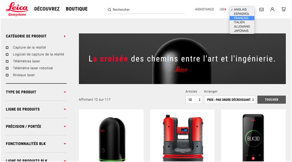
Oomph and Leica collaborated on an initial project in 2014 and have completed multiple projects since. We transitioned the site into a brand new codebase with Drupal 8. With this conversion, Oomph smoothed out the Leica team’s pain points related to a multisite architecture. We created a tightly integrated single site that can still serve multiple countries, languages, and currencies.
THE CHALLENGE
Feeling the Pain-points with Multisite
Leica’s e-commerce store is active in multiple countries and languages. Managing content in a Drupal multisite environment meant managing multiple sites. Product, content, and price changes were difficult. It was Oomph’s challenge to make content and product management easier for the Leica team as well as support the ability to create new country sites on demand. Leica’s new e-commerce site needed to support:
MULTIPLE COUNTRIES AND A GLOBAL OPTION
SIX LANGUAGES
MANY 3RD-PARTY INTEGRATIONS
The pain points of the previous Multisite architecture were that each country was a silo:
- No Single Sign On (SSO): Multiple admin log-ins to remember
- Repetitive updates: Running Drupal’s update script on every site and testing was a lengthy process
- Multiple stores: Multiple product lists, product features, and prices
- Multiple sites to translate: each site was sent individually to be translated into one language
THE APPROACH
Creating a Singularity with Drupal 8, Domain Access, & Drupal Commerce
A move to Drupal 8 in combination with some smart choices in module support and customization simplified many aspects of the Leica team’s workflow, including:
- Configuration management: Drupal 8’s introduction of configuration management in core means that point-and-click admin configuration can get exported from one environment and imported into another, syncing multiple environments and saving configuration in our code repository
- One Database to Rule Them All: Admins have a single site to log into and do their work, and developers have one site to update, patch, and configure
- One Commerce Install, Multiple stores: There is one Drupal Commerce 2.x install with multiple stores with one set of products. Each product has the ability to be assigned to multiple stores, and price lists per country control product pricing
- One Page in Multiple Countries and Multiple Languages: The new single site model gives a piece of content one place to live, while authors can control which countries the content is available and the same content is translated into all the languages available once.
- Future proof: With a smooth upgrade path into Drupal 9 in 2020, the Drupal 8 site gives Leica more longevity in the Drupal ecosystem
LEARN VS. SHOP
Supporting Visitor Intention with Two Different Modes
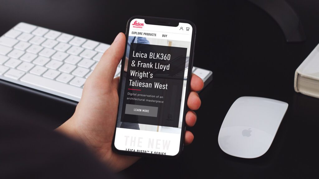
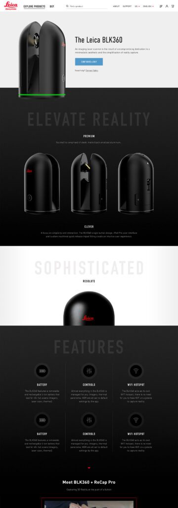
While the technical challenges were being worked out, the user experience and design had to reflect a cutting-edge company. With the launch of their revolutionary product, the BLK 360, in 2018, Leica positioned itself as the Apple of the geospatial measurement community — sleek, cool, cutting-edge and easy to use. While many companies want to look as good as Apple, few of them actually have the content and product to back it up.
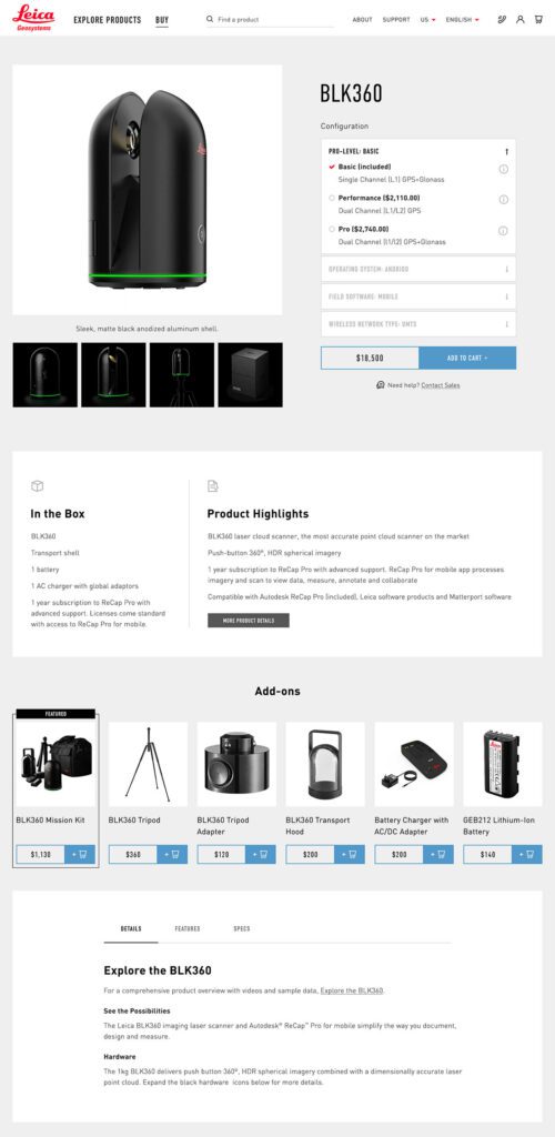
The navigation for the site went through many rounds of feedback and testing before deciding on something radically simple — Learn or Shop. A customer on the website is either in an exploratory state of mind — browsing, comparing, reviewing pricing and specifications — or they are ready to buy. We made it very clear which part of the website was for which.
This allowed us to talk directly to the customer in two very different ways. On the Learn side, the pages educate and convince. They give the customer information about the product, reviews, articles, sample data files, and the like. The content is big, sleek, and leverages video and other embedded content, like VR, to educate.
On the Shop side the pages are unapologetically transactional. Give the visitor the right information to support a purchase, clearly deliver specs and options like software and warranties, without any marketing. We could assume the customer was here to purchase, not to be convinced, so the page content could concentrate on order completion. The entire checkout process was simplified as much as possible to reduce friction. Buying habits and patterns of their user base over the past few site iterations were studied to inform our choices about where to simplify and where to offer options.
THE RESULTS
More Nimble Together
The willingness of the Drupal community to support the needs of this project cannot be overlooked, either. Oomph has been able to leverage our team’s commitment to open source contributions to get other developers to add features to the modules they support. Without the give and take of the community and our commitment to give back, many modifications and customizations for this project would have been much more difficult. The team at Centarro, maintainers of the Commerce module, were fantastic to work with and we thank them.
We look forward to continuing to support Leica Geosystems and their product line worldwide. With a smooth upgrade path to Drupal 9 in 2020, the site is ready for the next big upgrade.
The Brief
Less can be Much More
The previous Foundation Medicine (FMI) team built their marketing platform on a decoupled content management architecture. Oomph has used decoupled and micro-service architecture for projects such as Leica Geosystems and Wingspans.
But decoupled is not right for every organization, and a decoupled approach can be architected in many different ways. FMI had found their implementation created more headaches than high-fives:
- The flat hierarchy of Contentful created 158 content types, most of which were not useful for creating content.* Therefore, authors had to sift through long lists to find the actual content they needed to edit or create.
- Not everything in their front-end templates was accessible through the CMS. (That would have created even more content types!) So the team was beholden to an engineer to make text edits within some areas.
- Previewing new pages before publishing was not added to their implementation. Authors struggled to predict how content in the admin would display as the published page, and spent much time toggling back and forth.
In short, publishing new content or making content edits was too slow. Responding quickly to changing market conditions or new announcements in the cancer treatment space was not possible, eroding reliance and trust in what should be a cutting-edge brand.
* It should be noted that Contentful uses a “Content Type” for almost everything, from content to taxonomy to design components.
The Approach
Moving away from Decoupled
Based on their current pain points, Oomph verified that switching to a traditional “monolithic” architecture would solve their problems and provide additional benefits:
- Reduce cognitive overload and maintenance overhead by drastically reducing content types
- Empower authors to update all content anywhere
- Accelerate content publishing with an accurate visual preview
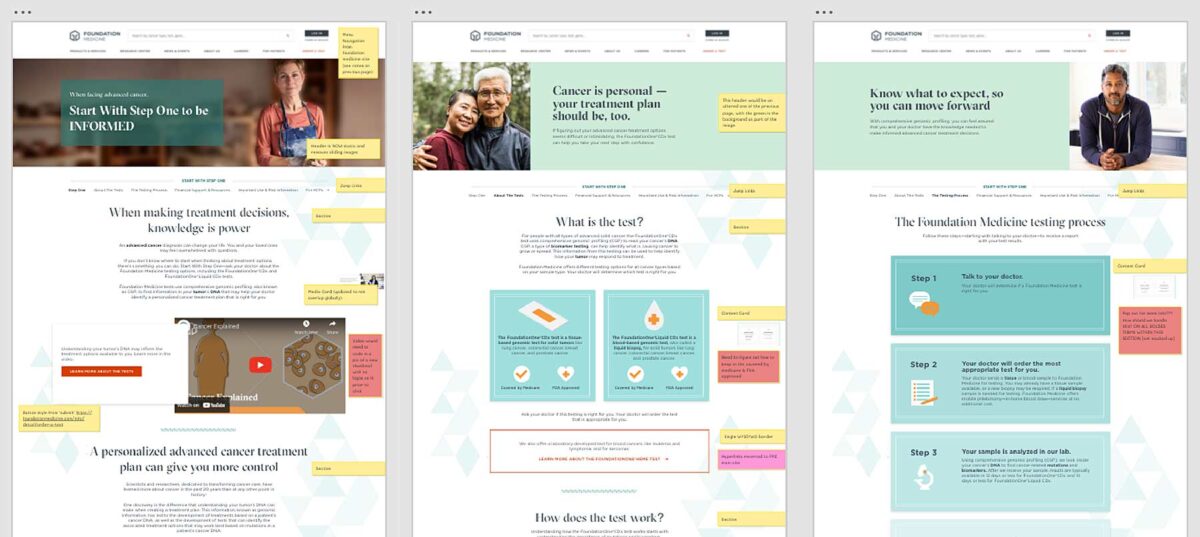
Oomph completed an extensive audit and reduced content types from 158 down to 30. We created a tight, flexible system in Drupal of just 14 content types — news item, event page, product page, etc. — and 16 design components — text blocks, accordions, etc.
How did we achieve such a reduction? Our consolidation approach moved from fewer specific options (one thing for a small number of very specific pieces of content) to flexibility within general ones (one thing to support many pieces of content with specific options).
Retaining Key Functionality
Foundation Medicine exists to help people with cancer and those who treat them. To accomplish this, the website features intricate tools for providers to navigate essential cancer resources and patients to find a specialist. None of these tools were compromised by switching to Drupal. In fact, with efficiency gains and more timely content governance, these resources became more valuable.
The Results
Connecting Providers with Genomic Data and Patients with Personalized Care
The upgrade to Foundation Medicine’s digital platform has been invisible by design. The brand and the visuals were performing well for their business and were comfortable for their audience. The outward appearance didn’t need an update, but the internal workflows that support continued trust certainly did.
The Foundation Medicine team now has the autonomy to make content updates quickly, the architecture and design components to confidently curate each page build, and the infrastructure to create clear and consistent content — a win for the team and for the many people who turn to Foundation Medicine in their time of need.
Page Views
Scroll Depth
User Engagement
One question we frequently hear from clients, especially those managing web content, is “How can we implement accessibility best practices without breaking the bank or overwhelming our editorial team?”
It’s a valid concern. As a content editor, you’re navigating the daily challenge of maintaining quality while meeting deadlines and managing competing priorities.
When your team decides to prioritize website accessibility, the initial scope can feel daunting. You might wonder “Does this really make a difference?” or “Is remediation worth the effort?” The answer is always a resounding yes.
Whether you’re working on a small site or managing thousands of pages, accessible content improves user experience, ensures legal compliance, boosts SEO performance, and reinforces your brand as inclusive and responsible. As a content editor, you have the power to make steady, meaningful progress with the content you touch every day.
Why Accessibility Creates Business Impact
Accessible content delivers measurable outcomes across multiple business objectives:
Expanded Market Reach: When your content is inaccessible to users with disabilities, you’re limiting your potential audience. Consider that disabilities can be temporary, like a broken arm, and 70% of seniors are now online—a demographic that often benefits from accessible design principles.
Risk Mitigation: Inaccessible websites can lead to legal complaints under the ADA and other regulations, creating both financial and reputational risks.
Enhanced User Experience: Clear structure, descriptive alt text, and keyboard-friendly navigation improve usability for all users while boosting SEO performance.
Brand Differentiation: Demonstrating commitment to accessibility positions your organization as inclusive and socially responsible.
Implementing Accessibility in Your Editorial Workflow
The challenge isn’t whether to implement accessibility—it’s how to do it efficiently without overwhelming your team or budget.
The Fix-It-Forward Approach
Rather than attempting to overhaul your entire site overnight, we recommend a “fix-it-forward” strategy. This approach ensures all new and updated content meets accessibility standards while gradually improving legacy content. The result? Steady progress without resource strain.
Leverage Open Source Tools
Many CMS platforms offer free accessibility tools that integrate directly into your editorial workflow:
Drupal: Editoria11y Accessibility Checker, Accessibility Scanner, CKEditor Accessibility Auditor
WordPress: WP Accessibility, Editoria11y Accessibility Checker, WP ADA Compliance Check Basic
These tools scan your content and flag common WCAG 2.2 AA issues before publication, transforming accessibility checks into routine quality assurance.
Prioritize High-Impact Changes
Focus your efforts on fixes that significantly improve usability for screen reader and keyboard users:
- Missing image alt text
- Poor heading structure
- Duplicate or unclear link text
- Links that open new windows without warning
- Insufficient color contrast (may require developer collaboration)
Less critical issues can be addressed during routine content updates, spreading the workload over time.
Manage Legacy Content Strategically
Don’t let your content backlog create paralysis. Prioritize high-traffic pages and those supporting key user journeys. Since refreshing legacy content annually is already an SEO best practice, use these updates as opportunities to implement accessibility improvements.
Build Team Capabilities
Make accessibility part of your content culture through targeted education and resources. Provide internal training, quick reference guides, and trusted resources to keep editors confident and informed.
Recommended Learning Resources:
Track Progress and Celebrate Wins
Measure success by tracking pages published with zero critical accessibility issues. Share achievements in editorial meetings to reinforce your team’s impact and maintain momentum.
Scaling Your Accessibility Program
While regular content checks provide immediate value, sustainable accessibility success requires periodic comprehensive assessments and usability testing. If your team lacks bandwidth for advanced testing, consider adding this to your 1-2 year digital roadmap. Consistent attention over time proves more sustainable and cost-effective than attempting massive one-time remediation.
Start with Free Tools: Google Lighthouse provides immediate insights into accessibility issues and actionable remediation guidance.
Advanced Assessment Options: For teams ready to expand their program, tools like SortSite, SiteImprove, and JAWS screen reader testing offer comprehensive assessments. These advanced tools can uncover complex issues beyond content-level checks, though they may require developer collaboration for implementation.
Quarterly Program Goals:
- Regular Google Lighthouse assessments for incremental improvements
- Full-site scans or top-page audits with developer support
- Remediation prioritization based on traffic and business value
- Ongoing WCAG 2.2 AA compliance tracking
Consider engaging someone who navigates the web differently than your team does. This perspective will expand your understanding of accessibility’s real-world impact and inform more effective solutions.
Accessibility as Continuous Improvement
Accessibility isn’t a one-time project—it’s an ongoing commitment to inclusive digital experiences.
By integrating accessibility best practices into your publishing workflow, you’ll build a stronger, more inclusive website that protects your brand, empowers your users, and demonstrates digital leadership.
The fix-it-forward approach transforms what seems like an overwhelming challenge into manageable, sustainable progress.
Ready to Accelerate Your Accessibility Journey?
Explore additional insights from our team:
- More than Mouse Clicks: A Non-Disabled User’s Guide to Accessible Web Navigation
- How Does the European Accessibility Act Affect Your Business?
Ready to take action? Contact Oomph to see how we can support your accessibility journey. We start with targeted accessibility audits that identify your highest-impact opportunities, then collaborate with your team to develop a strategic roadmap that aligns with your internal goals while respecting your resources and team size.
Homepage engagement time
Exhibition page views
“Inside the Collection” engagement time
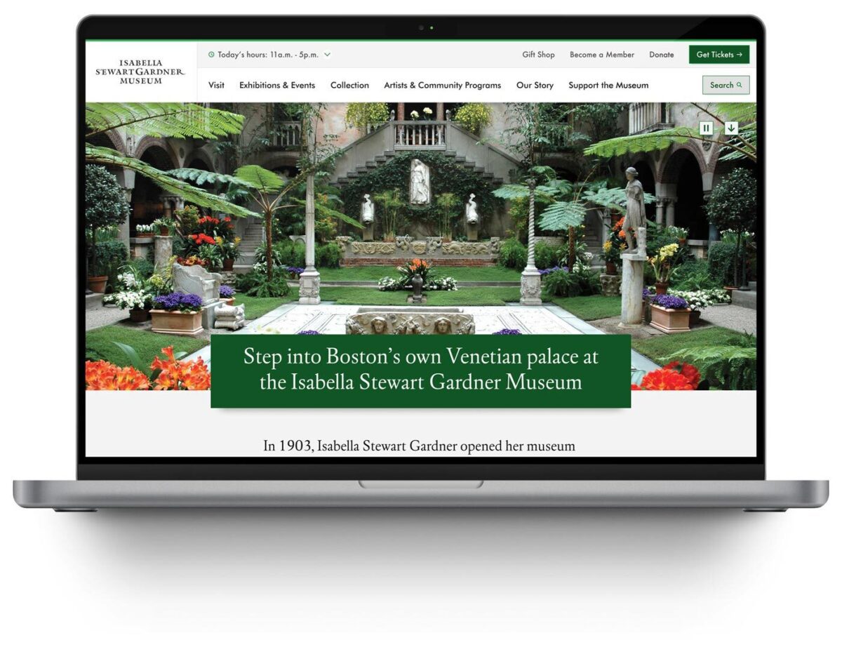
Overview
The Isabella Stewart Gardner Museum stands as one of Boston’s most distinctive cultural treasures. Founded by the visionary Isabella Stewart Gardner herself, the Museum offers a transportative experience that defies conventional art museum expectations. Yet for all its in-person magic, the digital experience had room to better serve the institution’s mission.
The Museum needed a solution that would honor their unique brand identity while solving critical usability challenges that were hindering meaningful digital engagement.
Challenge
The Museum faced a variety of digital barriers that were undermining their core mission. Since launching a redesign effort in 2017, their website struggled with fundamental usability issues that created friction at several touchpoints:
The Findability Crisis: Staff members regularly used Google to locate content on their own website. The people most familiar with the site struggled to navigate it efficiently, highlighting how challenging the experience must be for visitors.
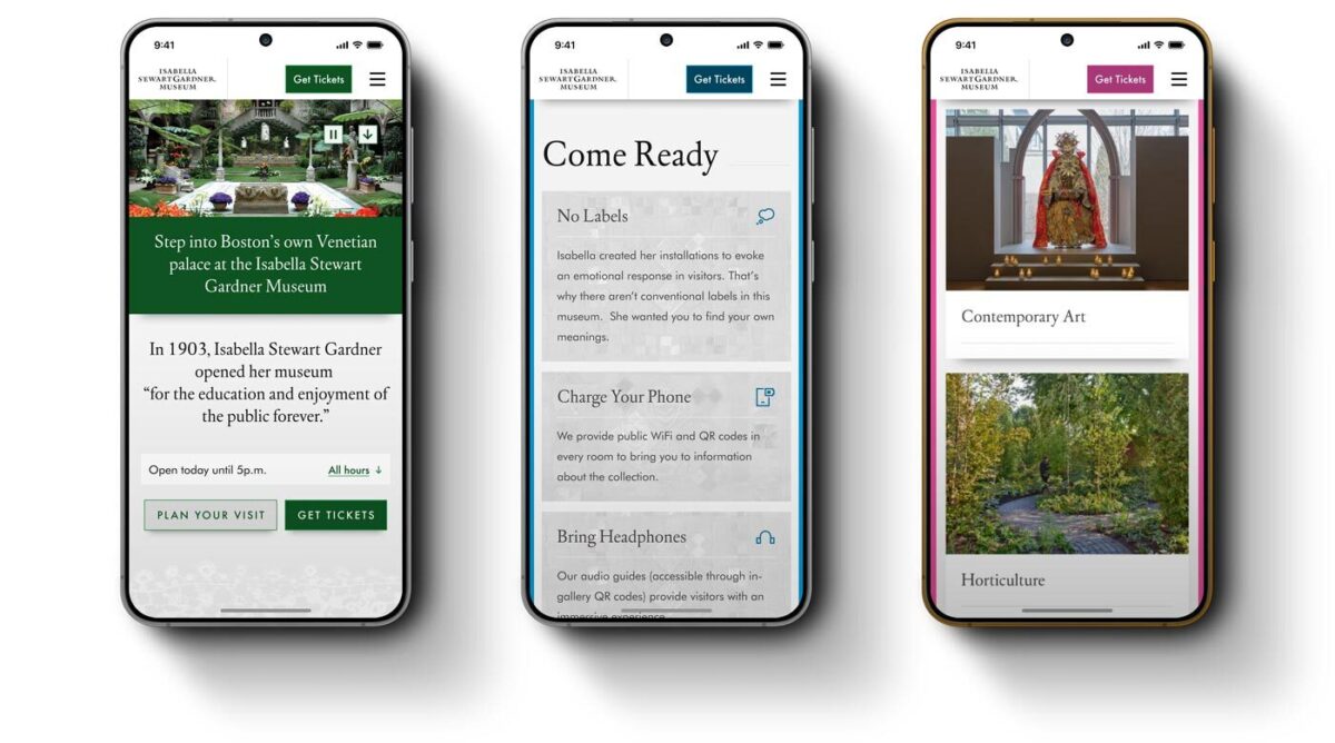
Accessibility Barriers: The website failed to meet current accessibility standards, with poor color contrast rendering content difficult to read for visitors with visual impairments. As an institution committed to welcoming all visitors, they have been spearheading important initiatives to review and remediate accessibility, including their digital platform.
Navigation Complexity: The previous design used internal logic that wasn’t intuitive to visitors, particularly those unfamiliar with the institution, treating many landing pages like a series of doors and frames. While visually striking, this approach created a maze-like experience that prioritized aesthetics over visitor needs.
Content Architecture Issues: Exhibition details, ticketing information, and visitor resources were scattered across the site without hierarchy or clear pathways between related content.
These challenges weren’t just inconveniences—they were preventing the Museum from achieving its core digital goals of inspiring visits, supporting trip planning, and fostering deeper engagement with their collection and history.
Our Approach
Rather than pursuing a complete rebuild that would disrupt operations and require extensive backend development, we opted for a strategic re-architecture. This approach allowed us to transform the user experience while preserving the visual identity and content management systems the Museum’s team relied on.
Our methodology centered on understanding both the institution’s unique character and their visitors’ diverse needs:
Discovery & Stakeholder Alignment
We began with comprehensive stakeholder workshops, bringing together team members from across the Museum to align on priorities and success metrics. By synthesizing member surveys, analytics data, and internal insights, we developed a clear picture of both current pain points and future opportunities.
User-Centered Design Strategy
We mapped core tasks to real visitor types by creating focused user journeys for Museum Members, purchasing a ticket, navigating the museum’s collection and information while visiting, and researching art online afterward. Our user journey mapping ensured every design decision served real visitor needs.
Information Architecture Transformation
We rebuilt the site’s navigation and menu system, creating intuitive pathways that support natural user behavior. TreeJack testing validated our approach, ensuring the new architecture would actually improve task completion rates.
Accessibility-First Enhancement
Newly designed components aligned with WCAG 2.2 AA standards, proving that accessibility and aesthetic excellence aren’t mutually exclusive. We demonstrated how inclusive design could enhance the Museum’s distinctive visual character.
“Gentle Elegance” Design Philosophy
Working closely with the Museum team, we developed a design approach that captured the institution’s intimate, sophisticated character through subtle details—lace patterns and mosaic elements that reference the collection and architecture without overwhelming the interface. This strategy allowed us to inject personality into the digital experience while maintaining focus on usability.
Strategic Solutions Delivered
Enhanced Navigation Architecture: We introduced drop down menus and logical content groupings that transformed how visitors move through the site. Museum websites often avoid complex navigation, but we proved that thoughtful hierarchy actually improves rather than complicates the user experience.
Reimagined Visit Page: This became the crown jewel of our transformation—a comprehensive resource that balances practical planning information with pathways to deeper content exploration. The page now prepares visitors for the Museum’s unique characteristics (awareness of the lack of labels, availability of audio guides and mobile device charging stations, etc.) while building excitement for the experience ahead.
Component System Redesign: Our new component library enables the Museum’s team to create engaging content layouts without sacrificing accessibility or performance standards.
Performance Optimization: Behind-the-scenes improvements ensure the site loads quickly and functions smoothly across all devices and connection speeds.
Measurable Impact
The transformed digital experience delivered immediate, measurable improvements across every key area of visitor engagement. Three weeks after launch, the data tells a compelling story of enhanced user behavior and meaningful interaction with the Museum’s digital presence.
Enhanced Homepage Engagement: The redesigned homepage achieved a 9.7% increase in views alongside a significant 15.6% increase in average engagement time, demonstrating that visitors are not only discovering the site more frequently but spending meaningful time exploring what it offers.
Dramatic Exhibition Discovery: The Exhibitions section experienced remarkable growth with a 179.7% increase in views and 22.9% higher engagement time. This transformation demonstrates how improved information architecture and content discoverability can dramatically expand visitor interest in the Museum’s programming.
Deeper Content Engagement: The Inside the Collection blog saw an 18.4% increase in views coupled with an impressive 61.7% increase in average engagement time. Visitors are not only finding this content more easily but engaging with it far more meaningfully, suggesting successful pathways between practical planning content and deeper cultural exploration.
Strengthened Community Connection: The Membership section achieved a 15.7% increase in views with steady engagement time growth of 2.5%, indicating improved pathways for visitors interested in developing ongoing relationships with the Museum.
These metrics validate our strategic approach of balancing usability improvements with content discoverability. The data shows visitors are finding information more efficiently while also discovering opportunities for deeper engagement with the Museum’s mission and offerings.
Why This Project Matters
Isabella Stewart Gardner created something unprecedented: an intimate, personal art experience that defies conventional museum expectations. Every element was chosen and placed with intention, creating an environment where visitors don’t simply observe art—they step into a carefully curated world.
This uniqueness creates both opportunity and responsibility in the digital realm. The website serves as many visitors’ first encounter with the Museum’s distinctive character. When that initial experience is confusing or inaccessible, it undermines so much of what makes the Gardner special.
Our strategic approach recognized that preserving the Museum’s essence required more than maintaining visual elements — it demanded understanding what makes the institution extraordinary and translating those qualities into digital interactions. By balancing usability, accessibility, and aesthetic sophistication, we enhanced an online experience that genuinely reflects the Gardner’s spirit.
The transformation supports the Museum’s broader mission in measurable ways:
Visitor Empowerment: Clear, accessible information helps visitors plan with confidence and arrive prepared for the Gardner’s unique approach to art presentation.
Deeper Engagement: Improved content discoverability means the relationship with the Museum can extend beyond the physical visit through blog content and collection exploration.
Inclusive Access: Meeting accessibility standards ensures the Gardner’s digital presence welcomes all visitors, reflecting the institution’s commitment to openness and equity.
Operational Excellence: Streamlined content management empowers staff to focus on mission-critical work rather than wrestling with technical barriers.
Ultimately, this project demonstrates how thoughtful digital transformation can honor an institution’s distinctive character while removing barriers to meaningful engagement. We didn’t just improve a website, we helped the Gardner Museum extend its intimate, intentional spirit into the digital realm, ensuring that more people can connect with what makes this cultural treasure truly extraordinary.
If your Drupal site relies on Acquia Search leveraging Solr, you’re likely facing a migration from Acquia Search to SearchStax. We’ve guided numerous organizations through this transition and want to share our proven approach to help you navigate this change successfully.
Before diving into the migration process, this transition presents an excellent opportunity to reassess your search strategy entirely. While Solr remains a powerful and robust solution, the search landscape has evolved significantly with innovative alternatives now available. For organizations considering broader platform transitions, this moment offers strategic value beyond search improvements. Modern React-based solutions can deliver dramatically faster user experiences. Our recent work with ONS demonstrates this potential—by replacing their Solr solution with Algolia Instant Search, we helped them achieve a 40% improvement in search response times while creating a more intuitive experience for their members.
Why the Move to SearchStax?
Acquia announced earlier this year that they’re sunsetting their Acquia Search offering in 2026, positioning SearchStax as the recommended migration path through their new partnership. This transition offers enhanced search capabilities and more direct control over your search environment through SearchStax’s comprehensive dashboard, providing visibility into Solr server performance, data analysis tools, search preview functionality, and advanced configuration options.
The architectural similarity ensures a seamless end-user experience—Solr remains the foundation, requiring no front-end changes for this migration path while delivering improved administrative control.
Our Proven Migration Framework
Through multiple successful migrations, we’ve developed a structured approach that minimizes risk and ensures smooth transitions. Here’s our step-by-step framework:
Phase 1: Foundation Setup
- Secure access to the SearchStax dashboard for complete environment management
- Install the SearchStax modules, including the critical “Solr to SearchStax Site Search Migration” module
- Configure and commit your basic settings to establish the foundation
Phase 2: Testing and Validation
- Deploy changes to DEV or STAGE environments for comprehensive testing
- Validate search functionality, performance, and user experience
- Identify and resolve any configuration issues before production deployment
Phase 3: Production Implementation
- Push validated changes to production environment
- Execute core migration steps including server migration (Drupal’s SearchStax authentication automatically generates endpoint and token configurations), index migration to transfer existing search indexes, and view switching to activate SearchStax indexes across your site
Phase 4: Configuration Management
- Implement configuration overrides and ignores to ensure environment-specific settings
- Secure sensitive data while maintaining dedicated SearchStax server settings per environment
- Export SearchStax indexes and updated views from production to feature branch
- Commit and deploy changes in your next release cycle
Phase 5: Transition Management
- Maintain Acquia search indexes temporarily for rollback capability
- Monitor performance and user experience during initial transition period
- Complete final cleanup by disabling Acquia search module and migration tools once stability is confirmed
Addressing Technical Challenges
Our experience across multiple migrations has revealed common technical hurdles that require proactive attention. Configuration issues with Boost by Date Processor settings, Highlighted Fields errors during index rebuilding, and Facet configuration mismatches between environments are frequent challenges. The key to success lies in early identification during lower environment testing and leveraging Acquia support resources to resolve issues before they impact production.
Each migration presents unique challenges based on your specific configuration and content structure. Our approach prioritizes thorough testing and validation to surface these issues early, ensuring smooth production deployment.
Strategic Search Optimization
Successful migration extends beyond technical implementation. Understanding your content architecture, user behavior patterns, and business objectives enables you to optimize search effectiveness during the transition. This migration provides an ideal opportunity to evaluate search performance metrics, refine content indexing strategies, and enhance user experience design.
By following this proven framework and preparing for potential challenges, your organization can successfully transition to SearchStax while improving both administrative capabilities and user search experience. The result is a more robust, manageable search solution that positions your site for future growth and enhanced user engagement.
Our comprehensive migration expertise extends beyond search implementations to complete platform transformations, ensuring your digital infrastructure supports your long-term strategic objectives.
Ready to begin your SearchStax migration? Don’t wait until the 2026 deadline creates a migration rush. Our fixed-price SearchStax migration service ($2,500) provides the structured, proven approach outlined in this guide—from foundation setup through transition management. Get started with your SearchStax migration today.
Drupal has long been known for its flexibility, robustness, and scalability. But for many marketers and content creators, that flexibility can come with a steep learning curve — especially when it comes to building layouts and managing design without the help of a developer. That’s about to change in a big way.
Enter Drupal Canvas (previously called Experience Builder), a new initiative in Drupal that promises to radically streamline and simplify how we build and design pages. While still in its early stages, Experience Builder is ready for testing and experimentation — and it’s something marketers should absolutely have on their radar.
What is Drupal Canvas?
Drupal Canvas is the evolution of Drupal’s current method of flexible page building called Layout Builder. It takes what we know from layout builder and expands it into a unified, user-friendly tool that allows non-developers to build and theme websites directly in the browser. It’s a huge leap toward making Drupal more accessible for site builders, marketers, and content creators alike.
Unlike other page builders, Canvas doesn’t just provide drag-and-drop layout tools. It leverages Drupal’s core strengths — structured data, fine-grained access controls, and reusable components — to ensure consistency across channels and scalability across enterprise-level websites. This makes it uniquely powerful for large organizations managing multiple digital properties.
Dries Buytaert, Drupal’s founder, described it as a response to the fragmented landscape of site-building options in Drupal today. The vision is to consolidate functionality from tools like Paragraphs and Layout Builder into a single, cohesive solution. One that’s intuitive, efficient, and packed with modern capabilities.
Here is a fantastic video demo from DrupalCon Atlanta that was shown by Dries during the keynote address:
Why Now?
The timing couldn’t be better. While Layout Builder was a step in the right direction when it launched in 2018, its limitations became clear as more site builders demanded easier workflows, styling tools, and richer content composition features.
At recent Drupal conventions, the community has rallied around the idea of enhancing user experience across the board. As part of the broader Drupal CMS, Canvas is a key component in bringing Drupal’s usability in line with the expectations of modern content teams.
Why I’m Excited About It
As an engineer who has worked closely with Drupal for years, what excites me most is how Canvas can bridge the many gaps in Drupal’s current page-building ecosystem. Today, there are so many ways to structure content — Blocks, Paragraphs, Layout Builder, Panels — that choosing the right one can be overwhelming.
Drupal Canvas is shaping up to be that “one-stop-shop” we’ve needed. It reduces decision fatigue and gives teams a faster way to get projects off the ground without needing to architect every page structure from scratch.
Even better, it supports creating single-page overrides, component-level editing, and even React-based components right in the editor. That’s something I’ve personally looked forward to for a long time. The ability to build and save reusable components that can be dropped into any page makes this a tool that truly enhances productivity — not just for developers, but for marketers and content creators, too.
My First Look
I had the chance to see Drupal Canvas in action at DrupalCon Atlanta this year. The live demos were impressive and really opened my eyes to what this tool could do, both for newcomers to Drupal and seasoned site builders. Along with Drupal CMS, and recipes, Canvas is easily one of the hottest topics in the Drupal ecosystem right now.
The energy in the room during the sessions was palpable — people are genuinely excited about this. It’s not just another experimental module; it’s a shift in how we think about building on Drupal.
A Game-Changer for Marketers
One of the biggest barriers for marketing teams has always been reliance on developers to make even small layout edits. That’s starting to change.
With Canvas, non-developers will be able to build out dynamic, visually engaging pages — without needing to dive into code. That’s a massive win, especially for small teams in government, education, or nonprofit sectors, where resources are limited and time is of the essence.
Being able to make changes quickly, reuse content intelligently, and maintain a consistent brand without touching a template file is something many organizations have wanted for years. Drupal Canvas delivers on that promise.
Want to Try It Yourself?
If you’re curious to see what the buzz is about, the best way to get started is simple: head to Drupal.org and download the latest version of Drupal CMS. It now comes with an optimized installer that makes getting started faster than ever. Once you’re up and running, you can add the Drupal Canvas module and start exploring.
Looking Ahead
It’s important to note that this is just the alpha version of the Canvas initiative. The team behind it is committed to rapid iteration and community feedback, which means what we’re seeing today is just the beginning.
If this is the foundation, I can only imagine how powerful the tool will become in the next year or two. The Drupal community is known for its collaborative spirit and constant innovation — and Canvas is shaping up to be one of the most important steps forward in years.
So if you’re a marketer, content strategist, or anyone who’s ever been frustrated by the limits of page building in Drupal — now’s the time to dive in. Drupal Canvas is here, and it’s ready to change the game. Contact us for a demo or more information about flexible-page-building in Drupal.
The Brief
Visit California is a Destination Marketing Organization (DMO) with over 25 years of experience in promoting California as a premier travel destination. The organization, funded through a unique partnership between the state and the travel industry, operates with a substantial budget of over $185 million (2023). As the leader of California’s brand messaging, Visit California previously anchored its campaigns under the “Dream Big” brand positioning. However, following a significant shift in traveler motivations post-pandemic, Visit California recognized a growing desire for experiences that foster joy, connection, and adventure.
This insight led to the evolution of the brand into “The Ultimate Playground,” a strategic repositioning that highlights the state’s unparalleled diversity of geography, activities, and cultural experiences.
The “Let’s Play” campaign leveraged a robust mix of television, out-of-home, digital, and social media activations to showcase California’s diverse offerings — from wine tasting and rock climbing to luxury hotel stays, food truck adventures, and outdoor music festivals. By highlighting the playful spirit inherent in every experience, the campaign aimed to deepen the audience’s emotional connection to the state, reinforcing California’s identity as The Ultimate Playground and setting the stage for sustained brand engagement.
The APPROACH
The initial roll-out of a rebrand update is critical, and transitioning from “Dream Big” to “The Ultimate Playground” required careful internal alignment and thorough message testing. Oomph, alongside Visit California’s partner agencies, began collaborating on this effort about nine months before the campaign launch. During these early planning meetings, our team contributed key ideas and strategic approaches to help shape the campaign.
Our focus remained on the web user and their position in the customer journey. Previous campaigns had not fully optimized the user flow, so we saw this as an opportunity to reimagine the experience. With paid media driving traffic to the website, it was essential to provide visitors with clear actions once they arrived. The advertising had done its job by capturing attention and sparking interest. Now, our challenge was to build on that momentum, guiding users from interest to meaningful engagement and action.
An interactive Quiz
The Ultimate Playground campaign needed to accomplish a few things:
- Educate the consumer about the new brand positioning and why California should be considered the Ultimate Playground
- Inform the consumer about play and how it is more about kids and theme parks. Adults can and should play as well, and serious activities can be conducted in playful ways
- Activate the consumer with inspiration by giving them a unique experience and curating inspirational, playful activities throughout the state
Our teams settled on a quiz as a way to engage visitors and serve them personalized content. Based on initial research, we decided an image-based quiz would be the fastest and most fun way to answer questions and receive a set of recommendations. Choosing preferences from a set of images is a quick way to make progress tangible. We limited the questions to nine, and most visitors took two minutes to complete the quiz.
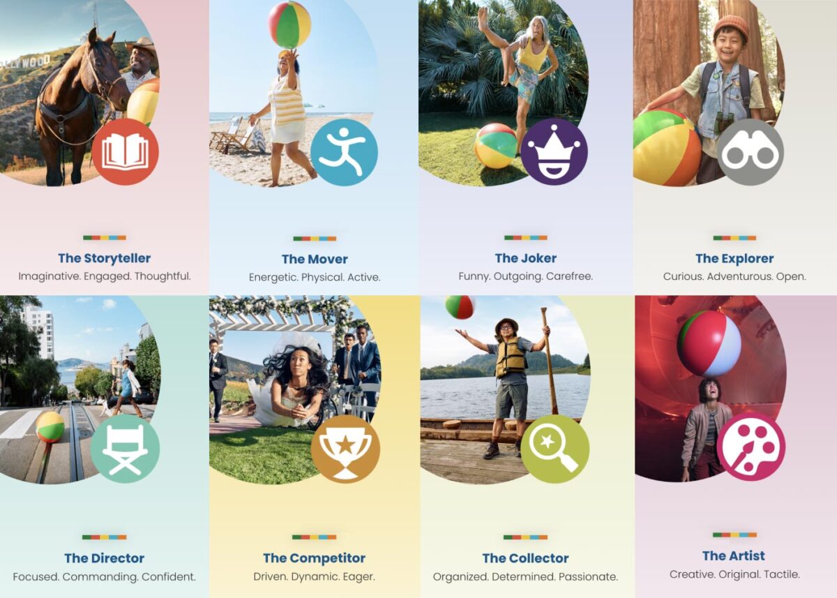
Play Styles
The eight Play Styles were based on personas researched and created by the National Institute for Play, headquartered in California. Content creators at Visit California crafted a series of TV spots with glimpses into different styles of play. Our Play Quiz would highlight which Play Style matched the participant’s preferences, and our results pages served relevant, curated content, a similar Celebrity personality, and even a secondary play style.
Email collection allowed visitors to send their play style results to themselves and allowed opt-in to more personalized content. Our team worked quickly over three months to solidify the approach, choose the quiz method and weighting criteria of the questions, and design the eight play style pages, two landing pages, a homepage takeover, and supporting pages for the new campaign.
The Results
Play Quiz: Avg. session duration
Play Styles: Avg. session duration
Compared to Site: Avg. session duration
Our approach to the campaign was to support the bottom of the funnel and give visitors coming from digital ads something useful. Given the wealth of content the Visit California website contains, these broad Play Style personas made visitors see themselves in California. It brought curated content to them and provided what we thought of as a personal homepage with relevant recommendations.
“Let’s Play” was the first part of a years-long brand campaign. We are already working on the campaign for 2025 which we hope will be even more engaging than the first!
THE CHALLENGE
The Challenge
For caregivers, clinicians, and individuals impacted by dementia, finding reliable, up-to-date resources is often difficult. Many existing platforms were outdated, hard to navigate, and cluttered with static information that failed to reflect the latest research and best practices.
To address this, a team at the University of California, San Francisco (UCSF) secured grant funding to create a new, centralized digital resource for dementia care. This website would serve as a go-to hub for caregivers, healthcare professionals, and those living with dementia, making essential guidance, local support services, and educational tools more accessible and easier to use.
UCSF partnered with Oomph to develop a modern, scalable platform designed to improve content discovery, simplify search, and support long-term content growth.
OUR APPROACH
To ensure the new dementia care site was intuitive, structured, and easy to maintain, Oomph worked closely with UCSF to:
1. Build a Flexible and Organized Content System
With hundreds of resources ranging from clinical guides to local service listings, content needed to be structured for easy access. We:
- Developed a content model that allows UCSF to continuously expand and update information.
- Designed audience-specific pathways so caregivers, clinicians, and individuals with dementia can quickly find relevant content.
- Built an admin system that simplifies content management for UCSF’s team.
2. Optimize Search and Resource Navigation
Given the depth of content, finding the right resources quickly was a priority. We:
- Built a location-based filtering system to help users find local dementia support services.
- Designed an intuitive search experience that prioritizes the most relevant resources.
- Created structured content relationships so users can easily explore related topics.
3. Introduce Video and Multimedia Features
To make the site more engaging, UCSF wanted to integrate video content as a core educational tool. We:
- Developed a featured video content block that highlights key dementia care topics.
- Ensured seamless integration of video alongside traditional text-based resources.
- Designed a flexible content structure that allows UCSF to scale its multimedia offerings over time.
THE RESULTS
A Smarter, More Accessible Dementia Care Resource
The new dementia care platform is a comprehensive digital tool designed to improve how caregivers and clinicians access critical information.
- One centralized hub for dementia care resources, all timely and up-to-date.
- Fast, intuitive navigation that allows users to find resources based on role and location.
- Optimized multimedia experience that integrates video education alongside traditional content.
- A scalable platform that UCSF can continue to expand as research and best practices evolve.
By focusing on content organization, searchability, and usability, Oomph delivered a digital hub that will support dementia care communities for years to come.
Helping Healthcare Organizations Build Digital Resources That Matter
For healthcare providers, research institutions, and public health organizations, a well-designed digital platform can be the difference between confusion and clarity, isolation and support. Let’s connect to see how we can help.
THE CHALLENGE
The Challenge
Oncology nurses play a critical role in patient care, but navigating scattered, disconnected digital resources, research, and education made it harder for them to access the right information at the right time in the right place.
The Oncology Nursing Society (ONS), a professional organization with 200 chapters and over 35,000 members, maintained three separate websites for a variety of functions including clinical tools, research data, educational materials, and membership.
The fragmented system made it difficult for:
- Nurses to quickly find information in fast-paced clinical settings.
- Healthcare institutions to manage memberships and resources for their staff.
- ONS administrators to maintain and update content efficiently.
ONS partnered with Oomph to unify these platforms into a single, intuitive digital hub, making essential oncology resources easier to find, use, and manage.
OUR APPROACH
Leveraging our deep expertise in healthcare content strategy and digital engineering, Oomph worked closely with ONS to streamline content, improve search functionality, and enhance the overall user experience.
Creating a Flexible, Scalable Content System
ONS had a vast library of interconnected clinical, educational, and research materials but lacked an effective way to organize them. We:
- Consolidated over 40 content types into just 23, ensuring a more structured, maintainable system.
- Built a flexible content model in Drupal that allows the ONS team to easily update and customize pages.
- Designed an intuitive content architecture that prioritizes clinical tools, continuing education, and membership resources.
Optimizing Interactive Oncology Tools
Two core resources—the Biomarker Database and Symptom Interventions tool—are essential to oncology nurses’ daily workflows. Oomph redesigned these tools to:
- Enhance filtering capabilities, enabling nurses to quickly access relevant biomarker and treatment information.
- Improve navigation and searchability, making evidence-based recommendations easier to find.
- Ensure mobile responsiveness, so nurses can access resources from any device, wherever they are.
Implementing Smarter Search for Faster Access
Nurses often rely on quick search queries to find patient care guidance. To enhance search accuracy and speed, Oomph replaced ONS’ legacy Solr search with Algolia’s instant search technology, delivering:
- Four custom search experiences, each tailored to different content types.
- Real-time, intent-based search results to match the needs of busy clinicians.
- Faster load times and improved accessibility across all search-enabled pages.
Aligning Design With the ONS Brand Evolution
ONS had recently completed a rebrand, but its digital presence hadn’t fully evolved to match. Oomph helped translate the new brand identity into a cohesive web experience by:
- Refining UI components to align with ONS’ refreshed visual identity.
- Experimenting with modern layout structures to create a clean, professional look.
- Ensuring accessibility compliance.
THE RESULTS
A Unified, High-Impact Digital Resource
The new ons.org is a centralized, efficient, and scalable platform that makes it easier for oncology nurses, institutions, and administrators to access and manage critical healthcare resources.
- One streamlined platform for nurses, institutions, and administrators.
- Optimized content structure that simplifies navigation and enhances usability.
- Advanced search functionality that delivers real-time, high-accuracy results.
- Scalable and flexible design that supports future content growth and evolving member needs.
For oncology nurses, this platform is more than just a website—it’s a trusted clinical resource that supports better patient care, continuing education, and professional growth.
Empowering Healthcare Organizations With Digital Solutions That Work
In healthcare, access to information can directly impact patient outcomes. If your digital platform is fragmented, slow, or difficult to maintain, let’s discuss.
THE CHALLENGE
The Challenge
Keene State College (KSC), a liberal arts institution within the University System of New Hampshire, needed a modern, user-friendly website that aligned with its mission while effectively serving multiple audiences.
Over time, the existing site had grown into an overwhelming digital ecosystem, filled with complex navigation, disjointed content, and inconsistent branding. To better serve students and stakeholders, KSC needed to:
- Prioritize prospective students while maintaining relevance for parents, faculty, and alumni.
- Simplify content structure to help users quickly find what they need.
- Modernize the design and user experience while staying true to the college’s brand.
- Improve accessibility and performance to ensure a seamless experience across all devices.
KSC partnered with Oomph to create a scalable, audience-first digital experience that supports recruitment, engagement, and long-term adaptability.
OUR APPROACH
We focused on eliminating friction and enhancing engagement through a user-first strategy, modern information architecture, and a flexible, scalable design system.
Understanding the Audience & Challenges
Our discovery process included stakeholder workshops, user journey mapping, and content analysis to identify key roadblocks. We uncovered:
- Difficult navigation made it hard for prospective students to find admissions and academic program details.
- Multiple audiences competing for visibility resulted in a cluttered, confusing user experience.
- Inconsistent branding and outdated UI weakened the college’s online presence and first impressions.
By clearly defining what success looked like and identifying areas of improvement, we laid the foundation for a streamlined, student-centric digital experience.
Defining the Strategy & Roadmap
With a deep understanding of user needs, we developed a strategy focused on engagement, clarity, and accessibility.
- Navigation designed for prospective students while keeping secondary audiences accessible.
- A scalable mega menu that simplified content discovery without overwhelming users.
- A brand refresh of the digital identity that modernized KSC’s online presence while maintaining its authenticity.
- WCAG 2.1 Level AA accessibility compliance to ensure an inclusive experience for all users.
This strategy ensured that KSC’s website would be functional, engaging, and built to support student recruitment.
Executing the Vision
To bring the strategy to life, we developed a modern design system with a flexible, component-driven architecture that simplifies content management and improves the user experience.
- Audience-first navigation & mega menu – Prospective students can quickly find key admissions and academic information, while faculty, parents, and alumni have dedicated sections tailored to their needs.
- Scalable component library – A structured yet flexible design system enables KSC teams to easily update and manage content while maintaining a cohesive visual identity.
- Optimized for mobile & accessibility – A fully responsive, WCAG-compliant design ensures a seamless experience across all devices.
By creating a well-structured, intuitive content ecosystem, KSC now has a digital experience that is easy to manage and designed for long-term adaptability.
This team brings creativity and structure to projects. Decisions are based on data and reports, but they include a connection to heart and real world users. They bring in subject matter experts at the appropriate time but never lose site of the big picture.”
DIRECTOR OF MARKETING, Keene State College
THE RESULTS
A Student-Centric Digital Experience
The new Keene State College website now provides:
- A clear, structured experience for prospective students – Admissions, academics, and student life content is now easier to find and explore.
- A modernized digital identity – A refreshed brand and UI create a welcoming, engaging first impression.
- Seamless navigation for multiple audiences – While prospective students remain the priority, faculty, alumni, and parents still have dedicated access points.
- An accessible, scalable, and future-proof platform – Designed to support long-term growth, engagement, and institutional goals.
A Digital Experience That Grows With Its Community
Keene State’s new site is more than just a redesign—it’s a long-term investment in student engagement, accessibility, and institutional identity. By focusing on audience needs, structured content, and a scalable design system, KSC now has a future-ready digital presence that enhances recruitment, supports students, and strengthens the college community.
Is Your Higher Ed Website Ready for the Next Generation of Students?
If your institution is struggling with outdated content, complex navigation, or disconnected user experiences, a strategic digital approach can create clarity and engagement.
Let’s talk about how Oomph can help your institution stand out in an increasingly competitive higher ed landscape.
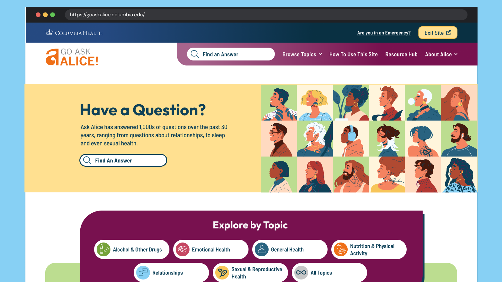
Go Ask Alice! (GAA!) is a judgment-free, anonymous question-and-answer site. It is part of Alice! Health Promotion, a department of Columbia Health. Their content has always been reliable, accurate, and thoroughly researched by professionals — humans, not Artificial intelligence (AI)! While organic search brings many different kinds of audiences across the globe to their answers, their primary audience is the college students of Columbia University. These digital natives need the content to speak their language and to look modern and relevant. Oomph leaned into the college-aged persona to create a user interface that was fun, unique, and approachable while acknowledging and respecting the gravity of the questions students ask.
The Brief
Empathize with both Visitors and Authors
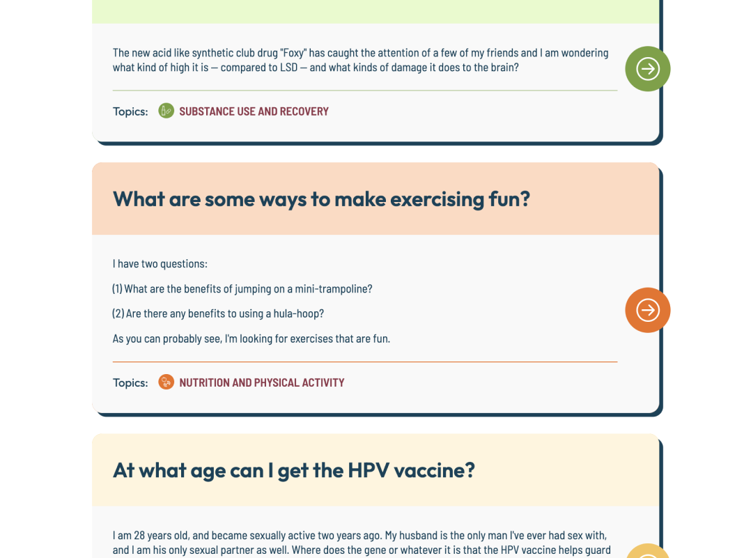
We began by working to understand and empathize with their audience — which was easy. How many of us have gotten lost searching for answers to questions we might not ask our own close friends? Questions like, “Can I get Hepatitis A from eating raw seafood?”, “Do I have OCD?” or even “Why did my father abandon me?” Analytics supported how these types of questions were prevalent. They also showed that while many visitors found GAA! through search, those visitors found their answer and quickly left. While in some ways, this was positive — someone had a question and found a satisfactory answer — visitors missed lots of other answers to questions they might have.
For the Go Ask Alice! author team, technical issues often arose that were rooted in an overly complex content architecture and workflows that required lengthy workarounds. A complicated review and approval process and ineffective spam filters made combing through user submissions time-consuming. The longer it takes the team to create new answers, the less students will want to send GAA! their questions.
Our shared goals were to:
- Modernize the design and attract more web-savvy students to read answers to questions they didn’t know they should ask.
- Reinforce trust by being open about the process and the real human professionals behind the answers.
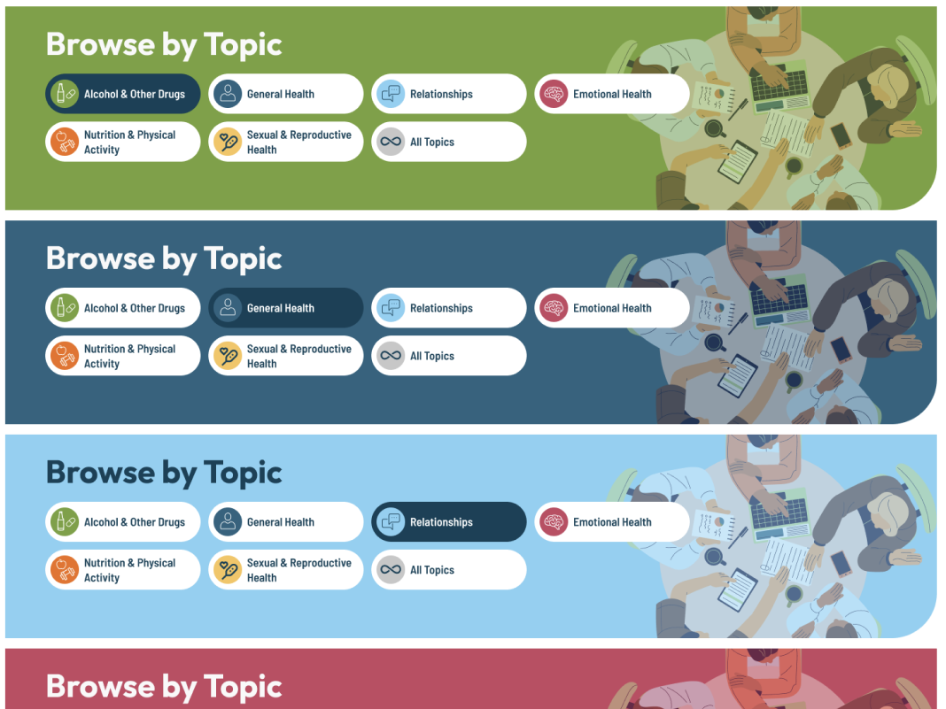
- Improve search, filtering, and findability by leading with topics first and guiding visitors to the types of questions that interest them most.
- Mitigate and simplify complex authoring processes to empower the small editorial team to answer more questions, support responses with engaging media, and reduce staff frustration.
The Approach
Modernization & Trust-building
Most Gen-Z students and younger generations won’t trust a site that isn’t designed well for a mobile screen. Our design process emphasized the small screen experience, keeping filters, sharing, citations, and recirculation in logical places. The Columbia Health brand is also a powerful lever for establishing trust with a young audience, but we were careful not to let it overpower GAA!’s own authentic brand.
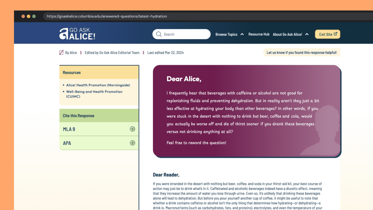
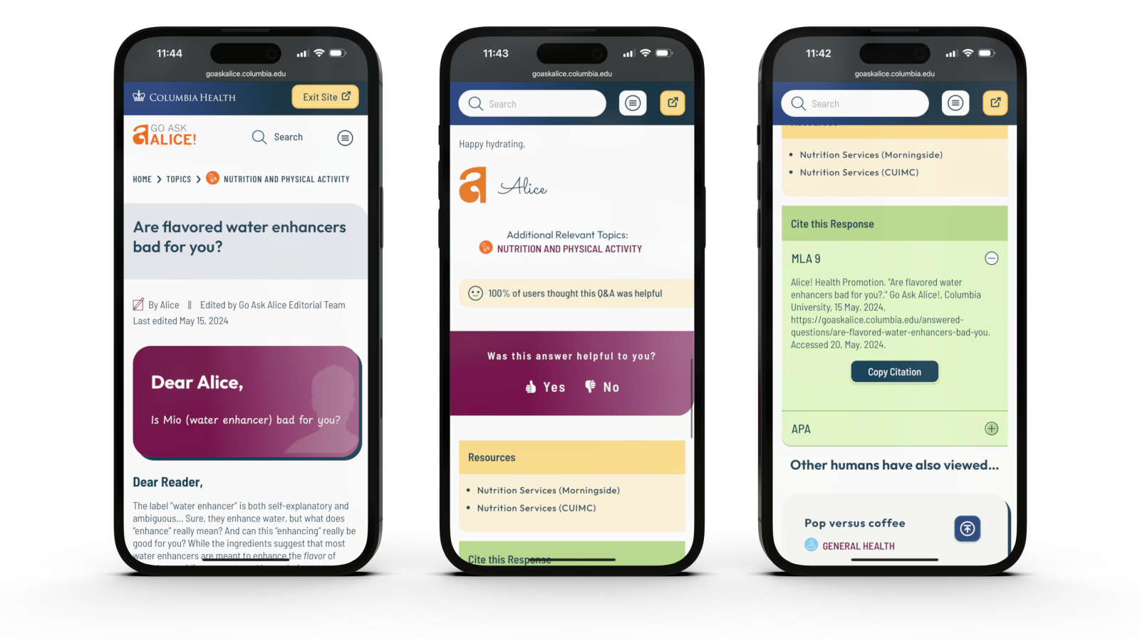
Human responses feel human
With the rise of AI and Google’s AI-generated search results, our design reinforced the humanity and empathy of GAA! by establishing a clear “Dear Alice” with a unique handwritten font and response from the author. When dealing with potentially sensitive and health-threatening answers, an authentic human voice is essential, and one that puts answers into context — is this thing I am asking about “normal”? What are the additional considerations I should know about? And so on. AI might give you one answer, but it won’t contain the context and nuance these anonymous human-generated questions require.
Unique Colors & Illustrations
Blue is strongly associated with Columbia Health and prevented the previous site from standing independently. Our design reduced focus on blue and shifted the site’s primary colors to maroon and yellow. Several other colors create wayfinding paths associated with answer topics. Scrolling the All Topics category page becomes a delightfully random color experience.
All color combinations adhere to WCAG 2.2 guidelines for Level AA, increasing the accessibility of this color-rich site for all visitors.
A new set of illustrations curates a sense of inclusivity better than stock photos could. A wide variety of humans were chosen to represent the diversity of student populations. Little details, like the randomized person in the site’s footer, add a sense of surprise and delight to the entire browsing experience.
Supporting Trust with New Features
Enhancement ideas started to surface during Discovery and continued throughout the process from both teams. Some of our favorites include:
- The editor’s name, the answer’s published date, and its revision date were moved from the bottom of an answer and brought to the top. This information helps establish credibility quickly before reading an entire answer
- A feedback feature was added to individual answers, giving the GAA! team real-time data about the responses but also giving new visitors a greater sense of social proof
- A “Cite this Response” feature makes cutting and pasting an MLA (Modern Language Association) General Format- or Chicago-style academic citation into research papers easy. Since answers are so well-researched, these citations propagate GAA! further into academic culture
Increased User Engagement & Accessibility
Accessibility & Safety with a Quick Exit Button
Go Ask Alice! has many sensitive questions: questions about sexual abuse, suicide, drug use, and topics generally that you may not want someone else to see on your phone. We introduced a Quick Exit feature on each page of the site. When visitors click the button, a new tab is quickly opened, and the site’s browsing history is removed from their device. While this is not a well-known action in the general population, many in unsafe situations know how they work and what “Exit Site” means.
Oomph has written an in-depth article about the quick exit button and has released a Quick Exit Drupal Module to help other teams implement this feature.
Encouraging Question Browsing over Asking New Questions
It may seem counterintuitive, but one of the major workflows we redesigned was asking a question in the first place. The GAA! team has compiled thousands of great answers over the years and frequently updates old answers with new content to keep them current with changes in medical approaches. The small but mighty team didn’t want to answer the same questions over and over again by referring new askers to pre-published answers.
Our solution emphasized search and intentionally made access to the Question form difficult. Visitors are encouraged to search for answers to previously posted questions first. Quite often, they will discover an answer to their questions (and maybe some helpful answers to questions they did not expect). Only if they have searched first will they encounter the “Can’t find your question” call to action, which leads them through the steps of asking a new question.
The Results
The new site feels like a new beginning for the GAA! team. While the site has only recently launched, we look forward to seeing how it impacts key metrics like time on site and return visits. In the meantime, we’re also excited to see how the newly revamped admin experience helps the GAA! content team serve their audience even better than before.
When faced with a sensitive question about mental, nutritional, emotional, or sexual health, college students can continue to Go Ask Alice!
From code to launch
Sites launched within a year
Performance improvement
THE BRIEF
A Fractured System
With a network of websites mired in old, outdated platforms, Rhode Island was already struggling to serve the communication needs of government agencies and their constituents. And then the pandemic hit.
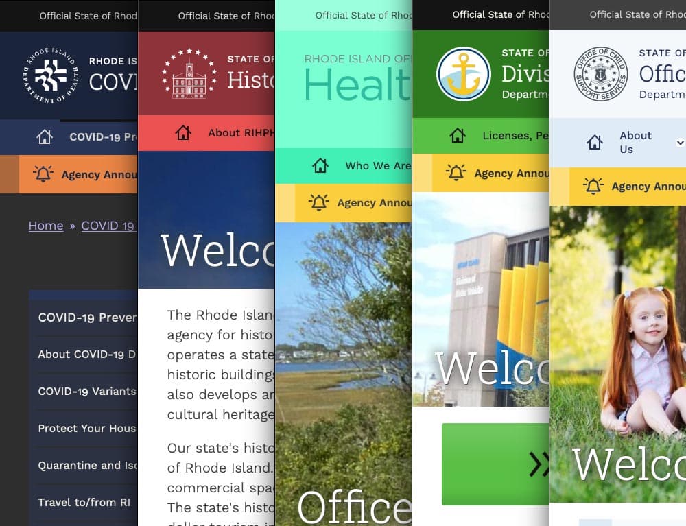
COVID accelerated the demand for better, faster communication and greater efficiency amid the rapidly changing pandemic. It also spotlighted an opportunity to create a new centralized information hub. What the government needed was a single, cohesive design system that would allow departments to quickly publish and manage their own content, leverage a common and accessible design language, and use a central notification system to push shared content across multiple sites.
With timely, coordinated news and notifications plus a visually unified set of websites, a new design system could turn the state’s fragmented digital network into a trusted resource, especially in a time of crisis.
THE APPROACH
Custom Tools Leveraging Site Factory
A key goal was being able to quickly provision sites to new or existing agencies. Using Drupal 9 (and updated to Drupal 10) and Acquia’s Site Factory, we gave the state the ability to stand up a new site in just minutes. Batch commands create the site and add it to necessary syndication services; authors can then log in and start creating their own content.
We also created a set of custom tools for the state agencies, to facilitate content migration and distribution. An asynchronous hub-and-spoke syndication system allows sites to share content in a hierarchical manner (from parent to child sites), while a migration helper scrapes existing sites to ensure content is properly migrated from a database source.
Introducing Quahog: A RI.gov Design System
For organizations needing agility and efficiency, composable technology makes it easier to quickly adapt digital platforms as needs and conditions change. We focused on building a comprehensive, component-based visual design system using a strategy of common typography, predefined color themes and built-in user preferences to reinforce accessibility and inclusivity.
The Purpose of the Design System
The new, bespoke design system had to support four key factors: accessibility, user preferences, variation within a family of themes, and speedy performance.
Multiple color themes
Site authors choose from five color themes, each supporting light and dark mode viewing. Every theme was rigorously tested to conform with WCAG AA (and sometimes AAA), with each theme based on a palette of 27 colors (including grays) and 12 transparent colors.
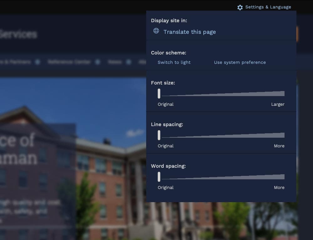
User preferences
Site visitors can toggle between light or dark mode or use their own system preference, along with adjusting font sizes, line height, word spacing, and default language.
Mobile first
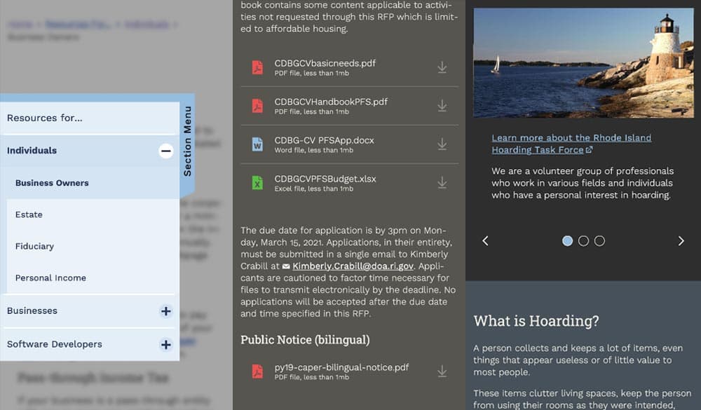
Knowing that many site visitors will be on mobile devices, each design component treats the mobile experience as a first-class counterpart to desktop.
Examples: The section menu sticks to the left side of the view port for easy access within sections; Downloads are clearly labelled with file type and human-readable file sizes in case someone has an unreliable network connection; galleries appear on mobile with any text labels stacked underneath and support swipe gestures, while the desktop version layers text over images and supports keyboard navigation.
High Accessibility
Every design pattern is accessible for screen readers and mobile devices. Color contrast, keyboard navigation, semantic labeling, and alt text enforcement all contribute to a highly accessible site. Extra labels and help text have been added to add context to actions, while also following best practices for use of ARIA attributes.
Performance aware
Each page is given a performance budget, so design components are built as lightly as possible, using the least amount of code and relying on the smallest visual asset file sizes possible.
THE RESULTS
Efficient and Effective Paths to Communication
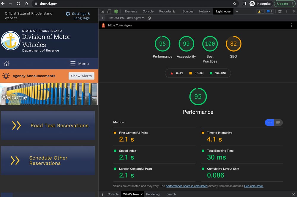
The first sites to launch on the new system, including covid.ri.gov, went live four and a half months after the first line of code was written. A total of 15 new sites were launched within just 8 months, all showing a 3-4x improvement in speed and performance compared with previous versions.
Every site now meets accessibility guidelines when authors adhere to training and best practices, with Lighthouse accessibility and best practice scores consistently above 95%. This means the content is available to a larger, more diverse audience. In addition, a WAF/CDN provider increases content delivery speeds and prevents downtime or slowdowns due to attacks or event-driven traffic spikes.
State agencies have been universally pleased with the new system, especially because it provides authors with an improved framework for content creation. By working with a finite set of tested design patterns, authors can visualize, preview, and deploy timely and consistent content more efficiently and effectively.
We were always impressed with the Oomph team’s breadth of technical knowledge and welcomed their UX expertise, however, what stood out the most to me was the great synergy that our team developed. All team members were committed to a common goal to create an exceptional, citizen-centered resource that would go above and beyond the technical and design expectations of both agencies and residents .
ROBERT MARTIN ETSS Web Services Manager, State of Rhode Island