Revenue Solutions, Inc.
Redefining UX for Government Software With a Scalable, User-Centered Design System

category
Accessibility
Design & UI
Research & Strategy
User Experience
capability
Design Systems
Figma
Information Architecture
Mobile & Responsive
React
User Research
industry
Municipalities & Government
Revenue Solutions Inc’s GOVERNMENT PREMIER® Solutions are a modern, cloud-native SAAS product software suite providing tax-collection solutions for city and state governments. User Interfaces (UI) and User Experience (UX) in this space are typically far behind that of consumer-facing products, but Revenue Solutions Inc (RSI) sought to change that drastically with our help.
The Brief
Simplifying Complexity without Losing Power
The biggest challenge as Oomph acclimated to the tax-collection world was rapidly learning enough about the complex regulations and requirements of municipalities in the industry to provide sound advice and recommendations. We started by examining their systems — the workflow of documenting and planning new product features and adding them to the roadmap, of designing the UX of those features, and of leveraging their in-house design system to build and support those features.
RSI’s main product, GOVERNMENT PREMIER, are highly customizable and configurable. Every single screen has options that would display depending on the authenticated user’s role and privileges and the tenant’s own back-office processes. User stories included many requirements based on permissions and configuration. This added challenges when imagining potential interface solutions that need to accommodate growth in multiple directions.
Oomph’s purposefully used our outside perspective to ask many questions about GOVERNMENT PREMIER’s processes. We took our years of experience designing interfaces for a wide range of consumers and applied them here. In this typically slow-to-evolve space, a user-focused experience coupled with GOVERNMENT PREMIER’s technical expertise would revolutionize tax collection as a friendlier, more intuitive, and highly customizable experience.
Our Approach
Maintaining Consistency in a Rapidly Evolving Product
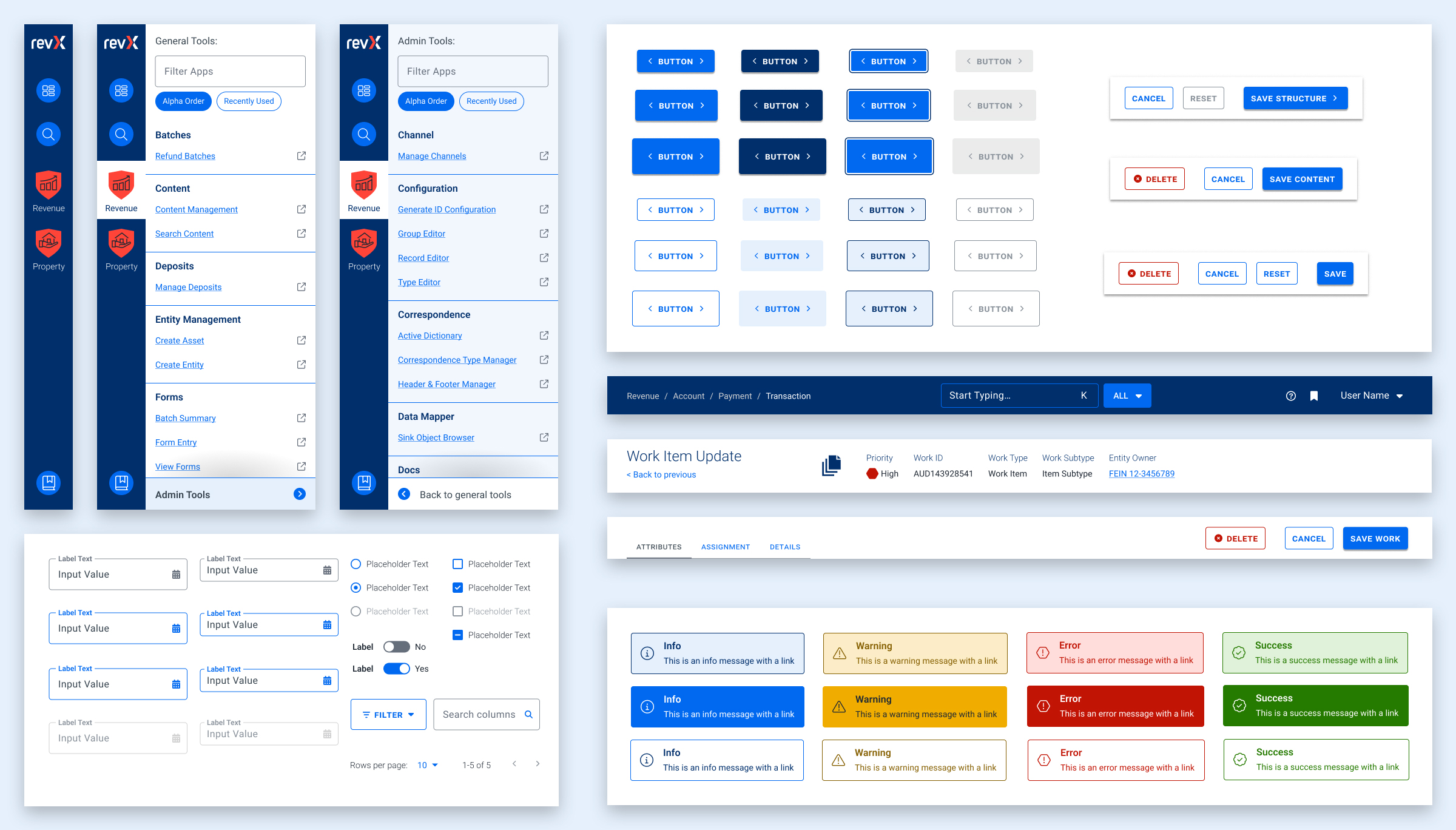
Our findings and recommendations indicated previous UX teams did not create a rulebook that governed their decisions, and so, the system lacked consistency. Quality Assurance reviews would suffer from this lack of governance as well. Therefore, the first thing we did was to establish rules to design by:
- Use Storybook as a source of truth, and expand atomic elements with larger patterns (called molecules in Atomic-design-speak).
- Enforce a global design token system for colors, typography, stateful user feedback, and spacing.
- Use Material UI (MUI) from Google as our foundation. This was a previous decision that was not fully enforced, which led elements to become over-engineered or duplicated. This became known as the “Build on the shoulders of giants” rule.
- Destructive actions (like Delete or Cancel) are placed to the left of creative actions, like “Save” or “Next.”
- Every screen has one primary focus. Complex screens need a focal point for the task and user’s need to feel confident they are using the interface correctly. When long forms are required, break them down into smaller chunks. Users can save their progress and concentrate on smaller groups of tasks. Color should be used to focus users on the most important actions, and to alert them when data errors need to be addressed.
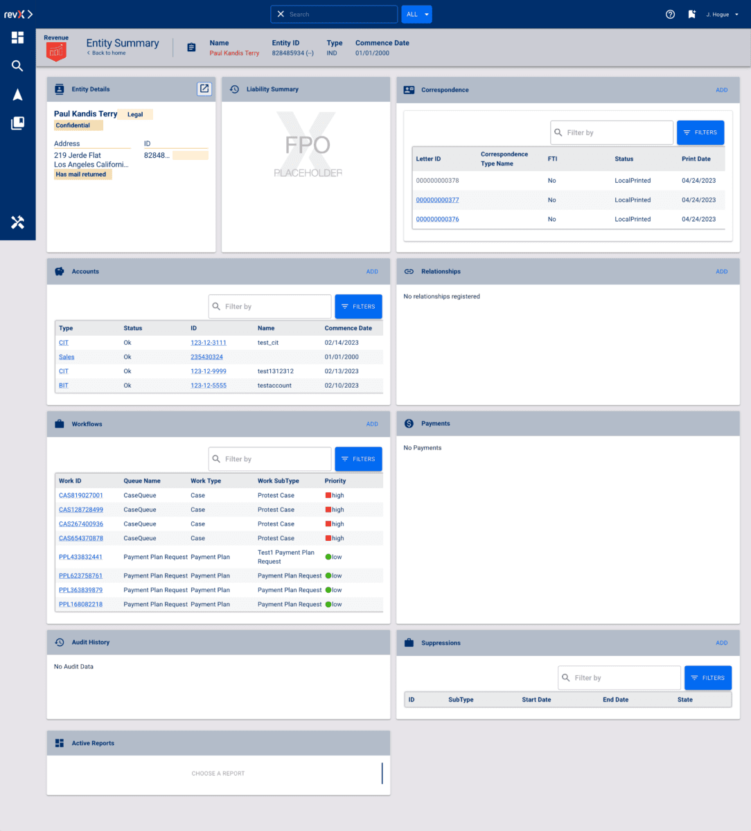
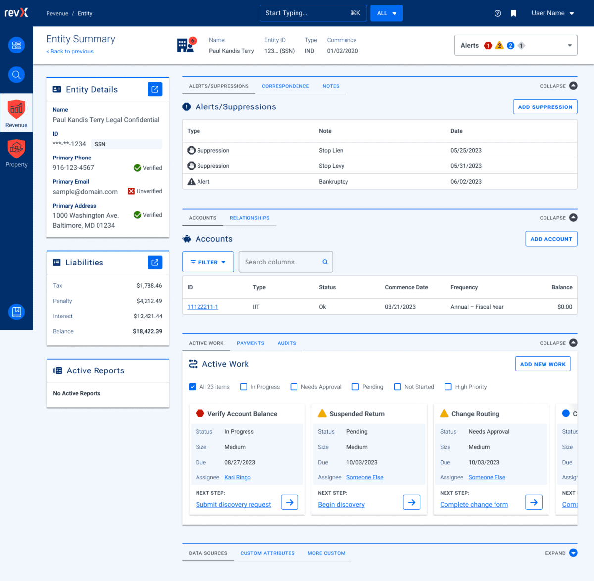
Ultimately, these rules are flexible and have served well as a starting point. Any new screen can adhere to these rules, and when we find cases where these rules are preventing users from completing their tasks or are frequently confusing users, we revisit them to make updates or clarifications. Oomph has continued to consult on new screen design and UX workflows after more than a year of working together.
The Results
Setting a New North Star to Align Our Compasses
To continue to move the product forward without increasing UX and technical debt, the teams needed a well-defined shared understanding for the user experience. Internal teams were moving forward, but not always in the same direction. Within the first month, our teams agreed upon a playbook and then continued to expand it during our engagement. We met twice weekly with product owners across the company and became a sought-after resource when teams were planning new features.
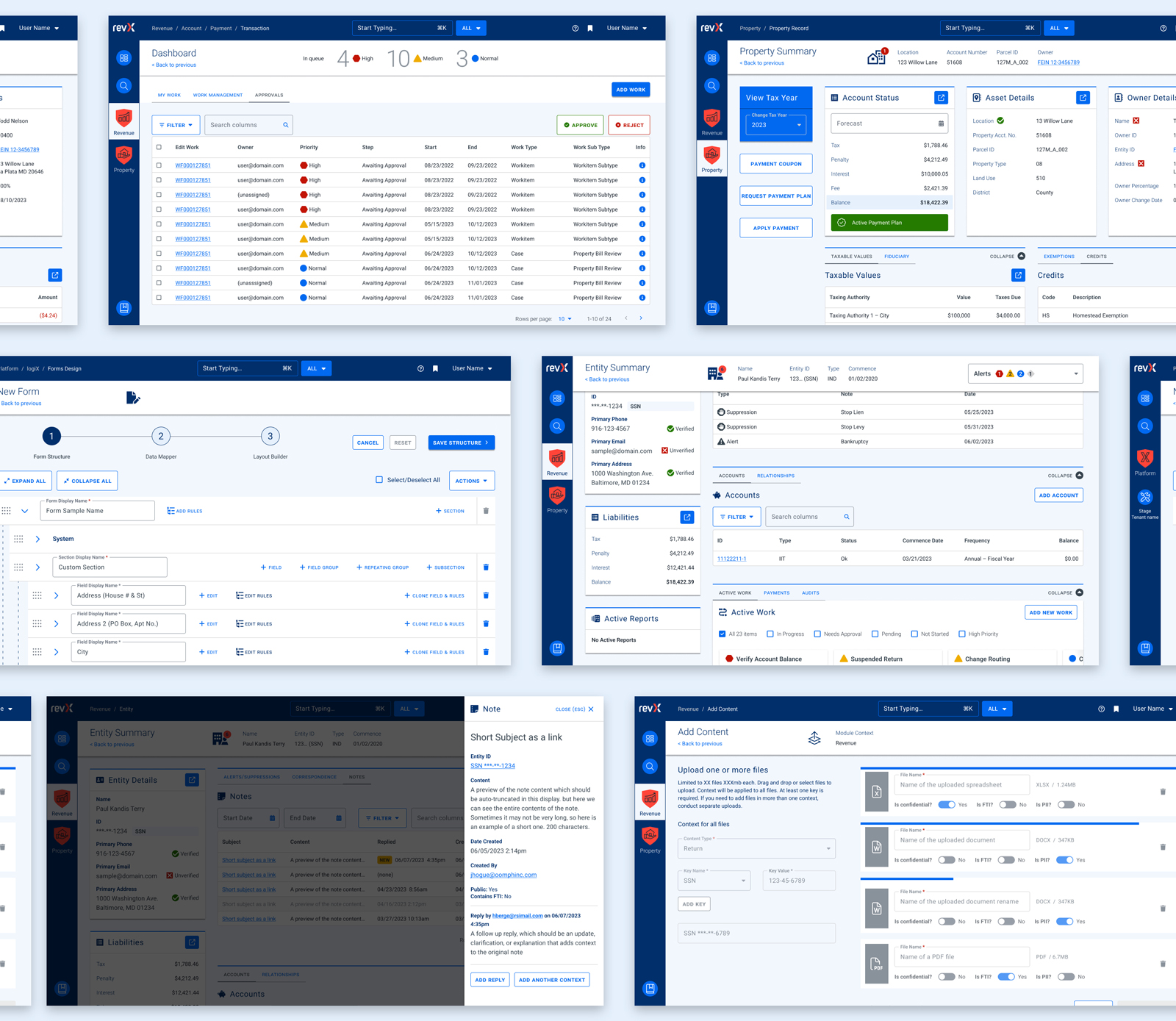
During our time together, we have celebrated these outcomes:
- Oomph consolidated the color palette from 55 colors to just 24 without losing any necessary distinctions. All colors are contrast conformant with WCAG 2.2 Level AA as a baseline.
- Colors, typographic sizes, spacing values, form elements, buttons, icons, and shadows have all been converted to design tokens.
- Figma has been used as the design system record, while Storybook has been strengthened and updated to smartly leverage Material UI. The success of Storybook is largely due to its inclusion as a GOVERNMENT PREMIER project dependency — it has to be used and the latest version is often pinned as the product evolves.
- An internal Design Manager at RSI was established as someone to lead the engineering team and maintain quality oversight as it pertains to the design system.
- Oomph completed designs for 15 features for GOVERNMENT PREMIER, many of which involve designs for three or more screens or modals. Oomph also designed workflows for over a dozen Online Services workflows with a heavier emphasis on mobile-responsive solutions.
As Oomph moves into our second year collaborating with the GOVERNMENT PREMIER teams, we plan to fully investigate user personas on both the admin and taxpayer side of the platform, add more context and governance to the project designs, and provide quality assurance feedback on the working application. We value our partnership with this unique team of experts and look forward to continuing the tax software revolution.
