Out & Equal
Evolving a Digital Identity to Reflect Clarity, Confidence, and Belonging
Visit Site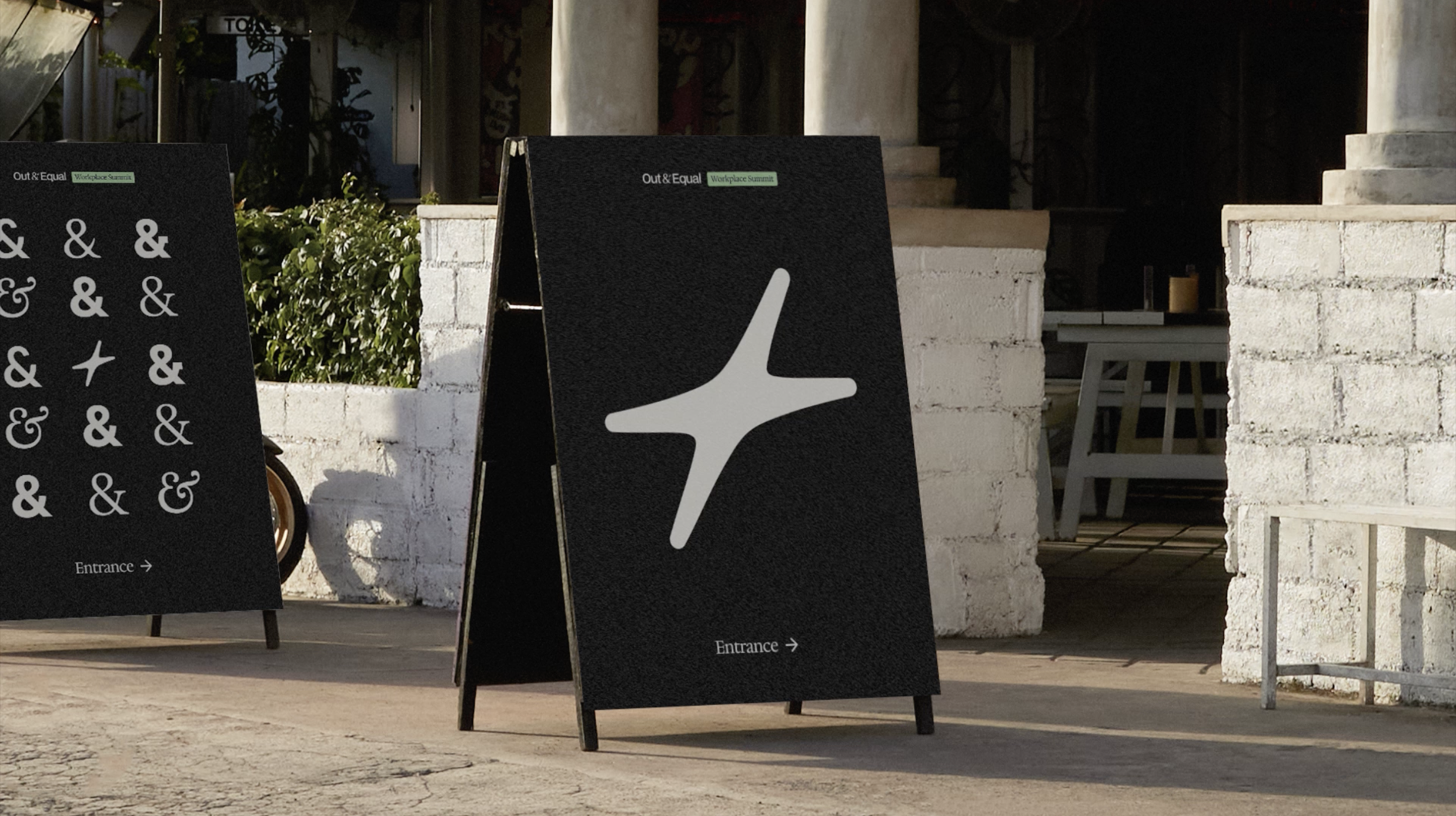
capability
Brand Redesign
Design Systems
category
Brand Strategy
Content Strategy
Design & UI
Research & Strategy
industry
Environmental & Non-profits
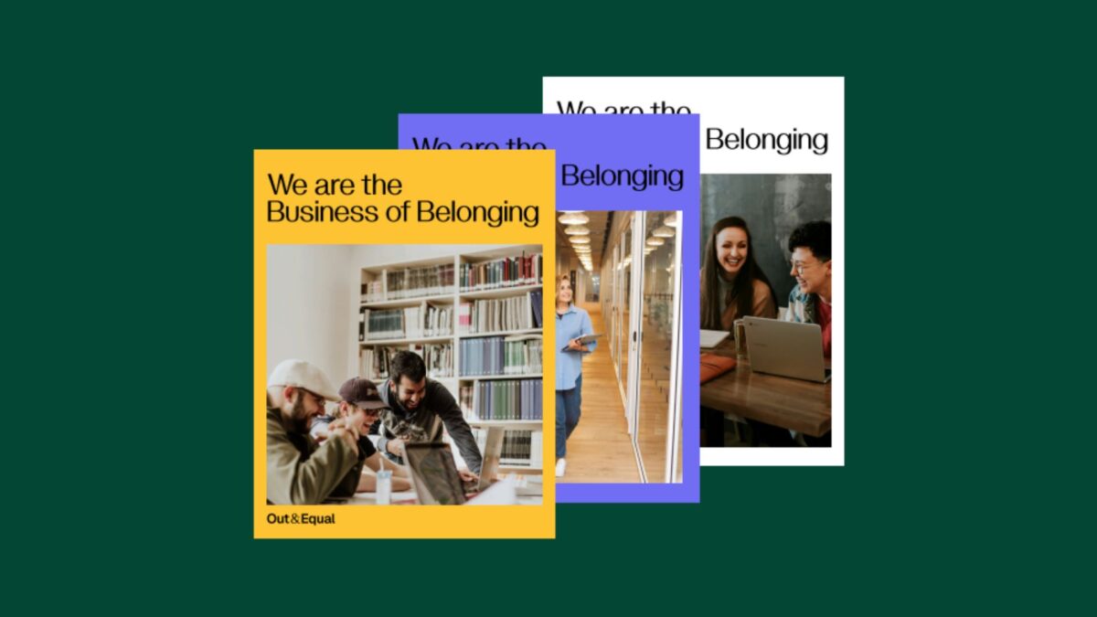
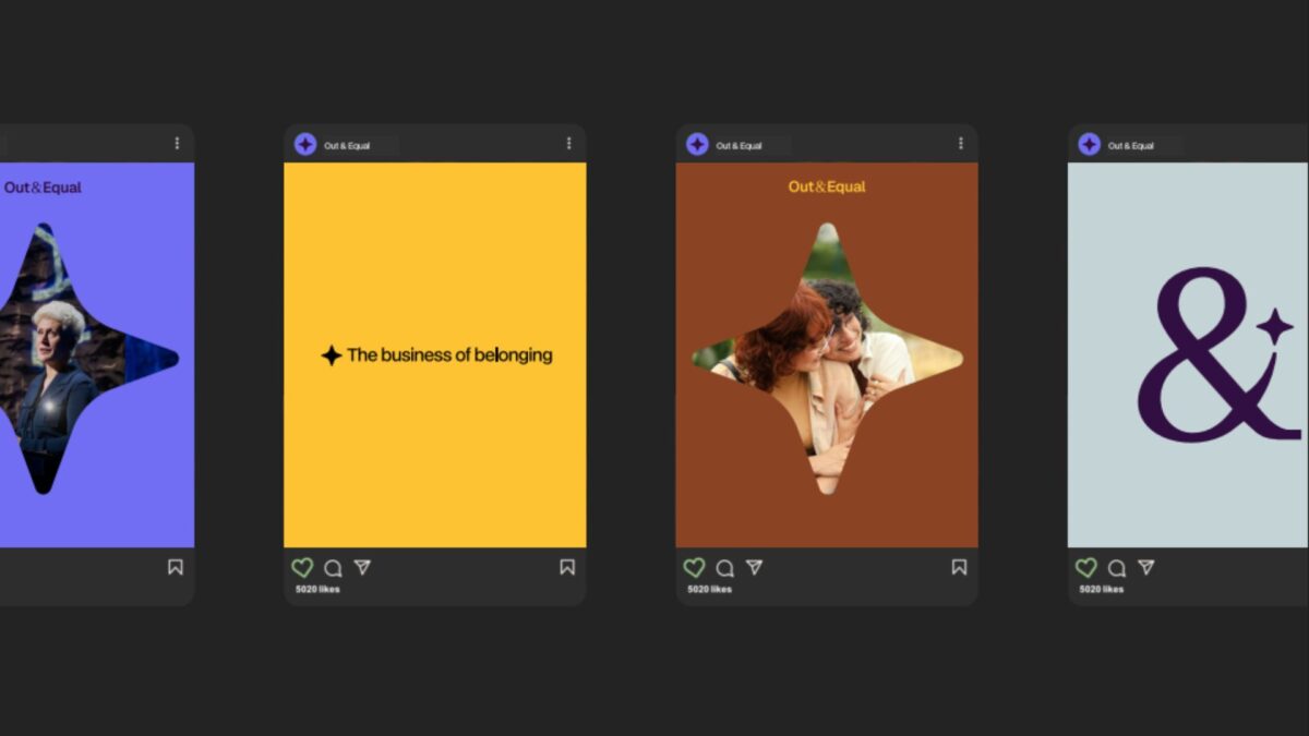
As Out & Equal evolves to meet the needs of a changing corporate landscape, its digital presence needed to reflect its role as a trusted guide for workplace belonging. Oomph introduced a refreshed visual identity and cohesive brand system—refining storytelling, establishing centralized governance through a Brand Site, and creating flexible design foundations that signal clarity, confidence, and care while staying rooted in the organization's LGBTQ+ origins.
Overview
As Out & Equal evolves alongside an ever-changing corporate landscape, its digital presence needs to best reflect who they are and the role they play for their sponsors and community.
This redesign project focused on aligning the brand with its identity as a trusted guide—helping organizations navigate complexity with clarity, confidence, and care, while remaining grounded in its LGBTQ+ roots and its commitment to belonging at work.
The work introduced a refreshed visual identity and a redesigned story-telling experience that clearly communicates purpose, narrative, and direction, providing a foundation for consistent expression across channels.

The approach
The redesign began with a focus on clarity and coherence—ensuring the brand could be expressed consistently while remaining flexible enough to evolve.
Key elements of the refresh included:
- A new color palette that signals confidence and warmth
- A refined logo that improves legibility and adaptability
- Visual storytelling that better reflects the organization’s values and future direction
To support long-term adoption, these changes were documented and operationalized through a centralized Brand Site. The site serves as a single source of truth for brand guidelines and assets, enabling internal teams and partners to apply the new identity with confidence.Brand assets are maintained directly in Figma, allowing designers to update and manage the system without engineering support and ensuring the brand remains current as it evolves.
Why This Matters
For Out & Equal, this redesign wasn’t simply about updating visuals—it was about clearly defining who they are and the role they play for the organizations and communities they serve, especially in a time of heightened scrutiny.
As a trusted guide, Out & Equal helps organizations navigate complexity with clarity, confidence, and care. The redesign ensures this role is immediately understood, while remaining deeply rooted in their LGBTQ+ origins and their long-standing commitment to belonging at work.
By aligning visual identity, storytelling, and governance, the new digital presence reflects Out & Equal’s purpose with intention. It provides internal teams with a clearer foundation to work from and offers external audiences a more confident understanding of where the organization is headed—and how they can move forward together.