United Way
Modernizing Philanthropic Giving Through Financial Technology
view live site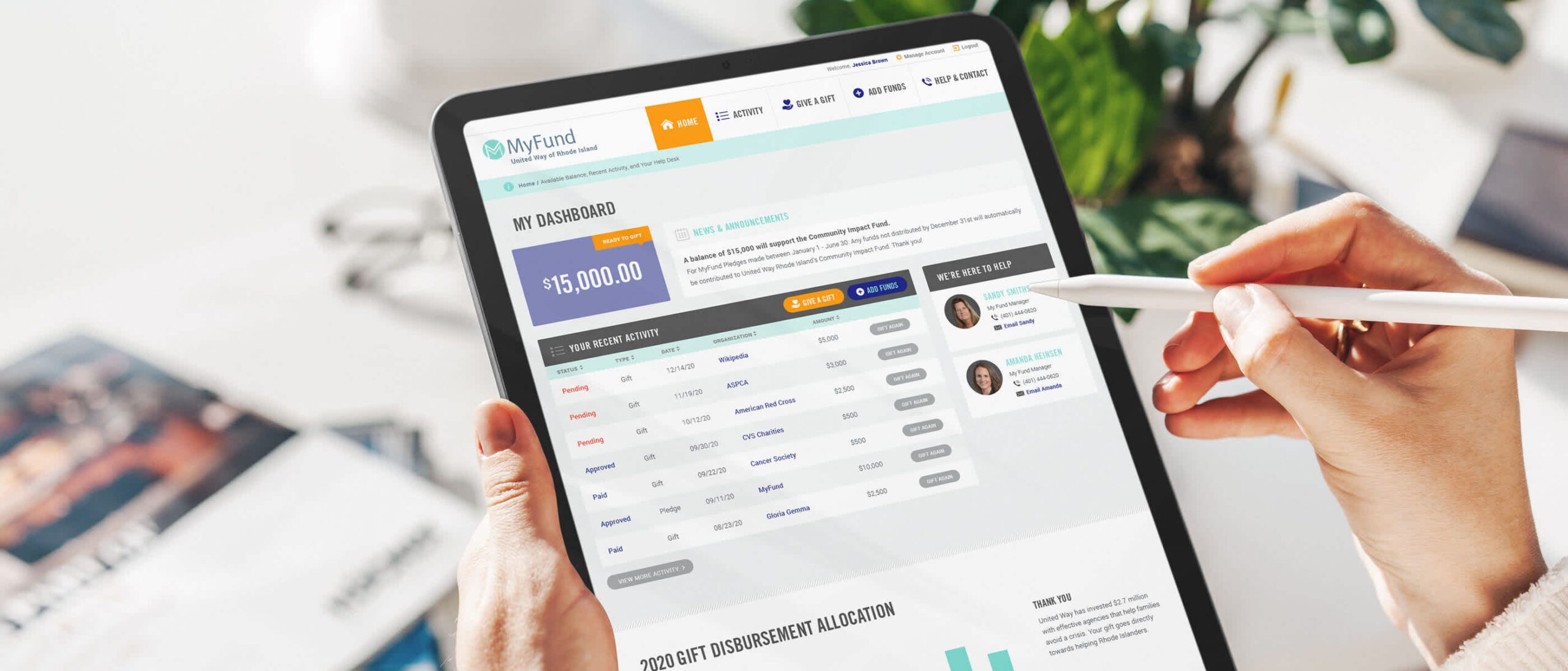
capability
Branding
Design Systems
Mobile & Responsive
User Research
category
Design & UI
Research & Strategy
User Experience
industry
Environmental & Non-profits
UWRI came to Oomph with financial technology in progress — and we took it to the next level. We helped create the name, brand, URL scheme, and user workflow for this philanthropic giving platform. Wireframe testing with real people helped ensure that our UX assumptions were on target. A stand-alone marketing site was also spun up to funnel new users into the online platform.
THE BRIEF
Supporting the Organizations You Love Should Be as Easy as Banking Online
After a successful redesign experience for their main property, United Way Rhode Island (UWRI) came to Oomph with an idea — modernize and rebrand their philanthropic giving platform as a mobile-responsive web app. They already had the software team building back-office integrations, but what they didn’t have was the all-important name, URL and brand.
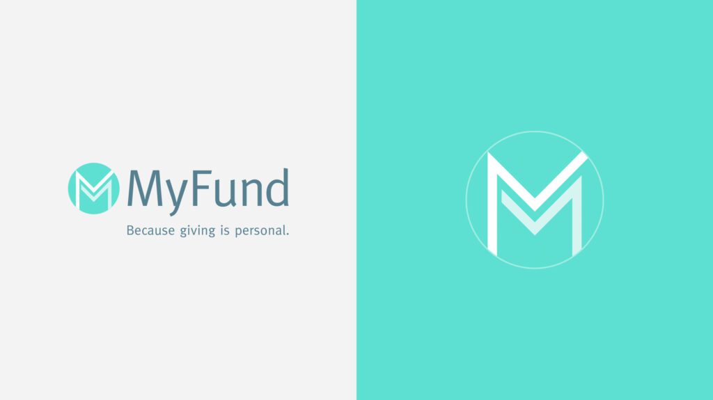
The name set the tone for the platform — easily understood, distinct in the marketplace, and personal. UWRI prides itself on being a personal organization, helping Rhode Islanders who need it most. And giving one’s time, one’s energy, and one’s assets is as personal as it gets. After some research into competitors, the banking space, logo and app naming trends, plus a whiteboard full of other ideas, a clear winner emerged — MyFund.
THE NEW BRAND
A New Sibling for a Recognizable Community Organizer
There is great public trust in UWRI that a new brand should leverage. After visual explorations, we decided to make the connection in a subtle way. The main color scheme borrowed from the recent redesign of UWRI’s website, using a highlight color of light teal as its primary color. The main typeface was Meta, which is the secondary typeface for much of UWRI’s print collateral. These subtle connections helped maintain a family resemblance, while allowing MyFund to stand on its own.
The simple circle with “M” mark abstractly suggests two bodies, side by side and with linked arms. The tagline, “Because Giving is Personal,” was the result of one of those serendipitous moments during an all-hands meeting. Someone floated it to the group and everyone just lit up and exclaimed, “That’s it!” Along the way, the name, the logo, the colors, the typeface, and the tagline just felt right. We all felt it, and it was very exciting to be a part of it.
THE RESULTS
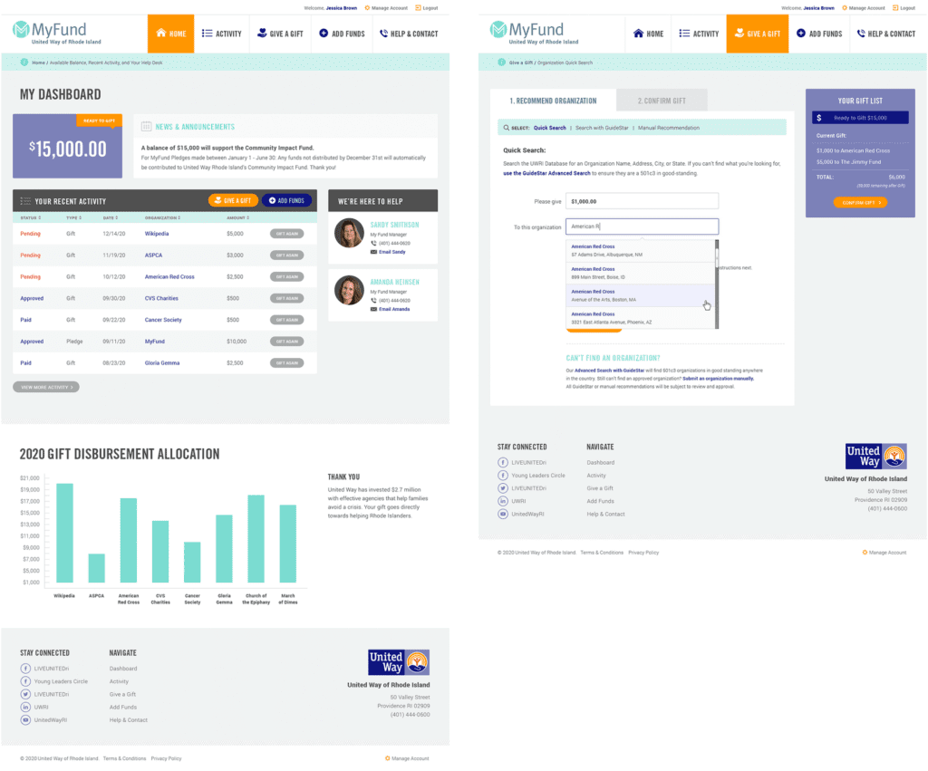
Web-app Interface Design
The interface was designed to follow many conventions of online banking in order to leverage customers’ intuition and expectations, but the result is softer and less like a typical financial institution. The concept of MyFund is similar to online banking in that the customer can make a donation through an online portal from a predetermined balance. The differences are in the workflow; MyFund transactions occur both on and offline. All transactions are guaranteed to go to registered 501c3 organizations in good standing with the IRS, therefore, when a request is made to send money to an organization, the final check is cut by a person. A customer may cancel a transaction before it has been fully processed but the back-office may also cancel it if the organization is not compliant. These nuances needed to be clear in the interface and messaging.
All along the way, the wireframes and designs were verified with real people. At the early stages, wireframes and workflows were tested with online tools and an HTML prototype. This not only gave the development team a live example of a customer’s workflow, but it gave the entire team a clear picture of how the responsive site was going to work.
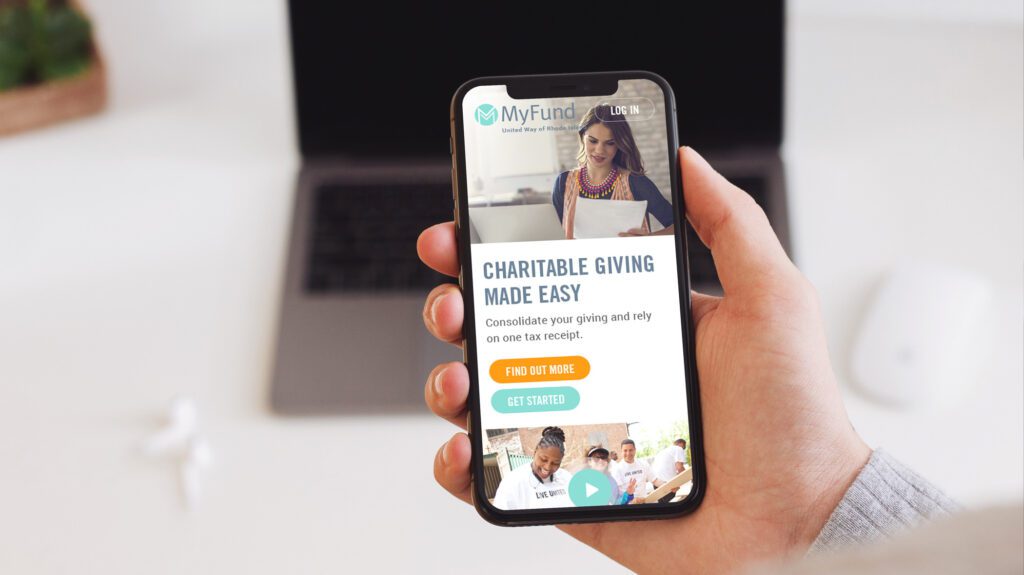
The Marketing Site
While the software was nearing completion and a beta launch, Oomph began work on a marketing site to promote the new web app. We were involved in writing the copy and crafting the story for prospective customers.
We scripted a series of videos to help explain how individual features worked, while one explainer video on the marketing site gave new customers a broad overview of why this platform is such a great idea. A list of primary features as well as some social proof in the form of personal testimonials help frame the platform as more than just a convenience — it can really help you make a difference in your community.
See the marketing site in action at MyFund.org.