
Let me be upfront about something. When I started digging into how universities handle student data, I genuinely expected to find a mixed bag. Some good, some bad, nothing too shocking. What I actually found was a picture far messier than most institutions would like to admit publicly.
The Data Challenge Universities Actually Face
Higher education has a data complexity problem that’s genuinely different in scale from most other sectors. On a single campus, you’ve got admissions offices, finance departments, health centers, libraries, research labs, and dozens of other units, all touching personal data in ways that rarely get coordinated. Then the General Data Protection Regulation arrived in 2018 and essentially said: sort it out, or pay for it.
Some universities sorted it out. Others are still finding their footing, six-plus years on.
That’s not a criticism. It’s a structural reality. A retailer knows roughly what data it holds and why. A university processes the personal information of students, staff, alumni, research participants, visiting scholars, applicants who never enrolled, donors, and contractors, often simultaneously, often under completely different legal bases. The scope is genuinely daunting.
Student records alone are an iceberg. Grades, health accommodations, financial aid history, disciplinary notes, mental health referrals. Each category carries its own sensitivity tier under the regulation, and special category data (health information, for instance) requires explicit protections that can’t be bolted on as an afterthought.
Research is where things get particularly complicated. Academic research can receive a degree of flexibility under GDPR, but that flexibility comes with strings attached: ethics board approval, data minimization obligations, retention schedules that actually get followed. A number of research departments are still operating on informal data management practices, and the gaps show.
What GDPR Actually Requires (Without the Legal Fog)
When people talk about GDPR compliance, they tend to either catastrophize it into a terrifying bureaucratic maze or wave it away as box-ticking. Neither framing is accurate.
At its core, the regulation asks institutions to answer some fairly practical questions. Do you know what personal data you hold? Where it lives? Who can access it? Under what legal basis are you processing it? And how long are you keeping it before you delete it?
That last one trips universities up constantly. Retention schedules exist on paper at most institutions. Whether the systems actually enforce deletion is a different conversation entirely.
Then there’s the rights side of things. Individuals, including students and staff, have the right to access their data, correct inaccuracies, request deletion under certain circumstances, and object to specific types of processing. Universities need workable processes for handling these requests, not a generic email address that someone checks when they get around to it.
Lawful basis matters too. There’s a tendency in higher education to lean on legitimate interests as a catch-all justification for data processing, but that’s not how it works. Processing needs a clearly identified basis, documented before the processing starts, not reverse-engineered after a complaint arrives.
The Consent Problem on Campus
Consent under GDPR must be freely given, specific, informed, and unambiguous. That last word does a lot of work.
The challenge with universities and consent is structural. When a student applies for a place, registers for courses, or uses campus health services, there’s an inherent power imbalance at play. Can a student genuinely refuse to consent to data processing when saying no might affect their access to university services? GDPR is fairly clear that where a meaningful power imbalance exists, consent isn’t a reliable legal basis. Yet plenty of institutions still rely on it for processing activities where a stronger basis would be more appropriate.
Alumni engagement sits in particularly awkward territory. Sending a fundraising appeal to a graduate decades later requires a legitimate legal basis.
“We’ve always done it” isn’t one. Neither is a pre-ticked opt-in buried in a registration form from years ago.
Third-Party Vendors and the Supply Chain Nobody Talks About
Universities run sprawling technology ecosystems. Student information systems, virtual learning environments, library databases, HR platforms, research repositories, catering apps. Behind each of those sits a vendor processing personal data on the institution’s behalf.
Under GDPR, data processors must have written agreements in place with controllers. Those agreements need to specify what data is being processed, for what purpose, under what security standards, and what happens to the data when the contract ends.
In practice, many universities have signed vendor contracts where the data processing terms weren’t exactly scrutinized closely. US-based edtech vendors in particular sometimes arrive with terms drafted for a pre-GDPR world, or for US legal frameworks that don’t map neatly onto European requirements. Negotiating those terms retroactively is tedious and uncomfortable. But it’s necessary.
The Schrems II decision added another layer of complexity. Transferring personal data outside the UK or EU requires additional safeguards: standard contractual clauses, transfer impact assessments, the full apparatus. International research collaborations and cloud services with US data centers both fall squarely into this territory.
Breach Notification: The 72-Hour Clock Nobody Loves
A personal data breach must be reported to the relevant supervisory authority within 72 hours of the institution becoming aware of it. Not three working days. Seventy-two hours, including weekends.
Universities experience breaches. Phishing attacks that compromise staff email accounts. Misconfigured databases. Laptops stolen from cars. The breach itself isn’t always the compliance failure. The failure is not having the detection and reporting processes in place so that when something goes wrong, the right people know quickly and the clock starts accurately.
Data protection officers at universities often describe the internal challenge as a political one. When a breach happens, the instinct from senior leadership is frequently to investigate quietly before involving regulators. That instinct is understandable. It’s also legally risky. The 72-hour requirement isn’t aspirational.
Where Universities Actually Stand
The honest answer is: it depends enormously on the institution.
Some large research universities have invested significantly in data protection infrastructure. Dedicated DPOs with real authority, properly resourced information governance teams, institution-wide data audits, staff training that goes beyond an annual click-through module. These institutions are in a reasonably strong position.
Smaller institutions, often with less resource and less specialist expertise, sometimes find GDPR compliance still sitting largely with whoever got handed the responsibility without the budget or headcount to match it. That’s a resourcing problem as much as a knowledge one.
The UK’s Information Commissioner’s Office has taken enforcement action in higher education. Fines have been issued. Reprimands published. The sector isn’t flying under the radar.
What Good Actually Looks Like
The institutions handling this well tend to share a few common traits. Data protection is genuinely embedded in how decisions get made, not consulted at the end of projects as a compliance sign-off. Their Records of Processing Activities document is actively maintained and regularly reviewed. Staff who handle sensitive data receive meaningful training rather than performative e-learning. And the DPO has a direct line to senior leadership, not a reporting line buried three layers down in legal or IT.
Perhaps most importantly, these institutions treat GDPR compliance as an ongoing discipline rather than a project with a finish line.
The data landscape keeps changing, the technology keeps changing, and the regulation, while stable in text, continues to be interpreted in new ways through enforcement decisions and case law.
Building systems robust enough to adapt to that reality is, ultimately, the whole game.
Bill Gates wrote “Content is King” back in 1996. He was right for about thirty years. On the open web, the winners were the ones who could produce, distribute, and monetize content at scale. That era shaped how we built digital products, how we organized marketing teams, and how we thought about content platforms.
That era is getting a new chapter.
When content becomes context
In the age of agents, content is context. It’s the raw material an AI uses to answer a customer’s question, draft a proposal, summarize a policy, or make a decision on behalf of your business.
If your context is a mess, your agent is a mess. Garbage in, confident-sounding garbage out.
For organizations in healthcare, higher education, and associations (industries where we work every day) that governance layer isn’t a nice-to-have. A health system deploying an agent to answer patient questions needs to know which clinical protocol is current, who approved it, and what the agent is and isn’t allowed to cite. An association managing member benefits can’t afford an agent that surfaces a two-year-old policy document as current guidance. And it’s not just the regulated organizations themselves. The enterprise technology companies that serve these industries, the SaaS platforms, the data providers, the system integrators, face the same challenge: if the content powering their products isn’t structured and governed, the agents built on top of it will inherit every gap. The stakes in regulated industries make the content-as-context problem concrete and urgent, but the same dynamics show up everywhere brand, voice, and accuracy matter: retail pricing, financial disclosures, B2B product specifications, public sector policy. Different risk profiles, same fundamental problem.
This isn’t theoretical. Gartner predicts that 40% of enterprise applications will include task-specific AI agents by the end of 2026, up from less than 5% in 2025. The shift is already moving from prediction to product.
The platforms we work with every day show the movement clearly. The Drupal AI Initiative launched last June and hit $1 million in funding within five months, with the Drupal AI and AI Agents modules reaching production-ready status in October 2025. Acquia built on that foundation with Acquia Source, shipping three AI agents for its Drupal-powered SaaS CMS in December. Contentful open-sourced its MCP server and has been publishing active guidance on agentic content operations. These aren’t experiments. They’re shipping.
Across the category, the pattern is broad. Contentstack launched Agent OS in September 2025 and introduced what it calls the “Context Economy” as its positioning. Kontent.ai shipped what it calls an Agentic CMS the following month. The Model Context Protocol that Anthropic introduced in late 2024 has become the connective tissue, adopted by OpenAI, Google DeepMind, and most of the CMS world.
The platforms are ready. The question is whether your content is.
What agents actually need
An agent doesn’t want a rendered web page. It wants structured, canonical, permissioned, versioned truth. That means:
- Structure so the agent can reason over content rather than scrape through marketing copy
- Versioning so it knows which policy, price, or product spec is current
- Permissions so the agent answering a customer question can’t pull from an internal-only HR doc
- Freshness signals so stale content doesn’t get treated as authoritative
- Governance so legal, brand, and compliance can trust what the agent says on their behalf
That’s the same job a mature content platform has been doing for years, just pointed at a new kind of consumer.
We’ve seen this movie before
Every channel shift exposes whether your content was ever really structured to begin with. CD-ROM, then the web, then mobile, now agents. Each one forces organizations to untangle content from presentation. Headless CMS platforms like Drupal, Contentful, Sanity, and Strapi won that argument. Content as structured data, delivered via API, rendered wherever you need it.
Agents are the most demanding channel yet. They don’t just display your content. They consume it, reason over it, and then take action. If your content is trapped inside HTML blobs or buried in PDFs that no one’s touched since 2021, it’s not ready to be context. Structure is the whole game now.
Where context lives today
Right now, company context is scattered across:
- Websites and headless CMS platforms
- GitHub repos full of markdown
- Confluence, Notion, SharePoint, Google Drive
- Salesforce, HubSpot, and a dozen other systems of record
- PDFs, Slack threads, and somebody’s laptop
Some of these are built for governance. Most aren’t. GitHub is hands-down great for technical content and version control, but marketing and legal teams aren’t opening pull requests to update a pricing page. Notion is excellent for collaboration, weak on structured content models and role-based delivery. Every organization I talk to has some version of this scatter, and it’s about to become a much bigger problem.
The rise of the Context Management System
The old acronym still works. CMS. New job.
Headless CMS platforms have quietly solved about 70% of what agents need. Structured content models. API-first delivery. Editorial workflows. Roles and permissions. Versioning. Audit trails. What they’re adding now is the connective tissue. Acquia is embedding AI agents directly into Drupal-powered workflows through Acquia Source, and Contentful has open-sourced its MCP server to let agents take action on content operations. Across the rest of the category, Sanity launched its Content Agent in January 2026, and Storyblok, Brightspot, and dotCMS have released MCP servers of their own. MCP servers, vector indexing, semantic metadata, agent-optimized delivery endpoints. That’s a much smaller leap than building the whole governance layer from scratch.
The “just throw it all in a vector database” approach has real merit as a retrieval layer. Retrieval is one job. Governance is a different one: who owns canonical truth, who approved the content, when it expires, and who’s allowed to see it. That’s always been the CMS job. It matters more now, not less.
For teams working on Drupal, Contentful, or Acquia Source, this is encouraging. The architectural decisions those platforms made years ago (structured data, granular revisioning, API-first design) turn out to be exactly what AI agents need. Your investment in content architecture is paying off in ways you didn’t plan for. Call it a head start.
What to do about it
If you’re building agentic products, or planning to, the content question is the quiet one that will bite you later. This is the work we’re spending most of our time on with clients right now. A few forward moves:
- Audit where your content actually lives and who owns it. You will be surprised.
- Pick a source of truth for each category of content. Don’t let five systems claim the same ground.
- Get your structured content models right. If your content is trapped inside HTML, it isn’t ready to be context.
- Build the governance layer before you need it. Versioning, permissions, approval workflows. Your legal team will thank you. So will your agent.
- Connect your CMS to your agents via MCP or equivalent. This is how context flows. Do it early.
Content was king when the battle was for attention. Context is king now that the battle is for correctness. Agents are only as good as the material you feed them, and that material has to be managed with the same rigor we’ve applied to code, to data, and yes, to content itself.
The organizations that treat content governance as infrastructure, not a cleanup project, will be the ones whose agents are trustworthy from day one. That window is shorter than it looks.
Summary
Most organizations are treating SEO and Generative Engine Optimization as two separate disciplines – and wasting resources in the process. The real strategic question is not which channel to optimize for but whether your content is built to be reused: extracted, synthesized, and cited by both search algorithms and AI answer engines. We call this Citation-Ready Content Architecture – a unified approach where structure, authority, and specificity make content perform across every discovery surface simultaneously. Organizations in regulated industries face compressed timelines: healthcare queries already trigger AI Overviews on nearly half of all searches.
Sixty percent of Google searches now end without a click. That number is not a forecast – it is a 2025 finding from Bain & Company. Meanwhile, Gartner predicts traditional search volume will drop 25% by the end of 2026 as users migrate to AI-powered answer engines. And here is the statistic that should change how you think about your content strategy: according to Ahrefs, 80% of URLs cited by ChatGPT, Perplexity, and Copilot do not rank in Google’s top 100 results for the original query.
That last data point is the one most SEO-vs.-GEO articles ignore. If the overlap between traditional rankings and AI citations were nearly complete, you could optimize for one and trust the other to follow. It is not. The two discovery channels draw from overlapping but meaningfully different content signals. Treating them as a single problem or two separate problems are both the wrong framing.
Why Is the “SEO vs. GEO” Framing Wrong?
Because it implies a choice between two competing strategies, when what actually matters is a single architectural principle applied across both.
SEO optimizes content for ranking position – getting your page onto a results list a human scans and clicks. GEO – Generative Engine Optimization, a term formalized by researchers at Princeton, Georgia Tech, and IIT Delhi in 2024 – optimizes content so AI systems can retrieve, synthesize, and cite it when generating answers. The Princeton study demonstrated that GEO techniques can boost content visibility in AI-generated responses by up to 40%, and that the most effective strategies vary by domain.
The difference is real. But the industry conversation has overcorrected, treating GEO as something exotic that requires a fundamentally new playbook. As Entrepreneur reported in April 2026, teams are making preventable mistakes by treating GEO “like an exotic new discipline” and shifting budget away from technical SEO into untested “AI visibility hacks.” Research from AirOps found that pages ranking number one in Google were cited by ChatGPT 3.5 times more often than pages outside the top 20.
Strong SEO remains the foundation. GEO is the structural extension that makes your existing authority legible to AI systems. They are not two strategies. They are one architecture.
What Makes Content “Citation-Ready” for Both Search and AI?
Citation-Ready Content Architecture is the practice of structuring content so it simultaneously ranks in traditional search results and gets extracted and cited by AI answer engines. It is not a new technology stack or a separate editorial workflow. It is a design principle: every piece of content your organization publishes should be built for reuse from the start.
Three characteristics define citation-ready content:
Modular structure. AI systems do not read your article top to bottom and decide whether to cite the whole thing. They extract passages – a definition, a statistic, a direct answer to a question. Content with clear headings, self-contained sections, and answer-first paragraphs gives both search engines and AI systems clean material to work with. The Princeton GEO study found that adding statistics to content improved AI visibility by 41%, and citing credible sources improved it by 115% for lower-ranked pages.
Demonstrated authority. Seer Interactive’s September 2025 study of 3,119 queries across 42 organizations found that brands cited in AI Overviews earned 35% more organic clicks and 91% more paid clicks than those not cited. Authority is no longer just a ranking signal – it is the qualification for being included in AI-generated answers at all. Author credentials, original research, linked sources, and topical depth are now dual-purpose investments.
Specificity over generality. AI systems select content that provides extractable facts – numbers, definitions, named frameworks, concrete comparisons. Content that gestures vaguely at a topic (“there are many factors to consider”) gets skipped in favor of content that states something specific and citable. We have written previously about how LLMs index and use content – the same accessibility and structural principles that help AI crawlers parse your pages also make your content more citation-worthy.
Why Are Healthcare and Higher Education Hit Hardest?
Because AI Overviews appear at disproportionately high rates for the query types these industries depend on – and the consequences of being absent or misrepresented are far more serious than lost traffic.
Conductor’s Q1 2026 analysis of 21.9 million searches found that healthcare queries trigger AI Overviews at a rate of 48.75% – nearly double the overall average of 25%. Technology queries trigger at roughly 30%. For healthcare organizations and universities, AI is already mediating nearly half the informational queries that drive patient acquisition and enrollment.
The real-world impact is already measurable. U.S. News reported in March 2026 that nearly 80% of people searching for degree information read Google’s AI Overviews, and many never click through to an institution’s website. The University of Maryland Global Campus responded by using AEO and GEO techniques to revise its degree pages and A/B test FAQ-style content. Johnson County Community College found that while AI-driven traffic represents less than 1% of its website visitors, engagement from that group is 59% above its site-wide average – suggesting AI-referred visitors arrive further along in their decision-making process.
For healthcare, the stakes go beyond enrollment. When AI engines synthesize clinical information, the accuracy of that synthesis depends on the quality and structure of the sources available. Organizations that have not optimized their content for AI citation are not just losing visibility – they are ceding authority over how their expertise gets represented to patients who increasingly trust AI-generated answers.
What Does the HubSpot Collapse Tell Us About This Shift?
That traffic built on loosely related content is structurally fragile in an AI-mediated search environment.
Multiple industry analyses documented an approximately 80% traffic drop across HubSpot’s blog properties as AI Overviews began answering the high-funnel informational queries that had driven HubSpot’s organic growth for over a decade. Pages about “famous sales quotes” and “cover letter examples” had driven enormous traffic but had minimal connection to HubSpot’s core CRM platform. When Google’s algorithm update prioritized content closely tied to a website’s core expertise, and AI Overviews began answering those generic queries directly, the traffic evaporated.
The lesson is not that content marketing failed. It is that content disconnected from your organization’s core authority is exactly the kind of content AI systems will summarize without ever sending a visitor your way. In our GEO optimization Q&A, we outline why organizations should start with their highest-authority content when optimizing for AI visibility rather than trying to cover every possible keyword.
For organizations in regulated industries – where your content is tightly tied to your institutional expertise by design – this is actually an advantage. A hospital publishing evidence-based patient education content is inherently closer to citation-ready than a SaaS company publishing tangentially related blog posts for traffic volume. The structural alignment is already there. What is often missing is the formatting and schema work that makes it extractable.
What Should Content Teams Do First?
Start with what you already have. The gap between SEO-optimized content and citation-ready content is usually structural, not substantive.
1. Audit your top 20 pages for extractability. Read the first paragraph of each section in isolation. Does it directly answer a question someone would ask an AI tool? If not, restructure it. AI systems and Google’s AI Overviews pull from the opening sentences of well-structured sections – bury your answer three paragraphs deep and it will not get cited.
2. Add the schema AI systems actually use. Implement FAQPage, Organization, Article, and author schema across your priority content. BrightEdge found that sites implementing structured data and FAQ blocks saw a 44% increase in AI search citations. Author schema is especially high-impact: websites with author schema are 3x more likely to appear in AI answers.
3. Track AI visibility alongside traditional rankings. Oomph’s GEO Analytics and Reporting service configures tracking in GA4 and Google Search Console to monitor AI bot traffic and AI-generated search impressions that standard analytics miss. At minimum, create referral segments for chat.openai.com, perplexity.ai, and other AI platforms, and watch for the signature pattern of rising impressions with declining clicks – the clearest signal that AI is summarizing your content without sending traffic.
The organizations that will maintain visibility over the next two years are not the ones choosing between SEO and GEO. They are the ones building content that works across both discovery surfaces from the start – structured for extraction, grounded in genuine expertise, and specific enough that AI systems treat it as source material rather than background noise.
That is not a new content strategy. It is the old one, built to the standard the new environment actually requires.
Summary
Most content strategies optimize for one outcome: ranking. Ranking is only half the visibility equation now. Citation-Ready Content Architecture, developed at Oomph, helps organizations build content that performs across traditional search results and AI-generated answers simultaneously. It rests on three principles – modular structure, demonstrated authority, and extractable specificity – and we apply it with clients in healthcare, higher education, and government where being cited accurately is as important as being found.
This crystallized during a client conversation earlier this year. We were looking at their analytics – a major healthcare organization – and the pattern was striking. Impressions were climbing. Rankings were stable. But clicks were dropping steadily, month over month. The content was being surfaced by Google, but patients were getting their answers from AI Overviews without ever visiting the site.
That’s a visibility problem most of us weren’t trained to solve – and it requires a different content architecture.
Gartner predicts traditional search volume will drop 25% by the end of 2026 as users migrate to AI-powered answer engines. Ahrefs found that 80% of URLs cited by ChatGPT, Perplexity, and Copilot don’t rank in Google’s top 100 for the original query. And the Pew Research Center’s study of 68,879 actual Google searches found that only 8% of users clicked a traditional result when an AI Overview appeared, compared to 15% without one – roughly half the click-through rate.
Content that ranks and content that gets cited aren’t always the same – but they can be, if you build for both from the start. That’s Citation-Ready Content Architecture.
What Is Citation-Ready Content Architecture?
Citation-Ready Content Architecture is the practice of structuring digital content so it simultaneously ranks in traditional search engine results and gets extracted, synthesized, and cited by AI answer engines like ChatGPT, Google AI Overviews, and Perplexity. Developed by Oomph as a framework for regulated industries, it combines modular content structure, demonstrated authority signals, and extractable specificity into a unified content design principle – replacing the need to maintain separate SEO and GEO strategies.
The key word in that definition is “simultaneously.” That means content architecturally designed to work across every discovery surface – ranked results, AI summaries, voice assistants, whatever comes next – because the underlying structure supports all of them.
In our work with clients across healthcare, higher education, and government, we’ve found this transition isn’t a massive lift for organizations with strong content fundamentals. The gap between SEO-optimized and citation-ready content is structural, not substantive – it’s about how content is organized, not whether it’s good.
Why Do Organizations Need a New Content Architecture Now?
Information discovery has forked. Content built for only one path leaves visibility on the table.
Two parallel discovery systems now exist. Traditional search ranks your content in a list users scan. AI-powered answer engines synthesize information from multiple sources into a single response – often without the user ever clicking through to your site.
The research is unambiguous. The foundational Princeton GEO study demonstrated that content optimized for generative engines can boost visibility by up to 40% in AI responses. But it also showed that the most effective strategies vary by domain – what works for a law firm doesn’t necessarily work for a children’s hospital. A March 2026 study from researchers at the University of Tokyo found that structural optimization alone – independent of content changes – improved citation rates by 17.3% across six major generative engines.
The most striking finding: research from AirOps found that pages ranking number one in Google were cited by ChatGPT 3.5 times more often than pages outside the top 20. Strong SEO remains the foundation. Citation-ready architecture is what makes that foundation legible to AI systems too.
What Are the Three Principles of Citation-Ready Content?
The framework rests on three principles. Each serves both search engines and AI systems simultaneously – that dual purpose is the point.
Modular structure
AI systems don’t read your article start to finish and decide whether to cite the whole thing. They extract passages – a definition, a data point, a direct answer to a specific question. Content with clear headings, self-contained sections, and answer-first paragraphs gives both search algorithms and AI systems clean material to work with.
We’ve written about how LLMs index and use content – and the takeaway is that the same accessibility principles that help AI crawlers parse your pages also make your content more citation-worthy. Semantic HTML, logical heading hierarchies, and sections that can stand on their own aren’t new concepts. They’re just worth more now than they’ve ever been.
Demonstrated authority
Being cited by AI systems has become a meaningful competitive advantage. BrightEdge found that sites earning citations inside AI Overviews see CTR increases of up to 35% compared to traditional organic rankings alone. Websites with author schema are 3x more likely to appear in AI answers, and sites implementing structured data and FAQ blocks saw a 44% increase in AI search citations.
In practice, demonstrated authority means: Author credentials on every piece. Original data and research when you have it. Linked sources for every claim. Topical depth across related content – not one-off articles, but interconnected clusters that demonstrate sustained expertise.
Authority isn’t just a ranking signal – it’s the entry qualification for AI inclusion.
Extractable specificity
This is the one that separates citation-ready content from content that’s merely well-written. AI systems select content that provides extractable facts – numbers, definitions, named frameworks, concrete comparisons. Content that gestures at a topic (“there are many factors to consider”) gets skipped in favor of content that states something specific and citable.
The Princeton study found that adding statistics to content improved AI visibility by 41%, and citing credible sources improved visibility by 115% for lower-ranked pages. That 115% figure is significant: it means content that isn’t winning the traditional ranking game can still earn AI citations by being specific and well-sourced.
How Does This Apply Differently in Regulated Industries?
For regulated industries, the stakes are higher and the timeline compressed – but the structural fit is actually better.
Conductor’s Q1 2026 analysis of 21.9 million searches found that healthcare queries trigger AI Overviews at a rate of 48.75% – nearly double the overall average. For healthcare organizations and universities, AI is already mediating close to half the informational queries that drive patient acquisition and enrollment.
The structural advantage for regulated industries is real. Organizations in regulated industries – healthcare systems, universities, government agencies – produce content that’s inherently tied to their institutional expertise. A hospital publishing evidence-based patient education content is structurally closer to citation-ready than a SaaS company publishing tangentially related blog posts for keyword volume. The authority is real. The specificity is built in by the nature of the content. What’s typically missing is the formatting and schema work that makes it extractable.
When we optimize content for GEO, the biggest wins often come from restructuring content that already exists – not creating new content from scratch.
What Should You Do First to Make Your Content Citation-Ready?
Start with what you have. The gap is almost always structural, not substantive.
- Audit your top 20 pages for extractability. Read the first paragraph of each section in isolation. Does it directly answer a question someone would ask an AI tool? If it doesn’t, restructure it. AI systems pull from the opening sentences of well-structured sections. Bury your answer three paragraphs in and it won’t get cited.
- Implement the schema that AI systems actually use. FAQPage, Organization, Article, and author schema across your priority content. Author schema is especially high-impact – BrightEdge’s research shows it triples your likelihood of appearing in AI answers.
- Track AI visibility alongside traditional rankings. Oomph’s GEO Analytics and Reporting service configures tracking in GA4 and Google Search Console to monitor AI bot traffic and AI-generated search impressions. At minimum, watch for the pattern of rising impressions with declining clicks – that’s the clearest signal that AI is summarizing your content without sending visitors.
- Build for reuse from the start. Every new piece of content should include at least one standalone definition, one specific data point, and one direct answer to a question your audience would ask an AI tool. Make it easy for AI systems to cite you. That’s the architecture.
In 20 years of building digital experiences, I’ve watched a handful of shifts fundamentally change how content needs to be structured. Mobile was one. Accessibility-first was another. The shift to AI-mediated discovery is the next.
Citation-Ready Content Architecture isn’t a bolt-on to your existing strategy – it’s the design principle that makes your existing strategy work across today’s fragmented discovery environment. Organizations that build for it now will compound that advantage as AI-mediated search grows. Those that wait will be optimizing for a world that has already moved on.
We’re helping clients across healthcare, higher education, and government make this shift. If your analytics show that pattern – impressions climbing, clicks dropping – start here.
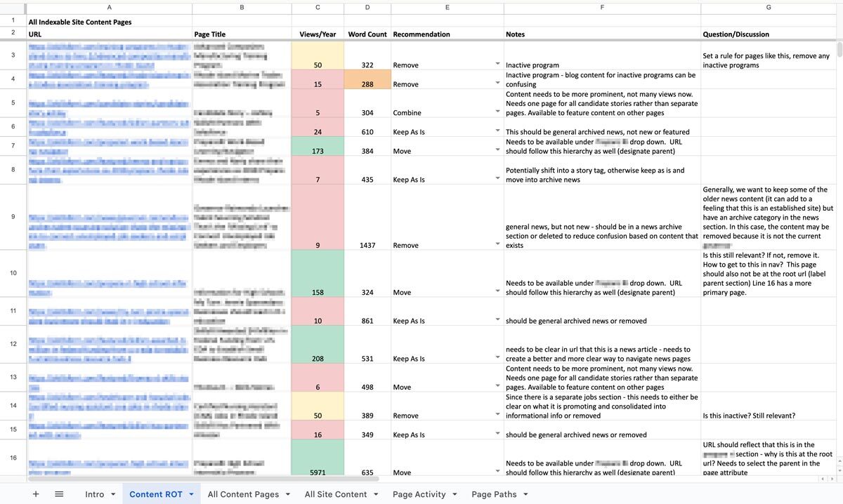
As direct website traffic decreases and LLMs slurp up text from multiple sources to mix together and redistribute to users, it has never been more important to maintain high-quality online content. A ROT analysis — which stands for Redundant, Obsolete, Trivial — is a framework through which we can evaluate site content to improve it for usability, SEO, retrieval, and GEO.
This is a flexible exercise that can apply to a variety of digital properties: web pages, PDFs, intranets, social media pages, call center databases, support knowledgebases… Anywhere that you, as an organization, are speaking to your audience, you have an opportunity to share knowledge, build trust, and solidify your brand image.
Similarly, ROTten content can mislead users, seed doubt, and damage your reputation.
When you use a ROT analysis to kickstart a content clean-up project, you’re ensuring that users and bots alike find only your latest, clearest, most accurate and relevant information. When done properly, it can even set up your team for better content production and management in the future.
How Oomph Approaches Content ROT Analyses
Every ROT analysis looks a little different depending on the industry, content, and what a particular audience needs.
Make a Plan
Before jumping into dashboards and spreadsheets, we start with a conversation. With any project, we need to understand what problems your organization needs to solve: What’s important to you and your users? Where are you struggling? This is our chance to understand the why behind your content.
As we learn more about what you need, we’ll define what ROT is for your organization. What existing policies do you have in place around archiving old or outdated content? If you don’t have policies, what makes sense for you? What key user journeys should the analysis focus on? We’ll answer these questions and more to make sure we’re going into the analysis with a clear vision of what your content should look like so we can see where it’s missing the mark.
Find the ROT
Let’s get into what ROT looks like specifically and where we look for it.
Redundant means the content communicates information in more than one place. This can result in an inefficient information architecture and messy user paths. There are times duplicate content can be helpful, like when separate task flows require some of the same information. That’s why it’s important to know upfront what journeys are most important to prioritize. In these cases, when the same content shows up in multiple places across a website or app, it’s important to have a method for keeping all content in sync. If it’s possible to edit this content in a single place while distributing it across multiple pages, that can be a great method for maintaining a single source of truth.
Redundant might also refer to several articles written over time that deal with the same topics in similar ways. This can result in the newest content on the topic having its SEO/GEO cannibalized by older content on the same topic. Users might more easily find older content when you want them to find the latest.
Obsolete content includes outdated information, language, and (probably broken) links. This type of ROT is especially damaging when it’s related to products, services, or something users are trying to take action on. It’s important to keep in mind your entire digital landscape; Maybe you’ve updated the content on your main service page, but did you remember to update automated emails, support articles, and meta descriptions? What pages aren’t built directly into a user flow but can still be found by Google?
Consider whether it makes sense to archive or unpublish old content, like past news and events. And consider your audience: Is there a reason users would be looking for a historical record, and is that need strong enough to justify keeping it available? If you do choose to keep outdated information published, make sure that it’s clear to users that the content is old and consider providing a link to the latest version.
Trivial content can be harder to define and is highly subjective based on the organization. This might look like “fluff” pieces shared for the sake of SEO or maintaining a publishing schedule, or excessive marketing language that ultimately doesn’t serve you or your users. It might be low-traffic fine print details that apply to a specific audience who typically finds it another way. Maybe it’s content that is related to but outside of your core business function. You’ll need to make some decisions about what is important to you.
To find ROT, we’ll use a variety of collection and measurement tools. SortSite, Screaming Frog, and Siteimprove can locate broken links, orphaned pages, and other SEO issues. Google Analytics, Hotjar, Contentsquare, and MS Clarity can show common user flows and help identify trivial content. Data from these tools can also prioritize the analysis by surfacing what content is most important to users. If a page gets a lot of traffic, we know that it needs to be clear, up-to-date, and accurate. If a page isn’t visited much, we need to ask whether it should be more highly trafficked, consolidated with higher performing content, or removed.
Deliverables and Next Steps
After all this sorting and evaluating, you might be wondering what you’ll tangibly get out of the process. We know content teams are busy, and going through a review can feel like adding more work to the pile. How can we help prioritize meaningful progress here?
The big outcome is one of my personal favorites: a clean, annotated, actionable spreadsheet. Specifically, we’ll put together an audit of your content with links, page titles, notes on whether the content falls into any of the three ROT categories, and what to do about it: keep, modify, combine, or delete. Depending on the tools your content team uses or what you are willing to subscribe to, we might prepare dashboards and reports directly within an app that your team can use as an ongoing progress tracker. Wherever this list of to-do’s lives, we’ll help you prioritize it so you can start ticking off the most crucial items. Depending on what we decided in early scoping agreements, we can even help work through some high-impact issues, like bulk deleting content, suggesting rewrites, and fixing broken links.
We can also set up an ongoing content hygiene plan. While a dedicated content ROT analysis is a great way to identify and work through issues, an effective content plan should prevent ROT as much as possible and reduce the need for a large effort in the future. This might involve setting up policies, practices, and tools to guide future content management. We’ll help you find ways to see the bigger picture when updating or developing new content to make sure all pieces are accounted for. And when ROT falls through the cracks, you’ll have a plan to regularly review site content, setting ahead of time the when, what, and who.
One Piece in the Puzzle of Strong Content
As we continue to inspect the quality of your website and other digital properties, we can use this ROT analysis as a jumping off point. The initial audit may lead directly into a deeper content audit to evaluate URL paths, heading usage, performance metrics, reading level, and more. As we consider reworking, combining, and cutting entire pages, we may find the need to restructure your information architecture and taxonomy structures, in part or in whole, informed by research exercises like card sorts and tree tests. Depending on what we’ve found in the existing content and how it needs to change, we might suggest changes to your content model, adding, modifying, or removing content types and the relationships between them.
A content ROT analysis is a flexible and fruitful way to take a fresh look at your content ecosystem. If you need help getting started, let us know. We’d love to dig in with you!
Compliance with the California Consumer Privacy Act (CCPA), as amended by the California Privacy Rights Act (CPRA), is a mandatory legal obligation for covered businesses, with significantly increased financial and operational risks starting in 2025.
The Critical Risk: Escalating Fines and Penalties
As of January 1, 2025, the California Privacy Protection Agency (CPPA) increased monetary thresholds and fines to align with the Consumer Price Index.
- Civil Penalties: Businesses face up to $2,663 per unintentional violation and up to $7,988 per intentional violation or those involving minors.
- No Total Cap: Because each individual consumer affected by a breach or non-compliant practice can count as a separate violation, total fines for large-scale data incidents can quickly reach millions of dollars.
- Private Right of Action: Consumers can sue for statutory damages between $107 and $799 per incident (or actual damages) following a data breach involving unencrypted personal data.
Key Deadlines and New Requirements (2026–2028)
Regulators have moved from a passive to an active enforcement model, removing the mandatory “grace period” for fixing violations before penalties are applied.
- Mandatory Risk Assessments (Effective Jan 1, 2026): Businesses must conduct risk assessments for “significant risk” processing, such as selling/sharing personal data or using sensitive information.
- Automated Decisionmaking (ADMT): New requirements for technologies that replace human decision-making (e.g., for credit or employment) go into effect, with a compliance deadline of January 1, 2027.
- Mandatory Reporting: Organizations must begin reporting their risk assessment activities to the CPPA by April 1, 2028.
Does This Apply to My Business?
A for-profit business must comply if it does business in California and meets any of the following:
- Gross annual revenue exceeds $26.625 million (updated for 2025).
- Buys, sells, or shares the personal information of 100,000 or more California residents or households.
- Derives 50% or more of its annual revenue from selling or sharing personal data.
Operational Impact of Non-Compliance
Beyond fines, non-compliance can lead to court-ordered injunctions, mandatory regular audits, and the required deletion of valuable data assets. It also risks significant reputational damage and customer churn, as modern consumers increasingly prioritize data security when choosing where to spend.
Is your website ready for California’s evolving privacy standards? Non-compliance isn’t just a legal risk — it’s a business one that can result in millions in fines, mandatory audits, and lasting reputational damage. Our team helps organizations like yours navigate complex regulatory requirements with confidence, so you can focus on what matters most. Talk to our team today.
Museum websites have a unique duality. Unlike many other digital platforms, their primary goal is to encourage visitors to come in person. Their website may feature engaging articles or archives, cool virtual experiences, or highlight important research, but the physical space remains the heart of the museum, home to priceless collections and host to educational tours and programs. While the digital experience is still an essential one, the main objective of most museums is to welcome people through their doors.
That is why the Visit section of a museum website is extra important. Visitors are looking for a single page that clearly outlines everything they need to know: admission prices and hours, what they can and can’t bring, accommodations for nursing mothers or individuals with disabilities, and so much more. Then again, different people need to know different information, so how do you keep everything together without it ballooning out of control? Despite its importance, many museum websites miss the opportunity to provide clear, concise, and accessible visit information in one central place.
A Survey of Website Visit Page Trends for Museums
As part of a recent engagement with the Isabella Stewart Gardner Museum in Boston, we conducted a cohort analysis of other leading museum and cultural organization websites. The study focused on key elements of museum digital platforms including menu design, navigation, and the Prepare for your Visit page. We noticed a theme that several Visit pages on museum websites felt like long, endless scrolls. They’re often filled with lots of information, but a lack of structure or thoughtful design makes them difficult to quickly parse. Through this exercise of finding what is and isn’t working well and questioning why, we walked away with a strong sense of what makes a successful Visit page.
Answer Visitors’ Top Questions
Who, what, where, when, how. When thinking about what information should be contained on the Visit page, these timeless questions are a strategic starting point. Though simple, they are the questions visitors will ask themselves before they arrive at the museum. These questions can take many forms, but for the Visit page, we’re prioritizing logistics:
- Where is the museum located?
- What does it cost?
- When is it open?
- How do I get there?
- Who can come along?
If you are writing the content for this page, start by answering these key questions.
You may have your content set, but you also need to think about how it is prioritized through strategic page design. You should make sure that the most important information (usually hours and admission prices) is at the top of the page and always visible. Don’t hide this information in accordions. And even if your admission is always free, point that out. Visitors want to have that information before they visit your museum, so make sure it is clearly stated. After all, free or reduced pricing is often an enticing reason for many to come!
Despite what you may think, duplicating some key content in different locations across your website can be helpful, as long as it doesn’t get confusing. Just because you have the hours on the homepage, doesn’t mean you should skip it on the Visit page. Presenting the information in different formats can also be helpful. For example, MoMA’s visitor guide provides a contained experience which includes a lot of content that can be found elsewhere on the site, but organized for a particular need (someone coming to the museum now).
Strike the Balance between Enough and Too Much with Accordions
Nearly every Visit page we studied used accordions. When you’re looking at a long list of content, the option of tucking away big chunks of it into a collapsible block sounds pretty appealing. That said, there are ways to do it well and plenty of ways it can go wrong.
Whenever you use an accordion, you’re asking users to click or tap to see more. While requiring an action like this can be a nice way to keep visitors engaged, whatever they see before interacting needs to accurately represent what’s inside. Let’s say a user wants to know whether they can carry a backpack around the museum. A generic heading — like “Guidelines” — doesn’t speak to its contents and the user could easily overlook it. Accordions that are organized well and labeled clearly — more like ”What You Can Bring in the Gallery” — can improve content organization and reduce cognitive load.
Also take care to make sure that the accordions are built in a way that everyone can use them. Test them with a screen reader and navigate through with only your keyboard to make sure they are meeting accessibility standards.
Our recommendation: use accordions, but strategically. Don’t have more than 7 or 8 and never add essential information there that visitors would be looking for at a quick glance.
Guidelines & Policies
One large category that sometimes stumps museum stakeholders is where to put all the guidelines and policies that they often need to state, sometimes even for legal protections. Oftentimes these get lumped into a large accordion or series of accordions on the Visit page, without the key policies pulled out and clearly stated for visitors looking for quick guidance on whether strollers are allowed in the galleries or whether they can take photos with their new fancy camera.
Particularly when you have an extensive list of guidelines, a successful approach can be linking to a larger guidelines and policies page with the information organized by clear headings and categories (which is also good for SEO/GEO), as seen on The Frick’s website. Just remember our earlier point about duplicate content: For essential guidelines, such as bags and security policies, consider also including this information on the main Visit page.
Help Visitors Plan Their Day
Planning your Visit is a big topic and depending on your museum’s particular offerings, might encompass a lot. Preparing ahead can include everything from directions and parking, what’s on view, amenities (dining, shopping), types of tours offered and at what times, etc. The goal for this content is to make it easy for visitors on the day of their visit, both logistically and emotionally. At the end of the day, you want visitors to get the most out of their time at the museum. Assess what is considered essential information that should be included on the main Visit page, but also what might warrant getting its own subpage. This is where in-page linking can be your best friend.
- Setting Expectations — Setting the right expectations is especially important when a museum provides an experience that deviates from the norm. For the Isabella Stewart Gardner Museum, for instance, they do not have wall labels for every object on display and instead rely on audio and room guides accessible via QR codes throughout the Museum. In their use case, making sure visitors know to bring headphones and have a fully charged phone is key information that may not be applicable to other cultural organizations, nor assumed by visitors before arriving.
- Themed Itineraries — One trend we uncovered in our cohort analysis is the rise of themed itineraries, giving visitors different ways to experience a museum. When creating these, consider what makes your museum unique and the audience groups you want to serve. For example, if you have a garden, you might design a “Garden Lover” itinerary that highlights outdoor spaces alongside artworks featuring landscapes or floral still lifes. Or, if time is the constraint, you could offer a one-hour itinerary like MoMA’s thoughtfully titled “The Unmissables.”
- Keeping the Delightful — In our conversations with museum stakeholders and throughout our cohort analysis, we learned that it’s common for most visitors to arrive at a museum having done very little, if any, preparation about the type of experience they will receive. Though every museum operates a little differently and has its own quirks, people come thinking they know what to expect based on past experiences. The resulting surprise can be anywhere from delightful to disorienting. Balancing the element of surprise with the right amount of logistical information for expectation setting can be a challenge, but hopefully a fun one to think through.
Prioritize an Easy Mobile Experience
Visitors often state that they want to “disconnect” while at a museum. They might be happy to pull out their phone for a photo, but otherwise want to spend their time and energy on the physical space around them. We truly love that for them, but also know that the website can, at times, meaningfully enhance the visitor experience. When thinking about what types of content should be considered from a mobile-first perspective, these come to mind:
- Maps — Include key features like restrooms and elevators. Enable common gestures like pinch-to-zoom and panning. Bonus points if the map is interactive, for example letting the user tap on a gallery to see what’s in it.
- Audio Guides — Provide basic controls, including play/pause, skip forward and backward (e.g. 15 seconds), and speed control. Let users access the transcript for greater accessibility.
- Artwork Information — This is especially important in the instance, like at the Gardner, where wall labels are not displayed in-situ and visitors are encouraged to access these via their phone in the galleries. They’ve addressed the need with digital Room Guides.
Ultimately, any content that is meant to be accessed while at the museum — member login and event schedule, for example — needs to be optimized for mobile. It’s especially important for this content to be easy to use and navigable on a small screen. We don’t want visitors to get lost in their phones or frustrated and ultimately give up. It needs to be intuitive to be a smooth piece of the whole experience.
Building a Successful Visit Page for Museums
Similar to building a successful navigation for a museum website, the first task of any organization looking to refresh their Visit page is to put yourself in the shoes of your visitors. Come up with a few key user journeys for various audiences. What would a family with small children need to know before coming to the museum? How about a person who requires a wheelchair or someone with low vision? What information would a student be searching the Visit page for?
Beyond walking through the experience first-hand yourself, it helps to get an outside perspective. If you have the means to talk to visitors while they’re on-site, that can lead to some fascinating insights on their in-gallery experience. However, know that you’ll most likely encounter a positive bias in their responses. Not only are they enjoying a day at the museum, but it can be tough to give critical feedback to someone standing right in front of them.
To counter that bias, gather feedback from additional sources: pop-up or email surveys, controlled usability testing, and website analytics. All of that data together can help give you the building blocks to ensure your visit page strikes the balance between being engaging and informative. By prioritizing clarity, accessibility, and thoughtful design, museums can ensure that visitors arrive knowledgeably at ease and excited to explore.
A well-crafted Visit page is more than just a logistics hub, it’s the digital admissions desk of your museum.
When done right, it reduces friction, answers essential questions, and sets the stage for a memorable in-person experience. Ultimately, the Visit page isn’t just about driving attendance, it’s about shaping the visitor’s journey from the very first click to the moment they step through your doors.
Learn more about building a successful Visit page in a Case Study of our 2025 Re-Architecture project for the Isabella Stewart Gardner Museum.
Generative Engine Optimization (GEO) is making organizations scramble — our clients have been asking “Are we ready for the new ways LLMs crawl, index, and return content to users? Does our site support evolving GEO best practices? What can we do to boost results and citations?”
Large language models (LLMs) and the services that power AI summaries don’t “think” like humans but they do perform similar actions. They seek content, split it into memorable chunks, and rank the chunks for trust and accuracy. If pages use semantic HTML, include facts and cite sources, and include structured metadata, AI crawlers and retrieval systems will find, store, and reproduce content accurately. That improves your chance of being cited correctly in AI overviews.
While GEO has disrupted the way people use search engines, the fundamentals of SEO and digital accessibility continue to be strong indicators of content performance in LLM search results. Making content understandable, usable, and memorable for humans also has benefits for LLMs and GEO.
How LLM systems (and AI-driven overviews) get their facts
Understanding how LLMs crawl, process, and retrieve web content helps us understand why semantic structure and accessibility best practices have a positive effect. When an AI system generates an answer that cites the web, several distinct back-end steps usually happen:
- Crawling — Bots visit URLs and download page content. Some crawlers execute javascript like a browser (Googlebot) while others prefer raw HTML and limit their rendering.
- Chunking — Large documents are split into small, logical “chunks” of paragraphs, sections, or other units. These chunks are the pieces that are later retrieved for an answer. How a page’s content is structured with headings, paragraphs, and lists determines the likely chunk boundaries for storage.
- Vectorization — Each chunk is then converted into a numeric vector that captures its semantic meaning. These embeddings live in a vector database and enable systems to find chunks quickly. The quality of the vector depends on the clarity of the chunk’s text.
- Indexing — Systems will store additional metadata (URL, title, headings, metadata) to filter and rank results. Structured data like schema metadata is especially valuable.
- Retrieval — A user asks a question or performs a search and the system retrieves the most semantically similar chunks via a vector search. It re-ranks those chunks using metadata and other signals and then composes its answer while citing sources (sometimes).
The Case for Human-Accessible Content
There are many more reasons why digital accessibility is simply the right thing to do. It turns out that in addition to boosting SEO, accessibility best practices help LLMs crawl, chunk, store, and retrieve content more accurately.
During retrieval, small errors like missing text, ambiguous links, or poor heading order can fail to expose the best chunks. Let’s dive into how this can happen and what common accessibility pitfalls contribute to the confusion.
For Content Teams — Authors, Writers, Editors
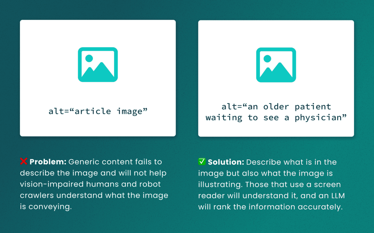
Lack of descriptive “alt” text
While some LLMs can employ machine-vision techniques to “see” images as a human would, descriptive alt text verifies what they are seeing and the context in which the image is relevant. The same best practices for describing images for people will help LLMs accurately understand the content.
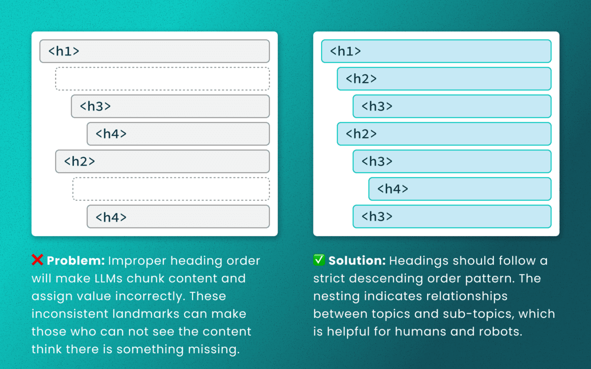
Out-of-order heading structures
Similar to semantic HTML, headings provide a clear outline of a page. Machines (and screen readers!) use heading structure to understand hierarchy and context. When a heading level skips from an <h2> to an <h4>, an LLM may fail to determine the proper relationship between content chunks. During retrieval, the model’s understanding is dictated by the flawed structure, not the content’s intrinsic importance. (Source: research thesis PDF, “Investigating Large Language Models ability to evaluate heading-related accessibility barriers”)
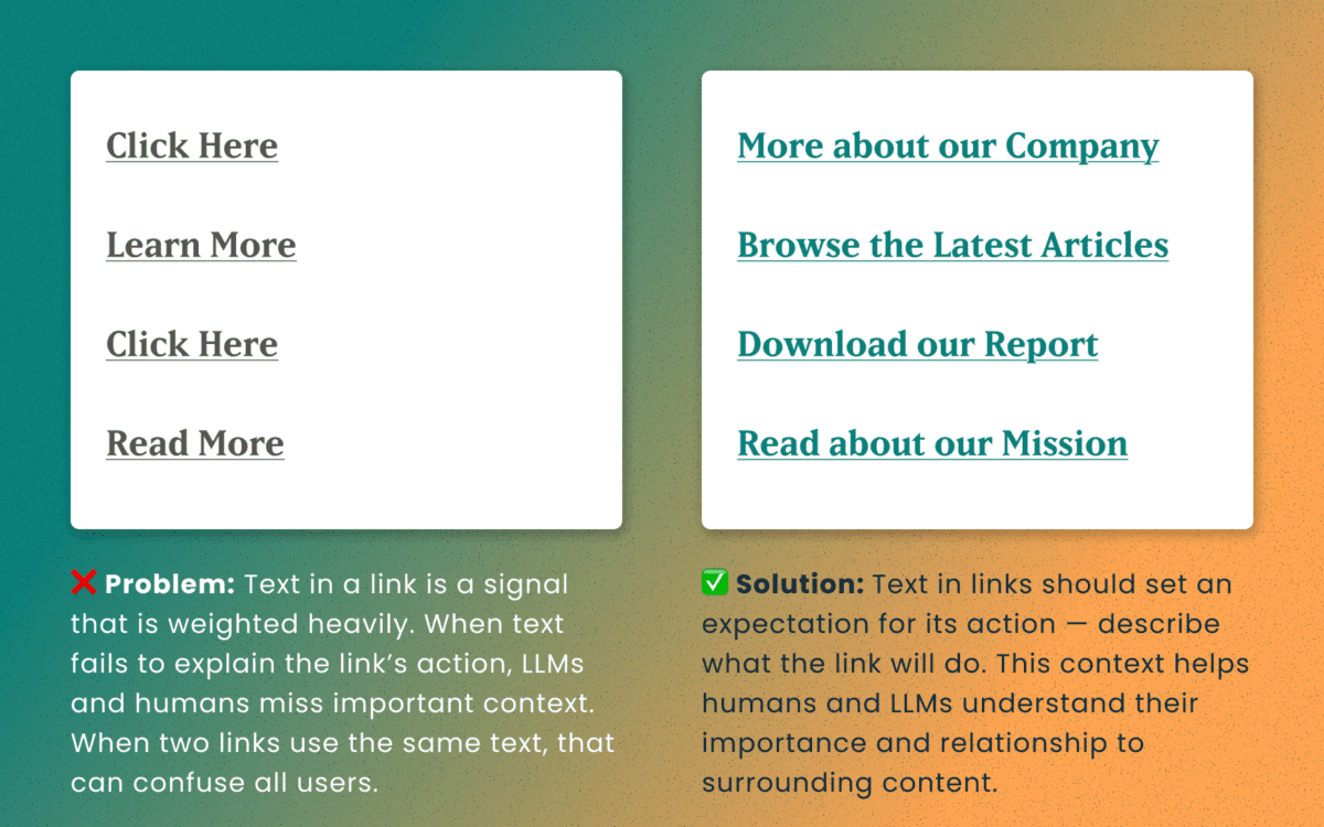
Descriptive and unique links
All of the accessibility barriers surrounding poor link practices affect how LLMs evaluate their importance. Link text is a short textual signal that is vectorized to make proper retrieval possible. Vague link text like “Click here” or “Learn More” does not provide valuable signals. In fact, the same “Learn More” text multiple times on a page can dilute the signals for the URLs they point to.
Using the same link text for more than one destination URLs creates a knowledge conflict. Like people, an LLM is subject to “anchoring bias,” which means it is likely to overweight the first link it processes and underweight or ignore the second, since they both have the same text signal.
Example of the duplicate link problem: <a href=“[URL-A]”>Duplicate Link Text</a>, and then later in the same article, <a href=“[URL-B]”>Duplicate Link Text</a>. Conversely, when the same URL is used more than once on a page, the same link text should be repeated exactly.
Logical order and readable content
Simple, direct sentences (one fact per sentence) produce cleaner embeddings for LLM retrieval. Human accessibility best practices of plain language and clear structure are the same practices that improve chunking and indexing for LLMs
For Technical Teams — IT, Developers, Engineers
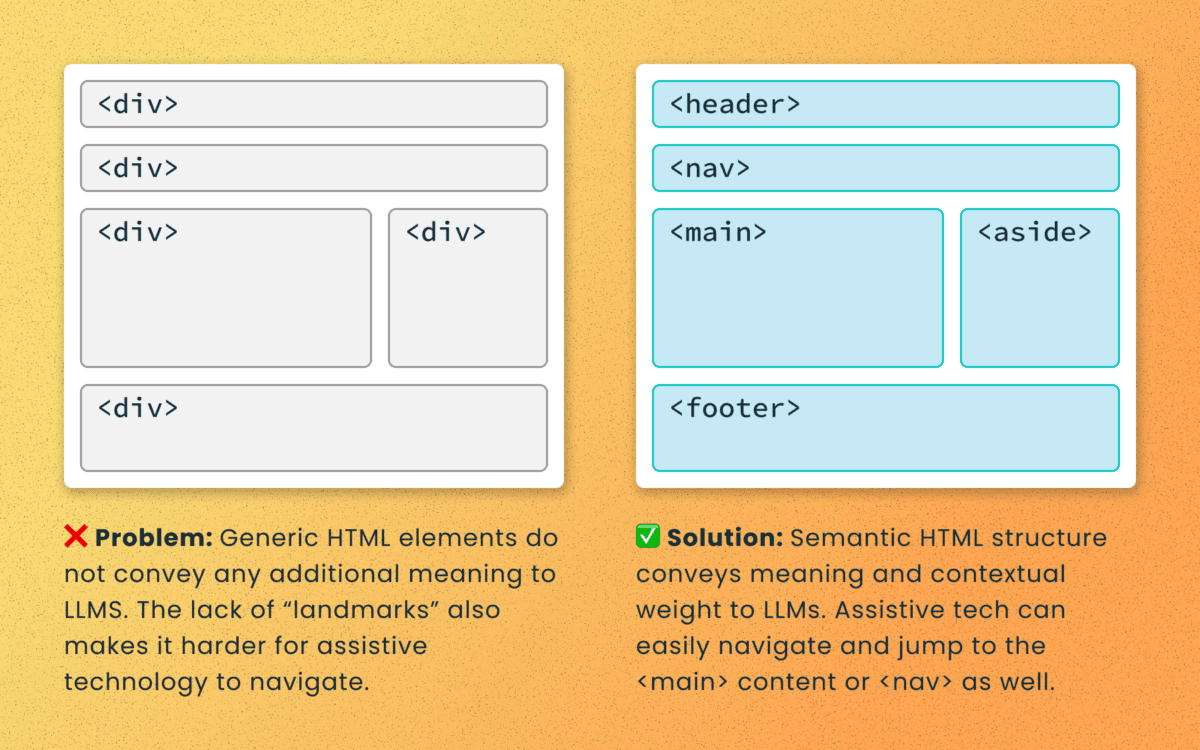
Poorly structured semantic HTML
Semantic elements (<article>, <nav>, <main>, <h1>, etc.) add context and suggest relative ranking weight. They make content boundaries explicit, which helps retrieval systems isolate your content from less important elements like ad slots or lists of related articles.
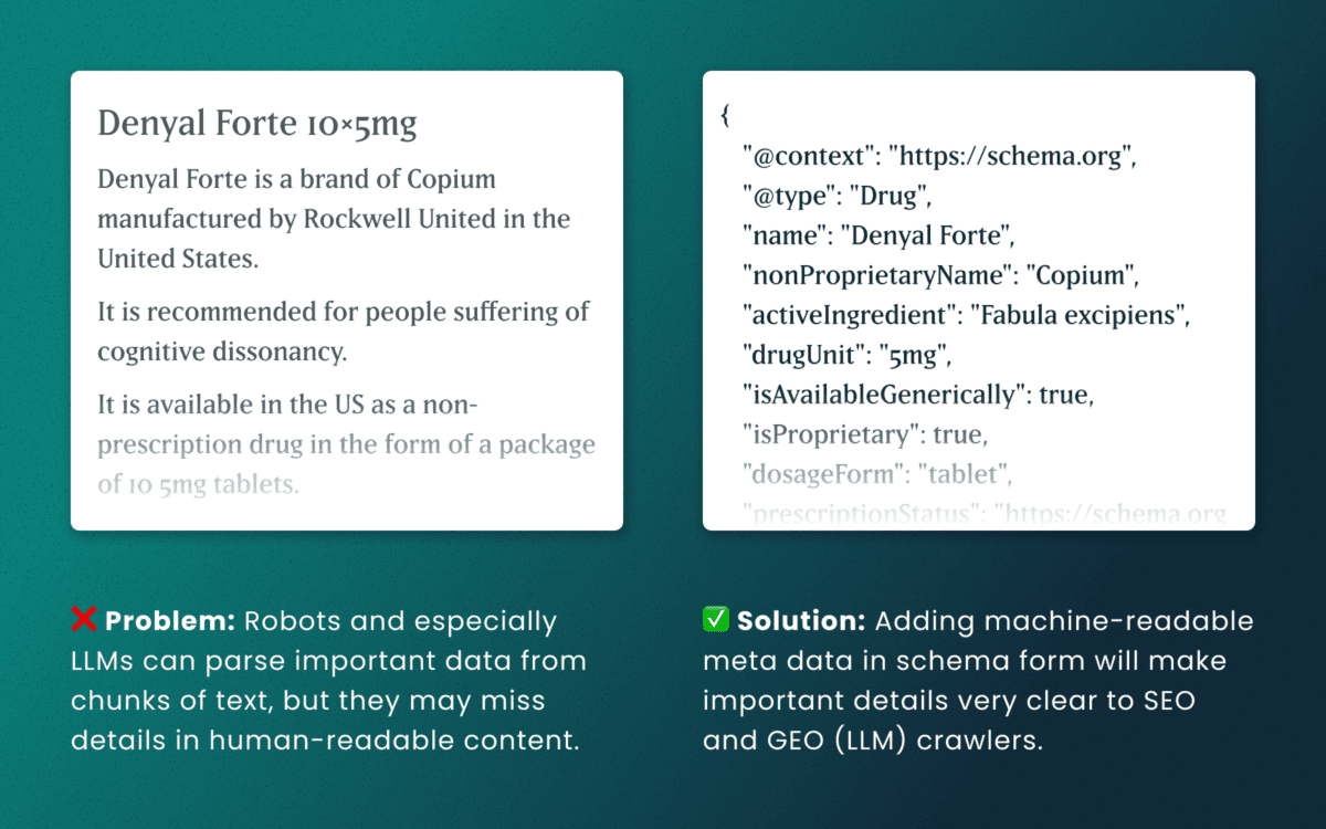
Lack of schema
This is technical and under the hood of your human-readable content. Machines love additional context and structured schema data is how facts are declared in code — product names, prices, event dates, authors, etc. Search engines have used schema for rich results and LLMs are no different. Right now, server-rendered schema data will guarantee the widest visibility, as not all crawlers execute client-side Javascript completely.
How to make accessibility even more actionable
The work of digital accessibility is often pushed to the bottom of the priority list. But once again, there are additional ways to frame this work as high value. While this work is beneficial for SEO, our recent research uncovers that it continues to be impactful in the new and evolving world of GEO.
If you need to frame an argument to those that control the investments of time and money, some talking points are:
- Accurate brand representation — Poor accessibility hides facts from LLMs. When customers ask an AI assistant for “best X for Y,” your content may not be shown — or worse, misrepresented. Fixing accessibility reduces brand risk and increases content authority.
- Engagement boost — Improvements that increase accurate citations and AI visibility can increase referral traffic, feature mentions, and lead quality. In a landscape where AI Answers are reducing click-through rates, keeping the traffic you have on your site for longer and building brand trust becomes vital.
- Increased exposure — Digital inclusion makes your content widely accessible to machines and the machines that assist humans. Think about a search engine as another human-assistive device, just like a keyboard or screen reader.
- Multi-pronged benefits — Accessibility improvement improves traditional SEO, can benefit mobile performance, and reduces the risks associated with accessibility compliance policies.
Staying steady in the storm
Let’s be clear — this summer was a “generative AI search freak out.” Content teams have scrambled to get smart about LLM-powered search quickly while search providers rolled out new tools and updates weekly. It’s been a tough ride in a rough sea of constant change.
To counter all that, know that the fundamentals are still strong. If your team has been using accessibility as a measure for content effectiveness and SEO discoverability, don’t stop now. If you haven’t yet started, this is one more reason to apply these principles tomorrow.
If you continue to have questions within this rapidly evolving landscape, talk to us about your questions around SEO, GEO, content strategy, and accessibility conformance. Ask about our training and documentation available for content teams.
Additional Reading
- AHREFs.com: Is SEO Dead? Real Data vs. Internet Hysteria
- SearchEngineJournal.com: How LLMs Interpret Content: How To Structure Information For AI Search
- InclusionHub.com: SEO and Web Accessibility: What You Need to Know (from 2020, but still relevant)
As a digital services firm partnering with destination marketing organizations (DMOs) across the U.S., we’re helping teams navigate what’s already proving to be a volatile 2025—especially on the inbound side. Analysis from the World Travel & Tourism Council (WTTC) projects a stark reality: the U.S. economy will miss out on $12.5 billion in international visitor spending this year, with inbound spend expected to dip to just under $169B, down from $181B in 2024. Even more concerning, the U.S. is the only country among 184 economies in WTTC’s study forecast to see an inbound-spend decline this year.
While external market forces remain largely beyond control, we’ve identified three strategic areas where DMOs can focus their digital platforms to weather this storm and continue demonstrating measurable demand to their partners.
1. Transform Content Into Action-Driving Experiences
Why this strategic shift matters now
With inbound spend shrinking by $12.5B and key feeder markets weakening, undecided travelers need clarity and confidence to choose your destination. Content that reduces uncertainty and highlights immediate value converts better than generic inspiration.
Strategic implementation approach
Activate “Go Now” signals. Combine always-on inspiration with time-sensitive reasons to visit—shoulder-season value, midweek deals, cooling weather breaks—strategically mapped to the soft periods your analytics reveal.
Elevate discovery through intelligent architecture. Curate SEO-optimized content hubs organized by Themes (outdoors, arts, culinary) and Moments (fall colors, winter lights). Implement structured data (FAQ, Event, Attraction) with strategic internal linking architecture so travelers find relevant options fast.
Deploy micro-itineraries for immediate conversion. Design 24–48-hour “micro-itins” featuring embedded maps, transit and parking guidance, and seamless handoffs to bookable partners. Partnering with platforms like MindTrip reduces content team effort while accelerating output—a strategy that’s proven particularly effective for our DMO clients facing resource constraints.
Authority-driven event content optimization. Event pages generate the highest intent traffic. Enhance them with rich media, last-minute planning resources, and strategic “if sold-out, try this” alternatives.
Transparent value communication. Feature free experiences prominently, implement intuitive budget filters, and deploy “Best Time to Visit” calendars comparing crowds and pricing by week and month. Transparency builds trust, and trust drives conversion.
2. Build Your Competitive Moat Through Data-Driven Audience Cultivation
Your first-party data represents your most defensible competitive advantage. As platform targeting becomes increasingly constrained and inbound spending softens, DMOs that build and activate their own audience will capture attention far more efficiently than those relying solely on paid channels.
Strategic audience development
Implement high-intent capture everywhere. Deploy contextual email and SMS prompts across high-intent templates—events, itineraries, trip planners, partner directories. Offer valuable micro-perks like exclusive maps and early event alerts.
Master progressive profiling. Collect visitor preferences—season, interests, party type, origin market—over multiple touchpoints rather than overwhelming users with lengthy initial forms.
Create actionable audience segments. Develop cohorts around 2025’s market realities: last-minute planners, shoulder-season seekers, road-trippers, value hunters, family weekenders, and meetings planners.
Future-proof attribution systems. Combine GA4 with server-side tagging and standardized UTM schemas for every partner handoff. Track outbound clicks, partner session quality, itinerary saves and usage, offer redemptions, and newsletter-driven sessions. This comprehensive approach ensures you maintain visibility into conversion paths as third-party cookies disappear.
Deploy trend-driven editorial strategy. Develop weekly dashboards blending organic query trends, on-site search terms, partner click-through rates, and feeder-market signals. When interest dips in one market, pivot homepage modules and paid social toward value and itinerary content targeting more resilient markets.
3. Transform Partner Relationships Through Measurable Value Delivery
In a softening inbound environment where domestic spending carries approximately 90% of the economic load, your partners need two critical elements: qualified attention and proof of conversion. Your website should function as the region’s premier meta-directory and conversion engine.
Experience optimization strategies
Enable one-click handoffs with context preservation. Pass user filters—dates, neighborhoods, price ranges—directly into partner sites and booking engines while preserving state if travelers return.
Deploy persistent trip planning tools. Allow users to save places and generate shareable itineraries with intelligent handoffs: “Book these two hotels,” “Reserve rentals,” “Get festival passes.”
Create compelling partner storefronts. Develop rich partner profiles featuring availability widgets, authentic reviews, social proof, and clear calls-to-action.
Implement strategic co-op modules. Design paid placements that provide value rather than feeling like advertisements: “Local Favorites” carousels, sponsor highlights, seasonal deal tiles—rotated by audience cohort and season. This generates additional revenue while maintaining user experience quality.
Establish closed-loop reporting systems. Standardize UTM tracking, monitor outbound events, and where permitted, implement partner pixels and offer codes to report assisted conversions by category and campaign. Partners need proof of ROI, and data-driven reporting builds stronger, more profitable relationships.
How Oomph Can Accelerate Your Success
If you’re experiencing softer international interest, shorter booking windows, or declining partner satisfaction, you’re facing the same challenges as DMOs nationwide. The organizations pulling ahead aren’t waiting for market recovery—they’re strengthening their digital platforms through strategic content optimization, systematic audience cultivation, and demonstrable partner value creation.
Our proven methodology transforms these challenges into competitive advantages.
We’ll conduct a comprehensive audit of your digital platform against these three strategic pillars, quantify immediate optimization opportunities, and provide your partners with what they need most: qualified, measurable demand. The market headwinds are real, but the right strategic approach can help you maintain resilience and emerge stronger when conditions improve. Let’s navigate these challenges together.
When you’re responsible for your organization’s digital presence, it’s natural to focus on what’s visible: the design, the content, the user experience. But beneath every modern website lies a complex ecosystem of technologies, integrations, and workflows that can either accelerate your team’s success or create hidden friction that slows everything down.
That’s where a technical audit becomes invaluable. It’s not just a diagnostic tool—it’s a strategic opportunity to understand the foundation of your platform and make informed decisions about your digital future.
It’s Like a Home Inspection for Your Website
Think about buying a house. You walk through focusing on the big picture—does the kitchen work for your family? Is there enough space? But a good home inspector looks deeper, checking the foundation, examining the electrical system, and spotting that small leak under the bathroom sink that could become a major problem later.
A technical audit takes the same comprehensive approach to your digital platform. We examine not just what’s working today, but what might impact your team’s ability to execute tomorrow. The goal isn’t to find problems for the sake of finding them—it’s to give you the complete picture you need to plan strategically.
Creating Shared Understanding Across Your Entire Team
One of the most powerful outcomes of a technical audit is alignment. Whether you’re managing internal developers, partnering with an agency, or preparing to issue an RFP, having a clear baseline allows everyone to ask better questions and make more accurate decisions.
A strategic technical audit delivers:
Proactive Problem-Solving: Surface technical issues before they become roadblocks to important campaigns or launches.
Performance Optimization: Identify specific improvements that will measurably enhance user experience and conversion rates.
Workflow Enhancement: Reveal friction points that slow down content updates, campaign launches, or day-to-day management tasks.
Vendor Enablement: Provide partners and potential vendors with the context they need to scope work accurately and ask intelligent questions.
Strategic Planning: Create a foundation for long-term digital strategy decisions, from infrastructure investments to editorial tooling.
The organizations we work with often tell us that a technical audit helped them transition from reactive maintenance to proactive digital platform management—a shift that pays dividends across every initiative.
What We Typically Discover
While every platform is unique, certain patterns emerge across industries and organization types. Technical audits frequently reveal:
Security and Maintenance Opportunities: Outdated software, plugins requiring updates, or access configurations that can be strengthened with minimal effort. This often includes ensuring accessibility compliance meets current standards.
Performance Enhancements: Specific optimizations in areas like image compression, caching strategies, or database queries that directly impact user experience. Modern audits also examine search visibility and performance optimization.
Scalability Considerations: Code or architectural decisions that work fine today but could limit growth or flexibility as your needs evolve. This includes evaluating search infrastructure and international expansion capabilities.
Process Improvements: Gaps in version control, deployment workflows, or change management that create unnecessary risk or slow down development cycles.
Editorial Workflow Optimization: Content management processes that feel cumbersome or inconsistent, often because they evolved organically rather than being designed strategically. For global organizations, this includes reviewing translation and localization systems.
Many of these findings aren’t urgent fixes—they’re strategic insights that become incredibly valuable when you’re planning a redesign, launching a major campaign, or evaluating new partnerships.
When a Technical Audit Delivers Maximum Value
You don’t need to wait for problems to emerge. Technical audits are particularly valuable when:
Taking Over Digital Responsibility: You’ve inherited a platform and need a comprehensive understanding of what you’re working with and where the opportunities lie.
Planning Major Initiatives: Before investing in a redesign, platform migration, or significant feature development, understanding your current foundation prevents costly surprises.
Preparing for Vendor Selection: Whether you’re issuing an RFP or evaluating agencies, giving potential partners accurate technical context leads to better proposals and more realistic timelines.
Developing Digital Strategy: When you’re ready to create a roadmap for digital growth, grounding decisions in technical reality rather than assumptions leads to better outcomes. This is especially important when considering AI integration or generative engine optimization strategies.
Our Approach to Technical Audits
We design our audits to build clarity and confidence, not overwhelm you with technical jargon. Rather than simply delivering a report, we walk through findings with your team, prioritize recommendations based on your specific goals, and translate technical insights into actionable business language you can share with stakeholders.
Our methodology goes beyond code analysis. We examine how your platform supports your current workflows, aligns with your organizational objectives, and positions you for future growth. This combination of technical depth and strategic perspective ensures you get insights that drive real business outcomes.
The audit process focuses on partnership, not judgment.
We’re not looking for flaws to criticize—we’re identifying opportunities to help you and your partners make smarter decisions. The result is visibility into the hidden layers of your digital platform and a foundation for more strategic planning, better technology investments, and sustainable long-term success.
Ready to understand what’s really happening under the hood of your digital platform? Let’s talk about how a technical audit could support your goals and strengthen your team’s ability to execute on your digital vision.
If your Drupal site relies on Acquia Search leveraging Solr, you’re likely facing a migration from Acquia Search to SearchStax. We’ve guided numerous organizations through this transition and want to share our proven approach to help you navigate this change successfully.
Before diving into the migration process, this transition presents an excellent opportunity to reassess your search strategy entirely. While Solr remains a powerful and robust solution, the search landscape has evolved significantly with innovative alternatives now available. For organizations considering broader platform transitions, this moment offers strategic value beyond search improvements. Modern React-based solutions can deliver dramatically faster user experiences. Our recent work with ONS demonstrates this potential—by replacing their Solr solution with Algolia Instant Search, we helped them achieve a 40% improvement in search response times while creating a more intuitive experience for their members.
Why the Move to SearchStax?
Acquia announced earlier this year that they’re sunsetting their Acquia Search offering in 2026, positioning SearchStax as the recommended migration path through their new partnership. This transition offers enhanced search capabilities and more direct control over your search environment through SearchStax’s comprehensive dashboard, providing visibility into Solr server performance, data analysis tools, search preview functionality, and advanced configuration options.
The architectural similarity ensures a seamless end-user experience—Solr remains the foundation, requiring no front-end changes for this migration path while delivering improved administrative control.
Our Proven Migration Framework
Through multiple successful migrations, we’ve developed a structured approach that minimizes risk and ensures smooth transitions. Here’s our step-by-step framework:
Phase 1: Foundation Setup
- Secure access to the SearchStax dashboard for complete environment management
- Install the SearchStax modules, including the critical “Solr to SearchStax Site Search Migration” module
- Configure and commit your basic settings to establish the foundation
Phase 2: Testing and Validation
- Deploy changes to DEV or STAGE environments for comprehensive testing
- Validate search functionality, performance, and user experience
- Identify and resolve any configuration issues before production deployment
Phase 3: Production Implementation
- Push validated changes to production environment
- Execute core migration steps including server migration (Drupal’s SearchStax authentication automatically generates endpoint and token configurations), index migration to transfer existing search indexes, and view switching to activate SearchStax indexes across your site
Phase 4: Configuration Management
- Implement configuration overrides and ignores to ensure environment-specific settings
- Secure sensitive data while maintaining dedicated SearchStax server settings per environment
- Export SearchStax indexes and updated views from production to feature branch
- Commit and deploy changes in your next release cycle
Phase 5: Transition Management
- Maintain Acquia search indexes temporarily for rollback capability
- Monitor performance and user experience during initial transition period
- Complete final cleanup by disabling Acquia search module and migration tools once stability is confirmed
Addressing Technical Challenges
Our experience across multiple migrations has revealed common technical hurdles that require proactive attention. Configuration issues with Boost by Date Processor settings, Highlighted Fields errors during index rebuilding, and Facet configuration mismatches between environments are frequent challenges. The key to success lies in early identification during lower environment testing and leveraging Acquia support resources to resolve issues before they impact production.
Each migration presents unique challenges based on your specific configuration and content structure. Our approach prioritizes thorough testing and validation to surface these issues early, ensuring smooth production deployment.
Strategic Search Optimization
Successful migration extends beyond technical implementation. Understanding your content architecture, user behavior patterns, and business objectives enables you to optimize search effectiveness during the transition. This migration provides an ideal opportunity to evaluate search performance metrics, refine content indexing strategies, and enhance user experience design.
By following this proven framework and preparing for potential challenges, your organization can successfully transition to SearchStax while improving both administrative capabilities and user search experience. The result is a more robust, manageable search solution that positions your site for future growth and enhanced user engagement.
Our comprehensive migration expertise extends beyond search implementations to complete platform transformations, ensuring your digital infrastructure supports your long-term strategic objectives.
Ready to begin your SearchStax migration? Don’t wait until the 2026 deadline creates a migration rush. Our fixed-price SearchStax migration service ($2,500) provides the structured, proven approach outlined in this guide—from foundation setup through transition management. Get started with your SearchStax migration today.
Search and SEO are evolving rapidly in the wake of new AI options. Many of our clients are concerned about continuing to receive a return on their SEO investment. They worry about putting effort into the right places. And they worry about how to prepare for a drastic shift in the landscape, should it come.
The speed of evolution has made these questions difficult to answer with authority. But we conducted research, asked some experts, and have some theories that put these fears into context. Hopefully, they can help your organization navigate these uncharted waters.
Do AI Overviews reduce click-through rates?
In 2024, Google introduced AI-generated answers to queries in its search results. These “AI Overviews” are more likely to appear when a visitor phrases their search query like a question, using “what,” “how,” or “why” language. These overviews provide citations to their sources and a right sidebar (on laptops) with other references. Some are calling the traffic these overviews generate “zero-click” searches.

While the answer is yes, click-through rates have reduced by as much as 10%, others argue that most websites will be unaffected. For one, Google has scaled back their AI Overviews to only 1.28% of its billions of daily searches. This will likely increase now that AI has become less likely to provide incorrect answers, but the misconception that AI Overviews are everywhere is overblown.
Further, the same article goes on to assert that 96.5% of all AI Overviews appear for informational keywords — meaning very few overviews are created for transactional, navigational, and local searches. Informational questions are much easier and safer for AI to answer and will likely remain the dominant use case.
Others argue that AI Overviews keep low-performing traffic away from your site. For many years, Google has already been answering queries with information cards. When you Google a business, you are likely to get a card with the business name, phone number, web address, and even a map with their location. Popular businesses might include reviews and specific details like daily open hours. These information cards have already been taking traffic away from your site. But was that the traffic that you wanted?
These folks argue, if the searcher just wanted to know an answer to a question they had while having a conversation with a friend, they would have come to your site for that information and then left. Their visit would have counted as a bounce and negatively affected your monthly traffic data. Same with the ones that just needed a phone number or wanted to know what time you close. They would have come to your website for that one thing and then left.
Google’s own research says that when people use AI Overviews to start understanding a topic, they end up searching more frequently and express higher satisfaction with the results. Their position is that these overviews scratch the surface and help visitors ask more in-depth follow-up questions. Other recent studies have found that click-through increased for companies featured in AI Overviews, while those without an AI Overview lost traffic.
One thing is for sure: AI Overviews’ prominent position at the top of the results have pushed down organic results and made it harder for high-ranking organic websites to get noticed.
Takeaway:
Mixed. Yes, it is possible that AI Overviews are preventing click-through. It is also possible this traffic was not going to convert. And depending on your product and position in the market, AI Overviews might drive slightly more traffic than organic search. Either way, the result is an even more competitive search landscape than before.
Should I optimize my content for AI Overviews?
The most obvious next question is “How can my brand rank for AI Overviews?” While this is an important question, remember that AI Overviews often include citations from multiple sources. So while your business may rank for an overview, it is likely not going to be alone.
The answer to this question is more of the same things you should already know. In order to rank highly, you should:
- Follow SEO best practices
- Be authentic (leverage first-hand experiences like anecdotes, reference data sources, and be as unique as possible with your perspective)
- Anticipate next steps (what does someone need to learn and in which order)
- Use structured data (schema, JSON, etc.)
- Include multimedia (images, video, gifs)
Lots of SEO companies want to help your business rank, and AI Overviews is the next frontier. But from all the articles we have reviewed (and there were many), the same best practices apply — there are no shortcuts to great content.
Takeaway
Yes, optimize your content for AI Overviews, but this does not mean you need to do more than what you are already doing. To be a highly quoted source within your industry has benefits for brand recognition and trust, but just like long-tail keywords, these searches may have low volume. In the end, it is an investment vs. return question. There is a significant overlap between the sources cited in AI Overviews and the top organic search results, therefore, if your site already ranks well, you can’t do much more to get into an AI Overview.
Should I continue investing in SEO for Google?
Some clients worry that Google will be unseated as the dominant search engine now that tools like OpenAI’s ChatGPT have seen an explosion of millions of users. While these tools are indeed experiencing hockey-stick growth, Google completely dominates search volume.
SparkToro charted a 20% growth in search queries for Google in 2024, and crunched the numbers to conclude Google receives 373 times more searches than ChatGPT.
To put that into context, Google handles 14 billion searches per day. The next closest competitor is Bing search with 613.5 million per day, followed by Yahoo, DuckDuckGo, and then Chat GPT. In other words, your investment would see a larger return if your team optimized content for Bing.com than for ChatGPT.
These numbers are fresh from March 2025. Things can change, of course, but AI tools are not used only for search, have a relatively small market share, and do not get used daily. They suffer from not being the default tool at hand, which for most people, is a web browser. Google remains synonymous with search for a large percent of the population.
Takeaway
Yes, continue to invest in SEO for Google specifically. Google is still the biggest player in the search market, and their share is gaining, not decreasing (yet).
If we don’t implement structured data, are we losing out on AI crawler traffic?
Structured data is great for all SEO, so actually, you should implement structured data like Schema.org for across-the-board SEO value.
For those of you using Google Tag Manager (GTM), you might know that you get some structured data for free. When a Googlebot crawls your site, it includes structured JSON data that it creates client-side, which means that Google gets the structured data but it is inaccessible to any other crawler. If the data existed server-side, other bots could access it.
Most non-Google robot crawlers do not execute Javascript, therefore, they miss out on anything rendered in the browser. These crawlers include Bing, Yahoo, ChatGPT, Claude, and Perplexity. So again, server-side structured data would benefit all the search engine crawlers that are not Google.
But do LLMs really need structured data?
Large Language Models (LLMs) use statistical analysis to predict what word will follow the previous set of words. They do not understand language as much as they can mathematically reproduce its patterns. Therefore, they create structure from unstructured data all the time.
But while LLMs process and understand unstructured text, providing structured data would significantly help interpret and categorize your content effectively and accurately.
Takeaway
The short answer is no, LLMs do not require structured data to create meaningful connections between content and search intent. But structured data would help them and any other search service to correctly label, tag, and organize your data. The longer answer is an investment in structured metadata would pay off in dividends for all search engines and crawlers.
How can we prepare for SEO’s evolving future?
In mid-2024, when Google first introduced AI Overviews, some in the SEO/SERP industry claimed sites could lose up to 25% of their traffic. That has not come to pass, with some sites reporting as high as 12% and others lows of 8.9% and 2.6% — not insignificant, but lower than expected. And the data is still coming in, with others reporting increases in traffic with specific kinds of intent.
While AI increasingly shapes search results, content strategy will need to shift for sites to remain visible and relevant. High-quality, authoritative, and authentic content that offers depth, accuracy, and unique insights is still valuable currency. AI algorithms are designed to identify and prioritize quality, trustworthy, and well-researched content for inclusion in their summaries.
Sites should continue to target long-tail and question-based keywords to align content with visitor’s increase in natural language queries. This type of content is often more challenging for AI to fully synthesize and may still necessitate user click-through for a comprehensive understanding. Going deeper to investigate specific intents behind longer conversational queries could also be crucial for attracting relevant traffic.
Finally, diversifying content formats by incorporating video, infographics, and interactive elements will continue to enhance engagement and provide unique value that text-based AI summaries don’t fully replicate. And optimizing content for featured snippets remains important, as appearing in these snippets increases the likelihood of a website’s content being cited within AI Overviews.
Takeaway
The fundamentals of great content and best-practice SEO has not changed as dramatically as the tools that crawl your site and serve your content have.
Final Thoughts
Anything in the tech space evolves rapidly, and SEO is no exception. While the methods and the tools we leverage might change, the fundamentals remain strong. Keep doing what you have been doing, keep being curious, and keep asking these important questions of those in your circle whom you trust. We’re all figuring these things out in real time and can benefit from each other’s expertise.
If you have in-depth questions about SEO, content management, and the evolving AI-powered landscape, reach out to our team and we’ll always do our best to answer them thoughtfully and from multiple angles.
AI disclaimer: Google’s Deep Research was used for initial exploration and source gathering. All sources cited in this article were reviewed by the author. ChatGPT was used for follow up questions, as well as AI Overviews for examples of common questions. This article synthesizes these sources and was written by a human.