
The Brief
Simplifying Complexity without Losing Power
The biggest challenge as Oomph acclimated to the tax-collection world was rapidly learning enough about the complex regulations and requirements of municipalities in the industry to provide sound advice and recommendations. We started by examining their systems — the workflow of documenting and planning new product features and adding them to the roadmap, of designing the UX of those features, and of leveraging their in-house design system to build and support those features.
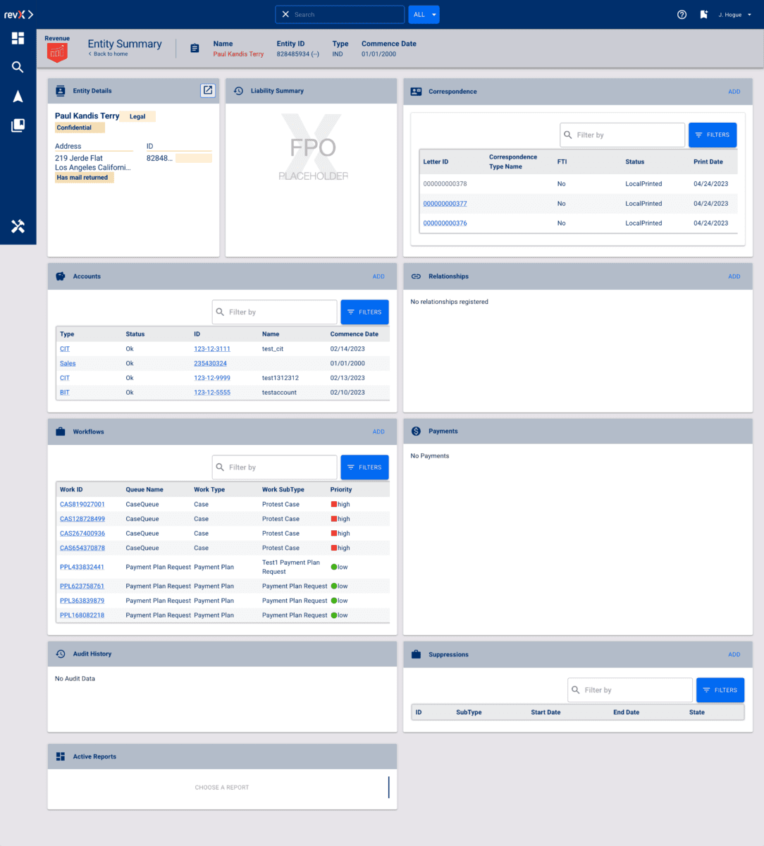
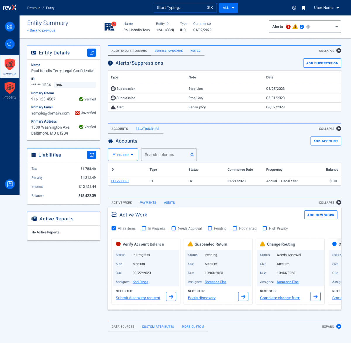
RSI’s main product, GOVERNMENT PREMIER, are highly customizable and configurable. Every single screen has options that would display depending on the authenticated user’s role and privileges and the tenant’s own back-office processes. User stories included many requirements based on permissions and configuration. This added challenges when imagining potential interface solutions that need to accommodate growth in multiple directions.
Oomph’s purposefully used our outside perspective to ask many questions about GOVERNMENT PREMIER’s processes. We took our years of experience designing interfaces for a wide range of consumers and applied them here. In this typically slow-to-evolve space, a user-focused experience coupled with GOVERNMENT PREMIER’s technical expertise would revolutionize tax collection as a friendlier, more intuitive, and highly customizable experience.
Our Approach
Maintaining Consistency in a Rapidly Evolving Product
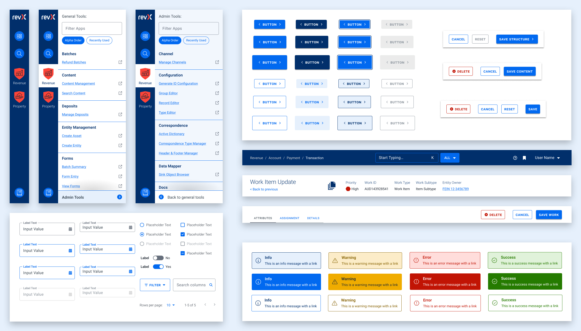
Our findings and recommendations indicated previous UX teams did not create a rulebook that governed their decisions, and so, the system lacked consistency. Quality Assurance reviews would suffer from this lack of governance as well. Therefore, the first thing we did was to establish rules to design by:
- Use Storybook as a source of truth, and expand atomic elements with larger patterns (called molecules in Atomic-design-speak).
- Enforce a global design token system for colors, typography, stateful user feedback, and spacing.
- Use Material UI (MUI) from Google as our foundation. This was a previous decision that was not fully enforced, which led elements to become over-engineered or duplicated. This became known as the “Build on the shoulders of giants” rule.
- Destructive actions (like Delete or Cancel) are placed to the left of creative actions, like “Save” or “Next.”
- Every screen has one primary focus. Complex screens need a focal point for the task and user’s need to feel confident they are using the interface correctly. When long forms are required, break them down into smaller chunks. Users can save their progress and concentrate on smaller groups of tasks. Color should be used to focus users on the most important actions, and to alert them when data errors need to be addressed.
Ultimately, these rules are flexible and have served well as a starting point. Any new screen can adhere to these rules, and when we find cases where these rules are preventing users from completing their tasks or are frequently confusing users, we revisit them to make updates or clarifications. Oomph has continued to consult on new screen design and UX workflows after more than a year of working together.
The Results
Setting a New North Star to Align Our Compasses
To continue to move the product forward without increasing UX and technical debt, the teams needed a well-defined shared understanding for the user experience. Internal teams were moving forward, but not always in the same direction. Within the first month, our teams agreed upon a playbook and then continued to expand it during our engagement. We met twice weekly with product owners across the company and became a sought-after resource when teams were planning new features.
During our time together, we have celebrated these outcomes:
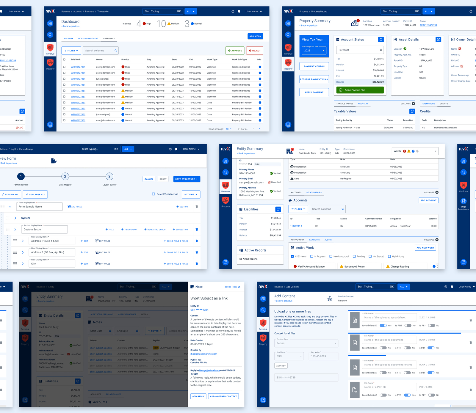
- Oomph consolidated the color palette from 55 colors to just 24 without losing any necessary distinctions. All colors are contrast conformant with WCAG 2.2 Level AA as a baseline.
- Colors, typographic sizes, spacing values, form elements, buttons, icons, and shadows have all been converted to design tokens.
- Figma has been used as the design system record, while Storybook has been strengthened and updated to smartly leverage Material UI. The success of Storybook is largely due to its inclusion as a GOVERNMENT PREMIER project dependency — it has to be used and the latest version is often pinned as the product evolves.
- An internal Design Manager at RSI was established as someone to lead the engineering team and maintain quality oversight as it pertains to the design system.
- Oomph completed designs for 15 features for GOVERNMENT PREMIER, many of which involve designs for three or more screens or modals. Oomph also designed workflows for over a dozen Online Services workflows with a heavier emphasis on mobile-responsive solutions.
As Oomph moves into our second year collaborating with the GOVERNMENT PREMIER teams, we plan to fully investigate user personas on both the admin and taxpayer side of the platform, add more context and governance to the project designs, and provide quality assurance feedback on the working application. We value our partnership with this unique team of experts and look forward to continuing the tax software revolution.
THE BRIEF
Three Organizations Working Towards One Goal
The American Foundation for Suicide Prevention (AFSP), the National Action Alliance for Suicide Prevention (Action Alliance), and the Suicide Prevention Resource Center (SPRC) have been commissioning The Harris Poll to conduct a bi-annual, nationally representative survey of adults in the U.S. to understand the public’s beliefs and attitudes about mental health and suicide.


This year, 2022, all three suicide prevention organizations teamed up with Oomph to take that data and distill it into a microsite for easy consumption among professionals and the general public who visit the site.
The data from the poll shows that progress has been made, but there is still more to do. We all must continue to learn more about suicide and mental health, particularly through increased research efforts, teaching everyone how to help prevent suicide and strengthen mental health, and advocate for improved access to care and robust crisis services.
Oomph made sure our approach to information design, branding, and messaging came across effectively and clearly. How could we use data to show people which actions they could personally take to affect positive change?
THE APPROACH
Design Sprint to E-Learning Microsite
Our initial idea of the audience was more public facing rather than a specific audience. We started our design approach to be stylized and playful.
Taking a step back, we regrouped and determined that the audience was more academic and administrative, therefore it was to lean towards a professional tone. A new idea clicked — we could present this microsite as an e-learning experience.
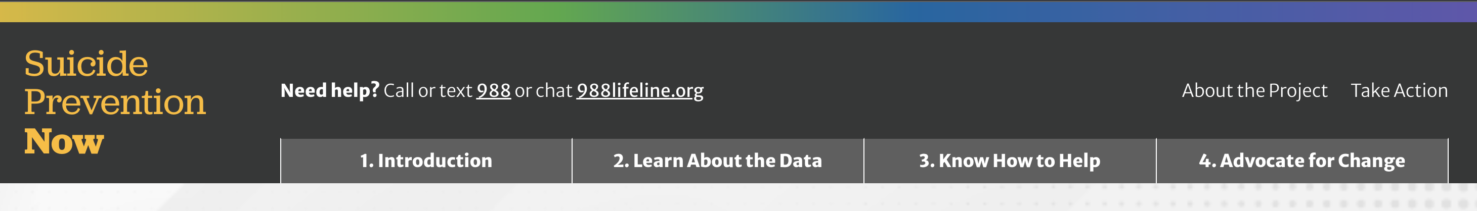
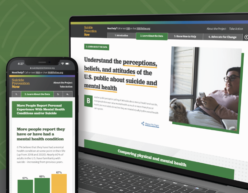
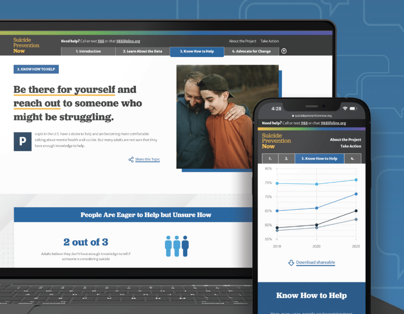
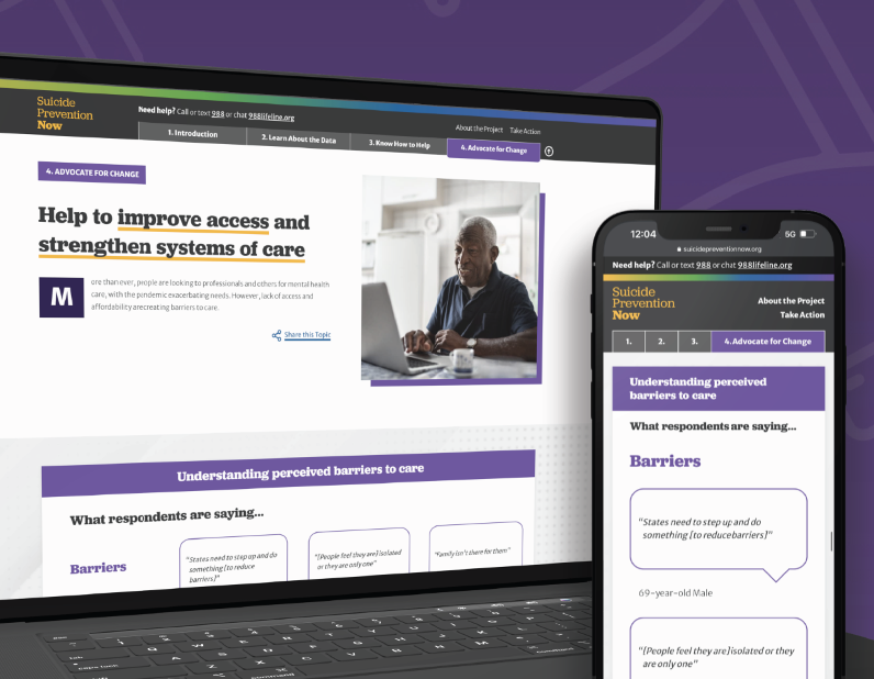
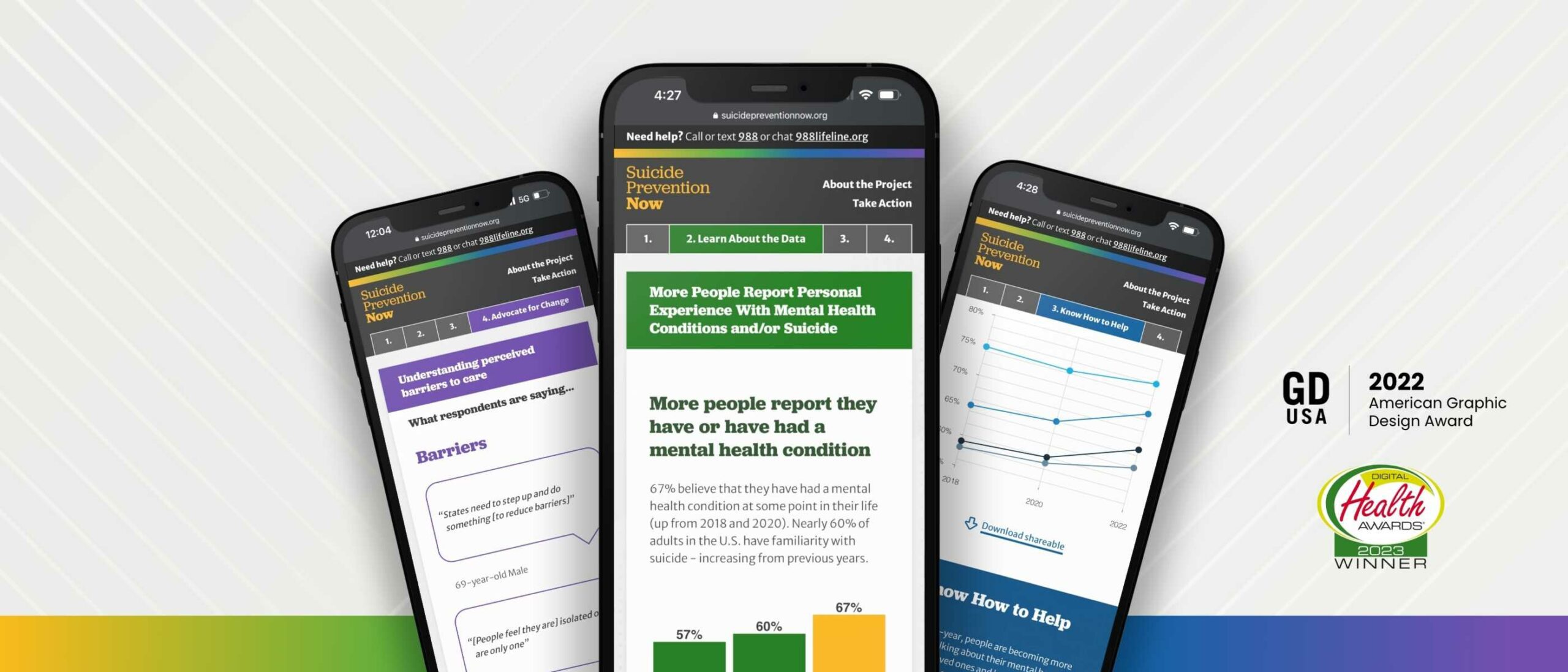
The new design direction features four key chapters: the Introduction, Learn About the Data, Know How to Help, and Advocate for Change. By implementing a tab-like navigation, it allows for users to hop to each section they may be most interested in, and reads as if it is an eBook.
Each section is color coded, and the navigation has a gradient that brings in all of the sections together in unity to showcase that message throughout. Each section follows a similar pattern: an introduction, data from the Harris Poll, an opportunity to find resources about the chapter, and shareable resources to help spread the message on the viewer’s own social channels. We hope that by the end of the microsite, the user is ready to inform themselves further by finding resources or sharing about the current perceptions of suicide.
THE RESULTS
Ongoing Public-education Impact
While Suicide Prevention Now is just one step of many, we hope that this project will help more people to become an advocate, or help spread awareness about suicide prevention. We hope it helps to save lives.
While working on this project, we became aware of a national suicide hotline number that is quick to dial and easy to remember, just like 911. Dial 988 to be connected to a friendly and helpful advocate if you or someone you know are having thoughts of suicide.
Working with Oomph was a great experience all the way around. From exploration to delivery, Oomph provided excellent guidance, and the quality of the final site is fantastic! I look forward to working with the team again in the future.
JONATHAN DOZIER-EZELL Director of Digital Communications,
American Foundation for Suicide Prevention
THE BRIEF
Wingspans’ primary audience is digital natives — young, tech-savvy users who expect fast, frictionless interactions and relevant content. Fail to deliver, and they’ll abandon you in a heartbeat.
The new platform needed to provide a scalable, flexible foundation for a range of content and tools being developed by the Wingspans team. We had to turn a collection of disparate pieces — story content, user data, school information, and more — into a cohesive digital framework that could grow and evolve. Above all, Wingspans needed a design-first approach, wrapping the educational aspects in an intuitive, engaging digital experience.
THE APPROACH
While storytelling formed the heart of the Wingspans platform, the site’s interactive features would be crucial for getting students to explore and engage with the content. Building on Lindsay’s familiarity with the educational market, we mapped out the content architecture, workflows, and functions for a host of interactive features to keep students engaged.
For the tech stack, we turned to a mix of microservices to provide a stable, flexible, and scalable architecture with lightning-fast performance. These included a Gatsby front end, Firebase database, AWS cloud storage, Algolia site search, Cosmic JS content management system, and more. We also worked to ensure the technology reflected Lindsay’s empathy-driven approach. For instance, we customized Algolia to deliver search results specifically tailored to a student’s profile and interests—in other words, an encyclopedia that understood its users and presented its information in a distinctly human way.
THE RESULTS
The platform’s most impactful feature is how easily students can find and bookmark career stories that resonate with who they are. With over 700 stories and 40 mini-documentaries available, each with an associated set of lessons, the site’s personalized search function and ultrafast content delivery are key. On the backend, the customized CMS and robust content architecture make it easy for the Wingspans team to align content with users’ profiles and browsing activity.
Bringing it all together, the Career Builder feature lets students select stories and content to create a customized career roadmap that they can share with parents, teachers, and counselors. A core element of the platform’s personalized user experience, the Career Builder brings Wingspans’ central premise to life: If you can see it, you can be it.
Oomph really fulfilled their commitment to building an immersive and radically personal platform that brought my vision to life.
— Lindsay Kuhn, Wingspans Founder and CEO
THE BRIEF
Same Look, Better Build
Ordinarily, when we embark on rearchitecting a site, it happens as part of a complete front-end and back-end overhaul. This was a unique situation. Visit California users enjoyed the site’s design and helpful content features, so we did not want to disrupt that. At the same time, we needed to upgrade the frustrating back-end experience, look for broken templates, and find optimizations in content and media along the way.
An underperforming API (which functions like an information pipeline to move content from one part of the site to another) and bloated data/code resulted in sluggish site performance and slow content updates/deployments. If the Visit California team wanted to change a single sentence on the site, pushing it live took well over an hour, sometimes longer — and often the build failed. Poorly optimized images slowed the site down even further, especially for the mobile visitors who make up the majority of site traffic.
They were in dire need of a decoupled site connection overhaul so they could:
- Reduce time and effort spent on updating site content
- Implement a more reliable build process decreasing frustration and delays
- Create a better, faster browsing experience for users
THE APPROACH
Oomph started by looking under the hood — or, in this case, under the APIs. While APIs are supposed to make sites perform better, an outdated API was at the root of Visit California’s problem. Over the course of the project, Oomph integrated a new API, optimized images, and corrected bottlenecks across the site to make updates a breeze.
Putting Visit California in the Fast Lane
Implemented a New API
Visit California needed an API that could more quickly move data from the back end to the front. Two previous clients shared Visit California’s back-end architecture but used a modern JSON API Drupal module successfully. Switching from the GraphQL module to JSON API on the back end streamlined the amount of data, resulting in the team updating content or code in minutes instead of hours or days.
Streamlined Data During Deployments
On the front end, a Gatsby Source GraphQL plugin contributed to the issue by pulling and refreshing all data from the entire system with each content update. Oomph replaced the faulty plugin, which had known limitations and lacked support, with the Gatsby Source Drupal plugin. On the back end, the Gatsby Integration module was configured to work with JSON API to provide incremental builds — a process that pulls only updated content for faster deployments.
Avg. full build time
Unexplained failure rate Before
Avg. incremental build time
Unexplained failure rate After
Fixed Image Processing Bottlenecks
Because we were already in the code, both teams agreed this was a great opportunity to identify improvements to boost page performance. We found that image processing was a drag — the site previously processed images during deployment rather than processing them ahead of time on the back-end. Oomph used the JSON API Image Styles module to create image derivatives (copies) in different sizes, ultimately decreasing build times.
Lightened the Load on the Back-End
As Oomph configured the new architecture, we scoured the site for other opportunities to reduce cruft. Additional improvements included removing deprecated code and rewriting code responsible for creating front-end pages, eliminating static queries running thousands of times during page creation. We also resized large images and configured their Drupal site to set sizing guardrails for photos their team may add in the future.
Home page weight before and after:
| Page Weight | Before | After | % Change |
|---|---|---|---|
| Desktop | 25.41 MB | 3.61 MB | Down 85.79% |
| Mobile | 12.07 MB | 3.62 MB | Down 70.01% |
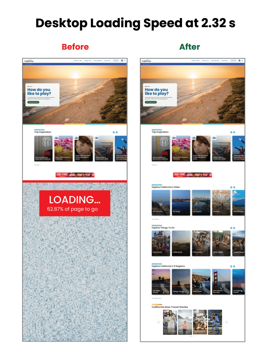
Visualizing the improvements to loading speed:
Core Web Vitals Improvements:
| Overall Score | First Contentful Paint | Largest Contentful Paint | Total Blocking Time | Cumulative Layout Shift | Speed Index | |
|---|---|---|---|---|---|---|
| Mobile before | 3 | 3.4s | 15.7s | 8980ms | 0.043s | 22.9s |
| Mobile after | 31 | 4.4s | 21.1s | 2140ms | 0.503s | 9.5s |
| CHANGE | +28 | +1s | +5.4 | -6840 ms | +0.43 | -13.4 |
| Desktop before | 38 | .9s | 4.5s | 1600ms | 0.043s | 3.9s |
| Desktop after | 63 | 1.2s | 4.5s | 420ms | 0.207s | 2.6s |
| CHANGE | +25 | +.3 s | 0 | -1180ms | +0.164 | -1.3 |
THE RESULTS
Exploring the Golden State, One Story at a Time
Once Oomph was done, the Visit California site looked the same, but the load times were significantly faster, making the site more easily accessible to users. By devising a strategy to pull the same data using completely different methods, Oomph created a streamlined deployment process that was night and day for the Visit California team.
The massive initiative involved 75,000 lines of code, 23 front-end templates, and plenty of collaboration, but the results were worth it: a noticeably faster site, a markedly less frustrating authoring experience, and page performance that would make any Californian proud.