
THE BRIEF
Connecting People and Planet
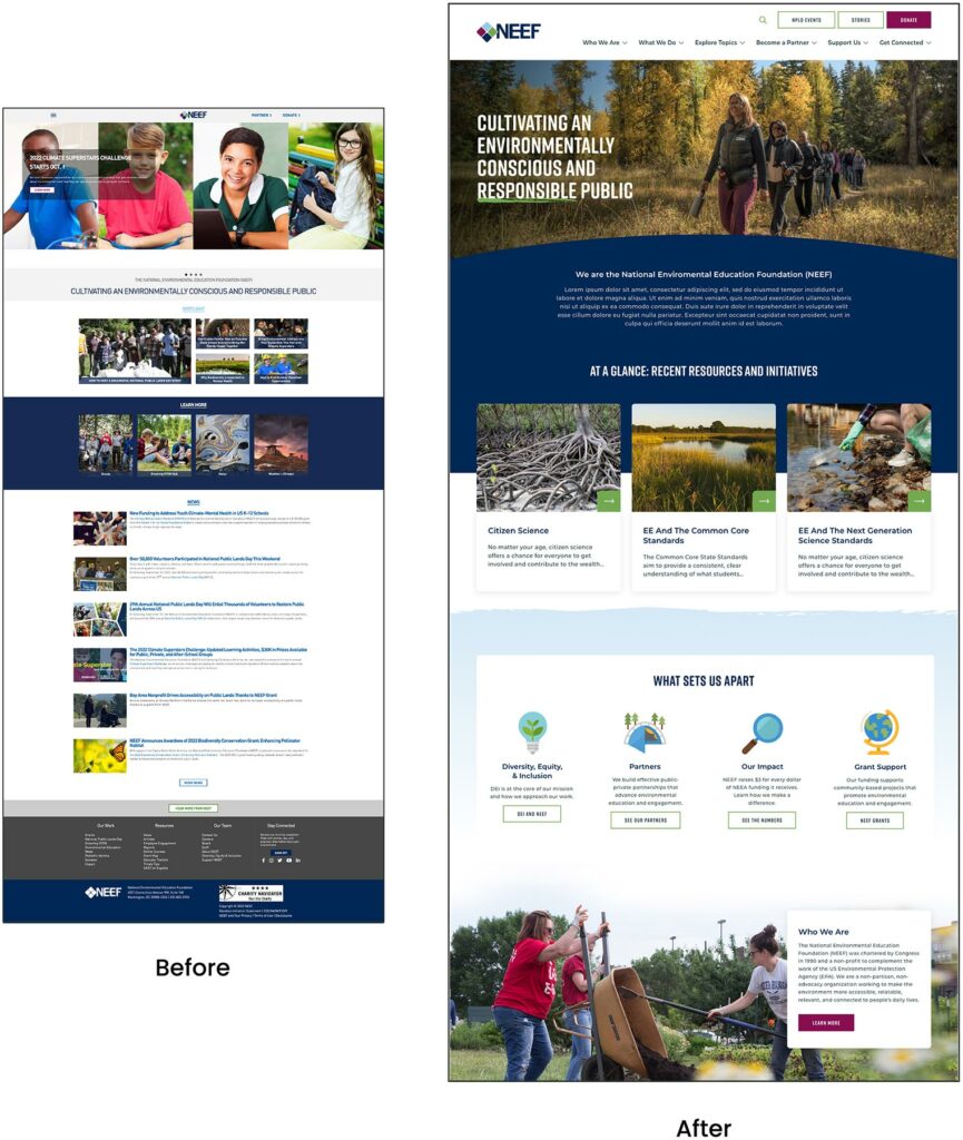
NEEF’s website is the gateway that connects its audiences to a vast array of learning experiences – but its existing platform was falling short. The organization needed more visually interesting resources and content, but it also knew its legacy Drupal site couldn’t keep up.
NEEF wanted to build a more powerful platform that could seamlessly:
- Communicate its mission and showcase its impact to inspire potential funders
- Broaden its audience reach through enhanced accessibility, content, and SEO
- Be a valuable resource by providing useful and engaging content, maps, toolkits, and online courses
- Build relationships by engaging users on the front end with easy-to-use content, then seamlessly channeling that data into back-end functionality for user-based tracking
THE APPROACH
Strategy is the foundation for effective digital experiences and the intuitive designs they require. Oomph first honed in on NEEF’s key goals, then implemented a plan to meet them: leveraging existing features that work, adding critical front- and back-end capabilities, and packaging it all in an engaging, user-centric new website.
Information architecture is at the core of user experience (UX). We focused on organizing NEEF’s information to make it more accessible and appealing to its core audiences: educators, conservationists, nonprofits, and partners. Our designers then transformed that strategy into strategic wireframes and dynamic designs, all of which we developed into a custom Drupal site.
The New NEEF: User-Centered Design
A Custom Site To Fuel Connection
NEEF needed a digital platform as unique as its organization, which is why Oomph ultimately delivered a suite of custom components designed to accommodate a variety of content needs.
Engaging and thoughtful design
NEEF’s new user experience is simple and streamlined. Visual cues aid in wayfinding (all Explore pages follow the same hero structure, for example), while imagery, micro-interactions (such as hover effects) and a bold color palette draw the user in. The UX also emphasizes accessibility and inclusivity; the high contrast between the font colors and the background make the website more readable for people with visual impairments, while people with different skin tones can now see themselves represented in NEEF’s new library of 100 custom icons.
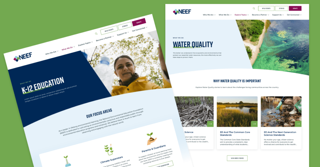
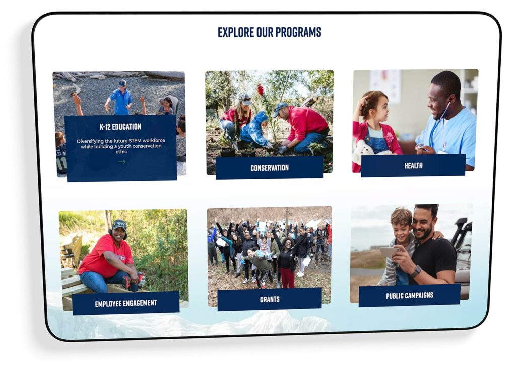
Topic-based browsing
From water conservation to climate change, visitors often come to the NEEF site to learn about a specific subject. We overhauled NEEF’s existing site map to include topic-based browsing, with pages that roll resources, storytelling, and NEEF’s impact into one cohesive package. Additional links in the footer also make it easier for specific audiences to find information, such as nonprofits seeking grants or teachers looking for educational materials.
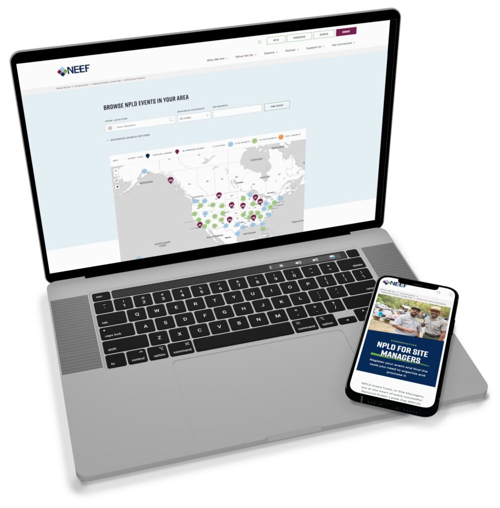
NPLD-hosted resources and event locator
Oomph refreshed existing components and added new ones to support one of NEEF’s flagship programs, National Public Lands Day (NPLD). People interested in hosting an event could use the new components to easily set one up, have their own dashboard to manage, and add their event to NEEF’s event locator. Once the event has passed, it’s automatically unlisted from the locator — but archived so hosts can duplicate and relaunch the event in future years.
THE RESULTS
Protecting the Planet, One User at a Time
Oomph helped NEEF launch its beautiful, engaging, and interactive site in May 2023. Within three months, NEEF’s team had built more than 100 new landing pages using the new component library, furthering its goal to build deeper connections with its audiences.
As NEEF’s digital presence continues to grow, so will its impact — all with the new custom site as its foundation.
“Inclusive design” may sound like vague, trendy, technical jargon. But inclusive design isn’t a trend — it’s the world catching up on the kind of digital experiences that should have been part of the web from the beginning.
Inclusive design is a crucial part of nearly every digital platform, be it website, app, or intranet.
Inclusive design as a concept and practice is broad and deep — this article barely scratches the surface, but will help you understand the mindset required. We’ll cover what it is, why it matters for your business, and some ways to assess whether your digital platform could be more inclusive.
- What does “inclusive design” mean?
- What are the benefits of inclusive design?
- How are inclusive design and accessibility different?
- How can you make your platform more inclusive?
What does “inclusive design” mean?
The Inclusive Design Research Center defines inclusive design as “design that considers the full range of human diversity with respect to ability, language, culture, gender, age and other forms of human difference.” Adding to that, Nielsen Norman calls it creating products that “understand and enable people of all backgrounds and abilities,” including economic situation, geography, race, and more.
Essentially, you’re aspiring to create interfaces that reflect how people from all walks of life interact with the world.
Inclusive design allows people to use a digital platform with ease, whatever their needs or point of view. Looking at characteristics like race, abilities, or geography helps us identify key areas where friction can occur between humans and the web.
In the end, it’s about designing for everyone.
What are the benefits of inclusive design?
Inclusive design isn’t just about recognizing and accommodating diversity; it also creates business advantages for organizations that are willing to invest in an inclusive approach. Here are a few key areas where inclusive design can give your digital platform an edge:
Grow your customer base. By understanding the best way to connect with a wider target audience, your team can create digital experiences that attract the most possible users.
Increase user engagement. Engagement goes up when platforms are welcoming and easy to use. Inclusive web design removes barriers and creates motivation for people to engage with your brand.
Spark innovation. Inclusive solutions have a history of spawning innovation that goes beyond the initial intended audience (think closed-captioning-turned-subtitles on Netflix). Sometimes, when you aim to solve a specific usability issue, you end up creating an entirely new market solution.
Motivate your team. The way a digital platform is designed affects all audiences, even employees. Designing with inclusivity in mind can also have a positive influence on your own team. Engaging employees in your efforts to build an inclusive digital platform can help create a sense of shared purpose — one many people are likely to rally around.
How are inclusive design and accessibility different?
You may have heard these terms used in similar contexts. While they overlap in meaning, they’re not the same thing.
By definition, accessibility focuses on accommodating people with varying physical and mental abilities. Accessible websites are measured by their conformance with Web Content Accessibility Guidelines, which pertain to things like auditory, cognitive, physical, and visual disabilities. Accessibility tests typically cover code-level issues that can be fixed in the source code of a site.
Inclusive design is about accommodating the entire spectrum of human diversity. It involves a variety of viewpoints, including those of people with disabilities. Inclusive solutions can involve anything from back-end coding to the way headlines are worded.
In a nutshell: An accessible site is one of the outcomes of an inclusive design, whereas inclusive design is the overall approach to creating accessibility.
Consider these examples:
- You’re filling out a form, and because you have a visual impairment, you’re using the keyboard to move through it. When you get to the end, you discover the form can’t be submitted because you left a few areas blank — even though you filled out every question asked. Turns out the keyboard had skipped past a few required fields. What a pain!
- While filling out a form, you’re asked to select your ethnicity from a list. As you read the options, you discover that yours is not listed, or that you identify with more than one. You feel like the “other,” compared to everyone else, leaving you frustrated about the task and… maybe even about the company too.
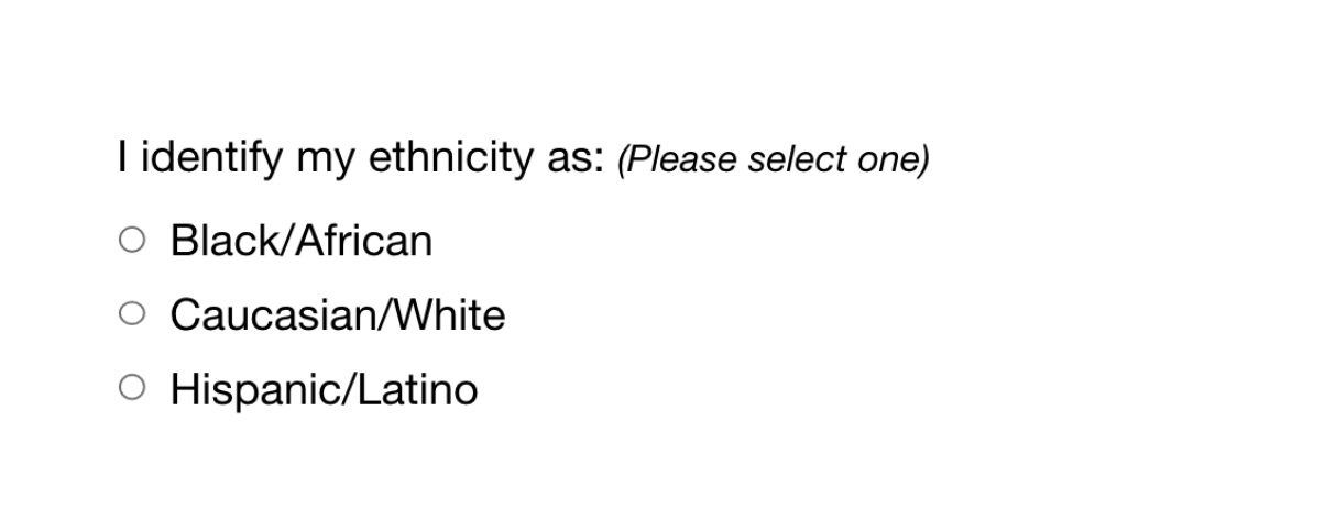
While both issues are addressed by inclusive design, the first issue relates to ability and can be fixed within the code, while the second relates to diversity and will take additional measures to address.
How Can You Make Your Platform More Inclusive?
The ethnicity example raises some interesting questions, such as:
- How do you know which ethnicities to add?
- How many do you need to account for?
- Should you just change the way the question is worded?
- Do you need to ask the question at all?
Mainly, this raises a bigger question: how do you maintain an inclusive site when there are so many important and broad variables (ability, language, culture, gender, age, etc.) — especially when that list of variables continues to grow and change?
The best way to get started is to arm yourself with knowledge and create a plan.
1. Identify the problems to solve.
Start by identifying opportunities for improvement in your current user experience (UX) by collecting quantitative and qualitative research with tools like UX audits, user interviews, user recordings, and heatmaps. Keep an eye out for areas where users seem confused, backpedal, or struggle to complete tasks. The more information you gather, the better!
2. Determine the best solutions.
Your user research will likely uncover many possible paths to change. This may include adding more categories to a list, creating an “Other” field users can type any answer into, or adding options to gather additional information.
Note: It’s common for areas that need improvement to hit on sensitive topics, things you may not fully figure out through data and research. Remember that the goal is understanding. Don’t be afraid to reach out to others for their thoughts and opinions.
3. Measure the results.
Some measures of success are easy to determine from user data in Google Analytics or changes in heatmaps and user recordings. Further data can come from users via surveys asking how your audience feels about the changes. The key is to stay continuously informed and aware of what your users are experiencing.
Note: One helpful tool for checking whether your design is, in fact, inclusive is Cards for Humanity. It offers a fun way to make sure you’re not missing anyone or anything in the spectrum of inclusivity.
Remember that the process of creating an inclusive design doesn’t end with implementation. Inclusive design is a work in progress. As a field, inclusive design is always evolving and requires continuous research to develop best practices.
We can’t predict what kind of mismatched interactions users will face in the years to come. But, with an open mind and a desire to learn and grow, we can continually adapt to meet them.
We’ve only scratched the surface of inclusive design! If you have any questions about inclusive design, we’d love to chat. Contact us anytime.
THE BRIEF
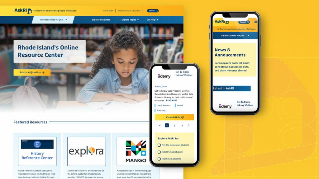
AskRI is a digital platform providing Rhode Island residents with free access to some of the top educational and research tools, along with links to many state resources. A collaboration among the state government and various libraries and agencies, AskRI is essentially a 24/7 help desk for Rhode Islanders.
The platform’s structure has three main approaches:
Databases
Online portals provide free access to premium third-party tools and services, including research platforms and libraries, online learning and tutoring platforms, and consumer resources for health, jobs, and more.
Audiences
AskRI curates information and resources for specific audiences, including K-12 students and teachers, parents, non-native-English speakers, and adults seeking continuing education.
FAQs
Supporting local librarians with ready-made links, the FAQ section answers crowd-sourced questions about a variety of government services (how to get a green card, where to get a fishing permit, etc…).
Fundamentally, it’s an incredible resource! But, as AskRI grew over time, it became increasingly difficult for users to find the information they needed — and harder for site managers to organize, update, and expand the content.
Aiming to make the platform more user-friendly all around, its owners opted for a comprehensive redesign with a few primary goals:
- Refresh the branding to re-energize the service internally and externally
- Provide more flexible and efficient content management tools
- Increase usage of the platform’s resources across all target audiences
THE APPROACH
Through a quick Discovery phase, we uncovered a diverse user base with a broad range of needs. Our next challenge was to create an energetic brand identity and a more intuitive way to organize the platform.
Visual Branding
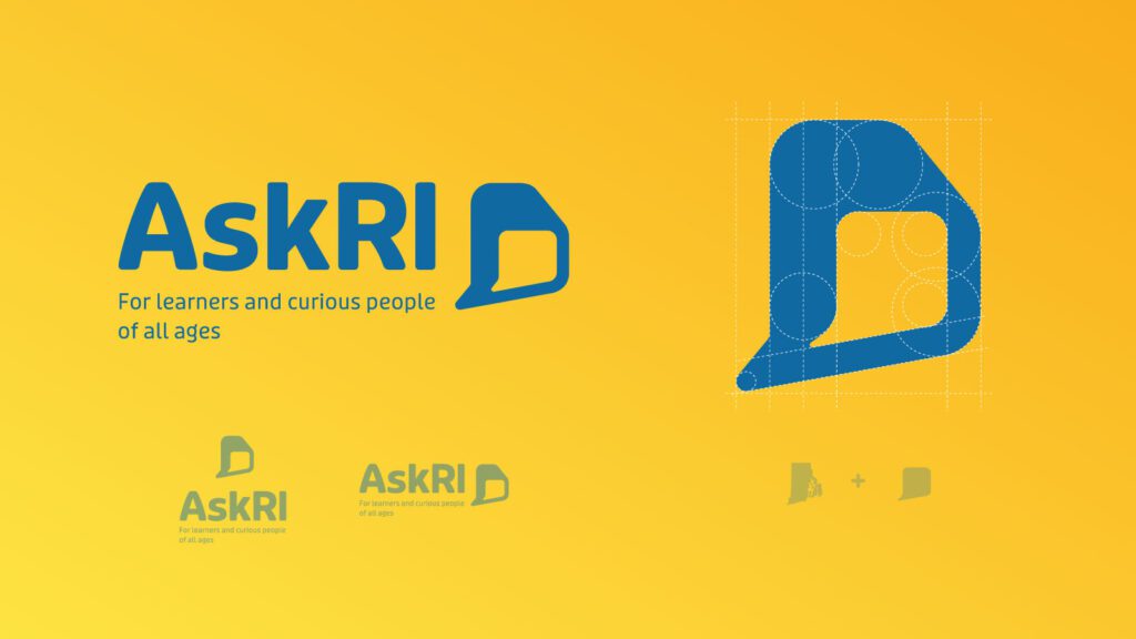
Rhode Island is a small but unique place, and its residents are proud of their state. We wanted the new branding to leverage a more modern, yet uniquely Rhode Island, identity. It could also evoke a sense of engagement, reinforcing the platform’s two-way interaction.
Over several design rounds, we explored logos that would represent two-way conversations while suggesting Rhode Island’s distinct shape. We also introduced a new, brighter color palette.
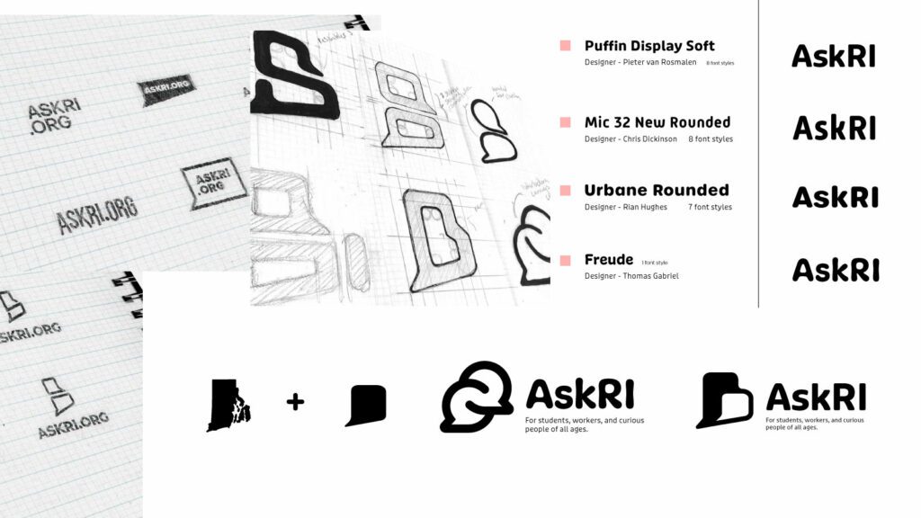
Digital Platform
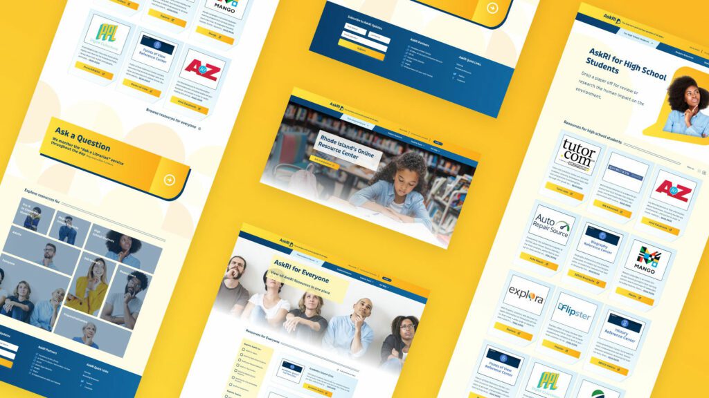
Redesigning the platform came down to an exercise in information architecture: What was the best way to organize the content so users could quickly find the tools and resources that were most relevant to them?
We knew only a small segment of the target audience would know exactly what they were looking for and be able to search for it directly. Most users would be on a mission of discovery, needing a way to browse the content. Then there was the FAQ section, where users might expect to find answers about the platform itself — but in its current form, the FAQs were confusingly broad and hard to find.
Our solution addressed all three areas:
- Knowing that frequent users would want to get to familiar databases quickly, we incorporated tried-and-true search and filter tools
- For those needing more guidance, we created a persona-based architecture with curated lists of content that addressed each persona’s unique needs
- By making the platform simpler and more intuitive, we removed the need for an FAQ section. We replaced it instead with a more interactive feature
THE RESULTS
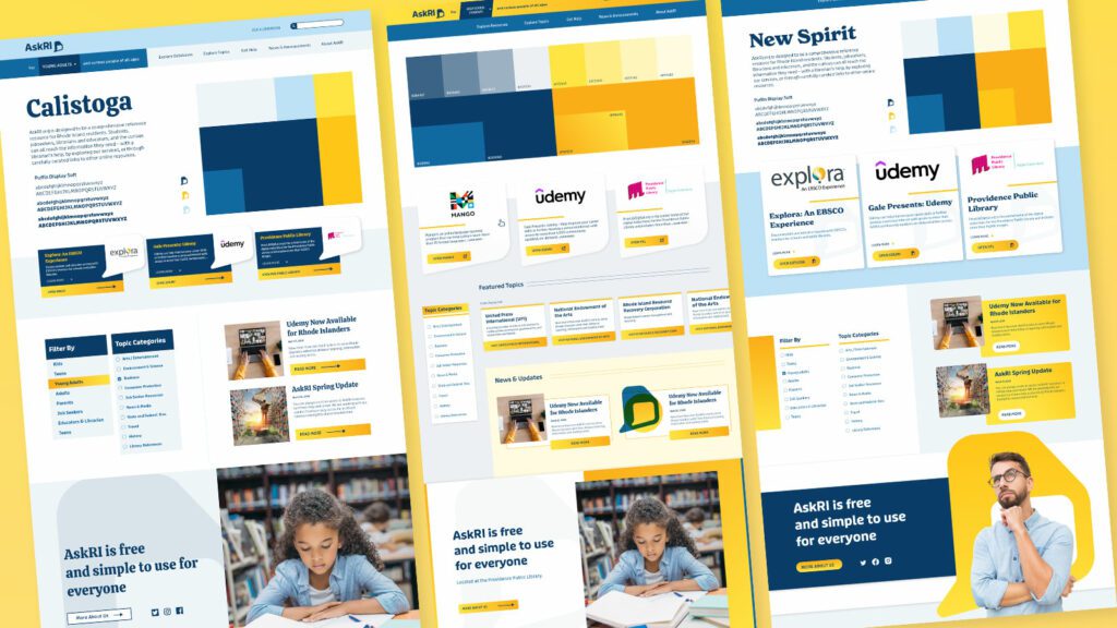
These relatively simple changes brought powerful results, creating a more engaging and intuitive platform. The fresh branding celebrates inquisitiveness and interaction, while the redesigned content is much easier for users to navigate and for authors to organize and expand.
The AskRI team loved the new brand identity, which evokes curiosity with visual elements that represent thinking and asking questions. Two thought bubbles form the shape of Rhode Island for the logo, while images of inquisitive people are featured throughout the site. In addition, the new colors bring fresh energy to the brand while preserving a sense of trust and authority.
The redesign not only improved the content’s organization and accessibility, it also fosters a greater sense of interaction with platform users. Visual personas provide an intuitive starting point for exploration, backed up with curated resource lists. A new dropdown menu titled “Find Resources for You” speaks directly to target audiences, while a new “Explore Topics” section offers lists of state resources grouped by user needs (small business, health, families, etc.).
Finally, as the most interactive part of the platform, the redesigned FAQs section is now the “Ask a Librarian” page, where users can submit questions on any topic. The most common platform-related questions get published to the site as a list of answers that users can browse. Input from users will not only inform the kinds of content that goes on the site, but may also spur access to new tools and databases.
Not long ago, company intranets were little more than a repository for shared files, general announcements, and the all-important list of holiday office closures. Today, the humble intranet has evolved as a way to enhance internal communication and employee engagement and to help workers do their jobs.
While organizations tend to have more content- and feature-rich intranets these days, many are missing one crucial element: a mobile-optimized version. As a result, they can exclude a large proportion of workers—including the 80% of people who make up today’s Deskless Workforce.
Top “deskless” industries include education, healthcare, retail, hospitality, and transportation, employing many of the frontline workers we all depend on.
One of our own clients, a large hospital system, told us that 70% of their workforce doesn’t sit at a desk, nor do they use a computer every day. And if 70% of their employees can’t easily access the company intranet, they’re not provided equitable access to the same resources as everyone else.
Why Mobile Matters Today
In addition to the challenges of communicating with deskless workers, the rise of remote work and the growing number of Millennials in the workforce are helping to drive an increased demand for mobile-optimized or employee-app versions of intranets.
Consider this: the average American spends more than 5 hours a day on their phone (and it’s almost always within reach). In addition, nearly half of smartphone users access the internet primarily on their phones versus a desktop computer, laptop, or tablet. Those numbers are even higher for Millennials, who currently make up 35% of the US workforce.
Mobile communication plays an essential role in our personal lives. To serve employees, company intranets must offer the same ease-of-use, convenience, and capability to our work lives. The intranet must go beyond the desktop box to where workers are.
The Benefits of an Inclusive Intranet
In addition to facilitating access, mobile technology offers a number of unique benefits that can significantly improve employee engagement and productivity and help reduce frustration.
Here are some of the key benefits of a mobile-optimized intranet:
Real-Time Push Notifications
Imagine there’s an emergency situation in your facility, or an important update that staff need to receive immediately. You can push the information straight to their phone, enabling real-time communication across your workforce. Unlike emails, most push notifications get read within the first 3 minutes after they’re received.
Broader Access for BYOD
As more and more organizations support remote work and flexible schedules—while fewer and fewer provide company smartphones—the “Bring Your Own Device” trend has become more prevalent. Many of today’s employees are using personal devices to access work-related resources and systems. And, as we noted earlier, most of the time that means they’re using a smartphone.
Freedom from Workstations
In some organizations, employees are still sharing desktop workstations that we might charitably describe as “clunky.” It’s inefficient and inconvenient, especially when multiple people have to go out of their way to get to a workspace. A mobile-optimized intranet gives everyone fast and easy access to the same resources, wherever they are.
Two-Way Communication
Intranets have traditionally been top-down communication platforms, focusing primarily on the needs of employers, not employees. Today, companies looking to increase engagement have shifted to a new mindset: communication tools are no longer for talking to employees, but talking with them.
Mobile-optimized platforms and mobile apps help facilitate two-way conversations, especially with features like built-in chatting or social forums where employees can like and comment on posts. This allows companies to have more personalized conversations with employees in addition to collecting valuable, on-the-spot feedback from the front lines.
Remote Doesn’t Feel So Remote
Without regular in-person interaction, remote workers often feel isolated and less engaged. By offering more of an app-like experience with ongoing communication, an intranet can help recreate an environment that fosters idea sharing and boosts morale. It also means that employees who work at home, or don’t have access to a computer, won’t feel uninformed and isolated from the rest of the team.
Better User Experience
If you’re looking to use your intranet as a tool for engagement, you’ll get the best results from an employee app. An app lets you take advantage of mobile-native tools, like location detection and offline access, which let you both customize content and make it more readily available. The improved user experience, speed, and features are the reasons why most people prefer apps to websites.
An Intranet for Everyone
Like many organizations, the purpose of your intranet might be to create a more engaged workforce or improve employee productivity. But if most of your workers either can’t or don’t access the content, you’re not going to achieve your goals.
As cultures, companies, and industries move towards creating more inclusiveness and equity, organizations across the world are looking for ways to meet the needs of their employees. One way to address your team’s needs and expectations is to start by ensuring your internal resources are truly benefiting everyone who relies on them.
In 2023, Oomph’s design for the Lifespan Intranet was selected by the Nielsen Norman Group as one of the Ten Best Intranets globally.
The Challenge
Execute on a digital platform strategy for a global private equity firm to create a centralized employee destination to support onboarding, create interpersonal connections between offices, and drive employee satisfaction.
The key components would be an employee directory complete with photos, bios, roles and organizational structure; News, events, and other communications made easily available and organized per location as well as across all locations; The firm’s investment portfolio shared through a dashboard view with all pertinent information including the team involved.
These components, and the expected tactical assets that an intranet provides, would help the firm deepen connections with and among employees at the firm, accelerate onboarding, and increase knowledge sharing.
The Approach
Supporting Multiple Intentions: Browsing vs. Working
An effective employee engagement platform, or intranet, needs to support two distinct modes — task mode and explore mode. In task mode, employees have access to intuitive navigation, quick page loading, and dynamic search or filtering while performing daily tasks. They get what they need fast and proceed with their day.
At the same time, a platform must also encourage and enable employees to explore company knowledge, receive company-wide communications, and connect with others. For this firm, the bulk of content available in explore mode revolves around the firm’s culture, with a special focus on philanthropic initiatives and recognition of key successes.
Both modes benefit from intuitive searching and filtering capabilities for team members, news, events, FAQs, and portfolio content. News and events can be browsed in a personalized way — what is happening at my location — or a global way — what is happening across the company. For every interaction within the platform, the mode was considered and influential of nearly all design decisions.
From a technical standpoint, the private equity firm needed to support security by hosting the intranet on their own network. This and the need to completely customize the experience for close alignment with their brand meant that no off-the-shelf pre-built intranet solution would work. We went with Drupal 8 to make this intranet scalable, secure, and tailor-made to an optimal employee experience.
The Results
The platform deployment came at a time when it was most needed, playing a crucial role for the firm during a global pandemic that kept employees at home. What was originally designed as a platform to deepen employee connections between offices quickly became the firm’s hub for connecting employees within an office. As many businesses are, the firm is actively re-evaluating its approach to the traditional office model, and the early success of the new platform indicates that it is likely to play an even larger role in the future.
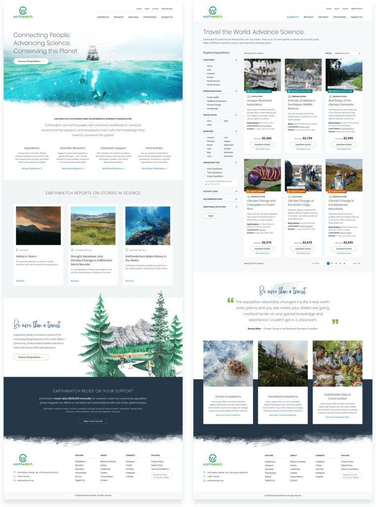
THE BRIEF
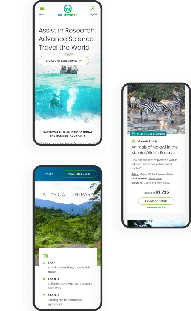
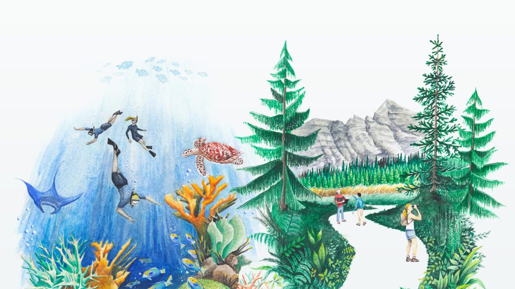
Transform the Experience
The core Earthwatch experience happens outdoors in the form of an expedition — usually for about a week and far away from technology in locations like the Amazon Basin, Uganda, or the Great Barrier Reef. But before this in-person experience happens, an expedition volunteer encounters a dizzying array of digital touchpoints that can sow confusion and lead to distrust. Earthwatch needed “Experience Transformation.”
SURVEY THE LANDSCAPE
Starting with a deep strategy and research engagement, Oomph left no stone unturned in cataloging users and their journeys through a decade’s worth of websites and custom applications. We were able to conduct multiple interview sessions with engaged advocates of the organization. Through these interviews, the Earthwatch staff learned how to conduct more interviews themselves and listen to their constituents to internalize what they find wonderful about the experience as well as what they find daunting.
CREATE THE MAP
With a high-level service blueprint in place, Oomph then set out to transform the digital experiences most essential to the organization: the discovery and booking journey for individuals and the discovery, research, and inquiry journey for corporate sustainability programs.
The solution took shape as an overhaul and consolidation of Earthwatch’s public-facing websites.
THE RESULTS
The Journey Before the Journey
A fresh design approach that introduces new colors, beautiful illustrations, and captivating photography.
Expedition discovery, research, and booking was transformed into a modern e-commerce shopping experience.
Corporate social responsibility content architecture was overhauled with trust-building case studies and testimonials to drive an increase in inquiries.
IN THEIR WORDS
The Oomph team far surpassed our (already high!) expectations. As a nonprofit, we had a tight budget and knew it would be a massive undertaking to overhaul our 7-year-old site while simultaneously launching an organizational rebrand. Oomph helped to guide us through the entire process, providing the right level of objective, data-driven expertise to ensure we were implementing user experience and design best practices. They listened closely to our needs and helped to make the website highly visual and engaging while streamlining the user journey. Thanks to their meticulous project management and time tracking, we successfully launched the site on time and exactly on budget.
ALIX MORRIS MHS, MS, Director of Communications, Earthwatch
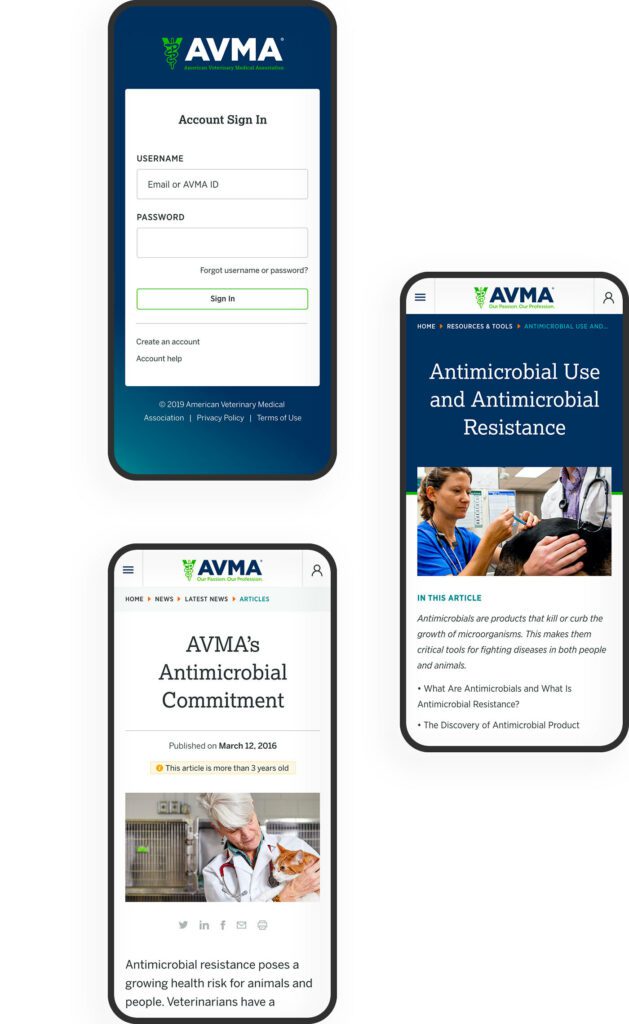
THE BRIEF
The American Veterinary Medical Association (AVMA) advocates on behalf of 91,000+ members — mostly doctors but some veterinary support staff as well. With roots as far back as 1863, their mission is to advance the science and practice of veterinary medicine and improve animal and human health. They are the most widely recognized member organization in the field.
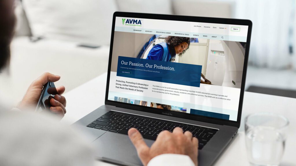
Make the Brand Shine
The AVMA website is the main communications vehicle for the organization. But the framework was very out of date — the site was not mobile-friendly and some pages were downright broken. The brand was strong, but the delivery on screen was weak and the tools reflected poorly.
Our goals were to:
IMPROVE THE SITE MAP
Content bloat over the years created a site tree that was in bad need of pruning.
IMPROVE SEARCH
When a site has so much content to offer, search can be the quickest way to find relevant information for a motivated user. Our goals were to make search more powerful while maintaining clarity of use.
COMMUNICATE THE VALUE OF MEMBERSHIP
Resources and benefits that come with membership were not clearly illustrated and while members were renewing regularly, they were not interacting with the site as a resource as often as they could.
STRENGTHEN THE BRAND
If the site was easier to navigate and search, if it had a clear value proposition for existing and prospective members, and if the visual design were modern and device-friendly, the brand would be stronger.
THE APPROACH
Put Members First
Oomph embarked on an extensive research and discovery phase which included:
- A competitor Analysis of 5 groups in direct competition and 5 similar membership-driven organizations
- An online survey for the existing audience
- A content and SEO audits
- Several in-person workshops with stakeholder groups, including attendance at their annual convention to conduct on-the-spot surveys
- More phone interviews with volunteers, members, and additional stakeholders
With a deep bed of research and personal anecdotes, we began to architect the new site. Communication was high as well, with numerous marketing, communications, and IT team check-ins along the way:
- An extensive card sort exercise for information architecture improvements — 200+ cards sorted by 6 groups from throughout the organization
- A new information architecture and audience testing
- A content modeling and content wireframe exercises
- A brand color accessibility audit
- Over a dozen wireframes
- Three style tiles (mood boards) with revisions and refinements
- Wireframe user testing
- A set of deep-dive technical audits
- Several full design mockups with flexible component architecture
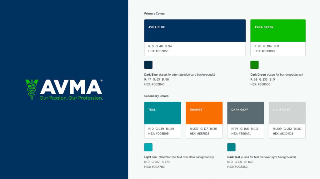
Several rounds of style tiles explored a new set of typefaces to support a modern refresh of the brand. Our ideas included darkening colored typography to meet WCAG thresholds, adding more colored tints for design variability, and designing a set of components that could be used to create marketing pages using Drupal’s Layout Builder system.
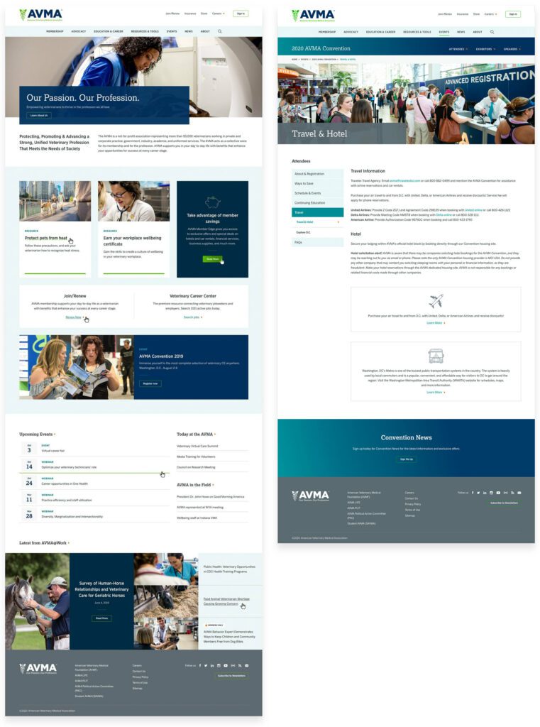
THE RESULTS
The design update brought the main brand vehicle fully into the modern web. Large headlines and images, chunks of color, and a clearer hierarchy of information makes each pages’ purpose shine. A mega-menu system breaks complex navigation into digestible parts, with icons and color to help differentiate important sections. The important yearly convention pages got a facelift as well, with their own sub-navigation system.
FINAL THOUGHTS
Supporting Animals & Humans Alike
Membership to the AVMA for a working veterinary doctor is an important way to keep in touch with the wider community while also learning about the latest policy changes, health updates, and events. The general public can more easily find information about common pet health problems, topical issues around animal well-being during natural disasters, and food and toy recalls. The goal of supporting members first while more broadly providing value to prospective members and non-members alike has coalesced into this updated digital property.
We look forward to supporting animal health and human safety as we continue to support and improve the site over the next year.
THE BRIEF
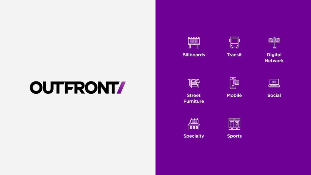
“Out of Home” (OHH) advertising is widely understood as billboards, transit stops, and street furniture. But OHH advertising is also place-based mobile advertising and digital messages that can react to the time of day and weather. These emerging avenues were some of the customer education messages that OUTFRONT Media, one of the top three outdoor advertising companies in the country, needed a new website to convey.
OHH was new to us, but we enjoy diving deep into new industries and absorbing information from all directions. While getting to know OUTFRONT Media during our initial explorations and discovery meetings, Oomph and Straightline Media were surprised to learn:
- 75% of travelers see a digital billboard every month
- 71% of people say digital billboards stand out better than online ads
- 25 million place-based screens are in the United States
The impact of out of home advertising is strong and has evolved to meet the challenges of a digital world. Part of our job was to position Outfront as the innovative leader they are, and educate business owners about the return on investment OOH can deliver.
THE DISCOVERY
Expanding Outfront’s reach from Agencies to “Mom-and-Pops”
OUR RESEARCH & UNDERSTANDING
“The United States of Audiences” is the demographic landscape made up of microcosms centered around interests and activities. OUTFRONT understands all these niche groups and can hyper target them to get businesses those audiences.
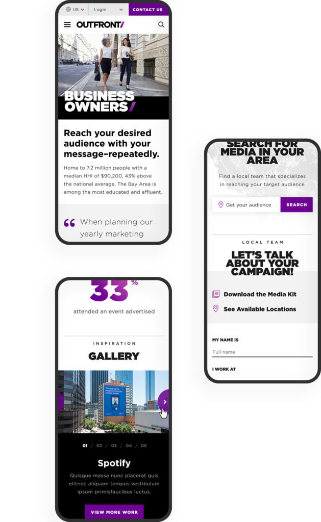
Through information architecture testing, an understanding of their business goals, and internalization of this new brand message, we crafted a main navigation that spoke directly to OUTFRONT’s target audiences. These pages communicate they “get” them in two ways — OUTFRONT understands these audiences’ needs and they can put the right message in front of the right people to get clients new business.
Large brands already understand how important it is to have OHH in their advertising mix. An emerging market for companies like OUTFRONT is actually smaller businesses — local chains and even mom and pop businesses. To court these new customers, OUTFRONT has to create a customer portal that supports do-it-yourself media management, and the website messaging has to educate a small business about the process and how to buy.
CUSTOMER ACTIONS
To buy media placements from OUTFRONT, a business needs to:
- Understand the value of OHH advertising
- Explore the media options in their location
- Investigate the costs of these different options
- Call a sales associate in their area to discuss custom packages
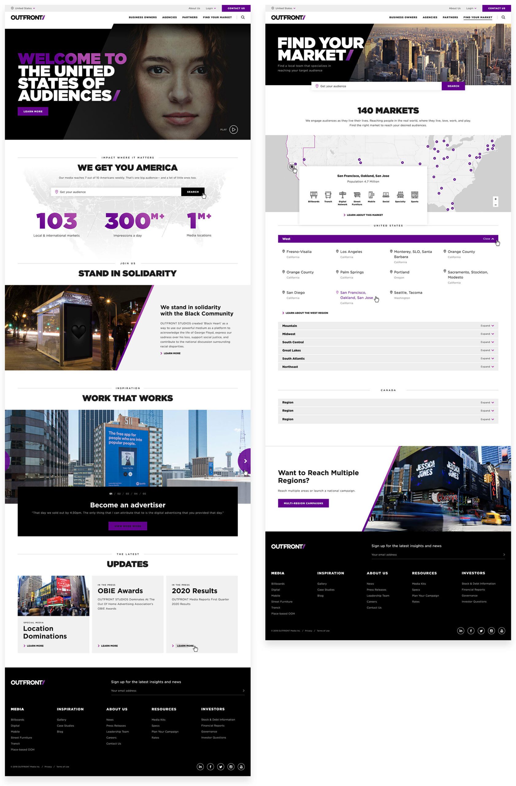
Finding a market lets a potential customer define themselves even further by gathering their location data. From here, they can easily access the media that is available specifically to their geographic area. After a sale is made, a customer needs continuing support.
The website should:
- Make it easy for a customer to find production specs for various media
- Provide links to a portal that give them analytics and reporting statistics
- Give them a clear path to extending their current campaign or starting a new one
THE APPROACH
Defining Audience Destinations
OUTFRONT narrowed its focus to the audiences that it needs to win and continue to support — new advertisers, new and existing agency relationships, and property owners who lease their real estate to OUTFRONT for displays (these could be individual real estate owners, large municipalities, or large destinations like airports, stadiums, and entire city transit systems). The journey for these new customers is the main navigation, and these journeys funnel through the Market Finder to become more personalized.
Returning customers will find inspiration, case studies, galleries, and support resources in the footer navigation. One of the reasons for this bifurcation was the amount of content that OUTFRONT Media needs to manage. Their previous navigation tried to be everything to everyone, and therefore, was confusing. Labels like “Who We Are / What We Do / Where We Are…” contained too much “we” and not enough “you”. A modern customer doesn’t have time to figure out the navigation — it should speak to them directly in language that they understand.
Giving Visitors Clear Directions
Their previous market finder used “inside baseball” language — terms that people at OUTFRONT understand, but that the general populace does not. Markets were labeled by city and state with vague geographic terms like “non-metro”. It was not friendly to the DIY customer. We helped guide technical conversations around how a better flow might work and captured the journey in wireframes and external working examples.
The Market finder is an integral part of the customer journey, so we placed it in page content to support the education process. As a customer understands how OHH and OUTFRONT works, they are prompted to enter their location and get more direct information. As part of wireframes and design, the language was an important aspect to try out and sharpen. Vague button text like “Get Started” was replaced with stronger and more descriptive actions like “Start Building Your Campaign.”
THE RESULTS
Focusing Attention on Results
OHH is a powerful mechanism to reach people even as consumers become blind to advertising in traditional media — a billboard or subway poster can’t be ad-blocked. One of the most powerful ways to tell this story is through data. OUTFRONT has a number of “Insights” but potential customers are less likely to seek this information out themselves. Instead, we made sure to include teasers along their journeys that highlight the effectiveness of sample campaigns. These Insights provide powerful results with brands that visitors are familiar with.
The entire journey from discovery to wireframing, testing, and design was an exciting and challenging process that pushed both teams towards an excellent outcome. We hope that the clarity of the navigation, message, and visitor journey continues to get new eyeballs and customers.