
As direct website traffic decreases and LLMs slurp up text from multiple sources to mix together and redistribute to users, it has never been more important to maintain high-quality online content. A ROT analysis — which stands for Redundant, Obsolete, Trivial — is a framework through which we can evaluate site content to improve it for usability, SEO, retrieval, and GEO.
This is a flexible exercise that can apply to a variety of digital properties: web pages, PDFs, intranets, social media pages, call center databases, support knowledgebases… Anywhere that you, as an organization, are speaking to your audience, you have an opportunity to share knowledge, build trust, and solidify your brand image.
Similarly, ROTten content can mislead users, seed doubt, and damage your reputation.
When you use a ROT analysis to kickstart a content clean-up project, you’re ensuring that users and bots alike find only your latest, clearest, most accurate and relevant information. When done properly, it can even set up your team for better content production and management in the future.
How Oomph Approaches Content ROT Analyses
Every ROT analysis looks a little different depending on the industry, content, and what a particular audience needs.
Make a Plan
Before jumping into dashboards and spreadsheets, we start with a conversation. With any project, we need to understand what problems your organization needs to solve: What’s important to you and your users? Where are you struggling? This is our chance to understand the why behind your content.
As we learn more about what you need, we’ll define what ROT is for your organization. What existing policies do you have in place around archiving old or outdated content? If you don’t have policies, what makes sense for you? What key user journeys should the analysis focus on? We’ll answer these questions and more to make sure we’re going into the analysis with a clear vision of what your content should look like so we can see where it’s missing the mark.
Find the ROT
Let’s get into what ROT looks like specifically and where we look for it.
Redundant means the content communicates information in more than one place. This can result in an inefficient information architecture and messy user paths. There are times duplicate content can be helpful, like when separate task flows require some of the same information. That’s why it’s important to know upfront what journeys are most important to prioritize. In these cases, when the same content shows up in multiple places across a website or app, it’s important to have a method for keeping all content in sync. If it’s possible to edit this content in a single place while distributing it across multiple pages, that can be a great method for maintaining a single source of truth.
Redundant might also refer to several articles written over time that deal with the same topics in similar ways. This can result in the newest content on the topic having its SEO/GEO cannibalized by older content on the same topic. Users might more easily find older content when you want them to find the latest.
Obsolete content includes outdated information, language, and (probably broken) links. This type of ROT is especially damaging when it’s related to products, services, or something users are trying to take action on. It’s important to keep in mind your entire digital landscape; Maybe you’ve updated the content on your main service page, but did you remember to update automated emails, support articles, and meta descriptions? What pages aren’t built directly into a user flow but can still be found by Google?
Consider whether it makes sense to archive or unpublish old content, like past news and events. And consider your audience: Is there a reason users would be looking for a historical record, and is that need strong enough to justify keeping it available? If you do choose to keep outdated information published, make sure that it’s clear to users that the content is old and consider providing a link to the latest version.
Trivial content can be harder to define and is highly subjective based on the organization. This might look like “fluff” pieces shared for the sake of SEO or maintaining a publishing schedule, or excessive marketing language that ultimately doesn’t serve you or your users. It might be low-traffic fine print details that apply to a specific audience who typically finds it another way. Maybe it’s content that is related to but outside of your core business function. You’ll need to make some decisions about what is important to you.
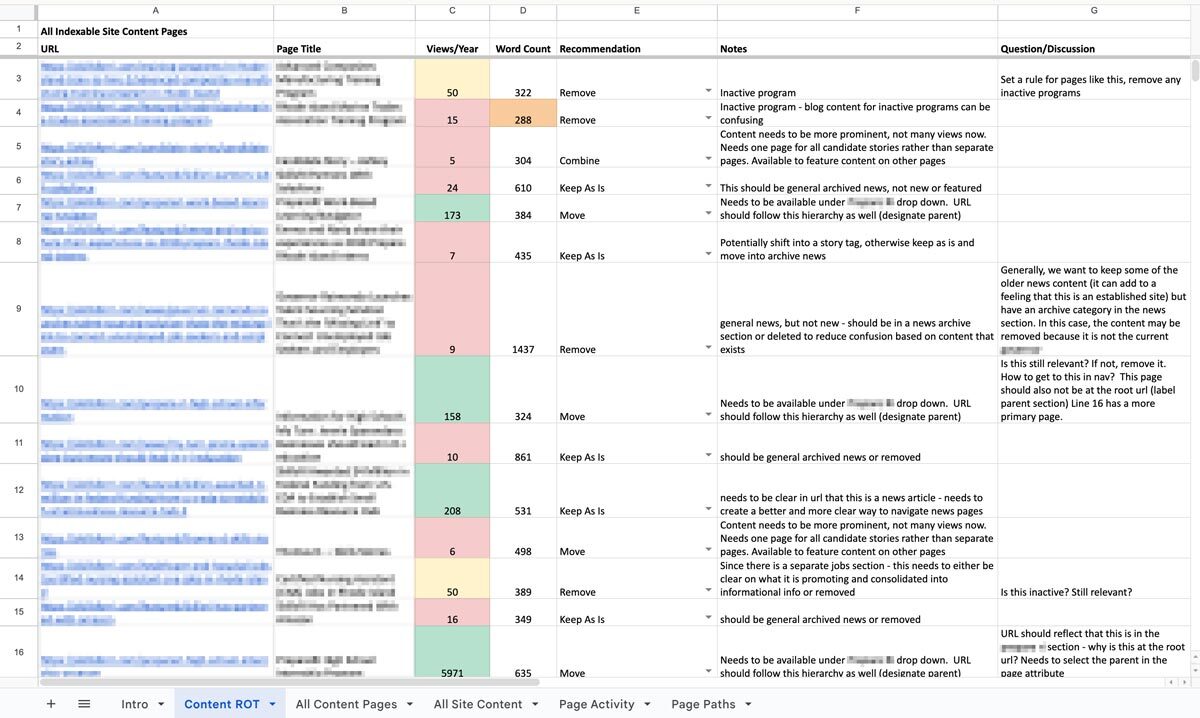
To find ROT, we’ll use a variety of collection and measurement tools. SortSite, Screaming Frog, and Siteimprove can locate broken links, orphaned pages, and other SEO issues. Google Analytics, Hotjar, Contentsquare, and MS Clarity can show common user flows and help identify trivial content. Data from these tools can also prioritize the analysis by surfacing what content is most important to users. If a page gets a lot of traffic, we know that it needs to be clear, up-to-date, and accurate. If a page isn’t visited much, we need to ask whether it should be more highly trafficked, consolidated with higher performing content, or removed.
Deliverables and Next Steps
After all this sorting and evaluating, you might be wondering what you’ll tangibly get out of the process. We know content teams are busy, and going through a review can feel like adding more work to the pile. How can we help prioritize meaningful progress here?
The big outcome is one of my personal favorites: a clean, annotated, actionable spreadsheet. Specifically, we’ll put together an audit of your content with links, page titles, notes on whether the content falls into any of the three ROT categories, and what to do about it: keep, modify, combine, or delete. Depending on the tools your content team uses or what you are willing to subscribe to, we might prepare dashboards and reports directly within an app that your team can use as an ongoing progress tracker. Wherever this list of to-do’s lives, we’ll help you prioritize it so you can start ticking off the most crucial items. Depending on what we decided in early scoping agreements, we can even help work through some high-impact issues, like bulk deleting content, suggesting rewrites, and fixing broken links.
We can also set up an ongoing content hygiene plan. While a dedicated content ROT analysis is a great way to identify and work through issues, an effective content plan should prevent ROT as much as possible and reduce the need for a large effort in the future. This might involve setting up policies, practices, and tools to guide future content management. We’ll help you find ways to see the bigger picture when updating or developing new content to make sure all pieces are accounted for. And when ROT falls through the cracks, you’ll have a plan to regularly review site content, setting ahead of time the when, what, and who.
One Piece in the Puzzle of Strong Content
As we continue to inspect the quality of your website and other digital properties, we can use this ROT analysis as a jumping off point. The initial audit may lead directly into a deeper content audit to evaluate URL paths, heading usage, performance metrics, reading level, and more. As we consider reworking, combining, and cutting entire pages, we may find the need to restructure your information architecture and taxonomy structures, in part or in whole, informed by research exercises like card sorts and tree tests. Depending on what we’ve found in the existing content and how it needs to change, we might suggest changes to your content model, adding, modifying, or removing content types and the relationships between them.
A content ROT analysis is a flexible and fruitful way to take a fresh look at your content ecosystem. If you need help getting started, let us know. We’d love to dig in with you!
The Brief
Simplifying Complexity without Losing Power
The biggest challenge as Oomph acclimated to the tax-collection world was rapidly learning enough about the complex regulations and requirements of municipalities in the industry to provide sound advice and recommendations. We started by examining their systems — the workflow of documenting and planning new product features and adding them to the roadmap, of designing the UX of those features, and of leveraging their in-house design system to build and support those features.
RSI’s main product, GOVERNMENT PREMIER, are highly customizable and configurable. Every single screen has options that would display depending on the authenticated user’s role and privileges and the tenant’s own back-office processes. User stories included many requirements based on permissions and configuration. This added challenges when imagining potential interface solutions that need to accommodate growth in multiple directions.
Oomph’s purposefully used our outside perspective to ask many questions about GOVERNMENT PREMIER’s processes. We took our years of experience designing interfaces for a wide range of consumers and applied them here. In this typically slow-to-evolve space, a user-focused experience coupled with GOVERNMENT PREMIER’s technical expertise would revolutionize tax collection as a friendlier, more intuitive, and highly customizable experience.
Our Approach
Maintaining Consistency in a Rapidly Evolving Product
Our findings and recommendations indicated previous UX teams did not create a rulebook that governed their decisions, and so, the system lacked consistency. Quality Assurance reviews would suffer from this lack of governance as well. Therefore, the first thing we did was to establish rules to design by:
- Use Storybook as a source of truth, and expand atomic elements with larger patterns (called molecules in Atomic-design-speak).
- Enforce a global design token system for colors, typography, stateful user feedback, and spacing.
- Use Material UI (MUI) from Google as our foundation. This was a previous decision that was not fully enforced, which led elements to become over-engineered or duplicated. This became known as the “Build on the shoulders of giants” rule.
- Destructive actions (like Delete or Cancel) are placed to the left of creative actions, like “Save” or “Next.”
- Every screen has one primary focus. Complex screens need a focal point for the task and user’s need to feel confident they are using the interface correctly. When long forms are required, break them down into smaller chunks. Users can save their progress and concentrate on smaller groups of tasks. Color should be used to focus users on the most important actions, and to alert them when data errors need to be addressed.
Ultimately, these rules are flexible and have served well as a starting point. Any new screen can adhere to these rules, and when we find cases where these rules are preventing users from completing their tasks or are frequently confusing users, we revisit them to make updates or clarifications. Oomph has continued to consult on new screen design and UX workflows after more than a year of working together.
The Results
Setting a New North Star to Align Our Compasses
To continue to move the product forward without increasing UX and technical debt, the teams needed a well-defined shared understanding for the user experience. Internal teams were moving forward, but not always in the same direction. Within the first month, our teams agreed upon a playbook and then continued to expand it during our engagement. We met twice weekly with product owners across the company and became a sought-after resource when teams were planning new features.
During our time together, we have celebrated these outcomes:
- Oomph consolidated the color palette from 55 colors to just 24 without losing any necessary distinctions. All colors are contrast conformant with WCAG 2.2 Level AA as a baseline.
- Colors, typographic sizes, spacing values, form elements, buttons, icons, and shadows have all been converted to design tokens.
- Figma has been used as the design system record, while Storybook has been strengthened and updated to smartly leverage Material UI. The success of Storybook is largely due to its inclusion as a GOVERNMENT PREMIER project dependency — it has to be used and the latest version is often pinned as the product evolves.
- An internal Design Manager at RSI was established as someone to lead the engineering team and maintain quality oversight as it pertains to the design system.
- Oomph completed designs for 15 features for GOVERNMENT PREMIER, many of which involve designs for three or more screens or modals. Oomph also designed workflows for over a dozen Online Services workflows with a heavier emphasis on mobile-responsive solutions.
As Oomph moves into our second year collaborating with the GOVERNMENT PREMIER teams, we plan to fully investigate user personas on both the admin and taxpayer side of the platform, add more context and governance to the project designs, and provide quality assurance feedback on the working application. We value our partnership with this unique team of experts and look forward to continuing the tax software revolution.
The Brief
Oomph has worked with Lifespan since 2010 and created the second version of their intranet on Drupal 7. A critical tool like an intranet needs regular maintenance. Even with regular updates, there comes a time when the whole platform needs a re-architecture to be flexible, secure, and performant.
In 2021, it was time to plan the next phase of the intranet on Drupal 9. Lifespan used the redesign as an opportunity to realign the employee journeys with the evolution of their work. And COVID-19 had provided an opportunity to reevaluate whether a security-first, HIPAA-compliant intranet could be available to those working from home.
Departments
Job & Clinical Tools
Staff Contacts
Critical Top-Tasks
The Oomph team ran a Discovery and research phase to gather requirements and understand employee expectations. We ran workshops with client stakeholders, identified important work tasks and created 5 employee personas, conducted one-on-one interviews with key persona types, and gathered feedback from employees with an online and email survey.
Through this research, we started to see two different types of tasks emerge: those that required speed to a destination and those that required exploration and unstructured browsing.
Tasks requiring speed to completion:
- Access health and safety policies
- Access a staff directory and immediately contact high-value individuals
- Access job tools, which are often 3rd-party digital services, for everything from timesheets to diagnostics to general education
- Access online forms to request items and services
- Access HR and employment benefits
Tasks requiring unstructured browsing:
- Access Department sites, particularly my department for relevant news & events
- Be exposed to company culture through up-to-date news and events, videos, seminars, and important business announcements or press coverage
- Access the internal job board to find advancement opportunities
- If I am a new employee, or a new manager, access onboarding material and quick links for new individuals
- Visit and browse the Bulletin Board
It became clear through our process that Lifespan employees needed to move quickly and slowly, often in the same session, depending on the important tasks they needed to complete. The intranet needed to support both types of journeys to remain a successful platform for getting work done and absorbing company culture.
The Approach
A Focused Priority on Search
Expectations about fast and accurate search are high because of you know who. When designing search for an employee intranet, the baseline requirements are even higher. We knew that we had to get the design and implementation of search right.
We took a learn-once, use-everywhere approach when it came to search interfaces. Search would be a core part of finding many types of content — tools, forms, people, departments, locations, and more. Each had to have a similar structure and set of filtering options to be the most useful.
The list of tools, locations, or people needed smart defaults. Before someone conducts their own search, each screen displays popular searches and the common content people need to access. In some cases, an employee does not even need to search in order to find what they need.
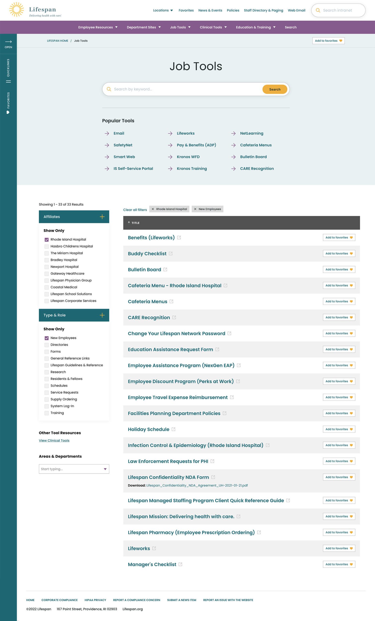


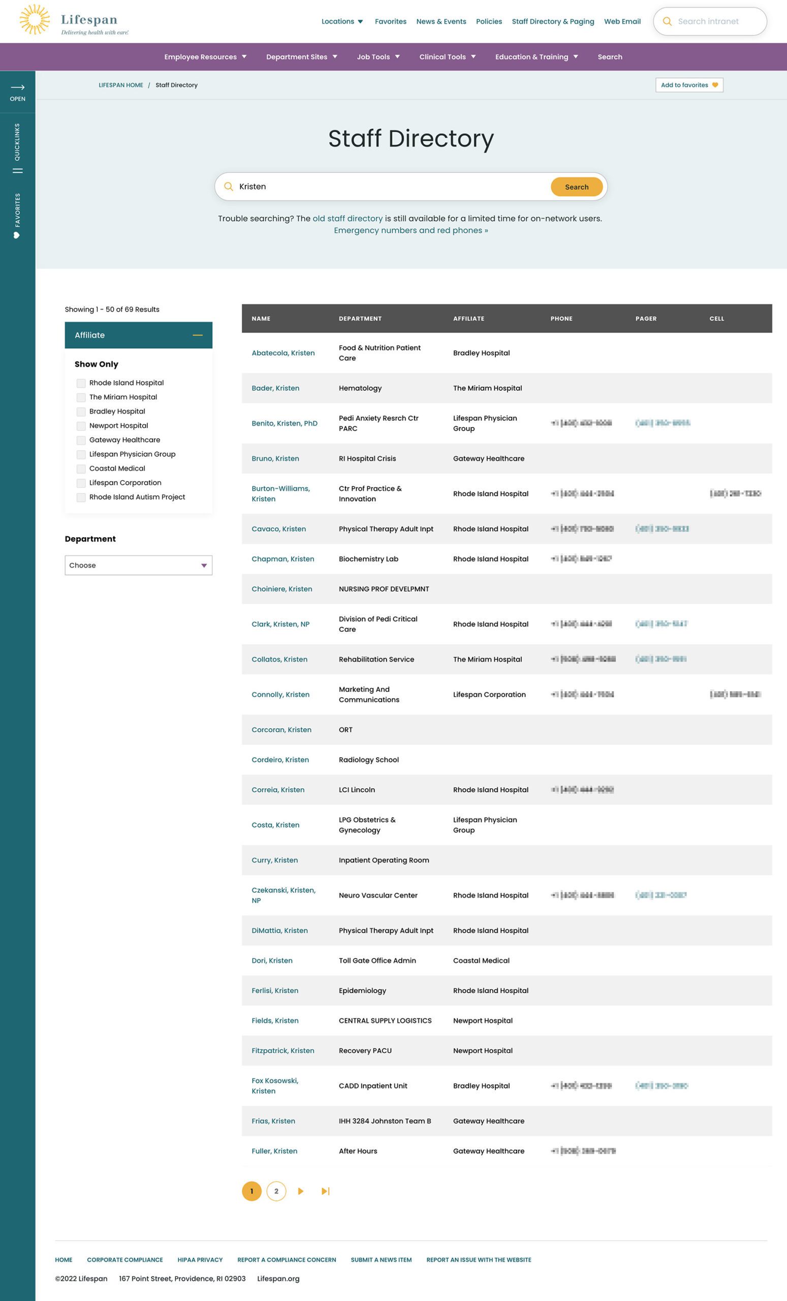
Two search pages, similar interfaces: The Job Tools search and Staff Directory follow similar patterns, adhering to our “learn once, use everywhere” rule
Personalization that follows Employees from Device to Device
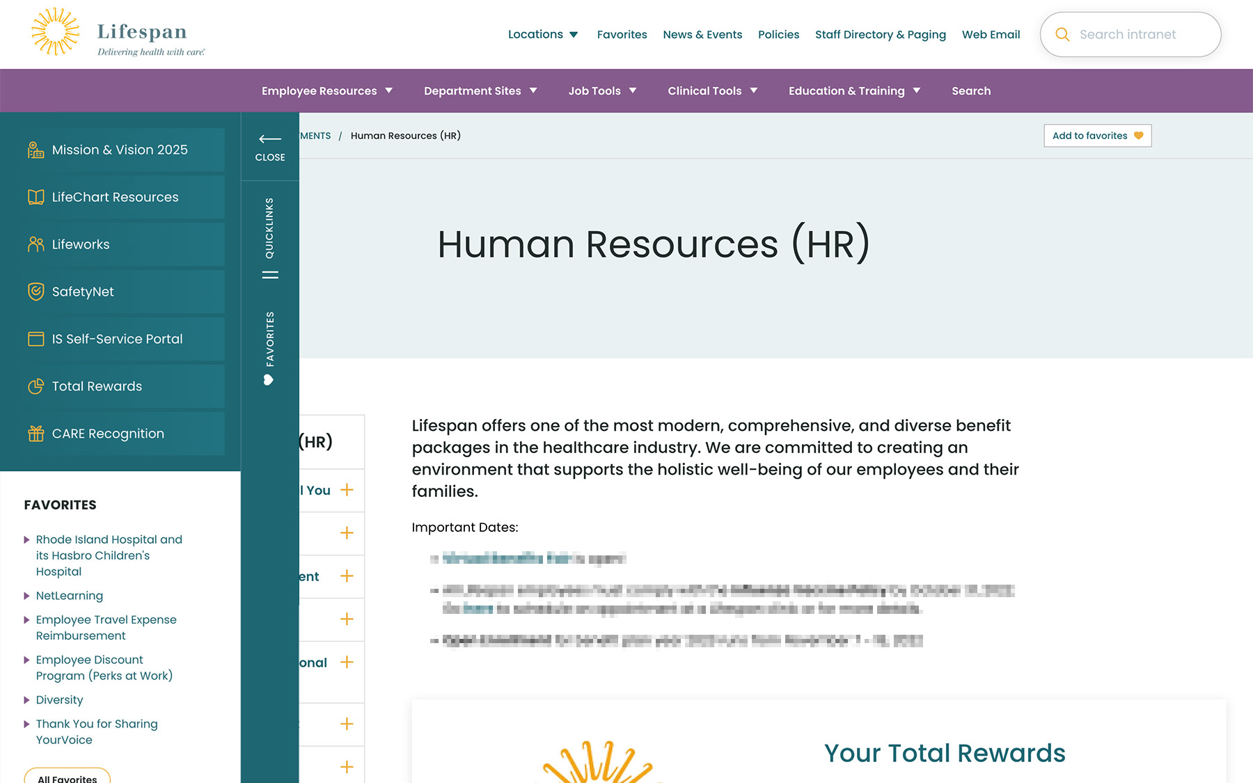
Personalization had to be a part of our solution as well. Employees are able to use S.S.O. to access the intranet from their personal devices or workstation computers in the hospitals. Workstations are often shared between multiple clinical staff, therefore, our system needed to support stopping one task on on device and picking it back up on another.
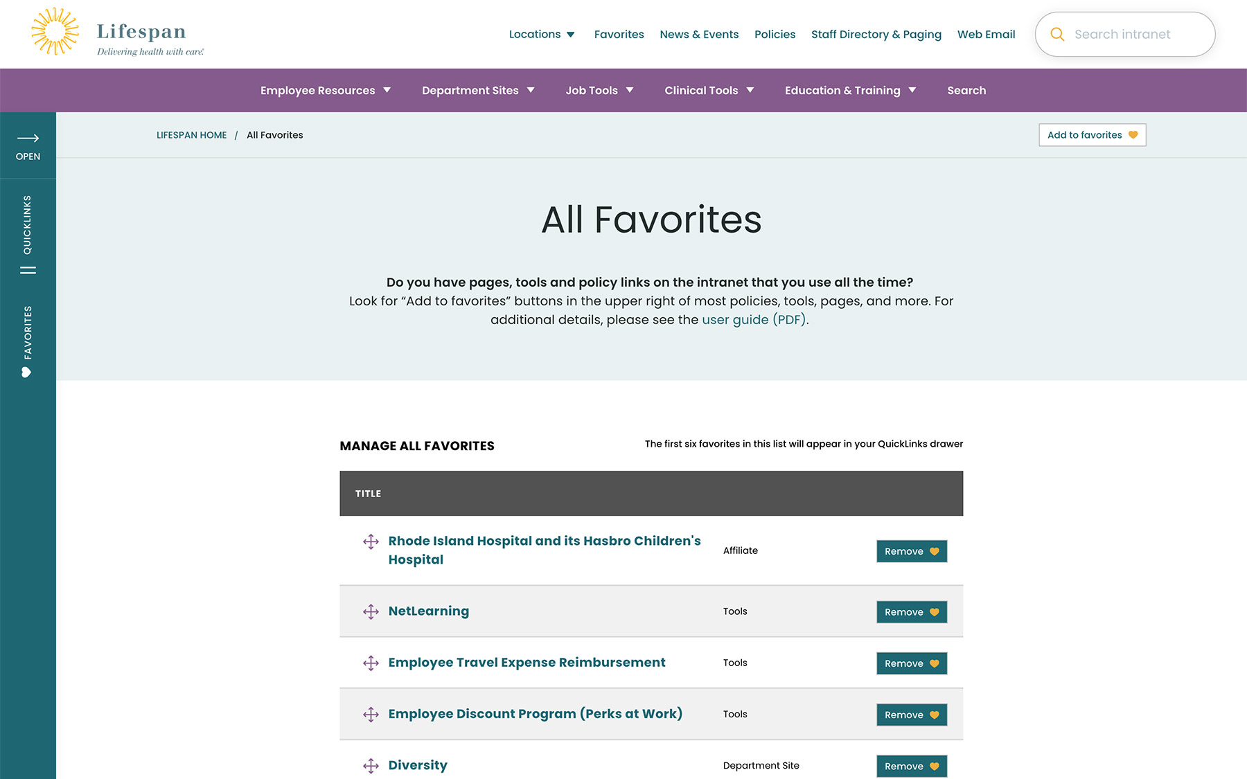
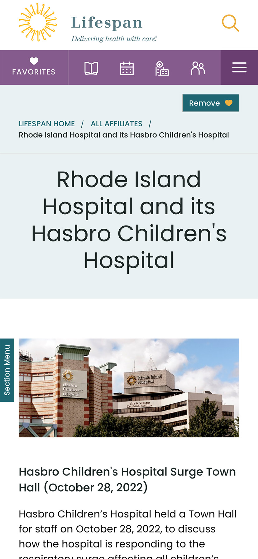
A Favorites feature allows employees to create their own transportable bookmarks. Almost everything on the site can be bookmarked, reducing the need to search for commonly used content and tools. Six custom favorites are available from the left drawer at all times, while the entire list of favorites is one more click away.
Supporting Speed and Engagement
Speed is at the heart of critical tasks and high-quality patient care. A nurse, at a shared workstation, needs to log in quickly, find the tool they need, and administer care. Time is critical. They don’t want extra clicks, a search that doesn’t work intuitively, or slow page load times. Staff don’t want it, and management doesn’t want it, either.
Engagement is slower and the intention is different. Speed is for tasks. Engagement is for exploring. This is how company culture is communicated and absorbed. This is when people catch up with department and company news, find events to attend, view a photo gallery from an event they missed, or browse a bulletin board to swap items with other employees. You can’t have an intranet that is ALL business just like you can’t have an intranet that is NO business.
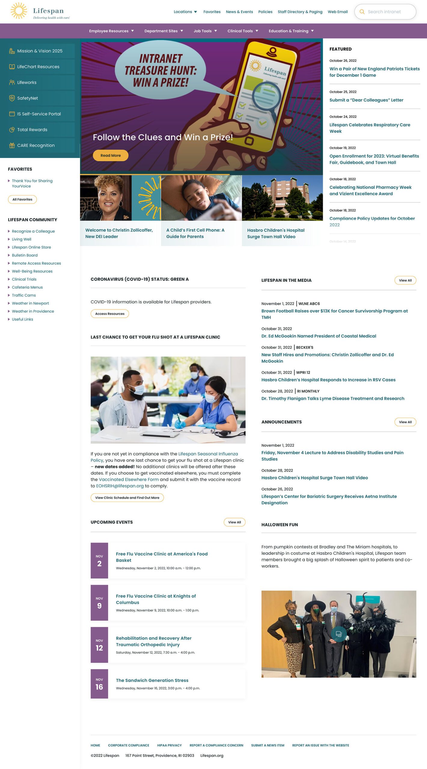
A Dashboard Built for Speed or Browsing
On the starting page, an employee might be in need for something immediate or might have time to explore. We do not know their intention, therefore, this page needs to support both.
The left drawer is open to employees on the dashboard. It is open to show them what it contains and to remove a click when accessing the important common destinations within. The first seven links are common items for any employee, curated by the Lifespan team. They are a mixture of tactical items — like time sheets — and company culture items — like the CARE recognition program.
Below that are the employee Favorites. The first six favorites are shown while all are available with an extra click.
The top navigation supports speed to common destinations, some of which are search interfaces and others which are built for browsing.
The rest of the page showcases engagement and company culture. Featured news stories with images are balanced with quick news and event lists. Flexible content sections allow authors to add and remove content blocks as new items are required.
Other content pages that were focused on engagement are the deeper News and Events pages, customized Location pages (for each major hospital location), and a community Bulletin Board.
The Results
Smooth Onboarding and Acceptance
No matter how confident our teams were, we didn’t really know if the redesign was a success until employees moved from the older tools they were familiar with. The Lifespan team did a fantastic job creating walk through videos ahead of the launch. Old tools and directories stayed available for a period of overlap, but our teams saw quick adoption into the new tools in favor of the familiar.
Since the intranet is now available off of the closed Lifespan network, we have seen mobile traffic increase dramatically. The responsive design is an improved experience over the previous intranet and the numbers prove it. In fact, we have found that more employees engage in company culture content on their personal devices, while using the company workstations for their tasks.
Oomph is very proud to have worked with one of the largest private employers in the state, and we are very proud to have our work used by over 17,000 people every day. Oomph continues to support the Lifespan team and the intranet project, iteratively improving the features and evolving the toolset to be effective for all.
The Brief
Powering Design With User Feedback
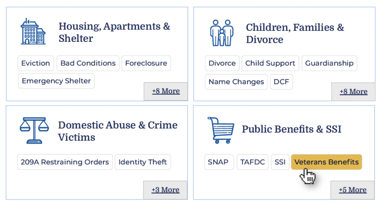
MLH exists to help Massachusetts residents find information to solve common legal issues, like securing public benefits or fighting an eviction. To ensure every aspect of the site was grounded in the audiences’ needs, MLH wanted to incorporate feedback during the discovery and design phases from real people who fit MLH’s primary and secondary audience profiles.
By performing a thorough discovery process — including working group interviews, visitor interviews, cohort site analysis, and wireframe and prototype testing — Oomph was able to create a successful site design dedicated to the needs of visitors.
The Approach
Helping the Audience by Understanding Them
MLH shares insights on heavy topics ranging from housing and homelessness to money, debt, and immigration. The site contains sensitive information that could change their visitors’ lives; by connecting them to domestic violence help or resources to get their children back, for example. When Oomph first jumped into the project, our main goal was to step into the shoes of their user groups to better understand their needs when they seek legal information.
The main audience of MLH is Massachusetts residents who are primarily low-income and may not speak English as a first language. They use the site to become informed about legal issues they’re facing quickly and efficiently. As one visitor stated:
“I’m coming here because I have a problem. I want to know, where’s the search? What can I do here? What can I not do? Don’t waste my time making me read [fluff]…”
To meet this need, the MLH team provides information in plain English at a fourth to sixth-grade reading level, rather than using complicated lawyer jargon, which makes it accessible to a wider group of people. Additionally, many resources have been professionally translated into other languages, such as Spanish.
The secondary audience that visits the site is those who help the primary audience, such as social service providers, legal aid lawyers, and legal librarians. Oomph had to walk a fine line by getting feedback from the secondary audience to help inform information about the primary audience; however, our main goal was to ensure that low-income and non-English-speaking people could find the answers they needed.
Gaining the Audience’s Trust with Thoughtful Design Details
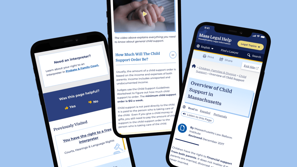
We learned that many visitors found the MLH website by searching Google with their questions. Many primary audience members would visit the site on their mobile phones, perhaps even listening to its content with their text-to-speech tool. This increased the importance of a mobile-first design so the pages loaded quickly, the information was clear, and the experience made sense for mobile browsing.
A Modernized Design
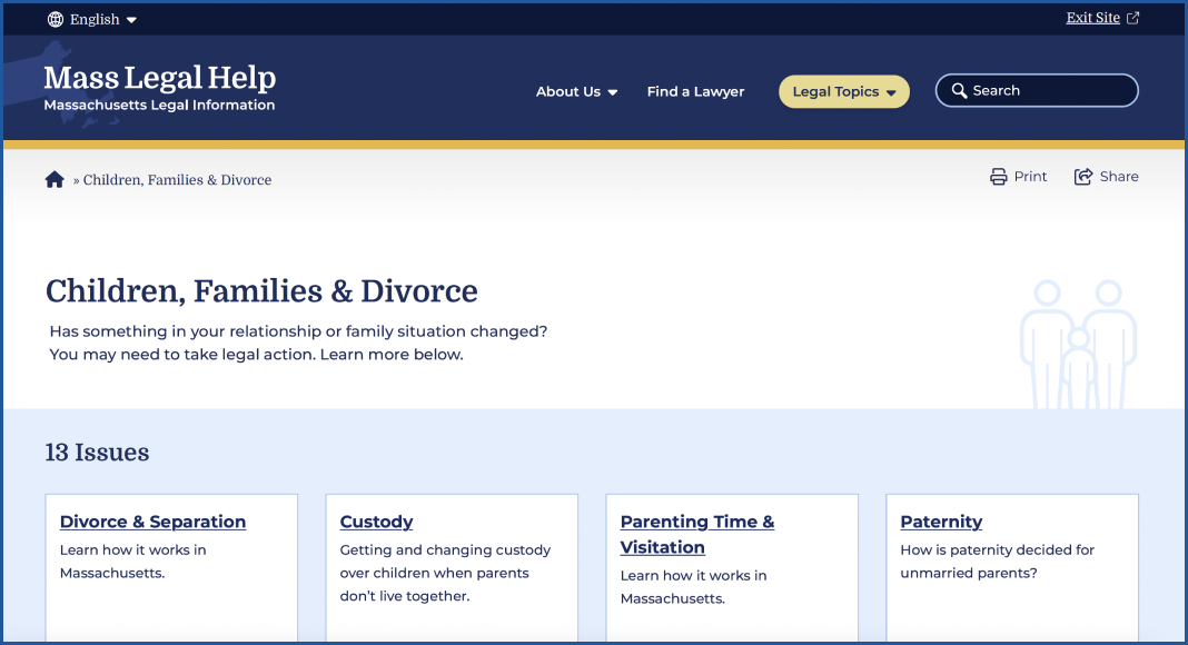
The site’s look was outdated, making some visitors feel that it either lacked credibility or didn’t contain the latest legal rules and laws (even though it’s been actively maintained and added to for the past 15+ years!). For the Oomph team, the final designs had to walk a fine line between being authoritative, trustworthy, and comforting. To achieve this, we retained the blue color palette but created slightly softer tones to help create a calming aesthetic.
Our team also limited the amount of photography on the site but ensured that any photos we used represented the diverse groups MLH serves. Icons became a tool to guide the visitor through different topics; regardless of the visitor’s language, the icon could help them understand what information may be within that particular topic.
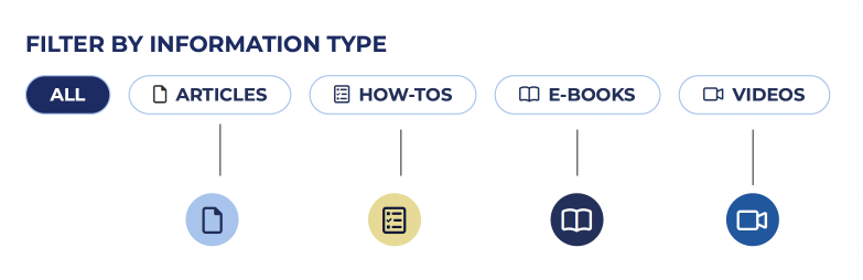
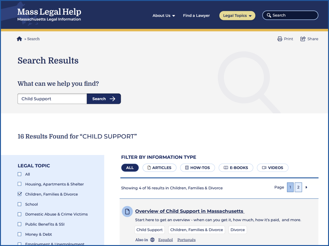
MLH has also accumulated a lot of content over the years. To help organize its search and topic organization feature, we incorporated content filters according to the information type: articles, how-tos, e-books, and videos. Each category has its own icon, and each icon is represented by a color. This helps unify the search based on the type of content the visitor is seeking.
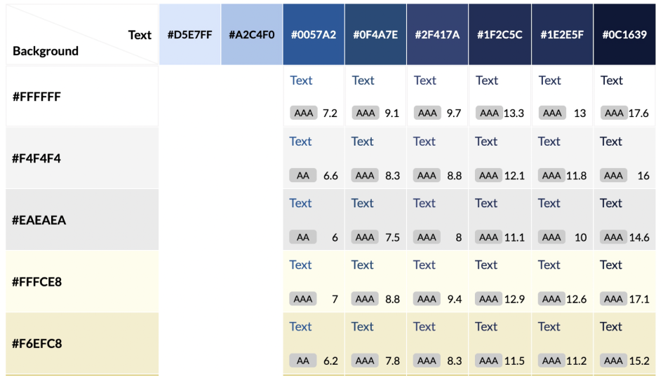
Color Contrast and Accessibility
From the start, MLH made it very clear that their new designs should comply with both 508 and WCAG 2.1 guidelines — ideally conforming to the highest level of contrast, level AAA. As Oomph created the color palette, we were careful to use only high-contrast colors and document how to use them in a system to ensure that the palette satisfied accessibility guidelines.
Supporting the Content With Tools
MLH had several existing tools to assist in digesting content. During our discovery phase, we validated the need for these tools and upgraded them. For example, on the content pages, there are options to print, share, listen to the content, and even switch the language as the visitor lands on the page.
Within the main navigation menu, the design included a “Quick Exit” button. This supports visitors who need to abandon the page when, for example, a domestic violence survivor’s abuser re-entered the room.
We cultivated a passion for this feature through our research and have written an article detailing our best practices for implementing a quick exit button. Additionally, we have created a Drupal Module for this feature so that more people can implement this important tool for sites with sensitive content.
Findability of Content Through the Main Menu Navigation
On a larger scale, the primary and secondary navigation menus needed an upgrade. As it stood, the main categories were wall-to-wall across the desktop, and it was hard to determine where a visitor needed to go. The secondary navigation menu read like a table of contents in a chapter book and didn’t allow the visitor to return to other categories.
We solved for this by creating a survey to test a proposed navigation structure and revised the information architecture (IA). This included a new top menu that supported every step of our primary audience’s journey. We also created a level of navigation that directed visitors to the information they were looking for, no matter how they entered the site.
Search
For search, we used a multi-filter approach which allows visitors to search both by topic and by content type. This filtering allowed them to find questions that might belong to multiple categories, and to narrow down content to the types they are willing to review.
Proactive vs. Reactive Enhancements
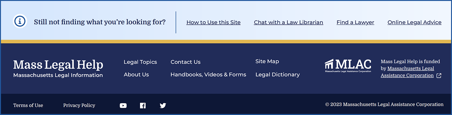
Analytics and user interview results showed that most visitors start their journey on either the homepage or pages that are three or more levels down the navigation. Many also reach the site via a specific Google search. While it is likely they found what they needed, they may not be aware of other information that can help them. To mitigate the risk of bouncing away from the website, we created a “Viewers also reviewed…” component on answer pages that showcased related content more naturally.
Repeating Help Footer
Above the footer, we created a “safety net” to help visitors who have browsed the site for a long time but have not found what they are looking for. If they reached the end of the page, this footer would direct them to more content that may hold their answers.
Previously Viewed
We added a “Previously Viewed” section at the bottom of content pages to remind visitors of the content they have already reviewed. This reduces the burden on the visitor when they ask themselves, “I think I’ve seen that already, but I can’t remember where I saw it.”
The Results
A Modern, Helpful Website Design
Through prototype testing with our first design mock-up with real visitors, the participants individually determined that the new site’s design and content organization was easy to navigate, gave them a trustworthy impression, and looked appealing. Today, the MLH website is live with a fresh Oomph design. We hope the structure and design will continue to not only keep visitors on the site longer but also help those visitors find the legal answers that they need.
Have a project that requires a human-first, empathetic approach? Consider talking to Oomph about incorporating user feedback into a user experience-focused design project for your next website refresh.
It’s no secret: Higher education institutions are complex.
Between multiple campuses, multiple audiences, and a high volume of content, higher ed marketing and communications teams have a ton to juggle.
And that’s before you throw a new website into the mix.
Not long ago, the team at Oomph partnered with the University of Colorado (CU) and Keene State College (KSC) to redesign sites for each institution. While their asks – and end products – were unique, the processes had a lot in common. So much so that we’re peeling back the curtain on our discovery process to give other higher ed institutions the tools to deliver websites that meet business goals and audience needs.
In this article, we’re turning our lessons learned into a discovery playbook that can help higher education institutions set the stage for a successful site redesign.
The Projects
University of Colorado Giving Platform
The University of Colorado has an active and engaged alumni network that loves supporting all things CU. The university came to Oomph because it needed a donor funds platform that could keep up. The goals of the discovery process were to:
- Document existing conditions, strengths and weaknesses, and stakeholder perceptions.
- Compare the strengths and weaknesses of the current site to similar ones from other colleges and universities.
- Refocus and align on core audiences that visit the site.
- Recommend ways to improve and enhance existing content and storytelling.
- Evaluate and make recommendations for a modern technology stack
While CU had a gut feeling about what it would take to meet internal expectations and keep prospective donors happy, gut feelings aren’t enough to build a website. CU knew that a professional perspective and data-backed analysis would lay a firm foundation for the site redesign.
Keene State College Main Website
KSC, a public liberal arts college in New Hampshire, wanted a refreshed main website that would resonate with prospective students, current students, and alumni alike. For KSC, key goals during discovery were to:
- Better understand the needs and more deeply define their primary audience: prospective students.
- Identify navigation patterns that would make it easier for students and their parents to find the content they need.
- Define design styles that create a more welcoming website experience and support storytelling during the future redesign.
The team came to Oomph with ideas but wanted research validation and guidance to nurture those ideas into a strategic design plan.
The Approach
For both projects, Oomph utilized our in-depth discovery process to validate assumptions, clarify priorities, and gain buy-in across the organizations.
KSC and CU both had a good sense of the work they needed to be done. But having a feel for the floorplan doesn’t mean you’re ready to build your dream house. Whether it’s a home or a website, both projects need an architect: an experienced professional who can consider all the requirements and create a strategic framework that’s able to support them. That work should happen before deciding what paint to put on the walls.
In our initial review, Oomph found that both sites had similar challenges: They struggled to focus on one key audience and to easily guide users through the site to the desired content. Our question was: How do we solve those struggles in a new website?
To answer it, we led KSC and CU through discovery processes that included:
- An intake questionnaire and live sessions with key stakeholders to understand the goals and challenges holding the current sites back.
- Defining strengths and areas for improvement with methods like a UX audit, a content and analytics audit, and a cohort analysis.
- Creating user journey maps that rolled audience, website, and competitive insights into a unified vision for the new user experience.
- Delivering a final set of data-backed recommendations that translated needs and wants into actionable next steps, equipping both teams to secure organizational approval and move the projects forward.
The Insights
Discovery isn’t a one-size-fits-all. However, our experiences with KSC and CU highlighted some common challenges that many higher-ed institutions face. Our insights from these projects offer a starting point for other institutions kicking off their own website redesigns.
- Start with your audience’s needs.
Who is your primary audience? Figure out who they are, then really drill down on their needs, preferences, and desired actions. This can be uniquely challenging for higher education institutions because they serve such a wide range of people.
Data is how you overcome that hurdle. As part of discovery, we:
- Completed a UX audit with tools like the BASIC heuristics framework to see which parts of the user flow are working and which need an overhaul.
- Rounded out those findings with a content audit to understand how users engaged with the site content.
- Completed a cohort analysis to see how the sites stacked up against their higher-ed peers.
When you do that work, you get a birds-eye view into what your audience really needs – and what it’ll take for your website to be up to the challenge.
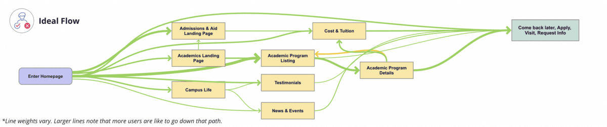
Take KSC. The existing site attempted to serve multiple audiences, creating a user journey that looked like this:
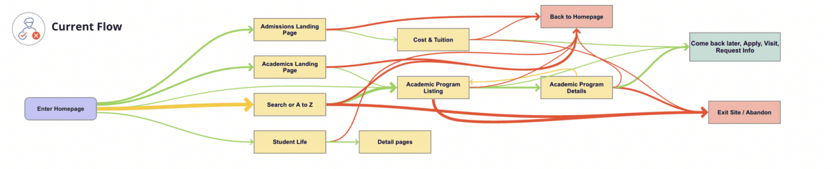
We identified a primary audience of prospective students, specifically local high school students and their parents/guardians. When you speak directly to those students, you get a simpler, cleaner user journey that looks like this:
- Define organized and clear navigation to support user journeys.
Your navigation is like a map. When all the right roads are in place, it should help your users get where they want to go.
That makes your navigation the starting point for your redesign. Your goal is to define where content will live, the actions users can take upon arrival, and, equally important, the content they won’t see at first. This then informs what goes where – the header nav, the footer nav, or the utility nav – because each has unique and complementary purposes.
With both KSC and CU, discovery was our opportunity to start building a navigation that would serve the primary audience we had already uncovered. For CU, the current navigation:
- Made it difficult for donors to find what they need. Search, Write-In Fund, and “Page Not Found” were among the top 20 most visited pages, indicating that users weren’t easily finding their way.
- Didn’t engage donors, which showed up in the low number of returning visits.
- Needed to help donors more quickly find what they need without having to search the entire site.
Current CU navigation:

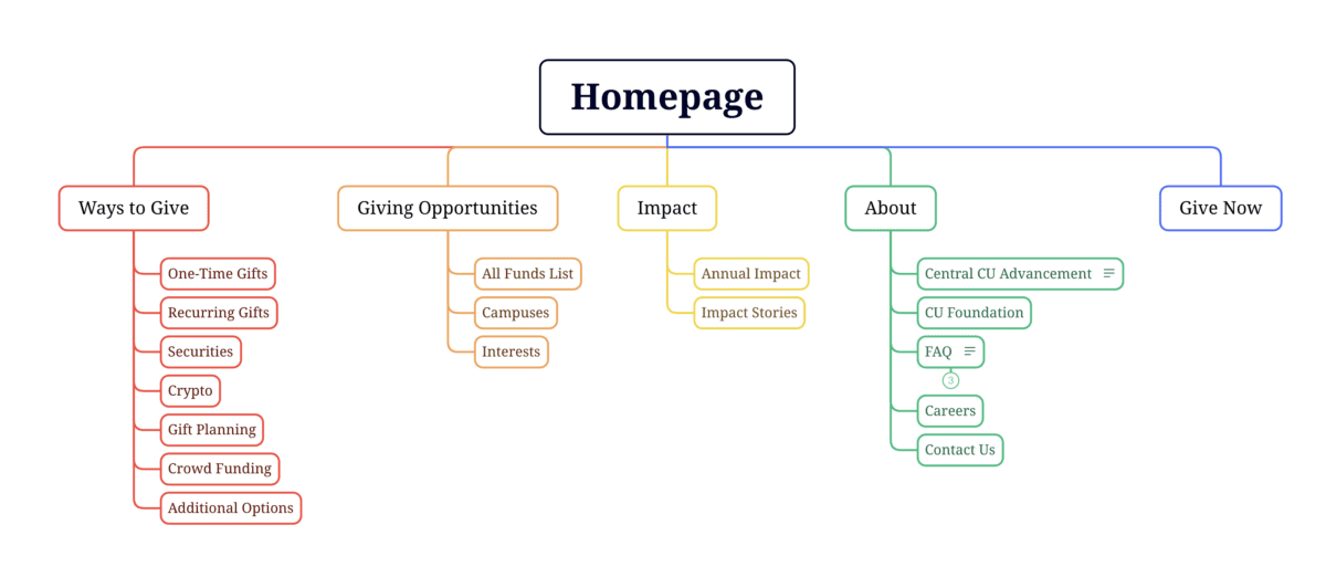
During discovery, we created an updated navigation that would appeal to its primary audience of prospective donors, while still meeting the needs of secondary audiences (returning donors and giving professionals).
Proposed CU navigation:
- Find an optimal blend of branding, design, and content – especially for the home page and other high-visibility areas.
The design and content you choose for your site should resonate with your target audience and enhance the navigation you already defined. In that way, your home page is like your storefront. What will you put on the sign or display in the windows so people will actually walk inside?
That’s the secret sauce behind this part of discovery: deciding what your primary audience really needs to know and how best to showcase it.
To help KSC speak to prospective students, we recommended:
- Using movement, color, and text styles to add visual impact to important content and create a welcoming, curated experience.
- Prioritizing diversity in visuals, so wide a range of students could picture themselves as part of the student body.
- Using stats and testimonials to build trust and foster a feeling of belonging.
CU wanted to connect with prospective donors, so we suggested a design that:
- Incorporated more storytelling and impact stories to show the positive ripple effect of every dollar donated.
- Included strategic calls to action to pull users deeper into the site.
- Added social sharing to enable donors to highlight their generosity and feel a deeper sense of connection.
- Probe additional areas where needed (and skip where it’s not).
Our hot take: There is such a thing as too much data. If you’re wading through pools of information that isn’t relevant to your end user, it can muddy the waters and make it harder to identify what’s worth acting on.
With that in mind, this step will change from project to project. Ask yourself, what else does my audience need to feel like they got what they came for?
For KSC, that involved additional strategy work – like the information architecture – that helped the institution gear up for later design phases. CU, on the other hand, needed significant technical discovery to address the level of custom code required, limited page building capabilities and clunky e-commerce integration. We recommended an updated tech stack, including a new donation platform and payment gateway, that would improve security, simplify maintenance, and enhance the user experience.
- Plan for a system that allows for easy updates later.
As they say, the only constant is change. This rings especially true for higher ed institution websites, where content is plentiful and multiple stakeholders need to make site updates.
To make sure CU and KSC’s sites continued to work for them long after our projects had ended, our discovery included suggestions around:
- Choosing the right content management system (CMS). We ensured each site had CMS capabilities that would allow non-tech-savvy team members to maintain and update the content.
- Establish design systems and templates for ease and consistency. For CU, that involved creating repeatable page layouts for their fund pages for simpler authoring and visual polish.
Start Your Redesign on the Right Foot
A thorough, well-researched, and well-organized discovery is key for designing a website that meets all of your – and your audience’s – needs.
Need a fresh perspective on your higher ed site redesign? Let’s talk about it.