
The Brief
Visit California is a Destination Marketing Organization (DMO) with over 25 years of experience in promoting California as a premier travel destination. The organization, funded through a unique partnership between the state and the travel industry, operates with a substantial budget of over $185 million (2023). As the leader of California’s brand messaging, Visit California previously anchored its campaigns under the “Dream Big” brand positioning. However, following a significant shift in traveler motivations post-pandemic, Visit California recognized a growing desire for experiences that foster joy, connection, and adventure.
This insight led to the evolution of the brand into “The Ultimate Playground,” a strategic repositioning that highlights the state’s unparalleled diversity of geography, activities, and cultural experiences.
The “Let’s Play” campaign leveraged a robust mix of television, out-of-home, digital, and social media activations to showcase California’s diverse offerings — from wine tasting and rock climbing to luxury hotel stays, food truck adventures, and outdoor music festivals. By highlighting the playful spirit inherent in every experience, the campaign aimed to deepen the audience’s emotional connection to the state, reinforcing California’s identity as The Ultimate Playground and setting the stage for sustained brand engagement.
The APPROACH
The initial roll-out of a rebrand update is critical, and transitioning from “Dream Big” to “The Ultimate Playground” required careful internal alignment and thorough message testing. Oomph, alongside Visit California’s partner agencies, began collaborating on this effort about nine months before the campaign launch. During these early planning meetings, our team contributed key ideas and strategic approaches to help shape the campaign.
Our focus remained on the web user and their position in the customer journey. Previous campaigns had not fully optimized the user flow, so we saw this as an opportunity to reimagine the experience. With paid media driving traffic to the website, it was essential to provide visitors with clear actions once they arrived. The advertising had done its job by capturing attention and sparking interest. Now, our challenge was to build on that momentum, guiding users from interest to meaningful engagement and action.
An interactive Quiz
The Ultimate Playground campaign needed to accomplish a few things:
- Educate the consumer about the new brand positioning and why California should be considered the Ultimate Playground
- Inform the consumer about play and how it is more about kids and theme parks. Adults can and should play as well, and serious activities can be conducted in playful ways
- Activate the consumer with inspiration by giving them a unique experience and curating inspirational, playful activities throughout the state
Our teams settled on a quiz as a way to engage visitors and serve them personalized content. Based on initial research, we decided an image-based quiz would be the fastest and most fun way to answer questions and receive a set of recommendations. Choosing preferences from a set of images is a quick way to make progress tangible. We limited the questions to nine, and most visitors took two minutes to complete the quiz.
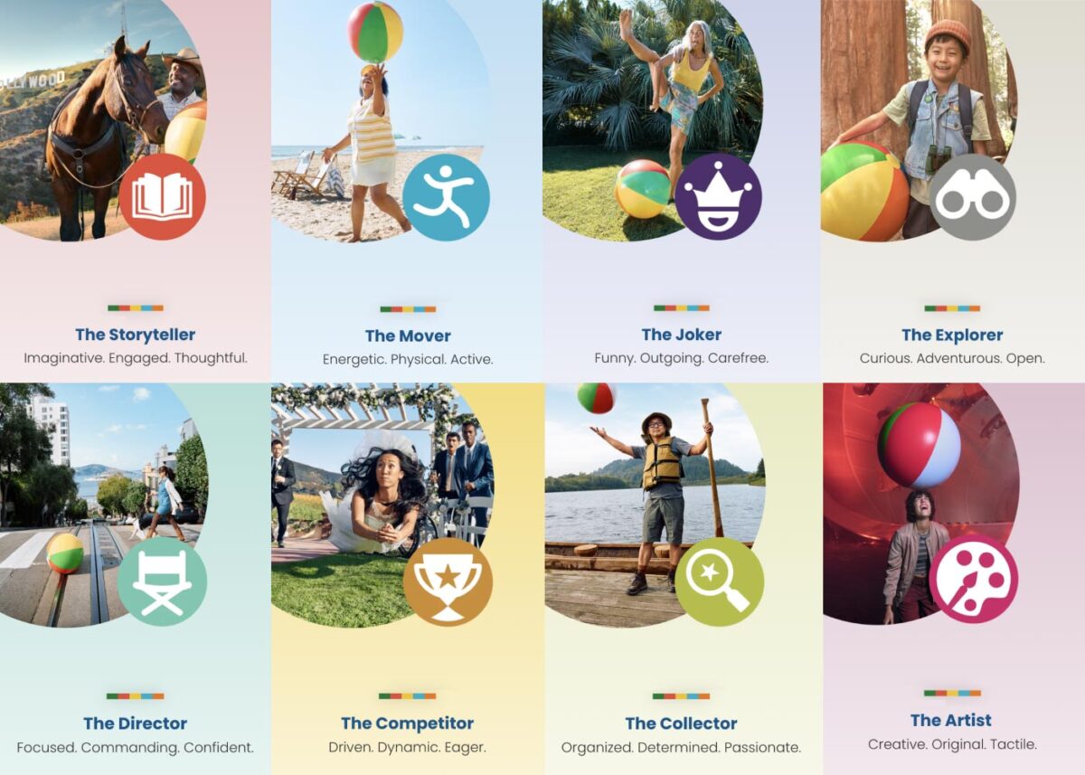
Play Styles
The eight Play Styles were based on personas researched and created by the National Institute for Play, headquartered in California. Content creators at Visit California crafted a series of TV spots with glimpses into different styles of play. Our Play Quiz would highlight which Play Style matched the participant’s preferences, and our results pages served relevant, curated content, a similar Celebrity personality, and even a secondary play style.
Email collection allowed visitors to send their play style results to themselves and allowed opt-in to more personalized content. Our team worked quickly over three months to solidify the approach, choose the quiz method and weighting criteria of the questions, and design the eight play style pages, two landing pages, a homepage takeover, and supporting pages for the new campaign.
The Results
Play Quiz: Avg. session duration
Play Styles: Avg. session duration
Compared to Site: Avg. session duration
Our approach to the campaign was to support the bottom of the funnel and give visitors coming from digital ads something useful. Given the wealth of content the Visit California website contains, these broad Play Style personas made visitors see themselves in California. It brought curated content to them and provided what we thought of as a personal homepage with relevant recommendations.
“Let’s Play” was the first part of a years-long brand campaign. We are already working on the campaign for 2025 which we hope will be even more engaging than the first!
THE BRIEF
Three Organizations Working Towards One Goal
The American Foundation for Suicide Prevention (AFSP), the National Action Alliance for Suicide Prevention (Action Alliance), and the Suicide Prevention Resource Center (SPRC) have been commissioning The Harris Poll to conduct a bi-annual, nationally representative survey of adults in the U.S. to understand the public’s beliefs and attitudes about mental health and suicide.


This year, 2022, all three suicide prevention organizations teamed up with Oomph to take that data and distill it into a microsite for easy consumption among professionals and the general public who visit the site.
The data from the poll shows that progress has been made, but there is still more to do. We all must continue to learn more about suicide and mental health, particularly through increased research efforts, teaching everyone how to help prevent suicide and strengthen mental health, and advocate for improved access to care and robust crisis services.
Oomph made sure our approach to information design, branding, and messaging came across effectively and clearly. How could we use data to show people which actions they could personally take to affect positive change?
THE APPROACH
Design Sprint to E-Learning Microsite
Our initial idea of the audience was more public facing rather than a specific audience. We started our design approach to be stylized and playful.
Taking a step back, we regrouped and determined that the audience was more academic and administrative, therefore it was to lean towards a professional tone. A new idea clicked — we could present this microsite as an e-learning experience.
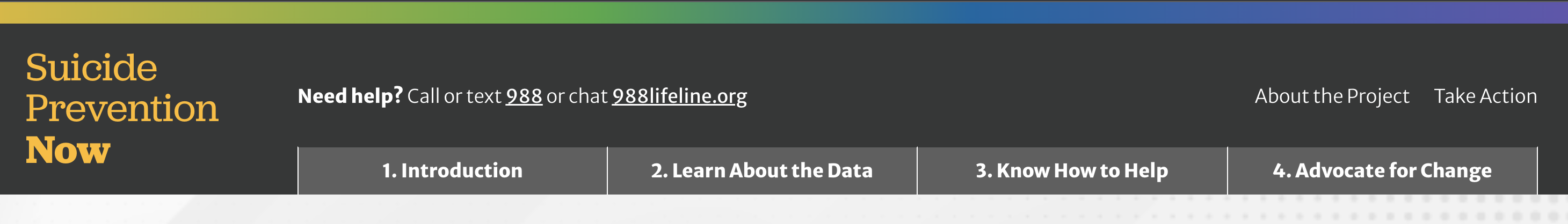
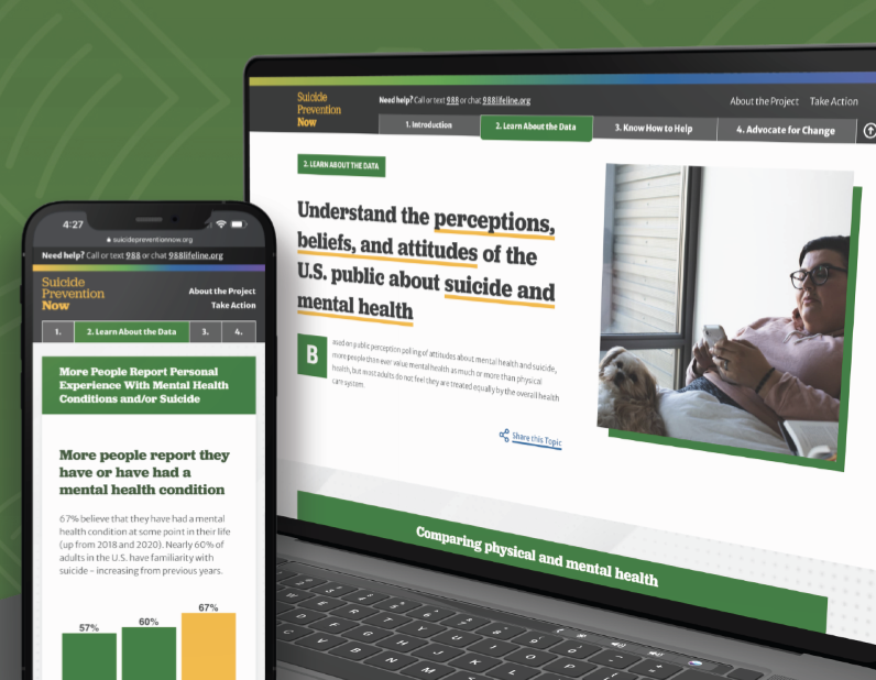
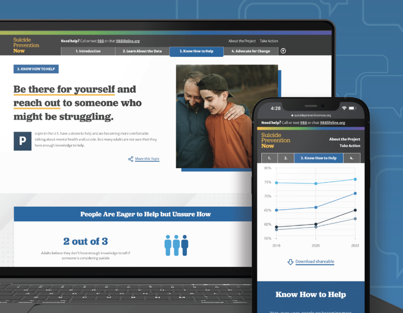
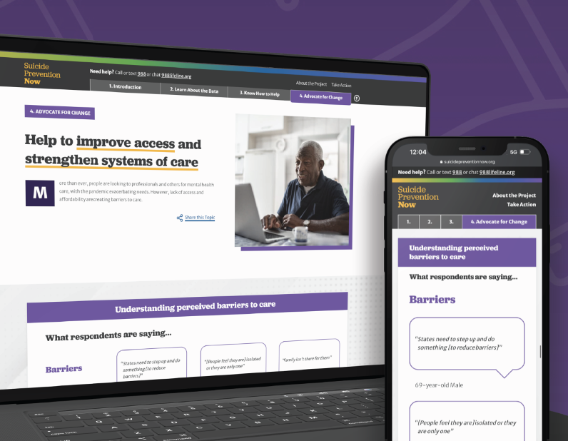
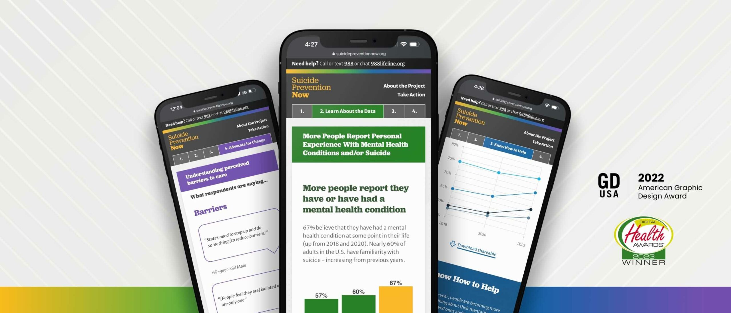
The new design direction features four key chapters: the Introduction, Learn About the Data, Know How to Help, and Advocate for Change. By implementing a tab-like navigation, it allows for users to hop to each section they may be most interested in, and reads as if it is an eBook.
Each section is color coded, and the navigation has a gradient that brings in all of the sections together in unity to showcase that message throughout. Each section follows a similar pattern: an introduction, data from the Harris Poll, an opportunity to find resources about the chapter, and shareable resources to help spread the message on the viewer’s own social channels. We hope that by the end of the microsite, the user is ready to inform themselves further by finding resources or sharing about the current perceptions of suicide.
THE RESULTS
Ongoing Public-education Impact
While Suicide Prevention Now is just one step of many, we hope that this project will help more people to become an advocate, or help spread awareness about suicide prevention. We hope it helps to save lives.
While working on this project, we became aware of a national suicide hotline number that is quick to dial and easy to remember, just like 911. Dial 988 to be connected to a friendly and helpful advocate if you or someone you know are having thoughts of suicide.
Working with Oomph was a great experience all the way around. From exploration to delivery, Oomph provided excellent guidance, and the quality of the final site is fantastic! I look forward to working with the team again in the future.
JONATHAN DOZIER-EZELL Director of Digital Communications,
American Foundation for Suicide Prevention
THE BRIEF
Same Look, Better Build
Ordinarily, when we embark on rearchitecting a site, it happens as part of a complete front-end and back-end overhaul. This was a unique situation. Visit California users enjoyed the site’s design and helpful content features, so we did not want to disrupt that. At the same time, we needed to upgrade the frustrating back-end experience, look for broken templates, and find optimizations in content and media along the way.
An underperforming API (which functions like an information pipeline to move content from one part of the site to another) and bloated data/code resulted in sluggish site performance and slow content updates/deployments. If the Visit California team wanted to change a single sentence on the site, pushing it live took well over an hour, sometimes longer — and often the build failed. Poorly optimized images slowed the site down even further, especially for the mobile visitors who make up the majority of site traffic.
They were in dire need of a decoupled site connection overhaul so they could:
- Reduce time and effort spent on updating site content
- Implement a more reliable build process decreasing frustration and delays
- Create a better, faster browsing experience for users
THE APPROACH
Oomph started by looking under the hood — or, in this case, under the APIs. While APIs are supposed to make sites perform better, an outdated API was at the root of Visit California’s problem. Over the course of the project, Oomph integrated a new API, optimized images, and corrected bottlenecks across the site to make updates a breeze.
Putting Visit California in the Fast Lane
Implemented a New API
Visit California needed an API that could more quickly move data from the back end to the front. Two previous clients shared Visit California’s back-end architecture but used a modern JSON API Drupal module successfully. Switching from the GraphQL module to JSON API on the back end streamlined the amount of data, resulting in the team updating content or code in minutes instead of hours or days.
Streamlined Data During Deployments
On the front end, a Gatsby Source GraphQL plugin contributed to the issue by pulling and refreshing all data from the entire system with each content update. Oomph replaced the faulty plugin, which had known limitations and lacked support, with the Gatsby Source Drupal plugin. On the back end, the Gatsby Integration module was configured to work with JSON API to provide incremental builds — a process that pulls only updated content for faster deployments.
Avg. full build time
Unexplained failure rate Before
Avg. incremental build time
Unexplained failure rate After
Fixed Image Processing Bottlenecks
Because we were already in the code, both teams agreed this was a great opportunity to identify improvements to boost page performance. We found that image processing was a drag — the site previously processed images during deployment rather than processing them ahead of time on the back-end. Oomph used the JSON API Image Styles module to create image derivatives (copies) in different sizes, ultimately decreasing build times.
Lightened the Load on the Back-End
As Oomph configured the new architecture, we scoured the site for other opportunities to reduce cruft. Additional improvements included removing deprecated code and rewriting code responsible for creating front-end pages, eliminating static queries running thousands of times during page creation. We also resized large images and configured their Drupal site to set sizing guardrails for photos their team may add in the future.
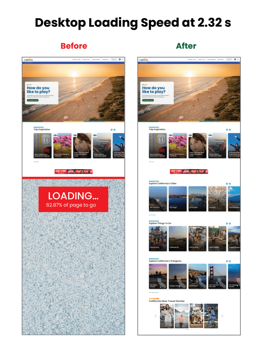
Home page weight before and after:
| Page Weight | Before | After | % Change |
|---|---|---|---|
| Desktop | 25.41 MB | 3.61 MB | Down 85.79% |
| Mobile | 12.07 MB | 3.62 MB | Down 70.01% |
Visualizing the improvements to loading speed:
Core Web Vitals Improvements:
| Overall Score | First Contentful Paint | Largest Contentful Paint | Total Blocking Time | Cumulative Layout Shift | Speed Index | |
|---|---|---|---|---|---|---|
| Mobile before | 3 | 3.4s | 15.7s | 8980ms | 0.043s | 22.9s |
| Mobile after | 31 | 4.4s | 21.1s | 2140ms | 0.503s | 9.5s |
| CHANGE | +28 | +1s | +5.4 | -6840 ms | +0.43 | -13.4 |
| Desktop before | 38 | .9s | 4.5s | 1600ms | 0.043s | 3.9s |
| Desktop after | 63 | 1.2s | 4.5s | 420ms | 0.207s | 2.6s |
| CHANGE | +25 | +.3 s | 0 | -1180ms | +0.164 | -1.3 |
THE RESULTS
Exploring the Golden State, One Story at a Time
Once Oomph was done, the Visit California site looked the same, but the load times were significantly faster, making the site more easily accessible to users. By devising a strategy to pull the same data using completely different methods, Oomph created a streamlined deployment process that was night and day for the Visit California team.
The massive initiative involved 75,000 lines of code, 23 front-end templates, and plenty of collaboration, but the results were worth it: a noticeably faster site, a markedly less frustrating authoring experience, and page performance that would make any Californian proud.
THE BRIEF
Never Stopping, Always Evolving
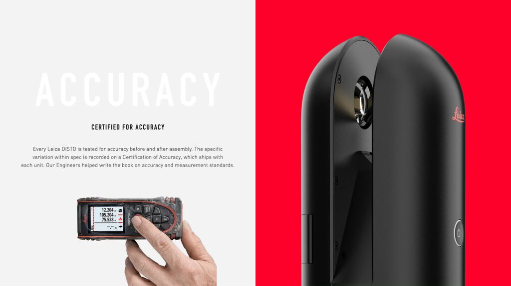
Leica Geosystems was founded on cutting-edge technology and continues to push the envelope with their revolutionary products. Leica Geosystems was founded by Heinrich Wild and made its first rangefinder in 1921. Fast forward to the 21st century, and Leica Geosystems is the leading manufacturer of precision laser technology used for measurements in architecture, construction, historic preservation, and DIY home remodeling projects.
Oomph and Leica collaborated on an initial project in 2014 and have completed multiple projects since. We transitioned the site into a brand new codebase with Drupal 8. With this conversion, Oomph smoothed out the Leica team’s pain points related to a multisite architecture. We created a tightly integrated single site that can still serve multiple countries, languages, and currencies.
THE CHALLENGE
Feeling the Pain-points with Multisite
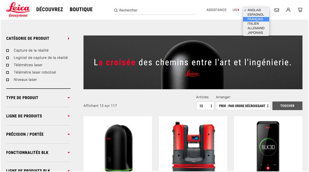
Leica’s e-commerce store is active in multiple countries and languages. Managing content in a Drupal multisite environment meant managing multiple sites. Product, content, and price changes were difficult. It was Oomph’s challenge to make content and product management easier for the Leica team as well as support the ability to create new country sites on demand. Leica’s new e-commerce site needed to support:
MULTIPLE COUNTRIES AND A GLOBAL OPTION
SIX LANGUAGES
MANY 3RD-PARTY INTEGRATIONS
The pain points of the previous Multisite architecture were that each country was a silo:
- No Single Sign On (SSO): Multiple admin log-ins to remember
- Repetitive updates: Running Drupal’s update script on every site and testing was a lengthy process
- Multiple stores: Multiple product lists, product features, and prices
- Multiple sites to translate: each site was sent individually to be translated into one language
THE APPROACH
Creating a Singularity with Drupal 8, Domain Access, & Drupal Commerce
A move to Drupal 8 in combination with some smart choices in module support and customization simplified many aspects of the Leica team’s workflow, including:
- Configuration management: Drupal 8’s introduction of configuration management in core means that point-and-click admin configuration can get exported from one environment and imported into another, syncing multiple environments and saving configuration in our code repository
- One Database to Rule Them All: Admins have a single site to log into and do their work, and developers have one site to update, patch, and configure
- One Commerce Install, Multiple stores: There is one Drupal Commerce 2.x install with multiple stores with one set of products. Each product has the ability to be assigned to multiple stores, and price lists per country control product pricing
- One Page in Multiple Countries and Multiple Languages: The new single site model gives a piece of content one place to live, while authors can control which countries the content is available and the same content is translated into all the languages available once.
- Future proof: With a smooth upgrade path into Drupal 9 in 2020, the Drupal 8 site gives Leica more longevity in the Drupal ecosystem
LEARN VS. SHOP
Supporting Visitor Intention with Two Different Modes
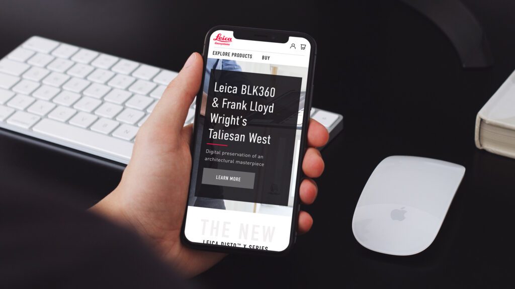
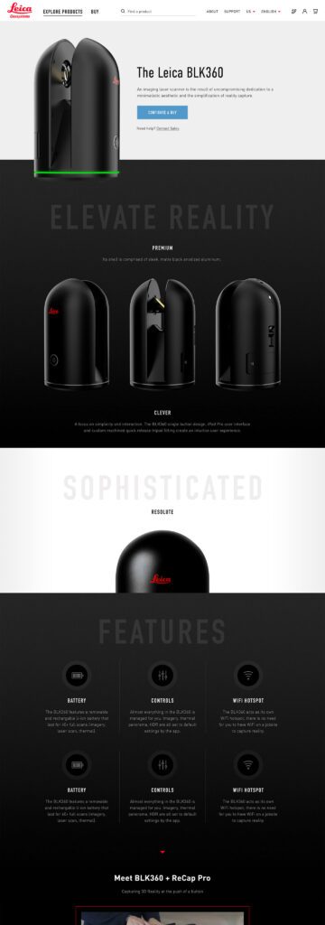
While the technical challenges were being worked out, the user experience and design had to reflect a cutting-edge company. With the launch of their revolutionary product, the BLK 360, in 2018, Leica positioned itself as the Apple of the geospatial measurement community — sleek, cool, cutting-edge and easy to use. While many companies want to look as good as Apple, few of them actually have the content and product to back it up.
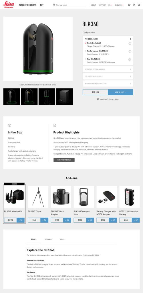
The navigation for the site went through many rounds of feedback and testing before deciding on something radically simple — Learn or Shop. A customer on the website is either in an exploratory state of mind — browsing, comparing, reviewing pricing and specifications — or they are ready to buy. We made it very clear which part of the website was for which.
This allowed us to talk directly to the customer in two very different ways. On the Learn side, the pages educate and convince. They give the customer information about the product, reviews, articles, sample data files, and the like. The content is big, sleek, and leverages video and other embedded content, like VR, to educate.
On the Shop side the pages are unapologetically transactional. Give the visitor the right information to support a purchase, clearly deliver specs and options like software and warranties, without any marketing. We could assume the customer was here to purchase, not to be convinced, so the page content could concentrate on order completion. The entire checkout process was simplified as much as possible to reduce friction. Buying habits and patterns of their user base over the past few site iterations were studied to inform our choices about where to simplify and where to offer options.
THE RESULTS
More Nimble Together
The willingness of the Drupal community to support the needs of this project cannot be overlooked, either. Oomph has been able to leverage our team’s commitment to open source contributions to get other developers to add features to the modules they support. Without the give and take of the community and our commitment to give back, many modifications and customizations for this project would have been much more difficult. The team at Centarro, maintainers of the Commerce module, were fantastic to work with and we thank them.
We look forward to continuing to support Leica Geosystems and their product line worldwide. With a smooth upgrade path to Drupal 9 in 2020, the site is ready for the next big upgrade.
Redesigning your company’s website is never an easy task. But when you’re a digital agency and you’re redesigning your own website, it somehow seems like an impossible challenge that you will never get right. First, you have client work that will always take precedence over working on your company’s website. Second, you’re a digital agency! This is your opportunity to push boundaries and try out new things that you otherwise may not be able to on client projects. (Not a requirement, but it would be nice, right?) Lastly, even for an agency, we only redesign our website every few years. In fact, I believe the last time we redesigned our website was in 2016. And thus, there’s still that little voice inside your mind telling you that you have to “get it right”.
So how did we go about doing it?
Changing up our process
If I were to classify the Oomph website I would call it a simple marketing and lead generation website. We need a place to talk about ourselves, who we are, what we do, showcase our work, and capture the information of prospective clients. Typically, when we do this kind of work for a client, these projects tend to last anywhere between four and six months. That doesn’t mean that our team is working on the project full time for that period of time. But with the typical back and forth, feedback and approval cycles, and iteration on design and content, it can easily take that long.
While many agencies do or claim to work in an agile fashion, with a project of this nature there are still typically defined phases to the project that work in a pretty standard waterfall fashion: Discovery -> Strategy -> Design -> Build -> QA -> Launch. Most of our projects follow that pattern as well.
Unfortunately, we didn’t have four to six months. Actually, we only had about six weeks, although those six weeks were not consecutive. So we decided that in order to achieve our compressed timeline, our standard process and methodology would need to be set aside. We determined that the best way for our team to pull this off would be to work in week-long design & development sprints where we had a specific set of pages or templates that we were going to design, develop, test and deploy within a week.
We decided that we weren’t going to use our typical project management system JIRA. There would be no tickets, estimates, or time logging. Instead, we were going to use this good old fashioned form of communication called talking. And while none of us were in the same room, we planned to achieve this by having an open zoom meeting all day long that we could jump in and out of at any time. If you had a question or a decision to make, there were no comments in JIRA issues or Slack messages that didn’t get a reply until the next day. You simply said, “I have a question.” Everyone participated in the conversation, we came to a group consensus and moved on.
Week 1: The Pilot
DISCLAIMER: So I will 100% admit that in week 1 we were not truly starting from scratch. Our design team had already been going through a process of developing style tiles for the site redesign in their spare time. Style tiles are essentially digital mood boards that explore color, typography, and other visual elements. Going into week 1 we already had a pretty good idea of what the look and feel would be. But that was about all we knew.
In order to be successful, we needed to have a few things clearly defined before starting. For example, we felt strongly that we needed core tenets that would help guide the process. These would be the pillars against which we would measure success:
- Even though we are remote, let’s treat this process like we are working together in the same room.
- There are no bad ideas! Everyone participates in the process. Designers participate actively in the development process and developers participate in the design process.
- We have a completed product at the end of every day. We made a schedule for the week of what we were going to accomplish each day and stick to it!
- We are shooting for excellence not perfection.
We needed a goal for the week. To help ensure that we were going to stick to that goal we set daily check-ins with our client (the CEO) at the end of each day. We also scheduled a presentation that we needed to give to the entire company at 4PM on Friday afternoon. We determined that by week’s end we were going to:
- Decide upon the underlying technology that would power the new site. While we had some general ideas as to what we wanted to use, we weren’t 100% sure and we didn’t really even have any experience working with those tools.
- We wanted a complete mobile responsive homepage. That meant we needed to create wireframes, high fidelity mockups, write copy, create assets, do the development and test it out.
At the end of week 1 we had come pretty close to reaching our goal. We selected, set up, and configured the new site to work with the Contentful CMS and use Gatsby as the front end. We designed the homepage and had most of the coding done. Our designer also created a beautiful new video format to help showcase our work. Overall, it was a major success.
Rinse and Repeat
On the heels of our Week 1 experiment, we received approval to continue the project using a similar format. And while we weren’t able to secure a team to work another five consecutive weeks, the team was able to work for two consecutive weeks and then in a few more three to four day stretches. We stuck to the same format but backed off on the all-day zoom calls to allow the team to focus as much on work as they could. However, we stuck to the core tenet of acting like we were in the same room. Anytime a conversation was required or a decision needed to be made, everyone hopped on a call or made a quick judgement call through Slack. There were no tickets.
When it came time to do QA on the site, we kept track of bugs using a spreadsheet that we prioritized and subsequently used to track the squashing of them.
Overall, in terms of project hours we were able to complete the site including QA and some iteration in under six week’s time. Of course, we have a nice laundry list of tasks to complete and ideas we want to iterate on after launch. But we were able to call it done and we are thrilled with the results!
Takeaways and Final Thoughts
We learned a lot from this process. In fact, my biggest takeaway was the benefits we yielded from not following a standard project management process. It was efficient and effective. We did not let the process get in the way of making progress. No balls were dropped. Even though we didn’t use estimates to gauge the level of effort on tasks, no deadlines were missed. I would even say that our communication was significantly better as a result of not using a ticketing system. We actually talked to each other in real-time and came to gain consensus on decisions faster.
Would this work on a larger scale project? I’m not sure. But there are definitely some principles that I think could be applied and lessons learned. Would it work on a client project? I think yes depending upon the client sponsor and their goals. I hope we get to try someday.
In summary, I think that we live in a world where we are constantly looking towards tools and technology to help improve our efficiency. Unfortunately, those tools can often become a hindrance to making progress and being the most efficient version of ourselves. They also tend to remove the human connection from the building process. And when you are building these products for human use and consumption, why not try to add some human-ness back into the process? You may just end up with a better result in the long run.