
The Brief
Visit California is a Destination Marketing Organization (DMO) with over 25 years of experience in promoting California as a premier travel destination. The organization, funded through a unique partnership between the state and the travel industry, operates with a substantial budget of over $185 million (2023). As the leader of California’s brand messaging, Visit California previously anchored its campaigns under the “Dream Big” brand positioning. However, following a significant shift in traveler motivations post-pandemic, Visit California recognized a growing desire for experiences that foster joy, connection, and adventure.
This insight led to the evolution of the brand into “The Ultimate Playground,” a strategic repositioning that highlights the state’s unparalleled diversity of geography, activities, and cultural experiences.
The “Let’s Play” campaign leveraged a robust mix of television, out-of-home, digital, and social media activations to showcase California’s diverse offerings — from wine tasting and rock climbing to luxury hotel stays, food truck adventures, and outdoor music festivals. By highlighting the playful spirit inherent in every experience, the campaign aimed to deepen the audience’s emotional connection to the state, reinforcing California’s identity as The Ultimate Playground and setting the stage for sustained brand engagement.
The APPROACH
The initial roll-out of a rebrand update is critical, and transitioning from “Dream Big” to “The Ultimate Playground” required careful internal alignment and thorough message testing. Oomph, alongside Visit California’s partner agencies, began collaborating on this effort about nine months before the campaign launch. During these early planning meetings, our team contributed key ideas and strategic approaches to help shape the campaign.
Our focus remained on the web user and their position in the customer journey. Previous campaigns had not fully optimized the user flow, so we saw this as an opportunity to reimagine the experience. With paid media driving traffic to the website, it was essential to provide visitors with clear actions once they arrived. The advertising had done its job by capturing attention and sparking interest. Now, our challenge was to build on that momentum, guiding users from interest to meaningful engagement and action.
An interactive Quiz
The Ultimate Playground campaign needed to accomplish a few things:
- Educate the consumer about the new brand positioning and why California should be considered the Ultimate Playground
- Inform the consumer about play and how it is more about kids and theme parks. Adults can and should play as well, and serious activities can be conducted in playful ways
- Activate the consumer with inspiration by giving them a unique experience and curating inspirational, playful activities throughout the state
Our teams settled on a quiz as a way to engage visitors and serve them personalized content. Based on initial research, we decided an image-based quiz would be the fastest and most fun way to answer questions and receive a set of recommendations. Choosing preferences from a set of images is a quick way to make progress tangible. We limited the questions to nine, and most visitors took two minutes to complete the quiz.
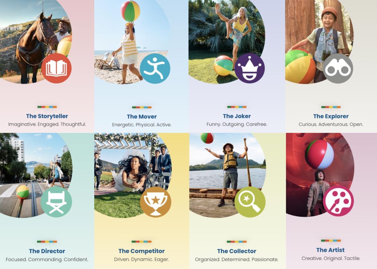
Play Styles
The eight Play Styles were based on personas researched and created by the National Institute for Play, headquartered in California. Content creators at Visit California crafted a series of TV spots with glimpses into different styles of play. Our Play Quiz would highlight which Play Style matched the participant’s preferences, and our results pages served relevant, curated content, a similar Celebrity personality, and even a secondary play style.
Email collection allowed visitors to send their play style results to themselves and allowed opt-in to more personalized content. Our team worked quickly over three months to solidify the approach, choose the quiz method and weighting criteria of the questions, and design the eight play style pages, two landing pages, a homepage takeover, and supporting pages for the new campaign.
The Results
Play Quiz: Avg. session duration
Play Styles: Avg. session duration
Compared to Site: Avg. session duration
Our approach to the campaign was to support the bottom of the funnel and give visitors coming from digital ads something useful. Given the wealth of content the Visit California website contains, these broad Play Style personas made visitors see themselves in California. It brought curated content to them and provided what we thought of as a personal homepage with relevant recommendations.
“Let’s Play” was the first part of a years-long brand campaign. We are already working on the campaign for 2025 which we hope will be even more engaging than the first!
The Brief
Simplifying Complexity without Losing Power
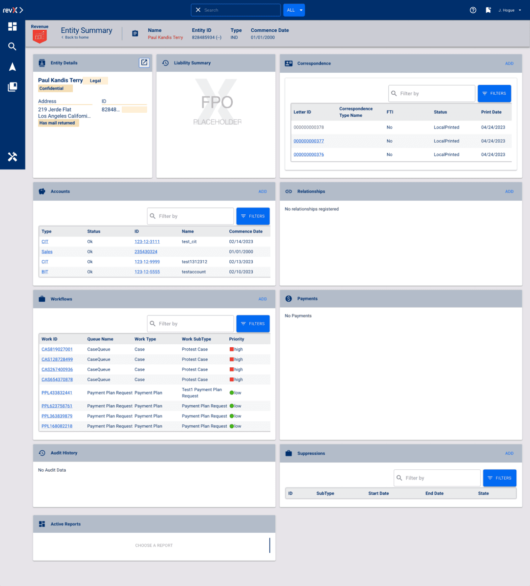
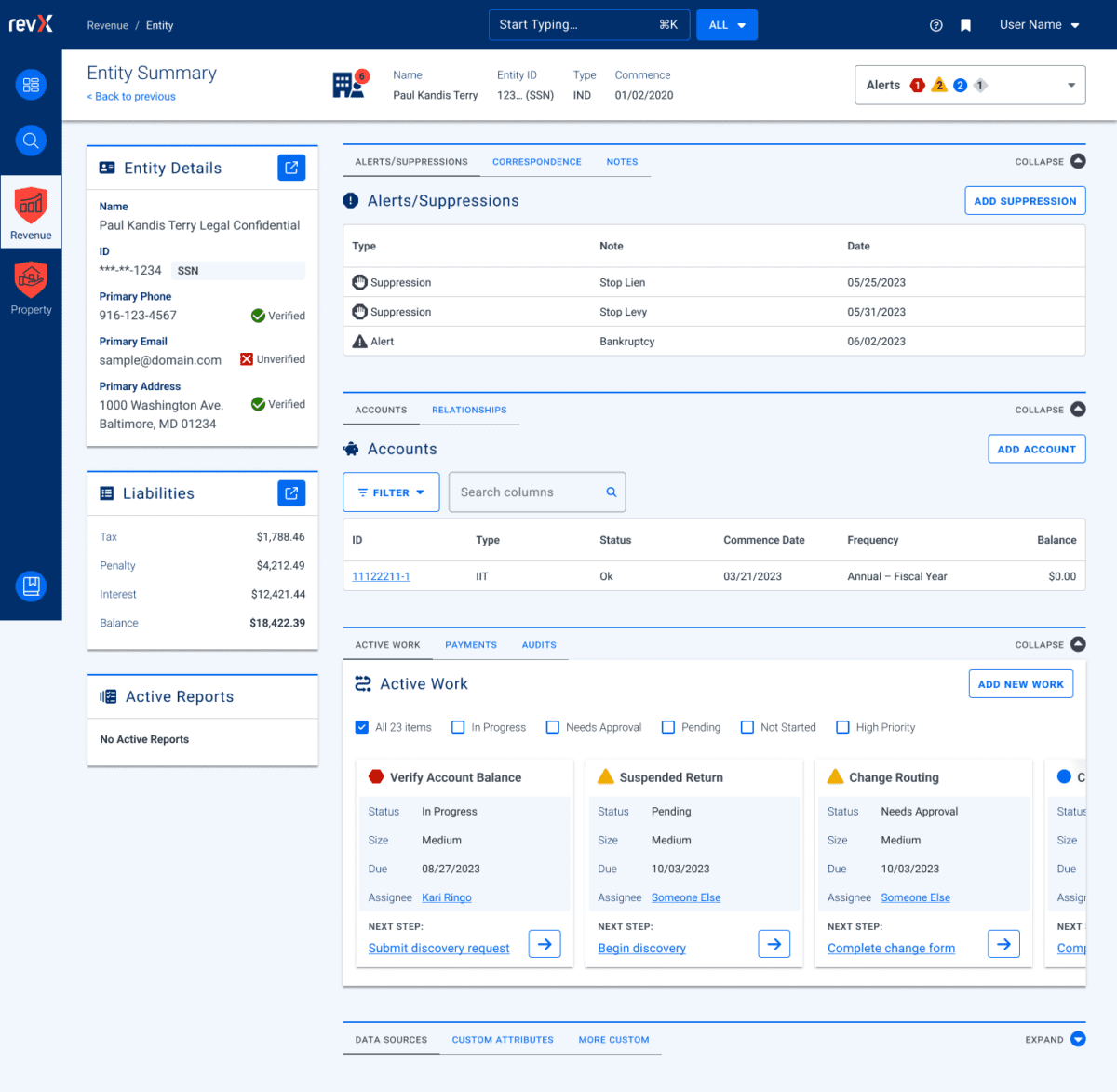
The biggest challenge as Oomph acclimated to the tax-collection world was rapidly learning enough about the complex regulations and requirements of municipalities in the industry to provide sound advice and recommendations. We started by examining their systems — the workflow of documenting and planning new product features and adding them to the roadmap, of designing the UX of those features, and of leveraging their in-house design system to build and support those features.
RSI’s main product, GOVERNMENT PREMIER, are highly customizable and configurable. Every single screen has options that would display depending on the authenticated user’s role and privileges and the tenant’s own back-office processes. User stories included many requirements based on permissions and configuration. This added challenges when imagining potential interface solutions that need to accommodate growth in multiple directions.
Oomph’s purposefully used our outside perspective to ask many questions about GOVERNMENT PREMIER’s processes. We took our years of experience designing interfaces for a wide range of consumers and applied them here. In this typically slow-to-evolve space, a user-focused experience coupled with GOVERNMENT PREMIER’s technical expertise would revolutionize tax collection as a friendlier, more intuitive, and highly customizable experience.
Our Approach
Maintaining Consistency in a Rapidly Evolving Product
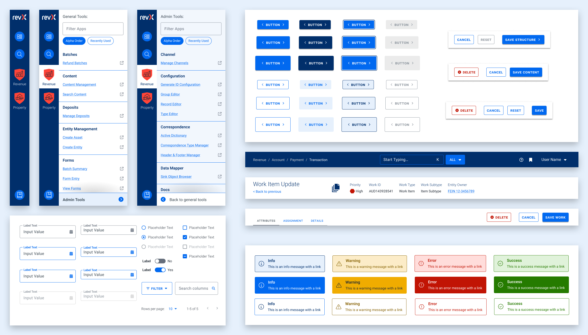
Our findings and recommendations indicated previous UX teams did not create a rulebook that governed their decisions, and so, the system lacked consistency. Quality Assurance reviews would suffer from this lack of governance as well. Therefore, the first thing we did was to establish rules to design by:
- Use Storybook as a source of truth, and expand atomic elements with larger patterns (called molecules in Atomic-design-speak).
- Enforce a global design token system for colors, typography, stateful user feedback, and spacing.
- Use Material UI (MUI) from Google as our foundation. This was a previous decision that was not fully enforced, which led elements to become over-engineered or duplicated. This became known as the “Build on the shoulders of giants” rule.
- Destructive actions (like Delete or Cancel) are placed to the left of creative actions, like “Save” or “Next.”
- Every screen has one primary focus. Complex screens need a focal point for the task and user’s need to feel confident they are using the interface correctly. When long forms are required, break them down into smaller chunks. Users can save their progress and concentrate on smaller groups of tasks. Color should be used to focus users on the most important actions, and to alert them when data errors need to be addressed.
Ultimately, these rules are flexible and have served well as a starting point. Any new screen can adhere to these rules, and when we find cases where these rules are preventing users from completing their tasks or are frequently confusing users, we revisit them to make updates or clarifications. Oomph has continued to consult on new screen design and UX workflows after more than a year of working together.
The Results
Setting a New North Star to Align Our Compasses
To continue to move the product forward without increasing UX and technical debt, the teams needed a well-defined shared understanding for the user experience. Internal teams were moving forward, but not always in the same direction. Within the first month, our teams agreed upon a playbook and then continued to expand it during our engagement. We met twice weekly with product owners across the company and became a sought-after resource when teams were planning new features.
During our time together, we have celebrated these outcomes:
- Oomph consolidated the color palette from 55 colors to just 24 without losing any necessary distinctions. All colors are contrast conformant with WCAG 2.2 Level AA as a baseline.
- Colors, typographic sizes, spacing values, form elements, buttons, icons, and shadows have all been converted to design tokens.
- Figma has been used as the design system record, while Storybook has been strengthened and updated to smartly leverage Material UI. The success of Storybook is largely due to its inclusion as a GOVERNMENT PREMIER project dependency — it has to be used and the latest version is often pinned as the product evolves.
- An internal Design Manager at RSI was established as someone to lead the engineering team and maintain quality oversight as it pertains to the design system.
- Oomph completed designs for 15 features for GOVERNMENT PREMIER, many of which involve designs for three or more screens or modals. Oomph also designed workflows for over a dozen Online Services workflows with a heavier emphasis on mobile-responsive solutions.
As Oomph moves into our second year collaborating with the GOVERNMENT PREMIER teams, we plan to fully investigate user personas on both the admin and taxpayer side of the platform, add more context and governance to the project designs, and provide quality assurance feedback on the working application. We value our partnership with this unique team of experts and look forward to continuing the tax software revolution.
THE BRIEF
When Seraphic Group’s founder, Zach Bush, MD, saw patterns in people’s health linked directly to problems with the food supply, he became an advocate for regenerative farming. As a potential solution to deteriorating public health, global warming, and even poverty, regenerative farming offers benefits for local and global communities. But, getting farmers to switch to it from conventional techniques is a challenge.
Regenerative farming is good for the environment and the economy in the long run—but, short term, it’s more work and more expensive than chemical-heavy, conventional farming. Add in that the appropriate techniques depend on variables like geography, soil type, and climate, and it’s a difficult thing for people to figure out on their own.
Their platform idea, Atlus∗U, needed to not only educate farmers about regenerative agriculture, but also motivate them to try it, and stick with it, for the long haul.
THE APPROACH
Understanding the Educational Purpose
As we noted in an article on different types of online learning platforms, a platform’s educational purpose determines the tools and features that will best achieve its objectives. Atlus∗U spans two purpose categories, Student Stakes Learning and Broad Stakes Learning, which means that effective education is crucial for both the learners and their larger communities.
To that end, our design vision focused heavily on content comprehension, along with keeping users motivated and engaged. Our framework included educational content and tools, accountability systems, and community features. A key component was personal stories: sharing the experiences of farmers who had successfully converted their businesses to regenerative farming and could help and encourage others to do the same.
Above all, Seraphic wanted Atlus∗U to grow and evolve over time as a kind of living guide to regenerative farming. While most online learning platforms stop when the coursework ends (think of a CPR course, where you get a certificate and you’re done), for this platform, the end of the coursework was just the beginning of the journey.
THE RESULTS
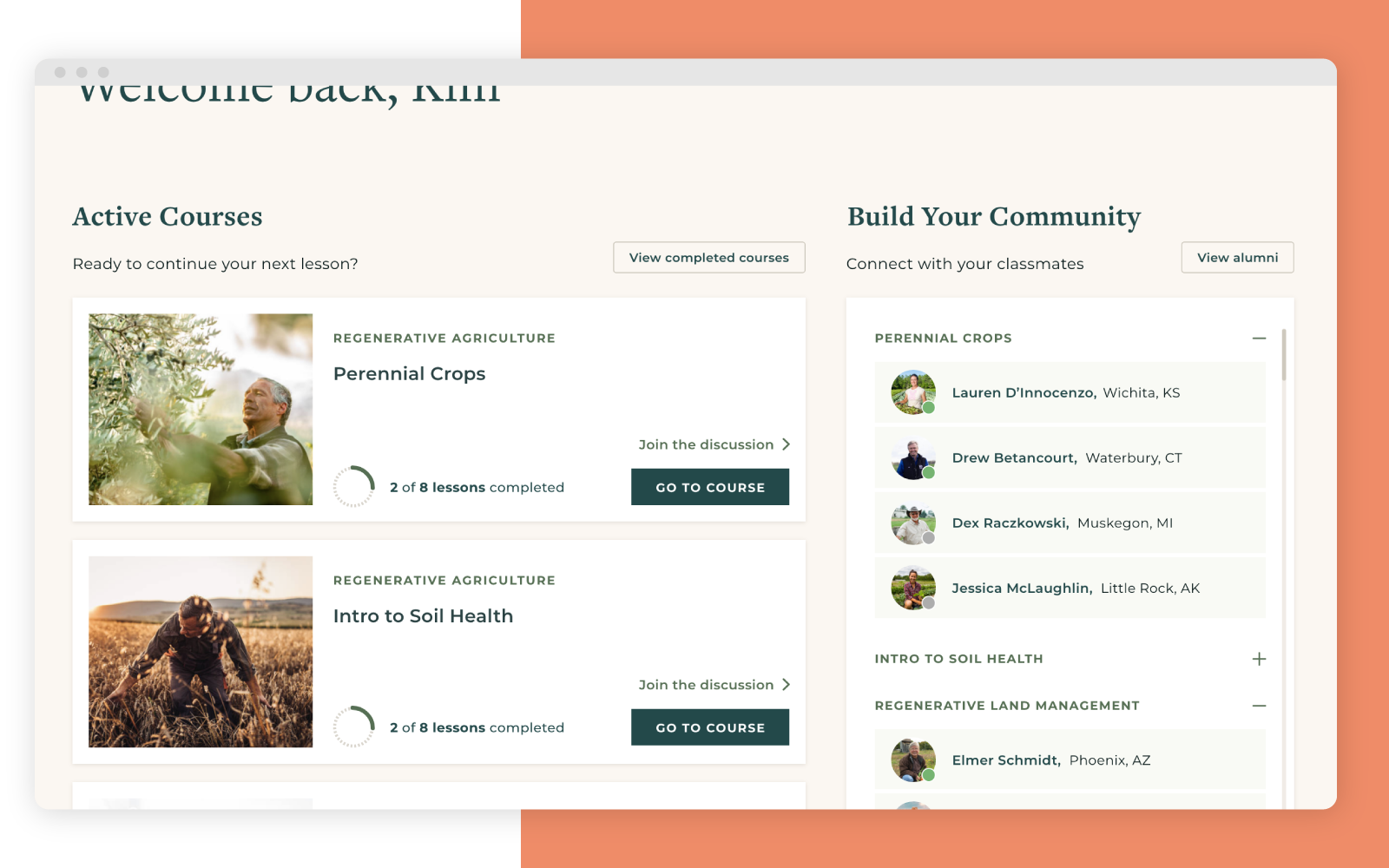
In our design, the whole community drives the learning experience, not just the teachers and coursework. It’s easy for students to connect with others who are taking the same courses, while members-only forums provide a place for productive networking, questions, stories, and support. Some forums are attached to specific lessons, so that the dialogue isn’t just between teachers and students; all members, including alumni, can participate and share their learnings on a given topic.
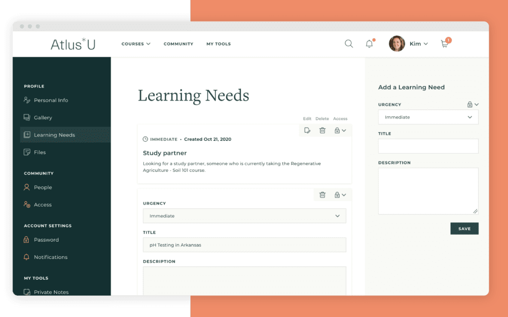
Another component, the accountability partner system, was crucial for achieving Seraphic’s goal of driving lasting change. Research shows that publicly sharing a goal gives people a 65% chance of success, while reporting to a specific accountability partner boosts that chance to 95%.
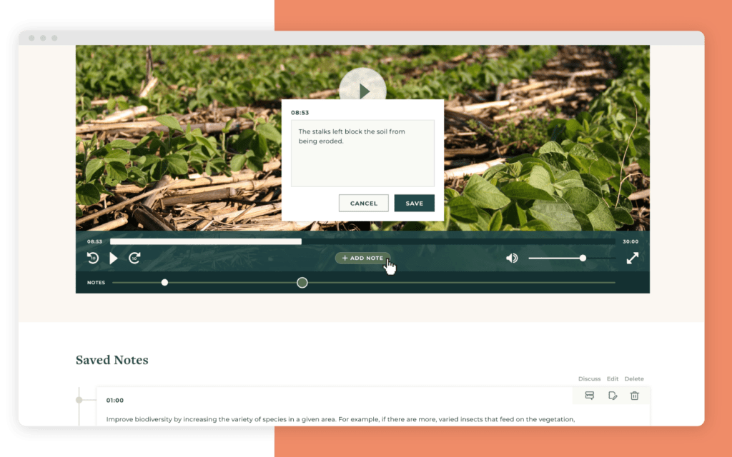
Finally, our learning tools were designed to enhance both content comprehension and retention. Course videos were a key feature, designed not just for the course, but for reference over time. Students have the ability to bookmark videos and attach notes to specific sections, letting them revisit important info whenever they need it.
THE IMPACT
While online learning has been around for a long time, recent advancements in design and functionality make it possible for learning platforms to have a transformative impact on individuals and across society.
In the case of Atlus∗U, it’s not just the coursework that drives users’ learning; an entire community is mobilized to help you succeed. With a focus on collaborative, lifelong learning, our design brings together farmers from around the world to improve their business, grow healthier food, and protect our world.
Need help building an effective online learning platform? Let’s talk about your goals and how to achieve them.
THE BRIEF
The goal of the site was to create a well-organized hub for a trove of resources that had been previously provided in one-off conversations. He also knew that those resources would only continue to grow, making it important to build a living site that appealed to public officials and future funders alike.
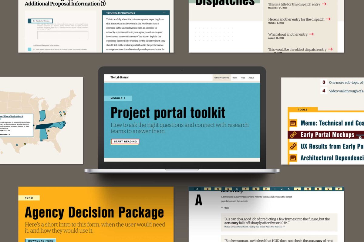
Together, we architected a vision for The Lab Manual website, identifying the essentials for launch and features to phase in later. Key goals included:
- Creating an interactive experience with tools that readers could use directly in their work
- Infusing the site with visual creativity and storytelling elements to make complex research topics more digestible
- Launching a minimum viable product (MVP) site within the desired timeline and budget, while planning for future growth
THE APPROACH
Oomph knew we had to look beyond traditional government and research sites to achieve The Lab Manual’s unique digital goals. We conducted in-depth stakeholder discovery sessions and scoured websites across industries, from data-rich websites like FiveThirtyEight to e-reader apps like Kindle, to gather inspiration for the features The Lab Manual needed: engaging long-form content, strong visual storytelling, and interactive data. Then, we engineered a website for The Lab Manual that felt like a dynamic guided journey.
Telling a Story Through Design & Development
A Narrative-Driven Homepage
To captivate users from their first click, we created a storytelling-focused homepage that concisely explained The Lab Manual’s mission and resources. Animated elements also helped make the page feel more immersive than a traditional linear scroll. We mocked up the animations directly in Figma so the client could see, rather than imagine, the user experience — saving time and effort during the development process.
Custom Educational Features
Oomph designed the website to be thought-provoking, but The Lab Manual wanted to leave readers with answers — not more questions. Our designers and developers collaborated to build features that helped readers understand content without interrupting the story. Key features included a linked glossary to expand on key terms used throughout the site; a pop-up search for other terms and topics, rather than relegating additional information to the footnotes; and a map created with Mapbox to help visitors find nearby policy labs.
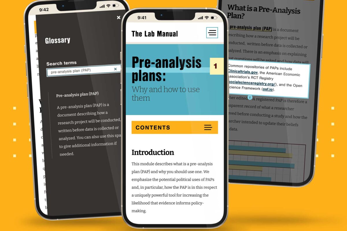
Simplified Content Management
Despite the complexity of its content, The Lab Manual needed to be simple to manage. Our developers built a CMS-less solution the client could edit using Markdown, making it easier and more cost-effective to update content as The Lab Manual grows.
THE RESULTS
Bridging Science and Policy, Now & For the Future
With a solid MVP in place, we are already seeking new features and content opportunities to serve The Lab Manual’s growing user base. The website has quickly caught the eye of the industry, winning a GDUSA Digital Design Award. For The Lab Manual, though, the real win is bringing what was once a lofty vision into reality — a resource that provides government officials with the tools to create effective, evidence-based policies.
THE APPROACH
Rapid Discovery with a Cohort Analysis
Oomph hit the ground running, bringing our human-centered design expertise and passion for environmental causes to strategize a solution. We knew that balancing rigor and speed would be critical – how could we design a site positioned for success without over-investing in features that might need to change later? Through market and user research, rapid prototyping, and close collaboration with Rare and development partner Adapt, we swiftly moved from vision to reality.
Surveying the Landscape
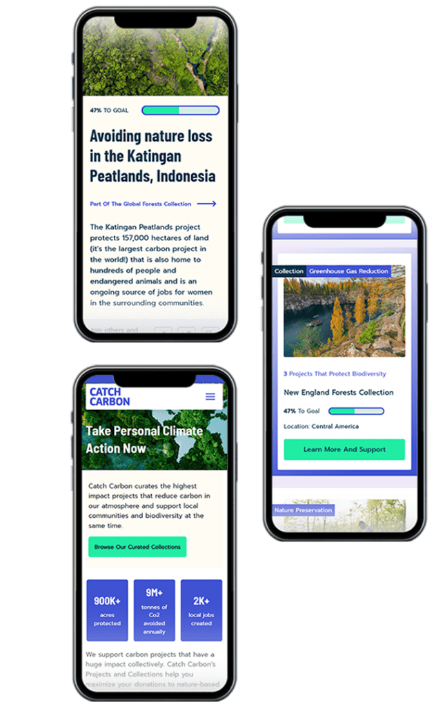
While purchasing carbon credits is similar to making a nonprofit donation in some ways, it also blends elements of investing and crowdfunding in a distinct experience. Oomph first conducted a cohort analysis of more than 20 platforms, from other emerging carbon credit marketplaces to crowdfunding sites like Kickstarter and Kiva. The process uncovered some promising initial approaches, but also underscored the lack of best practices in the space. Ultimately, we determined that Catch Carbon needed to emphasize real-world impact: giving like-minded supporters a place to rally behind a shared cause and directly see the positive effects of their dollars.
Creating Connection and Credibility with Users
Building on Rare’s insights into its audience – climate-concerned citizens eager to be part of the solution – we knew that Catch Carbon would primarily draw users interested in taking personal action to reduce carbon impacts. User journey mapping allowed us to anticipate the visitor’s thoughts and feelings at every stage – curious as they enter the site, inspired as they browse projects, proud after deciding to purchase – and make design choices to guide them along the way. Our strategy included:
- Synthesizing project data to showcase the total impact of Catch Carbon’s work, helping to build trust and motivate users
- Each item needs its own line
- Simplifying the primary navigation and standardizing project descriptions to help users easily discover, compare, and support projects that matched their interests
- Creating user-friendly naming conventions for project types, including “Collections,” which bundle multiple projects like a mutual fund so users can make their dollars go even further
A Collaborative Design Process
With a solid strategy in place, Oomph dove in to bring the design to life. We led Rare through a 20-second design “gut check” workshop to develop a shared design language, then used style tiles to quickly hone in on the design aesthetic. As we moved into full page designs, we worked hand in hand with Adapt and Rare to test an internal API system that would populate project data, refining the design in real-time as we determined which information was possible to include.
THE RESULTS
Just seven weeks after project kickoff, the Catch Carbon site debuted to the public. Its launch marked a major step forward for the voluntary carbon credit market, democratizing access for consumers and setting new standards for project transparency and quality. As a member of 1% for the Planet, Oomph is personally invested in sustaining our world for generations to come – making our work with Rare especially meaningful.
In addition to bringing Rare’s bold new idea to the public quickly, we equipped the organization with a set of KPIs to measure the effectiveness of specific design choices. By understanding factors like site traffic patterns and drop-off rates, Rare can test and iterate with precision.
Climate change is an insurmountable challenge to solve alone, but together, our efforts can make a difference. The Catch Carbon marketplace brings everyday people closer to carbon reduction solutions than ever before, spurring the behavioral change that’s at the heart of Rare’s mission.
THE BRIEF
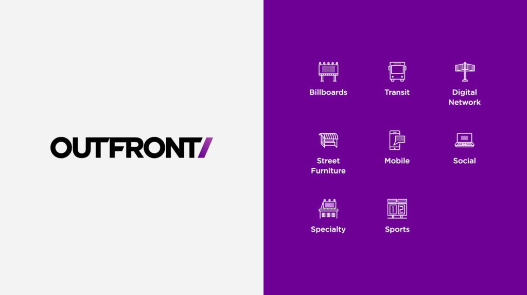
“Out of Home” (OHH) advertising is widely understood as billboards, transit stops, and street furniture. But OHH advertising is also place-based mobile advertising and digital messages that can react to the time of day and weather. These emerging avenues were some of the customer education messages that OUTFRONT Media, one of the top three outdoor advertising companies in the country, needed a new website to convey.
OHH was new to us, but we enjoy diving deep into new industries and absorbing information from all directions. While getting to know OUTFRONT Media during our initial explorations and discovery meetings, Oomph and Straightline Media were surprised to learn:
THE DISCOVERY
Expanding Outfront’s reach from Agencies to Mom-and-Pops
OUR RESEARCH & UNDERSTANDING
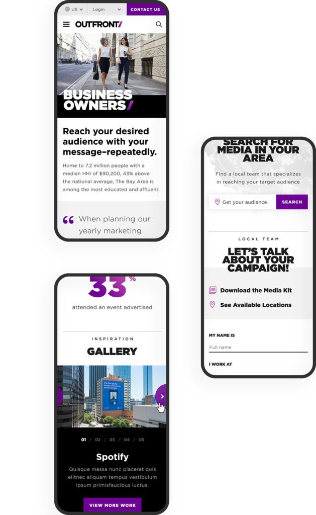
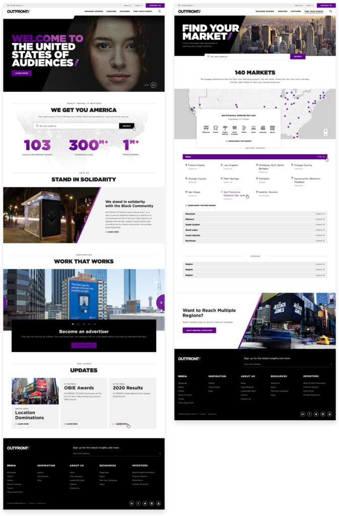
“The United States of Audiences” is the demographic landscape made up of microcosms centered around interests and activities. OUTFRONT understands all these niche groups and can hyper target them to get businesses those audiences.
Through information architecture testing, an understanding of their business goals, and internalization of this new brand message, we crafted a main navigation that spoke directly to OUTFRONT’s target audiences. These pages communicate they “get” them in two ways — OUTFRONT understands these audiences’ needs and
CUSTOMER ACTIONS
To buy media placements from OUTFRONT, a business needs to:
- Understand the value of OHH advertising
- Explore the media options in their location
- Investigate the costs of these different options
- Call a sales associate in their area to discuss custom packages
Finding a market lets a potential customer define themselves even further by gathering their location
they can put the right message in front of the right people to get clients new business.
Large brands already understand how important it is to have OHH in their advertising mix. An emerging market for companies like OUTFRONT is actually smaller businesses — local chains and even mom and pop businesses. To court these new customers, OUTFRONT has to create a customer portal that supports do-it-yourself media management, and the website messaging has to educate a small business about the process and how to buy.
data. From here, they can easily access the media that is available specifically to their geographic area. After a sale is made, a customer needs continuing support. The website should:
- Make it easy for a customer to find production specs for various media
- Provide links to a portal that give them analytics and reporting statistics
- Give them a clear path to extending their current campaign or starting a new one
THE APPROACH
Defining Audience Destinations
OUTFRONT narrowed its focus to the audiences that it needs to win and continue to support — new advertisers, new and existing agency relationships, and property owners who lease their real estate to OUTFRONT for displays (these could be individual real estate owners, large municipalities, or large destinations like airports, stadiums, and entire city transit systems). The journey for these new customers is the main navigation, and these journies funnel through the Market Finder to become more personalized.
Returning customers will find inspiration, case studies, galleries, and support resources in the footer navigation. One of the reasons for this bifurcation was the amount of content that OUTFRONT Media needs to manage. Their previous navigation tried to be everything to everyone, and therefore, was confusing. Labels like “Who We Are / What We Do / Where We Are…” contained too much “we” and not enough “you”. A modern customer doesn’t have time to figure out the navigation — it should speak to them directly in language that they understand.
Giving Visitors Clear Directions
he previous market finder used “inside baseball” language — terms that people at OUTFRONT understand, but that the general populace does not. Markets were labeled by city and state with vague geographic terms like “non-metro”. It was not friendly to the DIY customer. We helped guide technical conversations around how a better flow might work and captured the journey in wireframes and external working examples.
The Market finder is an integral part of the customer journey, so we placed it in page content to support the education process. As a customer understands how OHH and OUTFRONT works, they are prompted to enter their location and get more direct information. As part of wireframes and design, the language was an important aspect to try out and sharpen. Vague button text like “Get Started” was replaced with stronger and more descriptive actions like “Start Building Your Campaign.”
THE RESULTS
Focusing Attention on Results
OHH is a powerful mechanism to reach people even as consumers become blind to advertising in traditional media — a billboard or subway poster can’t be ad-blocked. One of the most powerful ways to tell this story is through data. OUTFRONT has a number of “Insights” but potential customers are less likely to seek this information out themselves. Instead, we made sure to include teasers along their journies that highlight the effectiveness of sample campaigns. These Insights provide powerful results with brands that visitors are familiar with.
The entire journey from discovery to wireframing, testing, and design was an exciting and challenging process that pushed both teams towards an excellent outcome. We hope that the clarity of the navigation, message, and visitor journey continues to get new eyeballs and customers.