
THE BRIEF
The Virtual Lab School (VLS) supports military educators with training and enrichment around educational practices from birth through age 12. Their curriculum was developed by a partnership between Ohio State University and the U.S. Department of Defense to assist direct-care providers, curriculum specialists, management personnel, and home-based care providers. Because of the distributed nature of educators around the world, courses and certifications are offered virtually through the VLS website.
Comprehensive Platform Assessment
The existing online learning platform had a deep level of complexity under the surface. For a student educator taking a certification course, the site tracks progress through the curriculum. For training leaders, they need to see how their students are progressing, assign additional coursework, or assist a student educator through a particular certification.
Learning platforms in general are complex, and this one is no different. Add to this an intertwined set of military-style administration privileges and it produces a complex tree of layers and permutations.
The focus of the platform assessment phase was to catalog features of the largely undocumented legacy system, uncover complexity that could be simplified, and most importantly identify opportunities for efficiencies.
THE RESULTS
Personalized Online Learning Experience
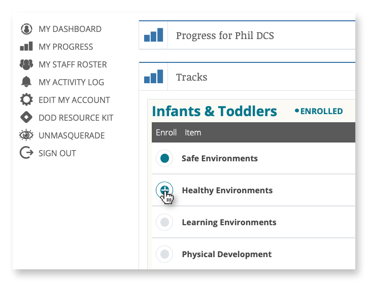
Enrollment and Administration Portal
Administrators and instructors leverage an enrollment portal to manage the onboarding of new students and view progress on coursework and certifications.
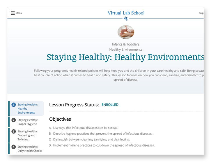
Course Material Delivery
Students experience the course material through a combination of reading, video, and offline coursework downloads for completion and submission.
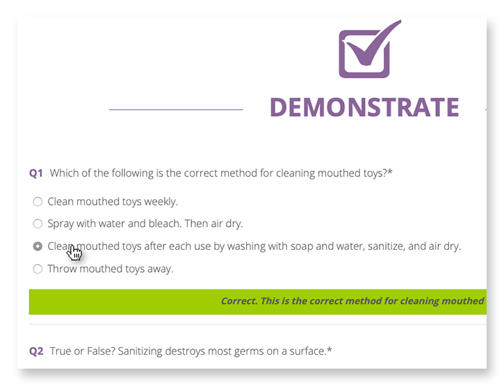
Learning Assessments & Grading
Students are tested with online assessments, where grading and suggestions are delivered in real time, and submission of offline assignments for review by instructors.
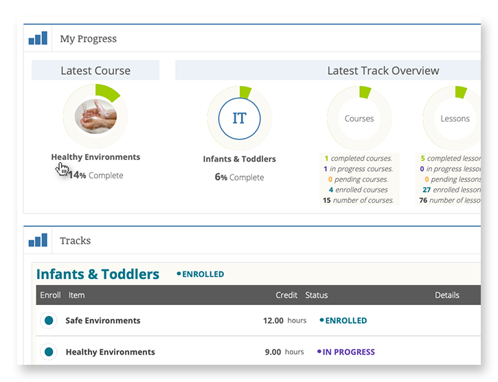
Progress Pathways
A personalized student dashboard is the window into progress, allowing students to see which courses have been started, how much is left to complete, and the status of their certifications.
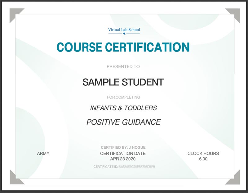
Certification
Completed coursework and assessments lead students to a point of certification resulting in a printable Certificate of Completion.
FINAL THOUGHTS
Faster and More Secure than Ever Before
When building for speed and scalability, fully leveraging Drupal’s advanced caching system is a major way to support those goals. The system design leverages query- and render-caching to support a high level of performance while also supporting personalization to an individual level. This is accomplished with computed fields and auto-placeholdering utilizing lazy builder.
The result is an application that is quicker to load, more secure, and able to support hundreds more concurrent users.
Why Drupal?
When building for speed and scalability, fully leveraging Drupal’s advanced caching system is a major way to support those goals. The system design leverages query- and render-caching to support a high level of performance while also supporting personalization to an individual level. This is accomplished with computed fields and auto-placeholdering utilizing lazy builder.
The result is an application that is quicker to load, more secure, and able to support hundreds more concurrent users.
The Brief
Less can be Much More
The previous Foundation Medicine (FMI) team built their marketing platform on a decoupled content management architecture. Oomph has used decoupled and micro-service architecture for projects such as Leica Geosystems and Wingspans.
But decoupled is not right for every organization, and a decoupled approach can be architected in many different ways. FMI had found their implementation created more headaches than high-fives:
- The flat hierarchy of Contentful created 158 content types, most of which were not useful for creating content.* Therefore, authors had to sift through long lists to find the actual content they needed to edit or create.
- Not everything in their front-end templates was accessible through the CMS. (That would have created even more content types!) So the team was beholden to an engineer to make text edits within some areas.
- Previewing new pages before publishing was not added to their implementation. Authors struggled to predict how content in the admin would display as the published page, and spent much time toggling back and forth.
In short, publishing new content or making content edits was too slow. Responding quickly to changing market conditions or new announcements in the cancer treatment space was not possible, eroding reliance and trust in what should be a cutting-edge brand.
* It should be noted that Contentful uses a “Content Type” for almost everything, from content to taxonomy to design components.
The Approach
Moving away from Decoupled
Based on their current pain points, Oomph verified that switching to a traditional “monolithic” architecture would solve their problems and provide additional benefits:
- Reduce cognitive overload and maintenance overhead by drastically reducing content types
- Empower authors to update all content anywhere
- Accelerate content publishing with an accurate visual preview
Oomph completed an extensive audit and reduced content types from 158 down to 30. We created a tight, flexible system in Drupal of just 14 content types — news item, event page, product page, etc. — and 16 design components — text blocks, accordions, etc.
How did we achieve such a reduction? Our consolidation approach moved from fewer specific options (one thing for a small number of very specific pieces of content) to flexibility within general ones (one thing to support many pieces of content with specific options).
Retaining Key Functionality
Foundation Medicine exists to help people with cancer and those who treat them. To accomplish this, the website features intricate tools for providers to navigate essential cancer resources and patients to find a specialist. None of these tools were compromised by switching to Drupal. In fact, with efficiency gains and more timely content governance, these resources became more valuable.
The Results
Connecting Providers with Genomic Data and Patients with Personalized Care
The upgrade to Foundation Medicine’s digital platform has been invisible by design. The brand and the visuals were performing well for their business and were comfortable for their audience. The outward appearance didn’t need an update, but the internal workflows that support continued trust certainly did.
The Foundation Medicine team now has the autonomy to make content updates quickly, the architecture and design components to confidently curate each page build, and the infrastructure to create clear and consistent content — a win for the team and for the many people who turn to Foundation Medicine in their time of need.
Page Views
Scroll Depth
User Engagement
The Drupal Association brought a new challenge to the Drupal community this past summer. At the beginning of May 2024, Dries Buytaert, the founder and leading visionary for the Drupal platform, announced an ambitious plan codenamed Starshot. The community rapidly came together around the concept and started planning how to make this vision of the future a reality, including Oomph.
What is Starshot/Drupal CMS?
Codename Starshot is now known as Drupal CMS. Drupal is a free, open-source content management system (CMS) where authors and developers build and maintain websites. Drupal has been around since 2001, and in the past, it was focused on being a developer-friendly platform that supports complex integrations and custom features.
Drupal CMS is a reimagining of Drupal for a wider market. Currently, Drupal successfully supports the complexities that governments, high-volume editorial sites, and membership organizations require. But, the barrier to entry for those that wanted to start with a small, simple site was too high.
Drupal CMS is the community’s solution to drastically lower the barrier to entry by providing a new onboarding and page-building experience, recipes for common features, advanced SEO features, and “AI Agents” that assist authors with content migration and site-building acceleration. Dries challenged the community to start building towards a working prototype in less than 4 months, in time to demonstrate significant progress for the audience at DrupalCon Barcelona in mid-September.
The Contact Form Track
The Contact Form is an official recommended recipe. As the name suggests, its purpose is to provide a Recipe that installs the necessary modules and default content to support a useful, but simple, Contact Form.
The primary user persona for Drupal CMS is a non-technical Marketer or Digital Strategist. Someone who wants to set up a simple website to promote themselves, a product, and/or a service. A Contact Form should start simple, but be ready for customization such as integrations with popular email newsletter services for exporting contacts and opting into receiving email.
Research and Competitive Analysis
Drupal CMS aims to compete with juggernauts like WordPress and relative newcomers like SquareSpace, Wix, and Webflow. To create a Contact Form that could compete with these well-known CMSs, our first step was to do some competitive research.
We went in two directions for the competitive analysis (Figma whiteboard). First, we researched what kinds of experiences and default contact forms competitor CMSs provided. Second, we took stock of common Contact Form patterns, including those from well-known SAAS products. We wanted to see the kinds of fields that sales lead generation forms typically leveraged. With both of these initiatives, we learned a few things quickly:
- The common fields for a simple Contact Form are generally consistent from platform to platform
- More complex sales lead forms also had much in common, though every form had something custom that directly related to the product offered
- WordPress does not have a Contact Form solution out of the box! Site owners need to research commonly used plugins to achieve this
Our approach was starting to take shape. We internally documented our decisions and high-value MVP requirements and presented them to the advisory board for feedback. With that, we were off to create the start of our Contact Form recipe.
Recipe and Future Phases
Phil Frilling started the Contact Form recipe, which is currently under peer review. The recipe is barebones for Phase 1 and will install the required modules to support a default Contact Form and email the site owner when messages are received. Once the initial recipe is accepted, a round of testing, documentation, and additional UI in a custom module may be required.
Our plans include additional fields set as optional for the site owner to turn on or off as they need. Some customization will be supported in a non-technical user-friendly way, but all the power of Drupal WebForms will be available to those that want to dig deeper into customizing their lead forms.
In the short term, we are proposing:
- Database storage of contacts that safeguards valuable leads that come in through forms
- Quick integrations with common CRMs and Newsletter providers
- Enhanced point-and-click admin UI through the in-progress Experience Builder
- Advanced fields to handle specialty data, like price ranges, date ranges, and similar
- Conditional defaults: Through the initial set up, when a site owner specifies an Editorial site they get one default Contact Form, while someone who specifies E-commerce gets another default Contact Form
- Feedback mechanism to request new fields
Next stop, the Moon
DrupalCon Barcelona took place last week, September 24 through 27, 2024, and the Drupal CMS prototype was displayed for all to see. Early 2025 is the next target date for a market-ready version of Drupal CMS. The community is continuing to push hard to create a fantastic future for the platform and for authors who are dissatisfied with the current CMS marketplace.
Oomph’s team will continue to work on the Contact Form Track while contributing in other ways with the full range of skills we have. The great part about such a large and momentous initiative as Drupal CMS is that the whole company can be involved, and each can contribute from their experience and expertise.
We’ll continue to share our progress in the weeks to come!
Thanks!
Track Lead J. Hogue with Philip Frilling contributing engineer, Akili Greer and Rachel Hart researchers, and thanks to Rachel Hart again for bringing the Contact Form Track Lead to Oomph for consideration.
The Brief
New Drupal, New Design
Migrating a massive site like healthdata.org is challenging enough, but implementing a new site design simultaneously made the process even more complex. IHME wanted a partner with the digital expertise to translate its internal design team’s page designs into a flexible, functional set of components — and then bring it all to life in the latest Drupal environment. Key goals included:
- Successfully moving the site from Drupal 7 to the latest release of Drupal
- Auditing and updating IHME’s extensive set of features to meet its authoring needs while staying within budget
- Translating the designs and style guide produced by the IHME team into accessible digital pages
- Enhancing site security by overhauling security endpoints, including an integration with SSO provider OneLogin
The Approach
The new healthdata.org site required a delicate balance of form and function. Oomph consulted closely with IHME on the front-end page designs, then produced a full component-based design system in Drupal that would allow the site’s content to shine now and in the future — all while achieving conformance with WCAG 2.1 standards.
Equipping IHME To Lead the Public Health Conversation
Collaborating on a Comprehensive Content Model
IHME needed the site to support a wide variety of content and give its team complete control over landing page layouts, but the organization had limited resources to achieve its ambitious goals. Oomph and IHME went through several rounds of content modeling and architecture diagramming to right-size the number and type of components. We converted their full-page designs into annotated flex content diagrams so IHME could see how the proposed flex-content architecture would function down to the field level. We also worked with the IHME team to build a comprehensive list of existing features — including out-of-the-box, plugins, and custom — and determine which ones to drop, replace, or upgrade. We then rewrote any custom features that made the grade for the Drupal migration.
Building Custom Teaser Modules
The IHME team’s design relied heavily on node teaser views to highlight articles, events, and other content resources. Depending on the teaser’s placement, each teaser needed to display different data — some displayed author names, for example, while others displayed only a journal title. Oomph built a module encompassing all of the different teaser rules IHME needed depending on the component the teaser was being displayed in. The teaser module we built even became the inspiration for the Shared Fields Display Settings module Oomph is developing for Drupal.
Creating a Fresh, Functional Design System
With IHME’s new content model in place, we used Layout Paragraphs in Drupal to build a full design system and component library for healthdata.org. Layout Paragraphs acts like a visual page builder, enabling the IHME team to construct feature rich pages using a drag and drop editor. We gave IHME added flexibility through customizable templates that make use of its extensive component library, as well as a customized slider layout that provides the team with even more display options.
You all are a fantastic team — professional yet personal; dedicated but not stressed; efficient, well-planned, and organized. Thank you so much and we look forward to more projects together in the future!
CHRIS ODELL Senior Product Manager: Digital Experience, University of Washington
The Results
Working to Make Citizens and Communities Healthier
IHME has long been a leader in population health, and its migration to the latest version of Drupal ensures it can lead for a long time. By working with Oomph to balance technical and design considerations at every step, IHME was able to transform its vision into a powerful and purposeful site — while giving its team the tools to showcase its ever-growing body of insights. The new healthdata.org has already received a Digital Health Award, cementing its reputation as an essential digital resource for the public health community.
Everyone’s been saying it (and, frankly, we tend to agree): We are currently in unprecedented times. It may feel like a cliche. But truly, when you stop and look around right now, not since the advent of the first consumer-friendly smartphone in 2008 has the digital web design and development industry seen such vast technological advances.
A few of these innovations have been kicking around for decades, but they’ve only moved into the greater public consciousness in the past year. Versions of artificial intelligence (AI) and chatbots have been around since the 1960s and even virtual reality (VR)/augmented reality (AR) has been attempted with some success since the 1990s (That Starner). But now, these technologies have reached a tipping point as companies join the rush to create new products that leverage AI and VR/AR.
What should we do with all this change? Let’s think about the immediate future for a moment (not the long-range future, because who knows what that holds). We at Oomph have been thinking about how we can start to use this new technology now — for ourselves and for our clients. Which ideas that seemed far-fetched only a year ago are now possible?
For this article, we’ll take a closer look at VR/AR, two digital technologies that either layer on top of or fully replace our real world.
VR/AR and the Vision Pro
Apple’s much-anticipated launch into the headset game shipped in early February 2024. With it came much hype, most centered around the price tag and limited ecosystem (for now). But after all the dust has settled, what has this flagship device told us about the future?
Meta, Oculus, Sony, and others have been in this space since 2017, but the Apple device has debuted a better experience in many respects. For one, Apple nailed the 3D visuals, using many cameras and low latency to reproduce a digital version of the real world around the wearer— in real time. All of this tells us that VR headsets are moving beyond gaming applications and becoming more mainstream for specific types of interactions and experiences, like virtually visiting the Eiffel Tower or watching the upcoming Summer Olympics.
What Is VR/AR Not Good At?
Comfort
Apple’s version of the device is large, uncomfortable, and too heavy to wear for long. And its competitors are not much better. The device will increasingly become smaller and more powerful, but for now, wearing one as an infinite virtual monitor for the entire workday is impossible.
Space
VR generally needs space for the wearer to move around. The Vision Pro is very good at overlaying virtual items into the physical world around the wearer, but for an application that requires the wearer to be fully immersed in a virtual world, it is a poor experience to pantomime moving through a confined space. Immersion is best when the movements required to interact are small or when the wearer has adequate space to participate.
Haptics
“Haptic” feedback is the sense that physical objects provide. Think about turning a doorknob: You feel the surface, the warmth or coolness of the material, how the object can be rotated (as opposed to pulled like a lever), and the resistance from the springs.
Phones provide small amounts of haptic feedback in the form of vibrations and sounds. Haptics are on the horizon for many VR platforms but have yet to be built into headset systems. For now, haptics are provided by add-on products like this haptic gaming chair.
What Is VR/AR Good For?
Even without haptics and free spatial range, immersion and presence in VR is very effective. It turns out that the brain only requires sight and sound to create a believable sense of immersion. Have you tried a virtual roller coaster? If so, you know it doesn’t take much to feel a sense of presence in a virtual environment.
Live Events
VR and AR’s most promising applications are with live in-person and televised events. In addition to a flat “screen” of the event, AR-generated spatial representations of the event and ways to interact with the event are expanding. A prototype video with Formula 1 racing is a great example of how this application can increase engagement with these events.
Imagine if your next virtual conference were available in VR and AR. How much more immersed would you feel?
Museum and Cultural Institution Experiences
Similar to live events, AR can enhance museum experiences greatly. With AR, viewers can look at an object in its real space — for example, a sarcophagus would actually appear in a tomb — and access additional information about that object, like the time and place it was created and the artist.
Museums are already experimenting with experiences that leverage your phone’s camera or VR headsets. Some have experimented with virtually showing artwork by the same artist that other museums own to display a wider range of work within an exhibition.
With the expansion of personal VR equipment like the Vision Pro, the next obvious step is to bring the museum to your living room, much like the National Gallery in London bringing its collection into public spaces (see bullet point #5).
Try Before You Buy (TBYB)
Using a version of AR with your phone to preview furniture in your home is not new. But what other experiences can benefit from an immersive “try before you buy” experience?
- Test-drive a new car with VR, or experience driving a real car on a real track in a mixed-reality game. As haptic feedback becomes more prevalent, the experience of test-driving will become even closer to the real thing.
- Even small purchases have been using VR and AR successfully to trial their products, including AR for fashion retail, eyeglass virtual try-ons, and preview apps for cosmetics. Even do-it-yourself retailer Lowe’s experimented with fully haptic VR in 2018. But those are all big-name retailers. The real future for VR/AR-powered TBYB experiences will allow smaller companies to jump into the space, like Shopify enabled for its merchants.
- Visit destinations before traveling. With VR, you could visit fragile ecosystems without affecting the physical environment or get a sense of the physical space before traveling to a new spot. Visitors who require special assistance could preview the amenities beforehand. Games have been developed for generic experiences like deep sea diving, but we expect more specific travel destinations to provide VR experiences of their own, like California’s Redwood Forest.
What’s Possible With VR/AR?
The above examples of what VR/AR is good at are just a few ways the technology is already in use — each of which can be a jumping-off point for leveraging VR/AR for your own business.
But what are some new frontiers that have yet to be fully explored? What else is possible?
- What if a digital sculptor or 3D model maker could create new three-dimensional models in a three-dimensional virtual space? The application for architects and urban planners is just as impactful.
- What if medical training could be immersive, anatomically accurate, and reduce the need for cadavers? What if rare conditions could be simulated to increase exposure and aid in accurate diagnoses?
- What if mental health disorders could be treated with the aid of immersive virtual environments? Exposure therapy can aid in treating and dealing with anxiety, depression, and PTSD.
- What if highly skilled workers could have technical mentors virtually assist and verify the quality of a build? Aerospace, automotive, and other manufacturing industry experts could visit multiple locations virtually and go where they’re needed most.
- What if complex mathematic-based sciences could provide immersive, data-manipulative environments for exploration? Think of the possibilities for fields like geology, astronomy, and climate change.
- What if movies were told from a more personal point of view? What if the movie viewer felt more like a participant? How could someone’s range of experiences expand with such immersive storytelling?
Continue the AR/VR Conversation
The Vision Pro hasn’t taken the world by storm, as Apple likely hoped. It may still be too early for the market to figure out what AR/VR is good for. But we think it won’t go away completely, either. With big investments like Apple’s, it is reasonable to assume the next version will find a stronger foothold in the market.
Here at Oomph, we’ll keep pondering and researching impactful ways that tomorrow’s technology can help solve today’s problems. We hope these ideas have inspired some of your own explorations, and if so, we’d love to hear more about them.
Drop us a line and let’s chat about how VR/AR could engage your audience.
Portable Document Format, or PDF, files have been around since 1992, offering a software-agnostic solution for presenting and sharing digital documents. For organizations that existed before the ’90s, PDFs became an easy way to move from physical to digital; they could take the same documents they used to print and now share them digitally as PDFs.
A few years after PDFs were officially launched, CSS came onto the scene as the preferred computer language for styling web pages. Over the following three decades, PDF capabilities grew alongside CSS and other digital technologies, giving creators new ways to lay out and publish their content.
Fast forward to today. Developers worldwide (Oomph among them) have been making websites for a while. We have online forms, interactive databases, and of course, plain old text on a webpage. And yet, PDFs persist.
What’s So Bad About PDFs?
Mobile Phones
Think of the last time you tried looking at a PDF on your phone. First off, there’s the issue of finding it. Depending on your operating system and browser, the file might open right in a new browser tab, or it might download and disappear into some folder you forgot about until this exact moment. (And of course, when you find the folder, you realize this is the fifth time you’ve downloaded this same file.)
Now that you’ve opened the file, you see the tiny text of an 8.5” x 11” page shrunk to a quarter of its intended size. So you pinch, zoom, and drag the page around your screen. You might rotate your phone to the dreaded horizontal orientation to fit a whole line of text at once. If this PDF is a fillable form, you may be simply out of luck on your mobile device unless you’re ready to go down a rabbit hole of separate apps and workarounds.
If, for just a minute, we want to ignore the massive amount of mobile usage — including the 15% of American adults who fully depend on phones for internet access — there’s plenty more cause for PDF concern.
Accessibility
Let’s talk about accessibility. There’s a good chance that your digital properties, including PDFs, are legally required to conform to accessibility standards. This is true for government entities — both federal and more recently, state, local, and district governments, thanks to a Title II update — as well as businesses and nonprofit organizations.
Beyond the legalities, the CDC reports that about 27% of American adults have a disability. While not all 70 million of these people use a screen reader, we know some people use assistive technology even if they don’t identify as having a disability. (When’s the last time you pressed a button to open a door just because your hands were full or to let a large group of people pass through?) Improvements for the sake of accessibility, more often than not, lead to a more effortless, more intuitive experience for everyone.
While it’s possible to make a PDF accessible, the process for doing so is extensive and involves several manual checks. This can be so time-consuming and specialized that businesses and professionals dedicate themselves entirely to remediating PDFs for accessibility.
Of course, making a website accessible isn’t as easy as plug-and-play, but accessibility should already be built into the system. Content editors who are not technical professionals can publish accessible content with relative ease on an accessible website platform (as long as we can all remember not to link “click here”) but are typically left to their own devices when it comes to documents.
Brand Reputation
Beyond these critical issues, there are a few more problems that are less vital to users but could have a negative business impact.
For one, documents like PDFs open up a whole world of styling possibilities. The flexibility might feel like a benefit at first, but give it a little time and I’m certain you’ll start seeing inconsistencies from one document to the next. Add in a few more people preparing these files, and those small differences will pile up, giving users an impression that maybe the business is not quite as put together as they thought. (Not to mention that every change in presentation is asking users to understand a new format, slowing them down or confusing them.) Consistency is key to building a trustworthy brand; every unnecessary variation erodes that trust.
There’s also the near certainty that the information provided in PDFs will need updating. When that happens, you’d better make sure to delete the old file in favor of the new one and update all your links. Since the file format made it easy (or necessary) for users to download the content to their devices, there’s a greater chance that they’ll hold onto old information, even though a newer version is now on the website.
Finally, storing important information in PDFs gives you less control over optimizing for search engines. Google has a tough time reading PDF content (though proper tagging and metadata will help), so these files often rank lower in search results than webpages with similar content. The more that content lives in PDFs and not webpages, the more your SEO will suffer, and the less likely people will be to find and consume your content.
What You Can Do Instead
Like I said, PDFs solved a real problem… 30 years ago. They still have their place today, but more often than not, there’s a better way.
Does It Need To Be a PDF?
When the PDF is just a basic document of text, we recommend turning that into a basic webpage of text. It’s easy to say, but making it happen might mean taking a fresh look at why that information is in a PDF in the first place.
Custom Layout
If you’re using PDFs to create a certain layout, consider how you can achieve something similar through CSS. You might be able to build something you like using the layout and style options already available in your CMS, but you probably won’t create a perfect 1:1 match.
Any design in a Word or Google document can also exist on a webpage. If there’s a certain design you use time and time again in your PDFs that you just can’t recreate with the web editing tools, you might need some new code. It becomes an exercise in prioritization to weigh the benefits of building a custom layout against the time and cost of doing so.
Also, remember that a design that works well for a printed page may not be the best design for a responsive webpage. Rather than recreating the exact layout digitally, ask yourself what you’re trying to achieve with the layout and whether there’s a better way to meet that same goal. While unique designs may be more difficult to create on a webpage than a PDF, I’d urge you to consider this a benefit in most cases. Limitations create consistency, which will most likely simplify the experience for both content editors and users.
Designing for Print
Speaking of print, that might be another reason for including PDFs. You may know that a portion of your audience will want to print out the page, maybe to annotate it or to have it on hand as they complete a related task.
In reality, you can serve this user without sacrificing everyone else’s online experience. Developers can use targeted CSS to customize how a webpage will print or export — including what content will display and its styling. Going this route affects how the page will print with the browser tool, and you could even provide a “Print” link if that’s a common need. Ultimately, targeted CSS means the printed content can look as similar or different from the webpage as needed.
Process
Another common cause for PDFs is that they’re simply baked into the content publishing process. Whether from fear of changing approved content or a lack of knowledge around what’s possible in the CMS, content teams may use PDF uploads as a fallback for publishing the information quickly and moving on.
A solution here may be to bring your site editor into the process sooner. As the web expert, they can speak to what will work well and what might need to change when moving the content to a webpage. The site editor may need to be heavily involved at first, but their load should lighten as the writers and other team members learn the website’s needs.
In some cases, it might also be worth building new CMS templates, such as content types. This can be especially helpful for reinforcing consistency when several people manage the website. If the content needs to follow a specific format, a highly structured edit form can act as an outline. You can share this template with the original content creators so that everyone is working toward a shared goal.
Repurposed Content
Most likely, your organization does more than manage a website. Maybe you have a brick-and-mortar office with brochures and paperwork, or you host webinars with branded slide decks. There are plenty of reasons you might create and share documents other than uploading them onto your website, but you still want the same information available online. And since it’s already put together, the easiest way to share it could be to upload the PDF.
Unfortunately, this is a situation where easy doesn’t cut it. The same tri-fold brochure that looks professional and appealing on a reception desk can be confusing and annoying on a computer or phone. A printed form works great for in-office visitors, but a web form can give users the benefits of autocomplete and progressive disclosure they’ve come to expect online.
The best experience for your users requires attention to their context. Ultimately, we need to be intentional and thoughtful about what users need in their current situation, which may require different presentations of the same content.
Embrace Digital
We’re not expecting to see the end of PDFs on websites anytime soon. For one, sometimes it’s simply out of your control. Maybe you’re providing an official government form that only exists as a fillable PDF. Even if the document is internally produced, change may be lengthy and involved, requiring buy-in from those who hold the purse strings.
While we wait for the world to change, we can advocate for a better user experience. If a PDF “needs” to stay, maybe you can duplicate the most important content onto the page linking to it. If you have any control over the document itself, you can test for accessibility and make sure it’s properly tagged. Get started with the tools and guidance we’ve collected in this accessibility resources document.
How easily your audience can access your information and services sets the tone for how they perceive your organization. The good news is that there’s so much you can do to make their experience positive, no matter how they choose to interact with your content. If you need help, let us know.
THE BRIEF
Same Look, Better Build
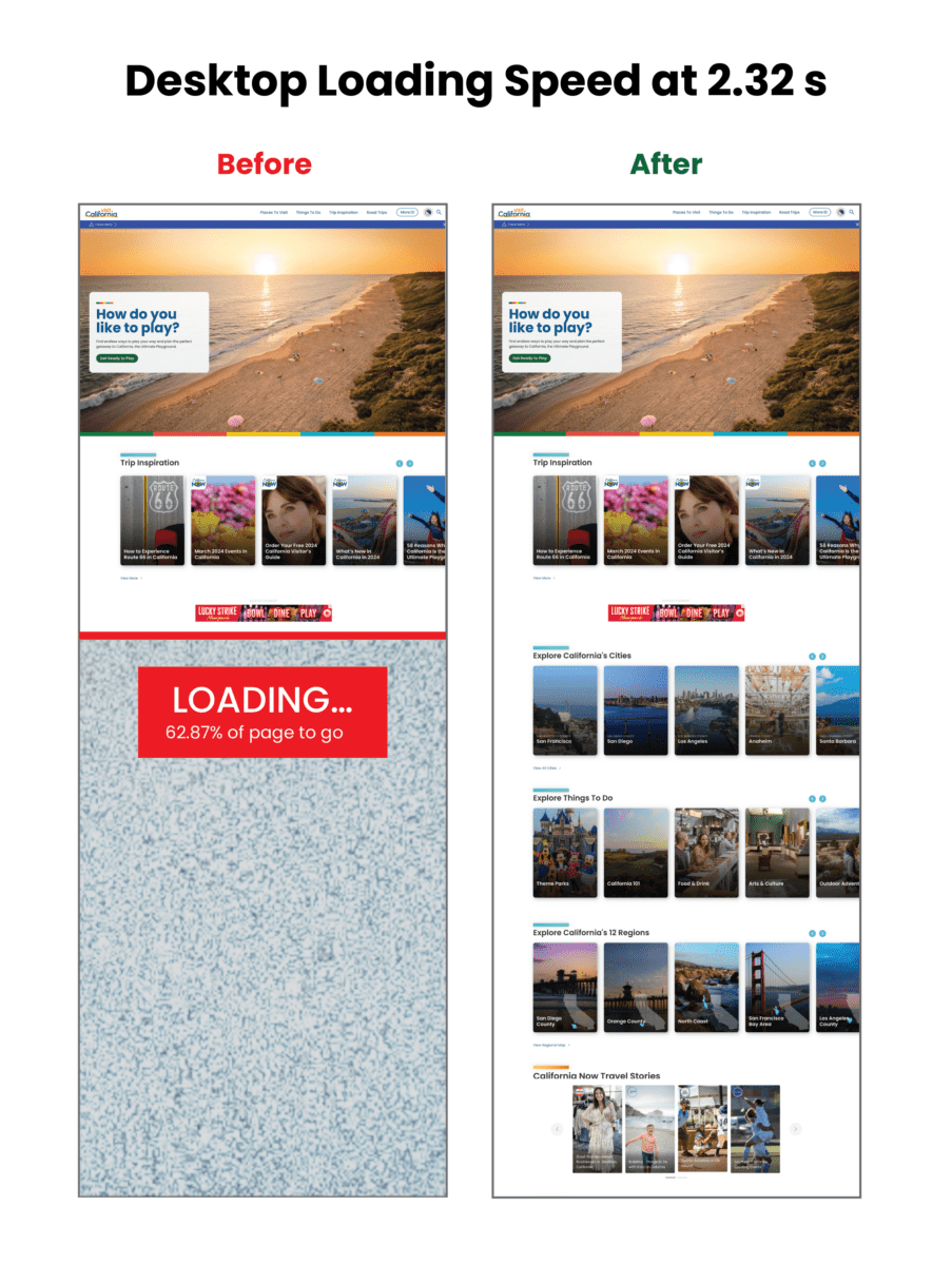
Ordinarily, when we embark on rearchitecting a site, it happens as part of a complete front-end and back-end overhaul. This was a unique situation. Visit California users enjoyed the site’s design and helpful content features, so we did not want to disrupt that. At the same time, we needed to upgrade the frustrating back-end experience, look for broken templates, and find optimizations in content and media along the way.
An underperforming API (which functions like an information pipeline to move content from one part of the site to another) and bloated data/code resulted in sluggish site performance and slow content updates/deployments. If the Visit California team wanted to change a single sentence on the site, pushing it live took well over an hour, sometimes longer — and often the build failed. Poorly optimized images slowed the site down even further, especially for the mobile visitors who make up the majority of site traffic.
They were in dire need of a decoupled site connection overhaul so they could:
- Reduce time and effort spent on updating site content
- Implement a more reliable build process decreasing frustration and delays
- Create a better, faster browsing experience for users
THE APPROACH
Oomph started by looking under the hood — or, in this case, under the APIs. While APIs are supposed to make sites perform better, an outdated API was at the root of Visit California’s problem. Over the course of the project, Oomph integrated a new API, optimized images, and corrected bottlenecks across the site to make updates a breeze.
Putting Visit California in the Fast Lane
Implemented a New API
Visit California needed an API that could more quickly move data from the back end to the front. Two previous clients shared Visit California’s back-end architecture but used a modern JSON API Drupal module successfully. Switching from the GraphQL module to JSON API on the back end streamlined the amount of data, resulting in the team updating content or code in minutes instead of hours or days.
Streamlined Data During Deployments
On the front end, a Gatsby Source GraphQL plugin contributed to the issue by pulling and refreshing all data from the entire system with each content update. Oomph replaced the faulty plugin, which had known limitations and lacked support, with the Gatsby Source Drupal plugin. On the back end, the Gatsby Integration module was configured to work with JSON API to provide incremental builds — a process that pulls only updated content for faster deployments.
Avg. full build time
Unexplained failure rate Before
Avg. incremental build time
Unexplained failure rate After
Fixed Image Processing Bottlenecks
Because we were already in the code, both teams agreed this was a great opportunity to identify improvements to boost page performance. We found that image processing was a drag — the site previously processed images during deployment rather than processing them ahead of time on the back-end. Oomph used the JSON API Image Styles module to create image derivatives (copies) in different sizes, ultimately decreasing build times.
Lightened the Load on the Back-End
As Oomph configured the new architecture, we scoured the site for other opportunities to reduce cruft. Additional improvements included removing deprecated code and rewriting code responsible for creating front-end pages, eliminating static queries running thousands of times during page creation. We also resized large images and configured their Drupal site to set sizing guardrails for photos their team may add in the future.
Home page weight before and after:
| Page Weight | Before | After | % Change |
|---|---|---|---|
| Desktop | 25.41 MB | 3.61 MB | Down 85.79% |
| Mobile | 12.07 MB | 3.62 MB | Down 70.01% |
Visualizing the improvements to loading speed:
Core Web Vitals Improvements:
| Overall Score | First Contentful Paint | Largest Contentful Paint | Total Blocking Time | Cumulative Layout Shift | Speed Index | |
|---|---|---|---|---|---|---|
| Mobile before | 3 | 3.4s | 15.7s | 8980ms | 0.043s | 22.9s |
| Mobile after | 31 | 4.4s | 21.1s | 2140ms | 0.503s | 9.5s |
| CHANGE | +28 | +1s | +5.4 | -6840 ms | +0.43 | -13.4 |
| Desktop before | 38 | .9s | 4.5s | 1600ms | 0.043s | 3.9s |
| Desktop after | 63 | 1.2s | 4.5s | 420ms | 0.207s | 2.6s |
| CHANGE | +25 | +.3 s | 0 | -1180ms | +0.164 | -1.3 |
THE RESULTS
Exploring the Golden State, One Story at a Time
Once Oomph was done, the Visit California site looked the same, but the load times were significantly faster, making the site more easily accessible to users. By devising a strategy to pull the same data using completely different methods, Oomph created a streamlined deployment process that was night and day for the Visit California team.
The massive initiative involved 75,000 lines of code, 23 front-end templates, and plenty of collaboration, but the results were worth it: a noticeably faster site, a markedly less frustrating authoring experience, and page performance that would make any Californian proud.
THE BRIEF
A Creative Beacon Sets a New Path
The RISD Museum is the 20th largest art museum in the United States with over 100,000 objects in its collection, including Ancient art, costumes, textiles, painting, sculpture, contemporary art, furniture, photography, and more. The museum occupies more than 72,000 square feet in three historic and two contemporary buildings along Providence’s bustling South Main Street and riverfront.
We often say that a website redesign is more like a collective therapy session — it’s an opportunity to air grievances in a safe space, to think about the future untethered to the present situation, and make decisions that could change the course of the organization. Since many websites are more than just a marketing platform, a redesign can affect the entire organization and the way they communicate their value to their own team and the world.
At the heart of this project were large, existential questions:
What does it mean to be a physical institution collecting physical objects in a digital world?
What do viewers want out of a museum experience in an interactive space?
Can a museum be more relaxed about how viewers will interpret the work?

Open Source the Museum’s Entire Collection
Behind the Museum’s initiative to re-platform the website from a closed system to an open source system like Drupal 8 was another, perhaps even larger, initiative: a plan to “open source” the museum’s entire collection. They will bring all 100,000 objects online (they have a little over 13,000 available prior to launch, a mere 13%) and use a Creative Commons license system that allows visitors to download and repurpose high-resolution images whenever the objects are in the public domain. This was the heart of the revolution upon which the RISD Museum was about to embark.
THE APPROACH
MuseumPlus & Drupal 8 equals Open Access
The heavy lift for our engineers was an integration with RISD’s museum software, MuseumPlus. MuseumPlus needed to continue to be the source of truth for any object, artist, or exhibition. The teams again collaborated extensively to work towards an API that could provide all the correct information
between the two databases, and a system of daily jobs and manual overrides to start a synchronization process. As the online connection grows, these connections will be the critical link between the public-facing object data and the internal records.
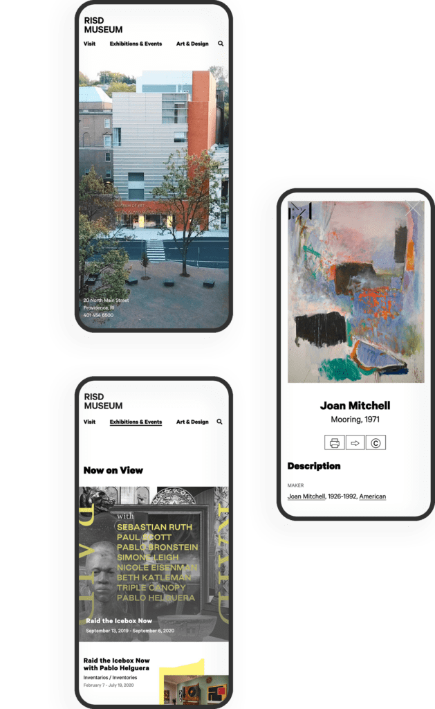
The aesthetics of the site became a structural backdrop for the objects, artwork, and images of people in the physical spaces of the museum.
Gray and white wireframes evolved into a black and white interface that kept information clear and clean while allowing the colors of the artwork to shine through. Language around the site’s architecture was simplified and tested for clarity. An element of time — words like Soon, Upcoming, Now, Ongoing, Past — keeps the visitor grounded around the idea of a physical visit, while open access to objects online serves a whole community of art lovers and historians that may never be able to visit in person.
A bold storytelling idea came out of our collective collaborative process — the homepage experience opens with four videos, a cinematic exterior shot and three interior videos that explore the three main sections of the navigation. The homepage becomes a gateway into the physical space. Choosing a path via the navigation takes the viewer inside to explore the spaces and the objects. Instead of a homepage that assumes a visitor wants to see everything and then choose something to explore deeper, this one introduces them to the content in a way that connects them to the physical space.
THE RESULTS
An Evolving Partnership
Site visit patterns have seen significant improvement — sessions per user and pages per session have increased while bounce rate has decreased. Thanks are due in part to the new hosting environment with Acquia, which has provided hefty speed increases and stability — page load times have decreased, server response time is significantly less, and page download time is far less as well.
As the RISD Museum grows their online collection even further, we have identified a backlog of ideas that we’d love to address, from a more fully featured search, an integrated audio guide, and a more open and collaborative way for users to share back what they have done with the museum’s assets. A new Drupal 8 (now 10) implementation gives the museum plenty of room to grow virtually. The collaborative relationship between Oomph and the RISD Museum is only beginning.
The Brief
Cultivating A Meaningful Website
Much like nurturing planted seeds, a digital platform needs careful attention to ensure success. While the website originally fit the needs of its audience, as FFRI’s programs continued to grow over time, so has the need to reframe the digital presence. As new content is continuously added to an inflexible structure, valuable information competes for customers’ attention, leaving messages to fall through the cracks.
While the client team was aware of some pain points, they had no clear direction to begin to make improvements — where to start? What changes would have the most impact? What can they do themselves vs. what do they need help with? Farm Fresh RI needed a quick set of valuable deliverables that could provide a foundation of understanding and roadmap for improvements.
The Customer Experience Audit
Our design team is passionate about helping organizations thrive. We also understand that some organizations do not have the resources to support a full-scale website redesign. Oomph has explored ways to offer value to those in FFRI’s position — an affordable, efficient set of exercises that can create a “Guiding Star” to help clients steer internal initiatives towards iterative improvements.
We created our Customer Experience Audit to provide a streamlined yet comprehensive look at an organization’s digital presence. It combines impactful exercises that uncover user experience (UX) gaps, accessibility issues, and opportunities to improve content and navigation. The goal is to empower organizations with the knowledge and direction they need to implement changes, whether independently or with our support — changes that address their audience’s needs directly, and therefore, the organization’s impact.
The Approach
Tilling the Existing Farm Fresh RI Website
We focused our audit on FFRI’s public-facing site, the primary audience’s first touch point. Our aim was to highlight any barriers preventing these consumers from efficiently accessing information or completing key tasks. Though there is a mobile App in the ecosystem, we focused on the introduction of the brand and its value, thinking that if the site]s initial impression were stronger, more customers would utilize other digital tools.
Through the audit, we uncovered several key areas for improvement that could significantly enhance the user experience:
Accessibility Gaps
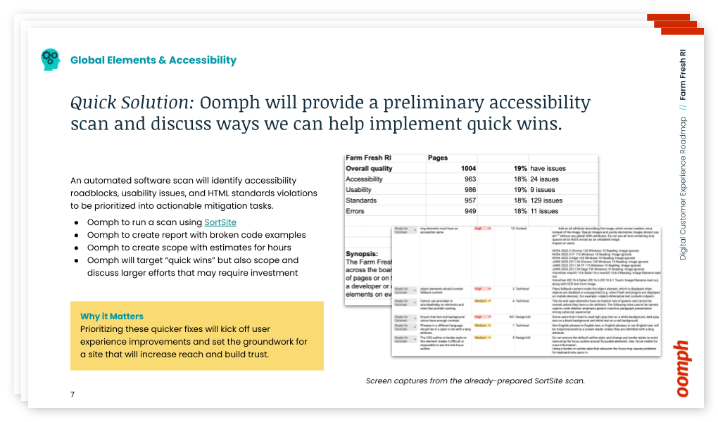
Through an automated and manual scan, we found and organized a number of accessibility and usability issues across the site.
- Clickable hero images that lacked clear visual cues
- Insufficient color contrast in key areas
- Inconsistent translation options for non-English-speaking users
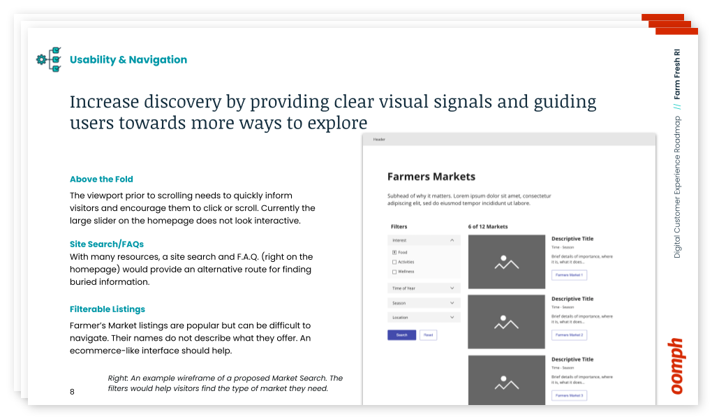
Organizing Content
Large hero images push important content below the fold, making it difficult for users to access crucial information quickly. By placing content above the fold, the site can quickly show users they have landed in the right place. We suggested revising the layout to shorten the height of page hero imagery, which helps users reach key resources with minimal scrolling.
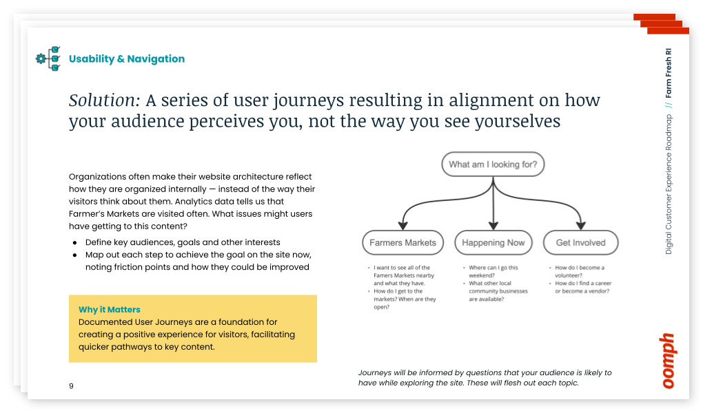
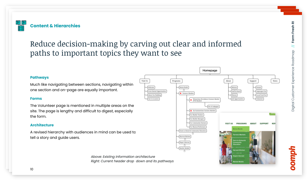
Finding the Content
The journey to find critical information, such as farmers’ market details, is complicated and fragmented across multiple pages. By consolidating this information, we recommended streamlining the user journey while also freeing up space to highlight other essential offerings.
The Results
Supporting a Better Harvest
This audit and roadmap project wasn’t just about identifying existing problems — it was about providing actionable next steps. It was not meant to lock Farm Fresh into working with us to complete those steps, either — even though we would be happy to — but rather to facilitate and supply them with the tools to push forward internally.
With our comprehensive roadmap in hand, Farm Fresh RI is already implementing our suggestions. The primary contact for the project noted that our audit validated many of their internal concerns and provided a clear path for solving issues they had struggled with for years. The deliverables included:
- A SortSite accessibility audit with outlined improvements
- Initial user journeys & information architecture “North Star” ideal to discuss internally
- Quick wireframes for the Homepage and Farmers Market Listing page to show how a new page flow can support customers
- Plan and direction for next steps and what they can do now
- Conversation about how we can help in the future
Our improvement roadmap equips Farm Fresh RI to serve their community more effectively and deliver on their mission. If your organization needs data and expert advice that sets a path forward to an improved customer experience, reach out and contact us. For a small investment, your organization can gain clarity and direction with actionable short- and long-term activities.
The Digital Customer Experience Roadmap
Would your organization benefit from a Digital Customer Experience Roadmap?
- Do you hear of customer complaints through email or phone outreach?
- Do you feel your navigation is bloated with too much content and not enough organization?
- Do pages look too similar, making customer miss important content or get lost within pages that all look the same?
- Have portions of your organization “gone rogue” to create sub-sites and offshoots they can more easily control?
If your digital platforms —website, e-commerce site, mobile App — suffer from any of these common problems, our exercise will define next steps to address these potential issues. Download our information sheet (pdf) and then get in touch with us to discuss your needs.
Not a lot of people get excited about creating an annual report. Yay! Let’s dive into last year’s operational metrics! If you and your colleagues fall into that camp, this statement should help stoke a little enthusiasm:
A compelling annual report can make the difference in reaching your goals for the coming year — and maybe even exceeding them.
Your annual report (also known as an “impact report” at many nonprofits) can be pivotal in earning the trust and support of key stakeholders. Read on to learn how a strong story, good design, and the right format can transform your company data into an invaluable outreach tool.
Why the Quality of Your Annual Report Matters
A good annual report communicates more than just financial performance and forecasts. It provides stakeholders with a deeper understanding of what you do, why you do it, and how well you do it — and gives them a reason to trust, invest in, and/or work with your brand.
This is crucial for nonprofits that rely heavily on fundraising or volunteers, or for-profit companies that need to attract and retain investors and employees. In the health and wellness sector, it’s a key opportunity for organizations to show how they’ve followed through on their commitments to contribute to the health and wellness of communities.
With an engaging design and thoughtful content, an annual report can be a powerful tool for fundraising, marketing, and recruiting. Done well, it’s also a good way to strengthen your brand reputation.
By contrast, a poorly done annual report can downplay your strengths and successes. It can also diminish your brand image, particularly if your website and other channels are more thoughtfully designed. In that case, the annual report may feel like an afterthought to readers who rely on its information.
How Your Annual Report Can Engage Key Audiences
While current and potential donors or investors tend to be the primary audiences for annual reports, there are a number of other stakeholders to take into account. Employees, customers, alumni, partners, and community leaders are all part of the ecosystem that benefits from, and drives value for, your organization.
Creating a multi-faceted report with content that speaks to different audiences can help you earn the trust and support of a range of key stakeholders. Here’s how.
Strengthen your investor or donor base
With an easy-to-digest record of accomplishments and impact, your annual report can help convince current and potential donors, sponsors, or investors that your organization is a solid investment. It’s also a great way to recognize those who helped you achieve your goals over the year or to reconnect with disengaged supporters.
Motivate your employees or volunteers
An engaging report can congratulate your team on their wins and highlight the innovation, commitment, and cooperation that underpin your success. By showing people how their work affects everything from stock value to community impact, you’ll reinforce why the work they do every day makes a difference and how they fit into the bigger picture.
Capture more customers or clients
Whether they’re buying your products or receiving the benefits of your services, most people want to do business with brands that genuinely care about them. Your annual report can include stories and visuals that showcase your mission and core values, as well as highlighting initiatives that put customers or clients first.
Enhance vendor or partner relationships
External partners want to know what they can expect from you and what’s expected of them — and just about everyone wants to feel appreciated. Your annual report can leverage data to show your financial strength and longevity while highlighting the level of quality and commitment you expect from vendors and partners. It can also spotlight those who went above and beyond, reinforcing those relationships.
6 Best Practices for an Engaging Annual Report
It’s not easy to distill an entire year’s worth of data into a single report that’s digestible, engaging, and convincing. The best annual reports tend to combine clear and purposeful storytelling with a little creativity.
Choose a unifying theme
One of the best ways to craft a cohesive narrative for your annual report is to choose an overarching theme and create relevant content around it. Centralizing your accomplishments around a main message will keep the report focused and better support your core objectives.
Some organizations anchor their reports by opening with their mission statements. Others use marketing-driven catchphrases like “Poised for the 21st Century.” We love the 2021 annual report from AIDS Foundation Chicago — it’s built around the theme “A Better Normal,” opens with a leaders’ letter, and includes a list of strategic priorities linked to different report sections.
Use visual elements to express impact
It’s easy for a message to get lost if it’s not presented in the right way. Design matters! Use things like photos, infographics, and other visual elements to bring your goals and successes to life. This will also help keep readers engaged with your content. In a nutshell: aim for more visuals and fewer words.
The Blue Cross Blue Shield of Rhode Island 2021 Annual Report does a great job of using impactful imagery and colorful visuals to illustrate their mission and key accomplishments.
Make it interactive
At the end of the day, you want people to read what you’ve put together. One of the best ways to keep readers engaged is to create an immersive experience with interactive features. Let your audience click through slides, watch videos, or expand graphics for more information.
TOMS’s 2022 Impact Report combines videos and dynamic visuals with lots of clickable content to cover a ton of info without making readers wade through long blocks of text.
Create a web page, not a PDF
While PDFs are easy to share online or in print, they can be clunky to interact with, they’re hard to read on mobile, and they’re notoriously inaccessible.
Here are some important advantages to building a web page instead:
- Web pages can be optimized for different digital devices
- You can use SEO techniques to help increase exposure
- They can easily meet diverse accessibility needs
Plus, since they’re native to web browsers, web pages make it easier for readers to navigate to additional resources or take action. And, well, PDFs just aren’t as much fun to scroll through as the 2020 Mailchimp Annual Report.
Employ data visualization
Numbers alone are easy to skim right over. Visual representations of data, however, get readers to think about the content in a more constructive way, like identifying trends or significant changes. Visualizations also help transform complex data into easy-to-understand information that’s more enjoyable to read.
Start Network’s 2019 Annual Report shows how to use color, graphics, and animation to bring life to your data.
Connect the data to real people
This is especially important for nonprofits and for-profit social enterprises, where it’s crucial to convey the impact of your work. You can humanize facts and data — and make an emotional connection with readers — by including stories and images showing how your product or service impacted the lives of real people.
For a wonderful example of how to incorporate real stories, check out Fairtrade Foundation’s 2019 Annual Report.
Why It’s All Worth It
Think about all the marketing and outreach methods your team uses to attract support for your organization. Of all those methods, the annual report provides a unique chance to showcase the full breadth of your value and impact. To unabashedly brag about yourselves, if you will.
For health and wellness organizations in particular, an annual report is a great opportunity to share community impact over the past year and highlight important investments or initiatives that impact the health and lives of the individuals they serve.
Is it a significant investment? It can be. But if you invest in making your annual report as engaging and compelling as possible, it can pay for itself by helping to fulfill your fundraising or recruitment goals — and spotlighting the crucial role your organization plays in the world at large.
Need help crafting your next annual report? Reach out to us today.