
The Brief
Visit California is a Destination Marketing Organization (DMO) with over 25 years of experience in promoting California as a premier travel destination. The organization, funded through a unique partnership between the state and the travel industry, operates with a substantial budget of over $185 million (2023). As the leader of California’s brand messaging, Visit California previously anchored its campaigns under the “Dream Big” brand positioning. However, following a significant shift in traveler motivations post-pandemic, Visit California recognized a growing desire for experiences that foster joy, connection, and adventure.
This insight led to the evolution of the brand into “The Ultimate Playground,” a strategic repositioning that highlights the state’s unparalleled diversity of geography, activities, and cultural experiences.
The “Let’s Play” campaign leveraged a robust mix of television, out-of-home, digital, and social media activations to showcase California’s diverse offerings — from wine tasting and rock climbing to luxury hotel stays, food truck adventures, and outdoor music festivals. By highlighting the playful spirit inherent in every experience, the campaign aimed to deepen the audience’s emotional connection to the state, reinforcing California’s identity as The Ultimate Playground and setting the stage for sustained brand engagement.
The APPROACH
The initial roll-out of a rebrand update is critical, and transitioning from “Dream Big” to “The Ultimate Playground” required careful internal alignment and thorough message testing. Oomph, alongside Visit California’s partner agencies, began collaborating on this effort about nine months before the campaign launch. During these early planning meetings, our team contributed key ideas and strategic approaches to help shape the campaign.
Our focus remained on the web user and their position in the customer journey. Previous campaigns had not fully optimized the user flow, so we saw this as an opportunity to reimagine the experience. With paid media driving traffic to the website, it was essential to provide visitors with clear actions once they arrived. The advertising had done its job by capturing attention and sparking interest. Now, our challenge was to build on that momentum, guiding users from interest to meaningful engagement and action.
An interactive Quiz
The Ultimate Playground campaign needed to accomplish a few things:
- Educate the consumer about the new brand positioning and why California should be considered the Ultimate Playground
- Inform the consumer about play and how it is more about kids and theme parks. Adults can and should play as well, and serious activities can be conducted in playful ways
- Activate the consumer with inspiration by giving them a unique experience and curating inspirational, playful activities throughout the state
Our teams settled on a quiz as a way to engage visitors and serve them personalized content. Based on initial research, we decided an image-based quiz would be the fastest and most fun way to answer questions and receive a set of recommendations. Choosing preferences from a set of images is a quick way to make progress tangible. We limited the questions to nine, and most visitors took two minutes to complete the quiz.
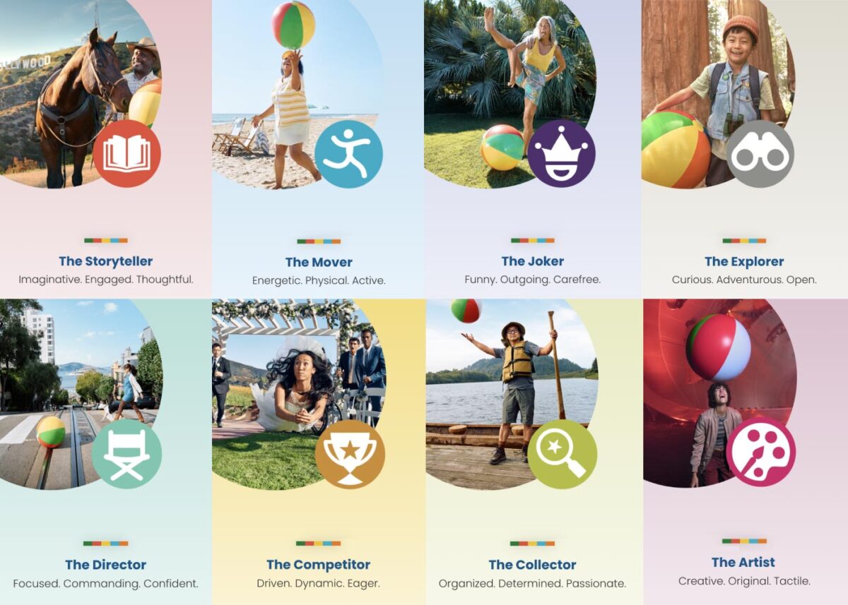
Play Styles
The eight Play Styles were based on personas researched and created by the National Institute for Play, headquartered in California. Content creators at Visit California crafted a series of TV spots with glimpses into different styles of play. Our Play Quiz would highlight which Play Style matched the participant’s preferences, and our results pages served relevant, curated content, a similar Celebrity personality, and even a secondary play style.
Email collection allowed visitors to send their play style results to themselves and allowed opt-in to more personalized content. Our team worked quickly over three months to solidify the approach, choose the quiz method and weighting criteria of the questions, and design the eight play style pages, two landing pages, a homepage takeover, and supporting pages for the new campaign.
The Results
Play Quiz: Avg. session duration
Play Styles: Avg. session duration
Compared to Site: Avg. session duration
Our approach to the campaign was to support the bottom of the funnel and give visitors coming from digital ads something useful. Given the wealth of content the Visit California website contains, these broad Play Style personas made visitors see themselves in California. It brought curated content to them and provided what we thought of as a personal homepage with relevant recommendations.
“Let’s Play” was the first part of a years-long brand campaign. We are already working on the campaign for 2025 which we hope will be even more engaging than the first!
I grew up on the computer. Through late elementary school, middle school, and high school I was always told to go offline because I was spending too much time online. What would I do when I’m out of school? I can’t just be on the computer all day, I’d never learn to interact with real people.
The COVID pandemic seemed to change everything. I started graduate school online, and my day job changed to remote. I transitioned from a fully in-person job to temporarily remote, then hybrid. After we started going back into the office, I couldn’t concentrate. I yearned to be at home working from the comfort of my home.
I looked for opportunities that would allow me to do so. In November 2021, my path led me to be an Associate User Interface (UI) Designer with Oomph. This was the first role I had that I had onboarded virtually, for a fully remote position. I was nervous to make friends. I had often relied on my sassy off-beat sense of humor in person to find my crowd. How was I going to do that in a virtual environment?
Our design team was small and consisted of J. Hogue, Renáta Miles, and Akili Greer. J. had been with Oomph for about 10 years, while Renáta first started work as a freelancer and then joined full-time for 6 years. In September of 2021, Akili — who had also started as a freelancer — joined full-time. Then I joined in November, and we added Ashley Estes a few weeks after me. That was a lot of growth in a short amount of time. Oomph encourages and supports meeting your team in person, so we decided to make it happen before COVID-19 infection rates started to soar again.
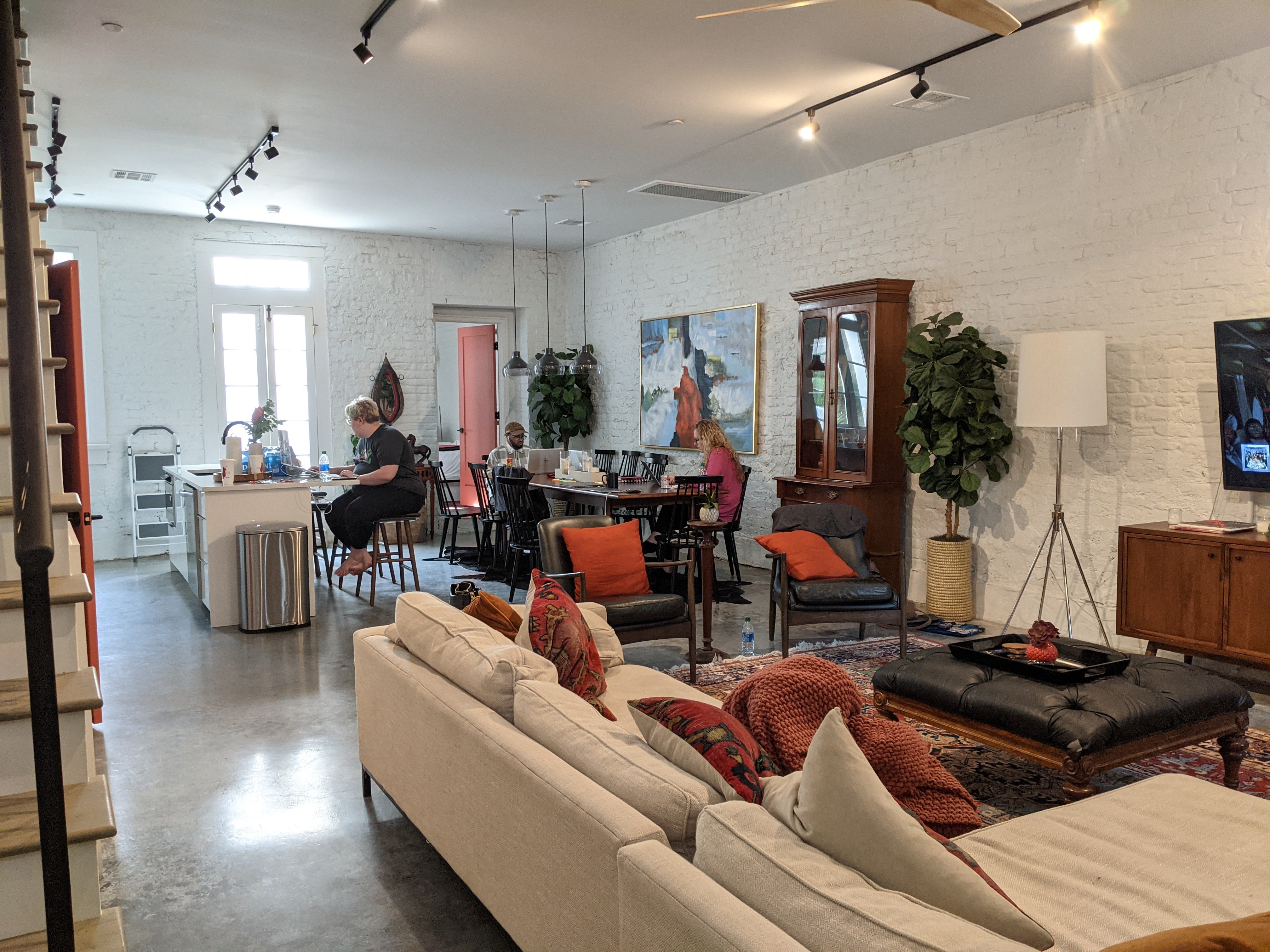
Our team started to research places that were in the middle of all of us. We were scattered across the county: two in Arizona, one in North Carolina, one in New Jersey, and one in Rhode Island. We booked the tickets with the help of our Operations & Finance Manager, Jana Aubin (thanks Jana!). Renáta found an AirBnB and created a grocery list while I planned a presentation of activities for our get-together. We designed t-shirts for our trip: black matte on black T-shirts (subtle, but cool). We determined goals for our trip, decided what projects to work on, and started our journey to figure out what makes the design team different.
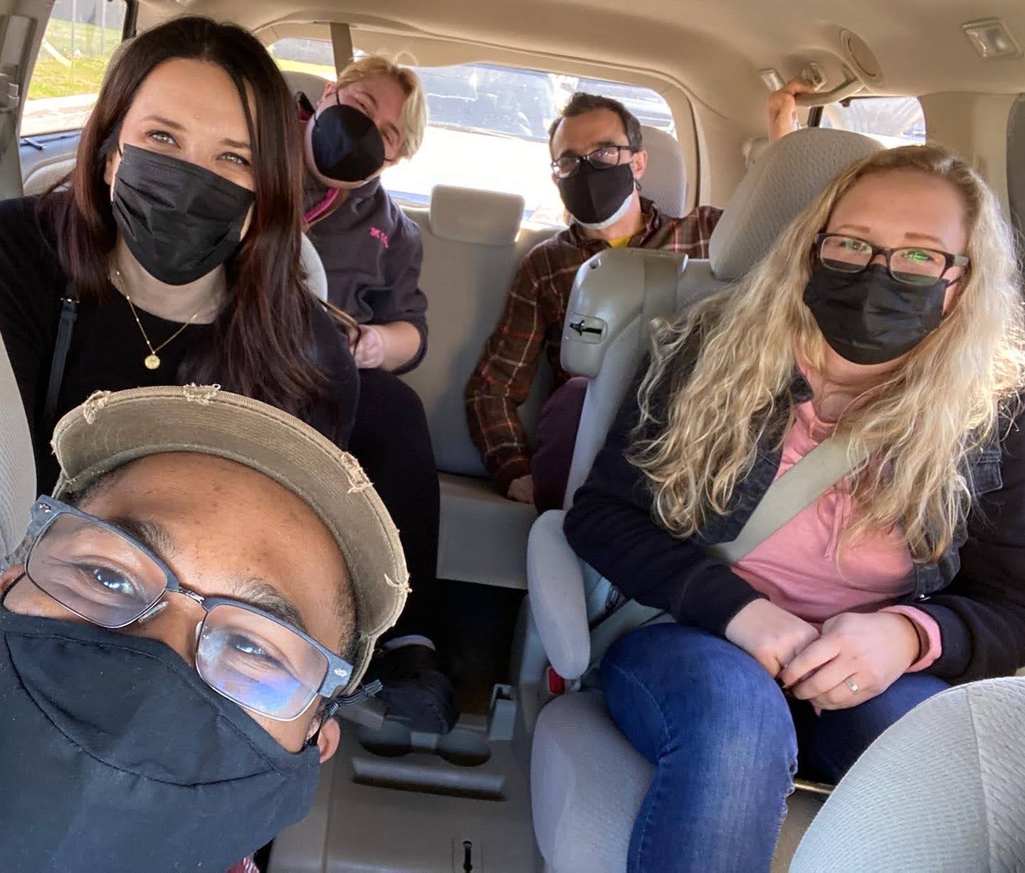
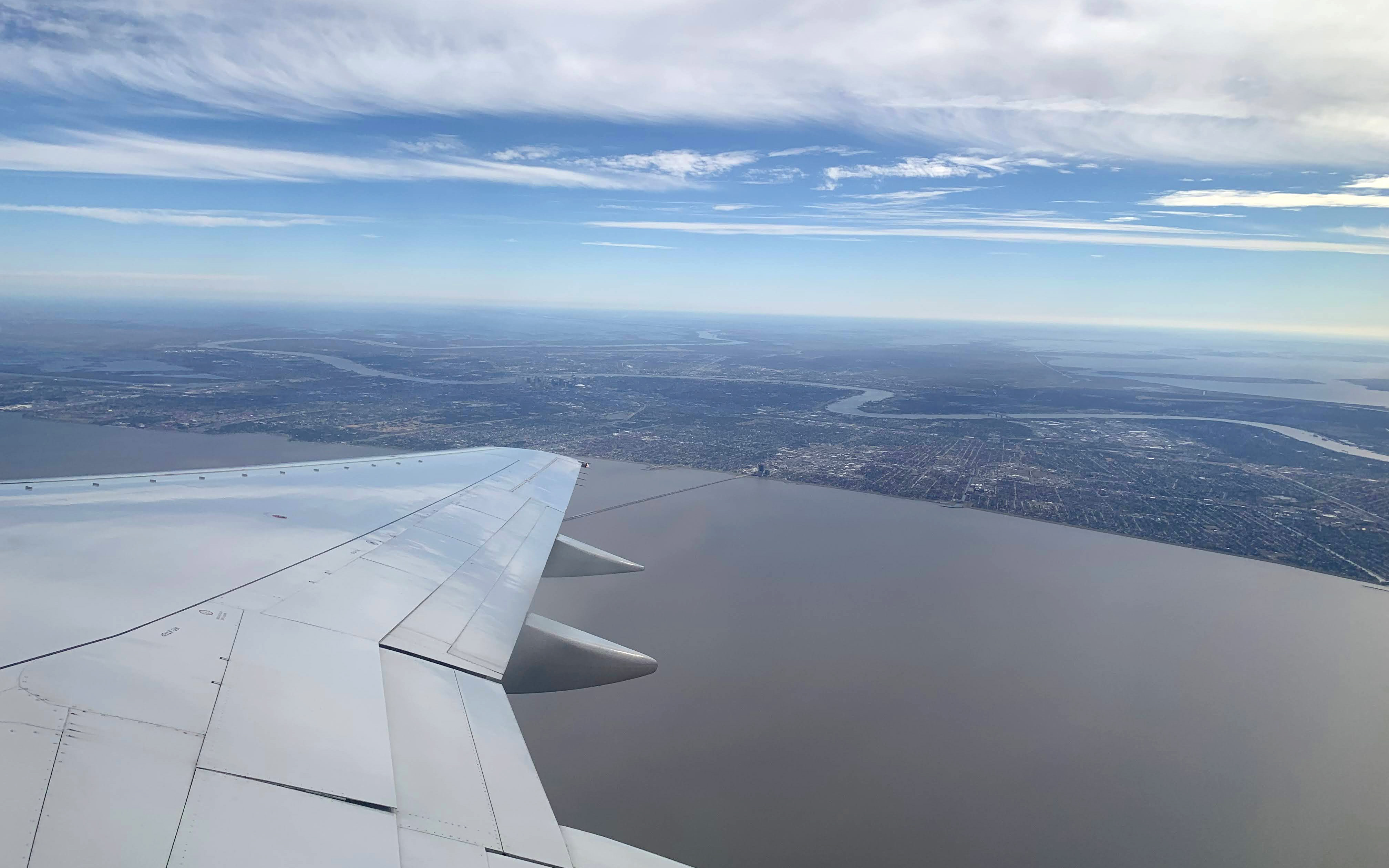
We embarked on our four-day trip at the end of January 2022. As I walked off my plane, Renáta jumped for joy as she met me at my gate. We walked together to our group who had just arrived. I forgot to even think about how tall everyone was! We hugged and happily made our way into the airport lobby, a live jazz band played as we strolled through. We made our way to an Uber to get to our AirBnB. We were chatting away and full of energy.
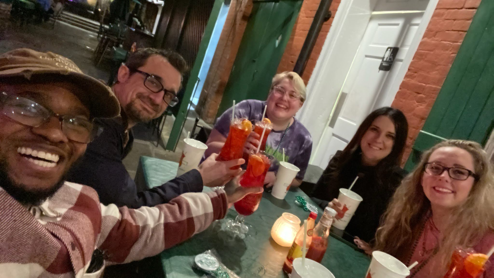
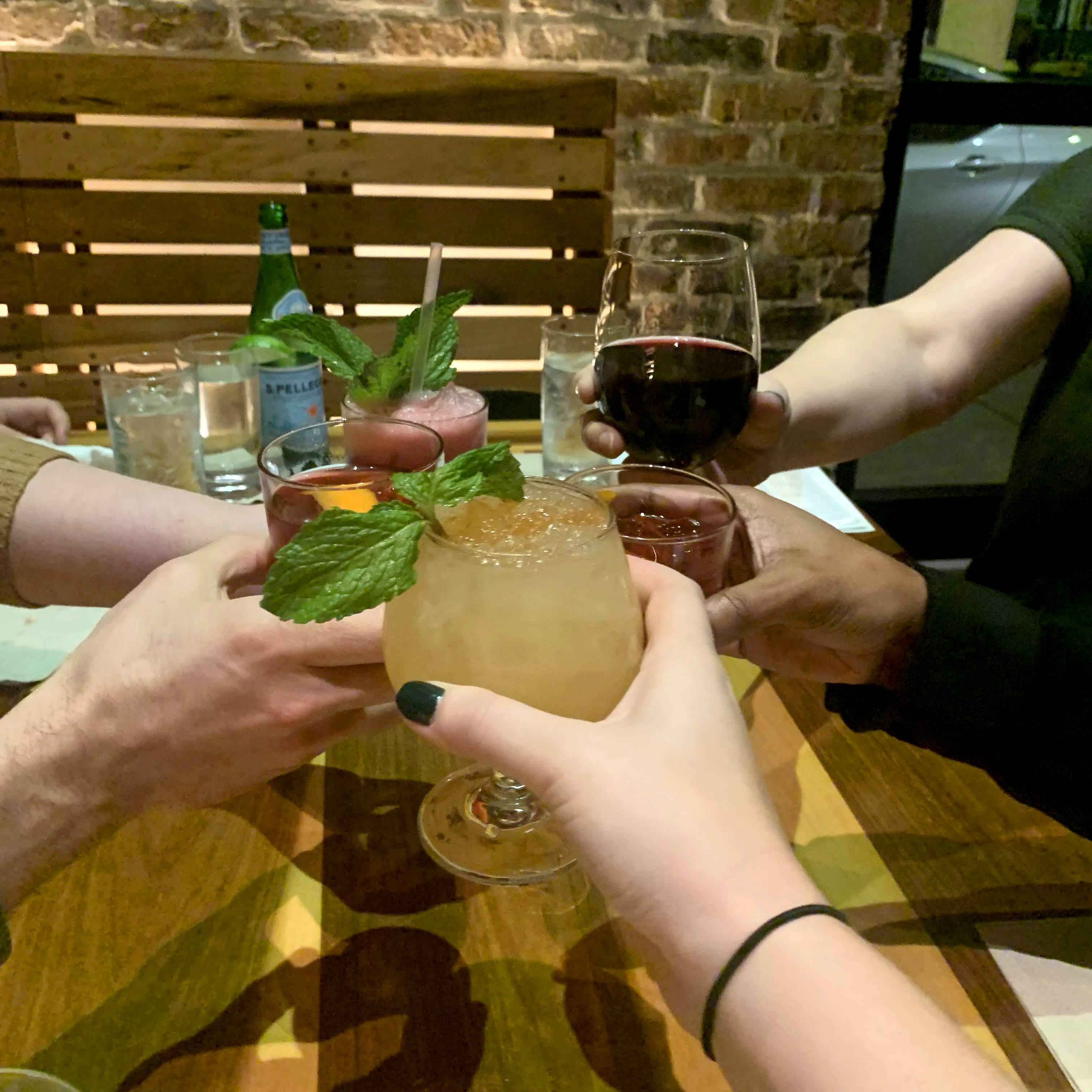
We made it to our destination: the two-floored home was huge and it felt like we were tiny among the giant open ceilings. We picked our rooms, got our groceries delivered, and tried some of Gus’ Famous Chicken that was located down the street. Later that night, we walked from our Airbnb to Pat O’Briens, the home of the Hurricane cocktail. We sat outside, were given plastic beads (very New Orleans), and were able to dine and get to know how everyone interacted. We cheered and drank to the trip and to the future.
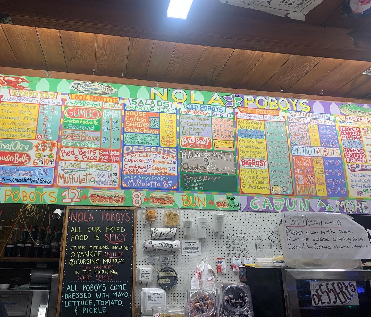
The next morning, we were able to have some breakfast and sit around our large dinner table to get some work done. Later in the day, we indulged in New Orleans culture and food with a Food-Walking tour, which included sights such as: Tchoupitoulas Street (CHOP-a-too-lis), French Quarter, Jackson Square, French Market, and Bourbon Street.
We learned about the top cuisine for locals, the history of some of the buildings and streets, the origin of the Mardi Gras colors, and the original meaning of voodoo1 dolls. After the tour, it started raining, and we visited a Voodoo shop for some souvenirs and the Pride store on Bourban Street. We stopped at another gift shop, and even at the famous Café du Monde to get some boxes to make beignets at home. My arms were heavy with all of my treasures, and my feet hurt from all the walking. I hadn’t moved around that much since pre-pandemic. When we got back to our AirBnB, we were tuckered out!
That night, we talked about what makes us unique as a team. We brainstormed ideas for team names, ideated different designs for logos, and spent the night chatting away about who we were and how we could define ourselves. We decided on Team Vantage for our new name. We thought about it in three ways: Perspective, “Point of view” as in a vantage point, and advantage. Our mission is to create clarity, drive excitement, and make the creative ideas of the client and project team tangible. Feeling accomplished, we went to sleep and passed out.
Tuesday started off similar to Monday, with breakfast and getting work done. We looked at current processes & ideated how we can improve for the better. Our newer teammates got an understanding of how the current process came to be. We were able to gather around one person’s computer for internal client meetings and talk to each other across the table about questions or findings. It felt surreal not to have to make a Zoom link to meet, call them up, or wait for a Slack message. The real-time collaboration felt special.
Later that night, we arrived at Cochon, a Cajun-style restaurant located down the street from our AirBnB. Our team went out to celebrate us, a successful trip, and the future. We walked around after to explore NOLA again for the last time as a team.
We arrived at the airport the early next morning and sat together, until one by one we left and parted ways. It was bittersweet, but we felt we grew because of the experience. As my plane took off, I reflected: Oomph supports us to grow together and supports us online and offline. Vantage became closer through quality time spent, which makes for more effective communication moving forward.
Before I knew it, we were back meeting again on Zoom, coffee in hand!
A Note on Names: Some scholars and practitioners prefer alternate spellings of Voodoo — such as Vodou, Vodon, Vodun or Vodu — in part to differentiate the religion from the stereotypes. Additionally, when used to refer to the religion itself, the word “Voodoo” is capitalized. For other uses, such as “voodoo dolls” or “voodoo economics,” it is not. Reference, HowStuffWorks.com
It’s been a long time since the Hack Day that launched ColorCube 1.0 — almost exactly 5 years, in fact. We are excited to have redesigned the tool to make it easier to use and to also give ourselves the opportunity to explore some new technology in the process.
Say Hello to AccessibleColor.design
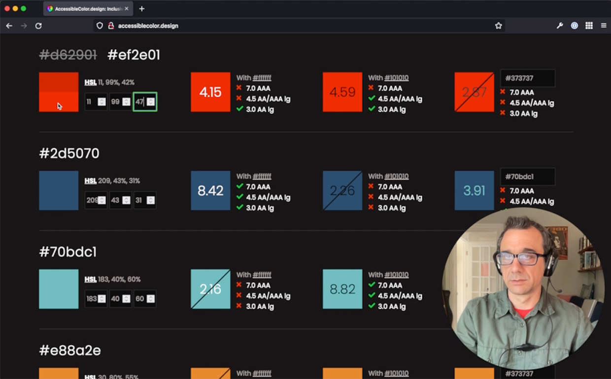
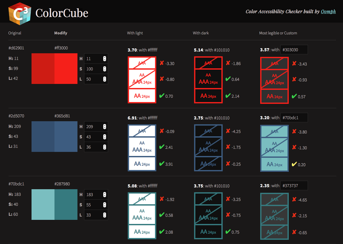
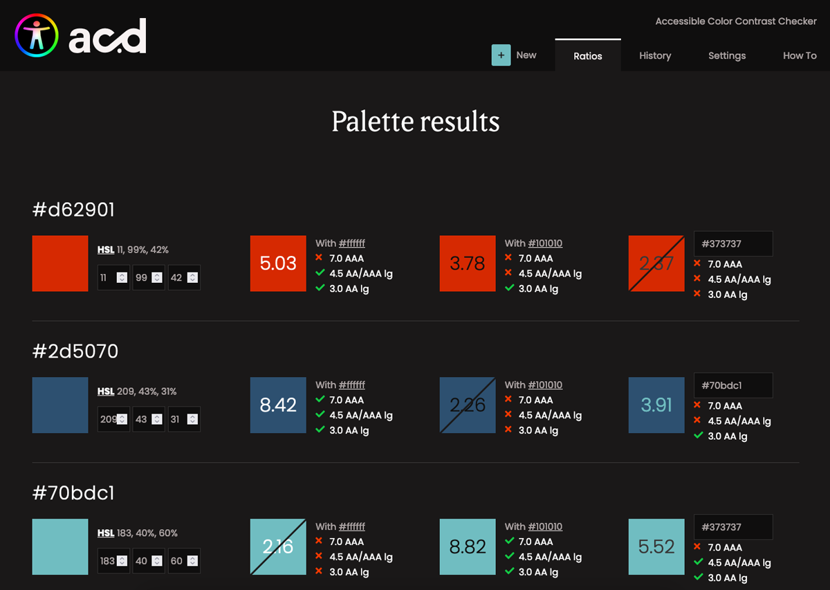
Formerly called ColorCube, AccessibleColor.design (ACd) is a tool built by developers for designers. It’s a tool that anyone can use, but the way it allows visitors to adjust colors to reach a passing threshold without the need for Photoshop or similar tools makes it perfect for designers.
The intention of the tool was always to display and manipulate color in a list. When we devised the interface, we noticed that so many of the other tools deal with one color pair at a time (this color text on top of that colored background). We wanted our tool to display a dense set of information — from a list of colors, show them with white, black, and one more color from the same lists. Then, allow the visitor to adjust the colors to a passing grade, as well as compare one color to another specific color without reloading the interface.
Highlights of the Redesign
The previous version of the tool was put up very quickly, and did not use a responsive design. Making a tool that displays dense information work for mobile was not our first priority, but now the interface has been simplified and so a move to responsive design was easier. While mobile traffic might continue to be low for a tool such as this, it is more likely that one might want to shrink the viewport to fit it on a large monitor alongside a website or design that someone is currently evaluating.
The design also greatly simplifies the output in the interface, making it easier to understand at a glance whether a particular color pair is passing or not. The previous tool highlighted values that were “edge”, meaning that they passed, but just barely. We found that this was confusing and did not add value to someone’s experience — so we removed it. The result is a more streamlined and clutter-free interface.
Functional Improvements
In addition to fixing a few bugs in the color calculations, we added new controls. Visitors can now specify a custom value for the default “light” and “dark” colors. Maybe your design does not use a white background or maybe nothing even gets to true black. Those colors can now be adjusted to meet your design.
The interface now takes advantage of operating system color mode preferences — ”Light” or “Dark” modes. These change the perceptions of the colors as well, so a visitor can override their OS setting in the interface and flip between light or dark modes as many times as they like.
Finally, a History tab has been added and the browser’s LocalStorage is used to save a history of color palettes that are provided to the tool. Going back to a previous color palette is easy, and any palettes from the list can be permanently removed as well.
Functional Enhancements
Internal projects are our chance to experiment with some new ideas and technology. We used this opportunity to add a few fun features.
One of these was the addition of a “Colors from image” feature. Upload an image, and the tool will pull out dominant colors and provide it as a new color palette to evaluate. Besides being fun and a source of color inspiration, this can be useful when a brand logo file has multiple colors that need to be evaluated.
Another enhancement was to add features that support Progressive Web Apps (PWAs). With a service worker in place and a little bit of extra code, the tool can now be recognized as a PWA, which allows it to be “installed” on a smartphone. It will work offline, syncing later as needed, and can be added to a home screen like any other native App without having to go through the App store. This was a fun enhancement that also taught our team a bit about how to make it all happen.
Future Improvements
Our GitHub issues list contains ideas we have sourced from the people who use the tool the most. Contribute your ideas if you use AccessibleColor.design for your next project. We hope to roll out more incremental improvements as we continue to use this project as a way to learn and contribute something valuable to the accessibility community.
THE BRIEF
AskRI is a digital platform providing Rhode Island residents with free access to some of the top educational and research tools, along with links to many state resources. A collaboration among the state government and various libraries and agencies, AskRI is essentially a 24/7 help desk for Rhode Islanders.
The platform’s structure has three main approaches:
Databases
Online portals provide free access to premium third-party tools and services, including research platforms and libraries, online learning and tutoring platforms, and consumer resources for health, jobs, and more.
Audiences
AskRI curates information and resources for specific audiences, including K-12 students and teachers, parents, non-native-English speakers, and adults seeking continuing education.
FAQs
Supporting local librarians with ready-made links, the FAQ section answers crowd-sourced questions about a variety of government services (how to get a green card, where to get a fishing permit, etc…).
Fundamentally, it’s an incredible resource! But, as AskRI grew over time, it became increasingly difficult for users to find the information they needed — and harder for site managers to organize, update, and expand the content.
Aiming to make the platform more user-friendly all around, its owners opted for a comprehensive redesign with a few primary goals:
- Refresh the branding to re-energize the service internally and externally
- Provide more flexible and efficient content management tools
- Increase usage of the platform’s resources across all target audiences
THE APPROACH
Through a quick Discovery phase, we uncovered a diverse user base with a broad range of needs. Our next challenge was to create an energetic brand identity and a more intuitive way to organize the platform.
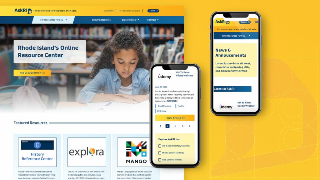
Visual Branding
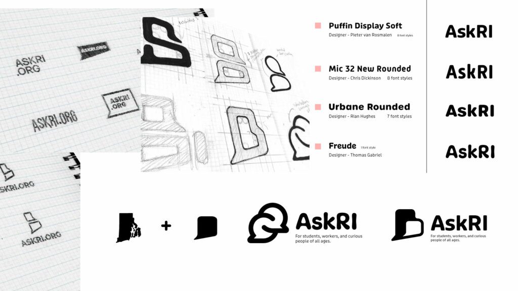
Rhode Island is a small but unique place, and its residents are proud of their state. We wanted the new branding to leverage a more modern, yet uniquely Rhode Island, identity. It could also evoke a sense of engagement, reinforcing the platform’s two-way interaction.
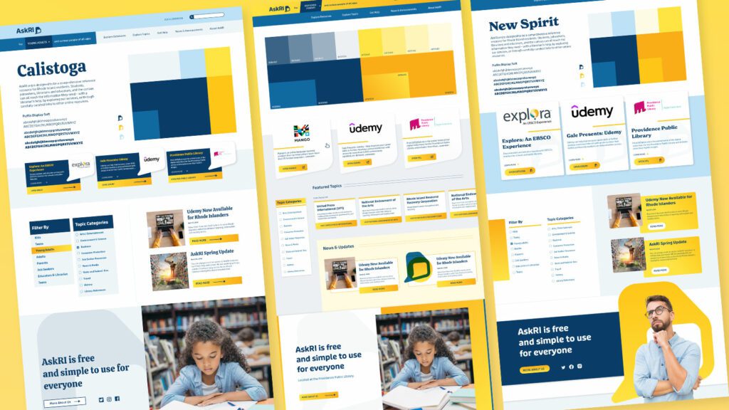
Over several design rounds, we explored logos that would represent two-way conversations while suggesting Rhode Island’s distinct shape. We also introduced a new, brighter color palette.
Digital Platform
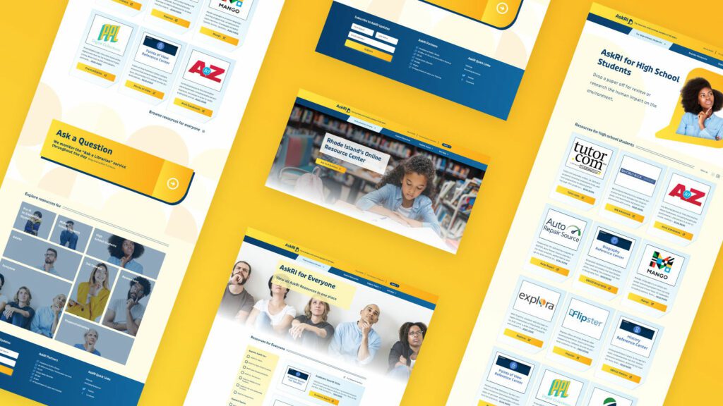
Redesigning the platform came down to an exercise in information architecture: What was the best way to organize the content so users could quickly find the tools and resources that were most relevant to them?
We knew only a small segment of the target audience would know exactly what they were looking for and be able to search for it directly. Most users would be on a mission of discovery, needing a way to browse the content. Then there was the FAQ section, where users might expect to find answers about the platform itself — but in its current form, the FAQs were confusingly broad and hard to find.
Our solution addressed all three areas:
- Knowing that frequent users would want to get to familiar databases quickly, we incorporated tried-and-true search and filter tools
- For those needing more guidance, we created a persona-based architecture with curated lists of content that addressed each persona’s unique needs
- By making the platform simpler and more intuitive, we removed the need for an FAQ section. We replaced it instead with a more interactive feature
THE RESULTS
These relatively simple changes brought powerful results, creating a more engaging and intuitive platform. The fresh branding celebrates inquisitiveness and interaction, while the redesigned content is much easier for users to navigate and for authors to organize and expand.
The AskRI team loved the new brand identity, which evokes curiosity with visual elements that represent thinking and asking questions. Two thought bubbles form the shape of Rhode Island for the logo, while images of inquisitive people are featured throughout the site. In addition, the new colors bring fresh energy to the brand while preserving a sense of trust and authority.
The redesign not only improved the content’s organization and accessibility, it also fosters a greater sense of interaction with platform users. Visual personas provide an intuitive starting point for exploration, backed up with curated resource lists. A new dropdown menu titled “Find Resources for You” speaks directly to target audiences, while a new “Explore Topics” section offers lists of state resources grouped by user needs (small business, health, families, etc.).
Finally, as the most interactive part of the platform, the redesigned FAQs section is now the “Ask a Librarian” page, where users can submit questions on any topic. The most common platform-related questions get published to the site as a list of answers that users can browse. Input from users will not only inform the kinds of content that goes on the site, but may also spur access to new tools and databases.
THE BRIEF
Supporting the Organizations You Love Should Be as Easy as Banking Online
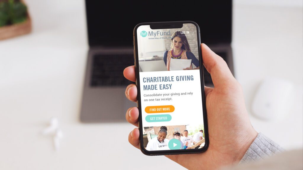
After a successful redesign experience for their main property, United Way Rhode Island (UWRI) came to Oomph with an idea — modernize and rebrand their philanthropic giving platform as a mobile-responsive web app. They already had the software team building back-office integrations, but what they didn’t have was the all-important name, URL and brand.
The name set the tone for the platform — easily understood, distinct in the marketplace, and personal. UWRI prides itself on being a personal organization, helping Rhode Islanders who need it most. And giving one’s time, one’s energy, and one’s assets is as personal as it gets. After some research into competitors, the banking space, logo and app naming trends, plus a whiteboard full of other ideas, a clear winner emerged — MyFund.
THE NEW BRAND
A New Sibling for a Recognizable Community Organizer
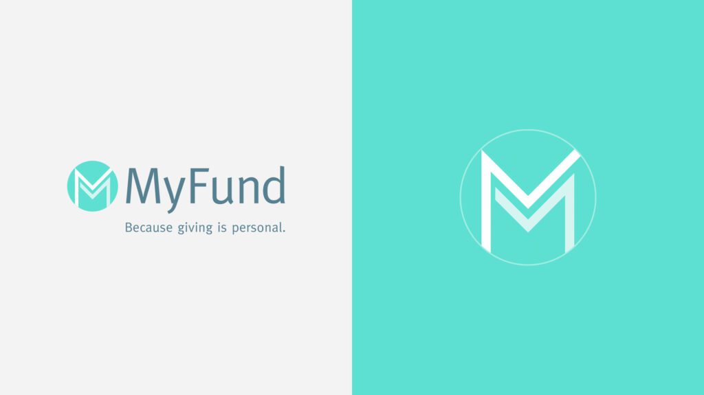
There is great public trust in UWRI that a new brand should leverage. After visual explorations, we decided to make the connection in a subtle way. The main color scheme borrowed from the recent redesign of UWRI’s website, using a highlight color of light teal as its primary color. The main typeface was Meta, which is the secondary typeface for much of UWRI’s print collateral. These subtle connections helped maintain a family resemblance, while allowing MyFund to stand on its own.
The simple circle with “M” mark abstractly suggests two bodies, side by side and with linked arms. The tagline, “Because Giving is Personal,” was the result of one of those serendipitous moments during an all-hands meeting. Someone floated it to the group and everyone just lit up and exclaimed, “That’s it!” Along the way, the name, the logo, the colors, the typeface, and the tagline just felt right. We all felt it, and it was very exciting to be a part of it.
THE RESULTS
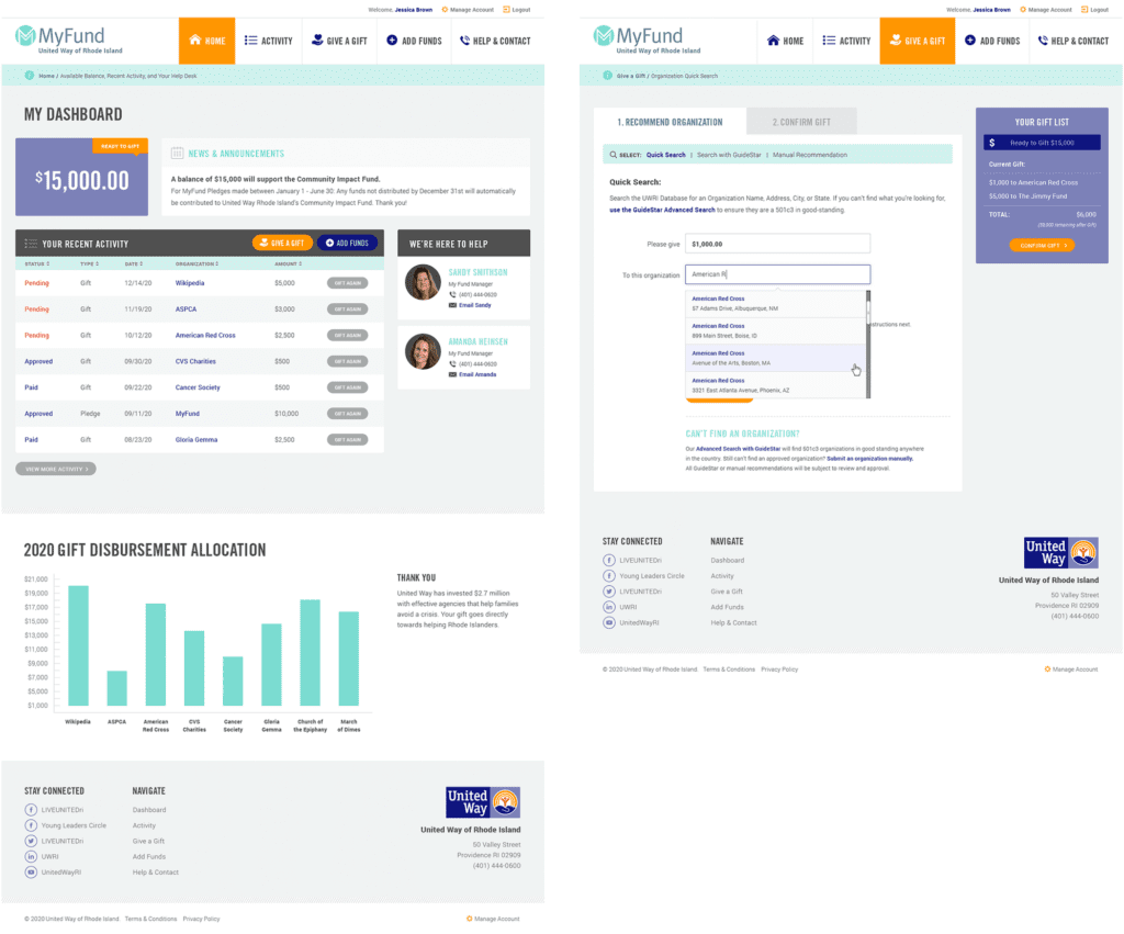
Web-app Interface Design
The interface was designed to follow many conventions of online banking in order to leverage customers’ intuition and expectations, but the result is softer and less like a typical financial institution. The concept of MyFund is similar to online banking in that the customer can make a donation through an online portal from a predetermined balance. The differences are in the workflow; MyFund transactions occur both on and offline. All transactions are guaranteed to go to registered 501c3 organizations in good standing with the IRS, therefore, when a request is made to send money to an organization, the final check is cut by a person. A customer may cancel a transaction before it has been fully processed but the back-office may also cancel it if the organization is not compliant. These nuances needed to be clear in the interface and messaging.
All along the way, the wireframes and designs were verified with real people. At the early stages, wireframes and workflows were tested with online tools and an HTML prototype. This not only gave the development team a live example of a customer’s workflow, but it gave the entire team a clear picture of how the responsive site was going to work.
The Marketing Site
While the software was nearing completion and a beta launch, Oomph began work on a marketing site to promote the new web app. We were involved in writing the copy and crafting the story for prospective customers.
We scripted a series of videos to help explain how individual features worked, while one explainer video on the marketing site gave new customers a broad overview of why this platform is such a great idea. A list of primary features as well as some social proof in the form of personal testimonials help frame the platform as more than just a convenience — it can really help you make a difference in your community.
See the marketing site in action at MyFund.org.