
As a digital services firm partnering with destination marketing organizations (DMOs) across the U.S., we’re helping teams navigate what’s already proving to be a volatile 2025—especially on the inbound side. Analysis from the World Travel & Tourism Council (WTTC) projects a stark reality: the U.S. economy will miss out on $12.5 billion in international visitor spending this year, with inbound spend expected to dip to just under $169B, down from $181B in 2024. Even more concerning, the U.S. is the only country among 184 economies in WTTC’s study forecast to see an inbound-spend decline this year.
While external market forces remain largely beyond control, we’ve identified three strategic areas where DMOs can focus their digital platforms to weather this storm and continue demonstrating measurable demand to their partners.
1. Transform Content Into Action-Driving Experiences
Why this strategic shift matters now
With inbound spend shrinking by $12.5B and key feeder markets weakening, undecided travelers need clarity and confidence to choose your destination. Content that reduces uncertainty and highlights immediate value converts better than generic inspiration.
Strategic implementation approach
Activate “Go Now” signals. Combine always-on inspiration with time-sensitive reasons to visit—shoulder-season value, midweek deals, cooling weather breaks—strategically mapped to the soft periods your analytics reveal.
Elevate discovery through intelligent architecture. Curate SEO-optimized content hubs organized by Themes (outdoors, arts, culinary) and Moments (fall colors, winter lights). Implement structured data (FAQ, Event, Attraction) with strategic internal linking architecture so travelers find relevant options fast.
Deploy micro-itineraries for immediate conversion. Design 24–48-hour “micro-itins” featuring embedded maps, transit and parking guidance, and seamless handoffs to bookable partners. Partnering with platforms like MindTrip reduces content team effort while accelerating output—a strategy that’s proven particularly effective for our DMO clients facing resource constraints.
Authority-driven event content optimization. Event pages generate the highest intent traffic. Enhance them with rich media, last-minute planning resources, and strategic “if sold-out, try this” alternatives.
Transparent value communication. Feature free experiences prominently, implement intuitive budget filters, and deploy “Best Time to Visit” calendars comparing crowds and pricing by week and month. Transparency builds trust, and trust drives conversion.
2. Build Your Competitive Moat Through Data-Driven Audience Cultivation
Your first-party data represents your most defensible competitive advantage. As platform targeting becomes increasingly constrained and inbound spending softens, DMOs that build and activate their own audience will capture attention far more efficiently than those relying solely on paid channels.
Strategic audience development
Implement high-intent capture everywhere. Deploy contextual email and SMS prompts across high-intent templates—events, itineraries, trip planners, partner directories. Offer valuable micro-perks like exclusive maps and early event alerts.
Master progressive profiling. Collect visitor preferences—season, interests, party type, origin market—over multiple touchpoints rather than overwhelming users with lengthy initial forms.
Create actionable audience segments. Develop cohorts around 2025’s market realities: last-minute planners, shoulder-season seekers, road-trippers, value hunters, family weekenders, and meetings planners.
Future-proof attribution systems. Combine GA4 with server-side tagging and standardized UTM schemas for every partner handoff. Track outbound clicks, partner session quality, itinerary saves and usage, offer redemptions, and newsletter-driven sessions. This comprehensive approach ensures you maintain visibility into conversion paths as third-party cookies disappear.
Deploy trend-driven editorial strategy. Develop weekly dashboards blending organic query trends, on-site search terms, partner click-through rates, and feeder-market signals. When interest dips in one market, pivot homepage modules and paid social toward value and itinerary content targeting more resilient markets.
3. Transform Partner Relationships Through Measurable Value Delivery
In a softening inbound environment where domestic spending carries approximately 90% of the economic load, your partners need two critical elements: qualified attention and proof of conversion. Your website should function as the region’s premier meta-directory and conversion engine.
Experience optimization strategies
Enable one-click handoffs with context preservation. Pass user filters—dates, neighborhoods, price ranges—directly into partner sites and booking engines while preserving state if travelers return.
Deploy persistent trip planning tools. Allow users to save places and generate shareable itineraries with intelligent handoffs: “Book these two hotels,” “Reserve rentals,” “Get festival passes.”
Create compelling partner storefronts. Develop rich partner profiles featuring availability widgets, authentic reviews, social proof, and clear calls-to-action.
Implement strategic co-op modules. Design paid placements that provide value rather than feeling like advertisements: “Local Favorites” carousels, sponsor highlights, seasonal deal tiles—rotated by audience cohort and season. This generates additional revenue while maintaining user experience quality.
Establish closed-loop reporting systems. Standardize UTM tracking, monitor outbound events, and where permitted, implement partner pixels and offer codes to report assisted conversions by category and campaign. Partners need proof of ROI, and data-driven reporting builds stronger, more profitable relationships.
How Oomph Can Accelerate Your Success
If you’re experiencing softer international interest, shorter booking windows, or declining partner satisfaction, you’re facing the same challenges as DMOs nationwide. The organizations pulling ahead aren’t waiting for market recovery—they’re strengthening their digital platforms through strategic content optimization, systematic audience cultivation, and demonstrable partner value creation.
Our proven methodology transforms these challenges into competitive advantages.
We’ll conduct a comprehensive audit of your digital platform against these three strategic pillars, quantify immediate optimization opportunities, and provide your partners with what they need most: qualified, measurable demand. The market headwinds are real, but the right strategic approach can help you maintain resilience and emerge stronger when conditions improve. Let’s navigate these challenges together.
One question we frequently hear from clients, especially those managing web content, is “How can we implement accessibility best practices without breaking the bank or overwhelming our editorial team?”
It’s a valid concern. As a content editor, you’re navigating the daily challenge of maintaining quality while meeting deadlines and managing competing priorities.
When your team decides to prioritize website accessibility, the initial scope can feel daunting. You might wonder “Does this really make a difference?” or “Is remediation worth the effort?” The answer is always a resounding yes.
Whether you’re working on a small site or managing thousands of pages, accessible content improves user experience, ensures legal compliance, boosts SEO performance, and reinforces your brand as inclusive and responsible. As a content editor, you have the power to make steady, meaningful progress with the content you touch every day.
Why Accessibility Creates Business Impact
Accessible content delivers measurable outcomes across multiple business objectives:
Expanded Market Reach: When your content is inaccessible to users with disabilities, you’re limiting your potential audience. Consider that disabilities can be temporary, like a broken arm, and 70% of seniors are now online—a demographic that often benefits from accessible design principles.
Risk Mitigation: Inaccessible websites can lead to legal complaints under the ADA and other regulations, creating both financial and reputational risks.
Enhanced User Experience: Clear structure, descriptive alt text, and keyboard-friendly navigation improve usability for all users while boosting SEO performance.
Brand Differentiation: Demonstrating commitment to accessibility positions your organization as inclusive and socially responsible.
Implementing Accessibility in Your Editorial Workflow
The challenge isn’t whether to implement accessibility—it’s how to do it efficiently without overwhelming your team or budget.
The Fix-It-Forward Approach
Rather than attempting to overhaul your entire site overnight, we recommend a “fix-it-forward” strategy. This approach ensures all new and updated content meets accessibility standards while gradually improving legacy content. The result? Steady progress without resource strain.
Leverage Open Source Tools
Many CMS platforms offer free accessibility tools that integrate directly into your editorial workflow:
Drupal: Editoria11y Accessibility Checker, Accessibility Scanner, CKEditor Accessibility Auditor
WordPress: WP Accessibility, Editoria11y Accessibility Checker, WP ADA Compliance Check Basic
These tools scan your content and flag common WCAG 2.2 AA issues before publication, transforming accessibility checks into routine quality assurance.
Prioritize High-Impact Changes
Focus your efforts on fixes that significantly improve usability for screen reader and keyboard users:
- Missing image alt text
- Poor heading structure
- Duplicate or unclear link text
- Links that open new windows without warning
- Insufficient color contrast (may require developer collaboration)
Less critical issues can be addressed during routine content updates, spreading the workload over time.
Manage Legacy Content Strategically
Don’t let your content backlog create paralysis. Prioritize high-traffic pages and those supporting key user journeys. Since refreshing legacy content annually is already an SEO best practice, use these updates as opportunities to implement accessibility improvements.
Build Team Capabilities
Make accessibility part of your content culture through targeted education and resources. Provide internal training, quick reference guides, and trusted resources to keep editors confident and informed.
Recommended Learning Resources:
Track Progress and Celebrate Wins
Measure success by tracking pages published with zero critical accessibility issues. Share achievements in editorial meetings to reinforce your team’s impact and maintain momentum.
Scaling Your Accessibility Program
While regular content checks provide immediate value, sustainable accessibility success requires periodic comprehensive assessments and usability testing. If your team lacks bandwidth for advanced testing, consider adding this to your 1-2 year digital roadmap. Consistent attention over time proves more sustainable and cost-effective than attempting massive one-time remediation.
Start with Free Tools: Google Lighthouse provides immediate insights into accessibility issues and actionable remediation guidance.
Advanced Assessment Options: For teams ready to expand their program, tools like SortSite, SiteImprove, and JAWS screen reader testing offer comprehensive assessments. These advanced tools can uncover complex issues beyond content-level checks, though they may require developer collaboration for implementation.
Quarterly Program Goals:
- Regular Google Lighthouse assessments for incremental improvements
- Full-site scans or top-page audits with developer support
- Remediation prioritization based on traffic and business value
- Ongoing WCAG 2.2 AA compliance tracking
Consider engaging someone who navigates the web differently than your team does. This perspective will expand your understanding of accessibility’s real-world impact and inform more effective solutions.
Accessibility as Continuous Improvement
Accessibility isn’t a one-time project—it’s an ongoing commitment to inclusive digital experiences.
By integrating accessibility best practices into your publishing workflow, you’ll build a stronger, more inclusive website that protects your brand, empowers your users, and demonstrates digital leadership.
The fix-it-forward approach transforms what seems like an overwhelming challenge into manageable, sustainable progress.
Ready to Accelerate Your Accessibility Journey?
Explore additional insights from our team:
- More than Mouse Clicks: A Non-Disabled User’s Guide to Accessible Web Navigation
- How Does the European Accessibility Act Affect Your Business?
Ready to take action? Contact Oomph to see how we can support your accessibility journey. We start with targeted accessibility audits that identify your highest-impact opportunities, then collaborate with your team to develop a strategic roadmap that aligns with your internal goals while respecting your resources and team size.
When you’re responsible for your organization’s digital presence, it’s natural to focus on what’s visible: the design, the content, the user experience. But beneath every modern website lies a complex ecosystem of technologies, integrations, and workflows that can either accelerate your team’s success or create hidden friction that slows everything down.
That’s where a technical audit becomes invaluable. It’s not just a diagnostic tool—it’s a strategic opportunity to understand the foundation of your platform and make informed decisions about your digital future.
It’s Like a Home Inspection for Your Website
Think about buying a house. You walk through focusing on the big picture—does the kitchen work for your family? Is there enough space? But a good home inspector looks deeper, checking the foundation, examining the electrical system, and spotting that small leak under the bathroom sink that could become a major problem later.
A technical audit takes the same comprehensive approach to your digital platform. We examine not just what’s working today, but what might impact your team’s ability to execute tomorrow. The goal isn’t to find problems for the sake of finding them—it’s to give you the complete picture you need to plan strategically.
Creating Shared Understanding Across Your Entire Team
One of the most powerful outcomes of a technical audit is alignment. Whether you’re managing internal developers, partnering with an agency, or preparing to issue an RFP, having a clear baseline allows everyone to ask better questions and make more accurate decisions.
A strategic technical audit delivers:
Proactive Problem-Solving: Surface technical issues before they become roadblocks to important campaigns or launches.
Performance Optimization: Identify specific improvements that will measurably enhance user experience and conversion rates.
Workflow Enhancement: Reveal friction points that slow down content updates, campaign launches, or day-to-day management tasks.
Vendor Enablement: Provide partners and potential vendors with the context they need to scope work accurately and ask intelligent questions.
Strategic Planning: Create a foundation for long-term digital strategy decisions, from infrastructure investments to editorial tooling.
The organizations we work with often tell us that a technical audit helped them transition from reactive maintenance to proactive digital platform management—a shift that pays dividends across every initiative.
What We Typically Discover
While every platform is unique, certain patterns emerge across industries and organization types. Technical audits frequently reveal:
Security and Maintenance Opportunities: Outdated software, plugins requiring updates, or access configurations that can be strengthened with minimal effort. This often includes ensuring accessibility compliance meets current standards.
Performance Enhancements: Specific optimizations in areas like image compression, caching strategies, or database queries that directly impact user experience. Modern audits also examine search visibility and performance optimization.
Scalability Considerations: Code or architectural decisions that work fine today but could limit growth or flexibility as your needs evolve. This includes evaluating search infrastructure and international expansion capabilities.
Process Improvements: Gaps in version control, deployment workflows, or change management that create unnecessary risk or slow down development cycles.
Editorial Workflow Optimization: Content management processes that feel cumbersome or inconsistent, often because they evolved organically rather than being designed strategically. For global organizations, this includes reviewing translation and localization systems.
Many of these findings aren’t urgent fixes—they’re strategic insights that become incredibly valuable when you’re planning a redesign, launching a major campaign, or evaluating new partnerships.
When a Technical Audit Delivers Maximum Value
You don’t need to wait for problems to emerge. Technical audits are particularly valuable when:
Taking Over Digital Responsibility: You’ve inherited a platform and need a comprehensive understanding of what you’re working with and where the opportunities lie.
Planning Major Initiatives: Before investing in a redesign, platform migration, or significant feature development, understanding your current foundation prevents costly surprises.
Preparing for Vendor Selection: Whether you’re issuing an RFP or evaluating agencies, giving potential partners accurate technical context leads to better proposals and more realistic timelines.
Developing Digital Strategy: When you’re ready to create a roadmap for digital growth, grounding decisions in technical reality rather than assumptions leads to better outcomes. This is especially important when considering AI integration or generative engine optimization strategies.
Our Approach to Technical Audits
We design our audits to build clarity and confidence, not overwhelm you with technical jargon. Rather than simply delivering a report, we walk through findings with your team, prioritize recommendations based on your specific goals, and translate technical insights into actionable business language you can share with stakeholders.
Our methodology goes beyond code analysis. We examine how your platform supports your current workflows, aligns with your organizational objectives, and positions you for future growth. This combination of technical depth and strategic perspective ensures you get insights that drive real business outcomes.
The audit process focuses on partnership, not judgment.
We’re not looking for flaws to criticize—we’re identifying opportunities to help you and your partners make smarter decisions. The result is visibility into the hidden layers of your digital platform and a foundation for more strategic planning, better technology investments, and sustainable long-term success.
Ready to understand what’s really happening under the hood of your digital platform? Let’s talk about how a technical audit could support your goals and strengthen your team’s ability to execute on your digital vision.
Key Outcomes
Within three weeks of launch, the redesigned digital experience system demonstrated measurable improvements across every key visitor behavior:
Homepage engagement time
Exhibition page views
“Inside the Collection” engagement time
Beyond the metrics, the new system fundamentally changed how the Gardner operates online:
- Operational efficiency: Staff can now find and update content without external search tools, reducing technical dependencies and accelerating publication cycles
- Foundation for iteration: Clear analytics, accessible components, and logical content structure enable ongoing testing and optimization based on visitor behavior
- Inclusive access: WCAG 2.2 AA compliance extended reach to visitors with disabilities while improving usability for everyone
- Strategic content pathways: Improved architecture creates discovery opportunities, extending engagement beyond transactional tasks to collection content, exhibitions, and membership
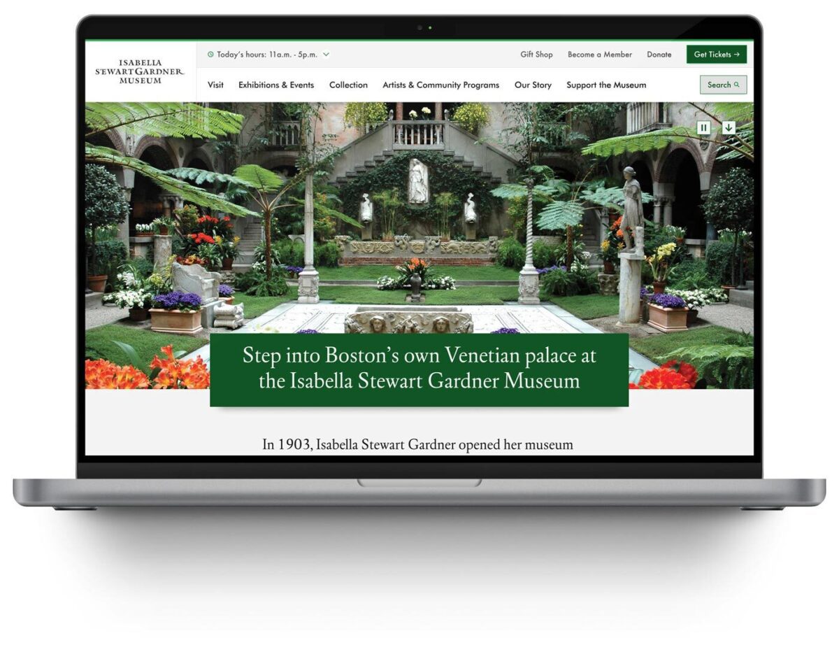
The Organization
The Isabella Stewart Gardner Museum is one of Boston’s most distinctive cultural institutions. Founded by Isabella Stewart Gardner herself, the Museum offers an intimate, unconventional art experience—no labels, personal curation, and a transportive environment that defies typical museum expectations.
For an institution built on intentionality and access, digital experience shapes whether people visit, how they prepare, and whether they return. When the Museum’s website became a barrier rather than a bridge, they needed a partner who could modernize their digital experience system without erasing what makes the Gardner extraordinary.
The Challenge
The Gardner’s digital presence had become operationally unsustainable and strategically misaligned:
- Internal navigation failures: Staff routinely used Google to find content on their own website, signaling fundamental architecture problems
- Accessibility gaps: The site failed WCAG 2.2 AA standards, excluding visitors with disabilities and contradicting the Museum’s commitment to inclusive access
- Scattered information architecture: Exhibition details, ticketing, and visitor resources lacked clear relationships or pathways, creating friction at critical decision moments
- Inflexible content management: The component system forced workarounds that undermined performance and brand coherence
These systemic barriers prevented the Museum from achieving core digital objectives: inspiring visits, supporting trip planning, and extending engagement beyond the physical experience.
The Approach
Oomph designed and implemented a comprehensive digital experience system—a fundamental rearchitecture of how the Museum operates online:
- Strategic alignment: Stakeholder workshops across departments established shared priorities, success metrics, and institutional identity through synthesis of member surveys, analytics, and internal insights
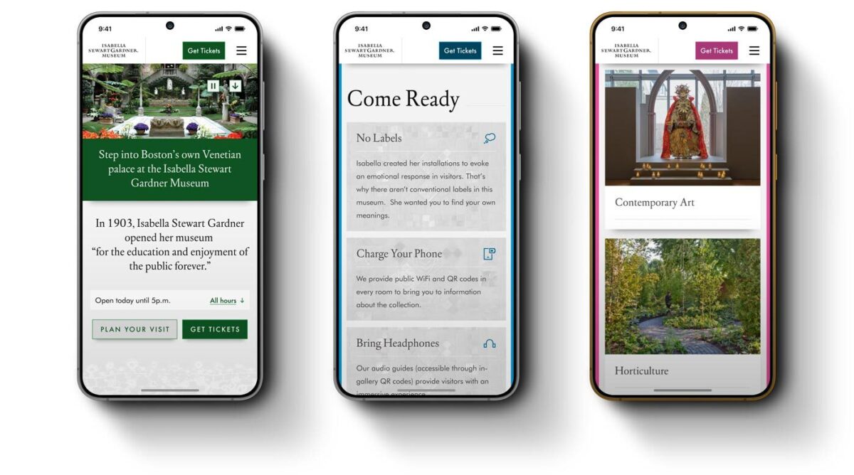
- User-centered architecture: Mapped visitor journeys for key personas—Museum Members, first-time ticket buyers, on-site visitors, and online researchers—ensuring structure supported real tasks
- Information architecture transformation: Rebuilt navigation and menu hierarchy from the ground up, validated through TreeJack testing before visual design
- Accessibility-first component system: Developed component library meeting WCAG 2.2 AA standards, proving accessibility and aesthetic excellence reinforce each other
- “Gentle elegance” design philosophy: Translated the Gardner’s intimate character into digital form through subtle details—lace patterns and mosaic elements—that inject personality without overwhelming content
- Strategic page redesigns: Reimagined Visit page balances practical planning information with pathways to deeper content exploration
- Performance infrastructure: Built technical foundation for speed, reliability, and long-term maintainability
The Result
The Isabella Stewart Gardner Museum now operates a digital experience system that reflects its institutional values—intimate, intentional, and accessible to all.
The platform performs measurably better across every key visitor behavior. The Museum’s team has infrastructure that supports their mission with clear pathways for ongoing optimization as visitor needs evolve.
The Gardner’s digital presence now prepares visitors for an extraordinary experience, removes barriers to access, and extends the Museum’s distinctive character beyond its physical walls.
Why This Matters
Cultural institutions must honor their distinct identity while meeting contemporary expectations for digital access and usability. The Gardner demonstrates how these priorities reinforce rather than conflict.
By treating digital experience as an integrated system, Oomph helped the Gardner build infrastructure that scales with their mission—creating operational capacity to measure, learn, and continuously improve how they serve visitors online.
This transformation moves metrics: measurable engagement growth, operational efficiency, and strategic flexibility. More fundamentally, it builds systems that help organizations do their most important work better.
In 2026, the way people discover and engage with digital content has shifted. Traditional Search Engine Optimization (SEO) is no longer the only strategy that brings people to your website. Meet Generative Engine Optimization (GEO), the emerging frontier for organizations looking to earn visibility through AI-driven platforms like ChatGPT, Google’s Gemini, and Perplexity.
If your organization hasn’t begun adapting its content strategy for GEO, now is the time. Here’s what GEO is, why it matters, and how to start optimizing for it.
What is GEO and How Is It Different From SEO?
While SEO focuses on improving your visibility on traditional search engine results pages (SERPs) through keywords, backlinks, and technical performance, GEO is about making your content the answer in AI-generated responses.
Rather than presenting users with a list of links, GEO centers on AI tools that synthesize information. These platforms use large language models (LLMs) to provide direct answers to questions. Instead of competing for a top 10 ranking on Google, you’re aiming to be cited, summarized, or linked to by tools like Gemini or ChatGPT.
In short: SEO gets you found, GEO gets you featured.
Why GEO Matters in 2026
AI tools are no longer sidekicks to Google—they’re central to how people research, compare options, and make decisions. As of late 2025, ChatGPT receives over 4.5 billion monthly visits, while Perplexity processes over 500 million searches per month. Google remains the dominant force in online search with billions of daily visits, but with the direct integration of Gemini into search results, the way people find information is changing. Users can now get answers without ever clicking through to your website—a “zero-click search result.”
If your content isn’t showing up in AI answers, you’re missing visibility with a massive and growing segment of your audience. Depending on what your digital experience delivers, this affects brand recognition, traffic and lead potential, and your credibility as an authority in your space.
In 2026, AI summaries are the new front page of search.
How GEO Works: What AI Tools Are Looking For
Each generative engine has its quirks, but several patterns are emerging across platforms:
1. Structure Matters More Than Ever
AI tools rely on clear, structured content. Use schema markup generously—particularly FAQPage, Organization, Article, and Product types. Structured data helps AI understand your content contextually, making it easier to reference in generated answers.
Tip: Google’s Structured Data Markup Helper is a great place to start reviewing your schema.
2. E-E-A-T Principles Still Rule
Google’s Expertise, Experience, Authoritativeness, and Trustworthiness (E-E-A-T) framework, a core concept for SEO, now extends to AI tools like Gemini. Show credentials, cite data, link to reputable sources, and provide content authored by credible experts.
If you have certifications, awards, partnerships, or original research, feature them clearly.
3. Conversation > Keywords
GEO is less about keywords and more about natural language. Write in a conversational tone and frame your content in terms of questions and answers. Think: “What are the best family vacation spots in California?” instead of “California vacation destinations.”
4. Content Freshness is Key
AI platforms—especially Perplexity, which indexes content daily—prioritize content that’s up to date. Refresh evergreen posts annually and use a content calendar to track when to review content. Prioritize articles with titles like “Top” or “Best,” as these perform well in answer generation, particularly on ChatGPT.
5. Visuals Are Increasingly Important
Gemini and Perplexity are both investing in multimodal search. Media assets like charts, videos, and well-optimized images can increase the chance of being featured. Also make sure your image alt text, captions, and surrounding content are descriptive.
6. Prioritize Performance & Mobile-Responsiveness
A site that performs well on mobile loads quickly, displays clearly on small screens, and avoids frustrating interactions like unclickable buttons or pop-ups. Poor mobile performance—including slow Core Web Vitals—can hurt your rankings, which in turn reduces your visibility to LLMs that rely on search results as input sources.
Tool-Specific GEO Tips
Gemini (Google)
- Optimize for the Search Generative Experience (SGE) with crawlable content and Core Web Vitals in check.
- Use a hub and spoke content model to build topical authority. This model organizes content around a central “hub” topic page that then links to related and more detailed “spoke” pages.
- Regularly monitor impressions and click-through rates in Google Search Console. A dip in clicks with high impressions could signal that your content is being used in AI answers.
Perplexity
- With an emphasis on factual accuracy, source transparency, and user control over search scope, sources are essential. Focus on citations and factual, digestible content.
- Use Question & Answer formatting to align with Perplexity’s research focus.
- Include multimedia assets and data points that back up your authority—charts, diagrams, and maps in addition to video and images.
ChatGPT
- Embrace personalization. ChatGPT seeks out phrases like “top” or “best” that give users the feeling of receiving personalized insights.
- Optimize your About Us page to clearly articulate your mission and values. ChatGPT often uses this to evaluate trustworthiness and authority.
- Strengthen your backlink profile to compete with high-authority sources like Wikipedia, Reddit, and news outlets frequently cited by the model.
Tracking GEO Performance
A consequence of AI summaries is that websites may see a drop in clicks and visits within their analytics, particularly a decrease in organic traffic month over month. With users getting answers from AI-generated search responses, they may no longer need to visit your website for information. However, those users who do click through often stay longer and discover more pages than they did previously.
Websites may also see an increase in impressions or referrals from AI assistants. This data is increasingly important to track.
Even if AI tools don’t always send traffic directly, you can still measure their impact:
- Google Analytics 4 (GA4) Segmentation: Create segments by referral source (e.g., chat.openai.com, perplexity.ai, gemini.google.com) to track AI-specific sessions.
- Landing Page Analysis: AI tools often link deep into your site. Use GA4 to monitor which long-tail pages are receiving AI-generated traffic.
- Google Search Console: Identify FAQ-style queries with high impressions but low CTR. These may indicate your content is being summarized in AI answers.
What This Makes Possible
For organizations investing in GEO, the shift isn’t just about traffic—it’s about creating the foundation for how your brand shows up when decisions are made. When your content is structured, current, and authoritative, you’re positioned to be the answer AI platforms cite. That visibility translates into trust, consideration, and the ability to shape how your expertise is perceived across the platforms your audiences use most.
Organizations that optimize for GEO now are building systems that can adapt as AI search continues to evolve, ensuring their digital presence performs across both traditional and emerging channels.
Action Items for Digital Teams
- Audit your existing content with these optimization strategies in mind. You can use AI tools like Gemini to identify optimization opportunities for particular pages.
- Update schema across all major content types, especially Q&A and organizational pages.
- Refresh your high-performing or evergreen content regularly, especially pieces tied to seasons, events, or top lists.
- Revise your content strategy to include multimedia assets, structured data, and topic clustering.
- Optimize your About page and author bios to strengthen trust signals for LLMs.
Final Thoughts
Optimizing for GEO is a fundamental shift in how people find and interact with content. As AI-generated answers become a dominant part of the discovery experience, your organization’s ability to show up in these spaces affects whether you gain trust or go unnoticed.
By embracing schema, writing conversationally, and refreshing content with purpose, your digital presence can evolve to meet the moment—one where the best answer often wins over the best ranking.
Ready to optimize your content for AI-powered search? Let’s talk about what that looks like for your organization.
Search and SEO are evolving rapidly in the wake of new AI options. Many of our clients are concerned about continuing to receive a return on their SEO investment. They worry about putting effort into the right places. And they worry about how to prepare for a drastic shift in the landscape, should it come.
The speed of evolution has made these questions difficult to answer with authority. But we conducted research, asked some experts, and have some theories that put these fears into context. Hopefully, they can help your organization navigate these uncharted waters.
Do AI Overviews reduce click-through rates?
In 2024, Google introduced AI-generated answers to queries in its search results. These “AI Overviews” are more likely to appear when a visitor phrases their search query like a question, using “what,” “how,” or “why” language. These overviews provide citations to their sources and a right sidebar (on laptops) with other references. Some are calling the traffic these overviews generate “zero-click” searches.

While the answer is yes, click-through rates have reduced by as much as 10%, others argue that most websites will be unaffected. For one, Google has scaled back their AI Overviews to only 1.28% of its billions of daily searches. This will likely increase now that AI has become less likely to provide incorrect answers, but the misconception that AI Overviews are everywhere is overblown.
Further, the same article goes on to assert that 96.5% of all AI Overviews appear for informational keywords — meaning very few overviews are created for transactional, navigational, and local searches. Informational questions are much easier and safer for AI to answer and will likely remain the dominant use case.
Others argue that AI Overviews keep low-performing traffic away from your site. For many years, Google has already been answering queries with information cards. When you Google a business, you are likely to get a card with the business name, phone number, web address, and even a map with their location. Popular businesses might include reviews and specific details like daily open hours. These information cards have already been taking traffic away from your site. But was that the traffic that you wanted?
These folks argue, if the searcher just wanted to know an answer to a question they had while having a conversation with a friend, they would have come to your site for that information and then left. Their visit would have counted as a bounce and negatively affected your monthly traffic data. Same with the ones that just needed a phone number or wanted to know what time you close. They would have come to your website for that one thing and then left.
Google’s own research says that when people use AI Overviews to start understanding a topic, they end up searching more frequently and express higher satisfaction with the results. Their position is that these overviews scratch the surface and help visitors ask more in-depth follow-up questions. Other recent studies have found that click-through increased for companies featured in AI Overviews, while those without an AI Overview lost traffic.
One thing is for sure: AI Overviews’ prominent position at the top of the results have pushed down organic results and made it harder for high-ranking organic websites to get noticed.
Takeaway:
Mixed. Yes, it is possible that AI Overviews are preventing click-through. It is also possible this traffic was not going to convert. And depending on your product and position in the market, AI Overviews might drive slightly more traffic than organic search. Either way, the result is an even more competitive search landscape than before.
Should I optimize my content for AI Overviews?
The most obvious next question is “How can my brand rank for AI Overviews?” While this is an important question, remember that AI Overviews often include citations from multiple sources. So while your business may rank for an overview, it is likely not going to be alone.
The answer to this question is more of the same things you should already know. In order to rank highly, you should:
- Follow SEO best practices
- Be authentic (leverage first-hand experiences like anecdotes, reference data sources, and be as unique as possible with your perspective)
- Anticipate next steps (what does someone need to learn and in which order)
- Use structured data (schema, JSON, etc.)
- Include multimedia (images, video, gifs)
Lots of SEO companies want to help your business rank, and AI Overviews is the next frontier. But from all the articles we have reviewed (and there were many), the same best practices apply — there are no shortcuts to great content.
Takeaway
Yes, optimize your content for AI Overviews, but this does not mean you need to do more than what you are already doing. To be a highly quoted source within your industry has benefits for brand recognition and trust, but just like long-tail keywords, these searches may have low volume. In the end, it is an investment vs. return question. There is a significant overlap between the sources cited in AI Overviews and the top organic search results, therefore, if your site already ranks well, you can’t do much more to get into an AI Overview.
Should I continue investing in SEO for Google?
Some clients worry that Google will be unseated as the dominant search engine now that tools like OpenAI’s ChatGPT have seen an explosion of millions of users. While these tools are indeed experiencing hockey-stick growth, Google completely dominates search volume.
SparkToro charted a 20% growth in search queries for Google in 2024, and crunched the numbers to conclude Google receives 373 times more searches than ChatGPT.
To put that into context, Google handles 14 billion searches per day. The next closest competitor is Bing search with 613.5 million per day, followed by Yahoo, DuckDuckGo, and then Chat GPT. In other words, your investment would see a larger return if your team optimized content for Bing.com than for ChatGPT.
These numbers are fresh from March 2025. Things can change, of course, but AI tools are not used only for search, have a relatively small market share, and do not get used daily. They suffer from not being the default tool at hand, which for most people, is a web browser. Google remains synonymous with search for a large percent of the population.
Takeaway
Yes, continue to invest in SEO for Google specifically. Google is still the biggest player in the search market, and their share is gaining, not decreasing (yet).
If we don’t implement structured data, are we losing out on AI crawler traffic?
Structured data is great for all SEO, so actually, you should implement structured data like Schema.org for across-the-board SEO value.
For those of you using Google Tag Manager (GTM), you might know that you get some structured data for free. When a Googlebot crawls your site, it includes structured JSON data that it creates client-side, which means that Google gets the structured data but it is inaccessible to any other crawler. If the data existed server-side, other bots could access it.
Most non-Google robot crawlers do not execute Javascript, therefore, they miss out on anything rendered in the browser. These crawlers include Bing, Yahoo, ChatGPT, Claude, and Perplexity. So again, server-side structured data would benefit all the search engine crawlers that are not Google.
But do LLMs really need structured data?
Large Language Models (LLMs) use statistical analysis to predict what word will follow the previous set of words. They do not understand language as much as they can mathematically reproduce its patterns. Therefore, they create structure from unstructured data all the time.
But while LLMs process and understand unstructured text, providing structured data would significantly help interpret and categorize your content effectively and accurately.
Takeaway
The short answer is no, LLMs do not require structured data to create meaningful connections between content and search intent. But structured data would help them and any other search service to correctly label, tag, and organize your data. The longer answer is an investment in structured metadata would pay off in dividends for all search engines and crawlers.
How can we prepare for SEO’s evolving future?
In mid-2024, when Google first introduced AI Overviews, some in the SEO/SERP industry claimed sites could lose up to 25% of their traffic. That has not come to pass, with some sites reporting as high as 12% and others lows of 8.9% and 2.6% — not insignificant, but lower than expected. And the data is still coming in, with others reporting increases in traffic with specific kinds of intent.
While AI increasingly shapes search results, content strategy will need to shift for sites to remain visible and relevant. High-quality, authoritative, and authentic content that offers depth, accuracy, and unique insights is still valuable currency. AI algorithms are designed to identify and prioritize quality, trustworthy, and well-researched content for inclusion in their summaries.
Sites should continue to target long-tail and question-based keywords to align content with visitor’s increase in natural language queries. This type of content is often more challenging for AI to fully synthesize and may still necessitate user click-through for a comprehensive understanding. Going deeper to investigate specific intents behind longer conversational queries could also be crucial for attracting relevant traffic.
Finally, diversifying content formats by incorporating video, infographics, and interactive elements will continue to enhance engagement and provide unique value that text-based AI summaries don’t fully replicate. And optimizing content for featured snippets remains important, as appearing in these snippets increases the likelihood of a website’s content being cited within AI Overviews.
Takeaway
The fundamentals of great content and best-practice SEO has not changed as dramatically as the tools that crawl your site and serve your content have.
Final Thoughts
Anything in the tech space evolves rapidly, and SEO is no exception. While the methods and the tools we leverage might change, the fundamentals remain strong. Keep doing what you have been doing, keep being curious, and keep asking these important questions of those in your circle whom you trust. We’re all figuring these things out in real time and can benefit from each other’s expertise.
If you have in-depth questions about SEO, content management, and the evolving AI-powered landscape, reach out to our team and we’ll always do our best to answer them thoughtfully and from multiple angles.
AI disclaimer: Google’s Deep Research was used for initial exploration and source gathering. All sources cited in this article were reviewed by the author. ChatGPT was used for follow up questions, as well as AI Overviews for examples of common questions. This article synthesizes these sources and was written by a human.
The Brief
Visit California is a Destination Marketing Organization (DMO) with over 25 years of experience in promoting California as a premier travel destination. The organization, funded through a unique partnership between the state and the travel industry, operates with a substantial budget of over $185 million (2023). As the leader of California’s brand messaging, Visit California previously anchored its campaigns under the “Dream Big” brand positioning. However, following a significant shift in traveler motivations post-pandemic, Visit California recognized a growing desire for experiences that foster joy, connection, and adventure.
This insight led to the evolution of the brand into “The Ultimate Playground,” a strategic repositioning that highlights the state’s unparalleled diversity of geography, activities, and cultural experiences.
The “Let’s Play” campaign leveraged a robust mix of television, out-of-home, digital, and social media activations to showcase California’s diverse offerings — from wine tasting and rock climbing to luxury hotel stays, food truck adventures, and outdoor music festivals. By highlighting the playful spirit inherent in every experience, the campaign aimed to deepen the audience’s emotional connection to the state, reinforcing California’s identity as The Ultimate Playground and setting the stage for sustained brand engagement.
The APPROACH
The initial roll-out of a rebrand update is critical, and transitioning from “Dream Big” to “The Ultimate Playground” required careful internal alignment and thorough message testing. Oomph, alongside Visit California’s partner agencies, began collaborating on this effort about nine months before the campaign launch. During these early planning meetings, our team contributed key ideas and strategic approaches to help shape the campaign.
Our focus remained on the web user and their position in the customer journey. Previous campaigns had not fully optimized the user flow, so we saw this as an opportunity to reimagine the experience. With paid media driving traffic to the website, it was essential to provide visitors with clear actions once they arrived. The advertising had done its job by capturing attention and sparking interest. Now, our challenge was to build on that momentum, guiding users from interest to meaningful engagement and action.
An interactive Quiz
The Ultimate Playground campaign needed to accomplish a few things:
- Educate the consumer about the new brand positioning and why California should be considered the Ultimate Playground
- Inform the consumer about play and how it is more about kids and theme parks. Adults can and should play as well, and serious activities can be conducted in playful ways
- Activate the consumer with inspiration by giving them a unique experience and curating inspirational, playful activities throughout the state
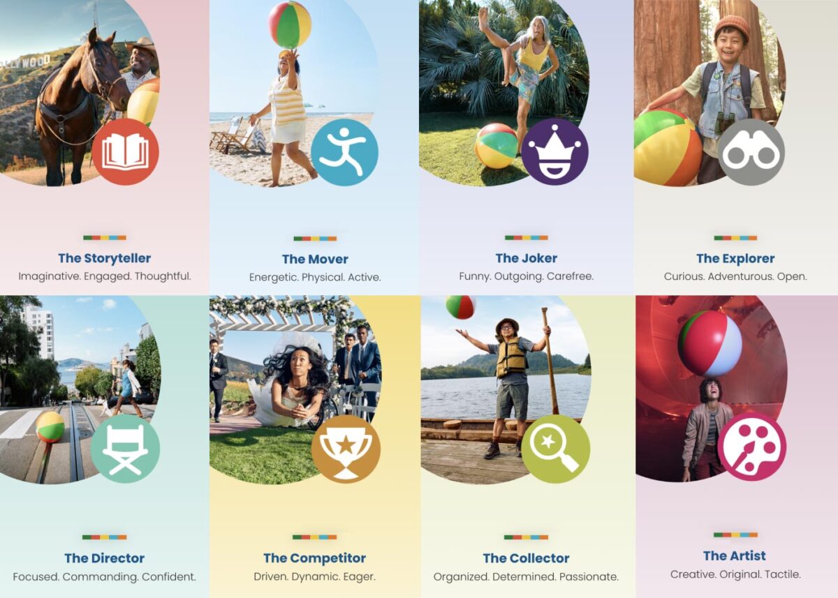
Our teams settled on a quiz as a way to engage visitors and serve them personalized content. Based on initial research, we decided an image-based quiz would be the fastest and most fun way to answer questions and receive a set of recommendations. Choosing preferences from a set of images is a quick way to make progress tangible. We limited the questions to nine, and most visitors took two minutes to complete the quiz.
Play Styles
The eight Play Styles were based on personas researched and created by the National Institute for Play, headquartered in California. Content creators at Visit California crafted a series of TV spots with glimpses into different styles of play. Our Play Quiz would highlight which Play Style matched the participant’s preferences, and our results pages served relevant, curated content, a similar Celebrity personality, and even a secondary play style.
Email collection allowed visitors to send their play style results to themselves and allowed opt-in to more personalized content. Our team worked quickly over three months to solidify the approach, choose the quiz method and weighting criteria of the questions, and design the eight play style pages, two landing pages, a homepage takeover, and supporting pages for the new campaign.
The Results
Play Quiz: Avg. session duration
Play Styles: Avg. session duration
Compared to Site: Avg. session duration
Our approach to the campaign was to support the bottom of the funnel and give visitors coming from digital ads something useful. Given the wealth of content the Visit California website contains, these broad Play Style personas made visitors see themselves in California. It brought curated content to them and provided what we thought of as a personal homepage with relevant recommendations.
“Let’s Play” was the first part of a years-long brand campaign. We are already working on the campaign for 2025 which we hope will be even more engaging than the first!
THE CHALLENGE
The Challenge
Keene State College (KSC), a liberal arts institution within the University System of New Hampshire, needed a modern, user-friendly website that aligned with its mission while effectively serving multiple audiences.
Over time, the existing site had grown into an overwhelming digital ecosystem, filled with complex navigation, disjointed content, and inconsistent branding. To better serve students and stakeholders, KSC needed to:
- Prioritize prospective students while maintaining relevance for parents, faculty, and alumni.
- Simplify content structure to help users quickly find what they need.
- Modernize the design and user experience while staying true to the college’s brand.
- Improve accessibility and performance to ensure a seamless experience across all devices.
KSC partnered with Oomph to create a scalable, audience-first digital experience that supports recruitment, engagement, and long-term adaptability.
OUR APPROACH
We focused on eliminating friction and enhancing engagement through a user-first strategy, modern information architecture, and a flexible, scalable design system.
Understanding the Audience & Challenges
Our discovery process included stakeholder workshops, user journey mapping, and content analysis to identify key roadblocks. We uncovered:
- Difficult navigation made it hard for prospective students to find admissions and academic program details.
- Multiple audiences competing for visibility resulted in a cluttered, confusing user experience.
- Inconsistent branding and outdated UI weakened the college’s online presence and first impressions.
By clearly defining what success looked like and identifying areas of improvement, we laid the foundation for a streamlined, student-centric digital experience.
Defining the Strategy & Roadmap
With a deep understanding of user needs, we developed a strategy focused on engagement, clarity, and accessibility.
- Navigation designed for prospective students while keeping secondary audiences accessible.
- A scalable mega menu that simplified content discovery without overwhelming users.
- A brand refresh of the digital identity that modernized KSC’s online presence while maintaining its authenticity.
- WCAG 2.1 Level AA accessibility compliance to ensure an inclusive experience for all users.
This strategy ensured that KSC’s website would be functional, engaging, and built to support student recruitment.
Executing the Vision
To bring the strategy to life, we developed a modern design system with a flexible, component-driven architecture that simplifies content management and improves the user experience.
- Audience-first navigation & mega menu – Prospective students can quickly find key admissions and academic information, while faculty, parents, and alumni have dedicated sections tailored to their needs.
- Scalable component library – A structured yet flexible design system enables KSC teams to easily update and manage content while maintaining a cohesive visual identity.
- Optimized for mobile & accessibility – A fully responsive, WCAG-compliant design ensures a seamless experience across all devices.
By creating a well-structured, intuitive content ecosystem, KSC now has a digital experience that is easy to manage and designed for long-term adaptability.
This team brings creativity and structure to projects. Decisions are based on data and reports, but they include a connection to heart and real world users. They bring in subject matter experts at the appropriate time but never lose site of the big picture.”
DIRECTOR OF MARKETING, Keene State College
THE RESULTS
A Student-Centric Digital Experience
The new Keene State College website now provides:
- A clear, structured experience for prospective students – Admissions, academics, and student life content is now easier to find and explore.
- A modernized digital identity – A refreshed brand and UI create a welcoming, engaging first impression.
- Seamless navigation for multiple audiences – While prospective students remain the priority, faculty, alumni, and parents still have dedicated access points.
- An accessible, scalable, and future-proof platform – Designed to support long-term growth, engagement, and institutional goals.
A Digital Experience That Grows With Its Community
Keene State’s new site is more than just a redesign—it’s a long-term investment in student engagement, accessibility, and institutional identity. By focusing on audience needs, structured content, and a scalable design system, KSC now has a future-ready digital presence that enhances recruitment, supports students, and strengthens the college community.
Is Your Higher Ed Website Ready for the Next Generation of Students?
If your institution is struggling with outdated content, complex navigation, or disconnected user experiences, a strategic digital approach can create clarity and engagement.
Let’s talk about how Oomph can help your institution stand out in an increasingly competitive higher ed landscape.
A world without third-party cookies is fast approaching. Big-name browsers like Safari and Firefox already block them by default, and Google Chrome — the biggest browser of them all — is set to follow.
First, a quick refresher: Websites use cookies to store data in your browser specific to that website and other sites. The question, though, is who the website is storing the data for. Third-party cookies store data that allows advertising services to track your behavior on any given site, while first-party cookies are those a website uses for its own purposes.
Like most things, not all cookies are created equal. As browsers transition to these new defaults, some will make the grade, while others will be blocked for good. What does this mean for your website, and how can you get ahead of the change? We’ll walk you through it.
Are Cookies Really Going Away?
That depends on the type of cookies your site uses. Browsers are slowly blocking third-party cookies by default — those associated with cross-site tracking for ad networks like Facebook or LinkedIn — but first-site, or same-site, cookies will remain.
That means that if retargeting is essential to your paid marketing strategy, you may need to rethink your approach. But any cookies you use to support your site features and functionality can keep on keeping on, assuming your users have agreed to the use of those cookies on your site. For example, you may be able to keep track of previously viewed content and use that information to suggest other relevant content to that user. So don’t say goodbye to your cookie consent services either; you still have to give users the chance to opt out of any first-party cookies.
Why Now? Haven’t We Been Using Cookies Forever?
While cookies have been a web-surfing staple for almost as long as we’ve been using the internet, that’s not necessarily a good thing.
Legislation like GDPR in Europe, the California Consumer Privacy Act, and the New York Privacy Act are tightening restrictions on the use of consumer data, and rapidly increasing cybersecurity threats in recent years have illuminated the risks of large-scale data storage. Consumers have also begun to prize their privacy, realizing that their information is valuable and no organization should be looking over their shoulder as they browse.
Ultimately, phasing out third-party cookies is about doing what’s best for your users. Making the move now can help instill trust in your website, since users know you aren’t capturing their data behind the scenes. Cookie consent forms also put the data you do use out in the open, showing users that your organization takes their privacy seriously and is prepared to protect it.
How Will The End of Third-Party Cookies Impact My Industry?
Not all organizations will feel the shift equally. We’ve seen some verticals get ahead of the curve, while others are naturally less reliant on third-party cookies. Here are some key industry-specific areas to consider.
Healthcare
Strict privacy laws and regulations like the Health Insurance Portability and Accountability Act (HIPAA) have turned healthcare organizations into pioneers in this area. The Office of Civil Rights even published a bulletin warning organizations about third-party cookies.
Many of the healthcare brands we support at Oomph are already focused on safeguarding user privacy because they’re used to doing it with medical records. One of our clients, for example, is already exploring adopting an in-house analytics tool hosted on their own server. If your healthcare organization is relying on third-party cookies for any marketing efforts, analytic insights, or other website features, start thinking now about the best way to phase them out.
Higher Education
Many institutions we work with are using third-party cookies because of digital efforts to drive student enrollment. When implementing personalization cookies, be sure they are implemented with the proper “SameSite” attribute value. Then be sure to engage your vendors; we’ve encouraged many of our higher education clients to explore how their vendors are preparing for this transition.
Nonprofits
Like higher education, nonprofits should review the vendors and larger ad networks they rely on to build their volunteer base or drive donations. Many nonprofits don’t use these services, but those that do should get ahead of the change, otherwise you may stand to lose an important fundraising channel.
4 Steps To Prepare for the End of Third-Party Cookies
Cookies, analytics, and cross-site tracking might all sound like areas best left to the pros. But there’s a lot you can do to prepare your organization for the move away from cookies, as well as critical opportunities to pull in a vendor to maintain the functionality you need.
Audit Your Site
A website audit should always be your first step. Taking stock of the cookies you use is the best way to get a handle on the changes you’ll need to make. Tapping your web partner is a great idea here, too. Your vendor should be able to identify existing third-party cookie warnings, which can help shape your audit.
For example, while we were updating a client’s email marketing integration recently, Chrome notified our developer that our client’s vendor was sending third-party cookies. We then reached out to the vendor to continue the conversation, knowing that those cookies had to be addressed.
Identify Affected Cookies
The goal of your audit is to identify all third-party cookies that won’t make the cut. Don’t stop by just listing the cookie, either. Review what function it serves and the role it plays in your organization’s digital footprint. You may have to get rid of the cookie, but that doesn’t mean you have to ditch the strategy it’s tied to.
Reach Out to Your Vendors
Ask vendors about their plans to handle the transition away from third-party cookies, and feel out whether they’ll still be able to offer the service they currently provide. Consider it a red flag if the vendor is uninformed or unprepared; you might have to seek out alternatives if there’s even the slightest chance your current vendor will be defunct by the end of the year.
Design Alternatives
The end of third-party cookies is daunting, but it’s also exciting. Take this opportunity to innovate on your users’ behalf. How can you design engaging new experiences that still exceed their expectations? That’s more than possible, so long as you have the right tools in place.
This could be a self-hosted analytics tool you build yourself or new local storage solutions to replace the role of cookies. You might also consider a fully authenticated experience for the users of your site. Lean on a trusted partner here, too. Vendors with website expertise can guide you toward the right solution for you and your users.
Cookies on the Brain?
For many organizations, this is the most they’ve thought about cookies in years. Third-party cookies have become so essential to building a business online, and yet they’ve largely flown under our radar. But while this change may feel overwhelming, making the switch doesn’t have to be.
Here at Oomph, we see this as a golden opportunity for organizations to put their users first, and we’re already taking steps to help our clients do just that.
Need a hand bringing your website into a world beyond third-party cookies? Let’s talk about it.
The Brief
Cultivating A Meaningful Website
Much like nurturing planted seeds, a digital platform needs careful attention to ensure success. While the website originally fit the needs of its audience, as FFRI’s programs continued to grow over time, so has the need to reframe the digital presence. As new content is continuously added to an inflexible structure, valuable information competes for customers’ attention, leaving messages to fall through the cracks.
While the client team was aware of some pain points, they had no clear direction to begin to make improvements — where to start? What changes would have the most impact? What can they do themselves vs. what do they need help with? Farm Fresh RI needed a quick set of valuable deliverables that could provide a foundation of understanding and roadmap for improvements.
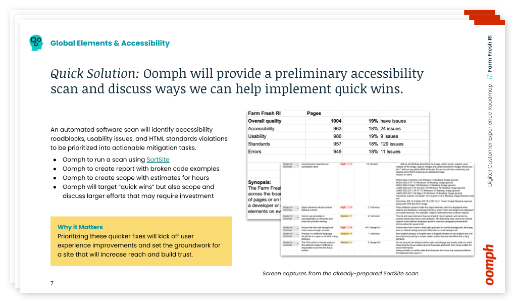
The Customer Experience Audit
Our design team is passionate about helping organizations thrive. We also understand that some organizations do not have the resources to support a full-scale website redesign. Oomph has explored ways to offer value to those in FFRI’s position — an affordable, efficient set of exercises that can create a “Guiding Star” to help clients steer internal initiatives towards iterative improvements.
We created our Customer Experience Audit to provide a streamlined yet comprehensive look at an organization’s digital presence. It combines impactful exercises that uncover user experience (UX) gaps, accessibility issues, and opportunities to improve content and navigation. The goal is to empower organizations with the knowledge and direction they need to implement changes, whether independently or with our support — changes that address their audience’s needs directly, and therefore, the organization’s impact.
The Approach
Tilling the Existing Farm Fresh RI Website
We focused our audit on FFRI’s public-facing site, the primary audience’s first touch point. Our aim was to highlight any barriers preventing these consumers from efficiently accessing information or completing key tasks. Though there is a mobile App in the ecosystem, we focused on the introduction of the brand and its value, thinking that if the site]s initial impression were stronger, more customers would utilize other digital tools.
Through the audit, we uncovered several key areas for improvement that could significantly enhance the user experience:
Accessibility Gaps
Through an automated and manual scan, we found and organized a number of accessibility and usability issues across the site.
- Clickable hero images that lacked clear visual cues
- Insufficient color contrast in key areas
- Inconsistent translation options for non-English-speaking users
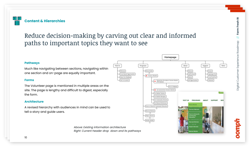
Organizing Content
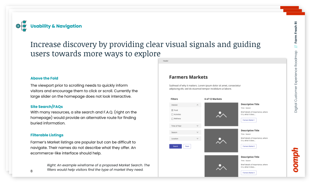
Large hero images push important content below the fold, making it difficult for users to access crucial information quickly. By placing content above the fold, the site can quickly show users they have landed in the right place. We suggested revising the layout to shorten the height of page hero imagery, which helps users reach key resources with minimal scrolling.
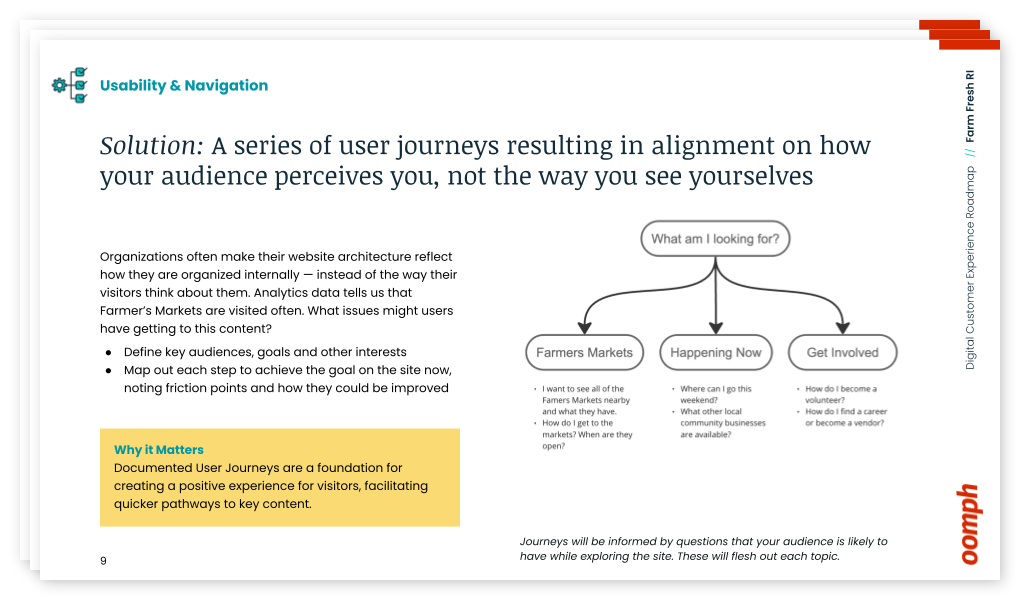
Finding the Content
The journey to find critical information, such as farmers’ market details, is complicated and fragmented across multiple pages. By consolidating this information, we recommended streamlining the user journey while also freeing up space to highlight other essential offerings.
The Results
Supporting a Better Harvest
This audit and roadmap project wasn’t just about identifying existing problems — it was about providing actionable next steps. It was not meant to lock Farm Fresh into working with us to complete those steps, either — even though we would be happy to — but rather to facilitate and supply them with the tools to push forward internally.
With our comprehensive roadmap in hand, Farm Fresh RI is already implementing our suggestions. The primary contact for the project noted that our audit validated many of their internal concerns and provided a clear path for solving issues they had struggled with for years. The deliverables included:
- A SortSite accessibility audit with outlined improvements
- Initial user journeys & information architecture “North Star” ideal to discuss internally
- Quick wireframes for the Homepage and Farmers Market Listing page to show how a new page flow can support customers
- Plan and direction for next steps and what they can do now
- Conversation about how we can help in the future
Our improvement roadmap equips Farm Fresh RI to serve their community more effectively and deliver on their mission. If your organization needs data and expert advice that sets a path forward to an improved customer experience, reach out and contact us. For a small investment, your organization can gain clarity and direction with actionable short- and long-term activities.
The Digital Customer Experience Roadmap
Would your organization benefit from a Digital Customer Experience Roadmap?
- Do you hear of customer complaints through email or phone outreach?
- Do you feel your navigation is bloated with too much content and not enough organization?
- Do pages look too similar, making customer miss important content or get lost within pages that all look the same?
- Have portions of your organization “gone rogue” to create sub-sites and offshoots they can more easily control?
If your digital platforms —website, e-commerce site, mobile App — suffer from any of these common problems, our exercise will define next steps to address these potential issues. Download our information sheet (pdf) and then get in touch with us to discuss your needs.
Humans encounter thousands of words every day. As a website owner, that means your site content is vying for your user’s attention alongside emails from their colleagues, the novel on their nightstand, and even the permission slip scrunched at the bottom of their kid’s backpack.
How do you cut through the clutter to create site content that people actually want to read?
While you may already be choosing topics that are the most interesting and relevant for your audience, the structure of your writing may not be optimized for how people read. By understanding your audience’s reading behaviors following best practices for readability and accessibility, you can make sure your content works with people’s natural tendencies – not against them – to create a more engaging digital experience. An added bonus: Google shares many of those same tendencies, so content that’s designed well for humans is also more likely to perform well for organic SEO.
As a digital platform partner to many clients with content-rich sites, Oomph often works with brands to redesign their content for digital success. Here’s a look at the basic principles we apply to any site design – and how you can use them to your advantage.
How People Read Online
When we dive into a book, we typically settle in for a long haul, ready to soak up each chapter one by one. But when we open up a website, it’s more like scanning a newspaper or the entire bookshelf – we’re looking for something specific to catch our eye. We quickly scan, looking for anything that jumps out at us. If we see something interesting, then we’ll slow down and start reading in more detail.
Think of it like an animal following an information “scent,” identifying a mixture of clues that are likely to lead to the content you’re looking for. Most people will decide which pages to visit based on how likely the page will have the answer they’re looking for and how long it’s going to take to get the answer.
Users need to be hooked within a few moments of looking at a website or they’ll move on. They need to be able to identify and understand key factors like:
- The point of the information and why they should keep reading
- Whether they can trust the information and the source
- The type of content provided and any action expected from them, like signing up for an event
- How visually engaging and readable the content is
The takeaway for brands? Writing with your readers’ needs in mind is a way to show them you care and want to help them solve their problem. It’s also the key to achieving your site goals.
Your site content does more than just convey information – it’s about building trust, establishing rapport, and creating a connection that goes beyond the page. Whether you’re trying to sell a product or promote a cause, crafting content around your audience’s needs, desires, and preferences is the most effective way to compel them to take action. Here are four ways to set your website content up for success.
1. Put your data to work.
If you’re looking to refresh your current site, data can help you make informed choices about everything from your content strategy to your layout and design. Use digital reporting tools to answer questions like:
- Is our target audience visiting our site – and are other audiences visiting that we don’t know about yet?
- Which content do visitors download or engage with most frequently?
- What does a typical site visit look like? Are there places where users are getting stuck or bouncing off?
Google Analytics is a go-to tool for understanding the basics of who is visiting your site and how they’re engaging with your content. You can track metrics like session duration, traffic sources, and top-performing pages, all of which can help you better understand what your audience is looking for and what you want to tell them.
Additional tools like Screaming Frog and Hotjar can give you even deeper insights, helping you track content structure and real-time user interactions.
2. Create a simple and consistent content structure.
When it comes to site content, consistency is like the foundation of a house (minus the power tools and hard hats).
A well-structured site not only helps users navigate and understand your content more easily, but also enhances the visual appeal and flow of the site. Think of it like a dance floor – you want your users to be able to move smoothly from one section to the next, without any awkward missteps.
That means focusing on shorter sentences, bullet points, and clear subheadings, all backed up by engaging visuals that serve as resting points for the eye. And while you’re at it, don’t forget to declutter your content — users don’t want to wade through a sea of unnecessary words just to find the nuggets of gold.
Ask yourself: Does this content flow smoothly, is it easy to scan, and does it make my key messages stand out? If the answer is yes, then you’re on your way to successful content.
3. Make sure visuals and content play nicely together.
When it comes to enhancing your content with visuals, the key is to strike a balance between style and substance. Your design should complement your content, not compete or distract from it.
Beyond their aesthetic appeal, well-designed visuals are important for creating a sense of credibility with users. Think back to the concept of information scent: If your design looks sloppy or inconsistent, users are less likely to trust the information you’re presenting. So make sure you’re using design elements wisely, creating ample white space, and avoiding anything that makes your content feel like a sales pitch.
4. Focus on accessibility.
When it comes to site content, accessibility can’t be ignored. Content should be engaging and informative and also conform to the , Website Content Accessibility Guidelines (WCAG). Tools like SortSite can help identify these issues and guide you toward accessibility success.
There are a number of things all sites need to consider:
- Using consistent text stylings, including text color, leading, kerning, and tracking.
- Design to support individuals with visual impairments, assistive technology like screen readers, and those that require navigation via the keyboard only
- Following heading orders and grouping content together to make it easier to scan. For example: Following a heading level 2 with a heading level 3 when the ideas are related, but starting with a new heading 2 if changing to a new section of thought.
- Using multiple methods to indicate action items and descriptive text for buttons and alternative text.
- PDFs can be useful, but are also big accessibility red flags, so it’s best to avoid using them when possible. If a PDF is a must, make sure it follows accessibility best practices.
Designing Engaging Content Doesn’t Need To Be a Full-Time Job
If you already have a library of content, auditing the content that already exists can be daunting. And sometimes, you need a little help from your friends. That’s where third-party experts (like us!) come in.
During our website discovery process, we use strategies like content and analytics audits, UX heuristics, and user journey mapping to help position client sites for success. We’ll help you identify areas for improvement, highlight opportunities for growth, and guide you toward achieving content greatness.
Ready for a fresh perspective on your content? We’d love to talk about it.
You’ve just rolled out an important new feature on your platform, and it’s time to answer the all-important question: is it getting the results you want? If you’ve set up an analytics tool, you can look at performance indicators like registrations, logins, downloads, or shares. But that kind of quantitative data will only get you so far.
Let’s say that new feature isn’t having the impact you’d hoped for — maybe registrations are lacking or engagement is low. You have a problem you need to solve, but you don’t have any information about why it’s happening. And you may have an entirely different underlying problem you need to address.
Where can you find actionable information? Enter qualitative research.
By answering the why behind what’s happening, qualitative data provides context for problems that surface through quantitative analysis. It helps you uncover the root of the problem you have and can also reveal problems you didn’t even know existed.
In this article, we’ll cover how to use both types of research to inform your platform design.
First, the Numbers: Quantitative Research
When you’re evaluating the performance of a digital platform, a good place to start is the cold, hard numbers. Quantitative research provides numerical data that can indicate, at a glance, whether your platform is meeting your business objectives. It can also show the scale of any problems and help prioritize which ones to address.
One major benefit of quantitative data is benchmarking. Tracking your data over time reveals whether UI changes are producing the results you want — and can help you measure the ROI of your efforts. You can also compare your data to an industry benchmark or a competitor’s stats as a barometer for your own performance.
Here are some examples of quantitative research methods:
Web analytics
This data describes what people are doing with your platform: where they go, what they click on, what features they use. It’s good for finding problems and monitoring the performance of content or features.
A/B testing
Here, you’re using experiments to compare different UI designs. By creating two live versions of the same element, like a call-to-action button, you can see which one performs best. Learn more in our article on A/B testing.
Surveys and questionnaires
Surveys let you gather information about your users’ preferences, attitudes, and behaviors, and they can produce a combination of quantitative and qualitative data. For easy-to-capture numerical data, use techniques like ratings and multiple-choice questions.
Usability testing
By measuring user experience with hard data, you can test how easy (or not) a platform feature is to use. Let’s say you just released a reminder function, and you want to know if users can create a reminder in two minutes or less. You can run a test where you ask participants to set a reminder, and measure what percentage are able to complete the task within two minutes.
Now that you’ve got a sense of what users are doing on your platform, let’s look at ways to learn why and how they’re doing it.
Now for the Words: Qualitative Research
Qualitative research can help you investigate why something is happening, identify ways to fix problems, and even determine whether you should phase out a feature or redesign it. Using detailed, contextual descriptions of users’ experiences, you can dive deeper into exactly which elements are working well and which are problematic.
Quantitative and qualitative research both provide useful data, but they’re more powerful when used together.
Unlike with quantitative research, you don’t need a ton of data points to get usable info. For example, if you see five customers in a row walk into the corner of a display in a retail store’s entrance, you can safely assume that most visitors will do the same thing.
You may be avoiding qualitative data because it seems expensive. And some techniques, like focus groups, require a greater investment than others. But, because you don’t need an enormous amount of data, qualitative research can be very cost-effective. It might even save you money by helping you identify and fix problems faster.
Here are some examples of qualitative research methods:
User Interviews
There are a number of different ways to handle user interviews, depending on the type and specificity of info you’re looking for. Here are a few:
- Talk to a subset of your platform users and ask what they like, don’t like, and why. What could be improved?
- Listen to users narrate their experience as they move through your platform, to learn how they feel about particular elements or tasks.
- Give test subjects a post-task survey, to capture their experiences while they’re fresh.
Focus Groups
These are similar to user interviews, but they’re done in a group setting. The advantage of a group is that it can often generate more feedback, as people tend to open up when they hear the experiences of others. Just be sure you have a moderator who gives everyone a chance to speak.
Field Studies
What people say they do… is often not what they actually do. Watching platform users in their natural environment can reveal gaps in your understanding of the user experience. You can use direct observation, interviews, contextual inquiry, and usability tests to learn how people do things and why they do them in particular ways.
Diary Study
This method asks users to document their experiences over time, making it useful for understanding longer-term behaviors. You can learn things like what motivates people to use certain features, what they’re trying to accomplish, how they feel, and what their overall journey looks like.
User Surveys
As opposed to quantitative surveys, qualitative surveys use open-ended questions to learn what users think and feel in their own words. One common pitfall: avoid leading questions. Instead of asking, say, “How easy was it to find the info you needed?”, ask “Describe your experience looking for that information.”
Like Peanut Butter & Jelly
Quantitative and qualitative research both provide useful data, but they’re more powerful when used together. Remember that quantitative data can tell you when there’s a problem with your platform design, but you’ll need qualitative data to know how to fix it.
Chances are, you’ll use them at different times. Qualitative research can be done during the initial design phase, once you have a working product, or during a redesign. It’s especially valuable at the beginning of a design process because it can help you focus on what your users need and why. Quantitative research is generally done only when you have a working product (either at the beginning or end of a design cycle), so you can measure the results of a design or change.
Want to learn more about how data-driven design can improve your platform performance? We’d love to help. Contact us today to schedule a call.