
From code to launch
Sites launched within a year
Performance improvement
THE BRIEF
A Fractured System
With a network of websites mired in old, outdated platforms, Rhode Island was already struggling to serve the communication needs of government agencies and their constituents. And then the pandemic hit.
COVID accelerated the demand for better, faster communication and greater efficiency amid the rapidly changing pandemic. It also spotlighted an opportunity to create a new centralized information hub. What the government needed was a single, cohesive design system that would allow departments to quickly publish and manage their own content, leverage a common and accessible design language, and use a central notification system to push shared content across multiple sites.
With timely, coordinated news and notifications plus a visually unified set of websites, a new design system could turn the state’s fragmented digital network into a trusted resource, especially in a time of crisis.
THE APPROACH
Custom Tools Leveraging Site Factory
A key goal was being able to quickly provision sites to new or existing agencies. Using Drupal 9 (and updated to Drupal 10) and Acquia’s Site Factory, we gave the state the ability to stand up a new site in just minutes. Batch commands create the site and add it to necessary syndication services; authors can then log in and start creating their own content.
We also created a set of custom tools for the state agencies, to facilitate content migration and distribution. An asynchronous hub-and-spoke syndication system allows sites to share content in a hierarchical manner (from parent to child sites), while a migration helper scrapes existing sites to ensure content is properly migrated from a database source.
Introducing Quahog: A RI.gov Design System
For organizations needing agility and efficiency, composable technology makes it easier to quickly adapt digital platforms as needs and conditions change. We focused on building a comprehensive, component-based visual design system using a strategy of common typography, predefined color themes and built-in user preferences to reinforce accessibility and inclusivity.
The Purpose of the Design System
The new, bespoke design system had to support four key factors: accessibility, user preferences, variation within a family of themes, and speedy performance.
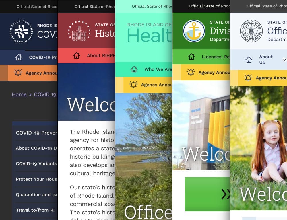
Multiple color themes
Site authors choose from five color themes, each supporting light and dark mode viewing. Every theme was rigorously tested to conform with WCAG AA (and sometimes AAA), with each theme based on a palette of 27 colors (including grays) and 12 transparent colors.
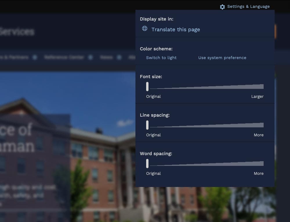
User preferences
Site visitors can toggle between light or dark mode or use their own system preference, along with adjusting font sizes, line height, word spacing, and default language.
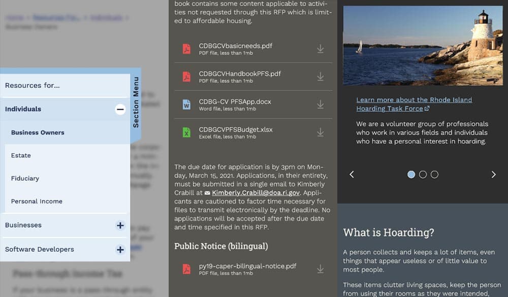
Mobile first
Knowing that many site visitors will be on mobile devices, each design component treats the mobile experience as a first-class counterpart to desktop.
Examples: The section menu sticks to the left side of the view port for easy access within sections; Downloads are clearly labelled with file type and human-readable file sizes in case someone has an unreliable network connection; galleries appear on mobile with any text labels stacked underneath and support swipe gestures, while the desktop version layers text over images and supports keyboard navigation.
High Accessibility
Every design pattern is accessible for screen readers and mobile devices. Color contrast, keyboard navigation, semantic labeling, and alt text enforcement all contribute to a highly accessible site. Extra labels and help text have been added to add context to actions, while also following best practices for use of ARIA attributes.
Performance aware
Each page is given a performance budget, so design components are built as lightly as possible, using the least amount of code and relying on the smallest visual asset file sizes possible.
THE RESULTS
Efficient and Effective Paths to Communication
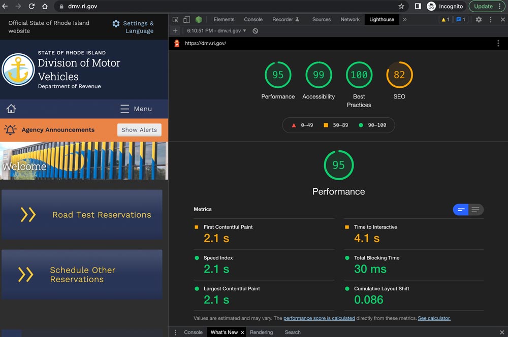
The first sites to launch on the new system, including covid.ri.gov, went live four and a half months after the first line of code was written. A total of 15 new sites were launched within just 8 months, all showing a 3-4x improvement in speed and performance compared with previous versions.
Every site now meets accessibility guidelines when authors adhere to training and best practices, with Lighthouse accessibility and best practice scores consistently above 95%. This means the content is available to a larger, more diverse audience. In addition, a WAF/CDN provider increases content delivery speeds and prevents downtime or slowdowns due to attacks or event-driven traffic spikes.
State agencies have been universally pleased with the new system, especially because it provides authors with an improved framework for content creation. By working with a finite set of tested design patterns, authors can visualize, preview, and deploy timely and consistent content more efficiently and effectively.
We were always impressed with the Oomph team’s breadth of technical knowledge and welcomed their UX expertise, however, what stood out the most to me was the great synergy that our team developed. All team members were committed to a common goal to create an exceptional, citizen-centered resource that would go above and beyond the technical and design expectations of both agencies and residents .
ROBERT MARTIN ETSS Web Services Manager, State of Rhode Island
The Drupal Association brought a new challenge to the Drupal community this past summer. At the beginning of May 2024, Dries Buytaert, the founder and leading visionary for the Drupal platform, announced an ambitious plan codenamed Starshot. The community rapidly came together around the concept and started planning how to make this vision of the future a reality, including Oomph.
What is Starshot/Drupal CMS?
Codename Starshot is now known as Drupal CMS. Drupal is a free, open-source content management system (CMS) where authors and developers build and maintain websites. Drupal has been around since 2001, and in the past, it was focused on being a developer-friendly platform that supports complex integrations and custom features.
Drupal CMS is a reimagining of Drupal for a wider market. Currently, Drupal successfully supports the complexities that governments, high-volume editorial sites, and membership organizations require. But, the barrier to entry for those that wanted to start with a small, simple site was too high.
Drupal CMS is the community’s solution to drastically lower the barrier to entry by providing a new onboarding and page-building experience, recipes for common features, advanced SEO features, and “AI Agents” that assist authors with content migration and site-building acceleration. Dries challenged the community to start building towards a working prototype in less than 4 months, in time to demonstrate significant progress for the audience at DrupalCon Barcelona in mid-September.
The Contact Form Track
The Contact Form is an official recommended recipe. As the name suggests, its purpose is to provide a Recipe that installs the necessary modules and default content to support a useful, but simple, Contact Form.
The primary user persona for Drupal CMS is a non-technical Marketer or Digital Strategist. Someone who wants to set up a simple website to promote themselves, a product, and/or a service. A Contact Form should start simple, but be ready for customization such as integrations with popular email newsletter services for exporting contacts and opting into receiving email.
Research and Competitive Analysis
Drupal CMS aims to compete with juggernauts like WordPress and relative newcomers like SquareSpace, Wix, and Webflow. To create a Contact Form that could compete with these well-known CMSs, our first step was to do some competitive research.
We went in two directions for the competitive analysis (Figma whiteboard). First, we researched what kinds of experiences and default contact forms competitor CMSs provided. Second, we took stock of common Contact Form patterns, including those from well-known SAAS products. We wanted to see the kinds of fields that sales lead generation forms typically leveraged. With both of these initiatives, we learned a few things quickly:
- The common fields for a simple Contact Form are generally consistent from platform to platform
- More complex sales lead forms also had much in common, though every form had something custom that directly related to the product offered
- WordPress does not have a Contact Form solution out of the box! Site owners need to research commonly used plugins to achieve this
Our approach was starting to take shape. We internally documented our decisions and high-value MVP requirements and presented them to the advisory board for feedback. With that, we were off to create the start of our Contact Form recipe.
Recipe and Future Phases
Phil Frilling started the Contact Form recipe, which is currently under peer review. The recipe is barebones for Phase 1 and will install the required modules to support a default Contact Form and email the site owner when messages are received. Once the initial recipe is accepted, a round of testing, documentation, and additional UI in a custom module may be required.
Our plans include additional fields set as optional for the site owner to turn on or off as they need. Some customization will be supported in a non-technical user-friendly way, but all the power of Drupal WebForms will be available to those that want to dig deeper into customizing their lead forms.
In the short term, we are proposing:
- Database storage of contacts that safeguards valuable leads that come in through forms
- Quick integrations with common CRMs and Newsletter providers
- Enhanced point-and-click admin UI through the in-progress Experience Builder
- Advanced fields to handle specialty data, like price ranges, date ranges, and similar
- Conditional defaults: Through the initial set up, when a site owner specifies an Editorial site they get one default Contact Form, while someone who specifies E-commerce gets another default Contact Form
- Feedback mechanism to request new fields
Next stop, the Moon
DrupalCon Barcelona took place last week, September 24 through 27, 2024, and the Drupal CMS prototype was displayed for all to see. Early 2025 is the next target date for a market-ready version of Drupal CMS. The community is continuing to push hard to create a fantastic future for the platform and for authors who are dissatisfied with the current CMS marketplace.
Oomph’s team will continue to work on the Contact Form Track while contributing in other ways with the full range of skills we have. The great part about such a large and momentous initiative as Drupal CMS is that the whole company can be involved, and each can contribute from their experience and expertise.
We’ll continue to share our progress in the weeks to come!
Thanks!
Track Lead J. Hogue with Philip Frilling contributing engineer, Akili Greer and Rachel Hart researchers, and thanks to Rachel Hart again for bringing the Contact Form Track Lead to Oomph for consideration.
The Brief
Oomph has worked with Lifespan since 2010 and created the second version of their intranet on Drupal 7. A critical tool like an intranet needs regular maintenance. Even with regular updates, there comes a time when the whole platform needs a re-architecture to be flexible, secure, and performant.
In 2021, it was time to plan the next phase of the intranet on Drupal 9. Lifespan used the redesign as an opportunity to realign the employee journeys with the evolution of their work. And COVID-19 had provided an opportunity to reevaluate whether a security-first, HIPAA-compliant intranet could be available to those working from home.
Departments
Job & Clinical Tools
Staff Contacts
Critical Top-Tasks
The Oomph team ran a Discovery and research phase to gather requirements and understand employee expectations. We ran workshops with client stakeholders, identified important work tasks and created 5 employee personas, conducted one-on-one interviews with key persona types, and gathered feedback from employees with an online and email survey.
Through this research, we started to see two different types of tasks emerge: those that required speed to a destination and those that required exploration and unstructured browsing.
Tasks requiring speed to completion:
- Access health and safety policies
- Access a staff directory and immediately contact high-value individuals
- Access job tools, which are often 3rd-party digital services, for everything from timesheets to diagnostics to general education
- Access online forms to request items and services
- Access HR and employment benefits
Tasks requiring unstructured browsing:
- Access Department sites, particularly my department for relevant news & events
- Be exposed to company culture through up-to-date news and events, videos, seminars, and important business announcements or press coverage
- Access the internal job board to find advancement opportunities
- If I am a new employee, or a new manager, access onboarding material and quick links for new individuals
- Visit and browse the Bulletin Board
It became clear through our process that Lifespan employees needed to move quickly and slowly, often in the same session, depending on the important tasks they needed to complete. The intranet needed to support both types of journeys to remain a successful platform for getting work done and absorbing company culture.
The Approach
A Focused Priority on Search
Expectations about fast and accurate search are high because of you know who. When designing search for an employee intranet, the baseline requirements are even higher. We knew that we had to get the design and implementation of search right.
We took a learn-once, use-everywhere approach when it came to search interfaces. Search would be a core part of finding many types of content — tools, forms, people, departments, locations, and more. Each had to have a similar structure and set of filtering options to be the most useful.
The list of tools, locations, or people needed smart defaults. Before someone conducts their own search, each screen displays popular searches and the common content people need to access. In some cases, an employee does not even need to search in order to find what they need.
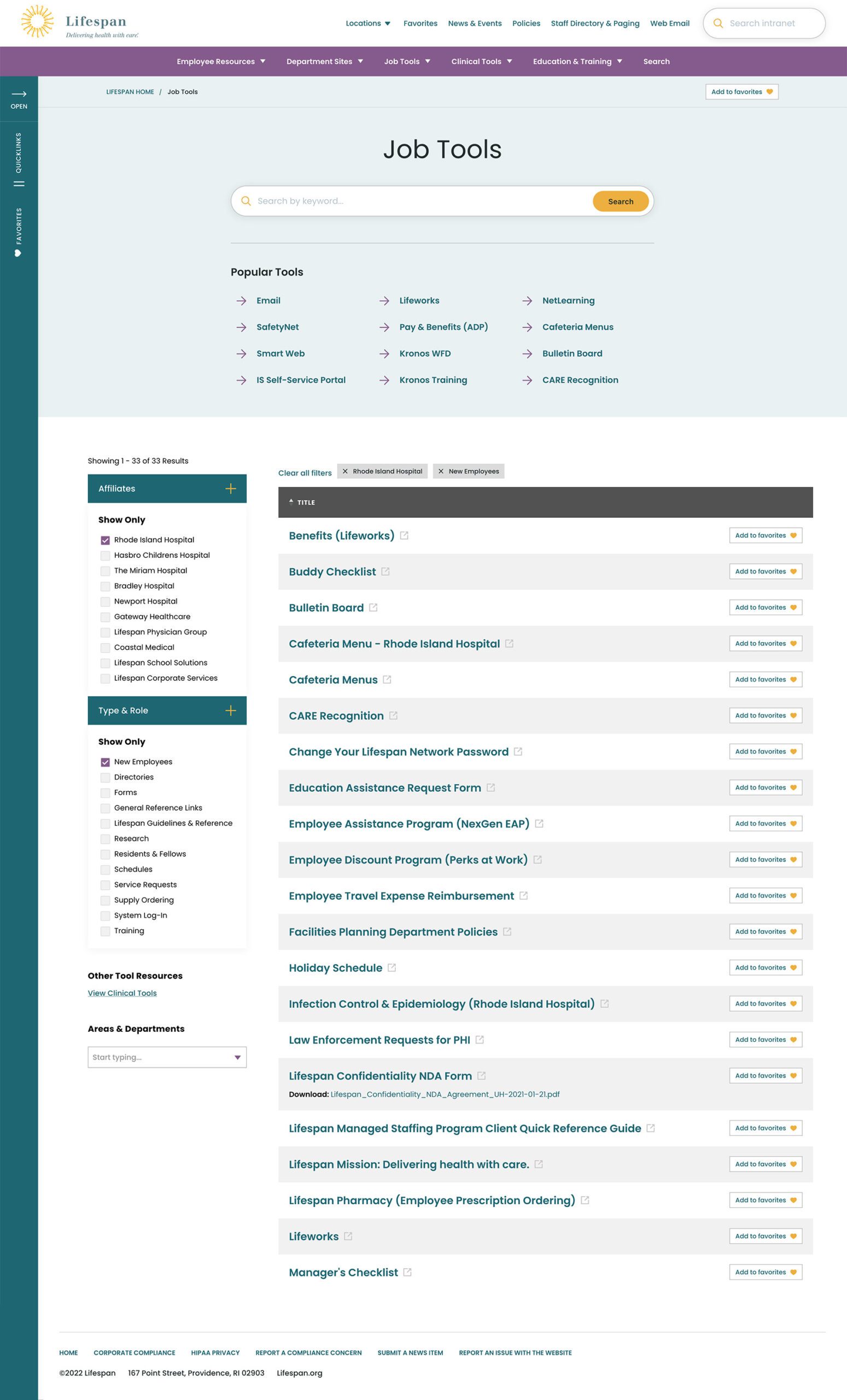


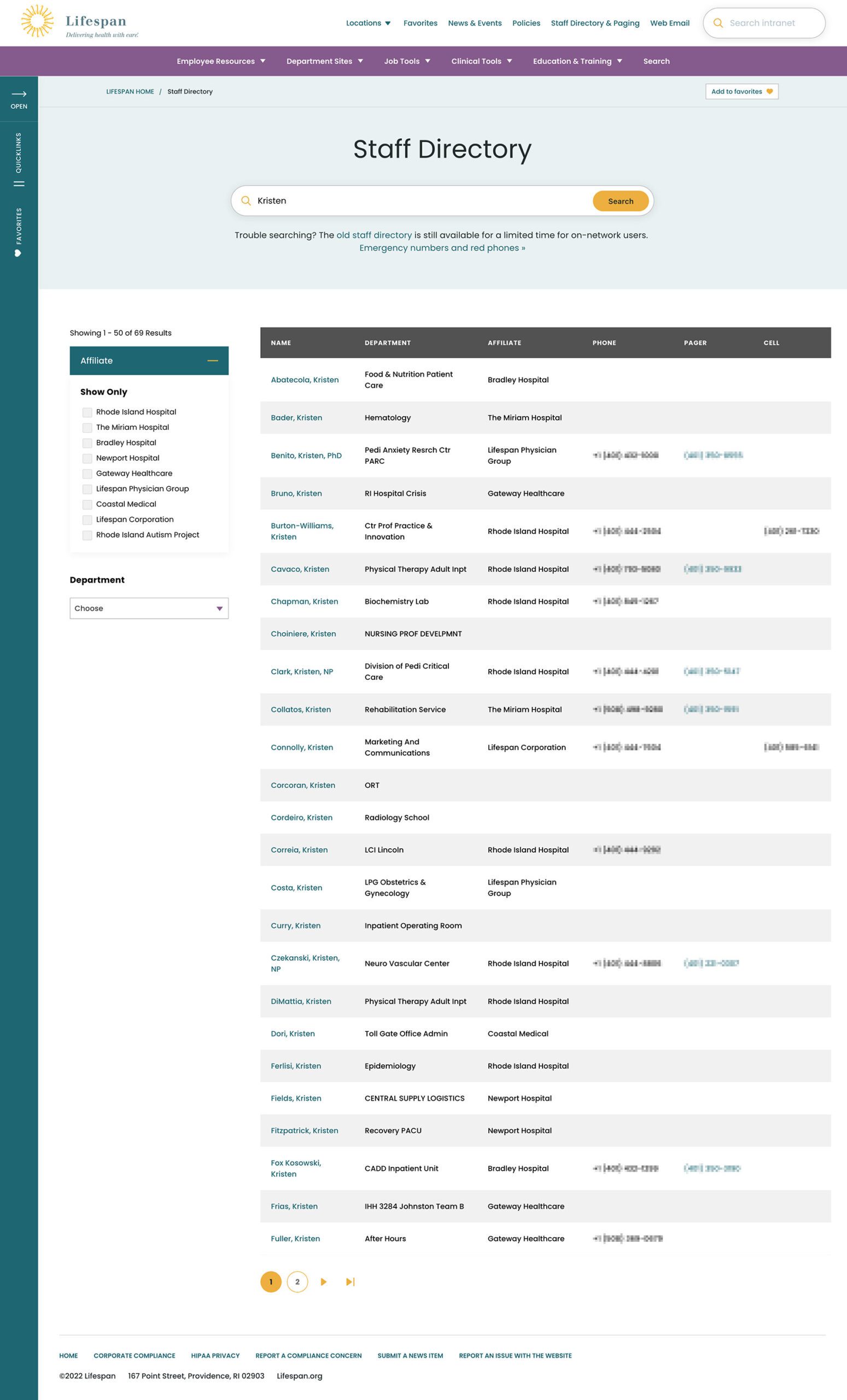
Two search pages, similar interfaces: The Job Tools search and Staff Directory follow similar patterns, adhering to our “learn once, use everywhere” rule
Personalization that follows Employees from Device to Device
Personalization had to be a part of our solution as well. Employees are able to use S.S.O. to access the intranet from their personal devices or workstation computers in the hospitals. Workstations are often shared between multiple clinical staff, therefore, our system needed to support stopping one task on on device and picking it back up on another.
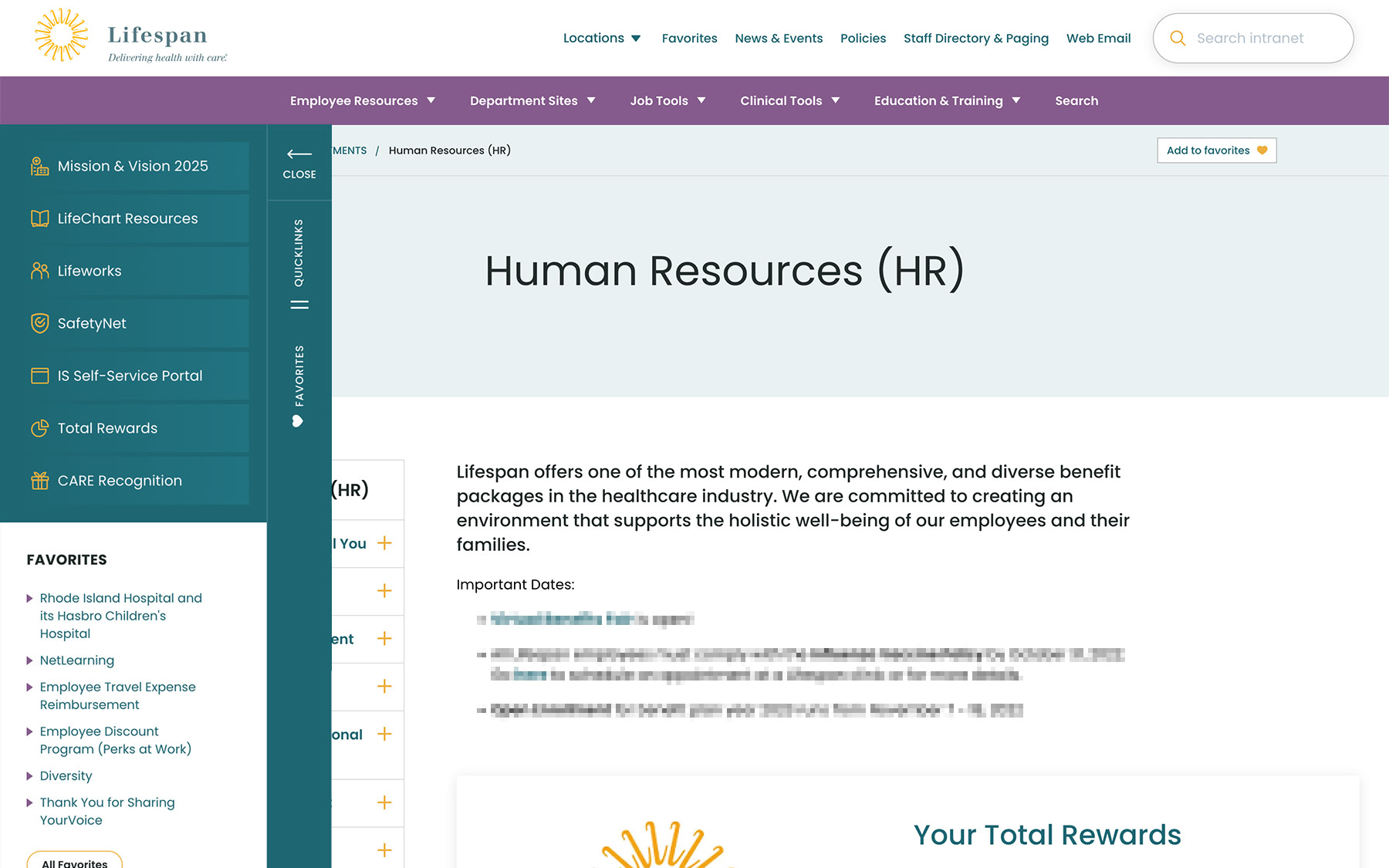
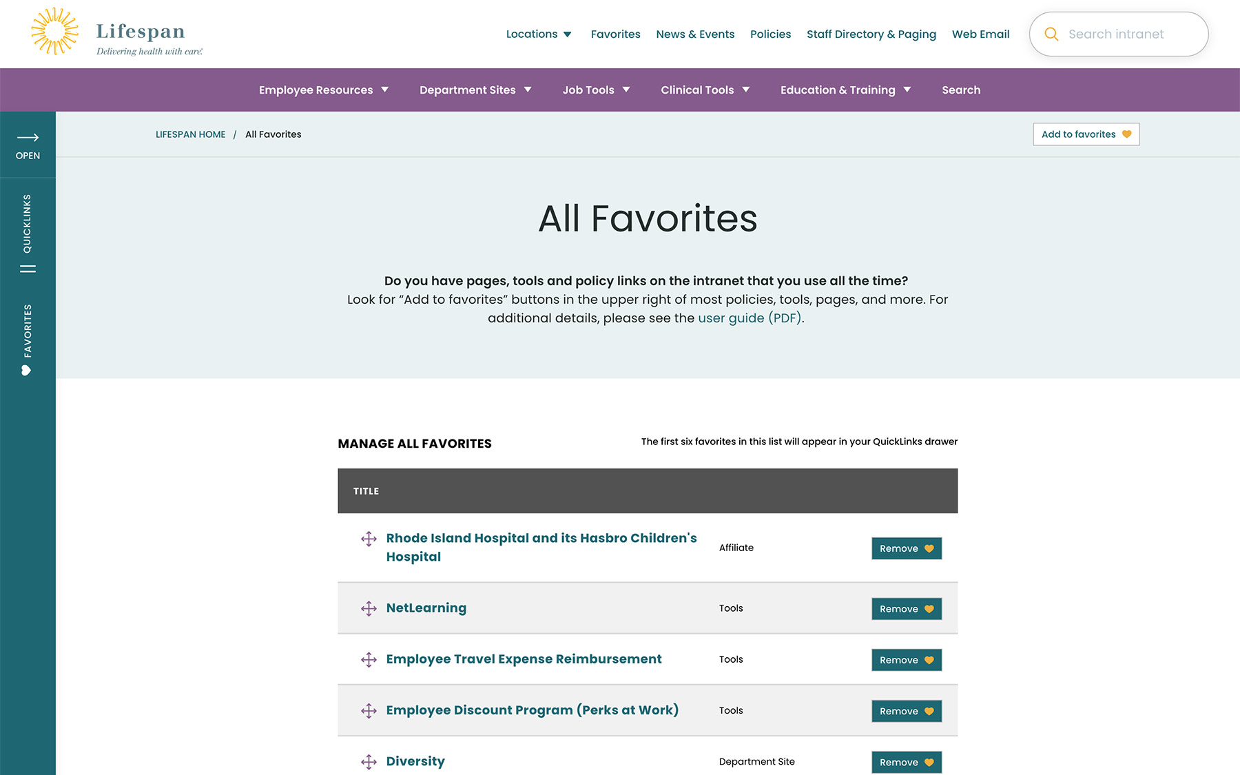
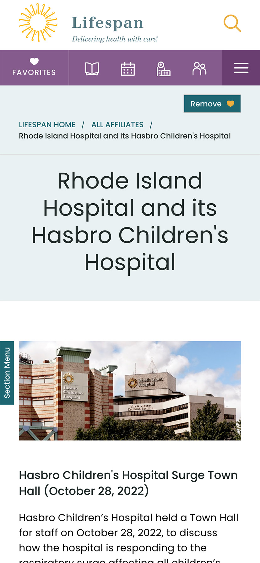
A Favorites feature allows employees to create their own transportable bookmarks. Almost everything on the site can be bookmarked, reducing the need to search for commonly used content and tools. Six custom favorites are available from the left drawer at all times, while the entire list of favorites is one more click away.
Supporting Speed and Engagement
Speed is at the heart of critical tasks and high-quality patient care. A nurse, at a shared workstation, needs to log in quickly, find the tool they need, and administer care. Time is critical. They don’t want extra clicks, a search that doesn’t work intuitively, or slow page load times. Staff don’t want it, and management doesn’t want it, either.
Engagement is slower and the intention is different. Speed is for tasks. Engagement is for exploring. This is how company culture is communicated and absorbed. This is when people catch up with department and company news, find events to attend, view a photo gallery from an event they missed, or browse a bulletin board to swap items with other employees. You can’t have an intranet that is ALL business just like you can’t have an intranet that is NO business.
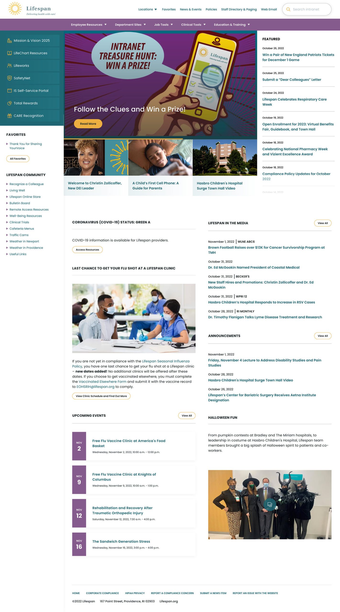
A Dashboard Built for Speed or Browsing
On the starting page, an employee might be in need for something immediate or might have time to explore. We do not know their intention, therefore, this page needs to support both.
The left drawer is open to employees on the dashboard. It is open to show them what it contains and to remove a click when accessing the important common destinations within. The first seven links are common items for any employee, curated by the Lifespan team. They are a mixture of tactical items — like time sheets — and company culture items — like the CARE recognition program.
Below that are the employee Favorites. The first six favorites are shown while all are available with an extra click.
The top navigation supports speed to common destinations, some of which are search interfaces and others which are built for browsing.
The rest of the page showcases engagement and company culture. Featured news stories with images are balanced with quick news and event lists. Flexible content sections allow authors to add and remove content blocks as new items are required.
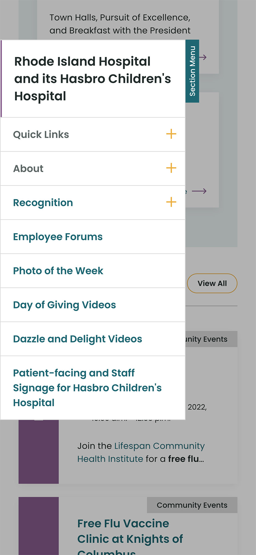
Other content pages that were focused on engagement are the deeper News and Events pages, customized Location pages (for each major hospital location), and a community Bulletin Board.
The Results
Smooth Onboarding and Acceptance
No matter how confident our teams were, we didn’t really know if the redesign was a success until employees moved from the older tools they were familiar with. The Lifespan team did a fantastic job creating walk through videos ahead of the launch. Old tools and directories stayed available for a period of overlap, but our teams saw quick adoption into the new tools in favor of the familiar.
Since the intranet is now available off of the closed Lifespan network, we have seen mobile traffic increase dramatically. The responsive design is an improved experience over the previous intranet and the numbers prove it. In fact, we have found that more employees engage in company culture content on their personal devices, while using the company workstations for their tasks.
Oomph is very proud to have worked with one of the largest private employers in the state, and we are very proud to have our work used by over 17,000 people every day. Oomph continues to support the Lifespan team and the intranet project, iteratively improving the features and evolving the toolset to be effective for all.
We are thrilled to share that Oomph has been recognized as an Acquia Certified Drupal Cloud Practice for completing Acquia’s rigorous evaluation program, which recognizes the highest standards of technical delivery on the platform.
To earn Drupal Cloud Practice Certification, Acquia partners must meet a stringent set of technical criteria. These requirements include a core team of Acquia certified developers, significant hands-on experience delivering Acquia Drupal Cloud products to clients, and a meticulous company review with Acquia partner specialists.
“I am incredibly proud that our team has achieved this Acquia Practice Certification” said Christopher Murray, CEO at Oomph. “We have a long history of delivering impactful client solutions around Drupal and Acquia and we are passionate and excited about extending our work within the Acquia ecosystem.”
The Acquia Practice Certification Program rewards partners who demonstrate a mastery of Acquia’s Cloud Platform in three separate areas: Drupal Cloud, Marketing Cloud and DXP. These certifications are awarded to organizations with a proven record of technical achievement, and a commitment to driving transformative business engagements on the Acquia Platform.
As a Certified Drupal Cloud Practice, Oomph receives the benefits of a deeper working relationship with Acquia, and heightened visibility as a trusted technical partner.
“We’re proud to recognize Oomph as a certified Drupal Cloud Practice,” said Mark Royko, Director of Practice Development at Acquia. “At Acquia, we continually strive to serve more customers while helping our valued partners grow their businesses. With Drupal Cloud certification, we know we can count on partners like Oomph to help us reach those goals.”
This honor is one of several Acquia accolades that Oomph has achieved since becoming an Acquia Partner in 2012. This year Oomph won a 2022 Acquia Engage Award for our work designing and building the platform that powers many of the websites operated by the state of Rhode Island.
“These certifications are awarded to organizations with a proven record of technical achievement, and a commitment to driving transformative business engagements on the Acquia Platform. It helps more customers realize the tremendous value of working with Acquia’s Drupal Cloud.”
— Christopher Murray, CEO
We’re always looking to expand our Acquia knowledge to help our partners make the most of their Drupal websites. Our team leads the way on emerging Drupal practices so we can advise our clients how to build innovative websites that help them forge the best connections with their audiences.
As an Acquia Partner we are excited to help you deliver great Drupal experiences. Start by reaching out. Contact us today to connect with an expert!