
Overview
edX operates one of the world’s largest digital learning catalogs, serving millions of learners through professional certificates, microcredentials, and degree programs from top universities and institutions worldwide. As the platform evolved from its MOOC origins into a revenue-driving marketplace of credentialed programs, digital experience became central to competitive differentiation and learner acquisition.
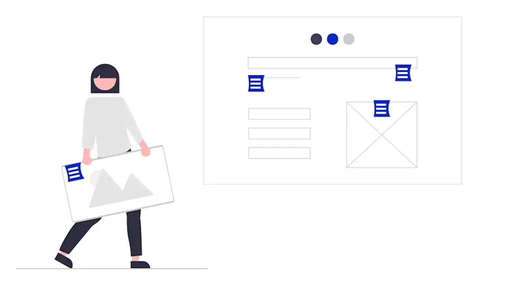
The challenge wasn’t course quality or platform stability—it was operational velocity. Marketing teams couldn’t move fast enough to support growth, and the content architecture that served 1,000 courses was breaking under the weight of 4,000. For edX and parent company 2U, this represented a structural constraint on growth, not a publishing workflow problem.
The Challenge
When Content Architecture Becomes a Growth Limiter
edX faced a common problem for organizations operating at scale: their content and data systems were tightly coupled, creating dependencies that slowed marketing execution and limited experimentation.
Discovery Was Breaking at Scale: Thousands of courses existed in internal systems of record, but marketing pages struggled to surface the right context—audience fit, learning outcomes, format options, and credential value. Paid and organic traffic landed on pages that couldn’t adapt to query intent or learner type, creating friction in the conversion path.
Content Velocity Required Engineering: Every new program launch, campaign page, or SEO test required custom development. Editors faced a choice between rigid templates that couldn’t express program nuance or hard-coded pages that created bottlenecks with engineering. This constrained speed to market and limited the team’s ability to test, iterate, and optimize.
Platform Coupling Created Organizational Drag: Course metadata lived in proprietary databases. Marketing narratives lived elsewhere. Assembling a page required manual coordination across systems and teams. For a platform competing in an increasingly crowded eLearning market, this wasn’t a workflow issue—it was a structural constraint on growth capacity.
Our Approach
Building a Content Operating System for Scale
Oomph worked with edX to design and implement a content architecture that decoupled marketing execution from platform dependencies. The goal wasn’t to replace existing systems—it was to create the right separation of concerns so teams could operate independently at scale.
System Design: Oomph implemented Contentful as a central content orchestration layer, integrated with edX’s existing course databases. Course data remained authoritative in internal systems, while marketing and narrative content moved into a structured CMS. Pages were dynamically assembled using structured course metadata, modular editorial content, and reusable components governed by design system rules.
This architecture allowed edX to scale content output without duplicating data, increasing engineering dependency, or sacrificing brand consistency.
Content Governance at Scale: Oomph structured content models and component libraries to enforce design system standards while giving editors flexibility to adapt messaging by audience, channel, or campaign. Taxonomy and metadata schemas were designed to support SEO systematically rather than through manual optimization. Reusable content patterns minimized duplication across credential types and program categories.
Operational Enablement: The system was designed to shift content creation and optimization from engineering to marketing. Editors could launch program pages, build campaign landing experiences, and iterate based on performance—all without custom development. This freed engineering to focus on platform capabilities while giving marketing teams the speed and flexibility needed to support business growth.
What This Made Possible
The new content architecture fundamentally changed how edX’s marketing teams could operate:
Speed to Market: New program launches no longer required bespoke page builds or engineering sprints. Campaign landing pages could be adapted by audience segment or acquisition channel in real time. Testing and iteration became routine rather than exceptional.
Systematic SEO: Content structure improved indexability across thousands of URLs. Program-level pages could be optimized without breaking templates or creating technical debt. Internal linking, metadata, and taxonomy became consistent by design rather than through manual intervention.
Scalable Operations: Following launch, edX published approximately 1,000 new pages without additional headcount. Content creation centralized into a single system of record, eliminating duplicate workflows and reducing coordination overhead. Marketing teams gained operational independence while maintaining governance and brand standards.
Foundation for Performance: The system created a clear path for data-informed optimization. Structured content made A/B testing feasible at scale. Clear ownership and reduced dependencies positioned the team to measure, learn, and iterate on conversion performance over time.
The result
edX transformed its content operations from project-based execution to a scalable operating model. Marketing teams gained the speed and flexibility to support growth while maintaining brand consistency and governance at scale. Engineering dependencies for routine marketing needs were eliminated, freeing technical resources for platform innovation.
For higher-ed and eLearning platforms competing on learner experience and acquisition efficiency, this represents a shift in operating model—not just a technology implementation.
As part of ongoing platform optimization, edX implemented Cloudflare image optimization to improve Core Web Vitals, reduce bandwidth consumption, and enhance performance for global users—demonstrating the kind of continuous improvement the new architecture was designed to support.
Why This Matters
Organizations operating digital marketplaces face a common tension: growth requires speed and flexibility, but scale requires structure and governance. The answer isn’t choosing between the two—it’s designing systems that deliver both.
Oomph’s work with edX demonstrates how strategic content architecture can unlock operational capacity without adding headcount, enable marketing velocity without sacrificing brand standards, and create the foundation for data-informed optimization at scale.
This is how complex organizations move the metrics that matter: by building resilient systems that scale, adapt, and perform.
Overview
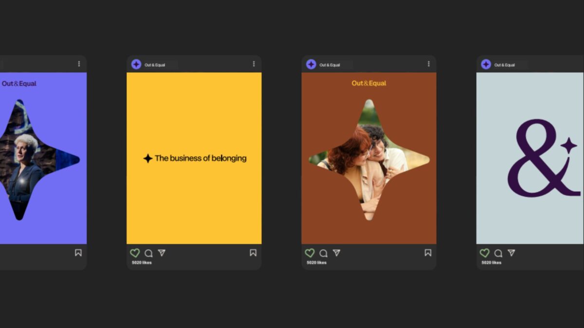
As Out & Equal evolves alongside an ever-changing corporate landscape, its digital presence needs to best reflect who they are and the role they play for their sponsors and community.
This redesign project focused on aligning the brand with its identity as a trusted guide—helping organizations navigate complexity with clarity, confidence, and care, while remaining grounded in its LGBTQ+ roots and its commitment to belonging at work.
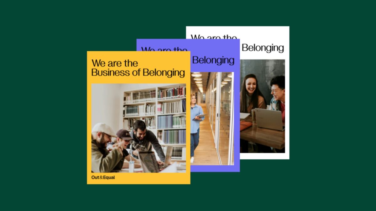
The work introduced a refreshed visual identity and a redesigned story-telling experience that clearly communicates purpose, narrative, and direction, providing a foundation for consistent expression across channels.

The approach
The redesign began with a focus on clarity and coherence—ensuring the brand could be expressed consistently while remaining flexible enough to evolve.
Key elements of the refresh included:
- A new color palette that signals confidence and warmth
- A refined logo that improves legibility and adaptability
- Visual storytelling that better reflects the organization’s values and future direction
To support long-term adoption, these changes were documented and operationalized through a centralized Brand Site. The site serves as a single source of truth for brand guidelines and assets, enabling internal teams and partners to apply the new identity with confidence.Brand assets are maintained directly in Figma, allowing designers to update and manage the system without engineering support and ensuring the brand remains current as it evolves.
Why This Matters
For Out & Equal, this redesign wasn’t simply about updating visuals—it was about clearly defining who they are and the role they play for the organizations and communities they serve, especially in a time of heightened scrutiny.
As a trusted guide, Out & Equal helps organizations navigate complexity with clarity, confidence, and care. The redesign ensures this role is immediately understood, while remaining deeply rooted in their LGBTQ+ origins and their long-standing commitment to belonging at work.
By aligning visual identity, storytelling, and governance, the new digital presence reflects Out & Equal’s purpose with intention. It provides internal teams with a clearer foundation to work from and offers external audiences a more confident understanding of where the organization is headed—and how they can move forward together.
Overview
Catch Carbon is powered by Rare, a global conservation organization with 40 years of experience driving behavior change across 60 countries. Their mission depends on mobilizing individuals and communities to take actions that benefit both people and the planet.
To expand the voluntary carbon credit market, Rare needed a digital platform that could explain carbon offsets clearly, build trust with everyday users, and convert awareness into action—all while maintaining the flexibility to test, learn, and scale based on real user behavior.
The Challenge
The voluntary carbon market had a visibility problem. Carbon offsets represent a powerful tool for individual climate action, but public awareness remained low. Most people didn’t understand what carbon offsets were, why they mattered, or how to purchase them confidently.
Rare needed more than a website. They needed a digital experience system that could:
- Educate and convert users unfamiliar with carbon markets
- Publish and iterate content quickly as they tested messaging and engagement strategies
- Scale efficiently without recurring platform constraints or cost bloat
- Maintain design and message consistency across all content and user journeys
The existing infrastructure couldn’t support this level of agility or growth. Rare needed a modern platform built for continuous improvement, not static delivery.

The Approach
Oomph designed and built a flexible, performance-ready platform in under three months.
Strategy and Platform Design
We began by evaluating Rare’s content needs, user behaviors, and operational constraints. The platform needed to support rapid publishing, consistent design patterns, and easy editorial workflows—without locking the team into rigid templates or slow release cycles.
We recommended Contentful as the content foundation and React for the front-end experience. This headless architecture separated content management from presentation, giving Rare the ability to update messaging, test new pages, and refine user flows without developer dependencies.
Experience Design and System Thinking
We built a modular design system that balanced clarity, trust, and accessibility. Every component—from educational explainers to conversion flows—was designed to reduce friction and build confidence for users new to carbon markets.
The design system ensured consistency across pages while giving editors the flexibility to structure content based on evolving user needs and campaign goals.
Engineering and Integration
We extended Rare’s existing API to support the new platform, working alongside their internal development team to ensure seamless data flow and operational continuity. Front-end development brought the design system to life, while back-end integration connected content, user data, and transaction workflows into a unified experience.
Throughout, we treated the platform as a system, not a site—designed for iteration, not completion.
What This Made Possible

The new platform gave Rare the operational infrastructure to:
- Test and refine messaging at speed, publishing new content and campaign pages without platform delays
- Scale outreach efforts efficiently, supported by a design system that maintains quality and consistency across growth
- Reduce editorial and technical dependencies, empowering the team to manage content, flows, and user experiences independently
- Build user trust through clarity, with educational content and conversion flows designed to meet users where they are
By decoupling content from code, Rare gained the flexibility to respond to user feedback, market conditions, and organizational priorities in real time—without platform friction or cost escalation.
The Result
Catch Carbon launched on a modern, headless platform designed for continuous improvement. The system supports Rare’s mission to make carbon markets accessible and actionable for everyday users, with the operational flexibility to evolve as the market and audience grow.
The platform positions Catch Carbon to move key engagement and conversion metrics over time—not through one-time delivery, but through ongoing iteration and optimization.
Why This Matters
Most organizations in the climate and nonprofit space face the same trade-off: build something fast and limited, or invest in systems that take too long and cost too much. Catch Carbon proves that speed and sustainability aren’t mutually exclusive.
By treating digital infrastructure as a system to operate, not a project to complete, Rare gained the foundation to test, learn, and scale—on their terms, within their budget.
At Oomph, we believe that moving the metrics that matter starts with building platforms that can adapt, perform, and grow. Catch Carbon is doing exactly that.
It’s nice to have a partnership [with Adapt] where you guys are so honest, straightforward, hardworking, and thoughtful.
— Catch Carbon
Overview
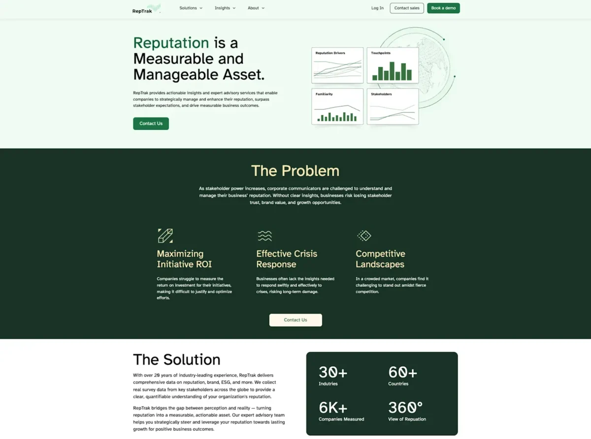
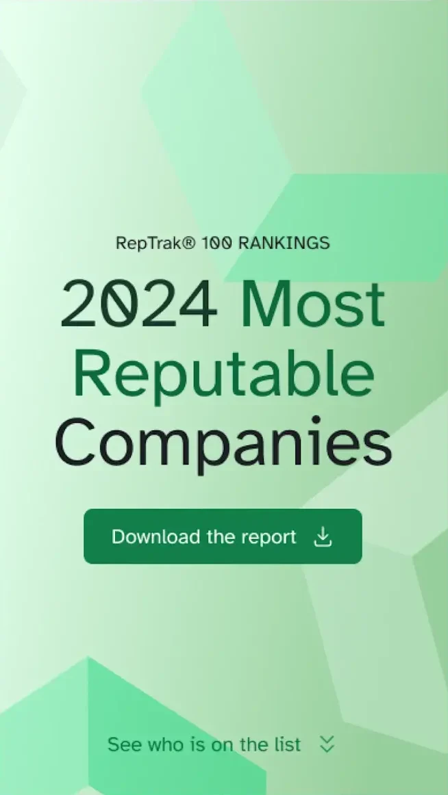
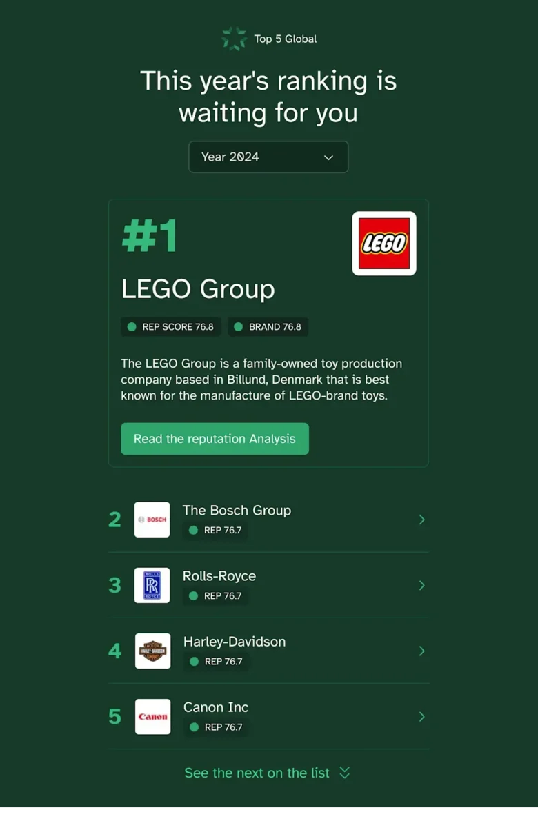
For over twenty years, RepTrak has been the go-to provider for reputation data and insights, helping organizations understand and improve their corporate reputation. With their flagship Global RepTrak 100 report, RepTrak offers an annual definitive ranking of corporate reputation for the world’s leading companies, providing valuable benchmarks that influence strategic decisions and stakeholder relationships.
The RepTrak Platform draws on the world’s largest reputation database with over 20 years of data. Their reputation scores serve as a leading indicator, allowing teams to interpret constantly updating streams of reputation, brand, ESG, and media data.
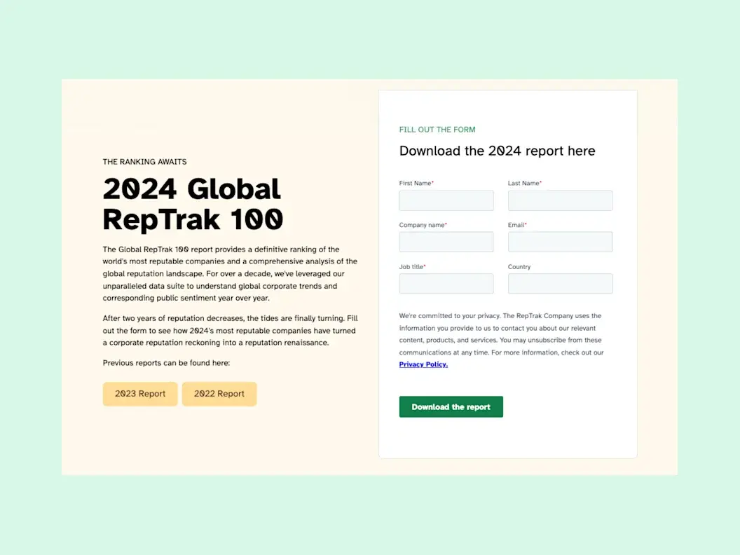
RepTrak’s Home and Global RepTrak 100 Landing Page are their most important lead generators, making it imperative to get these digital experiences right.
Key results
Increase in report downloads
YoY conversion boost
The Challenge
The Global RepTrak 100 report is more than just data — it’s a definitive ranking system recognized industry-wide that reinforces RepTrak’s leadership in the reputation industry. Their homepage demands similar attention as the first or second touchpoint for leads.
The challenge was to design landing pages that not only met the aesthetic and functional needs of their users but also reinforced RepTrak’s brand as a trusted and authoritative source. With the report being their top lead generator for the year, the landing page needed to be engaging, fast-loading, and seamlessly integrated into their Contentful site.
Beyond aesthetics for outside visitors, their internal team required Contentful modeling conducive to empowering Content Managers, guidance on technical integrations, and a new design system.
The Approach
Redefining Technical Support
With any project, proper guidance is an often overlooked prerequisite. It’s fairly common to “know what you want” and have no idea how to get there. It’s even more common to “know what you want” and for that journey to achieve the “want” be ill-advised. Without the outside perspective of a technical solutions partner, internal biases and inefficiencies multiply.
We approached this project interdisciplinary and agile. Assuming the role of impartial confidant, we were able to give the RepTrak team objective recommendations, allowing us to focus on speed with a collaborative touch.
Collaborative and Strategic Design
The Home and Global RepTrak 100 landing page received a complete overhaul, designed to elevate user experience, increase engagement, and drive conversions. Not to mention, make content editing and management easier for all parties internally.
The redesigned landing page is a testament to our collaborative efforts with RepTrak, merging aesthetics with functionality. By focusing on user experience and leveraging Contentful’s robust capabilities, we created a page that not only highlights the significance of the Global RepTrak 100 report but also aligns with RepTrak’s brand values and business goals.
The design features intuitive navigation, clear calls to action, and visually appealing elements that draw attention to key insights from the report. We also incorporated responsive design principles to ensure the page performs well across devices, catering to a global audience.
The Results
The redesign delivered measurable impact on RepTrak’s most important lead generation channels. Report downloads increased by 6% and conversions saw an impressive 40% year-over-year boost.
The new landing page is not just a one-time update — it’s a strategic investment in RepTrak’s digital presence. By ensuring a seamless and engaging experience, we’ve laid the groundwork for future enhancements that will extend to other areas of their Contentful site.
[Oomph] truly understood how important this report was to the company and helped us build something that can be translated across our website — so every piece we release can be just as powerful.
— Bianca Martucci-FiNk, Director of Global Content Marketing, The RepTrak Company
Overview
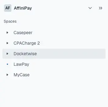
8am is the professional business platform purpose-built to help lawyers, accountants, and other experts deliver world-class outcomes for their clients and their firms. The company manages five distinct brands: MyCase (legal practice management), LawPay (legal payments and financial management), CasePeer (personal injury practice management), DocketWise (immigration practice management), and CPACharge (accounting payments and billing). Trusted by over 260,000 professionals and approved by 175+ bar and professional associations, 8am has spent 20+ years helping professionals make time for what matters.
As 8am prepared for a major rebrand to unify operations across all brands, they faced a complex technical challenge: multiple legacy CMS platforms including WordPress, HubSpot, and custom page builders created inconsistent publishing workflows, heavy plugin dependencies, and thousands of scattered media assets across their portfolio.
Stats/Key Outcomes
- 5 brands → 1 architecture: MyCase, LawPay, CasePeer, Docketwise, and CPACharge now managed in one scalable platform.
- Faster publishing cycles: Marketing teams can launch campaigns in hours, not days.
- Consistent branding & governance: Centralized templates + Frontify DAM integration keep every asset on-brand.
- GEO & SEO + growth built-in: Redirects preserved, structured content for AI/SEO visibility, and scalable content modeling.
- Future-ready: Supports personalization, localization, and new product rollouts.
The Challenge
8am faced operational challenges across multiple legacy CMS platforms including WordPress, HubSpot, and custom page builders. Inconsistent publishing workflows, heavy plugin dependencies, and thousands of scattered media assets created bottlenecks that slowed their marketing efforts.
The upcoming rebrand to 8am required unifying operations across all Affinipay brands, but their existing infrastructure couldn’t support this level of coordination and consistency.
The Solution
We partnered with Contentful to deliver a unified content architecture, beginning with a full migration of MyCase.com from WordPress to Contentful.
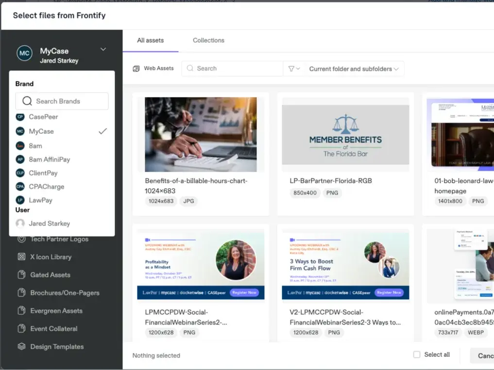
Key elements of the MyCase solution included a full migration of MyCase.com encompassing 166+ pages, 400+ blog posts, and 4,700+ media files. We built a structured content model for blogs, guides, webinars, press releases, videos, and landing pages. Design system standardization streamlined and standardized design components across the site. We ensured SEO continuity and GEO visibility by preserving 143+ SEO-critical redirects and improving metadata governance. For MarOps enablement, we integrated Marketo forms directly into Contentful’s structured model. Tech enablement connected Frontify DAM to manage brand assets consistently across all brands.
With the help of an Atomic Design System, this solution became the blueprint for ongoing migrations and updates across the broader 8am portfolio.
Shared DAM: One asset library powers all 8am brands — no duplication, no outdated files.
The Results
8am now operates on a centralized, API-first content platform that empowers its marketing and digital teams to scale campaigns faster, maintain consistent brand messaging, and collaborate more efficiently.
Structured workflows and reusable components reduced time-to-publish significantly. Brand, marketing, and digital teams now collaborate inside one system with shared visibility. Centralized asset management through DAM integration ensures consistency across all brands. The scalable foundation positions 8am for personalization, AI readiness, and continued growth.
It’s truly a night and day difference working with this new flow … It’s fantastic.
— Alexander Maxwell, Senior Designer, 8am
THE CHALLENGE
The Challenge
Fidelity Investments manages one of the most extensive content ecosystems in financial services, producing a constant stream of insights, trend analyses, and investment strategies. However, its design team faced a critical challenge — their design system felt restrictive rather than empowering.
While Fidelity’s internal team was updating brand standards, they struggled to apply them strategically within their digital experience. The design system supported incremental changes but lacked the flexibility to evolve with new ways of presenting content. Designers felt stuck in familiar patterns, limiting opportunities to rethink layouts, improve content discovery, and enhance engagement.
To break free from these constraints, Fidelity brought in Oomph to infuse fresh thinking, introduce new editorial layout strategies, and expand the capabilities of their design system.
OUR APPROACH
Oomph worked inside Fidelity’s existing design system, bringing an outside perspective to challenge old assumptions and push the boundaries of their brand standards.
Reimagining Editorial Storytelling
With Fidelity generating massive amounts of financial content, our team explored new ways to organize and present information. We conducted a cohort analysis of leading editorial experiences across industries, studying how different platforms arranged related content, structured topic-based storytelling, and guided users through complex financial narratives.
We then worked within Fidelity’s Figma files, prototyping new layout variations that:
- Allowed for dynamic grouping of content by topic, trend, or investor interest.
- Introduced larger, more structured content modules to replace scattered individual components.
- Created scalable patterns that could adapt to different content types and investment themes.
Expanding the Design System Beyond Incremental Updates
While Fidelity’s internal team was busy refining brand alignment, we helped them move beyond small tweaks to explore new possibilities. Our role was to:
- Push the boundaries of what was possible within their existing system.
- Experiment with layouts that weren’t explicitly outlined in the brand standards.
- Provide fresh external perspectives on how the brand could evolve digitally.
Collaboration & Seamless Handoff
We worked side by side with Fidelity’s internal team, ensuring every new layout and component fit within their development and governance structure. While Oomph focused on strategy and design, Fidelity’s team took the lead on integrating new components into their system and coding them into production.
Our handoff process included:
- Detailed design annotations and functionality breakdowns.
- Guidance on flexibility—such as how components could adapt to different use cases.
- Clear expectations for future scalability and content governance.
By the end of the engagement, Fidelity had not only expanded their design system but also re-energized their creative thinking.
THE RESULTS
A More Flexible, Scalable Design System
Oomph helped Fidelity’s design team break free from rigid design patterns and accelerate innovation by delivering:
- A reimagined editorial content strategy that improves engagement and storytelling.
- Expanded design system components that allow for more dynamic content grouping.
- A faster, more creative design workflow that helps Fidelity scale design updates with confidence.
By combining fresh creativity with structured execution, Fidelity was able to move forward with clarity, confidence, and a more powerful digital experience.
Helping Enterprises Scale Design Without Sacrificing Innovation
For large enterprises, design systems should accelerate progress—not slow it down. If your team is struggling with applying brand standards, creating scalable content models, or evolving your digital experience, let’s talk.
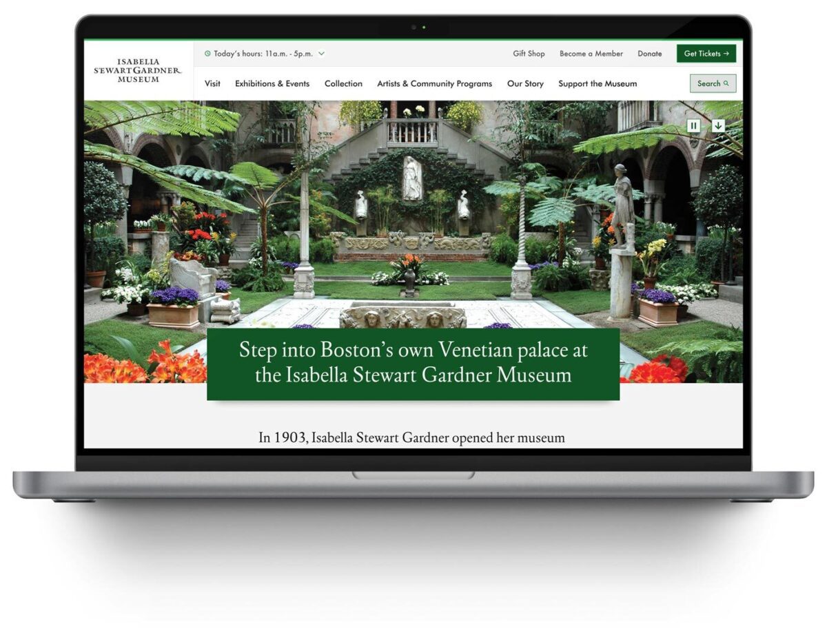
Museum websites have a unique duality. Unlike many other digital platforms, their primary goal is to encourage visitors to come in person. Their website may feature engaging articles or archives, cool virtual experiences, or highlight important research, but the physical space remains the heart of the museum, home to priceless collections and host to educational tours and programs. While the digital experience is still an essential one, the main objective of most museums is to welcome people through their doors.
That is why the Visit section of a museum website is extra important. Visitors are looking for a single page that clearly outlines everything they need to know: admission prices and hours, what they can and can’t bring, accommodations for nursing mothers or individuals with disabilities, and so much more. Then again, different people need to know different information, so how do you keep everything together without it ballooning out of control? Despite its importance, many museum websites miss the opportunity to provide clear, concise, and accessible visit information in one central place.
A Survey of Website Visit Page Trends for Museums
As part of a recent engagement with the Isabella Stewart Gardner Museum in Boston, we conducted a cohort analysis of other leading museum and cultural organization websites. The study focused on key elements of museum digital platforms including menu design, navigation, and the Prepare for your Visit page. We noticed a theme that several Visit pages on museum websites felt like long, endless scrolls. They’re often filled with lots of information, but a lack of structure or thoughtful design makes them difficult to quickly parse. Through this exercise of finding what is and isn’t working well and questioning why, we walked away with a strong sense of what makes a successful Visit page.
Answer Visitors’ Top Questions
Who, what, where, when, how. When thinking about what information should be contained on the Visit page, these timeless questions are a strategic starting point. Though simple, they are the questions visitors will ask themselves before they arrive at the museum. These questions can take many forms, but for the Visit page, we’re prioritizing logistics:
- Where is the museum located?
- What does it cost?
- When is it open?
- How do I get there?
- Who can come along?
If you are writing the content for this page, start by answering these key questions.
You may have your content set, but you also need to think about how it is prioritized through strategic page design. You should make sure that the most important information (usually hours and admission prices) is at the top of the page and always visible. Don’t hide this information in accordions. And even if your admission is always free, point that out. Visitors want to have that information before they visit your museum, so make sure it is clearly stated. After all, free or reduced pricing is often an enticing reason for many to come!
Despite what you may think, duplicating some key content in different locations across your website can be helpful, as long as it doesn’t get confusing. Just because you have the hours on the homepage, doesn’t mean you should skip it on the Visit page. Presenting the information in different formats can also be helpful. For example, MoMA’s visitor guide provides a contained experience which includes a lot of content that can be found elsewhere on the site, but organized for a particular need (someone coming to the museum now).
Strike the Balance between Enough and Too Much with Accordions
Nearly every Visit page we studied used accordions. When you’re looking at a long list of content, the option of tucking away big chunks of it into a collapsable block sounds pretty appealing. That said, there are ways to do it well and plenty of ways it can go wrong.
Whenever you use an accordion, you’re asking users to click or tap to see more. While requiring an action like this can be a nice way to keep visitors engaged, whatever they see before interacting needs to accurately represent what’s inside. Let’s say a user wants to know whether they can carry a backpack around the museum. A generic heading — like “Guidelines” — doesn’t speak to its contents and the user could easily overlook it. Accordions that are organized well and labeled clearly — more like ”What You Can Bring in the Gallery” — can improve content organization and reduce cognitive load.
Also take care to make sure that the accordions are built in a way that everyone can use them. Test them with a screen reader and navigate through with only your keyboard to make sure they are meeting accessibility standards.
Our recommendation: use accordions, but strategically. Don’t have more than 7 or 8 and never add essential information there that visitors would be looking for at a quick glance.
Guidelines & Policies
One large category that sometimes stumps museum stakeholders is where to put all the guidelines and policies that they often need to state, sometimes even for legal protections. Oftentimes these get lumped into a large accordion or series of accordions on the Visit page, without the key policies pulled out and clearly stated for visitors looking for quick guidance on whether strollers are allowed in the galleries or whether they can take photos with their new fancy camera.
Particularly when you have an extensive list of guidelines, a successful approach can be linking to a larger guidelines and policies page with the information organized by clear headings and categories (which is also good for SEO/GEO), as seen on The Frick’s website. Just remember our earlier point about duplicate content: For essential guidelines, such as bags and security policies, consider also including this information on the main Visit page.
Help Visitors Plan Their Day
Planning your Visit is a big topic and depending on your museum’s particular offerings, might encompass a lot. Preparing ahead can include everything from directions and parking, what’s on view, amenities (dining, shopping), types of tours offered and at what times, etc. The goal for this content is to make it easy for visitors on the day of their visit, both logistically and emotionally. At the end of the day, you want visitors to get the most out of their time at the museum. Assess what is considered essential information that should be included on the main Visit page, but also what might warrant getting its own subpage. This is where in-page linking can be your best friend.
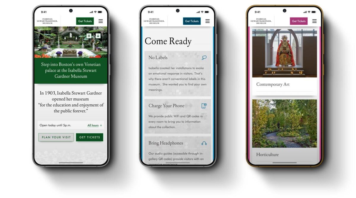
- Setting Expectations — Setting the right expectations is especially important when a museum provides an experience that deviates from the norm. For the Isabella Stewart Gardner Museum, for instance, they do not have wall labels for every object on display and instead rely on audio and room guides accessible via QR codes throughout the Museum. In their use case, making sure visitors know to bring headphones and have a fully charged phone is key information that may not be applicable to other cultural organizations, nor assumed by visitors before arriving.
- Themed Itineraries — One trend we uncovered in our cohort analysis is the rise of themed itineraries, giving visitors different ways to experience a museum. When creating these, consider what makes your museum unique and the audience groups you want to serve. For example, if you have a garden, you might design a “Garden Lover” itinerary that highlights outdoor spaces alongside artworks featuring landscapes or floral still lifes. Or, if time is the constraint, you could offer a one-hour itinerary like MoMA’s thoughtfully titled “The Unmissables.”
- Keeping the Delightful — In our conversations with museum stakeholders and throughout our cohort analysis, we learned that it’s common for most visitors to arrive at a museum having done very little, if any, preparation about the type of experience they will receive. Though every museum operates a little differently and has its own quirks, people come thinking they know what to expect based on past experiences. The resulting surprise can be anywhere from delightful to disorienting. Balancing the element of surprise with the right amount of logistical information for expectation setting can be a challenge, but hopefully a fun one to think through.
Prioritize an Easy Mobile Experience
Visitors often state that they want to “disconnect” while at a museum. They might be happy to pull out their phone for a photo, but otherwise want to spend their time and energy on the physical space around them. We truly love that for them, but also know that the website can, at times, meaningfully enhance the visitor experience. When thinking about what types of content should be considered from a mobile-first perspective, these come to mind:
- Maps — Include key features like restrooms and elevators. Enable common gestures like pinch-to-zoom and panning. Bonus points if the map is interactive, for example letting the user tap on a gallery to see what’s in it.
- Audio Guides — Provide basic controls, including play/pause, skip forward and backward (e.g. 15 seconds), and speed control. Let users access the transcript for greater accessibility.
- Artwork Information — This is especially important in the instance, like at the Gardner, where wall labels are not displayed in-situ and visitors are encouraged to access these via their phone in the galleries. They’ve addressed the need with digital Room Guides.
Ultimately, any content that is meant to be accessed while at the museum — member login and event schedule, for example — needs to be optimized for mobile. It’s especially important for this content to be easy to use and navigable on a small screen. We don’t want visitors to get lost in their phones or frustrated and ultimately give up. It needs to be intuitive to be a smooth piece of the whole experience.
Building a Successful Visit Page for Museums
Similar to building a successful navigation for a museum website, the first task of any organization looking to refresh their Visit page is to put yourself in the shoes of your visitors. Come up with a few key user journeys for various audiences. What would a family with small children need to know before coming to the museum? How about a person who requires a wheelchair or someone with low vision? What information would a student be searching the Visit page for?
Beyond walking through the experience first-hand yourself, it helps to get an outside perspective. If you have the means to talk to visitors while they’re on-site, that can lead to some fascinating insights on their in-gallery experience. However, know that you’ll most likely encounter a positive bias in their responses. Not only are they enjoying a day at the museum, but it can be tough to give critical feedback to someone standing right in front of them.
To counter that bias, gather feedback from additional sources: pop-up or email surveys, controlled usability testing, and website analytics. All of that data together can help give you the building blocks to ensure your visit page strikes the balance between being engaging and informative. By prioritizing clarity, accessibility, and thoughtful design, museums can ensure that visitors arrive knowledgeably at ease and excited to explore.
A well-crafted Visit page is more than just a logistics hub, it’s the digital admissions desk of your museum.
When done right, it reduces friction, answers essential questions, and sets the stage for a memorable in-person experience. Ultimately, the Visit page isn’t just about driving attendance, it’s about shaping the visitor’s journey from the very first click to the moment they step through your doors.
Learn more about building a successful Visit page in a Case Study of our 2025 Re-Architecture project for the Isabella Stewart Gardner Museum.
By Rachel Heidenry & Rachel Hart
Museum websites are beautifully complex. As the digital counterpart to a physical space, they serve many essential functions. They must reflect the museum’s mission and values, while guiding users clearly to key areas of information. Museums with collections often need dedicated sections for research and archives; zoos may focus on telling the stories of their animals; and contemporary art institutions sometimes even use their sites as platforms for artists to showcase new work. At the same time, nearly all museum websites must serve practical needs like selling tickets or memberships, promoting events or fundraisers, and providing essential visitor information, like hours and directions.
Managing that much critical and varied information is a challenge for any website, which is why strong information architecture (IA) is essential. A successful navigation should be intuitive and accessible, with clear labels and well-organized categories.
Mobile-responsiveness is also crucial, especially for visitors who need quick access to find information, like admission prices or the current exhibitions, or who want to purchase tickets on the go.
For cultural organizations, a strong menu and navigation system is arguably the most important indicator of a successful website.
A Survey of Website Navigation Trends for Art Museums
While not all cultural organizations prioritize aesthetics, art museums inherently do. As institutions dedicated to the presentation of art, they think critically about how visual design shapes their brand identity. In some cases, aesthetics can overshadow usability, resulting in beautiful or cutting-edge websites that are ultimately difficult for both internal staff members and external visitors to navigate.
As part of a recent engagement with the Isabella Stewart Gardner Museum in Boston, we conducted a cohort analysis of other leading museum websites. The study focused on key elements of art museum digital platforms including menu design, navigation, content organization, and user flows. One striking insight was that many art museum websites avoid dropdown menus, instead favoring a simple list of four or five top-level categories. These are often labeled with opaque or “insider” terms, raising questions like: What does “Programs” signify? Does “Art” lead to the permanent collection or temporary exhibitions? Does the general population know the difference? And where in the world is the museum’s blog?
Let’s take a look at the building blocks of a site’s navigation and what we learned from reviewing a cohort of cultural institution websites.
Utility Navigation
The utility navigation should help visitors quickly access essential information. As the name suggests, the utility navigation traditionally contains tools and actions (like login, search, and language select) that help visitors use the website. You’ll typically see it as a secondary list of items above the main menu, often in a smaller font.
When deciding what to include in it, consider your primary visitors’ goals: What do they need to know or do on your website? Museums often use the utility navigation to drive high-value actions like purchasing tickets or memberships. Our analysis also showed that museums with online shops frequently included links to the store or member login portals when relevant. In general, it’s best practice to limit the utility navigation to 2-4 key items, not including search.
- Open/Closed Status — More museum websites are starting to include an open/closed status directly in the utility navigation, as demonstrated by The Huntington’s website. This enhancement directly improves user experience and is particularly valuable on mobile where this status sits at the very top of the page. (Some museums, like MoMA, include this status elsewhere on the homepage which is a second best option).
- Tickets, Tickets, Tickets — For most museums, ticket sales or memberships drive revenue. Our findings show that successful museum websites don’t shy away from putting that fact front and center, with optimal placement in the utility navigation as simply “Tickets” and “Join.” Even better is if the “Tickets” link/button stands out through a distinctive design or unique brand color, like this pop of yellow on the MFA Boston’s website that makes the button unmissable.
The Dropdown or Mega Menu
Museums have a lot of content. And the larger the institution, the more content its website undoubtedly has to provide visitors. Our analysis showed that institutions that embrace the dropdown menu are overall easier to navigate and more often mobile-friendly. The bottom line: you don’t want visitors to your website to have to go down rabbit holes to find essential information.
- Dropdown Usability — Just having dropdowns on your menu isn’t enough. You still need to make sure the design is usable and accessible. Make sure you can move your mouse around without losing your place, and that you can navigate through menu items only using a keyboard. Mega menus provide the space for further grouping of sub-items or helpful descriptive text, but don’t fill them with too much or you risk overwhelming users. A well-designed menu dropdown can even take the place of a top-level landing page for the section, a pattern we saw on several museum websites.
- Menu Subpages — If you do have dropdown menus, be strategic about what pages you feature in the subnavigation. Resist including every single website subpage—many museums unfortunately attempt to accommodate too many categories. With competing departments and stakeholders, limiting selections sometimes proves challenging, but aim for 3-6 subpages. To supplement, you can create deeper content tiers within sections themselves and rely on structured in-page linking to help users discover additional site content.
Categories & Language
A navigation menu requires words (obviously). These are among the first words anyone sees when they land on your website. Thus they set the tone and expectation for what kind of museum you are, while also telling the story of what someone can do both on-site and online. Making sure the words that comprise the navigation are distinctive, accessible, and concise is key.
- Titles & Character Counts — Sometimes the hardest part of finalizing a navigation is agreeing on the words that comprise it. You might have figured out the general categories, but should you call the permanent collection “Collection” or “Art” or something else entirely? User testing provides essential validation and can help museum stakeholders move beyond insider terminology towards language that resonates with broader audiences. Whatever category headings you land on, consider length carefully. You rarely want to have more than 2 words and definitely strive to stay under 20 characters.
- “What’s On” — Many museum sites are adopting the “What’s On” category to capture Events and Exhibitions together. This colloquium is already widely used for British museums and reflects a more casual and (arguably) approachable language. If you’re considering this category title, think about your particular audience and if that phrase will resonate with visitors. Keeping it classic with “Exhibitions” or “Events” is perfectly fine too and is still widely in use.
Hamburger Menu
To keep the main navigation simple and clean, some museums, like The Barnes Foundation, opt to put additional links behind a hamburger menu, even at desktop widths. In this way, less significant information does not busy up the navigation, but visitors can still intuitively click through to find other key subpages. If you do this, be sure to still repeat the top level menu items, as this pop-out navigation will become your mobile view.
- Collapsed Menus — Whether hamburger menus, accordions, or other collapsible components, make sure that the most important information is always visible. Though most users these days recognize and understand the hamburger menu icon, hiding menu items behind a click or tap means they might be overlooked. Whether on desktop or mobile, determine what highly important items (like today’s hours or a link to purchase tickets) should always be visible on the page.
- Side Menus — Many websites use side menus to help users navigate to deeply nested content, but these constrain available width and cut into key page content. For museums who pay close attention to how the website looks and how images are being displayed, this may be reason enough to avoid this solution. If ensuring that artwork images are never cropped or obstructed is part of your acceptance criteria, this is not the route for your site. If you choose to forego the side menu, take care to help visitors move through the deeper content on your site with another solution, like a horizontal subnavigation bar or structured on-page links.
Conclusion: Building a Successful Navigation for Museums
If you are a cultural institution that is starting to rethink your website navigation, the first step is to put yourself in the shoes of your visitor. It’s critical to put aside internal org charts and take a user-centered design approach. Come up with a few key user journeys for various audiences. How would a first-time visitor purchase a ticket? How would a repeat visitor find more information about a particular work of art they loved? And then navigate your site as your user would. What are the pain points? What works well? What makes absolutely no sense at all?
Once you’ve done that, be sure to take a step back from your website to see what types of content you have and the common ways they might intersect. This is important for establishing the key categories of your site, as well as its subcategories. You’ll often be surprised at the connections you can make and the overlaps in content that can be streamlined together.
From there, you have the building blocks to start conceptualizing your new navigation, one that is usable, clear, and beautifully intuitive. Learn more about building a successful navigation in a Case Study of our 2025 Re-Architecture project for the Isabella Stewart Gardner Museum.
Key Outcomes
Within three weeks of launch, the redesigned digital experience system demonstrated measurable improvements across every key visitor behavior:
Homepage engagement time
Exhibition page views
“Inside the Collection” engagement time
Beyond the metrics, the new system fundamentally changed how the Gardner operates online:
- Operational efficiency: Staff can now find and update content without external search tools, reducing technical dependencies and accelerating publication cycles
- Foundation for iteration: Clear analytics, accessible components, and logical content structure enable ongoing testing and optimization based on visitor behavior
- Inclusive access: WCAG 2.2 AA compliance extended reach to visitors with disabilities while improving usability for everyone
- Strategic content pathways: Improved architecture creates discovery opportunities, extending engagement beyond transactional tasks to collection content, exhibitions, and membership
The Organization
The Isabella Stewart Gardner Museum is one of Boston’s most distinctive cultural institutions. Founded by Isabella Stewart Gardner herself, the Museum offers an intimate, unconventional art experience—no labels, personal curation, and a transportive environment that defies typical museum expectations.
For an institution built on intentionality and access, digital experience shapes whether people visit, how they prepare, and whether they return. When the Museum’s website became a barrier rather than a bridge, they needed a partner who could modernize their digital experience system without erasing what makes the Gardner extraordinary.
The Challenge
The Gardner’s digital presence had become operationally unsustainable and strategically misaligned:
- Internal navigation failures: Staff routinely used Google to find content on their own website, signaling fundamental architecture problems
- Accessibility gaps: The site failed WCAG 2.2 AA standards, excluding visitors with disabilities and contradicting the Museum’s commitment to inclusive access
- Scattered information architecture: Exhibition details, ticketing, and visitor resources lacked clear relationships or pathways, creating friction at critical decision moments
- Inflexible content management: The component system forced workarounds that undermined performance and brand coherence
These systemic barriers prevented the Museum from achieving core digital objectives: inspiring visits, supporting trip planning, and extending engagement beyond the physical experience.
The Approach
Oomph designed and implemented a comprehensive digital experience system—a fundamental rearchitecture of how the Museum operates online:
- Strategic alignment: Stakeholder workshops across departments established shared priorities, success metrics, and institutional identity through synthesis of member surveys, analytics, and internal insights
- User-centered architecture: Mapped visitor journeys for key personas—Museum Members, first-time ticket buyers, on-site visitors, and online researchers—ensuring structure supported real tasks
- Information architecture transformation: Rebuilt navigation and menu hierarchy from the ground up, validated through TreeJack testing before visual design
- Accessibility-first component system: Developed component library meeting WCAG 2.2 AA standards, proving accessibility and aesthetic excellence reinforce each other
- “Gentle elegance” design philosophy: Translated the Gardner’s intimate character into digital form through subtle details—lace patterns and mosaic elements—that inject personality without overwhelming content
- Strategic page redesigns: Reimagined Visit page balances practical planning information with pathways to deeper content exploration
- Performance infrastructure: Built technical foundation for speed, reliability, and long-term maintainability
The Result
The Isabella Stewart Gardner Museum now operates a digital experience system that reflects its institutional values—intimate, intentional, and accessible to all.
The platform performs measurably better across every key visitor behavior. The Museum’s team has infrastructure that supports their mission with clear pathways for ongoing optimization as visitor needs evolve.
The Gardner’s digital presence now prepares visitors for an extraordinary experience, removes barriers to access, and extends the Museum’s distinctive character beyond its physical walls.
Why This Matters
Cultural institutions must honor their distinct identity while meeting contemporary expectations for digital access and usability. The Gardner demonstrates how these priorities reinforce rather than conflict.
By treating digital experience as an integrated system, Oomph helped the Gardner build infrastructure that scales with their mission—creating operational capacity to measure, learn, and continuously improve how they serve visitors online.
This transformation moves metrics: measurable engagement growth, operational efficiency, and strategic flexibility. More fundamentally, it builds systems that help organizations do their most important work better.
Drupal has long been known for its flexibility, robustness, and scalability. But for many marketers and content creators, that flexibility can come with a steep learning curve — especially when it comes to building layouts and managing design without the help of a developer. That’s about to change in a big way.
Enter Drupal Canvas (previously called Experience Builder), a new initiative in Drupal that promises to radically streamline and simplify how we build and design pages. While still in its early stages, Experience Builder is ready for testing and experimentation — and it’s something marketers should absolutely have on their radar.
What is Drupal Canvas?
Drupal Canvas is the evolution of Drupal’s current method of flexible page building called Layout Builder. It takes what we know from layout builder and expands it into a unified, user-friendly tool that allows non-developers to build and theme websites directly in the browser. It’s a huge leap toward making Drupal more accessible for site builders, marketers, and content creators alike.
Unlike other page builders, Canvas doesn’t just provide drag-and-drop layout tools. It leverages Drupal’s core strengths — structured data, fine-grained access controls, and reusable components — to ensure consistency across channels and scalability across enterprise-level websites. This makes it uniquely powerful for large organizations managing multiple digital properties.
Dries Buytaert, Drupal’s founder, described it as a response to the fragmented landscape of site-building options in Drupal today. The vision is to consolidate functionality from tools like Paragraphs and Layout Builder into a single, cohesive solution. One that’s intuitive, efficient, and packed with modern capabilities.
Here is a fantastic video demo from DrupalCon Atlanta that was shown by Dries during the keynote address:
Why Now?
The timing couldn’t be better. While Layout Builder was a step in the right direction when it launched in 2018, its limitations became clear as more site builders demanded easier workflows, styling tools, and richer content composition features.
At recent Drupal conventions, the community has rallied around the idea of enhancing user experience across the board. As part of the broader Drupal CMS, Canvas is a key component in bringing Drupal’s usability in line with the expectations of modern content teams.
Why I’m Excited About It
As an engineer who has worked closely with Drupal for years, what excites me most is how Canvas can bridge the many gaps in Drupal’s current page-building ecosystem. Today, there are so many ways to structure content — Blocks, Paragraphs, Layout Builder, Panels — that choosing the right one can be overwhelming.
Drupal Canvas is shaping up to be that “one-stop-shop” we’ve needed. It reduces decision fatigue and gives teams a faster way to get projects off the ground without needing to architect every page structure from scratch.
Even better, it supports creating single-page overrides, component-level editing, and even React-based components right in the editor. That’s something I’ve personally looked forward to for a long time. The ability to build and save reusable components that can be dropped into any page makes this a tool that truly enhances productivity — not just for developers, but for marketers and content creators, too.
My First Look
I had the chance to see Drupal Canvas in action at DrupalCon Atlanta this year. The live demos were impressive and really opened my eyes to what this tool could do, both for newcomers to Drupal and seasoned site builders. Along with Drupal CMS, and recipes, Canvas is easily one of the hottest topics in the Drupal ecosystem right now.
The energy in the room during the sessions was palpable — people are genuinely excited about this. It’s not just another experimental module; it’s a shift in how we think about building on Drupal.
A Game-Changer for Marketers
One of the biggest barriers for marketing teams has always been reliance on developers to make even small layout edits. That’s starting to change.
With Canvas, non-developers will be able to build out dynamic, visually engaging pages — without needing to dive into code. That’s a massive win, especially for small teams in government, education, or nonprofit sectors, where resources are limited and time is of the essence.
Being able to make changes quickly, reuse content intelligently, and maintain a consistent brand without touching a template file is something many organizations have wanted for years. Drupal Canvas delivers on that promise.
Want to Try It Yourself?
If you’re curious to see what the buzz is about, you have two great options to get started:
- Try it yourself: Head to Drupal.org and download the latest version of Drupal CMS. It now comes with an optimized installer that makes getting started faster than ever. Once you’re up and running, you can add the Drupal Canvas module and start exploring.
- See it in action: Not ready to dive in alone? Schedule an implementation consultation with our team for a live demo and personalized guidance on how Drupal CMS can work for your organization.
Looking Ahead
It’s important to note that this is just the alpha version of the Canvas initiative. The team behind it is committed to rapid iteration and community feedback, which means what we’re seeing today is just the beginning.
If this is the foundation, I can only imagine how powerful the tool will become in the next year or two. The Drupal community is known for its collaborative spirit and constant innovation — and Canvas is shaping up to be one of the most important steps forward in years.
So if you’re a marketer, content strategist, or anyone who’s ever been frustrated by the limits of page building in Drupal — now’s the time to dive in. Drupal Canvas is here, and it’s ready to change the game. Ready to explore Drupal Canvas for your organization? Contact us for a complimentary consultation.
THE CHALLENGE
The Challenge
Keene State College (KSC), a liberal arts institution within the University System of New Hampshire, needed a modern, user-friendly website that aligned with its mission while effectively serving multiple audiences.
Over time, the existing site had grown into an overwhelming digital ecosystem, filled with complex navigation, disjointed content, and inconsistent branding. To better serve students and stakeholders, KSC needed to:
- Prioritize prospective students while maintaining relevance for parents, faculty, and alumni.
- Simplify content structure to help users quickly find what they need.
- Modernize the design and user experience while staying true to the college’s brand.
- Improve accessibility and performance to ensure a seamless experience across all devices.
KSC partnered with Oomph to create a scalable, audience-first digital experience that supports recruitment, engagement, and long-term adaptability.
OUR APPROACH
We focused on eliminating friction and enhancing engagement through a user-first strategy, modern information architecture, and a flexible, scalable design system.
Understanding the Audience & Challenges
Our discovery process included stakeholder workshops, user journey mapping, and content analysis to identify key roadblocks. We uncovered:
- Difficult navigation made it hard for prospective students to find admissions and academic program details.
- Multiple audiences competing for visibility resulted in a cluttered, confusing user experience.
- Inconsistent branding and outdated UI weakened the college’s online presence and first impressions.
By clearly defining what success looked like and identifying areas of improvement, we laid the foundation for a streamlined, student-centric digital experience.
Defining the Strategy & Roadmap
With a deep understanding of user needs, we developed a strategy focused on engagement, clarity, and accessibility.
- Navigation designed for prospective students while keeping secondary audiences accessible.
- A scalable mega menu that simplified content discovery without overwhelming users.
- A brand refresh of the digital identity that modernized KSC’s online presence while maintaining its authenticity.
- WCAG 2.1 Level AA accessibility compliance to ensure an inclusive experience for all users.
This strategy ensured that KSC’s website would be functional, engaging, and built to support student recruitment.
Executing the Vision
To bring the strategy to life, we developed a modern design system with a flexible, component-driven architecture that simplifies content management and improves the user experience.
- Audience-first navigation & mega menu – Prospective students can quickly find key admissions and academic information, while faculty, parents, and alumni have dedicated sections tailored to their needs.
- Scalable component library – A structured yet flexible design system enables KSC teams to easily update and manage content while maintaining a cohesive visual identity.
- Optimized for mobile & accessibility – A fully responsive, WCAG-compliant design ensures a seamless experience across all devices.
By creating a well-structured, intuitive content ecosystem, KSC now has a digital experience that is easy to manage and designed for long-term adaptability.
This team brings creativity and structure to projects. Decisions are based on data and reports, but they include a connection to heart and real world users. They bring in subject matter experts at the appropriate time but never lose site of the big picture.”
DIRECTOR OF MARKETING, Keene State College
THE RESULTS
A Student-Centric Digital Experience
The new Keene State College website now provides:
- A clear, structured experience for prospective students – Admissions, academics, and student life content is now easier to find and explore.
- A modernized digital identity – A refreshed brand and UI create a welcoming, engaging first impression.
- Seamless navigation for multiple audiences – While prospective students remain the priority, faculty, alumni, and parents still have dedicated access points.
- An accessible, scalable, and future-proof platform – Designed to support long-term growth, engagement, and institutional goals.
A Digital Experience That Grows With Its Community
Keene State’s new site is more than just a redesign—it’s a long-term investment in student engagement, accessibility, and institutional identity. By focusing on audience needs, structured content, and a scalable design system, KSC now has a future-ready digital presence that enhances recruitment, supports students, and strengthens the college community.
Is Your Higher Ed Website Ready for the Next Generation of Students?
If your institution is struggling with outdated content, complex navigation, or disconnected user experiences, a strategic digital approach can create clarity and engagement.
Let’s talk about how Oomph can help your institution stand out in an increasingly competitive higher ed landscape.
From code to launch
Sites launched within a year
Performance improvement
THE BRIEF
A Fractured System
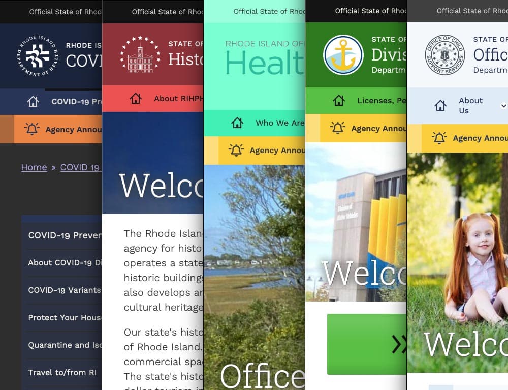
With a network of websites mired in old, outdated platforms, Rhode Island was already struggling to serve the communication needs of government agencies and their constituents. And then the pandemic hit.
COVID accelerated the demand for better, faster communication and greater efficiency amid the rapidly changing pandemic. It also spotlighted an opportunity to create a new centralized information hub. What the government needed was a single, cohesive design system that would allow departments to quickly publish and manage their own content, leverage a common and accessible design language, and use a central notification system to push shared content across multiple sites.
With timely, coordinated news and notifications plus a visually unified set of websites, a new design system could turn the state’s fragmented digital network into a trusted resource, especially in a time of crisis.
THE APPROACH
Custom Tools Leveraging Site Factory
A key goal was being able to quickly provision sites to new or existing agencies. Using Drupal 9 (and updated to Drupal 10) and Acquia’s Site Factory, we gave the state the ability to stand up a new site in just minutes. Batch commands create the site and add it to necessary syndication services; authors can then log in and start creating their own content.
We also created a set of custom tools for the state agencies, to facilitate content migration and distribution. An asynchronous hub-and-spoke syndication system allows sites to share content in a hierarchical manner (from parent to child sites), while a migration helper scrapes existing sites to ensure content is properly migrated from a database source.
Introducing Quahog: A RI.gov Design System
For organizations needing agility and efficiency, composable technology makes it easier to quickly adapt digital platforms as needs and conditions change. We focused on building a comprehensive, component-based visual design system using a strategy of common typography, predefined color themes and built-in user preferences to reinforce accessibility and inclusivity.
The Purpose of the Design System
The new, bespoke design system had to support four key factors: accessibility, user preferences, variation within a family of themes, and speedy performance.
Multiple color themes
Site authors choose from five color themes, each supporting light and dark mode viewing. Every theme was rigorously tested to conform with WCAG AA (and sometimes AAA), with each theme based on a palette of 27 colors (including grays) and 12 transparent colors.
User preferences
Site visitors can toggle between light or dark mode or use their own system preference, along with adjusting font sizes, line height, word spacing, and default language.
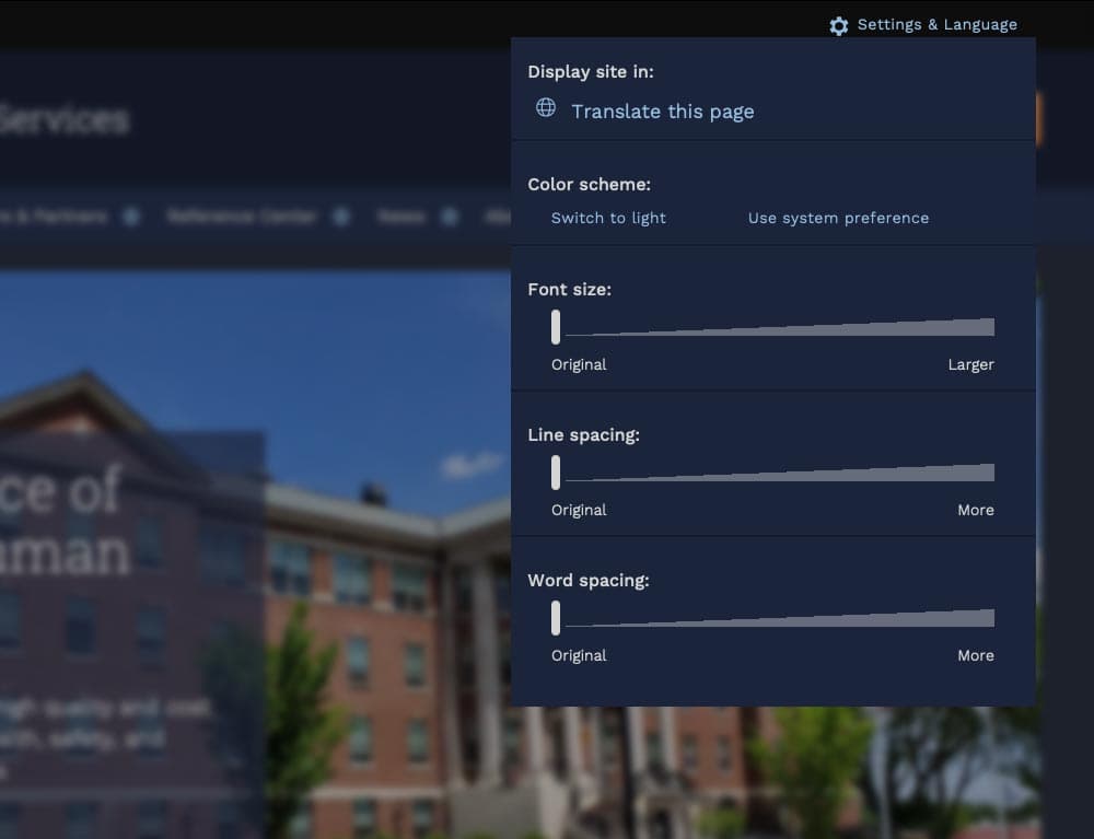
Mobile first
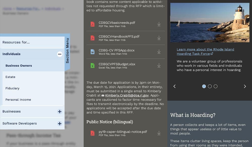
Knowing that many site visitors will be on mobile devices, each design component treats the mobile experience as a first-class counterpart to desktop.
Examples: The section menu sticks to the left side of the view port for easy access within sections; Downloads are clearly labelled with file type and human-readable file sizes in case someone has an unreliable network connection; galleries appear on mobile with any text labels stacked underneath and support swipe gestures, while the desktop version layers text over images and supports keyboard navigation.
High Accessibility
Every design pattern is accessible for screen readers and mobile devices. Color contrast, keyboard navigation, semantic labeling, and alt text enforcement all contribute to a highly accessible site. Extra labels and help text have been added to add context to actions, while also following best practices for use of ARIA attributes.
Performance aware
Each page is given a performance budget, so design components are built as lightly as possible, using the least amount of code and relying on the smallest visual asset file sizes possible.
THE RESULTS
Efficient and Effective Paths to Communication
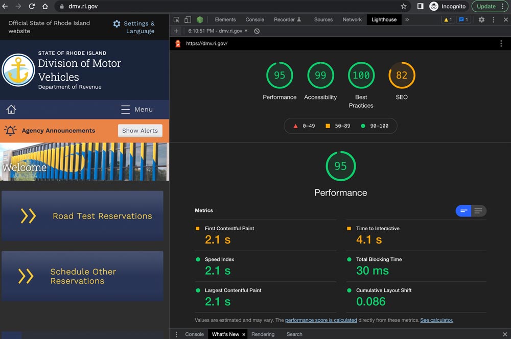
The first sites to launch on the new system, including covid.ri.gov, went live four and a half months after the first line of code was written. A total of 15 new sites were launched within just 8 months, all showing a 3-4x improvement in speed and performance compared with previous versions.
Every site now meets accessibility guidelines when authors adhere to training and best practices, with Lighthouse accessibility and best practice scores consistently above 95%. This means the content is available to a larger, more diverse audience. In addition, a WAF/CDN provider increases content delivery speeds and prevents downtime or slowdowns due to attacks or event-driven traffic spikes.
State agencies have been universally pleased with the new system, especially because it provides authors with an improved framework for content creation. By working with a finite set of tested design patterns, authors can visualize, preview, and deploy timely and consistent content more efficiently and effectively.
We were always impressed with the Oomph team’s breadth of technical knowledge and welcomed their UX expertise, however, what stood out the most to me was the great synergy that our team developed. All team members were committed to a common goal to create an exceptional, citizen-centered resource that would go above and beyond the technical and design expectations of both agencies and residents .
ROBERT MARTIN ETSS Web Services Manager, State of Rhode Island